53 unique website color schemes to make a lasting impression


Share 53 unique website color schemes to make a lasting impression
Explore more from
Design basics
From wireframe to website, faster
Design, prototype, and refine every page.


Color communicates before content. The moment someone visits your site, your palette sets expectations and guides their journey. A considered color scheme helps users navigate, understand priorities, and connect with your brand—even before they read a single word.
A well-executed color scheme can transform a simple Web design into a captivating experience, drawing users in and encouraging them to engage and take action.
Read on to learn:
- 53 website color scheme examples
- When to use different color schemes
- Tips for choosing a website color scheme
Minimal and neutral website color schemes
Minimal and neutral color schemes, often characterized by a limited color palette of whites, blacks, grays, and soft pastels, are perfect for brands that prioritize elegance, simplicity, and clarity.
Websites like Asana and Calm use this approach to create a serene, sophisticated atmosphere that promotes focus and relaxation.
Color scheme 1: Ink wash

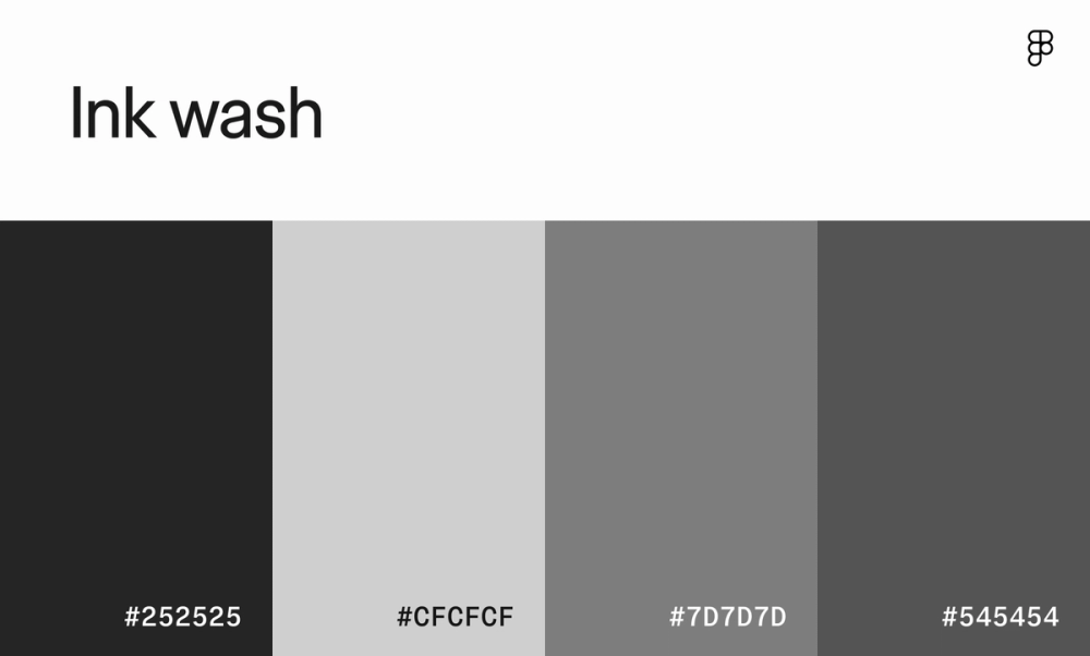
From print newspapers to photography, there’s a reason this minimal color scheme works for nearly every medium. The monochromatic shades of gray create a clean and focused aesthetic, making it ideal for websites and apps that prioritize readability.
Color scheme 2: Neutral elegance

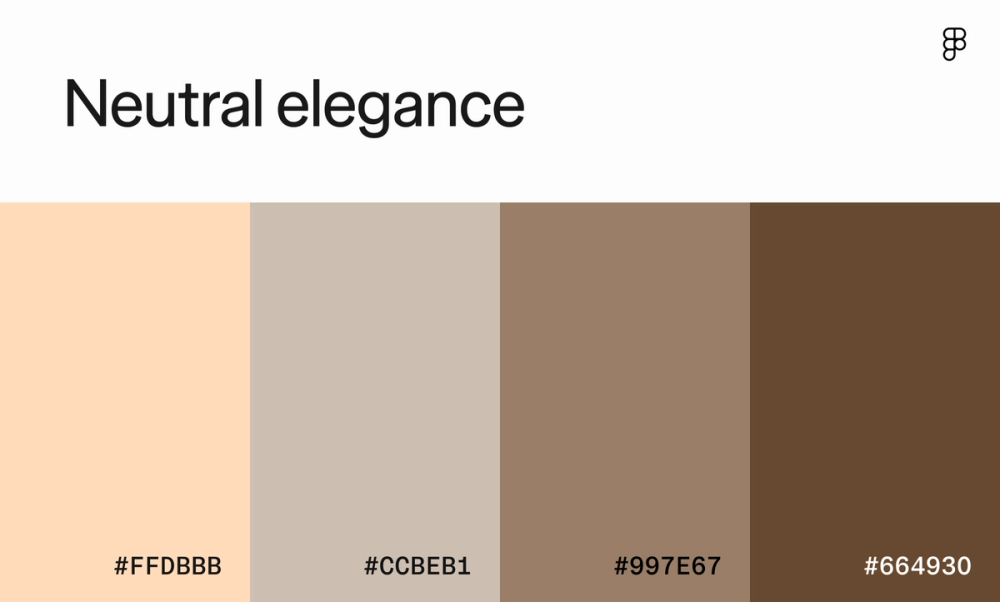
The muted beige, gray, and brown tones in this color scheme create a serene and professional atmosphere, making it a great choice for websites looking to convey a sense of luxury and minimalism. Brands like Burberry and Louis Vuitton use similar earthy tones for many of their website designs.
Color scheme 3: Jade pebble morning

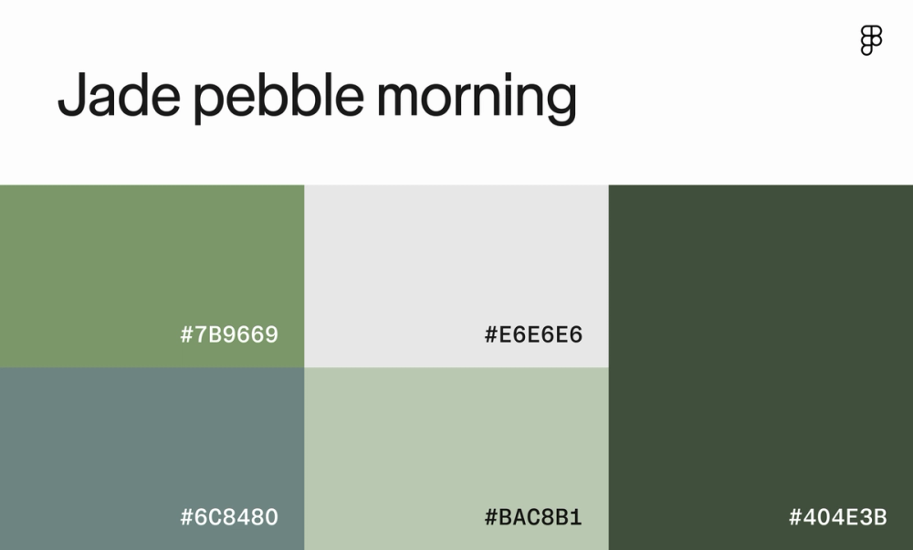
This color combination features cool shades of green that convey tranquility and nature, ideal for businesses like yoga studios, organic food brands, or eco-friendly products. The darker shades add enough contrast to create visual hierarchy while maintaining harmony.
Color scheme 4: Woodland

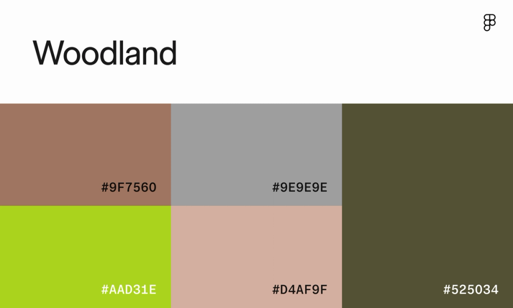
Add a pop of chartreuse against an otherwise neutral color scheme for a playful touch against a calming backdrop. This color scheme works well for websites that promote sustainability, health, or outdoor activities, like a camping gear retailer or wellness retreat.
Color scheme 5: Driftwood pearl morning

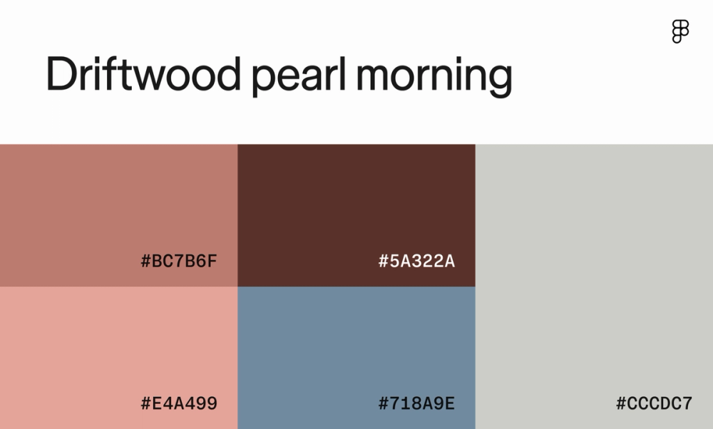
This color palette evokes a sense of warmth and tranquility with rose gold and brown tones, while the chocolate brown and blue add depth and contrast. The lighter gray provides a neutral background that enhances readability.
Color scheme 6: Graphite

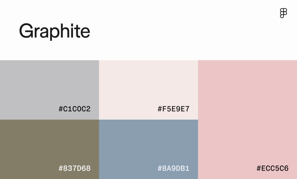
This combination of cool gray, green, blue, and pink tones creates a gentle and inviting atmosphere perfect for those looking to promote wellness and relaxation, like skincare brands. While soft, the deep brown and blue-gray colors add just enough contrast to make essential website elements stand out.
Color scheme 7: Urban slate

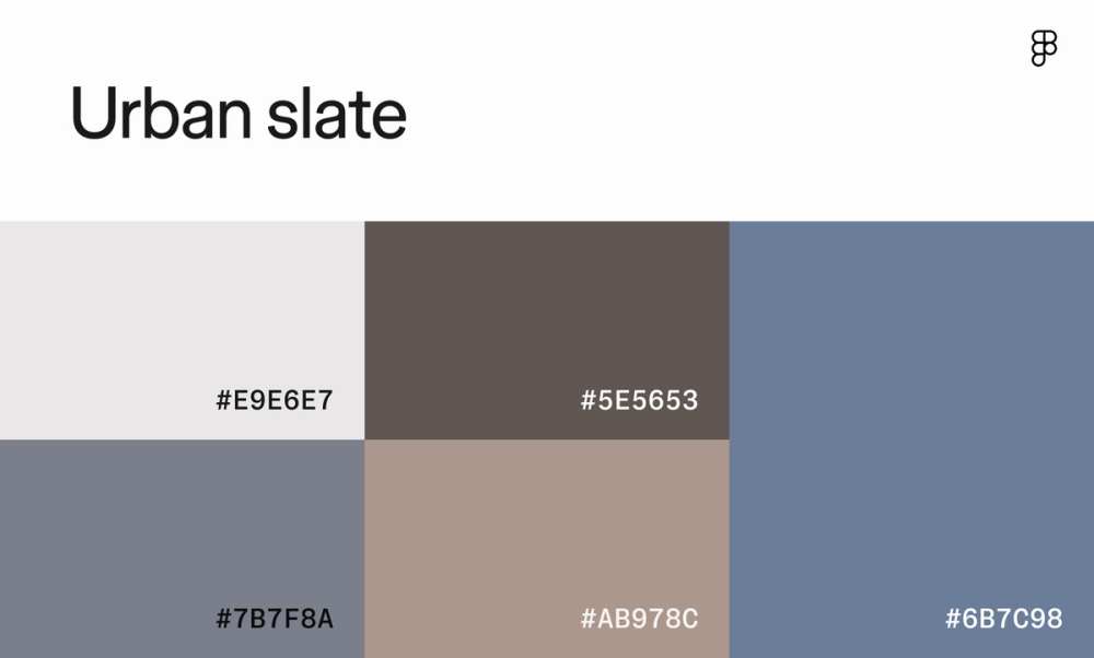
As the name suggests, this color scheme pulls from foggy cityscapes to evoke a sense of calm and sophistication. The combination of light and dark shades creates a sense of depth and contrast, while the overall color scheme maintains a serene and professional aesthetic.
Color scheme 8: Pearl

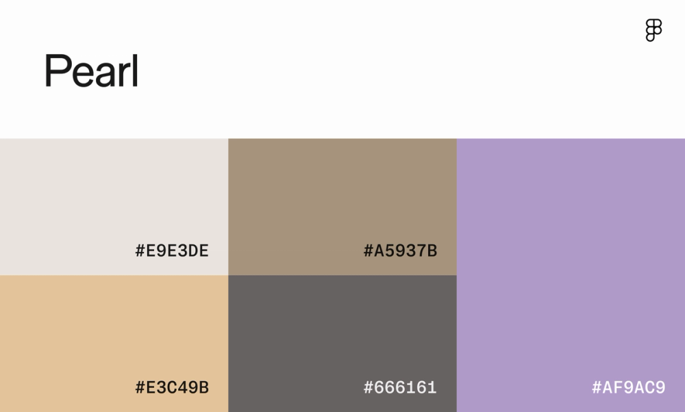
Purple is often associated with wisdom and luxury and adds a hint of elegance and sophistication to this otherwise neutral palette. It can be used as an accent color to draw the eye to certain elements, elevating the overall design. For example, a luxury skincare brand or a high-end fashion retailer might use a similar color palette to convey a sense of exclusivity and refinement.
Color scheme 9: Vichy

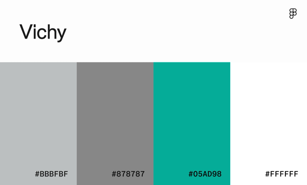
This website color scheme is a breath of fresh air. The soft gray and crisp white create a clean and modern base, while the vibrant teal adds a pop of energy. This combo is excellent for websites that want to feel modern, calming, and a bit playful—think tech startups, health and wellness brands, or even fun and trendy clothing stores.
Color scheme 10: Sorbet

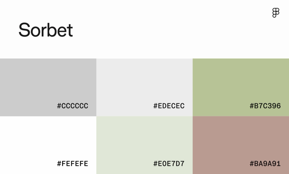
Cozy clothing brands and minimalist design portfolios can appreciate this soft, muted color scheme, which is easy on the eyes. This palette is perfect for brands wanting to evoke peace, tranquility, and elegance.
Color scheme 11: Frozen mist

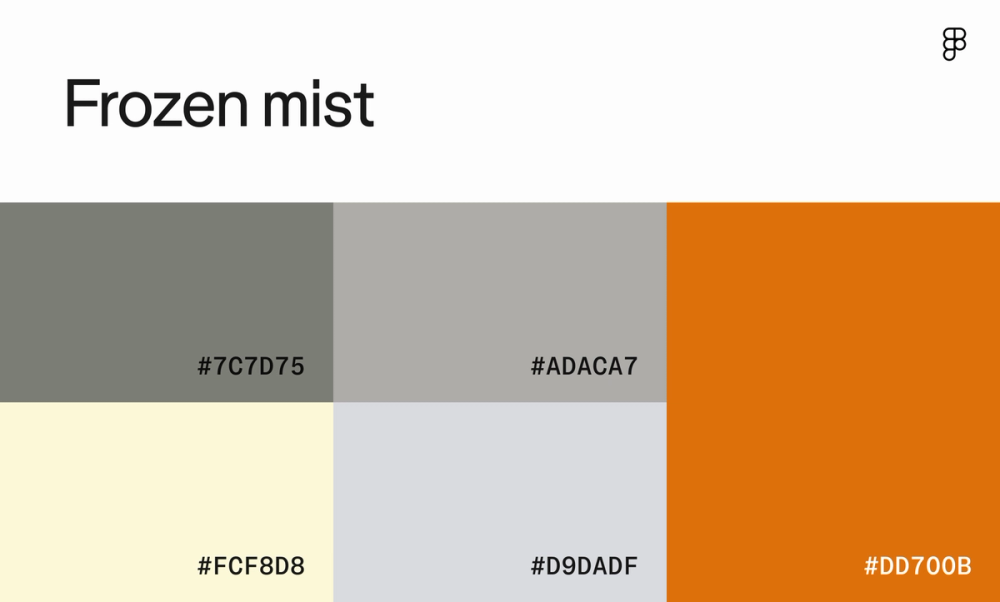
While the monochromatic grays in this color scheme provide a neutral base, the cinnamon has a vibrancy that’s great for CTA buttons and clickable elements urging action. It’s the star of the show, adding a touch of excitement without overwhelming the design.
Color scheme 12: Yacht club

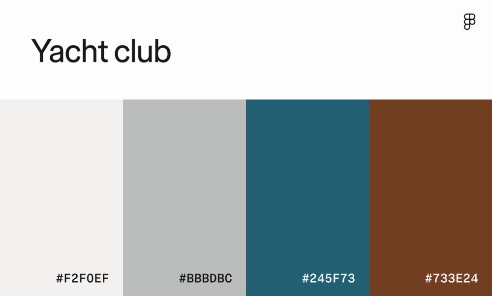
This maritime-inspired color scheme balances cool grays, rich indigo, and mahogany, creating a serene and inviting feel. The deeper shades add a grounding quality that can help lighter elements on the page stand out.
Warm website color schemes
Color theory suggests that warm color schemes, often featuring red, orange, and yellow hues, can evoke energy, excitement, and passion. They work well for industries like food, entertainment, and home goods.
For example, Chipotle uses warm, earthy colors to create a sense of comfort and homeliness while highlighting its food's freshness and natural ingredients. Like Etsy's playful palette, warm colors can also reflect creativity and individuality.
Color scheme 13: Amber walnut morning

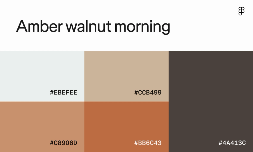
This warm, earthy brown color scheme offers excellent contrast, making for an appealing and easy-to-read site. This palette works well for websites that want to convey a sense of luxury, comfort, or natural beauty, like Living Spaces.
Color scheme 14: Copper aquamarine dream

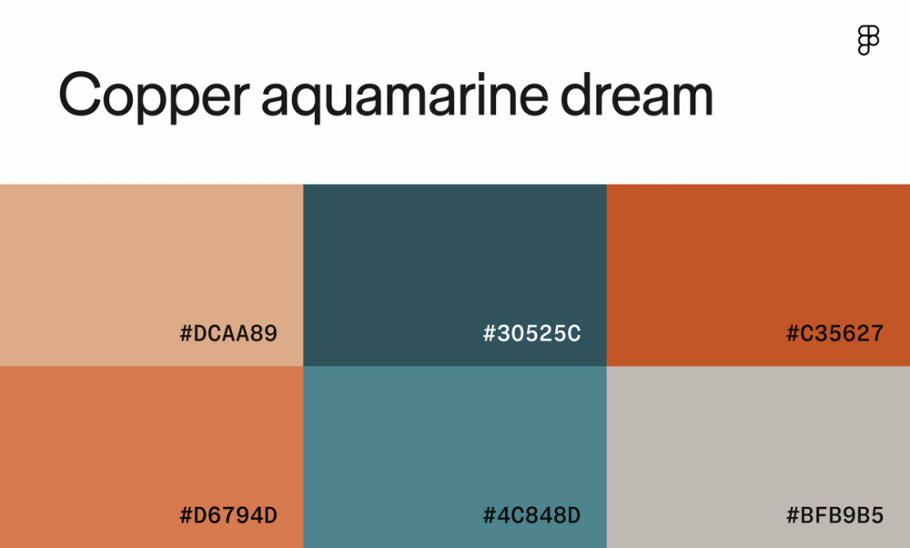
With warm colors and a hint of modern flair, this color palette feels like a serene walk through a coastal forest. The burnt orange and muted shades ground the design, while the cool blues and greens add a touch of tranquility.
Color scheme 15: Cocoa topaz noonday

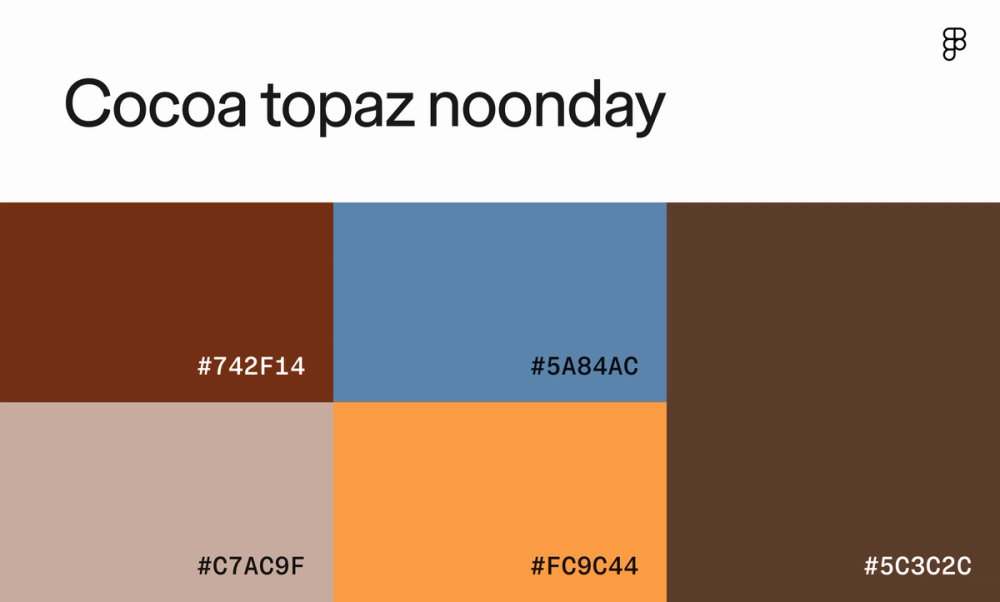
Evoke cozy autumn vibes with warm, earthy tones and calming blues. The contrast between the dark browns and the bright orange creates a dynamic color scheme ideal for calling attention to buttons or headlines. This palette suits websites that want to portray warmth, comfort, and nostalgia, like a local bookstore, vintage clothing shop, or home decor brand.
Color scheme 16: Sandstone aquamarine serenity

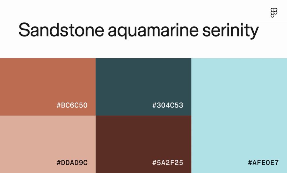
This color scheme relies heavily on natural tones, but the striking pastel blue is a refreshing accent. Use it sparingly for elements like buttons, links, or highlighted text to draw the user’s eye and add a touch of vibrancy. Or, use it for background elements or subtle gradients to create a calming and airy design.
Color scheme 17: Honey opal sunset

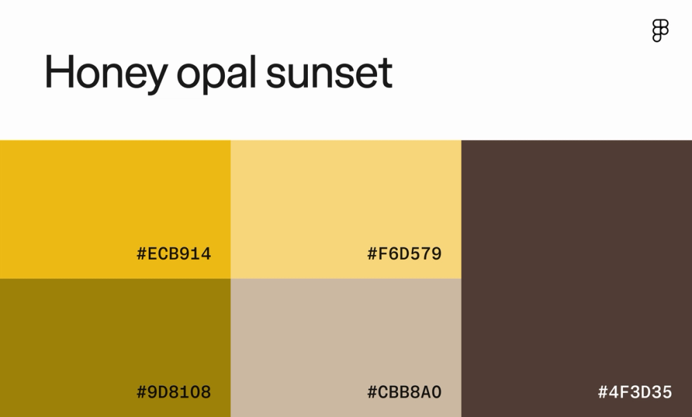
This color palette's rich mustard yellow and taupe create a timeless and elegant aesthetic, perfect for posh websites. The contrast between the dark and light shades adds depth and dimension.
Color scheme 18: Seashell garnet afternoon

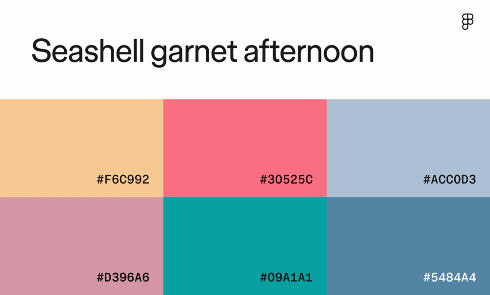
Juxtapose calmness and peace with energy and excitement by combining soft pastels with pops of vibrant coral. This color scheme brings gentle summer breezes to your design while still emphasizing call-outs with contrasting colors.
Color scheme 19: Rose quartz evening

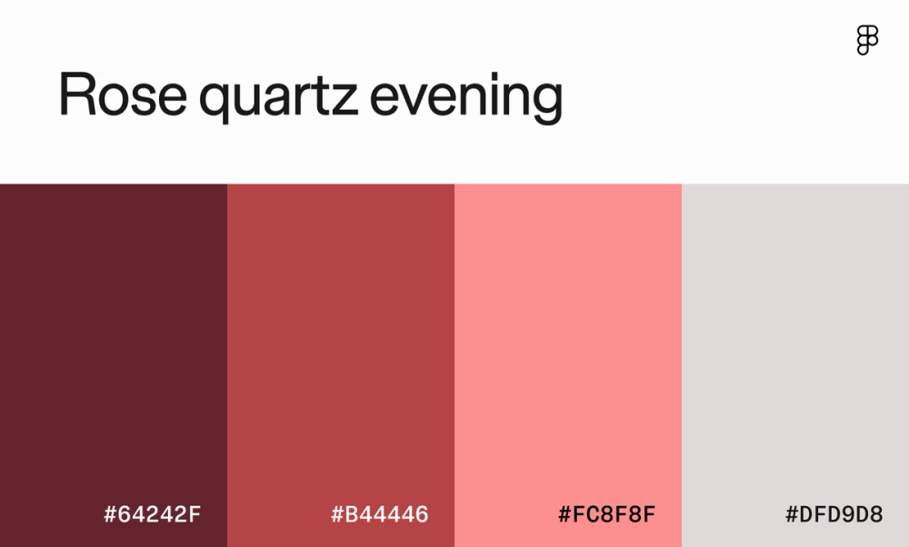
Play on your users’ sense of romance with this monochromatic color scheme. Rich maroon exudes strength and elegance, while blush pink draws on classic femininity. These colors make a striking combo for an upscale boutique or wedding planner website.
Color scheme 20: Calcite

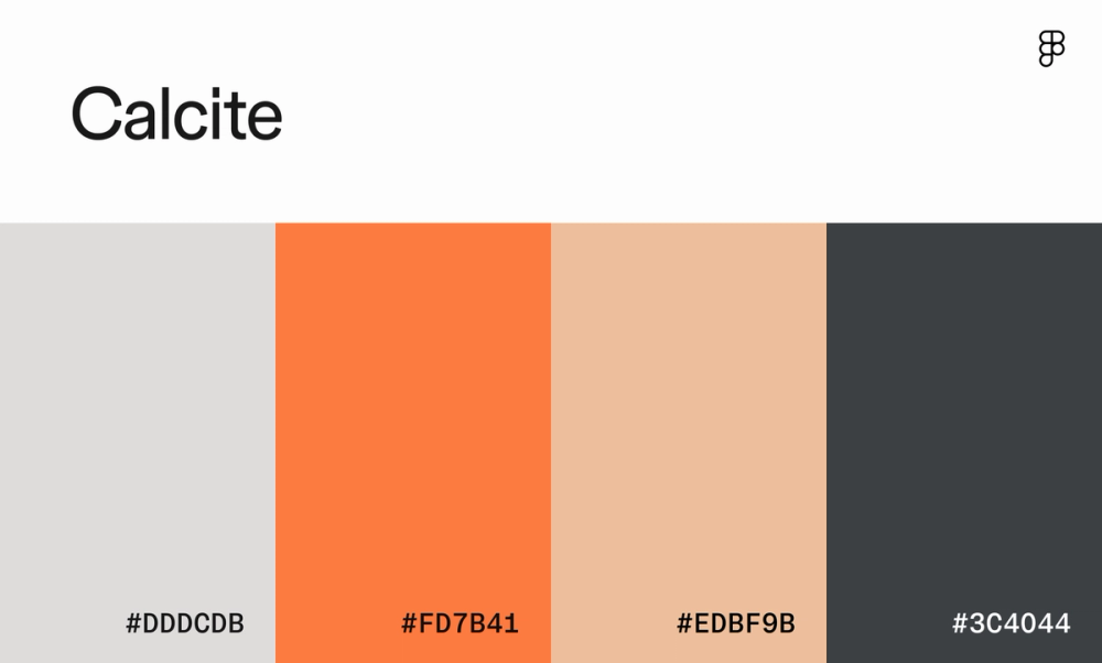
Who said modern websites had to be boring? This unexpected color scheme combines sophistication and fun, with warm grays and blues coupled with pops of orange and peach. An energetic tech startup looking to stand out could draw inspiration from these colors.
Color scheme 21: Fireside

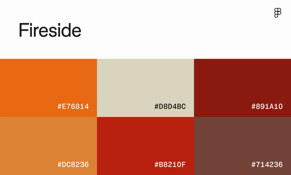
This color palette brings the campfire straight to your screen with toasty hues of orange and red. The neutral beige and deep brown provide a calming contrast, making the brighter colors come to life. Balancing muted and vibrant tones is useful for UI designs that aim to stand out while still being easy on the eyes.
Color scheme 22. Terrazzo

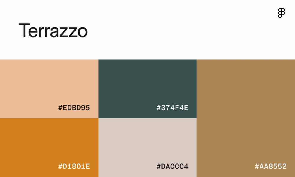
This website color scheme is like a modern take on traditional Italian terrazzo. The warm, earthy tones evoke a sense of comfort and nostalgia, offset by pops of yellow and teal to help break up the neutral monotony. This color scheme is perfect for websites that want to create a welcoming and inviting atmosphere, such as a restaurant, hotel, or lifestyle brand.
Cool website color schemes
From slate grays to crisp blues, cool website color schemes are often linked to calmness, intelligence, and dependability. These colors are ideal for businesses that want to project a sense of professionalism and security, like those in finance, technology, and healthcare.
Consider IBM, Microsoft, and PayPal—all three tech giants use cool shades of blue and gray to convey their expertise.
Color scheme 23: Sapphire nightfall whisper

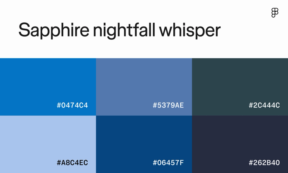
Channel the cool ocean waves with calming shades of blue ranging from light and airy to deep and mysterious. This gradient palette offers a range of blues to help create dimension and depth in your design.
Color scheme 24: Lapis velvet evening

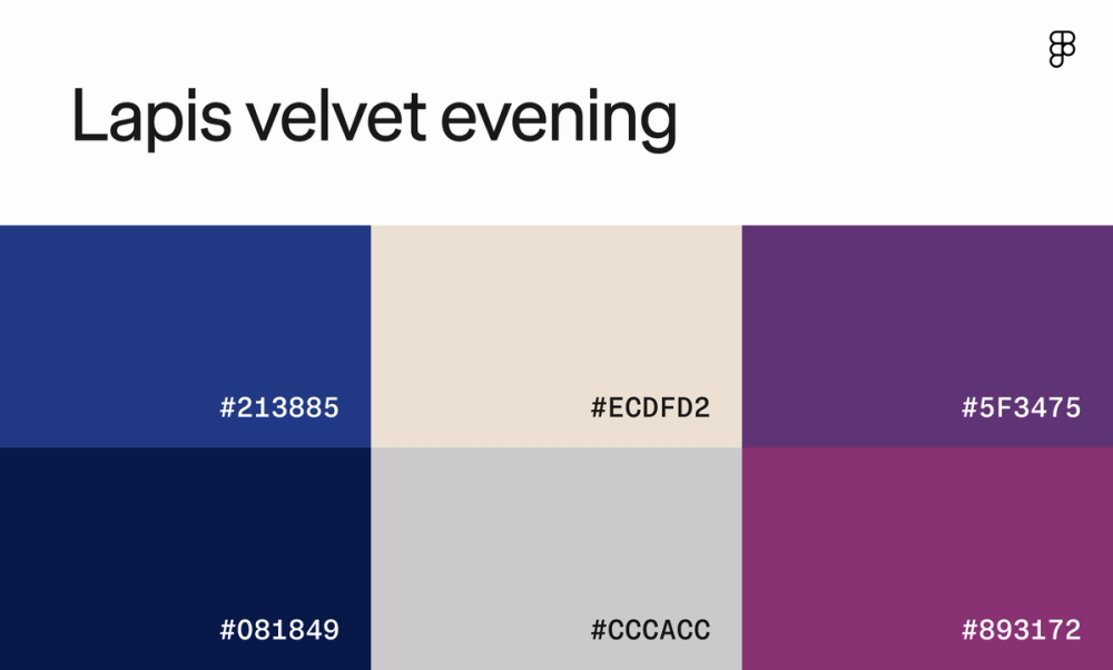
This color palette is like a starry night, with deep blues and plum creating a sense of sophistication and elegance. The soft beige and gray add a touch of warmth, balancing the darker hues. This combination is ideal for websites that want to evoke feelings of luxury, creativity, and innovation.
Color scheme 25: Marina

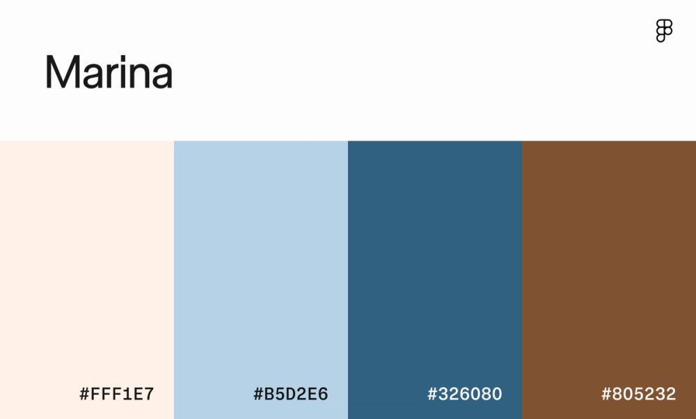
Pull inspiration from a beachside stroll with this mix of soft pastels and grounding navy and chestnut. This versatile scheme is perfect for brands evoking nautical luxury.
Color scheme 26: Emerald lavender lake

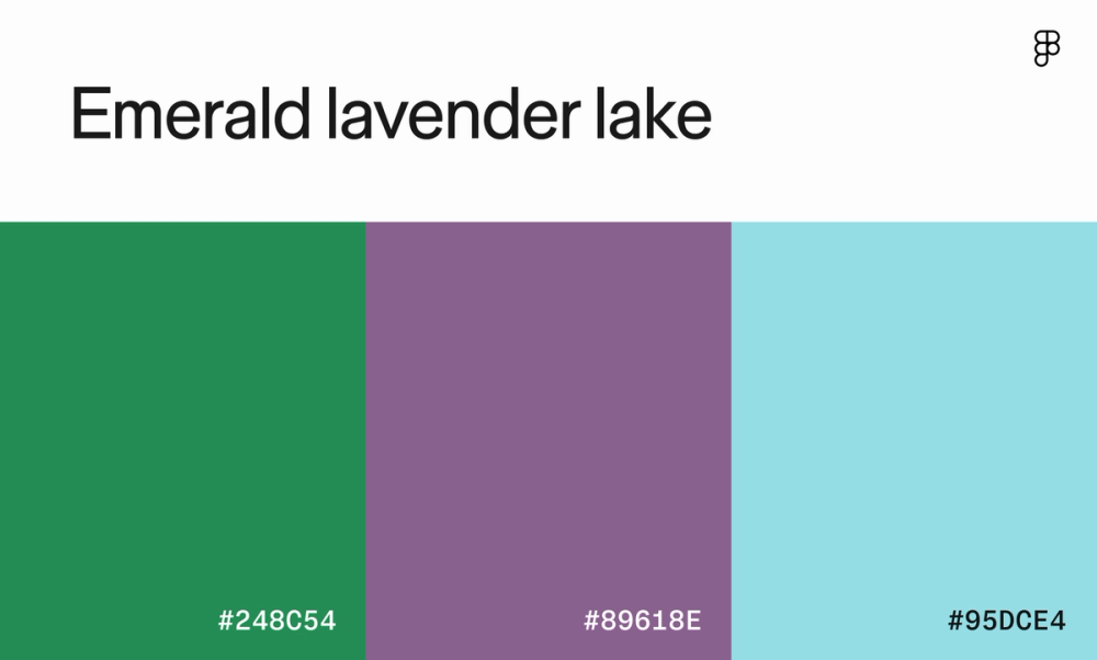
This color palette emits a feeling of tranquility with a touch of whimsy. The soft green and blue create a serene and inviting atmosphere, while the lilac adds a hint of intrigue. This color scheme is perfect for websites that want to convey a sense of peace, creativity, or childhood nostalgia, like a handmade soap shop.
Color scheme 27: Sage peridot morning

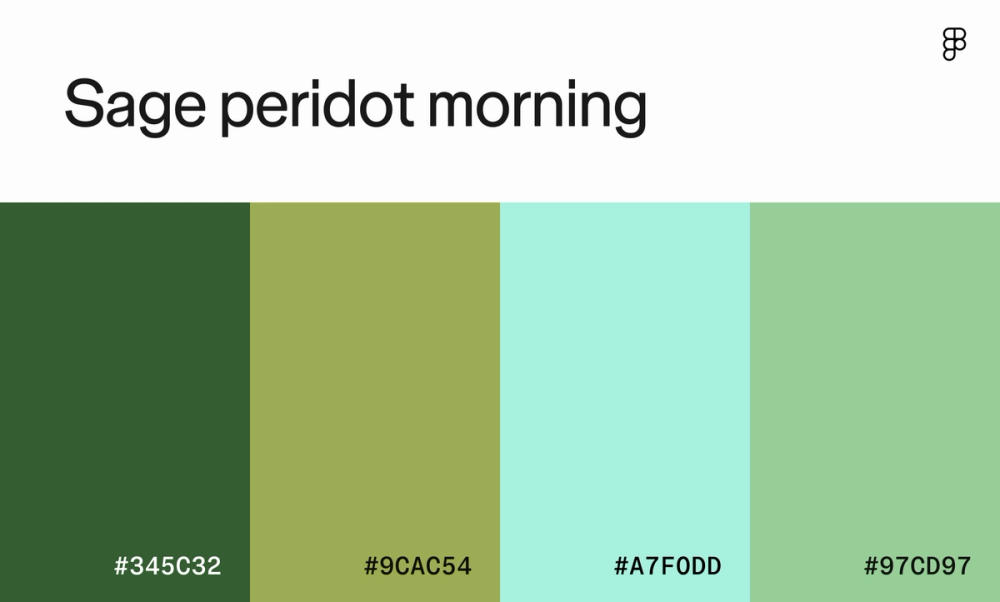
Looking to breathe a bit of freshness into your design? This green-toned color scheme creates a calming, earthy atmosphere with a hint of vibrancy pulled from the mint green. This palette works well for websites focused on sustainability, wellness, or organic living.
Color scheme 28: Amethyst dawn haze

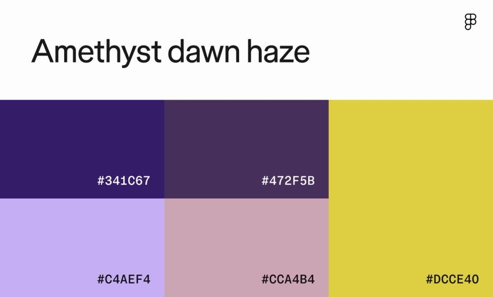
This color palette is a dreamy blend of soft purples and a vibrant yellow. As a complementary color to purple, yellow creates a striking contrast and draws the eye to important elements like buttons or calls to action.
Color scheme 29: Moon dust

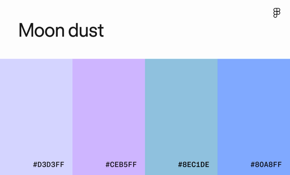
The soft, ethereal shades of blue and periwinkle in this website color scheme are reminiscent of a gentle summer sky. The light and airy colors evoke feelings of peace, tranquility, and innocence, perfect for brands targeting young children or babies.
Color scheme 30: Turquoise amber autumn

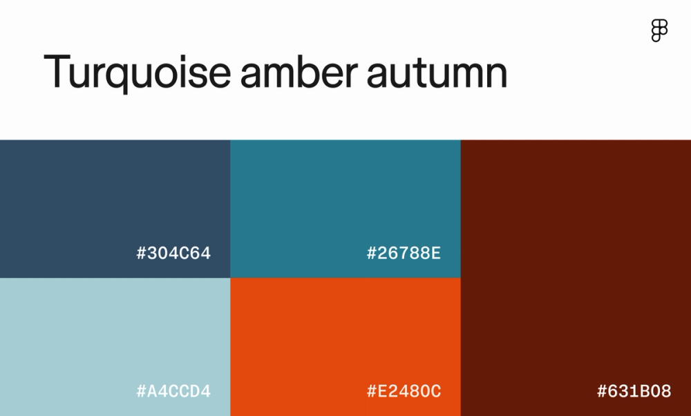
The contrast between the cool blues and the warm oranges and reds creates a dynamic scheme that is both calming and exciting. This color scheme is perfect for a website that wants to convey a sense of adventure, exploration, or outdoor living, like a travel website or adventure sports brand.
Color scheme 31: Sapphire ash morning

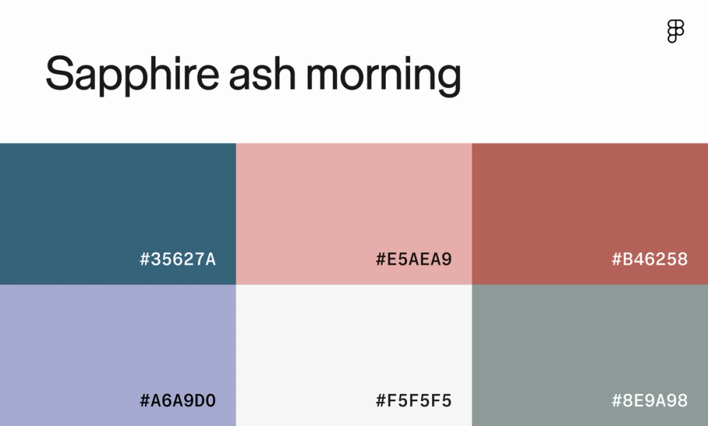
This dreamy pastel palette evokes the sense of a cool summer breeze. Dusty blue and pink create a delicate and feminine atmosphere, while crisp white adds a touch of modernity and elegance. The darker teal and terracotta bring a touch of depth and sophistication.
Color scheme 32: Frosted aura

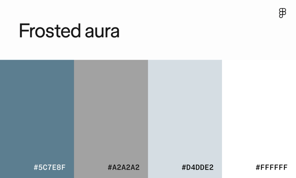
This classic cool-toned color scheme works well for websites that want to convey a sense of authority, expertise, or security—think law firms, financial institutions, or tech companies. The stark white and shades of gray provide a clean and modern look, while the darker blue and pewter add contrast and sophistication.
Color scheme 33: Royal glimmer

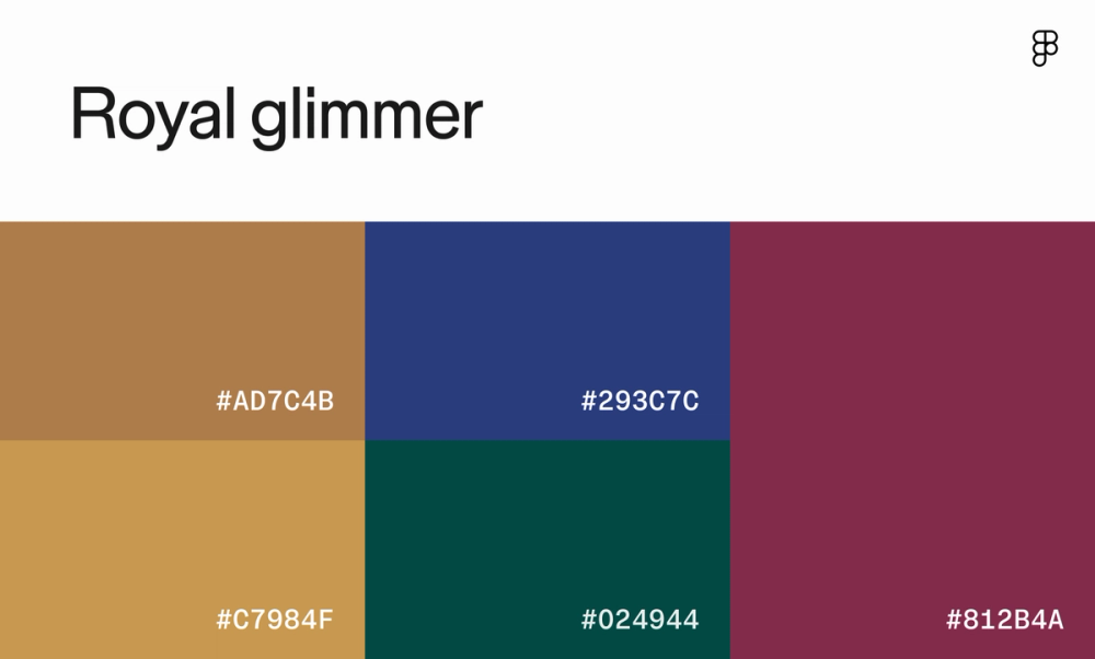
Exude a sense of luxury and refinement with rich jewel tones from the royal glimmer palette. This versatile color scheme can be used for a variety of websites, from high-end fashion brands to upscale restaurants, creating a sophisticated and memorable user experience.
Color scheme 34: Neptune

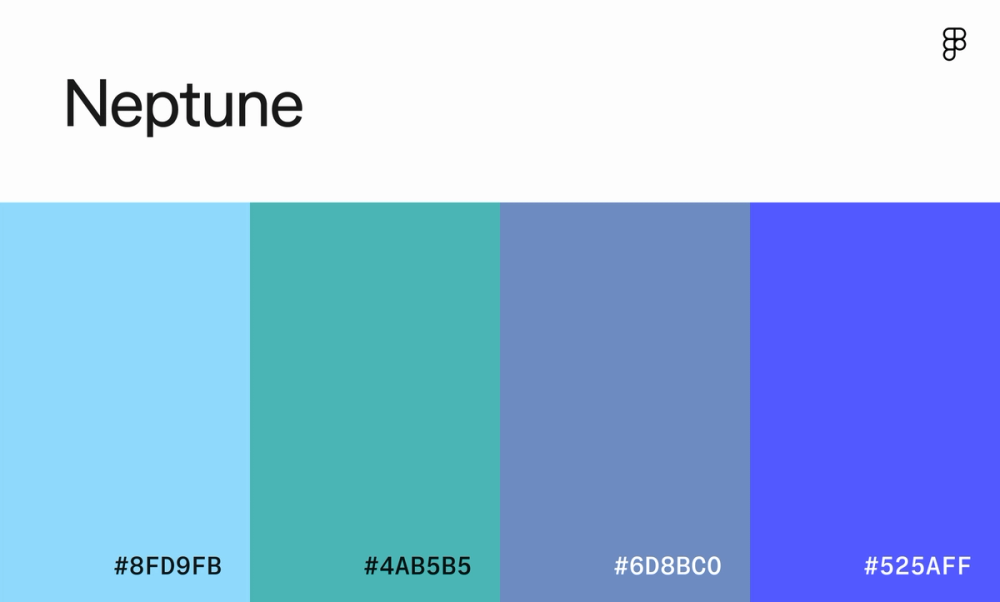
This color scheme gives off a chill, laid-back vibe, like a cool summer day by the ocean. The light blue and teal are refreshing and calming, while the darker blue adds depth to the design. It’s perfect for creating a peaceful and serene online experience.
Vibrant and bold website color schemes
Website designs characterized by bold, saturated hues are ideal for brands that want to capture attention, evoke excitement, and create a lasting impression. These color palettes are particularly effective for industries like trending fashion, gaming, and children’s products, where energy, fun, and creativity are a must.
For example, Spotify effectively uses bright, playful colors to reflect the diversity of music and podcasts it offers. Airbnb also incorporates vibrant colors to highlight its unique and exciting accommodations around the world.
Color scheme 35: Tropical jade sunrise

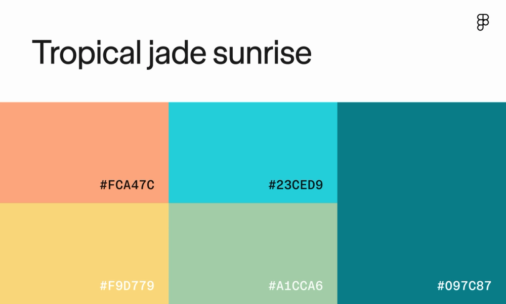
Piña coladas, anyone? Sandal shades of orange balanced with cool ocean tones evoke the nostalgia of a coastal vacation. Websites wanting to create a playful and inviting atmosphere—like beachwear brands or travel agencies—could benefit from colors like these.
Color scheme 36: Amethyst mint harmony

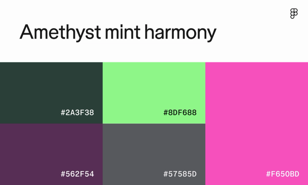
This color palette is a playful mix of dark and light tones. The deep purple and emerald green create a moody atmosphere, while the neon pink and lime green add some much-needed energy and excitement. Use this contrast to draw attention to headlines or featured content—just use these bold colors sparingly!
Color scheme 37: Hibiscus aura

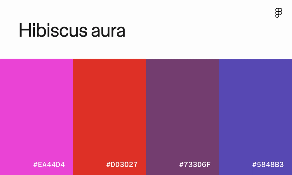
From music artist websites to gaming apps, this vibrant color scheme works well for those looking to make a statement and demand attention. The fuchsia and cherry red evoke feelings of excitement and passion, while the deeper purple and blue allow the brighter colors to virtually jump off the page.
Color scheme 38: Ocean ruby radiance

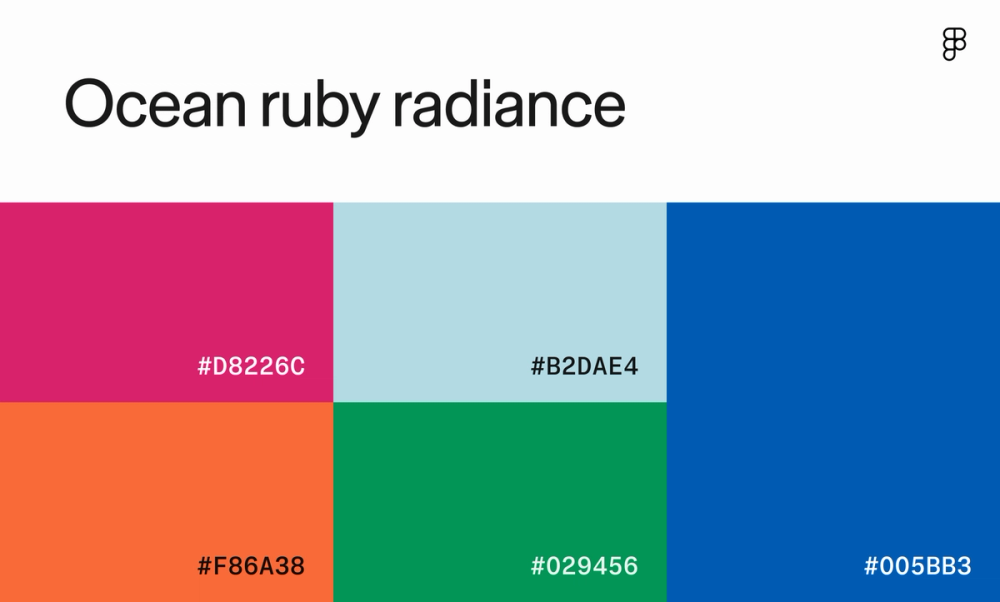
Evoke a sense of playful energy and optimism with this website color palette. The bright pink and orange pop against the deep royal blue and green, creating a dynamic visual experience. A children’s toy store or a beachside retreat might use this scheme for its website.
Color scheme 39: Tropical heat

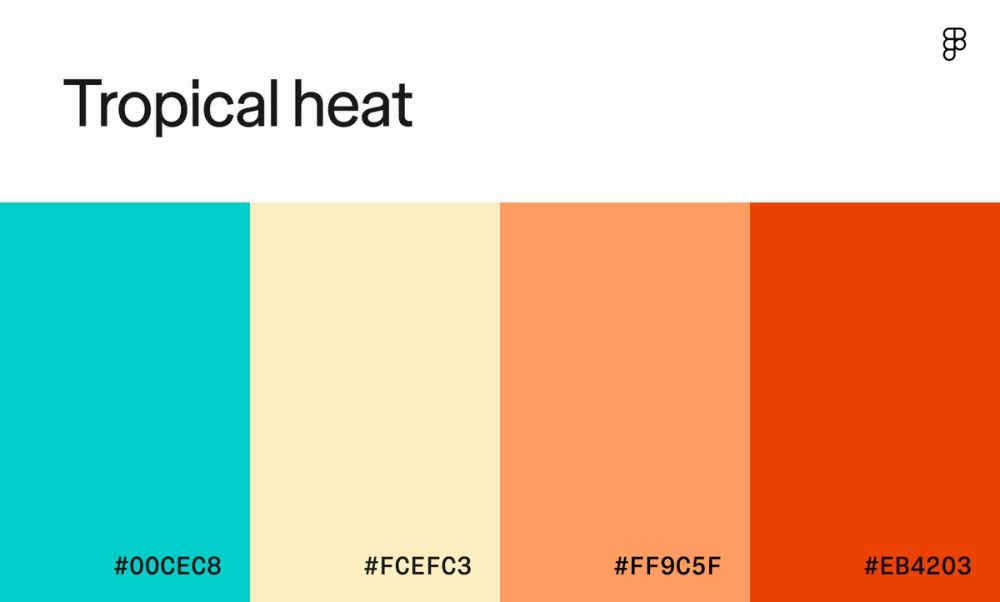
These retro colors create a sense of nostalgia reminiscent of vintage beach posters or ‘70s-era designs. The combination of blue-green, cream, and coral creates a cheerful and inviting atmosphere, with enough contrast to break up important blocks of the page.
Color scheme 40: Celestial

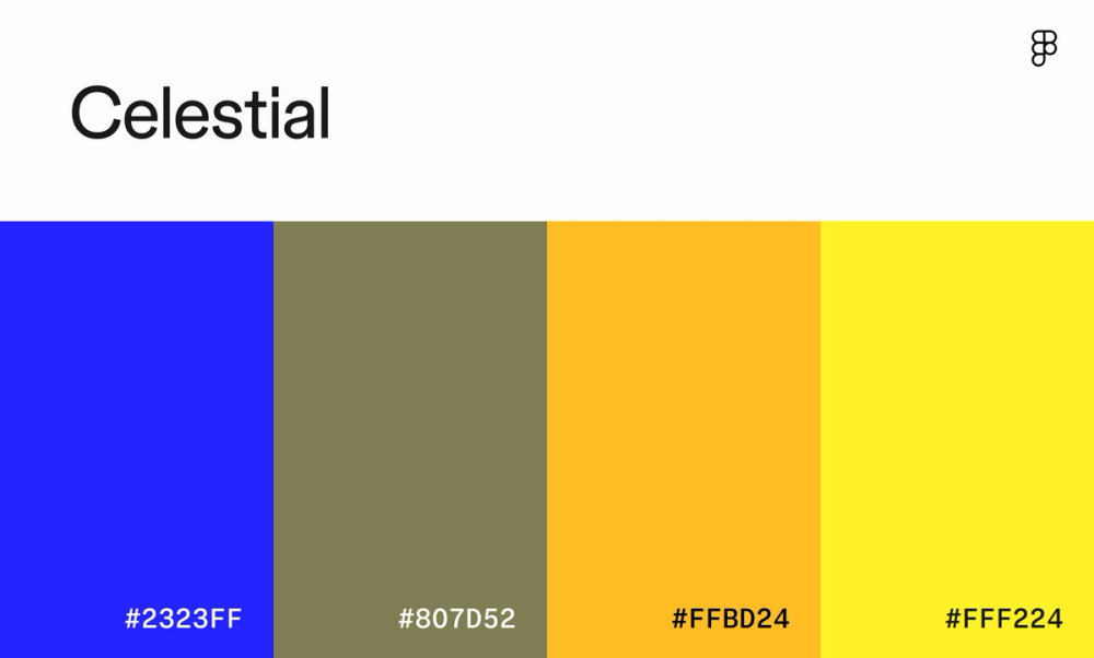
This color scheme is bold and energetic, with a strong contrast between bright yellow and blue. The earthy brown adds a touch of grounding and stability. This scheme is great for a tech startup that wants to convey innovation and creativity or a sports brand that wants to inspire action and excitement.
Color scheme 41: Festive eve

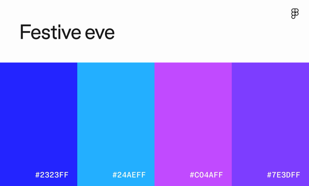
Looking to bring a bit of fantasy into your design? This website color scheme is dreamy and ethereal, perfect for evoking a sense of wonder and magic. The gradient of blues and purples creates a soft, harmonious effect reminiscent of a twilight sky. Creativity apps like Canva use a similar color scheme.
Color scheme 42: Freshly squeezed

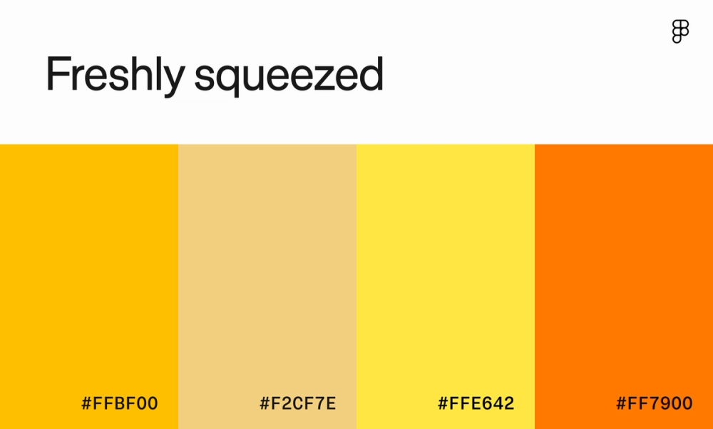
Channel sunny days with this vibrant color palette. The yellow and orange hues will warm and energize users, while the cream color adds a touch of softness and balance. It’s great for promoting a summer festival, a children’s toy store, or a healthy food brand focused on energy and vitality.
Color scheme 43: Jelly shoes

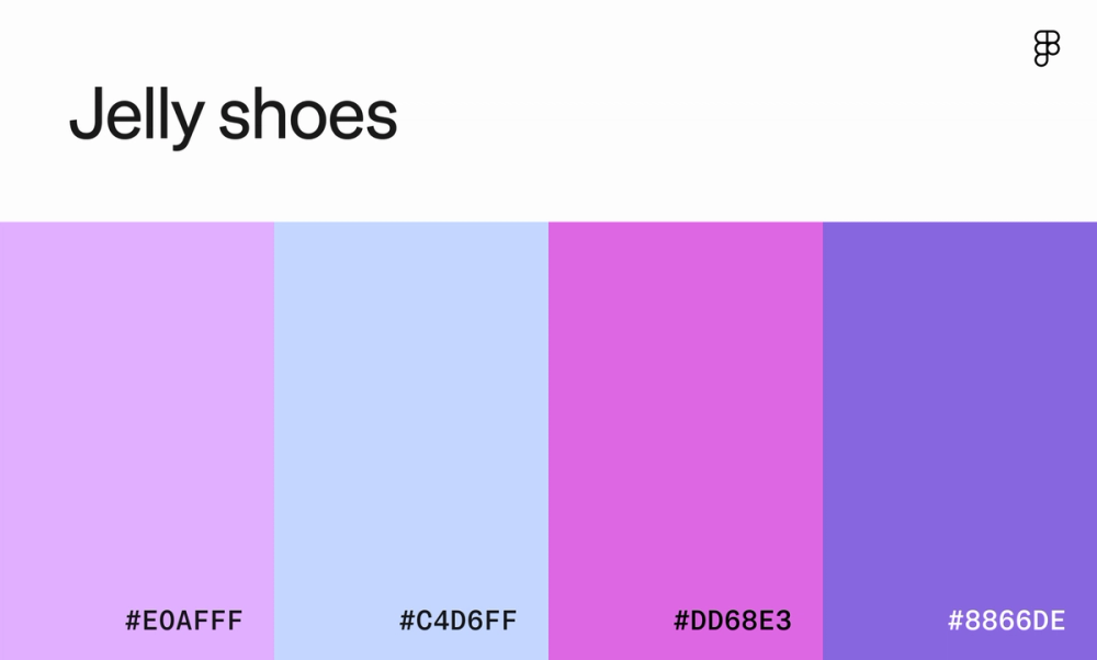
This color palette evokes a sense of whimsical nostalgia and gentle sweetness. The soft pinks and purples and their vibrant counterparts create a calming and romantic atmosphere reminiscent of cotton candy skies and lavender fields. These colors work well for a boutique selling delicate jewelry or a brand specializing in teen-targeted skincare.
Modern website color schemes
Many modern website color schemes prioritize minimalism, muted tones, and a focus on readability. These color palettes are perfect for tech companies, software startups, and other businesses that want to convey a sense of innovation, professionalism, and sophistication.
Modern websites like Tesla and Apple create a sleek and contemporary aesthetic that appeals to a tech-savvy audience by using a limited color palette and emphasizing clean lines and typography.
Color scheme 44: Opaline

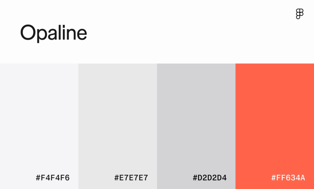
This sleek and minimalist color palette gives off a modern and sophisticated vibe. The soft grays and whites create a clean and airy feel, while the pop of cinnabar brings energy and excitement.
Color scheme 45: Gossamer

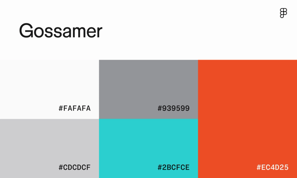
Add a touch of retro flair against a clean and modern backdrop. The vibrant turquoise and coral add a playful and energetic vibe, perfect for modern art galleries or a vintage-inspired fashion brand.
Color scheme 46: Clockwork

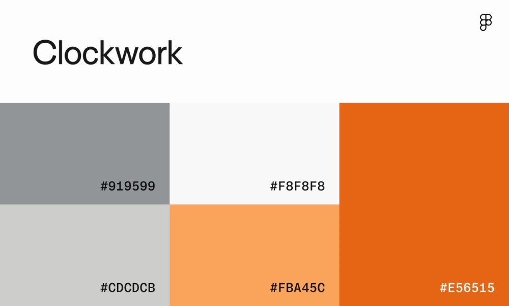
The neutral gray base of this color scheme lets the orange shades shine, offering some much-needed warmth and vibrancy. It effectively balances minimalism with coziness, ideal for fashion brands that prioritize clean design and rich materials.
Color scheme 47: Lemon granite morning

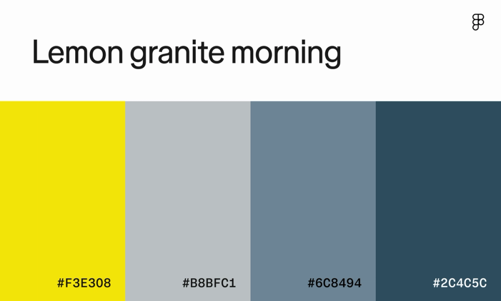
This versatile color scheme can be used for multiple websites, from edgy fashion brands to financial services. Bright yellow adds a cheerful and energetic tone, juxtaposed by calm and cool shades of gunmetal gray and blue.
Color scheme 48: Arctic reflection

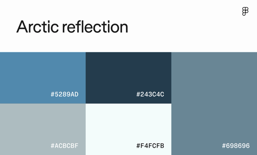
This blue monochromatic color scheme is ideal for a website promoting wellness and relaxation, like a luxury hotel or spa. The dusty glaucous evokes calm and tranquility reminiscent of a serene winter day.
Color scheme 49: Slate

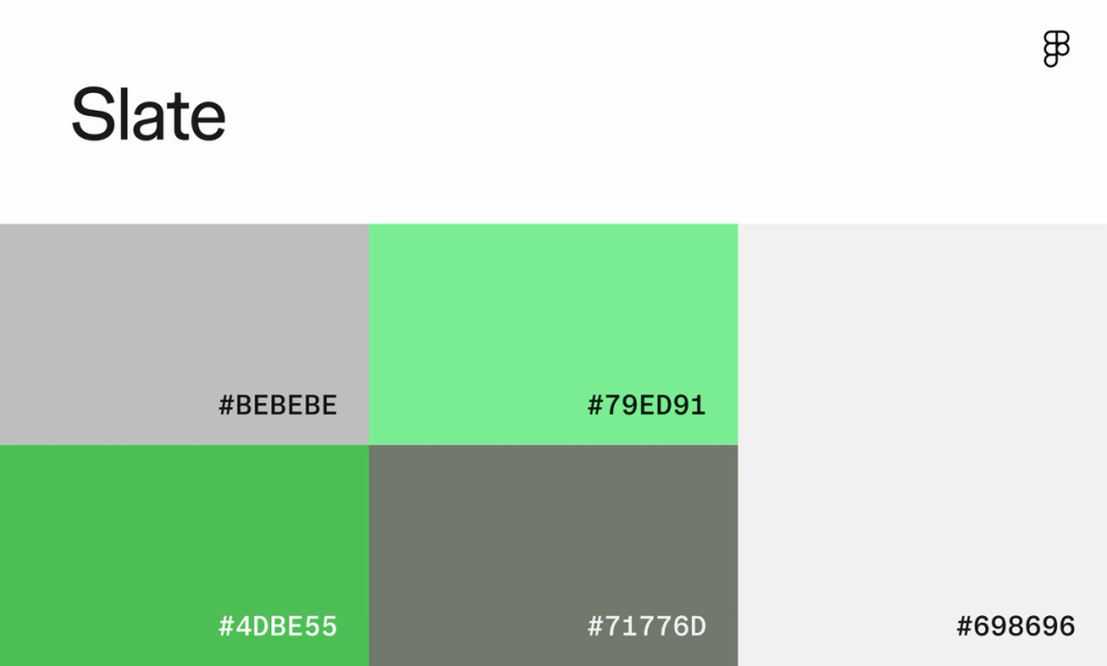
Based on color theory, green represents harmony, health, and prosperity. Set against neutral grays, this color scheme’s vibrant shade of pastel green could be the perfect accent color for innovative fintech websites or a new wellness app.
Color scheme 50: Autumn luxe

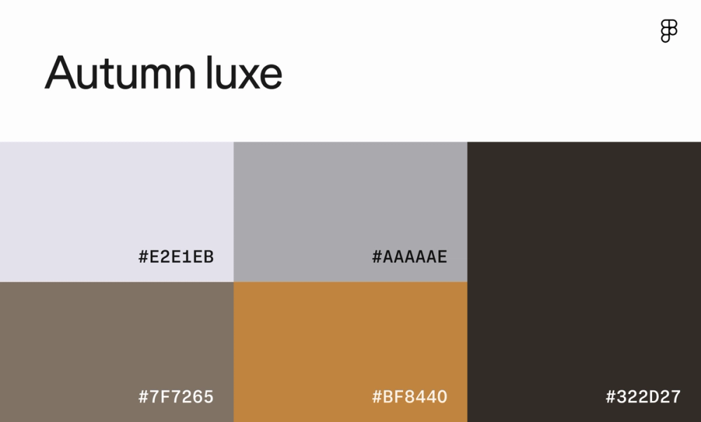
This color palette is a sophisticated blend of warm and cool tones. The soft grays and white create a neutral base, while the deep gold and black add depth and richness. This balanced approach creates a sophisticated, timeless aesthetic for luxury fashion brands.
Color scheme 51: Inked

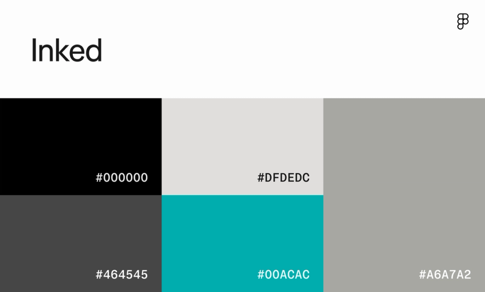
Give classic black and white a modern edge with a dash of vibrant teal, which helps draw the eye to important headlines and CTAs. This is a great choice for websites that want to convey a sense of new-age sophistication and creativity.
Color scheme 52: Wraith

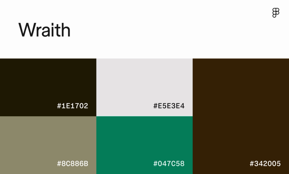
Evoke a modern edge with a touch of earthy warmth. The dark browns ground this color scheme, while the soft grays and white create a sense of balance. The swatch of emerald green adds a touch of freshness and vitality.
Color scheme 53: Urban nocturne

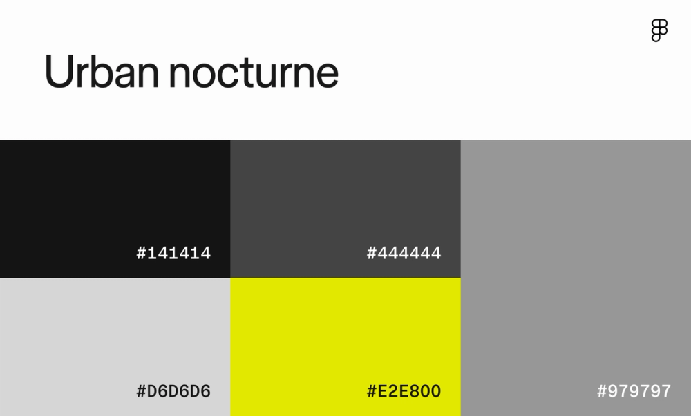
This color palette is a bold, striking combination of dark and light tones, perfect for gaming websites or sports brands. The black and gray create a strong foundation, while the lime green adds energy and excitement.
Five pro tips for choosing a website color scheme
Now that you understand the power of color in website design, let’s dive into some practical tips to create a color scheme that resonates with your brand and users:
- Consider your brand identity. Your color choices should reflect your brand’s personality and values. Think of the emotions you want to evoke and choose colors that align with that message.
- Use a color palette generator. Tools like Figma’s color palette generator can help you explore different color combinations and create harmonious schemes around a base color.
- Think about user actions. Use color strategically to guide users’ attention. Highlight important information with contrasting colors and create a visual hierarchy that directs users toward desired actions.
- Test your color scheme. Don’t guess—test! A/B testing and user testing can reveal how different color schemes impact user behavior and engagement.
- Account for accessibility. Make sure your website is usable by everyone. Choose colors with sufficient contrast to meet accessibility guidelines for users with visual impairments.
Start designing your website with Figma
The colors you choose for your website can profoundly impact brand perception.
Figma empowers you to design with confidence. Here’s how:
- Discover pre-made and customizable color palettes to jumpstart your design process.
- Learn best practices for color theory, visual hierarchy, and accessible design with Figma’s design basics.
- Join the Figma Community and explore other users’ color palette creations.
Ready to create website color schemes?