What are triadic colors?


Share What are triadic colors?
Explore more from
Design basics
Master color to elevate your designs
Experiment, refine, and apply color palettes in Figma.


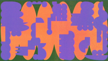
Want to produce a color palette that’s balanced, but pushes creative limits with distinctive colors? Try a triadic color scheme. The right balance of triadic colors can make your next graphic design or web project even more memorable—and give your brand a boost.
Read on to learn more about:
- What triadic colors are—and how to combine these different colors
- Triadic color design tips
- 4 examples of triadic color schemes
- How to use triadic colors with Figma
What are triadic colors?
A triadic color scheme combines three colors evenly spaced around the color wheel—typically a dominant color plus two supporting colors. Typically, a designer chooses a dominant color that appeals to users and enhances their company’s brand personality (e.g., green to convey growth and abundance). Then they select complementary colors to balance out the main color and achieve color harmony.
How to combine triadic colors
The color wheel contains four triadic color combinations:
- Primary colors: red, yellow, and blue
- Secondary colors: orange, green, and violet
- Tertiary colors: red-orange, yellow-green, and blue-violet
- Tertiary colors: yellow-orange, blue-green, and red-violet
Test out color combinations with Figma's color palette generator. Primary colors work best for high-contrast, vibrant designs. If you want a more subtle color palette, try secondary colors instead. For an even more understated look, choose tertiary colors.
Pro tips for using triadic colors
Top designers tap into color theory and color psychology to create captivating triadic color palettes. Beginners can design like pros with these tips:
- Consider context. Choose colors that align with brand identity and design goals.
- Mind the 60-30-10 rule. A balanced palette is typically 60% dominant color, 30% secondary color, and 10% accent color.
- Strive for harmony. Adjust tints, shades, and saturation for a cohesive visual design.
- Check color contrast. Make sure your user experience is legible and accessible.
5 alternatives to triadic color schemes
As you search for your ideal color palette, consider options beyond triadic colors. Experiment with different types of color to achieve your design goals using these five approaches:
- Analogous color schemes offer a calming, unified look.
- Complementary color schemes boost contrast and vibrancy.
- Split-complementary colors also offer contrast and vibrancy, but with less intensity.
- Monochromatic colors produce a simple, cohesive design.
- Tetradic color schemes can create vivid visual effects.
Build your triadic color palette with Figma
Go bold with triad colors for your next design using Figma’s design resources. First, apply FigJam’s brand personality framework to identify your dominant brand color. Then use Figma’s color picker to find complementary colors with accessible contrast.
Ready to put your color palette to the test? Research and design templates can help you collect feedback. Then you can explore and refine ideas with your design team using Figma’s design tool.
Craving more color tips and tricks? Figma’s design basics library covers color theory, color symbolism, RGB, and more. For inspiration, browse pro-level color palettes shared by Figma’s design community.
Ready to try out triadic colors?
Keep reading


What is UI design
What is UI design today, and what role does it play in the design thinking process?
Learn more


What is visual hierarchy
If everything looks the same, then you see nothing. Visual hierarchy can change that.
Learn more


UI vs UX
Read on to find out what it takes to design engaging UI, and create a memorable UX.
Learn more
From the blog
The Figma design agent is here
Starting today, work with an agent that is built for Figma—directly on the canvas.

The TL;DR on MCP: Why context matters and how to put it to work
Figma’s MCP server brings your design decisions into the tools where code gets written—so what gets built actually matches what was designed. Here’s what that unlocks for everyone who builds products.
How to supercharge your design system with slots
Slots give you the ability to customize components without breaking the system. We’re sharing five field-tested tips from early users to help you unlock more freedom without giving up control.
The new business case for design systems
Design systems have evolved from static libraries to key drivers of business revenue, customer loyalty, and product strategy. Here’s what you need to know about how to track and communicate the value of your design system, based on new research from the Design Executive Council (DXC).


5 shifts redefining design systems in the AI era
As AI reshapes how we make products, design systems are evolving from libraries of reusable parts into living frameworks that scale taste and craft. We spoke with product leaders and practitioners about the shifts they’re seeing in how design systems are built, used, and maintained.


Schema 2025: Design systems for a new era
Design systems help teams push what’s possible while maintaining a high level of craft, polish, and performance. Here’s everything we announced at Schema by Figma to help teams design for the AI era.