Responsive website design: Key components + how to use them
Share Responsive website design: Key components + how to use them
Explore more from
Design basics
From wireframe to website, faster
Design, prototype, and refine every page.


Have you ever tried to browse a website on your phone but had to pinch, zoom, and scroll just to read the text? That frustrating experience is likely the result of a non-responsive website.
Responsive website design ensures that a website or application adapts to fit any device and screen size. Whether you view from a desktop, mobile phone, or tablet, responsive websites automatically adjust their layout, content, design, and text to fit perfectly on any viewing screen.
In a mobile-first world, responsive website design is crucial—not optional—to create a frictionless and positive user experience.
Read on to learn:
- The importance of a responsive website
- Responsive Web design frameworks
- The components of responsive Web design
- Responsive website examples
- How to set up a responsive design workflow in Figma
Why is a responsive website important?
Some benefits of having a responsive website include:
- Enhances the user experience. 74% of online users are likely to revisit a website with a mobile-friendly design. They’re easier to navigate, load quickly, and ensure content is accessible from any screen. This offers users an ideal and consistent viewing experience across devices.
- Improves efficiency. Responsiveness eliminates the need to update different versions of your website, allowing you to manage content in one place and ensure changes are reflected across all devices. Developers can also reuse code, reducing the need to write code for different devices.
- Boosts conversion rates. Establishing a consistent visual hierarchy and user journey across devices helps guide users toward CTAs that lead to sales.
- Ensures accessibility. Responsive design elements that use semantic HTML allow screen readers or other assistive technology to effectively understand the meaning and structure of a website’s content, ensuring accessibility for all users.
- Decreases costs. With responsive websites, you won’t have to maintain separate mobile and desktop versions, which is significantly more affordable and less time-consuming.
Responsive Web design frameworks
Explore these responsive Web design frameworks for helpful APIs, documentation, guides, and references to get the ball rolling.
| Framework | Best for | Advantages |
|---|---|---|
| Bootstrap | Rapid prototyping and a variety of pre-built components | Pre-built components and grid system for quick prototyping. Built-in classes for responsiveness across devices. |
| Pure CSS | Smaller projects or precise styling | Lightweight with no external libraries, making it good for performance-focused pages. Greater flexibility over styling. |
| Foundation | Complex websites with Sass mixins and built-in JavaScript components | Responsive grid system and media queries. Focus on semantic HTML and WCAG compliance to ensure accessibility. |
| Semantic UI | Websites emphasizing responsiveness and accessibility | Easy to customize aesthetics and layouts with themes. Uses semantic class names for readability. |
| jQuery | Using in conjunction with other frameworks for dynamic responsiveness | Ability to manipulate the DOM and add interactivity. Comprehensive documentation and plugins available. |
| Tailwind CSS | Complex layouts requiring a high level of customization | Precise control over styling with utility classes. Highly customizable with responsive variants built into utility classes. |
Many Web design frameworks offer basic to advanced features that ensure a website is responsive. The framework you choose depends on your unique needs and preferences. Here are some popular frameworks to consider.
SS styles to achieve dynamic and responsive behavior that changes depending on the viewing screen. jQuery can also hide specific elements or reveal additional content based on screen sizes and user interaction.
For example, say you have a website with a complex navigation bar that displays all navigation links on large screens. On smaller screens like mobile devices, you want to hide the navigation links. You can use jQuery to create code that hides these elements and implements a hamburger menu button that reveals the links in a dropdown menu when clicked.
Bootstrap
Best for: Rapid prototyping and projects with many pre-built components
As one of the most widely used frameworks, Bootstrap offers pre-designed elements that help speed up Web development. Bootstrap provides a wide range of comprehensive pre-built components, such as its flexible grid system, navbars, and content components, offering a consistent and responsive user experience. It also includes media queries for styling layouts based on screen size or device orientation.
Pure CSS
Best for: Smaller projects or when you only need to style specific components
Pure CSS is a lightweight framework, making it ideal for projects that don’t require a large set of pre-built components. Pure CSS offers greater customization than other frameworks, giving you more control over styling elements from scratch to tailor them to your design preferences. Unlike other frameworks with an extensive library of pre-built components, this customization requires more in-depth CSS development.
Foundation
Best for: Complex websites with Sass mix-ins and built-in JavaScript components
Similar to Bootstrap, Foundation has a comprehensive set of pre-built components for building responsive websites. It also provides Sass mixins, allowing developers to create reusable code snippets to streamline development and ensure consistent styles across a website.
Foundation uses a flexible grid system with media queries to ensure layouts adjust to any screen size. It also includes built-in JavaScript components such as sticky elements, off-canvas menus, and reveal modals, all with responsive behavior, that add interactivity to interfaces. You can also use visibility classes to conditionally hide or show elements based on the viewer’s screen size.
Semantic UI
Best for: Websites emphasizing responsiveness and accessibility
Though accessibility is essential regardless of framework, Semantic UI focuses on responsive features and semantic HTML, making it ideal for building accessible websites. Semantic UI design principles offer responsive utility classes to ensure elements adjust their size or behavior appropriately. It also uses a flexible grid system built with CSS Flexbox.
jQuery
Best for: Using in conjunction with other frameworks for dynamic responsiveness
jQuery isn’t actually considered a framework—it’s a JavaScript library often used with other frameworks to simplify DOM manipulation and event handling. Within jQuery, you can write code and modify CSS styles to achieve dynamic and responsive behavior that changes depending on the viewing screen. jQuery can also hide specific elements or reveal additional content based on screen sizes and user interaction.
For example, say you have a website with a complex navigation bar that displays all navigation links on large screens. On smaller screens like mobile devices, you want to hide the navigation links. You can use jQuery to create code that hides these elements and implements a hamburger menu button that reveals the links in a dropdown menu when clicked.
Tailwind CSS
Best for: Complex layouts requiring a high level of customization
Tailwind CSS provides more precise control over how responsive elements adapt to different screen sizes compared to pre-built components in other frameworks for a higher level of customization. Its utility-first approach offers a variety of utility classes for styling, including responsive behaviors. This allows developers to style elements without having to write custom CSS. Each utility class is prefixed with a breakpoint keyword to conditionally apply styles across different screen sizes.
No matter what framework you choose, Figma’s Dev Mode makes it easy to copy and paste the code you need. You can adjust your settings to your preferred coding language and hover over design elements to access auto-generated code. Then, copy and paste the code into your preferred text editor for further use. You can also use Code Connect, which lets you see code snippets from your design system library instead of using auto-generated code.
Want to make a website prototype?
Figma Make can help. Go from prompt to prototype in minutes and discover how to code all the features you need.
Components of responsive website design
Using HTML, CSS, and JavaScript, developers enhance the user experience by adding responsiveness to a website. Below are five features your Web design and development team can implement to ensure your website is responsive.
Flexible layouts
Flexible layouts and grids are used to create websites that adapt their structure to different viewport sizes. A flexible layout ensures these elements resize, rearrange, or even hide themselves based on the size of the user’s screen.
Two of the most common layout techniques include:
| Fluid grid layouts | Flexbox layouts |
|---|---|
| Use properties like grid-template-columns and grid-template-rows to create a flexible structure that adjusts to different screen sizes. | Offer precise control over the positioning, order, and sizing of elements within a container. |
| Elements resize and adapt as the screen size changes. | Properties like flex-grow, flex-shrink, and flex-basis control how elements distribute available space and respond to different screen sizes. |
| They’re straightforward to implement and offer basic responsiveness to a website’s overall structure. | They’re ideal for more complex, responsive layouts. |
Example code for fluid grid layouts:

.container {
  display: grid;
  grid-template-columns: repeat(auto-fit, minmax(250px, 1fr));
  gap: 16px;
}
Example code for flexbox layouts:
.flex-container {
display: flex;
flex-wrap: wrap;
gap: 12px;
}
.flex-item {
flex: 1 1 200px; /* Grow and shrink with a base width of 200px */
min-width: 150px;
}Use other common CSS properties, like margin, padding, width, height, max-width, and min-width, to style your layout and ensure it adapts appropriately. You can also use media queries to determine the layout style across different screen sizes.
Media queries
Media queries apply specific styles to your website based on different characteristics of the user’s device or the environment in which your webpage is viewed. You can add multiple media queries to your stylesheet at different breakpoints.
For example, use media queries to target screen widths below a specific breakpoint, adjust font sizes across different screen sizes, style navigation menus to change based on screen size, or hide elements depending on the viewing environment.
Media queries are defined using the @media rule within CSS followed by specific conditions. The condition is based on different media features that describe the device or environment characteristics.
Some common media features include:
- Screen width consists of the viewport’s maximum width and minimum width.
- Screen height consists of the viewport’s maximum height and minimum height.
- Screen resolution consists of the maximum resolution and minimum resolution of the viewport.
- Device orientation refers to the viewport's orientation, including portrait or landscape.
The example code below uses media queries to hide an element. After the @media rule, the condition sets a max width of 600px. This means the element will hide if the screen has a width of 600px or less.
Example CSS code:

@media (max-width: 600px) {
  .sidebar {
    display: none;
  }
}
Responsive navigation
A responsive navigation bar adjusts its look and layout based on screen size and device type. Complex desktop menus are often simplified for smaller screens and mobile devices, using hamburger menus, accordions, or tabbed navigation for better readability and usability.
A menu’s structure is defined using unordered lists <ul> and list items <li>. Each list item represents a navigation link. From there, media queries help define different navigation menu styles by using properties like min-width and max-width to target various screen sizes.
Example code:

<nav>
  <button class="menu-toggle" aria-label="Toggle navigation menu">☰</button>
  <ul class="nav-links">
    <li><a href="#">Home</a></li>
    <li><a href="#">About</a></li>
    <li><a href="#">Services</a></li>
    <li><a href="#">Contact</a></li>
  </ul>
</nav>

<style>
  .nav-links {
    display: flex;
    gap: 24px;
  }

  @media (max-width: 768px) {
    .nav-links {
      display: none;
    }
    .menu-toggle {
      display: block;
    }
  }
</style>
Responsive images and video
One of the easiest and most common ways to ensure your images and videos are responsive is to use the max-width property, which sets a maximum width for an image or video. This ensures the image or video doesn’t exceed its container's width, regardless of its original dimensions. If it’s wider than its container, the max-width property automatically adjusts the image or video to fit its container.
When used with the height: auto; property, max-width helps maintain an image or video’s aspect ratio by automatically adjusting the height to fit within its container. This helps prevent overflow that could disrupt your layout. The max-width property may also improve loading speed since the images scale down and have a smaller file size.
Setting the max-width to 100% ensures the image doesn’t exceed the width of its container, and the height: auto; property helps the image maintain its aspect ratio as it scales.
You can use media queries to define different max-width values at multiple breakpoints and ensure images and videos adapt appropriately to different screen sizes and devices. Responsive video players are also helpful for maintaining video aspect ratio and adjusting accordingly.
Example code:

img, video {
  max-width: 100%;
  height: auto;
  display: block;
}
Responsive text
Responsive text adjusts fonts based on different screen sizes and devices to ensure proper readability for users. Different ways to implement responsive text include using viewport width (vw) and viewport height (vh)units or adding media queries to change the font size based on specific screen sizes.
The clamp( ) function in CSS is also useful for creating fluid typography. This function sets a minimum and maximum font size range to ensure readability across different screen sizes while allowing the text to scale based on the viewport size.
The clamp( ) function in the example below creates a flexible font size for an <h1> element. The text size will stay between 1rem (the base font size) and 3rem, ideally scaling to 10% of the viewport width as the screen gets bigger.
Example code:

h1 {
  font-size: clamp(1rem, 10vw, 3rem);
}
Responsive website examples
These examples show how responsive templates in Figma adjust layouts, content, and visuals across different screen sizes while maintaining a consistent user experience.
Example 1: Cozy restaurant website

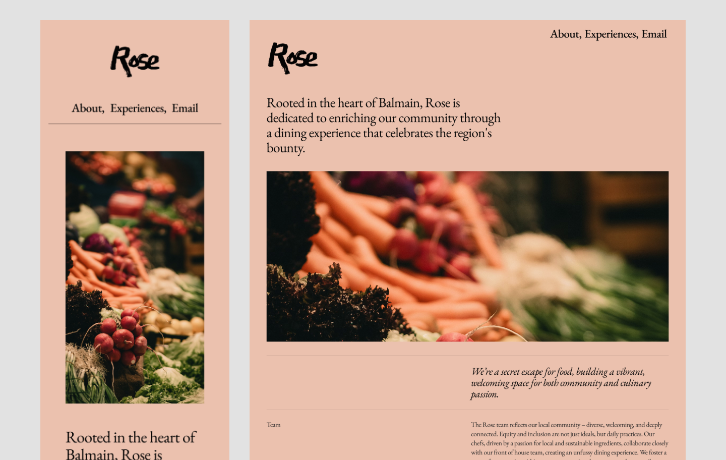
This clean, sleek design for a restaurant website adapts effortlessly and delivers a consistent user experience across devices. The flexible layout maintains a clear information architecture by arranging and organizing content to match different screen sizes. The most important info is positioned clearly at the top: location, hours of operation, and a button to book reservations. Further down, visitors can browse the menu.
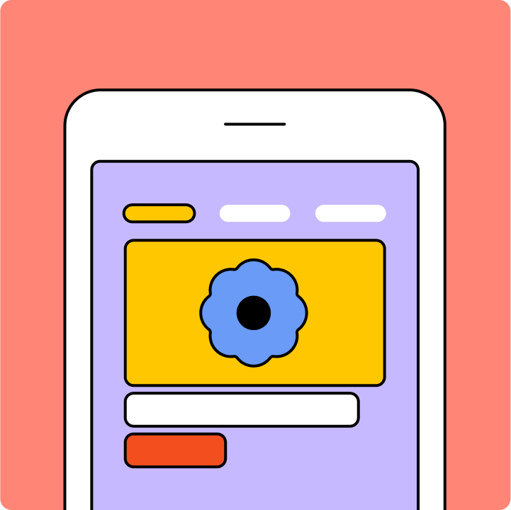
Example 2: Hip fashion website


Focused on visual storytelling, this playful, stylish template highlights photography in a spacious layout. On mobile, the flexible grid layout turns into a single column of eye-catching squares representing different links and product categories.
Example 3: Sophisticated vacation rental website

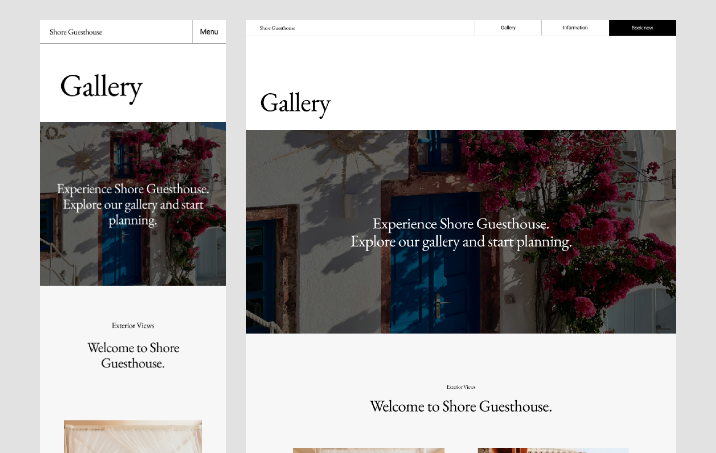
This image-heavy template showcases how responsive layouts can maintain elegance and clarity across breakpoints. A horizontally scrolling marquee of image thumbnails sits in the middle. The responsive Web design maintains ample negative space, even on smaller screens.
Responsive design workflow in Figma
Whether you're building from scratch or refining an existing layout, Figma makes it easy to set up a responsive design system. Start with the steps below—or browse customizable premade templates from Figma Sites to move even faster.
Create frames in your canvas
Similar to artboards, Figma’s frames feature allows you to design projects for different screen sizes. You can create multiple frames for different devices, from phones, tablets, and desktops to social media and watches.
Define your breakpoints to specify the screen sizes your design should adapt to. You can also use the following features to optimize your designs responsively:
- Design with auto layout and constraints. This allows you to define how your design elements should resize and position themselves across screens.
- Use libraries and components. Create reusable components and store them in Figma libraries to maintain design system consistency across different breakpoints.
Pro tip: Not sure where to begin with your design? Figma Make allows you to go from prompt to prototype in minutes.
Enhance your workflow with plugins

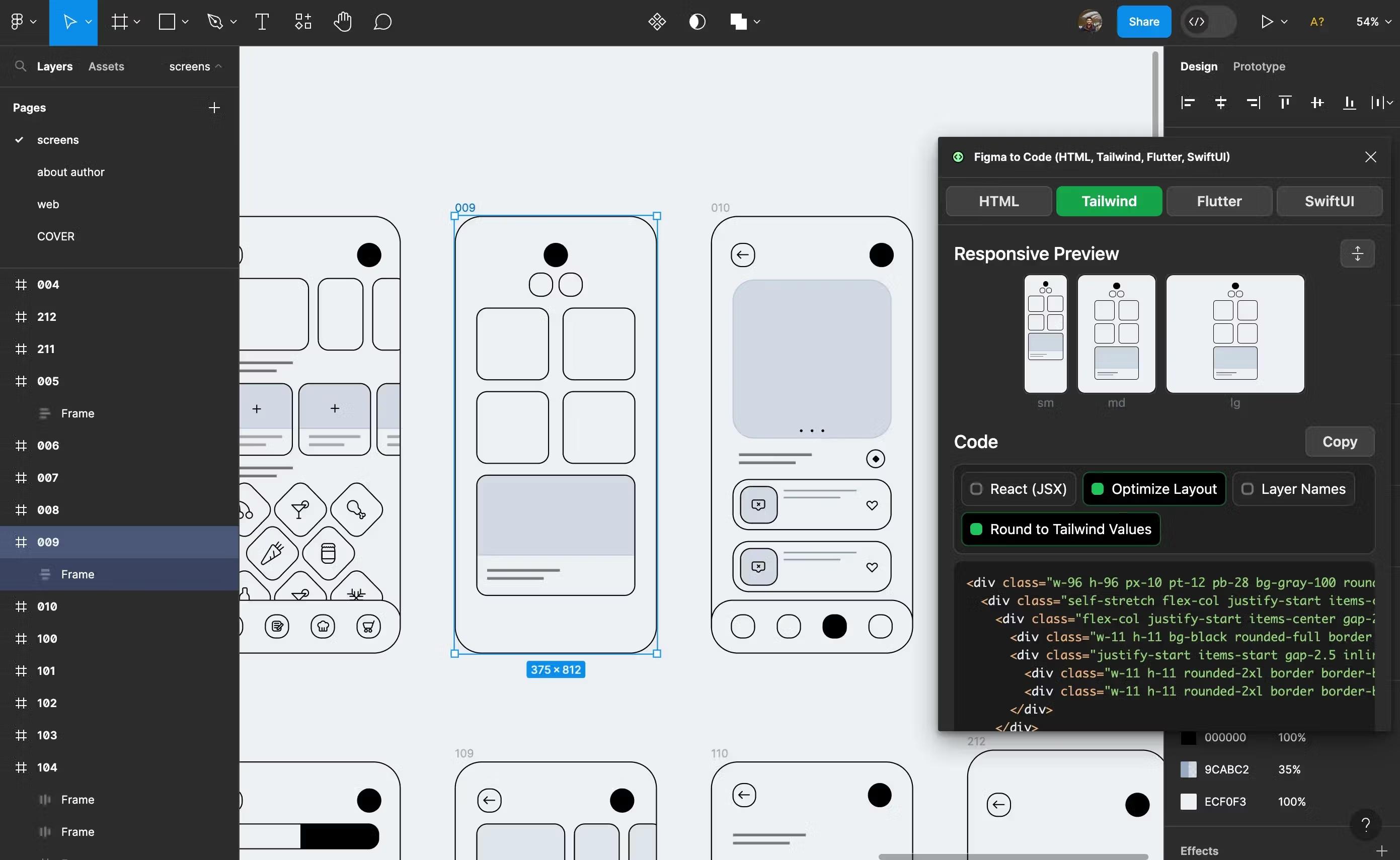
Figma’s Dev Mode streamlines the design-to-development handoff. Codegen plugins can enhance your workflow and help you create responsive websites by automatically generating code based on designs.
Some plugins to explore include:
- Figma to Code creates responsive code directly from your Figma designs, even generating code for mobile applications.
- Locofy.ai generates interactive code that adapts to different screen sizes.
- Anima allows you to export Figma components into responsive code.
- Builder.io uses AI for code generation, allowing you to train its output to match your style and make designs responsive.
Testing and iteration

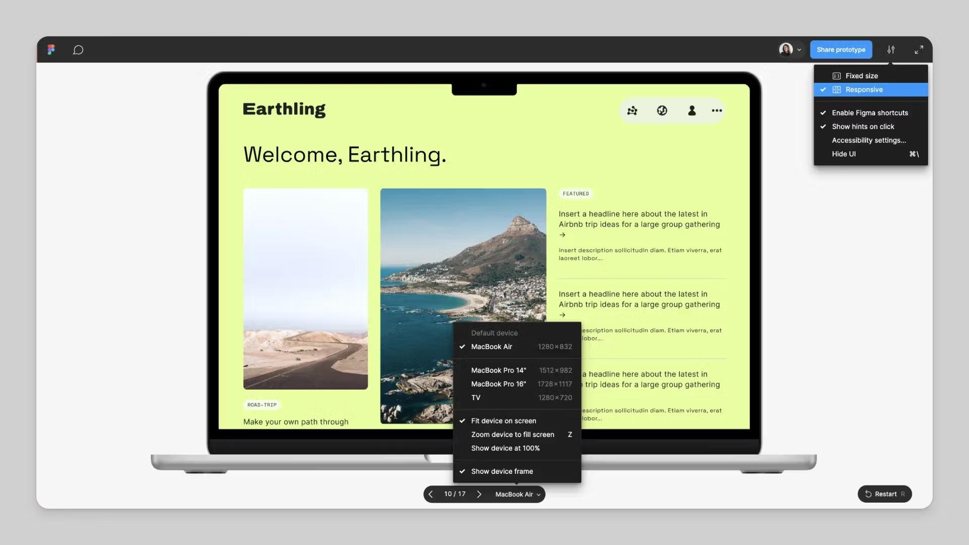
Testing your design across different devices and browsers is important to ensure it adapts appropriately. Figma’s responsive prototyping feature allows you to view your design on any screen and adjusts accordingly depending on your constraints and auto layout settings.
You can play the prototype in the preview view, which allows you to experience it in the editor and see how it works as you build. Or use the presentation view to share the prototype with your team to get feedback and test how it responds across different screens.
Responsive Web design FAQ
How does responsive design affect SEO?
Responsive Web design can improve SEO by offering a consistent user experience and faster load times. Since Google prioritizes mobile-friendly sites in ranking, responsive design can also increase your website’s visibility and organic traffic.
What are the three basic things required for responsive Web design?
For responsive Web design to be effective, these three things are required:
- Fluid grid layouts. Use relative units (like percentages) instead of fixed pixel widths to let content scale based on screen size.
- Flexible images. Make images adapt to their containers so they resize automatically without distortion.
- CSS media queries. Apply different styling rules depending on screen width, resolution, orientation, or other conditions.
Many teams also include responsive text and navigation as key parts of a strong responsive system.
What is the difference between responsive and mobile-first design?
Mobile-first design starts with the smallest screens and progressively builds up for larger devices. Responsive design adjusts layouts for any screen size. In practice, mobile-first is a common strategy used within a responsive design approach, especially when mobile traffic is dominant.
How can I test if my website is truly responsive?
To test a responsive Web design, check how it behaves across different screen sizes and devices. Use tools like browser developer mode, device simulators, online responsive testers, and validate on real devices whenever possible. You’re looking for smooth layout adjustments, readable content, and working navigation at all breakpoints.
What common mistakes should I avoid in responsive design?
Watch for text that’s too small, buttons that are difficult to tap, and layouts that get cluttered on smaller screens. Also avoid using large images that don’t scale well. Test touch interactions and spacing across screen sizes to make sure everything stays usable.
Create responsive websites with Figma Sites
Responsive websites are the cornerstone of a seamless user experience. Whether you’re undertaking a website redesign or starting from scratch, the right framework makes it easier to build layouts that adapt smoothly and stay consistent from desktop to mobile..
Figma can help you design responsive websites and streamline the development process. Here’s how:
- Use Figma’s prototyping tool to test your designs on different screen sizes to ensure they resize responsively.
- Browse Figma’s library of developer resources to explore APIs and plugins, suggest feedback, or share what you’ve built with the Figma Community.
- Use Dev Mode to generate and copy code snippets or customize code, no matter your framework.
- Start strong with a premade responsive Web design template from Figma Sites.
Ready to build a responsive website?
Figma Sites has everything you need to design, prototype, and publish—all in one place.