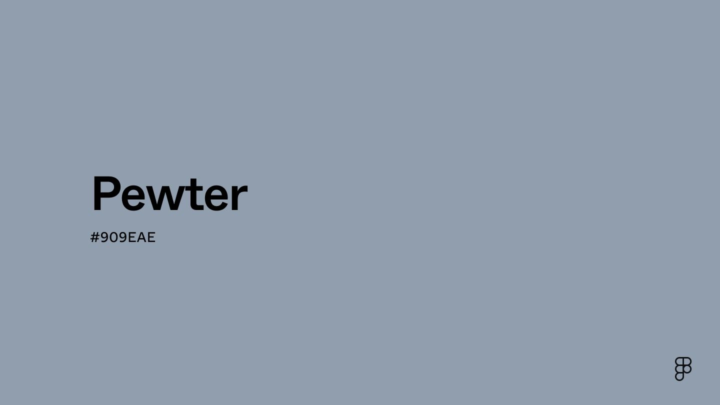
Pewter is a cool, versatile light bluish-gray with a serious, industrial feel. This desaturated shade falls between blue and green at the edge of the grayscale center on the color wheel, with a steely quality that evokes modernity and minimalism.

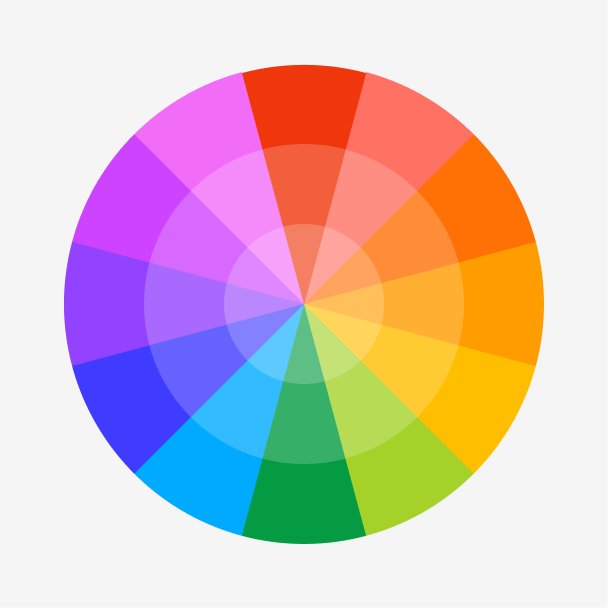
Color variations
Shades
Tints
Tones
Hues
Color harmonies
Complementary
Split
Monochromatic
Analogous
Triadic
Square
Custom palettes
Murky Waters
Harbor Haze
Misty Cliffs
Pewter is represented by specific color codes and values in the digital world to ensure it appears consistently across platforms and devices.
- HEX code: #909EAE
- RGB value: 56.5% red, 62% green, and 68.2% blue
Accessibility considerations play a crucial role in UX and UI design color choices. Figma offers plugins in the Community to make sure your designs meet Web Content Accessibility Guidelines.
Here are some ways to use pewter in your designs:
- Enhance readability. Pewter is excellent for text and backgrounds due to its moderate brightness. It contrasts well against light backgrounds to improve readability and pairs effectively with darker text for a subtle yet impactful visual.
- Balance bold colors. Pewter is ideal for tempering brighter, bolder colors. It helps create a balanced visual experience that pleases the eye without overwhelming users.
- Convey professionalism. Use pewter for elements like navigation menus or secondary buttons to project a professional and sophisticated look..
- Establish hierarchy. Use pewter to distinguish less critical elements from primary ones, enhancing navigation and usability with a clear visual hierarchy.
Keep in mind that color and its meaning can change from culture to culture—and at any given time. If you are designing for a global audience, research color considerations for your specific regions.
For variations within the same muted gray spectrum as pewter, consider:
- Slate (#6D8196) leans darker with more blue undertones, giving off a cooler, smokey feel.
- Gunmetal (#353E43) brings a moody depth, dipping closer to black for a moodier hue.
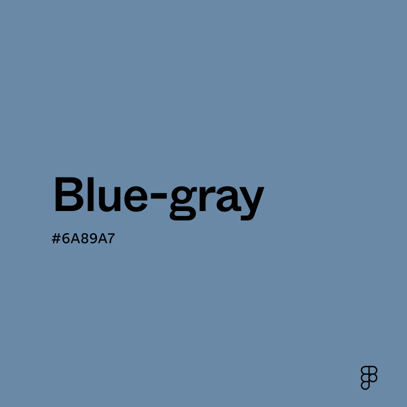
- Blue-gray (#6A89A7) shares the same muted tone with added vibrancy, resembling faded denim or an evening storm.
- Gray (#898989) provides balance and stability as a balanced neutral shade.
To complement pewter, consider pairing it with:
- Tan (#D6B588) adds a warm, earthy contrast to pewter’s cool tone for a grounded, natural feel.
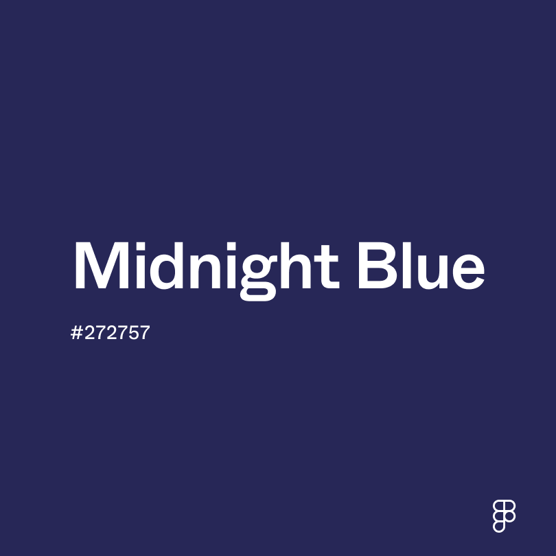
- Midnight blue (#272757) complements pewter’s sophistication with depth and a touch of drama.
- Maroon (#550000) creates a bold contrast with vibrant warmth, tempered by pewter’s simple elegance.
- Cinnabar (#E84B3D) pops against pewter’s subdued hue, creating an energetic and classy pair.
While pewter is a cool, neutral shade, it may clash with:
- Brown (#895129) can create a muddy, bland look that diminishes both colors’ individual qualities.
- Green (#008000) may compete with pewter’s subdued coolness, creating an imbalanced, over-saturated feel.
- Purple (#9D00FF) can overwhelm pewter with its commanding vibrancy.
- Ebony (#5D6658) may create a flat, mechanical aesthetic with muted green undertones that conflict with pewter’s subtle blue shade.
Pewter, with its cool undertones and hint of blue, typically conveys a serious and sophisticated air. Its depth and subtle elegance symbolize practicality, sincerity, and intellect. However, like other shades of gray, pewter can also imply detachment and apathy, particularly when used in a muted, monochromatic setting.
In color psychology, pewter's gray and blue undertones are calming and can evoke feelings of stability and reliability. Its neutral yet deep hue promotes focus and can help reduce the perception of chaos in an environment, making it conducive to thoughtful and introspective moods. However, excessive use of pewter may also lead to feelings of coldness and isolation due to its starkness.
In UI design, this light, neutral shade is valued for its neutrality and ability to work well across a range of color schemes to create a sophisticated aesthetic. It's particularly effective for backgrounds or as an accent color to convey professionalism and elegance. Pewter can be used to highlight important elements without overpowering them.
Unlike many colors with histories steeped in pigments and dyes, "pewter" likely originated as a practical term. The word "pewter" appeared in English around the 1300s, coinciding with the widespread use of pewter for functional objects like tableware and cookware. The distinctive grayish tone of pewter metal became a shorthand for this material.
Today, the color "pewter" continues this legacy. It represents a dependable, neutral gray that evokes a sense of functionality and understated elegance.
Contrast checker
Contrast 2.73
- Large Text
#909EAE
- Normal Text
How you design, align, and build matters. Do it together with Figma.
| Category | ||
|---|---|---|
Fail | Fail | |
Fail | Fail | |
Fail | Fail |
Contrast 7.69
- Large Text
#909EAE
- Normal Text
How you design, align, and build matters. Do it together with Figma.
| Category | ||
|---|---|---|
Pass | Pass | |
Pass | Pass | |
Pass | Pass |
Color simulations
Protanopia
Deuteranopia
Tritanopia
Achromatopsia
The hexadecimal color #909EAE, known as pewter, has RGB values of R:144, G:158, B:174 and CMYK values of C:17, M:9, Y:0, K:32.
| VALUE | CSS | |
|---|---|---|
| HEX | 909EAE | #909EAE |
| RGB DECIMAL | 144, 158, 174 | RGB(144, 158, 174) |
| RGB PERCENTAGE | 56.5, 62, 68.2 | RGB(56.5%, 62%, 68.2%) |
| CMYK | 17, 9, 0, 32 | |
| HSL | 212°, 15.6, 62.4 | HSL(212,15.6%,62.4%) |
| HSV (OR HSB) | 212°, 17.2, 68.2 | |
| WEB SAFE | 999999 | #999999 |
| CIE-LAB | 64.514, -1.519, -9.985 | |
| XYZ | 31.367, 33.439, 44.844 | |
| xyY | 0.286, 0.305, 33.439 | |
| CIE-LCH | 64.514, 10.1, 261.351 | |
| CIE-LUV | 64.514, -8.275, -14.647 | |
| HUNTER-LAB | 57.826, -4.371, -5.501 | |
| BINARY | 10010000, 10011110, 10101110 | |
| iOS - SwiftUI | Color(red: 0.565, green: 0.62, blue: 0.682) | |
| iOS - UIKit | UIColor(red: 0.565, green: 0.62, blue: 0.682, alpha: 1) | |
| Android - Compose | Color(0xFF909EAE) |