What are secondary colors — and how to use them in design

Share What are secondary colors — and how to use them in design
Explore more from
Design basics
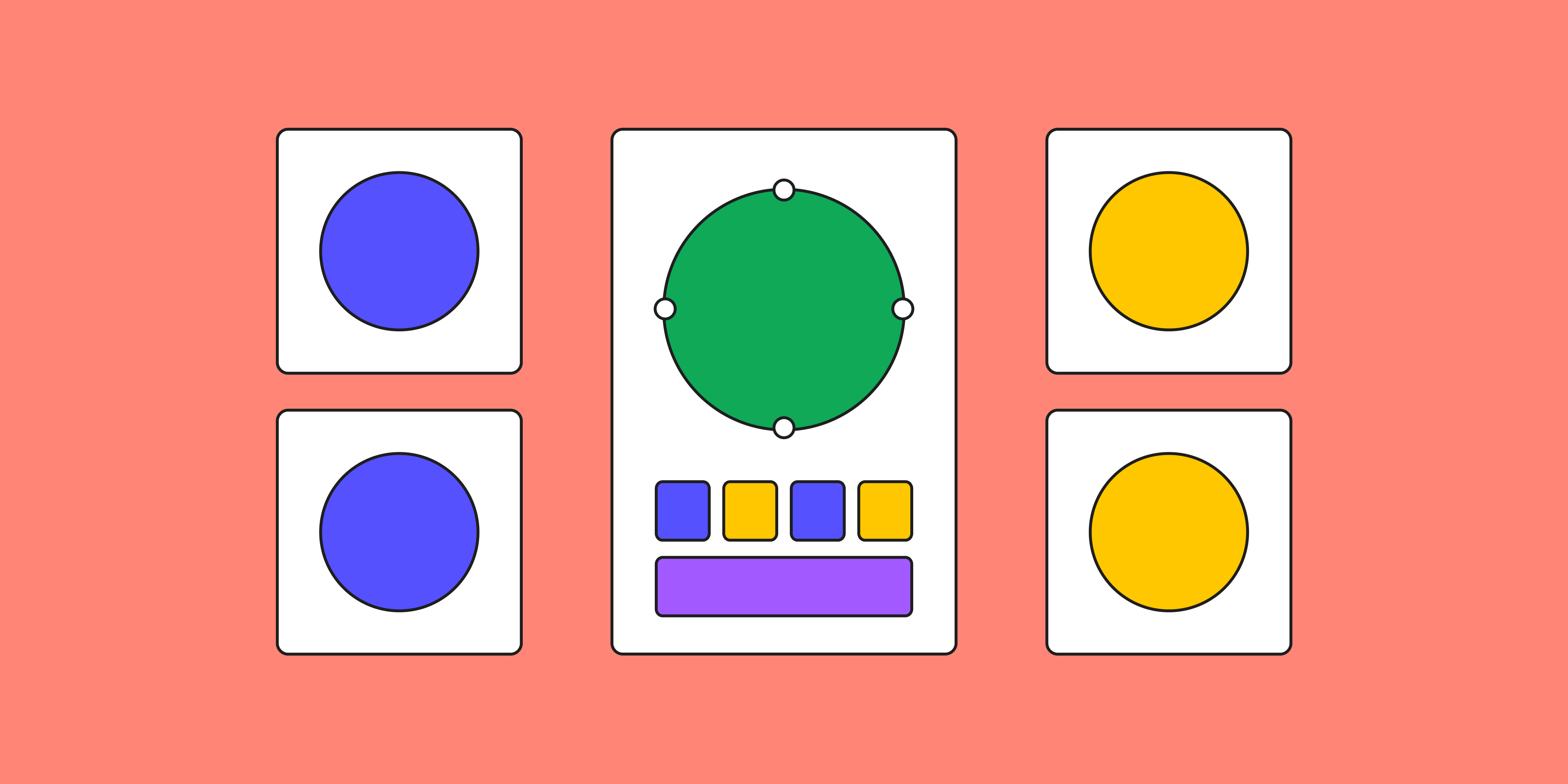
Master color to elevate your designs
Experiment, refine, and apply color palettes in Figma.

Don’t let the name fool you—secondary colors play leading roles in design. This set of colors gives designers a powerful visual language to create memorable emotional experiences.
Read on to learn:
- What secondary colors are, and how designers use them
- 4 brands that use secondary colors effectively
- 5 pro tips to put secondary colors to work in your designs with Figma
What are the 3 secondary colors?
On the color wheel, secondary colors sit midway between primary colors red, yellow, and blue (RYB). You can produce secondary colors by mixing equal amounts of primary colors as follows:
- Mixing red and yellow creates orange.
- Blending yellow and blue produces green.
- Combining blue and red gives us purple.
To explore different color options, add more of one of the two primary colors in your secondary color. That's how you make tertiary colors, including yellow-green (aka chartreuse), yellow-orange (aka amber), red-orange (aka vermillion), red-purple (aka magenta), blue-purple (aka blue-violet), and blue-green (aka teal). Together, the 12 primary, secondary, and tertiary colors complete the color wheel.
How are secondary colors useful in design?
To attract customers, designers seek out fresh color combinations beyond classic, basic colors. Designers might explore secondary colors to create a signature color palette, distinctive brand identity, or unique user experience. Secondary colors can help build a color system that's pleasing to the human eye, balancing warm colors like red and orange with cool colors like blue and green.
4 brands that use secondary colors effectively
Savvy brands use secondary colors to create memorable user experiences, inspire engagement, and strengthen audience connection. Here are four prime examples:
- Spotify. Spotify sets its platform apart with a neon green cranked up to maximum saturation. The green suggests growth, creativity, and freshness, capturing Spotify's mission to provide endless music discovery for its users.
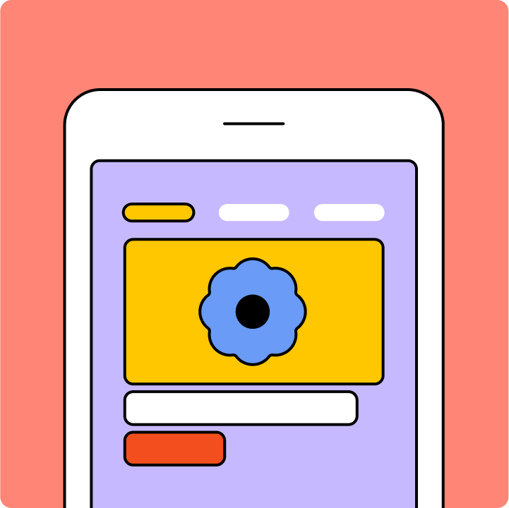
- Headspace. A sunny yellow-orange monochromatic color scheme is a cornerstone of the uplifting design for the Headspace meditation app.
- Twitch. Twitch's main color is a playful purple, promoting its platform as a fun, creative community space. This strategic, innovative use of color makes Twitch an exciting home for gamers and creators.
- FedEx. Instead of relying on one hue, FedEx uses a bold set of secondary colors—orange and purple—in its iconic logo. This highly recognizable color combo is a study in contrasts: purple gives a premium touch to FedEx's VIP delivery service, while orange adds a sense of urgency. FedEx also uses orange selectively to highlight key features, like the “Track” button.
5 pro tips to use secondary colors in design
You don't have to be an expert in color theory to elevate your design by mixing colors. With these five pro tips, you can use colors to tell a more memorable story with your design, so it resonates more deeply with your audience.
- Explore complementary colors. Check out the color wheel and try Figma's color palette generator to find colors that complement your dominant brand color. A concise color scheme of 1-6 foundational hues strengthens brand identity, while avoiding sensory overload.
- Apply the 60-30-10 UX rule. Try a neutral color for 60% of your design, a primary color for 30%, and a secondary accent color for the remaining 10%. This balance builds visual interest without overwhelming viewers.
- Build an accessible color palette. Secondary colors can provide the contrast you need for your palette to meet accessibility standards.
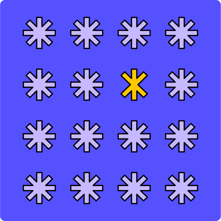
- Create a visual hierarchy. Use different shades, tints, and hues of secondary colors to draw attention to important details. In UI design, these visual cues can guide users through workflows and highlight important information.
- Convey meaning through color. To make an emotional impact with your brand, consider the associations secondary colors can evoke. Use them strategically to reinforce your brand image and enhance user experience.
How to create secondary colors for your designs
To keep secondary colors consistent across your designs, make sure you're using the right color model. If you're designing for digital screens, you can create secondary colors with additive colors, or RGB (red, green, and blue, aka RGB color). In the RGB color model, secondary colors emerge through adding two primary colors of light at full intensity.
- Cyan is a blend of green and blue light.
- Magenta combines red and blue light.
- Yellow forms by merging red and green light.
Printed materials use subtractive colors, or CMYK (cyan, magenta, yellow, and key). The CMYK color model uses subtractive color, where dyes or pigments are used to create secondary colors. Mixing CMY inks filters light reflected from the paper, subtracting certain wavelengths of light. Here's how that works in practice:
- Magenta and yellow inks mix to create red.
- Cyan and yellow inks create green.
- Cyan and magenta inks make blue.
- The "K" stands for black ink, added to make images clearer and darker.
Unlock the power of secondary colors with Figma
You've got a world of secondary colors to explore with Figma's built-in templates and tools. Here's how to infuse your designs with secondary colors that communicate, captivate, and convert:
- Use Figma's free color wheel to blend and contrast secondary colors effortlessly.
- Experiment with color plugins developed by Figma's design community, designed to help you curate and apply secondary color palettes with precision.
- Apply color to screens expertly with Figma's comprehensive UI kits.
- Learn more about color theory with tutorials and examples from the Figma community.
Ready to make designs more impactful with color?
Ready to create your signature color palette?
Keep reading

What is UI design
What is UI design today, and what role does it play in the design thinking process?
Learn more

What is visual hierarchy
If everything looks the same, then you see nothing. Visual hierarchy can change that.
Learn more

UI vs UX
Read on to find out what it takes to design engaging UI, and create a memorable UX.
Learn more
From the blog
The Figma design agent is here
Starting today, work with an agent that is built for Figma—directly on the canvas.

The TL;DR on MCP: Why context matters and how to put it to work
Figma’s MCP server brings your design decisions into the tools where code gets written—so what gets built actually matches what was designed. Here’s what that unlocks for everyone who builds products.
How to supercharge your design system with slots
Slots give you the ability to customize components without breaking the system. We’re sharing five field-tested tips from early users to help you unlock more freedom without giving up control.
The new business case for design systems
Design systems have evolved from static libraries to key drivers of business revenue, customer loyalty, and product strategy. Here’s what you need to know about how to track and communicate the value of your design system, based on new research from the Design Executive Council (DXC).

5 shifts redefining design systems in the AI era
As AI reshapes how we make products, design systems are evolving from libraries of reusable parts into living frameworks that scale taste and craft. We spoke with product leaders and practitioners about the shifts they’re seeing in how design systems are built, used, and maintained.

Schema 2025: Design systems for a new era
Design systems help teams push what’s possible while maintaining a high level of craft, polish, and performance. Here’s everything we announced at Schema by Figma to help teams design for the AI era.