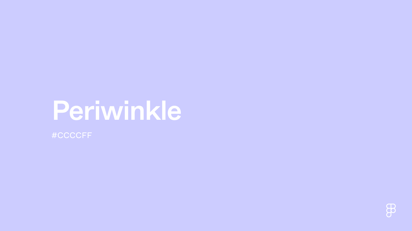
Periwinkle is a soft, cool-toned blend of blue and purple, embodying calm and tranquil qualities. This delicate shade sits between blue and purple on the color wheel, offering a dreamy and serene feel.

Color variations
Shades
Tints
Tones
Hues
Color harmonies
Complementary
Split
Monochromatic
Analogous
Triadic
Square
Custom palettes
Under the Moonlight
Sunny Lilac
Purple Starfish
Periwinkle is defined by the following color codes and values to ensure consistency across various digital platforms and devices.
- HEX code: #CCCCFF
- RGB value: 80% red, 80% green, and 100% blue
Accessibility considerations play a crucial role in UX and UI design color choices. Figma offers plugins in the Community to make sure your designs meet Web Content Accessibility Guidelines.
Here are some ways to incorporate periwinkle into UI designs:
- Create a calming atmosphere. Periwinkle has a light hue that can create a calming and inviting interface—ideal for sleep or meditation apps or any platforms that promote relaxation.
- Make key elements pop. Using periwinkle as a background color can help make CTAs and other important information stand out, providing a contrast that doesn’t overwhelm the user.
- Reduce eye strain. Periwinkle and other light shades offer a softer contrast than bolder interfaces that may cause eye fatigue.
Keep in mind that color and its meaning can change from culture to culture—and at any given time. If you are designing for a global audience, research color considerations for your specific regions.
For variations within the same soft spectrum as periwinkle, consider:
- Mauve (#E0AFFF) has a similar softness with a pink undertone.
- Light blue (#90D5FF) is slightly brighter with blue undertones, reminiscent of a clear blue sky.
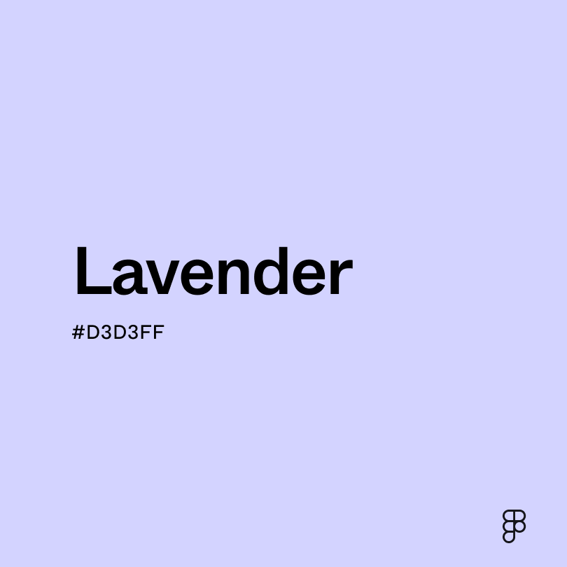
- Lavender (#D3D3FF) is more muted and soft with subtle purple undertones.
- Serenity (#B3CEE5) captures the essence of its name, offering a calming light blue color with gray undertones.
To complement periwinkle, consider pairing it with:
- Pastel yellow (#FFEE8C) brings a sunny and cheerful vibe, adding warmth to periwinkle’s coolness.
- Cornflower blue (#6395EE) creates a subtle contrast for a serene and calming color palette.
- Pastel orange (#FFC067) brings a warmth that creates a vibrant and energizing color combination.
- Ivory (#FFFFE3) creates a soft and elegant palette that allows periwinkle to shine.
Other colors worth considering include mint green for a refreshing and invigorating feel, coral to offer a vibrant contrast against the softness of periwinkle, and green sage for a natural and earthy color palette.
While periwinkle is calming, it may clash with:
- Neon green (#2CFF05) can overpower periwinkle’s delicate nature due to its intensity.
- Dark orange (#C76E00) has a warmth and richness that may appear unbalanced next to the coolness of periwinkle.
- Red (#FF2C2C) can clash with periwinkle due to its bright hue and saturation.
- Olive green (#636B2F) has deep green undertones that may not harmonize with periwinkle’s softer hue.
Periwinkle symbolizes peace and tranquility. It's also linked to nostalgia, as its gentle and calming nature can bring about sentimental memories. In Christianity, the periwinkle flower is linked to the Virgin Mary, symbolizing purity and innocence.
In color psychology, periwinkle’s calming blue undertones evoke feelings of relaxation and mental clarity, while its purple influence promotes feelings of trust and harmony.
In UI design, periwinkle can bring a calming effect to interfaces, ideal for wellness, meditation, and sleep apps. You can also use it to create a soft background color that helps bolder UI elements pop.
Periwinkle gets its name from the light blue and purple shades of the periwinkle flower. The color was first recorded in English in 1922 and added to the Crayola color palette in 1949.
In the ‘80s and ‘90s, like many other pastel hues, periwinkle gained popularity as muted color palettes became a staple in fashion, art, and interior design. Today, periwinkle ribbons symbolize hope and peace, raising awareness for esophageal and stomach cancer.
Contrast checker
Contrast 1.54
- Large Text
#CCCCFF
- Normal Text
How you design, align, and build matters. Do it together with Figma.
| Category | ||
|---|---|---|
Fail | Fail | |
Fail | Fail | |
Fail | Fail |
Contrast 13.65
- Large Text
#CCCCFF
- Normal Text
How you design, align, and build matters. Do it together with Figma.
| Category | ||
|---|---|---|
Pass | Pass | |
Pass | Pass | |
Pass | Pass |
Color simulations
Protanopia
Deuteranopia
Tritanopia
Achromatopsia
The hexadecimal color #CCCCFF, known as periwinkle, has RGB values of R:204 G:204, B:255 and CMYK values of C:0.2, M:0.2, Y:0, K:0.
| VALUE | CSS | |
|---|---|---|
| HEX | CCCCFF | #CCCCFF |
| RGB DECIMAL | 204, 204, 255 | RGB(204, 204, 255) |
| RGB PERCENTAGE | 80, 80, 100 | RGB(80%, 80%, 100%) |
| CMYK | 20, 20, 0, 0 | |
| HSL | 240°, 100, 90 | HSL(240,100%,90%) |
| HSV (OR HSB) | 240°, 20, 100 | |
| WEB SAFE | CCCCFF | #CCCCFF |
| CIE-LAB | 83.57, 10.297, -24.918 | |
| XYZ | 64.541, 63.243, 103.409 | |
| xyY | 0.279, 0.274, 63.243 | |
| CIE-LCH | 83.57, 26.962, 292.452 | |
| CIE-LUV | 83.57, -3.002, -41.552 | |
| HUNTER-LAB | 79.525, 5.699, -21.429 | |
| BINARY | 11001100, 11001100, 11111111 | |
| iOS - SwiftUI | Color(red: 0.8, green: 0.8, blue: 1) | |
| iOS - UIKit | UIColor(red: 0.8, green: 0.8, blue: 1, alpha: 1) | |
| Android - Compose | Color(0xFFCCCCFF) |