12 website layout ideas to captivate your audience

Share 12 website layout ideas to captivate your audience
Explore more from
Design basics
From wireframe to website, faster
Design, prototype, and refine every page.

Ever visit a website but find yourself lost, looking for the information you need? Maybe you spend a few minutes navigating the confusing layout, but the frustrating experience quickly leads you to bounce off the page. In modern Web design, page layout is crucial in creating a seamless user experience. It’s like the map that gives users directions to find the content they’re looking for.
Ready to explore how to create a website layout to keep your audience engaged?
Read on to learn:
- What a website layout is and why a good one is important
- 12 website layout ideas
- Tips for designing your website layout
What is a website layout?
A website layout is how a web page is structured and presented to users. Aside from being visually appealing, a good website layout has clear information architecture, which makes it easy for users to understand and navigate content.
A website layout also considers the natural flow of the human eye to properly guide users to the right information and improve the overall experience. There are a few key things to remember when visually processing information.
Natural eye patterns
Eye patterns are the way humans use their eyes to scan and navigate interfaces. The most common patterns include:
- Z-pattern: Users scan a web page in a Z shape, moving horizontally from the top left to diagonally and then to the bottom right.
- F-pattern: Users read content horizontally from left to right, scanning the left side of the screen first, then moving vertically down, forming an F shape.
- Upper left corner pattern: Users’ eyes gravitate toward the top left corner of a page, which is typically why important information like main CTAs, navigation menus, or search bars are placed there.
Knowing these common eye-tracking patterns can help you create a website layout that naturally guides users to the most important elements on a page.
Size and weight
Aside from where page elements are located, their size and weight also heavily influence how users view content. Larger elements naturally capture a user’s attention more than smaller ones because they’re visually prominent.
An element’s visual weight, which can be influenced by its size, color, and contrast, also plays a role. For example, a button in a bold color like red will have a heavier visual weight, thus appearing more visible on a page.
Why is a good website layout important?

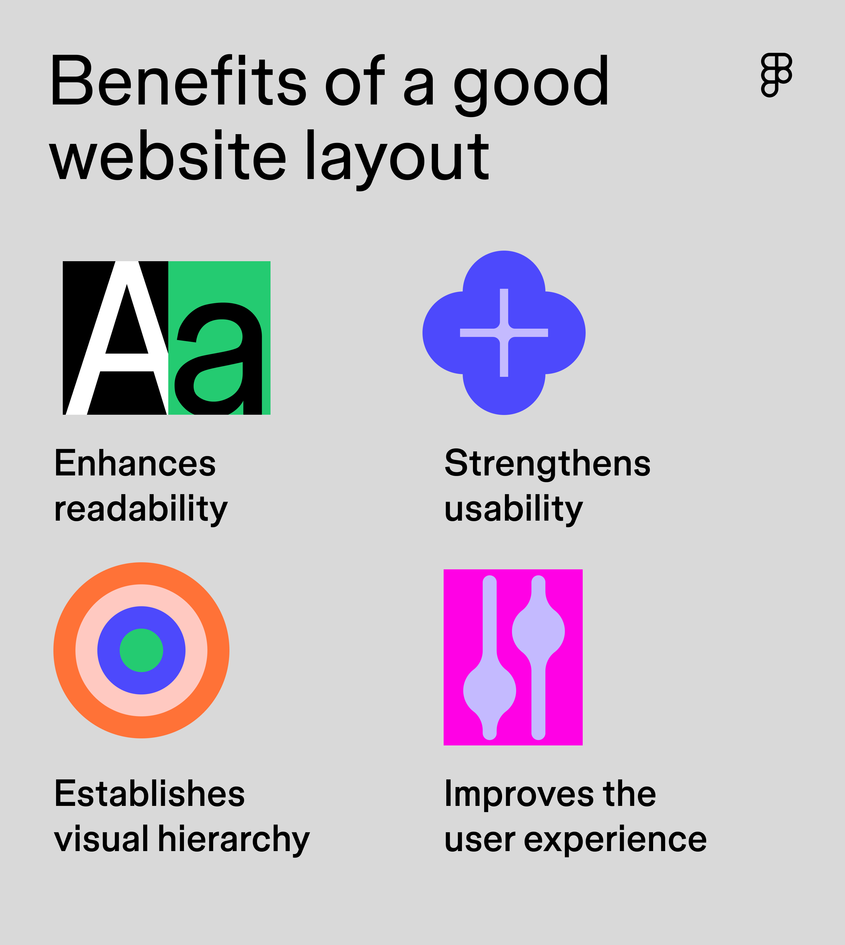
A smart website layout shapes how visitors explore and connect with your content. Here's why it matters:
- Makes reading easy. Good website layouts use headings, white space, and strategic placement to ensure important content elements stand out and are easy for users to read.
- Feels natural to use. When a layout flows naturally, visitors can flow through your site without having to stop and think about where to go next.
- Establishes a visual hierarchy. Just like a well-organized store, a good layout guides users’ eyes to what matters most, helping them find what they came for.
- Keeps visitors coming back. Nobody likes a confusing website. When your layout makes sense and is intuitive and user-friendly, visitors will stick around instead of bouncing out.
12 best website layout ideas
Ready to design a website that’s intuitive and engaging? Check out these website layout ideas for inspiration.
Idea 1: Grid layout

Best for: blogs, e-commerce sites, and responsive website design
A grid layout is one of the most basic and common structures used in Web design. It uses rows and columns to organize content, creating a framework that makes important elements easier to find. There are many different kinds of grid layouts, and some of the most popular ones include:
- Modular grid: This layout uses blocks or modules to organize content. Blocks can be tailored to fit different content types and layouts, making them highly customizable. For websites displaying a gallery of images, like e-commerce sites presenting product images, modular grids are popular.
- Single-column grid: This grid layout organizes content in a single column. It’s often used for websites displaying a long block of text, like blogs.
- Column grid: This layout splits a page into vertical columns (typically 3-12), creating an organizing framework for content. The columns create visual harmony by aligning text, images, and interactive elements and keep spacing consistent throughout your design.
The beauty of grid layouts? They are responsive so they play nice with all screens. Whether someone's browsing on their phone or their laptop, your design will adjust automatically, ensuring a consistent experience across devices.
Idea 2: Split-screen layout

Best for: landing pages, registration pages, and product pages
A split-screen website layout is a popular composition that divides a page into two equal sections, creating visual interest. It’s a great design technique for helping users compare and contrast information or displaying images and text side by side. For example, a landing page might have a product image displayed on one side, with product details on the other.
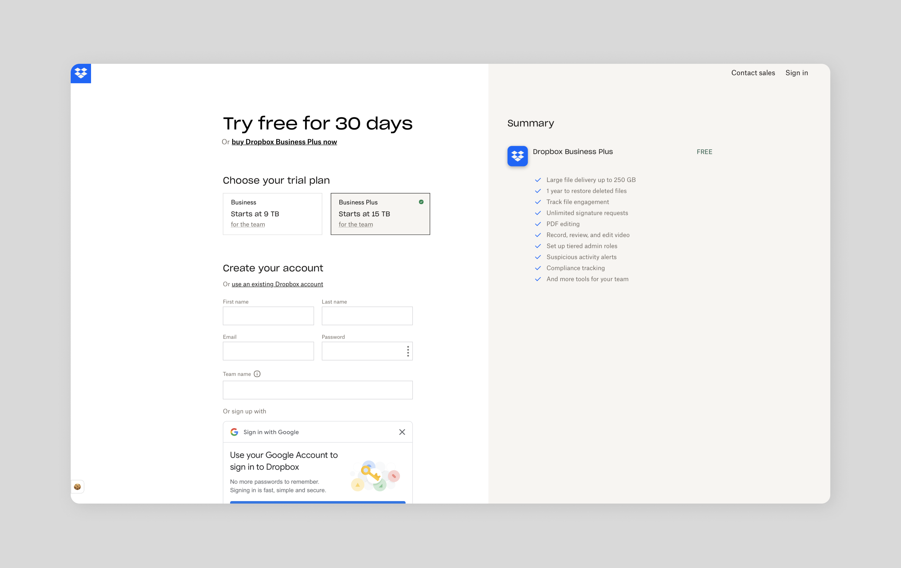
This layout is also useful for sign-up pages. Dropbox’s trial registration page uses a split-screen to help visitors compare the features of each business plan. On one side, the user fills out their information; on the other, they see a summary of the plan’s core features to help them determine which solution is right for them. Keeping all this information in one view makes decision-making simple and quick for the user.
Idea 3: Asymmetrical layout

Best for: landing pages and product pages
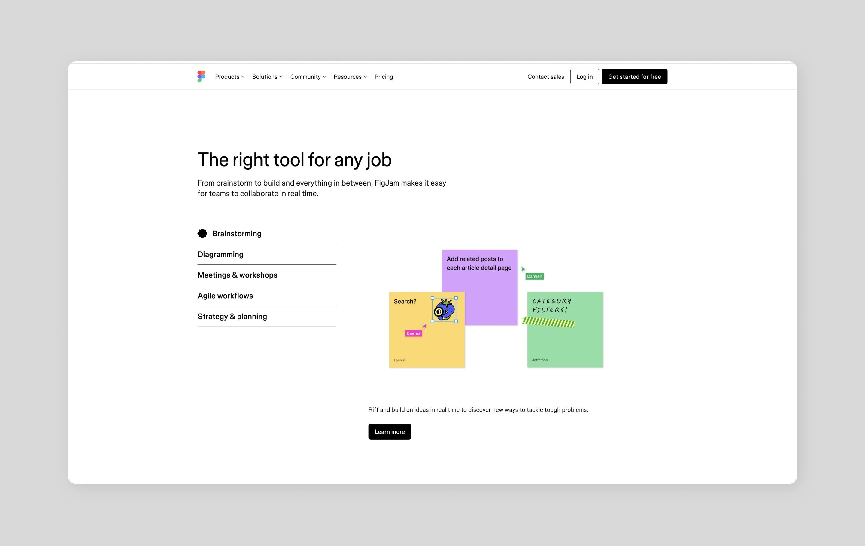
Like a split-screen layout, an asymmetrical layout divides content into two sections, but this time, the sections aren’t divided equally. The different proportions can create more visual interest than common symmetrical layouts.
Magic happens when you make one section bigger than the other. Your users’ eyes naturally gravitate to that larger space. Designers can use this to their advantage, placing key messages and call-to-action buttons where they'll get the most attention and drive conversions.
Take the FigJam product page as an example. It showcases different use cases with an asymmetrical design and uses images and CTAs that invite visitors to explore each option.
Idea 4: Full-screen layout

Best for: homepage designs, landing pages, and minimalist websites
A full-screen website layout uses the entire page to display an image or design as the background, with text, buttons, and other website elements usually overlaid on the image.
A full-screen layout works well on homepages when you need to capture your brand's essence at a glance. Just be sure to choose your background wisely. While an image might look stunning, you want to be sure the text is still easy to read and the buttons are easy to find.
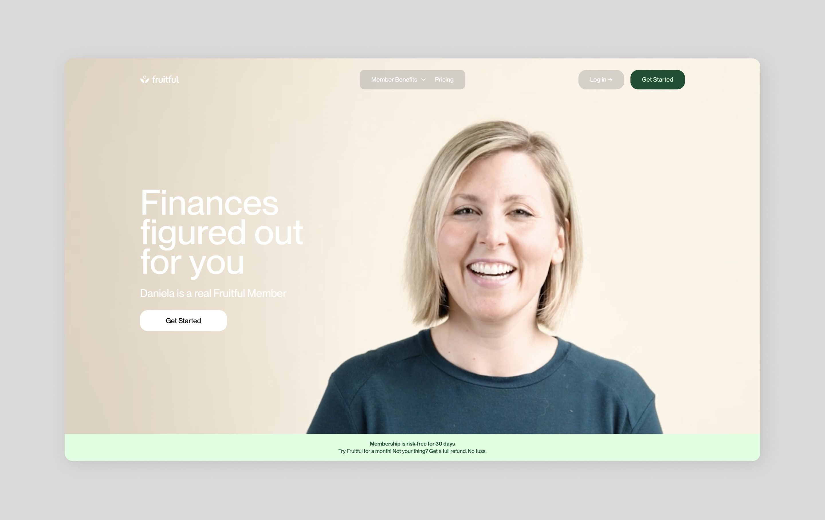
Financial company Fruitful connects members with certified financial planners to help individuals achieve financial success. Its homepage pairs powerful full-screen photos of its members and advisors with clear, readable content. This approach looks good and helps tell the brand’s story of connecting people with certified financial planners, making visitors more likely to click through and learn more.
Idea 5: Side-scrolling layout

Best for: category pages and image galleries
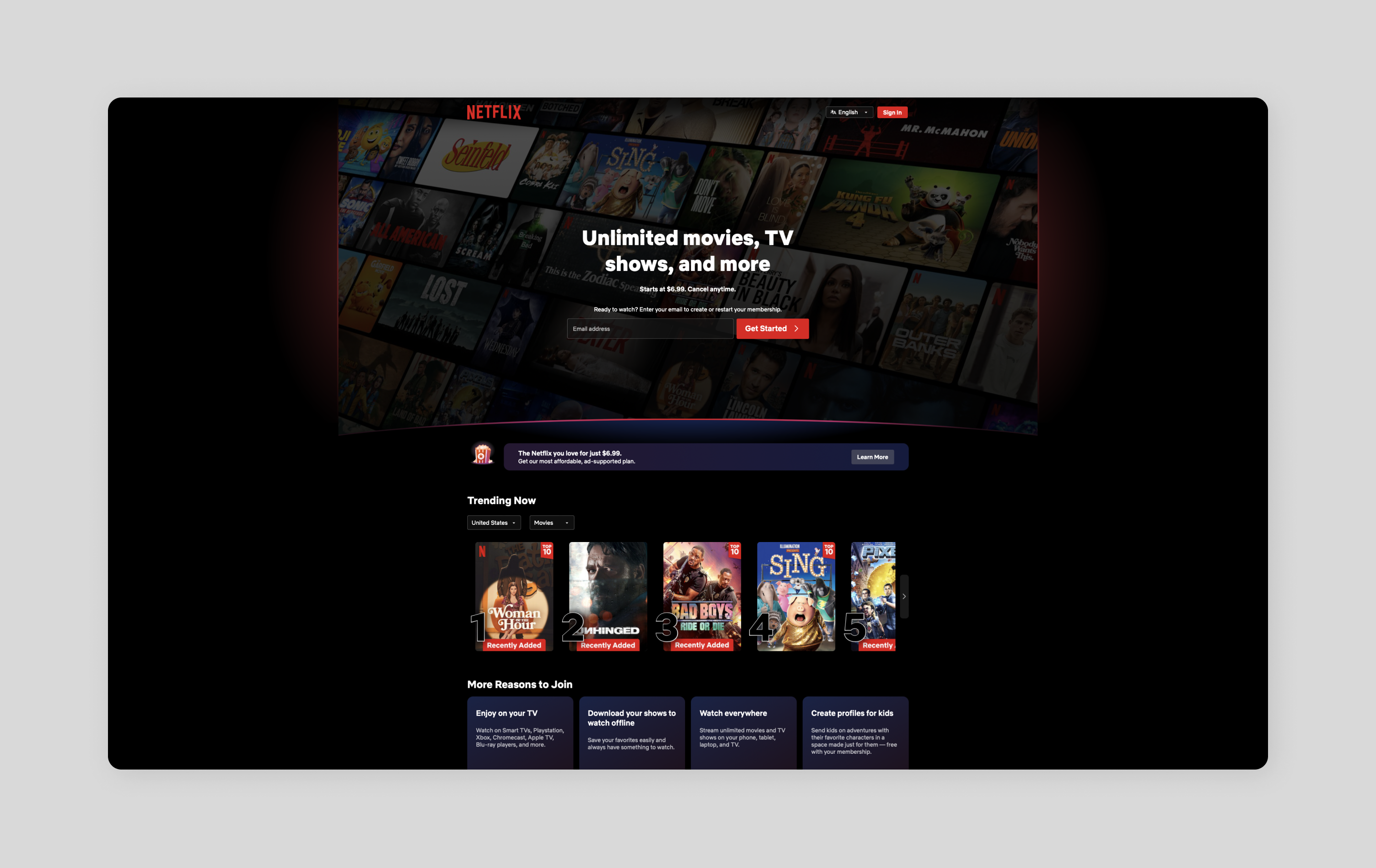
Sometimes it’s fun to think outside the scroll. Instead of the usual top-to-bottom browsing, side-scrolling lets your content flow from left to right. It's perfect for showing off image collections or organizing different categories without overwhelming visitors.
Netflix nails this. Movies and shows on the platform glide horizontally across the screen, keeping things neat while revealing new options as you scroll.
Just keep in mind that most people are wired to scroll down, not sideways. Adding clear visual hints like arrow buttons can help guide visitors and enhance the UX experience. It's all about making that sideways journey feel natural.
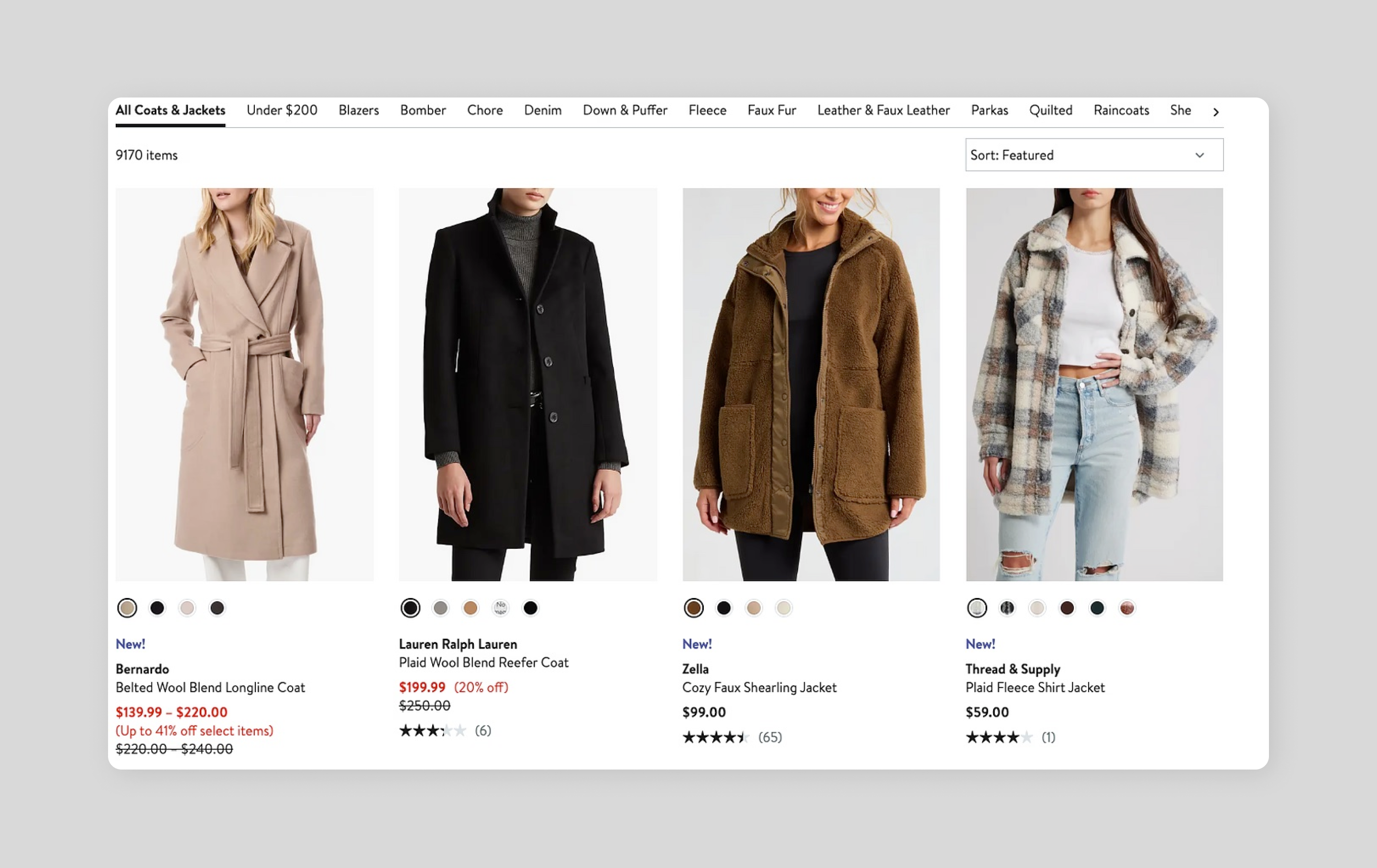
Idea 6: Card layout

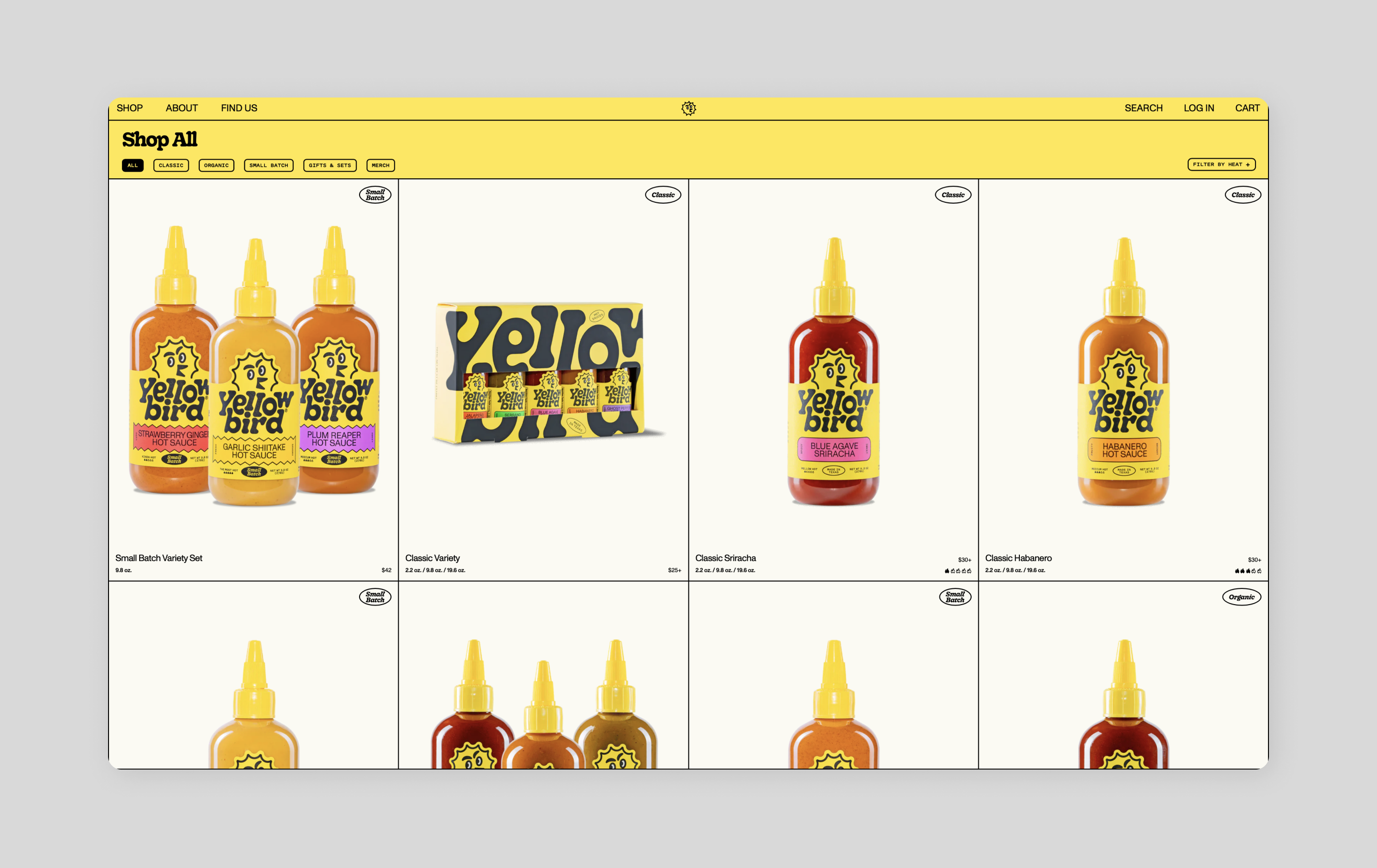
Best for: product pages, blogs, and galleries
Whether you're selling hot sauce or sharing blog posts, a card layout can help visitors quickly browse options. A card layout uses square or rectangular boxes, or “cards,” to display and organize content. Each card typically includes an image or icon with a quick overview of information, making it easy for users to browse options.
For example, Yellowbird uses product cards to display images of its sauces, the product names, and the prices, giving more detail if a user clicks the card to display the product page.
Cards make scanning simple, letting visitors find what they want without getting overwhelmed. They can also encourage user engagement, enticing users to explore and interact with different content. To make browsing more fun and interactive, have extra info pop up when someone hovers their mouse over a card.
Idea 7: Magazine layout

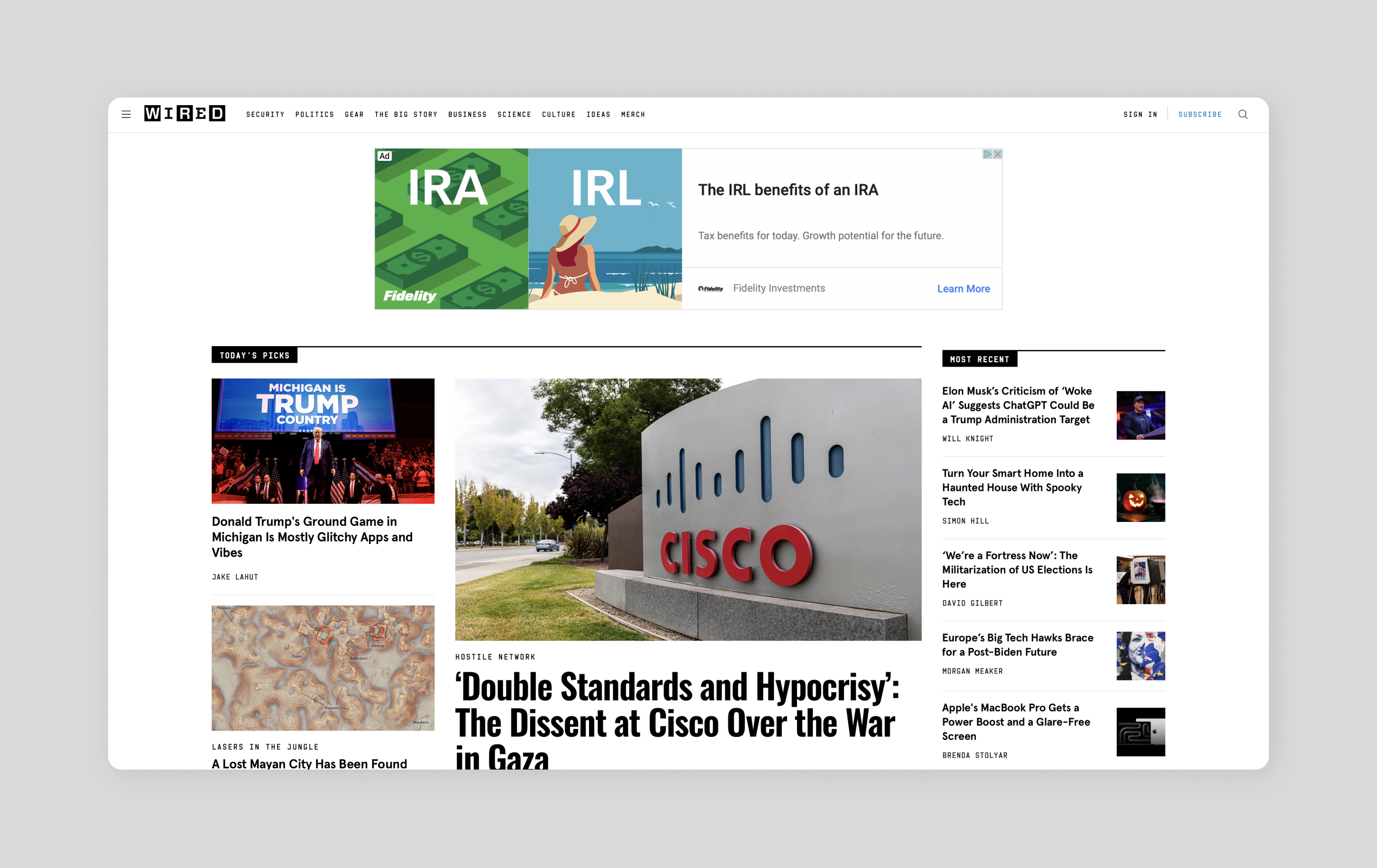
Best for: news sites and online publications
Missing the feel of flipping through glossy pages? Magazine layouts bring that classic print experience to the Web, using a grid-based structure to display text and organize stories.
Wired uses a large hero image paired with a prominent headline to grab attention for their biggest stories. The rest of their content flows naturally below, sorted by topic and time to keep readers in the loop.
Idea 8: Gallery layout

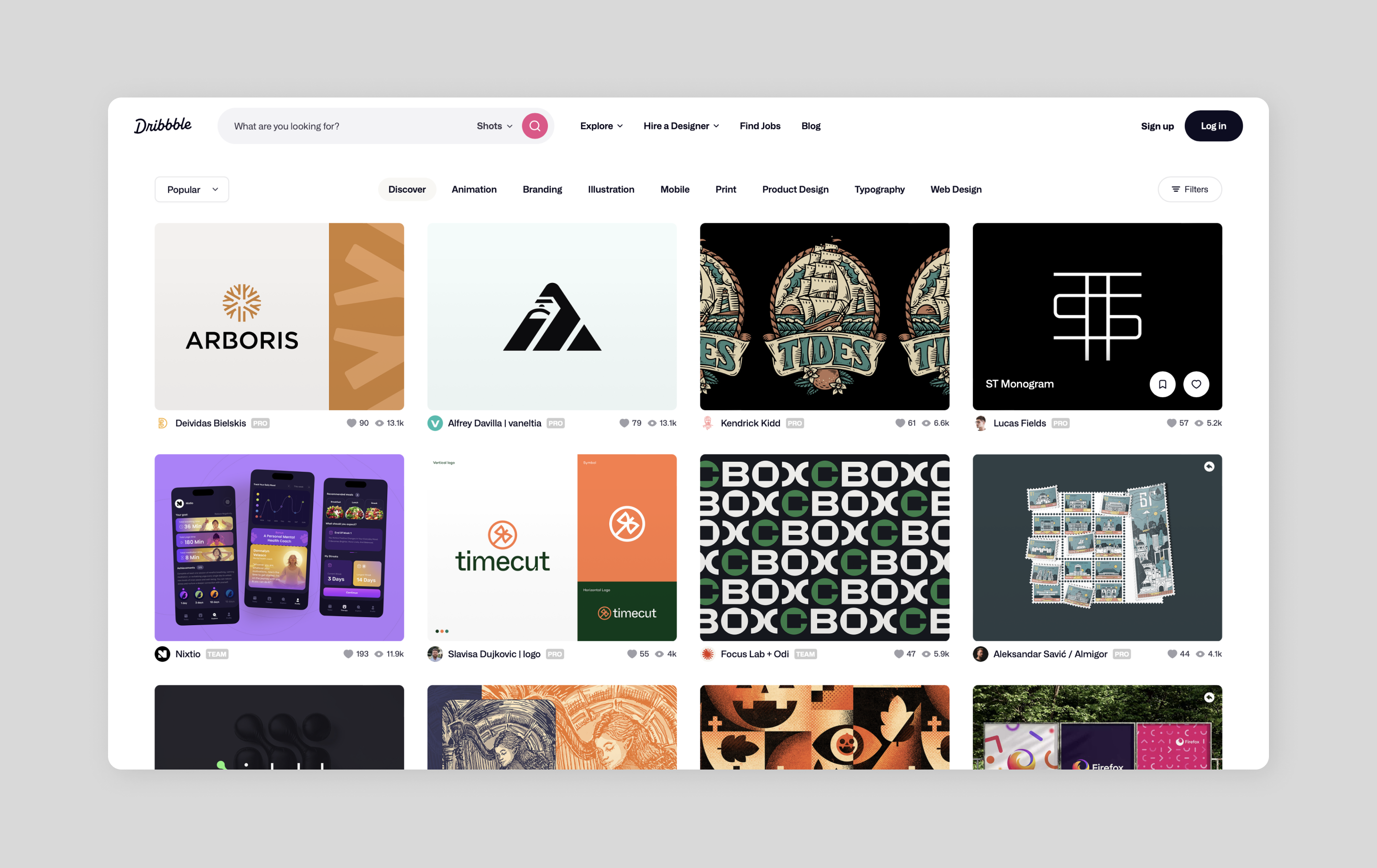
Best for: image galleries and online portfolios
When your visuals do most of the talking, gallery layouts, with minimal text, step back and let them shine. These types of layouts are perfect for portfolios or image galleries because it keeps text light and images front and center.
Check out how Dribbble does it, giving each design piece equal space in the grid. This makes it easy for users to browse categories and find the design inspiration they’re looking for.
Idea 9: Zig-zag layout

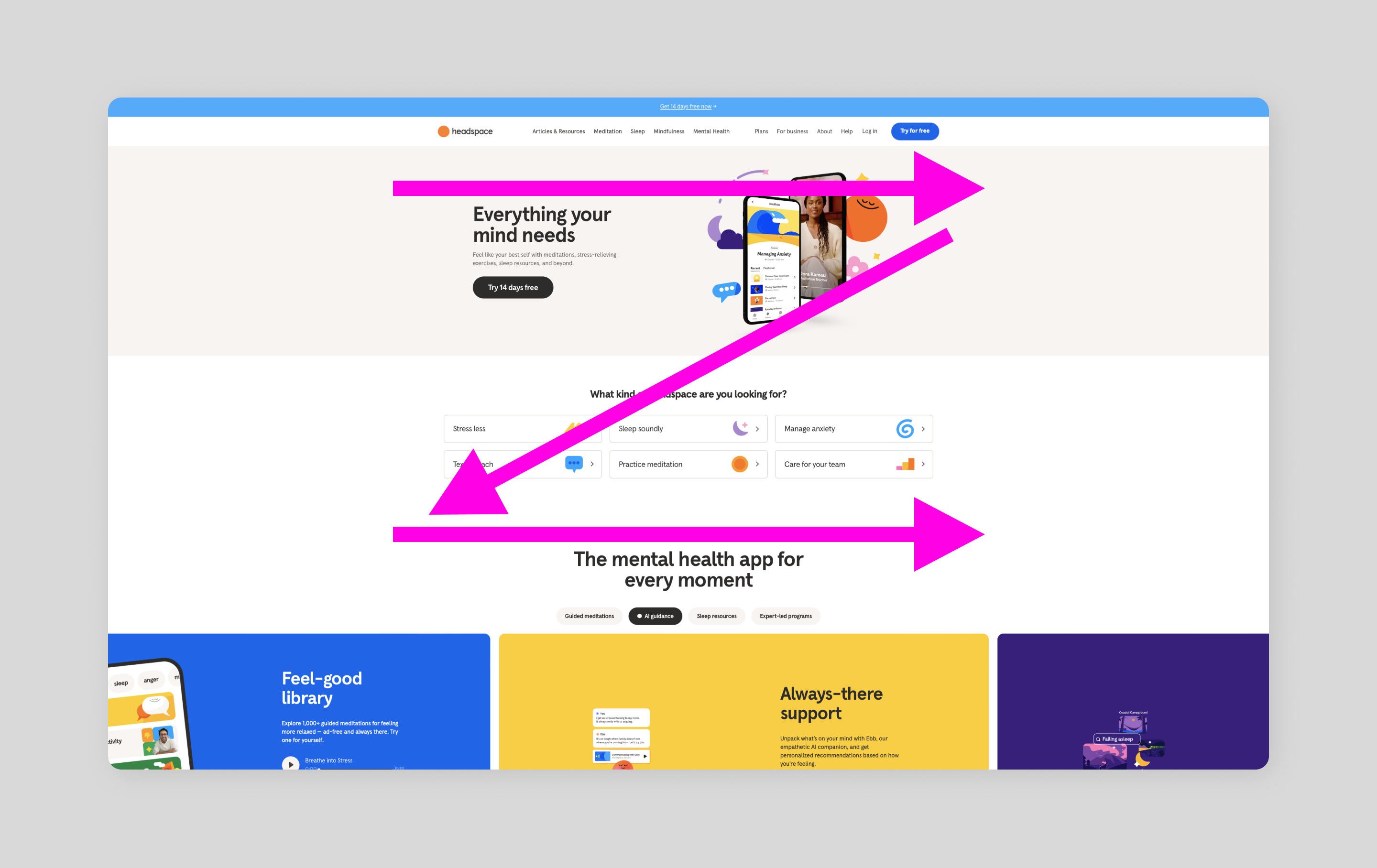
Best for: landing pages, product pages, and homepages
Ever notice how your eyes naturally zigzag across a page? Zig-zag website layouts tap into this natural eye-tracking pattern to present content in a Z shape, guiding the eye left to right, down, and across creating a natural journey and visual interest. The white space, blocks of text, and visually engaging images enhance readability and increase engagement.
Headspace uses a zigzag layout on its home page, weaving the message through images and text blocks which ultimately lead visitors right to where they want them to go—that "free trial" button.
Idea 10: F-pattern layout

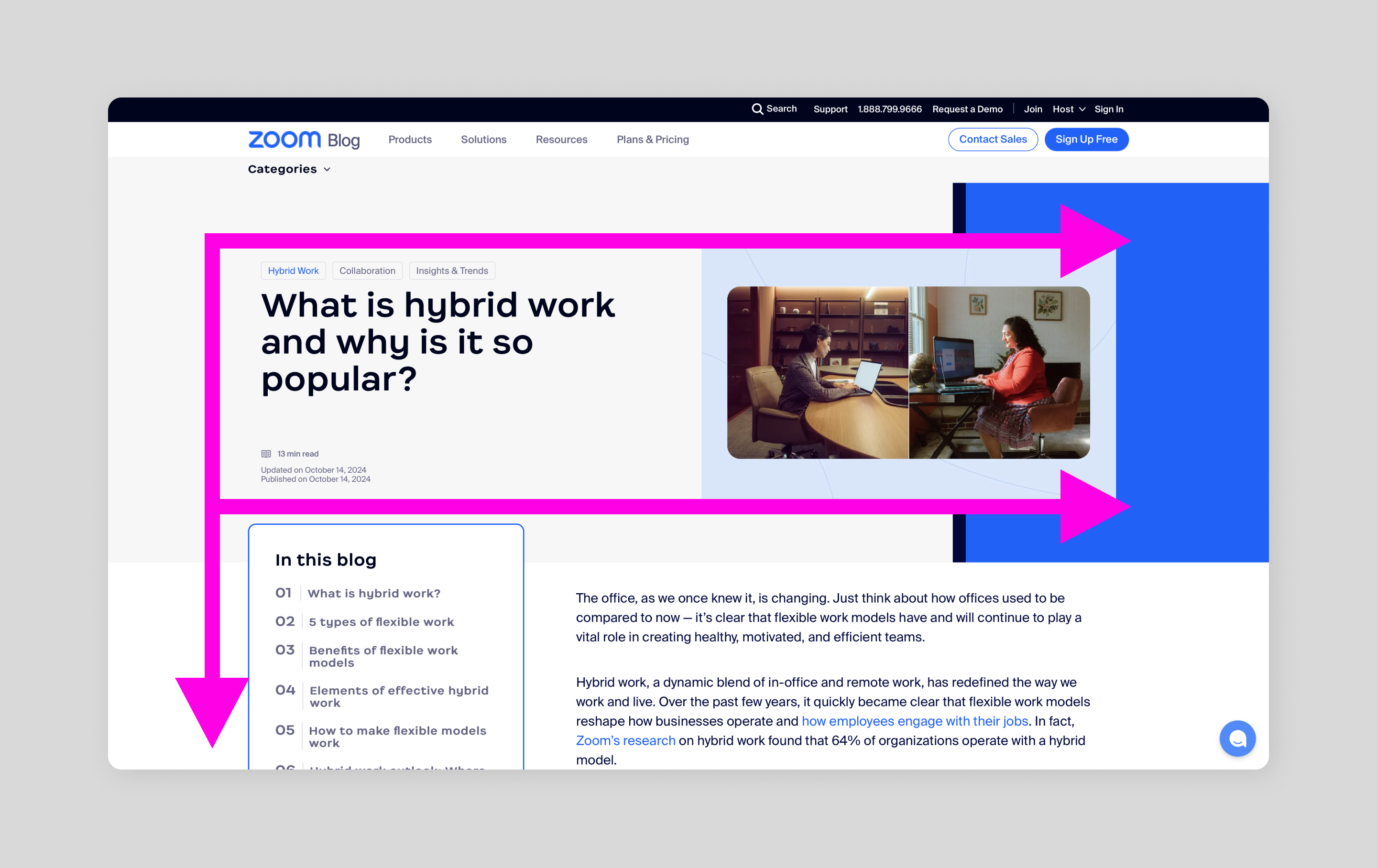
Best for: long-form content, landing pages, and navigation menus
Similar to the Z-pattern, you may also naturally read web pages in an F-shape. First across the top, then halfway across, then down the left side? You can use this natural reading pattern as your design guide, placing your most important content where the human eye already wants to go.
This layout is especially great for sites with long-form content, product pages, and landing pages because it helps readers quickly scan through information to find the key points.
For example, Zoom’s blog pages strategically use headlines and in-post images, making it easier for site visitors to get the main ideas at a glance.
Idea 11: Interactive layout
Best for: gaming sites, e-commerce websites, and educational websites
Interactive layouts create an immersive experience and are becoming more prevalent in modern Web design. Through buttons, scrolling effects, sliders, and animations, these designs invite people to explore and engage, great for creating a fun and memorable user experience that can lead to higher conversions.
This approach works everywhere—from gaming sites that let players sample new titles, to online stores with virtual try-ons, to learning platforms with hands-on quizzes.
Take PamPam as an example. Visitors can zoom in on specific locations and explore different locations around the world to discover activities that match their interests.
When designing interactive pages, just remember to keep it simple. Provide clear instructions and straightforward controls to make sure everyone can join the journey.
Idea 12: Animated layout
Best for: homepages and landing pages
Similar to interactive websites, animated layouts use animated features to capture a user’s attention and create an enjoyable user experience. This could look like motion graphics to create visual interest, unique transitions as users scroll through a page, or hover effects and click animations to provide engaging visual cues.
Look at Atlassian. This software company uses animation to showcase its products in action. These little motions of movement help tell the brand story and encourage users to keep exploring.
Quick tip: When designing with animation, keep them light to avoid affecting site loading time. A little movement goes a long way.
5 tips for designing a website layout
With so many website layout options to choose from, here’s what to keep in mind:
- Put the user first. Get familiar with who is visiting your site. Create user personas to understand their needs and habits, then shape your design around what makes their life easier.
- Look good everywhere. Choose a responsive website design so the site feels at home on any screen. Pick a responsive design that adapts smoothly whether someone's on their phone or their desktop. This ensures your website is viewable across all devices and screen sizes.
- Remember the rule of thirds. This composition technique helps create visual interest by dividing a page into nine equal parts, creating a more balanced layout when important elements are placed along the gridlines.
- Balance white space. White space helps create space between elements on a web page. Ensure you have enough white space, as this will prevent the page from feeling cluttered and improve user navigation.
- Test, learn, tweak. Watch real people use your site. User testing will help you gather the insights you need to uncover usability or navigation issues. Then fine-tune based on what you learn.
Design your website layout with Figma
Now that you've got a toolkit of layout ideas, it's time to bring your website to life. A great layout does double duty—it catches the eye while making navigation effortless.
Ready to start designing your website? Here’s how Figma can help:
- Use Figma’s wireframe kits for grid and spacing templates to inform your website design.
- Create a captivating website layout with Figma’s design tool, then use the prototyping tool to test it, ensuring it’s easy to use and adapts properly to different screen sizes.
- Simplify the design-to-development handoff with Dev Mode, and watch your website come to life.
Keep reading

What is Web design and development?
Learn the key differences between Web design and development.
Learn more

What is responsive website design?
Learn how to ensure your website adapts seamlessly to any screen size.
Learn more

What is UX design?
Learn key principles, skills, and how to use Figma for UX design.
Learn more