Gray is a smoky, neutral color created by mixing black and white, giving it a balanced quality. It is achromatic, meaning it technically has no color, so it does not appear on the color wheel. While gray can convey formality and sophistication, its neutrality may also evoke feelings of sadness or monotony in certain contexts.

Color variations
Shades
Tints
Tones
Hues
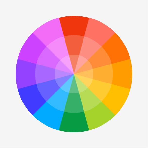
Color harmonies
Complementary
Split
Monochromatic
Analogous
Triadic
Square
Custom palettes
Grayscale
Sharp Edge
Gray Matters
Gray is defined by the following color codes and values to ensure consistency across various digital platforms and devices.
- HEX code: #898989
- RGB value: 53.7% red, 53.7% green, and 53.7% blue
Accessibility considerations play a crucial role in UX and UI design color choices. Figma offers plugins in the Community to make sure your designs meet Web Content Accessibility Guidelines.
Here are some ways to use gray in your designs:
- Create a minimalist aesthetic. Gray can create a clean and modern look, perfect for interfaces that prioritize simplicity and focus on content.
- Set the mood. Gray can create a sense of sophistication and seriousness or evoke feelings of sadness.
- Use it as a base. This neutral and balanced shade is an excellent choice for elements like backgrounds and text, providing a clean, unobtrusive appearance that supports various design styles and color palettes.
Keep in mind that color and its meaning can change from culture to culture—and at any given time. If you are designing for a global audience, research color considerations for your specific regions.
For variations within the same smoky spectrum as gray, consider:
- Cool gray (#CBCBCB) is a lighter version of gray, adding a touch of airiness.
- Silver (#C4C4C4) is a brighter gray hue that adds a bit of elegance.
- Pewter (#909EAE) is a grayish hue with a subtle blue undertone.
- Slate (#6D8196) is a deeper, cooler gray with a hint of blue.
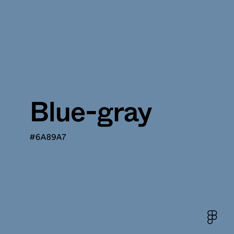
Gray is a neutral color, which allows it to play well with just about any color on the spectrum. Here are some ideas to spark your creativity:
- Blue-gray (#6A89A7) complements the coolness of gray while adding vibrancy, perfect for clean and modern aesthetics.
- Burnt sienna (#ED7B58) adds a warm and earthy touch that complements gray’s neutrality.
- Gunmetal (#353E43) provides depth and dimension, creating a sophisticated and professional feel.
- Crimson red (#B22222) offers a burst of energy without overwhelming the calmness of gray.
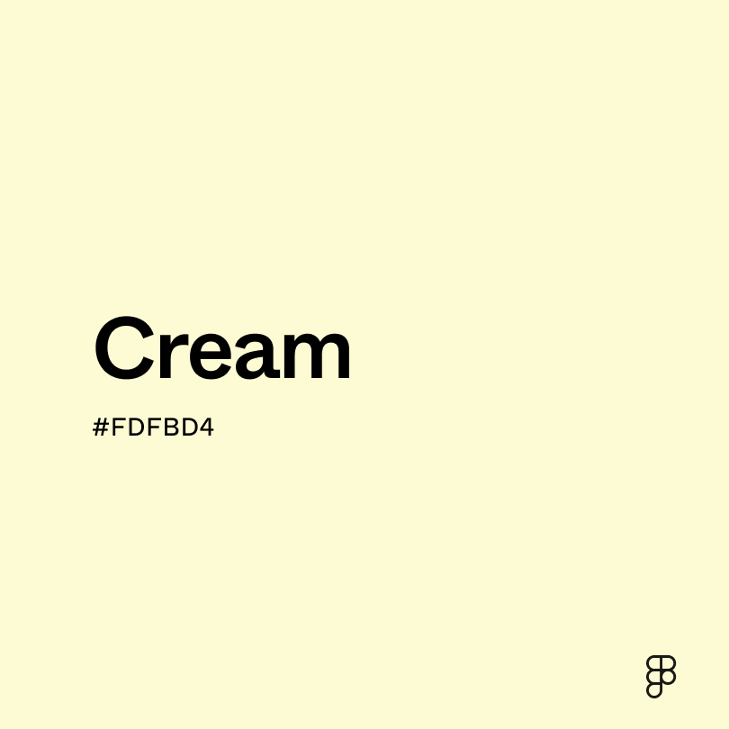
Other colors to consider include off-white for an elegant effect, aqua for a bright contrast, and subtle greens to complement the neutrality of gray, like moss on a stone.
While gray is neutral, it may clash with extremely saturated colors like:
- Neon green (#2CFF05) disrupts the neutrality of the gray, creating an intense contrast.
- Indigo (#560591) is a deep color, creating discord instead of complementing gray’s cool neutrality.
- Rose (#FF1D8D) clashes with the coolness of the gray, resulting in visual tension.
- Yellow (#FFFF00) overpowers mid-tone gray, producing a harsh contrast.
Gray symbolizes neutrality and balance, conveying impartiality and sophistication. It’s commonly used in professional settings to establish authority and trust.
In color psychology, gray represents impartiality and is often linked to the judicial system, fairness, and truth-seeking. Lighter grays evoke calmness and security, while darker tones might bring feelings of gloom and pessimism due to their lack of vibrancy.
In UI design, gray can improve readability and convey professionalism. However, excessive use of gray can make designs uninspiring or depressing. Lighter shades work well for backgrounds, while darker ones can add seriousness. Use dark grays sparingly to avoid creating a dull user experience.
The word “gray” originates from the Germanic languages, specifically from the Old English “græg,” which means “to dawn” or “to grow light.” The first recorded use of “gray” in English dates back to around 700 AD.
Gray has been a staple in fashion, from the simple tunics of peasants to the elegant gowns of nobility. Artists have used it for shading and depicting nature, while architects have incorporated gray stones and bricks into buildings across different eras. Even in jewelry, pearls and gemstones appear in various shades of gray.
Today, gray reflects modern efficiency and innovation while conveying professionalism, sophistication, and luxury. Lighter grays continue to be popular for their minimalist aesthetic, while darker tones can conjure a sense of urban living.
Contrast checker
Contrast 3.5
- Large Text
#898989
- Normal Text
How you design, align, and build matters. Do it together with Figma.
| Category | ||
|---|---|---|
Fail | Fail | |
Pass | Fail | |
Pass | Fail |
Contrast 6
- Large Text
#898989
- Normal Text
How you design, align, and build matters. Do it together with Figma.
| Category | ||
|---|---|---|
Pass | Fail | |
Pass | Pass | |
Pass | Pass |
Color simulations
Protanopia
Deuteranopia
Tritanopia
Achromatopsia
The hexadecimal color #898989, known as gray, has RGB values of R:137 G:137, B:137 and CMYK values of C:0, M:0, Y:0, K:46.
| VALUE | CSS | |
|---|---|---|
| HEX | 898989 | #898989 |
| RGB DECIMAL | 137, 137, 137 | RGB(137, 137, 137) |
| RGB PERCENTAGE | 53.7, 53.7, 53.7 | RGB(53.7%, 53.7%, 53.7%) |
| CMYK | 0, 0, 0, 46 | |
| HSL | 0°, 0, 53.7 | HSL(0,0%,53.7%) |
| HSV (OR HSB) | 0°, 0, 53.7 | |
| WEB SAFE | 999999 | #999999 |
| CIE-LAB | 57.091, -0, -0.005 | |
| XYZ | 23.777, 25.016, 27.241 | |
| xyY | 0.313, 0.329, 25.016 | |
| CIE-LCH | 57.091, 0.005, 266.929 | |
| CIE-LUV | 57.091, -0.004, -0.008 | |
| HUNTER-LAB | 50.016, -2.672, 2.718 | |
| BINARY | 10001001, 10001001, 10001001 | |
| iOS - SwiftUI | Color(red: 0.537, green: 0.537, blue: 0.537) | |
| iOS - UIKit | UIColor(red: 0.537, green: 0.537, blue: 0.537, alpha: 1) | |
| Android - Compose | Color(0xFF898989) |