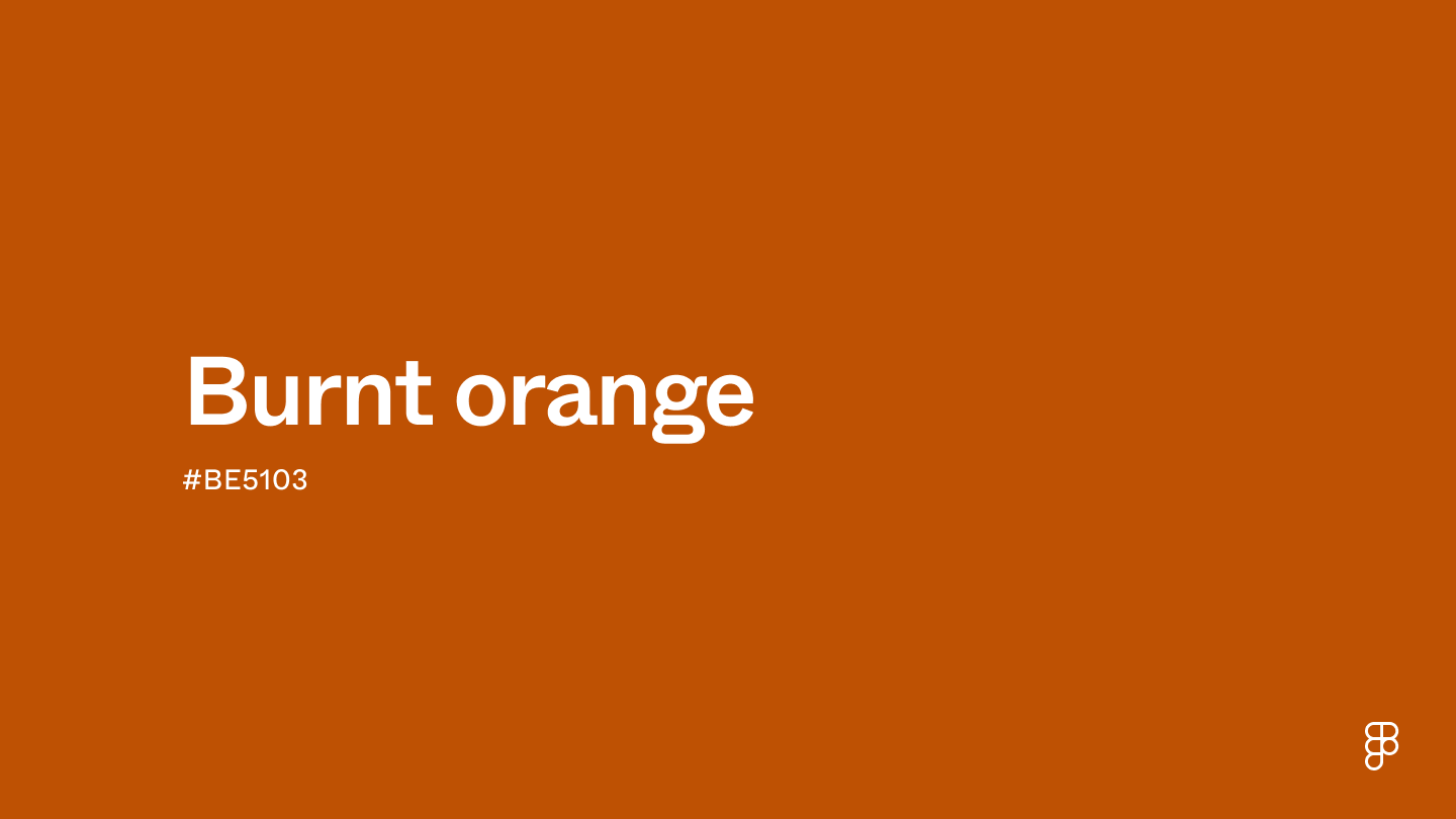
Burnt orange is a deep, warm shade that combines the vibrancy of orange with a subtle infusion of brown, giving it a rich, earthy quality. It's positioned in the red-orange side of the color wheel, exuding a sense of energy and enthusiasm while maintaining a cozy and inviting feel.

Color variations
Shades
Tints
Tones
Hues
Color harmonies
Complementary
Split
Monochromatic
Analogous
Triadic
Square
Custom palettes
Pumpkin Spice Season
Pottery Studio
Aztec Sun
Burnt orange is defined by the following color codes and values to ensure consistency across various digital platforms and devices.
- HEX code: #BE5103
- RGB value: 74.5% red, 31.8% green, and 1.2% blue
Accessibility considerations play a crucial role in UX and UI design color choices. Figma offers plugins in the Community to make sure your designs meet Web Content Accessibility Guidelines.
Here are some ways to use burnt orange in your designs:
- Create visual interest. Leverage burnt orange’s boldness for CTAs, progress bars, or important notifications. Pair it with cool tones for a strong contrast and clear visual hierarchy.
- Foster warmth and comfort. Use burnt orange as a background for areas you want users to linger, like product pages or reading sections. Choose lighter shades for a more inviting feel.
- Encourage user interaction. Burnt orange’s vibrancy makes it a great accent color for buttons, icons, or hover effects, drawing attention and prompting user interaction. It complements cool blues and grays for balanced CTAs.
- Maintain balance. Use burnt orange sparingly and balance it with neutrals like white, gray, or beige for a harmonious palette.
Keep in mind that color and its meaning can change from culture to culture—and at any given time. If you are designing for a global audience, research color considerations for your specific regions.
For variations within the same warm spectrum as burnt orange, consider:
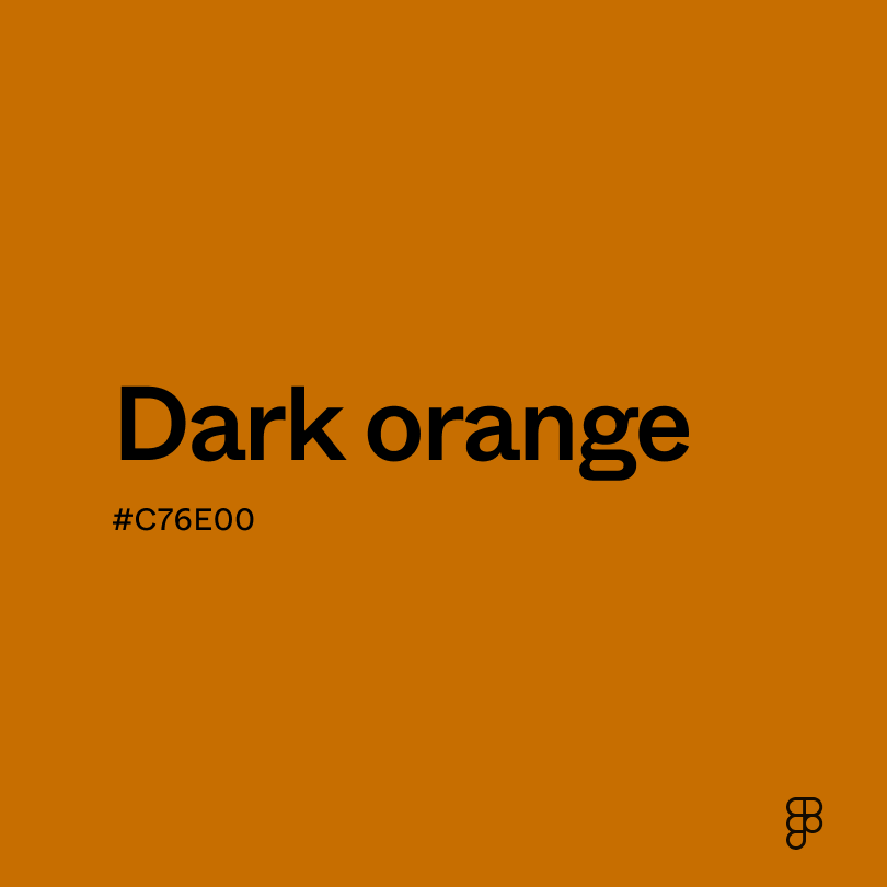
- Dark orange (#C76E00) is a deeper, richer orange with less brown.
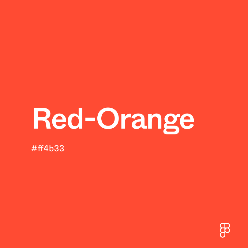
- Red-orange (#FF4D00) is a vibrant, fiery orange leaning more toward red.
- Cinnamon (#D47E30) is a softer, more muted orange with brown tones.
- Brown (#895129) exists in the warm undertones of burnt orange.
To complement burnt orange, consider pairing it with:
- Forest green (#2E6F40) creates a calming and organic vibe, perfect for fall-inspired palettes.
- Taupe (#54463A) adds a touch of elegance, allowing burnt orange to take center stage.
- Teal (#069494) creates a modern and vibrant combination that’s perfect for contemporary designs.
- Cream (#FDFBD4) softens the intensity of burnt orange and creates a warm and inviting palette.
Other colors worth considering include navy blue for a touch of formality, muted greens like sage to create an earthy feel, and charcoal gray for a cool contrast that grounds the warmth of burnt orange.
While burnt orange is warm and rich, it may clash with:
- Orange (#FFA500) competes for attention since it occupies a similar color space but lacks the richness of burnt orange.
- Neon green (#2CFF05) is an intense saturation that will overwhelm the warmth of burnt orange.
- Lavender (#D3D3FF) is a soft color that can clash with burnt orange’s warmth and richness.
- Burgundy (#660033) is another strong color that can create an overwhelming and unbalanced look when paired with burnt orange.
Burnt orange symbolizes warmth, energy, and the cozy ambiance of autumn. Its closeness to orange brings a burst of vibrancy, while the hint of brown adds an earthy depth. Depending on the shade, burnt orange’'s brown influences can symbolize strength and determination.
Burnt orange evokes a sense of security and relaxation, similar to a crackling fireplace. The vibrancy of the orange undertones can also promote creativity and social interaction.
In design, burnt orange’s versatility makes it a popular choice in various design applications. Its richness can evoke warmth and encourage user interaction. When paired with cool blues and grays, it creates a balanced and inviting user experience.
While the term “burnt orange” was coined later, the color, naturally found in clay and ochre, has been used for millennia in art forms like cave paintings and pottery. This rich, earthy hue has been a staple in art throughout history, including during the Renaissance and impressionist periods.
The specific term "burnt orange" was officially recognized in English around 1915. The color gained significant branding appeal when the University of Texas adopted it as the official color for their Longhorns football team in 1966, even trademarking it to solidify the team's visual identity.
Burnt orange was a prevalent color in the 1970s, frequently appearing in fashion and interior design. While brighter orange shades became more popular in the 1980s, burnt orange made a comeback in 2019, when Etsy named it a top trending color.
Contrast checker
Contrast 4.81
- Large Text
#BE5103
- Normal Text
How you design, align, and build matters. Do it together with Figma.
| Category | ||
|---|---|---|
Pass | Fail | |
Pass | Pass | |
Pass | Pass |
Contrast 4.37
- Large Text
#BE5103
- Normal Text
How you design, align, and build matters. Do it together with Figma.
| Category | ||
|---|---|---|
Fail | Fail | |
Pass | Fail | |
Pass | Fail |
Color simulations
Protanopia
Deuteranopia
Tritanopia
Achromatopsia
The hexadecimal color #BE5103, known as burnt orange, has RGB values of R:190 G:81, B:3 and CMYK values of C:0, M:57, Y:98, K:25.
| VALUE | CSS | |
|---|---|---|
| HEX | BE5103 | #BE5103 |
| RGB DECIMAL | 190, 81, 3 | RGB(190,81,3) |
| RGB PERCENTAGE | 74.5, 31.8, 1.2 | RGB(74.5%,31.8%,1.2%) |
| CMYK | 0, 57, 98, 25 | |
| HSL | 25°, 96.9, 37.8 | HSL(25,96.9%,37.8%) |
| HSV (OR HSB) | 25°, 98.4, 74.5 | |
| WEB SAFE | CC6600 | #CC6600 |
| CIE-LAB | 48.059, 40.766, 57.131 | |
| XYZ | 24.195, 16.841, 2.063 | |
| xyY | 0.561, 0.391, 16.841 | |
| CIE-LCH | 48.059, 70.184, 54.49 | |
| CIE-LUV | 48.059, 90.055, 42.014 | |
| HUNTER-LAB | 41.038, 33.424, 25.746 | |
| BINARY | 10111110, 01010001, 00000011 | |
| iOS - SwiftUI | Color(red: 0.745, green: 0.318, blue: 0.012) | |
| iOS - UIKit | UIColor(red: 0.745, green: 0.318, blue: 0.012, alpha: 1) | |
| Android - Compose | Color(0xBE5103) |