32 futuristic fonts to make your designs pop


Share 32 futuristic fonts to make your designs pop
Explore more from
Design basics
Design and prototype with consistent type
Bring type to life in every interaction.

Typography sets the tone of a design. If you’re aiming for something bold, sleek, or otherworldly, futuristic fonts can help your work stand out.
Futuristic fonts offer a blend of high-tech and experimental elements. Most are sans serif with geometric shapes, sharp angles, or sci-fi-inspired details, often built to shine on digital screens.
Whether you're designing for a space-themed campaign, a video game, or a forward-looking brand, the right font can make your project feel truly next-gen.
Read on to learn:
- 32 futuristic fonts
- How to use futuristic fonts in your designs
Font 1: Climate Crisis

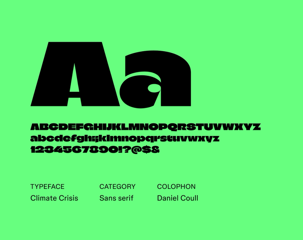
Climate Crisis is a concept font designed to reflect environmental data. Each font weight corresponds to a specific year, showing the decline of Arctic sea ice from 1979 into the future. As the ice shrinks, the letterforms grow thinner. It’s not meant for long text, but it’s a powerful choice for bold, time-stamped visuals that highlight the urgency of climate change.
Best for: Posters, banners, social media graphics, headlines
Font 2: Unbounded

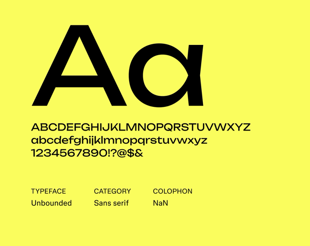
Unbounded mixes geometric precision with humanist curves, creating a modern yet friendly feel. As a variable font, it’s flexible across weights and styles. Plus, with broad language support, it’s a solid choice for global designs.
Best for: Branding, websites, editorial layouts
Font 3: Doto

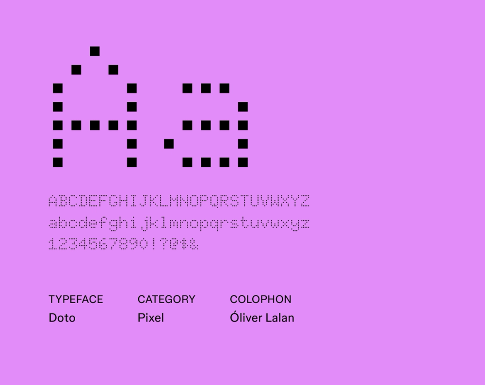
Doto is simple and geometric, with a large x-height that boosts legibility. It works well in body text, but its structure also holds up in subheads or clean, minimal layouts.
Best for: Websites, interfaces, editorial layouts, headlines
Font 4: Pixelify Sans

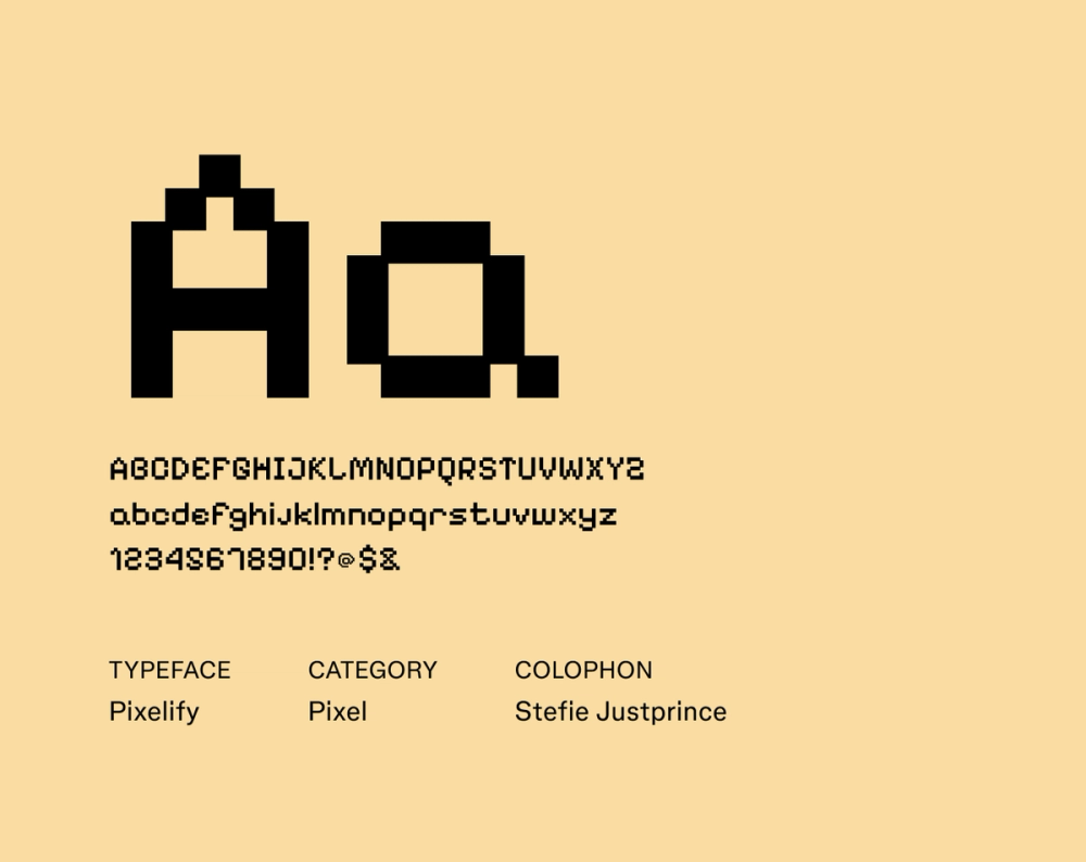
Pixelify Sans is pure retro energy. Built from pixel-like squares, it’s a throwback to the 8-bit and 16-bit graphics of early video games and computer screens. While it’s not meant for paragraphs, it makes short, bold copy feel instantly digital and nostalgic with a dash of fun.
Best for: Video games, pixel art, digital art, graphic design
Font 5: Space Mono

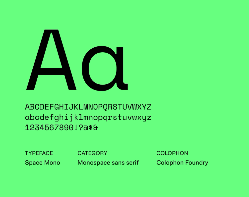
Inspired by the visual language of 1960s space exploration and early computer interfaces, Space Mono is a fixed-width typeface with a distinctly retro-futuristic feel. Its monospace structure gives it a technical edge, but it’s surprisingly versatile, suitable for display and short body text in design systems.
Best for: Websites, interfaces, graphic design, video game design
Font 6: Funnel Display

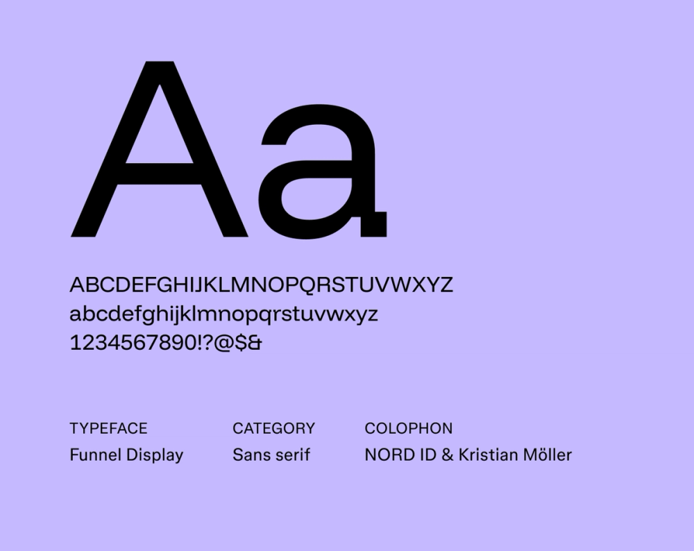
Funnel Display uses condensed proportions and sharp angles to create a strong visual impact. Its bold structure works well in tight spaces and commands attention in high-energy layouts.
Best for: Headlines, titles, posters
Font 7: Monoton

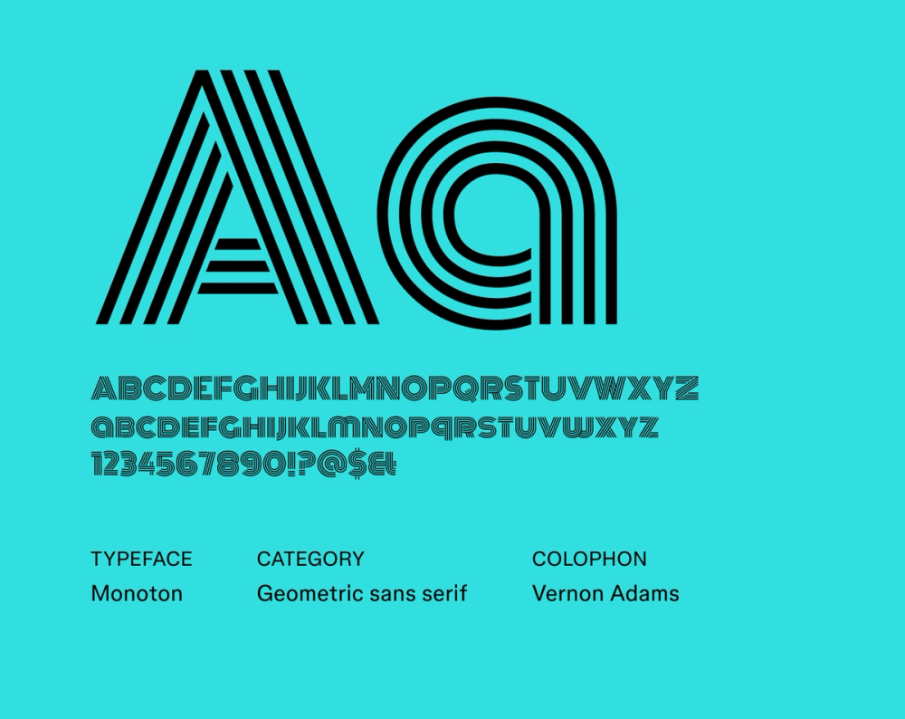
Monoton, designed by Vernon Adams and released through Google Fonts in 2011, channels the highly stylized look of 1930s metal press plates and Art Deco-era film titles. With uniform strokes and an all-caps design, it delivers a retro-futuristic effect. It shines when used sparingly and at larger sizes, making it ideal for headlines, titles, and branding.
Best for: Posters, headlines, websites
Font 8: Orbitron

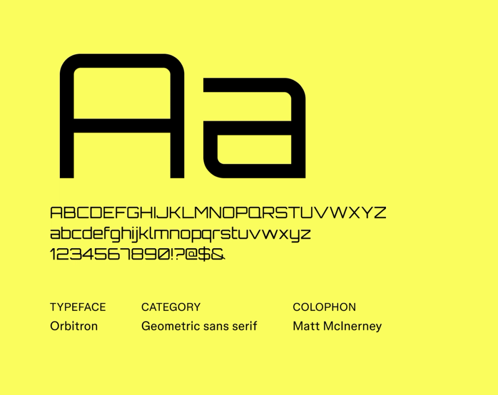
Orbitron is a geometric sans serif font inspired by classic sci-fi and vintage digital displays—think video games, HUDs, and early tech interfaces. Its clean lines, rounded corners, and angular shapes give it a distinctly space-age look. Available in multiple weights, it works well for bold titles where you want a futuristic edge without sacrificing legibility.
Best for: Websites, packaging, video game design, headings and titles
Font 9: Electrolize

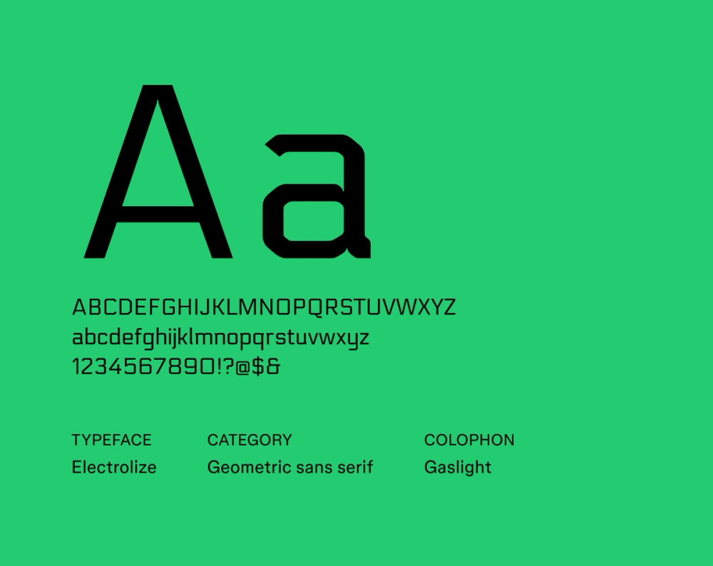
Inspired by lettering seen on a Russian commuter train, Electrolize is a geometric sans serif designed by Valery Zaveryaev. Its squared shapes and modular structure give it a modern, industrial tone that reads cleanly across digital platforms.
Best for: Digital interfaces, branding, graphic design
Font 10: Audiowide

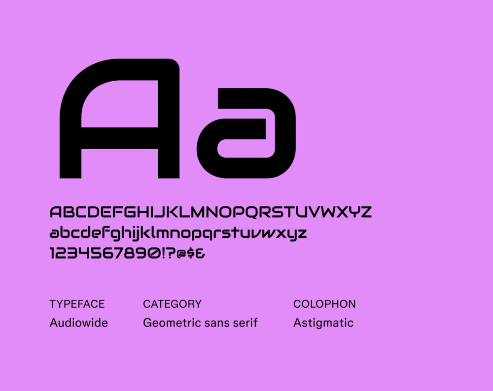
Audiowide is a display font designed by Astigmatic, known for its stylized nod to LED and segmented digital displays. The wide, blocky letterforms and rounded corners give it a distinct retro-futuristic feel, blending classic elements with a modern touch. Meant for big, bold moments, it is best used in short headlines where shape and style matter most.
Best for: Headlines, titles, posters, album covers, websites, user interfaces
Font 11: Michroma

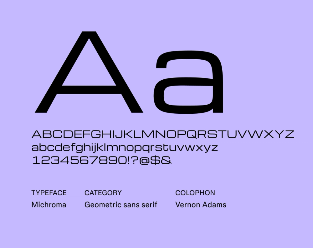
Michroma is a geometric sans serif typeface designed by Vernon Adams. It draws inspiration from technical drawings and digital interfaces. Its sharp, structured forms give it a distinctly futuristic tone while still maintaining clarity. As a display font, Michroma looks great in headlines in large sizes, but it also holds up well in smaller sizes for things like app interfaces.
Best for: Digital displays, user interfaces, branding, marketing materials
Font 12: Zen Dots

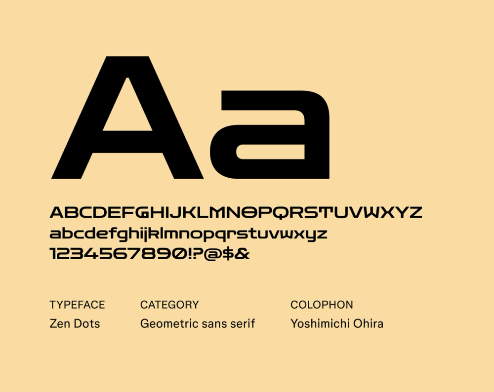
Zen Dots is a sleek sans serif typeface with a futuristic aesthetic. Its design is marked by simplicity, geometric letterforms, sharp angles, and a focus on clarity and visual balance. Zen Dots’ clean lines are legible in both large and small sizes and can be used for a variety of applications, from tech startups and futuristic fashion labels to sci-fi convention marketing.
Best for: Logos, branding, websites, interfaces
Font 13: Geo

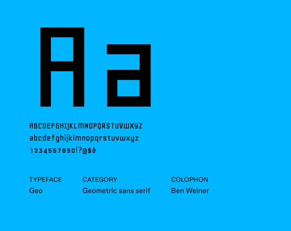
Geo, designed by Manfred Klein, is a minimalist geometric sans serif font that harkens back to the experimental typefaces of the 1920s, drawing inspiration from artists like Theo van Doesburg and Herbert Bayer. It is direct and bold, characterized by simple geometric forms, clean lines, and a focus on functional clarity.
Best for: Posters, headlines, logos, branding, publications
Font 14: Tektur

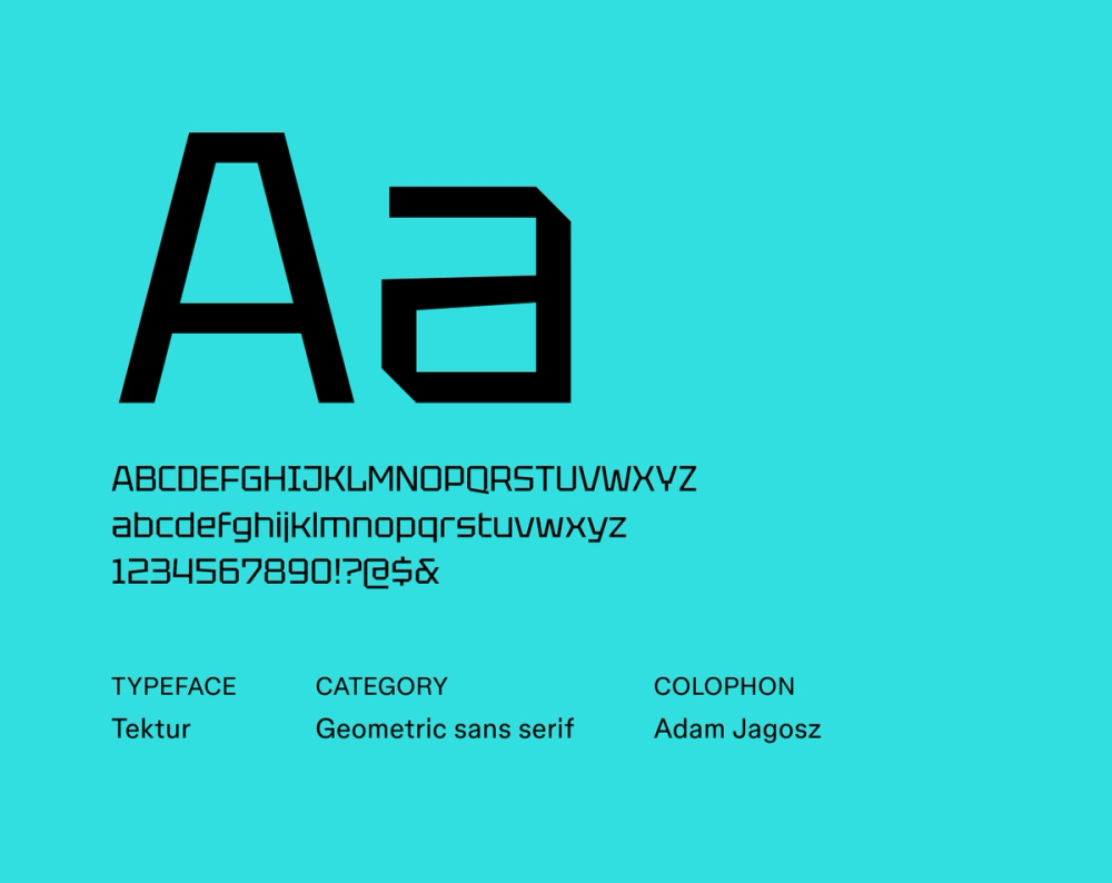
Tektur is known for its blocky letterforms with sharp edges and geometric shapes. It lends a strong futuristic and industrial vibe to any project. Tektur works well for display purposes, such as headings, titles, posters, and website banners, where its commanding presence can effectively grab attention.
Best for: Headings, titles, logos, posters, branding
Font 15: Gugi

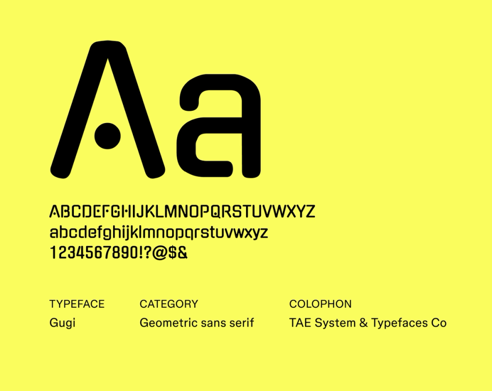
Gugi is a unique font that draws inspiration from Hangul, the Korean writing system. The designers aimed to capture Hangul’s organic movement and visual flow by using a ball as the core element in its construction. The overall aesthetic is both contemporary and approachable, suitable for various applications in digital and print media.
Best for: Websites, branding, signage, editorial layouts
Font 16: Tomorrow

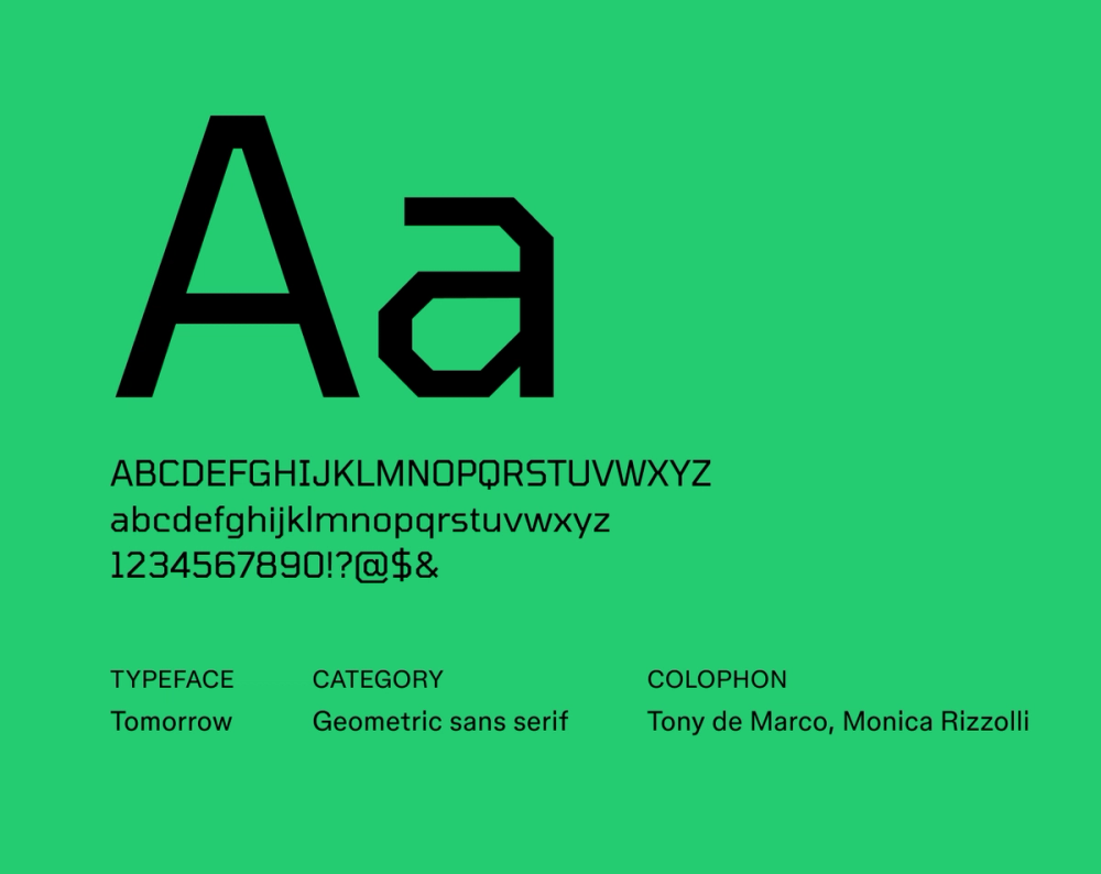
The Tomorrow font’s sharp geometric letterforms and unique glyphs show clear inspiration from science fiction and futuristic themes. Its clean and minimalist look makes it a popular choice for designs that aim to evoke a sense of innovation, technology, and the future.
Best for: Headlines, titles, posters, logos, branding
Kick-start your typography system and learn how to scale typography across multiple applications and devices.
Font 17: Nova Square

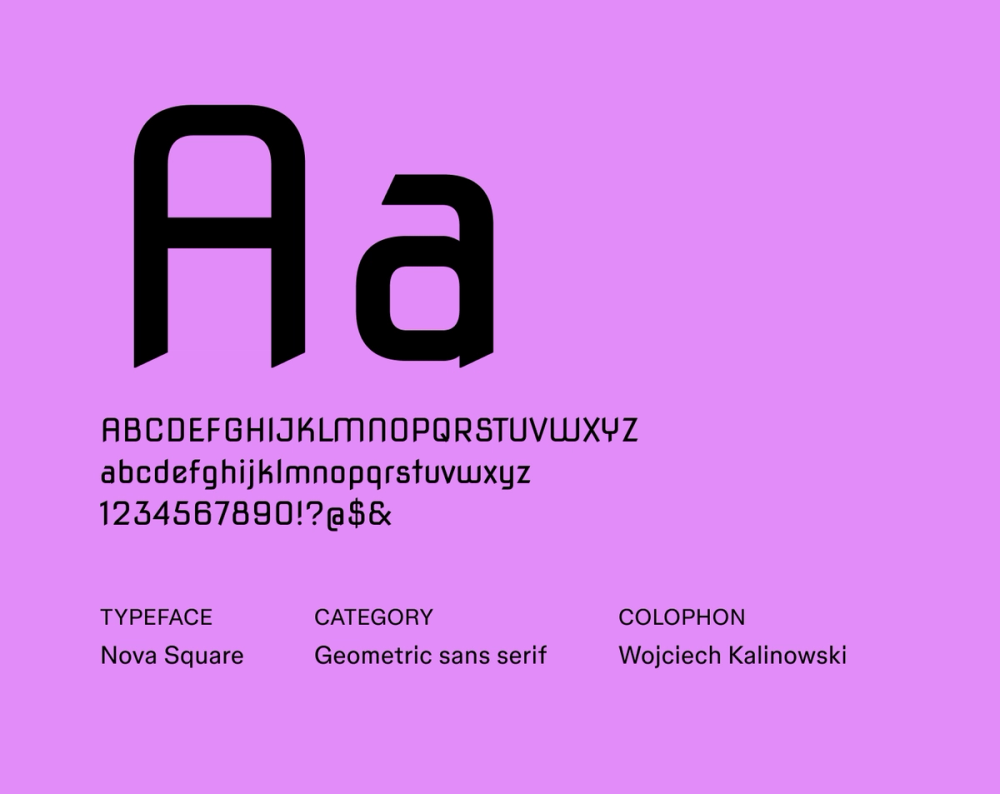
Despite its crisp, futuristic appearance, Nova Square was initially created to carve letters into stone. It was later expanded into a full font family. Nova Square is characterized by its sharp, angular letterforms, monolinear structure, and a slightly industrial feel. The font’s digital adaptation has made it a versatile typeface for display in both print and digital media.
Best for: Headlines, titles, posters, branding
Font 18: Russo One

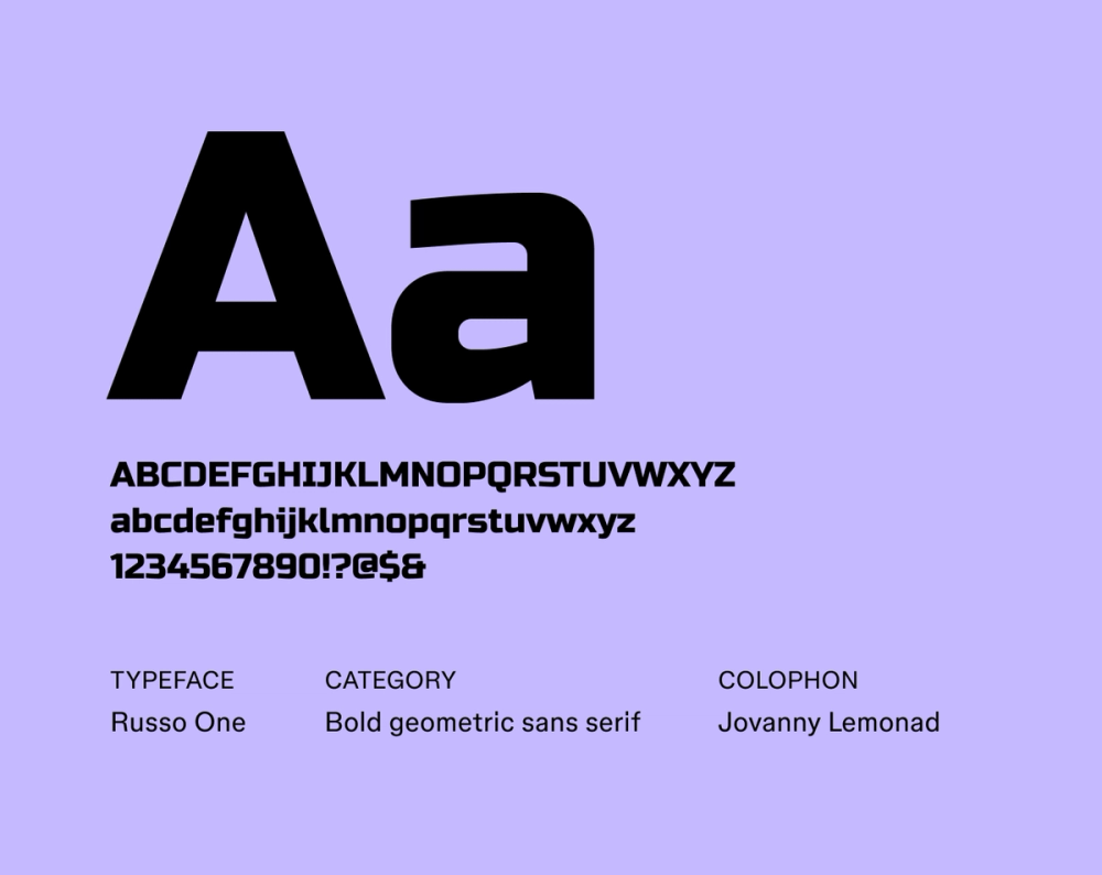
Russo One is a bold, geometric display font with rounded letterforms and a robust, industrial feel. Despite its slightly condensed proportions, it's highly legible, lending a powerful presence to any design. The distinctive blend of sharp angles and smooth curves commands attention in any application.
Best for: Headlines, titles, billboards, posters, logos
Font 19: Turret Road

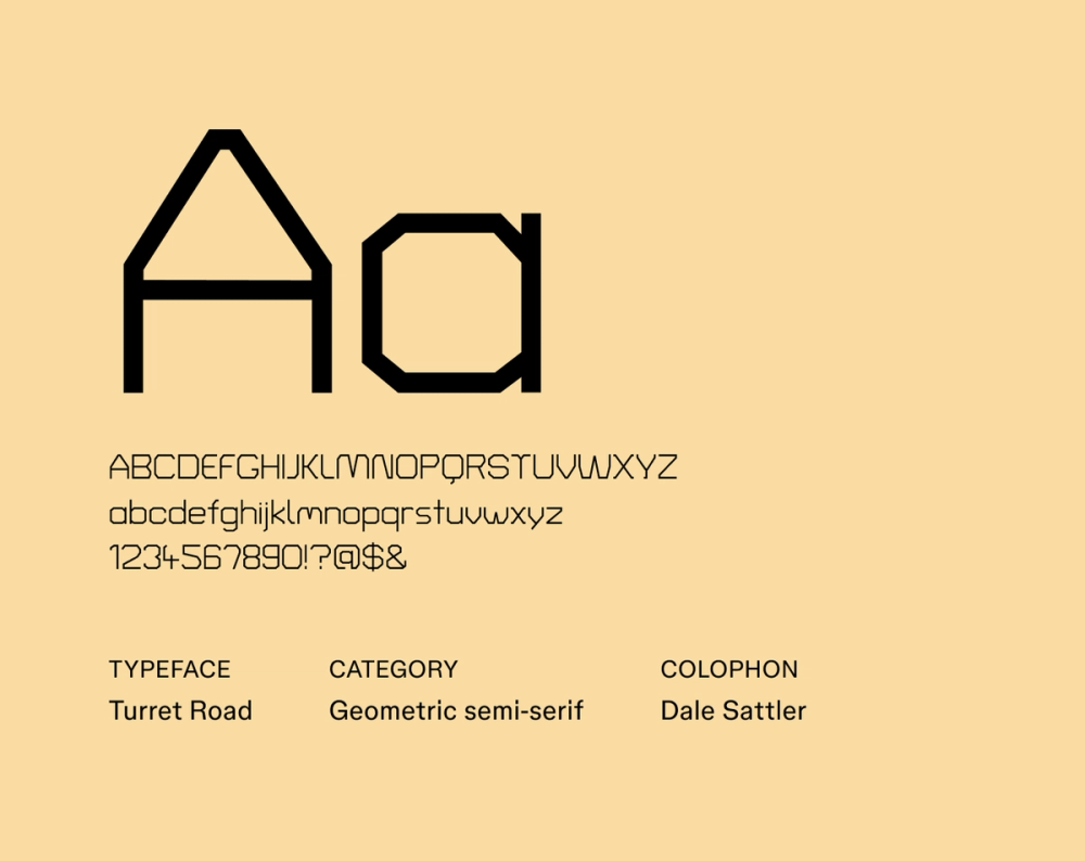
Turret Road presents a clean, modern aesthetic with a playful touch. Created as part of a larger series of site-specific typefaces by Dale Sattler, the font design reflects a contemporary approach to geometric sans serif forms, making it suitable for various applications. Turret Road is characterized by its low contrast, high x-height, and distinctive letterforms with diacritics.
Best for: Websites, mobile apps, body text, branding, editorial design, signage
Font 20: Syne Mono

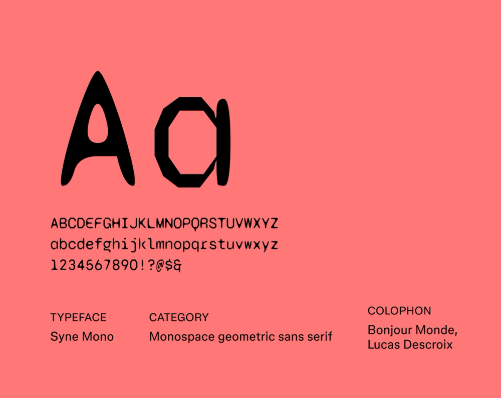
Syne Mono keeps the geometric foundation of the broader Syne family while adopting a fixed-width structure for a distinctly technical and coding-oriented feel reminiscent of vintage typewriters and digital terminals. It is best for coding environments, data displays, and technical documentation, but it is also a unique choice for graphic design projects seeking a retro-futuristic or industrial aesthetic.
Best for: Graphic design, interfaces, websites, headers, titles
Font 21: Smooch Sans

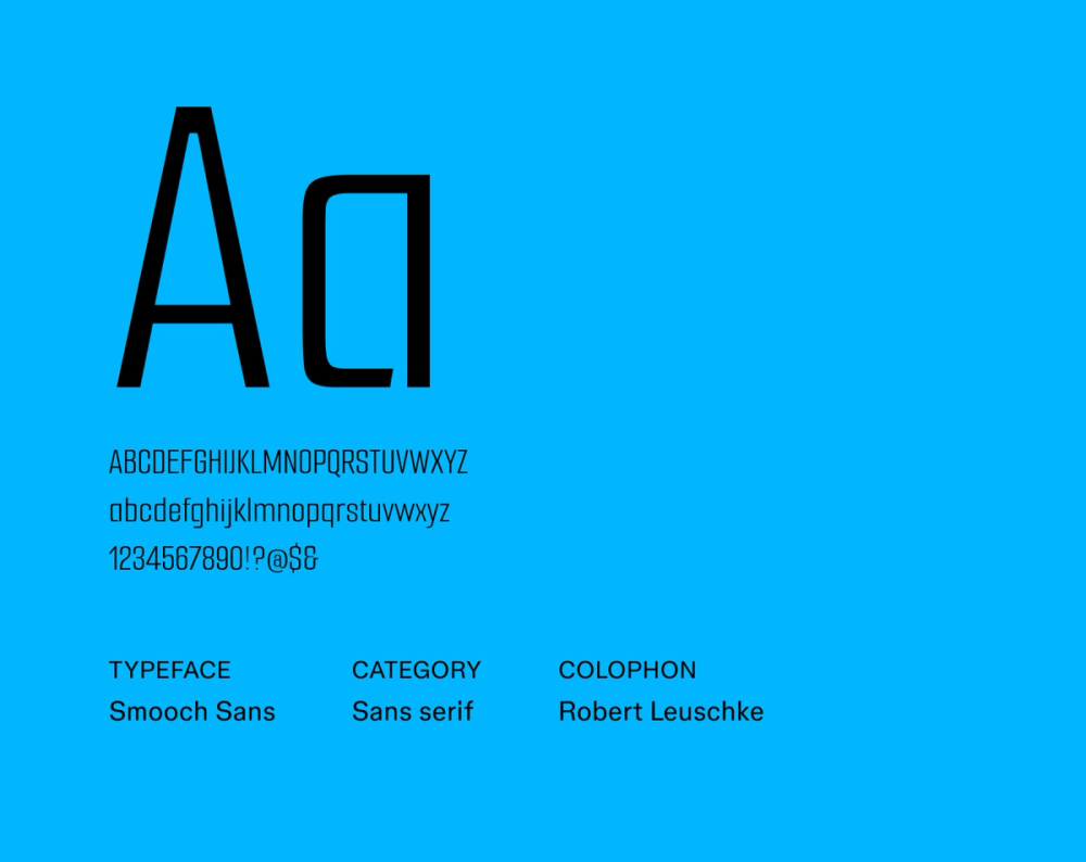
Smooch Sans is a playful sans serif typeface with tall letterforms and a friendly, inviting aesthetic. The rounded forms make the font highly legible and approachable. Smooch Sans is a great fit for any design that needs to feel welcoming, accessible, and lighthearted, particularly those aimed at children or a younger audience.
Best for: Websites, apps, branding, cards, educational materials
Font 22: Krona One

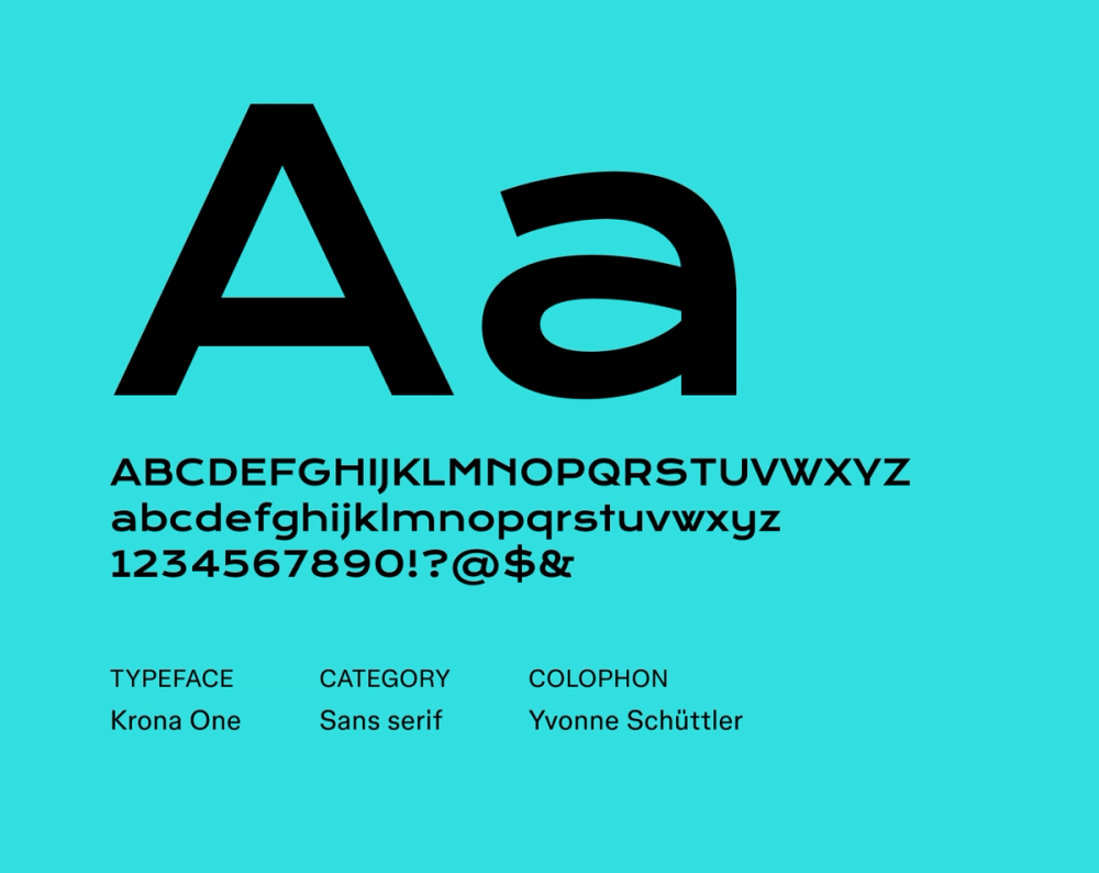
Krona One is a futuristic font designed by Yvonne Schütze. Its strong, angular letterforms and wide stance create a robust and powerful presence. With Krona One, you don’t have to sacrifice legibility to make an impact. The typeface commands attention and conveys a sense of modern, assertive style in any size.
Best for: Headlines, titles, posters, websites, branding, graphic design
Font 23: Wallpoet

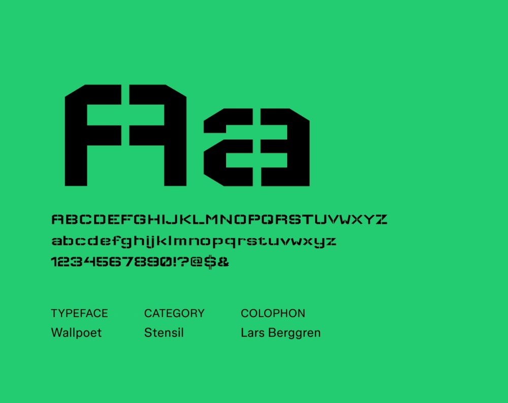
Wallpoet captures the essence of vintage signage. The gaps in the forms resemble how letters are cut out from a stencil, giving it an industrial flair. Wallpoet is great for designers seeking a more rebellious and rough-around-the-edges aesthetic in their futuristic fonts. It’s best suited for larger sizes in headlines, posters, and logo design, rather than extended body text.
Best for: Logos, headlines, branding, menus, posters, packaging
Font 24: Geostar

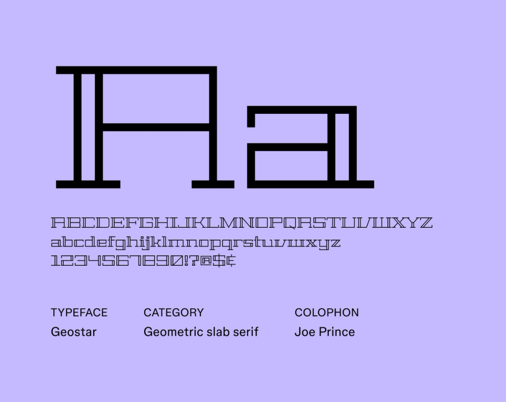
Geostar delivers a sense of futuristic elegance and geometric precision. Sharp, angular letterforms and clean lines feel modern and sophisticated, while the serif font details add unique flair. While legible in smaller sizes, Geostar’s sharp and symmetrical construction truly shines in larger applications, making a bold and impactful statement.
Best for: Headlines, titles, posters, branding, logos, websites
Font 25: Rubik Glitch

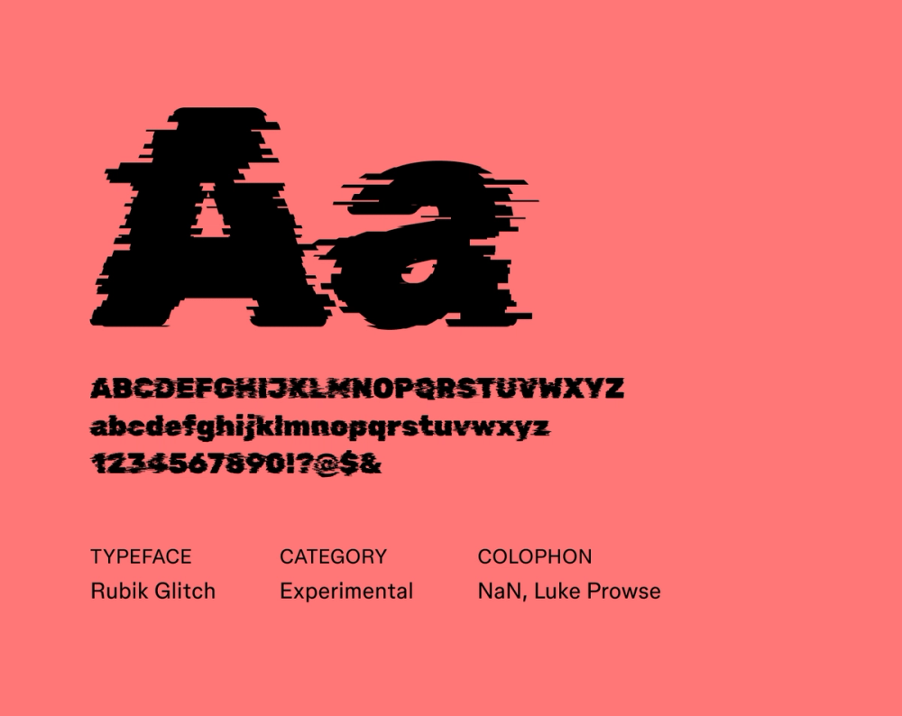
Created using NaN Glyph filters, Rubik Glitch builds upon the original Rubik font design by Hubert & Fischer, Meir Sadan, and Cyreal by adding a layer of distortion. This gives it a unique, edgy appearance, perfect for cyberpunk themes. It’s legible in larger sizes, but Rubik Glitch is not ideal for smaller body text sizes. For more futuristic-looking fonts, check out other variations on the Rubik font below.
Best for: Headlines, event posters, logos, digital art
Font 26: Rubik Broken Fax

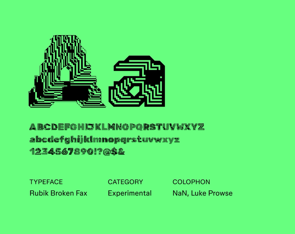
Rubik Broken Fax, another variation of the popular Rubik font, is a display typeface with a unique appearance, almost like bismuth crystals or computer chips. It excels wherever a visually disruptive and attention-grabbing presence is desired, such as posters and creative digital art projects with a rebellious, non-conformist attitude. It works best in larger sizes, where the distorted letterforms and glitched aesthetic can truly shine.
Best for: Posters, album covers, digital art
Font 27: Rubik 80s Fade

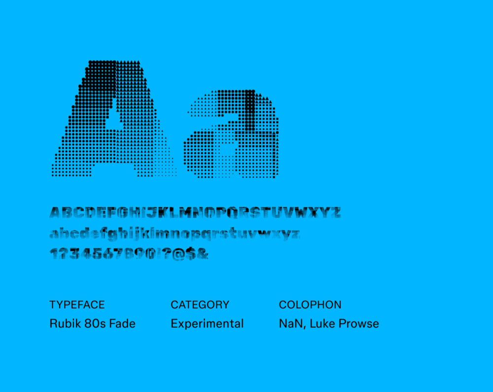
Rubik 80s Fade captures the essence of 1980s retro-futurism in its playful, vibrant aesthetic. Created using NaN Glyph filters, it’s a modification of the original Rubik font design. The designer, Luke Prowse, aimed to evoke the visual language of ‘80s graphic design with halftone textures. As the perfect fit for a synthwave album cover, Rubik 80s Fade’s pixelated and faded aesthetic works best in display applications.
Best for: Posters, album covers, digital art
Font 28: Digital Numbers

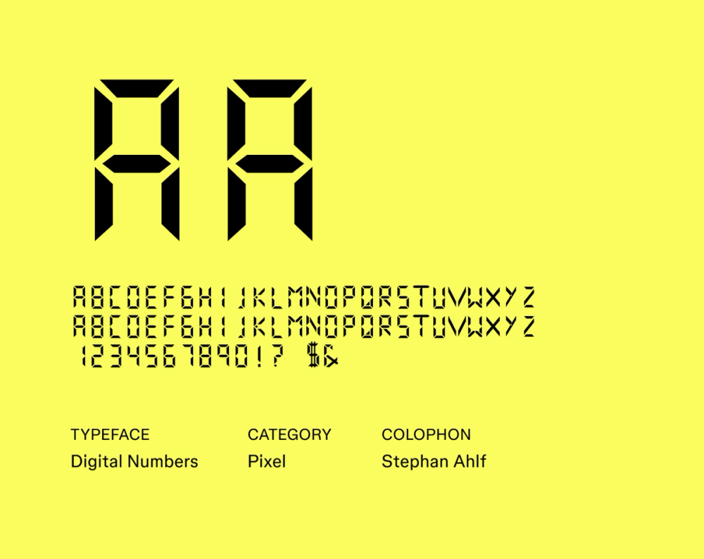
The segmented letterforms of Digital Numbers mimic the appearance of familiar digital displays like calculators and clocks. With a blocky and uniform monospaced structure, it’s primarily intended for large display sizes. While legible in smaller sizes, this font truly shines in larger applications.
Best for: User interfaces, video games, websites, digital art
Font 29: Workbench

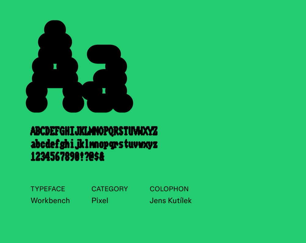
Workbench pays homage to the typography of early home computers, specifically the Amiga Workbench. Its modern variable font technology allows for dynamic adjustments to its weight, width, and even the appearance of scanlines and pixel bleed, two features inspired by CRT monitors. With blocky, pixelated letterforms, sharp corners, and a distinctly retro digital aesthetic, Workbench is best used for display purposes. Avoid using it for body text or long passages of text, as it can be tough to read at small sizes.
Best for: Video games, digital art, headlines, titles, logos, posters, flyers
Font 30: Sixtyfour

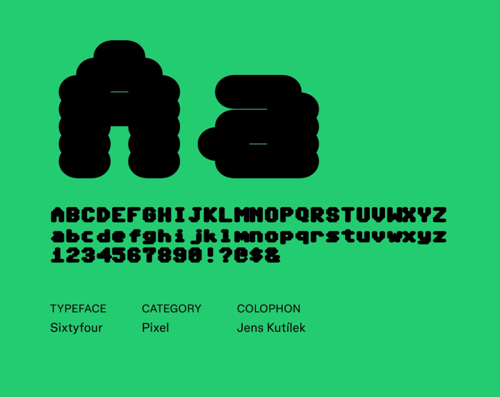
Sixtyfour, also designed by Jens Kutilek, pays homage to the Commodore 64 computer by capturing the essence of its iconic display font. Like Workbench, Sixtyfour is also a variable font, allowing for dynamic adjustments to its weight, width, and the appearance of scanlines and pixel bleed. Use it for a touch of playful nostalgia while still keeping a digital, futuristic vibe.
Best for: Websites, video games, pixel art
Explore the best Figma-approved website fonts to help your brand stand out.
Font 31: DotGothic16

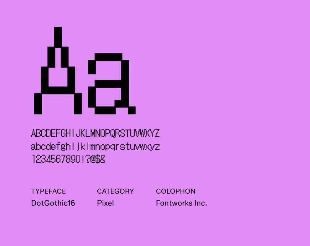
DotGothic16 is based on the classic 16x16 Gothic bitmap font. Think early 8-bit video games, old cell phones, and computer screens. With high readability, blocky pixelated letterforms, and sharp corners, it’s a good option if you’re looking for techy fonts but still want to keep things simple. It is a popular choice for pixel artists and other fans of retro aesthetics.
Best for: Pixel art, video games, interfaces, websites
Font 32: Train One

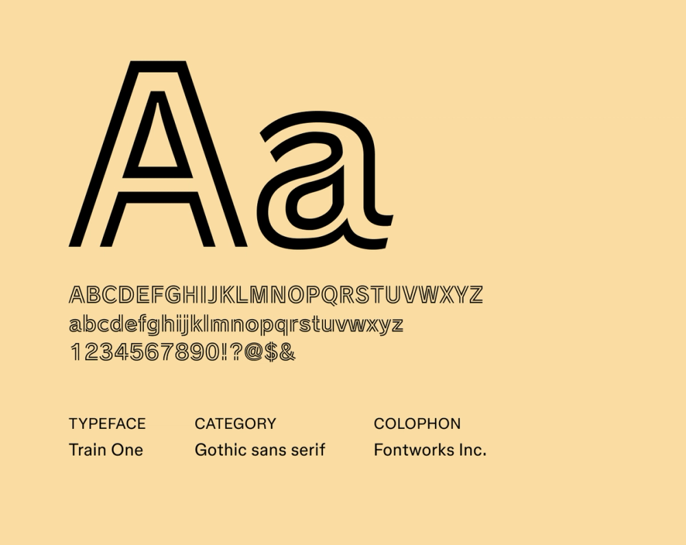
Train One is also known as “Railway” in Japan (not to be confused with the Raleway font). Inspired by the futuristic lettering of vintage railway signage and industrial graphics, Train One is characterized by its strong outlined letterforms with open ends. This adds a dimension of depth and motion to the font design, reminiscent of the “TRON” movie poster.
Best for: Posters, signage, logos, headlines, branding
How to use futuristic fonts
Want to bring futuristic type into your design? Here’s how to make it work:
- Match the font to the vibe. From sleek and minimal to edgy and experimental, choose a futuristic font style that aligns with the theme and tone of your project.
- Avoid long blocks of text. Many futuristic fonts are made for headlines, not paragraphs. Use a cleaner font for body copy to keep things readable.
- Pair thoughtfully. Let your main font do the heavy lifting. Pair it with a simple sans serif or monospace font for balance. Avoid using multiple decorative styles.
- Adjust spacing. Kerning and leading go a long way. Tighten up letters for sleekness, or loosen for a more open, digital feel — just don’t lose readability.
- Test on screen and in print. Some futuristic fonts lose clarity when printed. Run tests across formats to ensure your typography looks sharp in every medium.
Level up your designs with Figma
Now that you’ve explored the typography of the future, it’s time to blast off with your own design ideas. Figma can help. Here’s how:
- Browse the Figma Font Library to find the perfect font for your next project.
- Use Figma’s design tool to access thousands of font styles.
- Join the Figma Community and get inspired by designs and examples of futuristic fonts in action.
Build your next design in Figma
Use futuristic fonts in Figma for free