What are monochromatic colors?


Share What are monochromatic colors?
Explore more from
Design basics
Master color to elevate your designs
Experiment, refine, and apply color palettes in Figma.


If you think about your favorite brand, a color probably comes to mind. Most major brands intentionally use single-color or monochromatic logos to convey a singular, memorable brand personality. Monochromatic color schemes can draw your user’s attention with a bold, cohesive look for social media, web, or graphic design. But where do you start, and what color do you choose?
Read on to learn more about:
- What is monochrome color?
- Benefits of monochromatic design—plus pitfalls to avoid
- 4 monochromatic color scheme examples
- Pro tips to apply monochromatic color to your designs with Figma
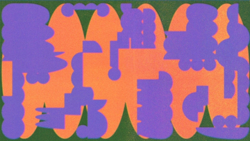
What is a monochromatic color scheme?
The name comes from the Greek words “monos” and “chroma,” meaning “one” and “color.” A monochromatic color scheme uses variations of a single color to create a unified look. First, designers reference color theory to choose a base color for their project. Then they apply different shades, tints, and tones of the base color to create a modern, minimalist color palette.
Monochrome color range: shades, tints, and tones
Savvy designers know: monochrome designs don't have to be monotonous. To lighten the palette, add white to the base color to create a lighter tint. Adding white to a primary color can produce a vivid, memorable pastel. To get darker shades, add black. Adding gray lowers base color saturation, introducing muted tones to your palette.
Why use monochrome colors?
Whether you lean into lighter pastel colors or deeper pigments, a single hue can set a mood. Designers often use monochromatic color schemes to:
- Achieve cohesion and unity for well-balanced, impactful visual experiences.
- Strengthen brand identity by highlighting key content and design elements.
- Connect with users’ thoughts and feelings through color psychology—using warm colors, cool colors, or neutral colors to stir different emotions.
- Simplify the color selection process, making it easier for teams to create stunning designs.
Monochromatic color scheme pitfalls to avoid
Leaning heavily on monochrome colors can lead to a monotonous user experience. Accent colors or color variations can help spark visual interest—just be sure to check contrast for accessibility. You can add undertones to the base color, like mixing yellow or red with gray to warm it up. Test it out before you commit—color shifts can affect your design’s mood and meaning. Adding too much red might cause alarm, while blue might strike a sad note.
Monochromatic color scheme alternatives
If a monochromatic scheme doesn't suit your brand, try another approach to develop your color palette. Analogous color schemes create harmony by using three colors that sit next to each other on the color wheel (such as blue, blue-violet, and violet). For more contrast and vibrancy, try complementary colors, opposite each other on the color wheel.
Apply monochrome colors to your designs with Figma
Want to try out a monochromatic scheme for your next design project? Figma’s professional design resources can help kickstart your color palette:
- Browse Figma’s design basics library to read up on color theory, color symbolism, primary colors, and more.
- Get inspired by the monochrome designs and templates from Figma’s expert design community.
- Explore color with your design team using Figma’s robust design tool.
Keep reading


What is UI design
What is UI design today, and what role does it play in the design thinking process?
Learn more


What is visual hierarchy
If everything looks the same, then you see nothing. Visual hierarchy can change that.
Learn more


UI vs UX
Read on to find out what it takes to design engaging UI, and create a memorable UX.
Learn more
From the blog
The Figma design agent is here
Starting today, work with an agent that is built for Figma—directly on the canvas.

The TL;DR on MCP: Why context matters and how to put it to work
Figma’s MCP server brings your design decisions into the tools where code gets written—so what gets built actually matches what was designed. Here’s what that unlocks for everyone who builds products.
How to supercharge your design system with slots
Slots give you the ability to customize components without breaking the system. We’re sharing five field-tested tips from early users to help you unlock more freedom without giving up control.
The new business case for design systems
Design systems have evolved from static libraries to key drivers of business revenue, customer loyalty, and product strategy. Here’s what you need to know about how to track and communicate the value of your design system, based on new research from the Design Executive Council (DXC).


5 shifts redefining design systems in the AI era
As AI reshapes how we make products, design systems are evolving from libraries of reusable parts into living frameworks that scale taste and craft. We spoke with product leaders and practitioners about the shifts they’re seeing in how design systems are built, used, and maintained.

Schema 2025: Design systems for a new era
Design systems help teams push what’s possible while maintaining a high level of craft, polish, and performance. Here’s everything we announced at Schema by Figma to help teams design for the AI era.