19+ call-to-action examples + tips to boost clicks


Share 19+ call-to-action examples + tips to boost clicks
Explore more from
Design basics
From wireframe to website, faster
Design, prototype, and refine every page.

That "Shop Now" button catching your eye? It's no accident. A well-designed call-to-action (CTA) turns browsing into buying. Strong CTAs combine compelling language with thoughtful design to transform passive website visitors into active customers.
Powerful, personalized CTAs can increase conversion rates by as much as 202%. By using persuasive language, strategic placement and Web design, clear value propositions, and persuasive language, you can guide users toward specific actions—from signing up for a webinar to downloading a free trial.
Read on to learn:
- Common CTA formats
- Examples of compelling CTAs
- CTA best practices to increase engagement and conversions
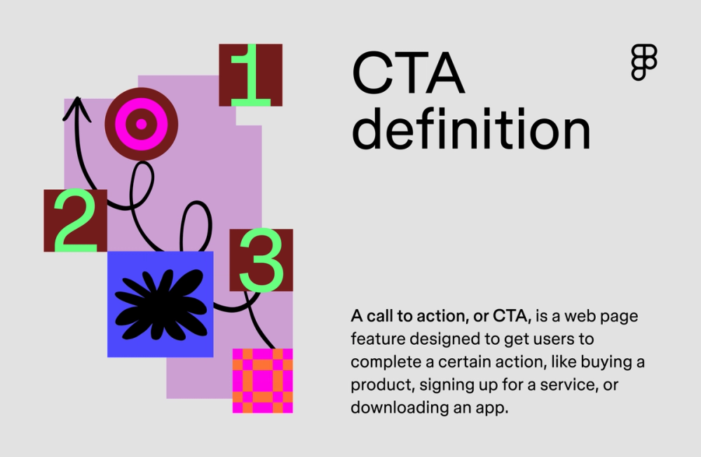
What is a CTA?
A CTA is a marketing term for a Web page feature designed to prompt an immediate user response. CTAs guide visitors toward specific goals like making purchases, signing up for newsletters, or downloading resources. Without them, valuable leads and customers slip away.
CTAs come in two forms: direct or indirect, typically seen at the top and bottom of pages. Direct CTAs explicitly tell users what to do with commands like “Buy Now” or “Sign Up.” Indirect CTAs take a softer approach with phrases like“Learn More” or “Explore Our Products.” You find them in many formats:
- Buttons prompt immediate action through clear, clickable elements.
- Text-based links blend naturally into your content while driving engagement.
- Images combine visual appeal with interactive overlays.
- Pop-ups or slide-ins appear at strategic moments to capture attention.
- Forms gather user information through structured input fields.
- Banners showcase important offers in prominent locations.
- Videos embed action prompts directly into video content.

CTA examples to encourage action
Real CTAs from top brands show effective strategies you can apply to your own designs. Each example highlights specific techniques that drive engagement and boost conversions.
Example 1: Figma

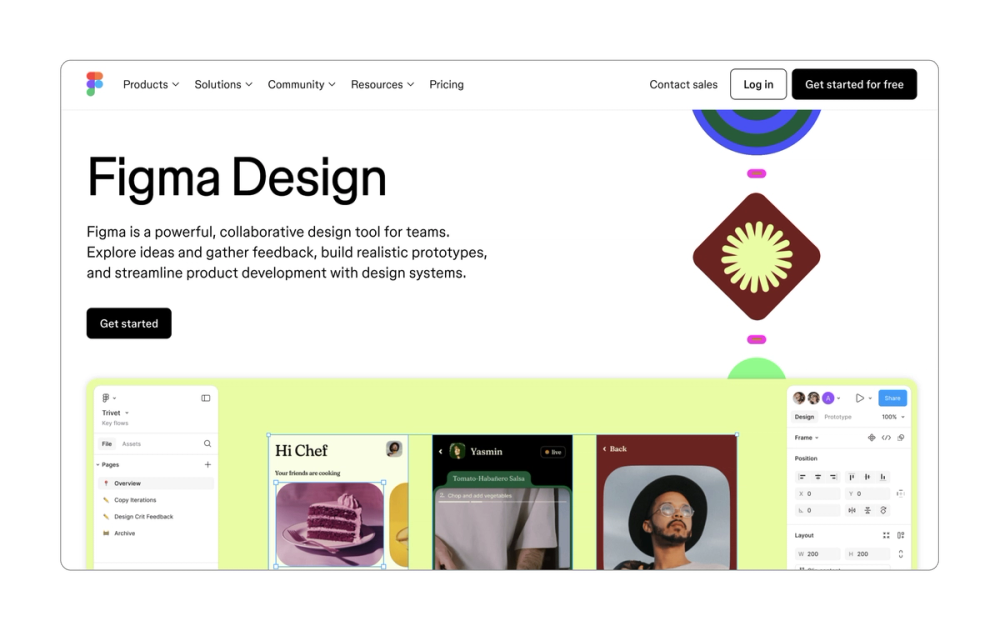
The Figma page leads with what matters most to new users: it’s free to get started. This transparent approach addresses the cost question head-on. Strategic white space around, providing contrast draws the eye to the CTAs.
Multiple CTAs guide users throughout the page journey: top-of-page, mid-page, and an extra large button users can’t miss at the bottom. True to Figma’s brand identity as a design tool, these buttons include interactive hover states that add both function and delight.
Key takeaway: Strategic CTA placement gives users multiple opportunities to engage.
Example 2: Atlassian/Jira


Jira’s CTAs evolve as users scroll down the page. Starting with the broad “Get started,” the CTAs become more specific (like “Get started with Jira Product Discovery”), matching each stage of the user’s journey. This CTA progression acknowledges that user intent becomes clearer as they learn more about the product.
Key takeaway: Match your CTA language to reflect the user’s stage in their journey.
Example 3: HelloFresh

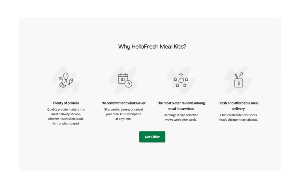
HelloFresh uses a popular strategy in its site CTAs: emphasizing a specific offer. This direct value-first approach taps into both savings and scarcity. When users see "Get Offer," it suggests that this deal won't stick around forever.
Key takeaway: Build natural urgency into your CTA language to inspire the user to act quickly.
Example 4: Headspace

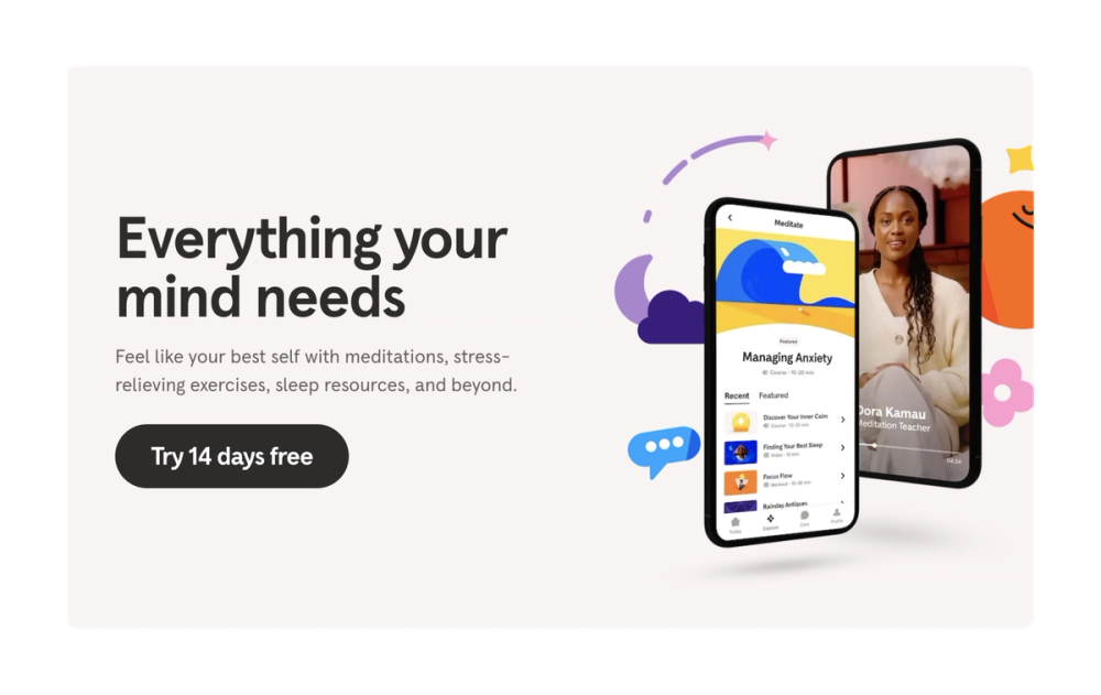
Headspace opens with a clear 14-day free trial offer. It also has buttons placed in multiple spots on the page, with a large “Get your headspace” button toward the bottom. Multiple button placements create natural entry points throughout the user's browsing journey.
Key takeaway: Emphasize free trials or other similar offers to get sign-ups.
Example 5: Netflix

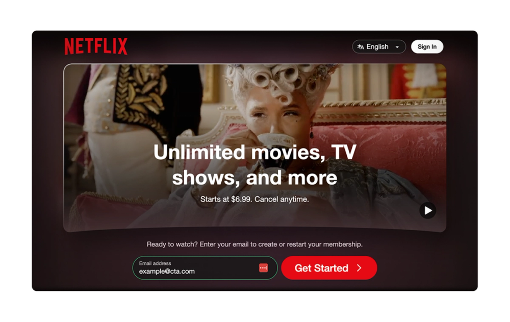
Netflix masters the persistent but unobtrusive CTA. An initial “Get Started” button sits above the fold with an email field, making it easy for users to set up an account right away if they choose.
Then, a sticky CTA follows as users scroll. This approach keeps the CTA visible without interrupting the discovery experience.
Key takeaway: Scrolling CTAs stick with the user, offering multiple chances to engage.
Example 6: Philips

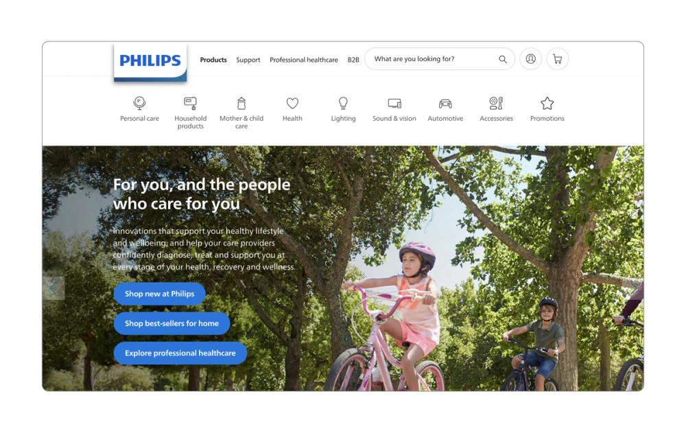
Philips tailors each CTA to a specific shopping goal. Instead of generic “Shop” buttons, they guide users with more precise actions like “Shop new” or “Shop best-sellers.” This clarity removes the guesswork and streamlines the path to purchase.
Key takeaway: Make each CTA specific to its intended action.
Example 7: Lucky Beard

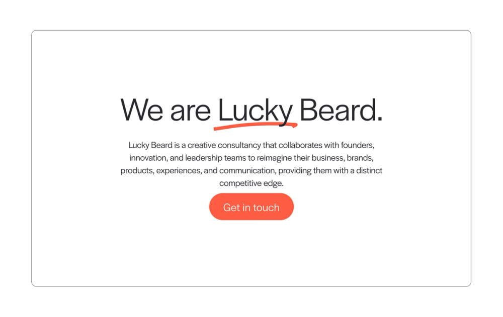
Creative consultancy company Lucky Beard uses friendly, simple CTA button copy that aligns well with the brand. These CTAs live on various spots on the page, creating multiple opportunities for users to click to “Get in touch.”
Strong lead-in copy explains exactly why someone would want to reach out, while consistent CTA button placement throughout the page maintains this message. Each CTA pairs service benefits with clear next steps.
Key takeaway: Support your CTAs with strong contextual copy that answers "Why click?"
Example 8: Vanquis Banking Group

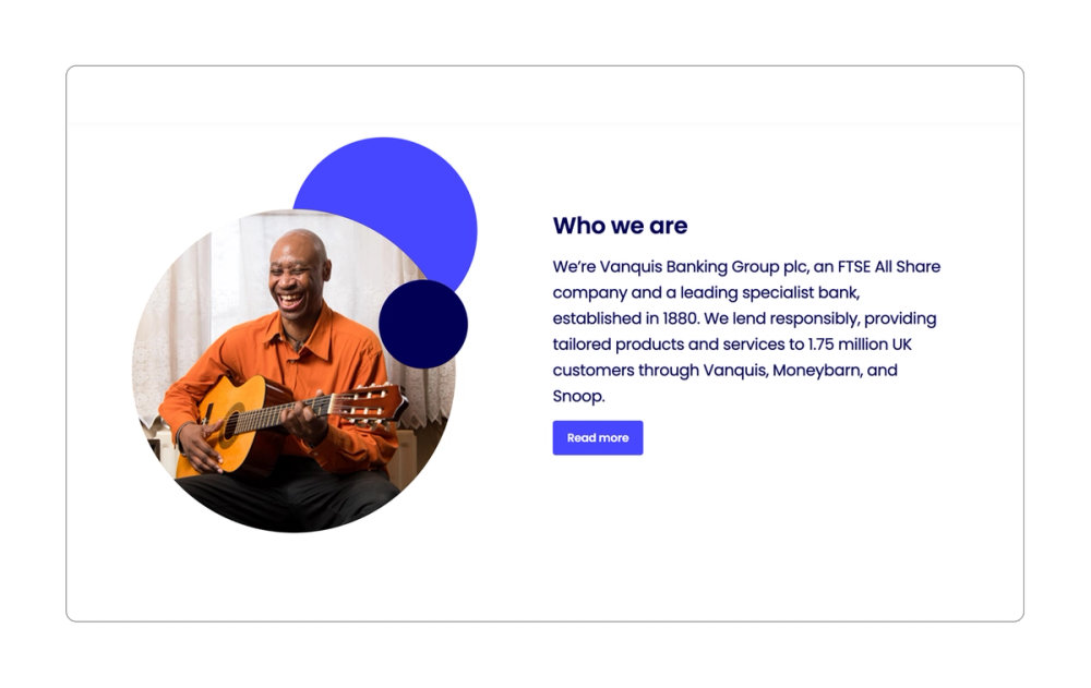
Vanquis Banking Group proves simple CTAs still work. Its classic “Read more” CTA minimizes on-page clutter while white space naturally draws users’ eyes to the CTA.
The “Read more” or “Learn more” CTA is also a great way to encourage users to move deeper into the customer journey.
Key takeaway: Take advantage of white space around a CTA to better draw the user’s attention.
Example 9: Stitch Fix

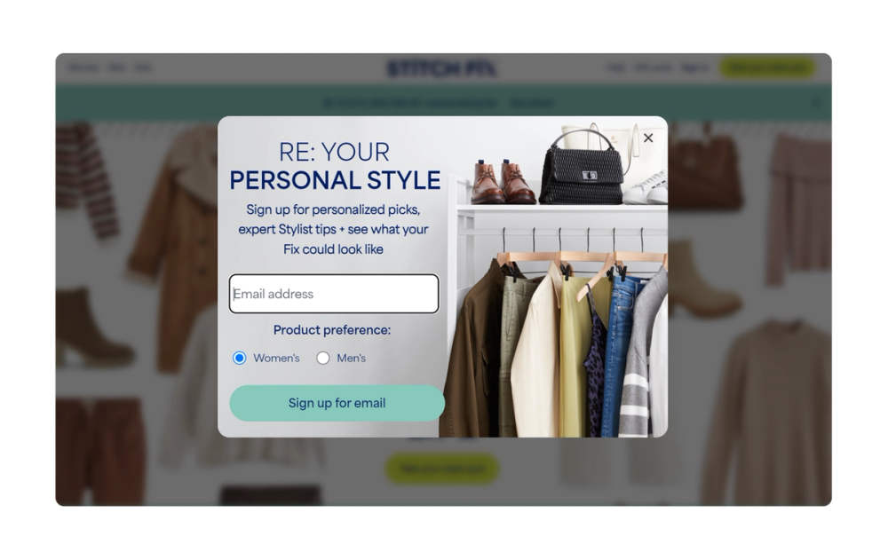
Stitch Fix uses a well-timed pop-up CTA to get users to sign up for newsletters. It appears at natural engagement points, with clear exit options market by an X. This balanced approach respects the user experience while maximizing conversion opportunities for Stitch Fix.
Key takeaway: Time your pop-up CTAs for moments of peak user interest to capture attention and drive conversions.
Example 10: PayFit


Payroll software company PayFit uses classic SaaS (software as a service) language for its CTA button: “Book a demo.” This has a very clear intention, inviting users to schedule a one-on-one demonstration of a product or service, allowing for deeper engagement and a higher likelihood of conversion.
The CTA also provides a clear value proposition with its lead-in copy. Not only does it offer benefits such as ease of use, but it also includes trust signals by showcasing its 4.3-star rating.
Key takeaway: Surround your CTA with social proof that builds trust.
Example 11: Basecamp

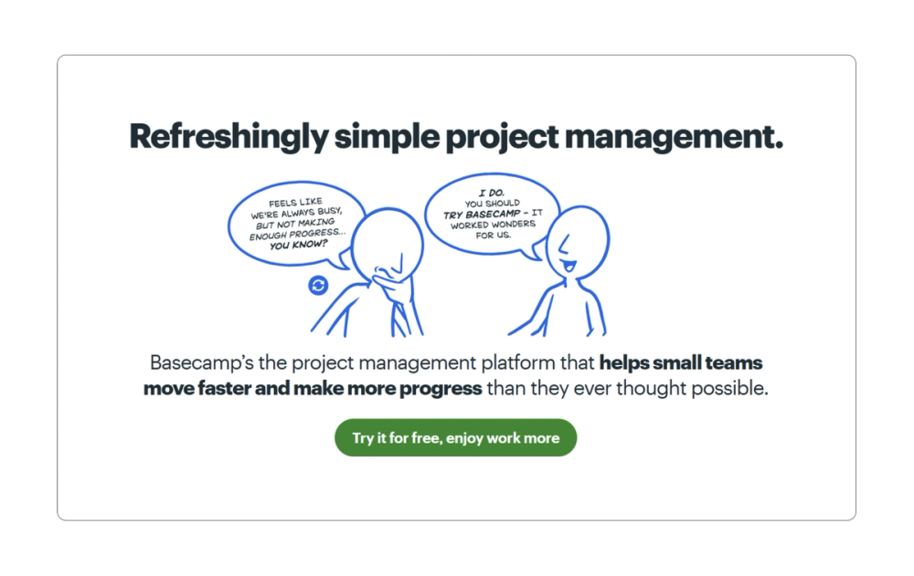
Basecamp pairs problem-solving with possibility. The illustration shows workplace pain points while the CTA promises users can “enjoy work more.” It also includes a free offer, which removes the final barrier to action, encouraging users to sign up.
Key takeaway: Connect your CTA directly to the problem you solve.
Example 12: Zoom

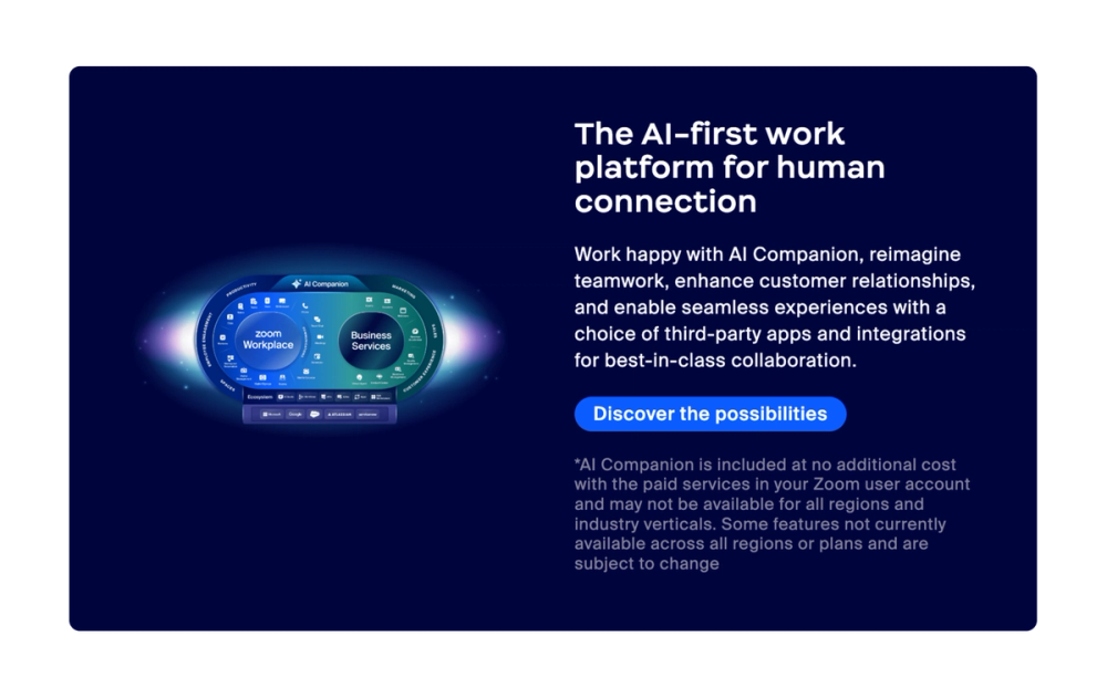
Zoom invites casual exploration rather than demanding action. The creative button copy “Discover the possibilities” opens doors while other buttons offer direct purchase paths. Giving choice respects different user needs, whether it’s learning more about the product or making a purchase.
Key takeaway: Offer CTA options that match different user intentions.
Example 13: YETI

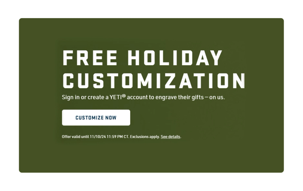
YETI uses CTAs that are common in the e-commerce space, such as “Shop Now,” while also including options that are specific to the brand’s unique selling proposition, like “Customize Now.”
Another unique feature of YETI’s CTAs is that they incorporate seasonal offers, which can be more engaging for the user and drive sales by creating a natural sense of urgency and exclusivity—without feeling forced.
Key takeaway: Mix proven CTA strategies with brand-specific options.
Example 14: Crunchyroll

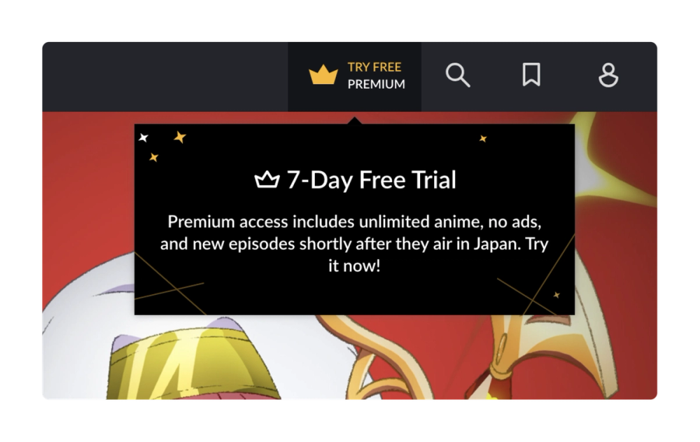
Crunchyroll is an online streaming platform for anime. The CTA copy speaks directly to its streaming audience with its “Start Watching” CTA. A sticky button in the upper right corner follows users as they browse, turning content discovery into an opportunity for engagement.
Key takeaway: Make sure your CTA reflects what users actually want to do.
Example 15: Dropbox

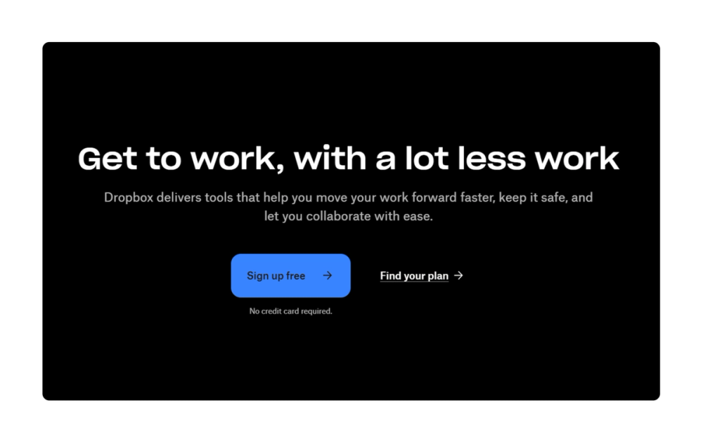
Dropbox combines several effective CTA best practices, including side-by-side CTAs that address different user intents. “Sign up free” is a clear and straightforward CTA that encourages users to create an account. It stands out visually, while supporting copy removes friction by clarifying “no credit card required.” This straightforward approach puts user’s concerns first, while still driving conversions.
Key takeaway: Keep CTAs simple and place them prominently on the page.
Example 16: Carta

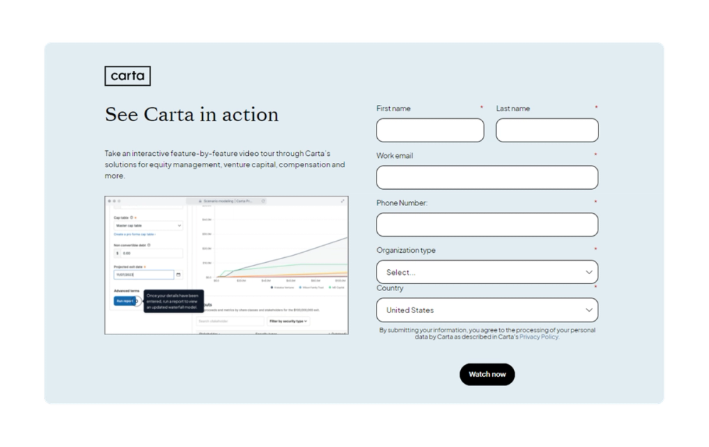
Carta guides users through its equity management solution with concise and strategically placed CTAs. Each button leads to a form that captures key details about the user’s company type, enabling Carta to provide tailored solutions and personalized support from the first interaction.
Key takeaway: Use form CTAs to capture additional information to personalize the user experience.
Example 17: Dwell

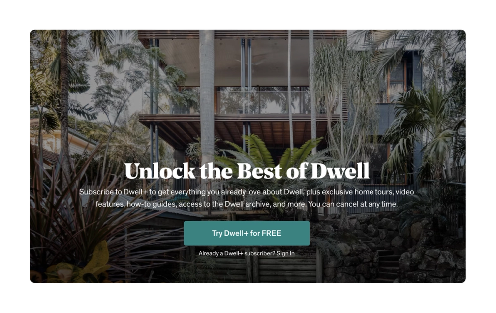
Interior design magazine and website Dwell uses stylish and simple images, copy, and CTAs that align well with its brand. In the example above, Dwell’s lead-in copy emphasizes value while FREE in all capitals draws the eye and creates a sense of urgency.
Key takeaway: Use bold or all-caps copy to draw the user’s eye and encourage interactions.
Example 18: Repsol

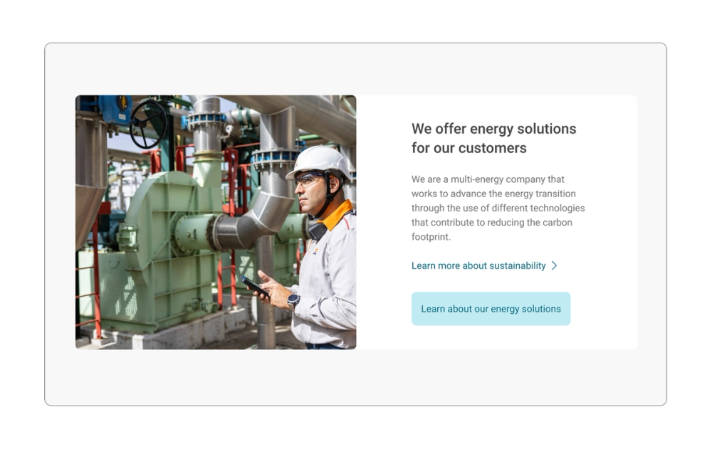
Sometimes the best CTA is the one that’s most true to your brand. Repsol, a global energy company, understands the power of a well-crafted CTA that aligns with its brand identity.
Its “Discover our energy solutions” and “Learn more about sustainability” buttons communicate exactly what Repsol offers, building trust through clarity.
Key takeaway: Prioritize clarity over creativity or cleverness.
Example 19: bulb

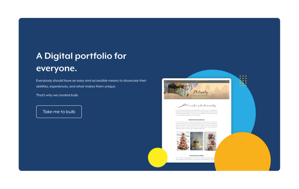
bulb, a digital portfolio website, weaves its brand into every CTA, turning standard sign-in buttons into moments of recognition. This approach not only streamlines the user experience but also strengthens overall brand perception, turning a functional action into a branded moment.
Key takeaway: Use the company name in the CTA to build brand recognition.
Explore ready-made portfolio website templates
Display your creative work with professional portfolio templates from Figma Sites.
Example 20: Tuft + Paw

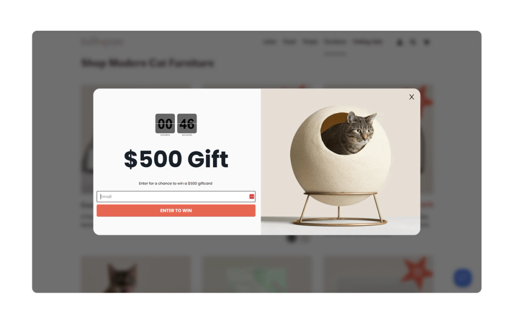
Tuft & Paw combines sleek graphic design with functionality to create a premium pet product line. It uses strong, evocative language and focuses on the emotional benefits of its products, effectively engaging its target audience and driving conversions.
It also uses pop-up CTAs that feature a countdown clock, creating a sense of urgency. The button copy “Enter to win” on the pop-up emphasizes the prize, motivating users to enter their information and participate in the contest.
Key takeaway: Use language that clearly connects to your product while motivating users to engage.
5 tips for crafting strong CTAs

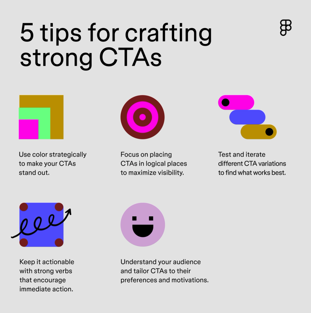
Knowing how to craft the perfect CTA can be challenging. Here are some overarching CTA tips to get you started:
- Use color to attract attention. Create contrast with bold color combinations and clear typography to make your CTAs stand out. The size of the CTA should be proportional to the screen size and overall design—large enough to spot and small enough to feel natural.
- Position CTAs strategically. Place your most important CTAs above the fold and in high-traffic areas of your website to create a visual hierarchy. Add sticky CTAs that follow users as they scroll for key actions like “Sign Up” or “Start Free.”
- Keep language actionable. Use strong action verbs like “Buy Now,” “Learn More,” or “Sign Up” to encourage immediate action. Clear and concise language helps users understand exactly what happens when they click.
- Know your audience. Tailor your CTAs to your target audience’s needs and motivations. Consider using language and imagery that resonates with their specific needs and desires. For example, a developer tool might use "View Docs" while a retail site opts for "Shop New Styles."
- Test and iterate. Run A/B tests on colors, placement, and copy. Track which CTAs perform best and make changes based on real user behavior.
Design your CTA with Figma
These compelling CTA examples can help you drive user engagement and conversions. Are you ready to start creating your own high-performing CTAs? Here’s how Figma can help:
- Use Figma Design to quickly prototype and iterate on your CTA designs.
- Browse the Figma Community for CTA templates and components.
- Use FigJam’s online whiteboard to brainstorm CTAs, plan, and collaborate with your team.
Create eye-catching CTAs
Ready to design your own call-to-action prompts?