Purple is situated exactly between red and blue on the color wheel. These primary colors elicit opposing emotions, with red being more fiery and blue being more serene. This contradiction blends perfectly into purple, evoking feelings of wealth, sophistication, and power.

Color variations
Shades
Tints
Tones
Hues
Color harmonies
Complementary
Split
Monochromatic
Analogous
Triadic
Square
Custom palettes
Purple Haze
Alchemical Reaction
Fuchsia Fantasy
Purple is defined by the following color codes and values to ensure consistency across various digital platforms and devices.
- HEX code: #9D00FF
- RGB value: 61.6% red, 0% green, and 100% blue
Accessibility considerations play a crucial role in UX and UI design color choices. Figma offers plugins in the Community to make sure your designs meet Web Content Accessibility Guidelines.
Here are some ways to use purple in your designs:
- Create luxurious branding. Purple is ideal for projects that aim to convey luxury and quality, making it an excellent choice for interfaces of high-end products or services.
- Make important information pop. A well-chosen purple palette can effectively differentiate categories or highlight specific statistics for certain data sets.
- Draw attention and encourage action. A splash of bold purple against a neutral background draws attention to important buttons or sections of a website.
Keep in mind that color and its meaning can change from culture to culture—and at any given time. If you are designing for a global audience, research color considerations for your specific regions.
For variations within the same reddish-blue spectrum as purple, consider:
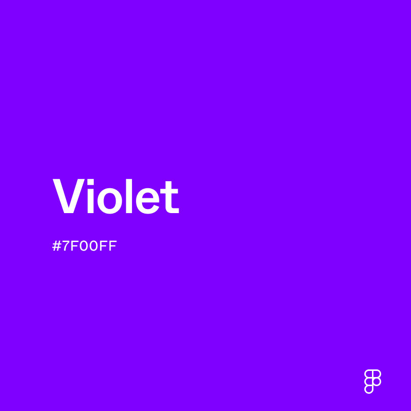
- Violet (#7F00FF) leans more toward blue and can have a stronger association with spirituality and wisdom.
- Lavender (#D3D3FF) is a close relative to purple but offers a lighter, more calming effect.
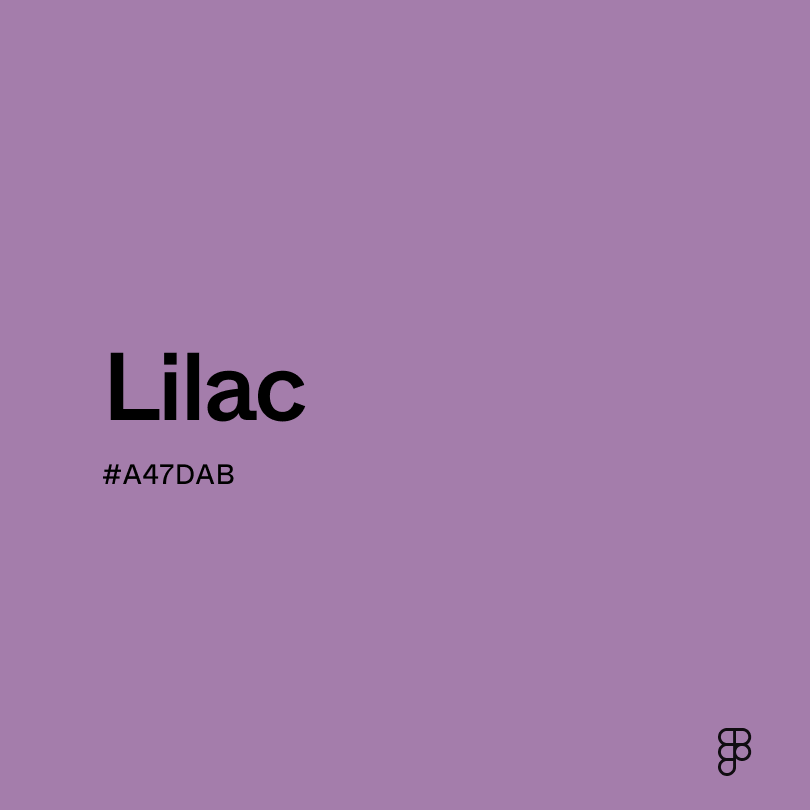
- Lilac (#A47DAB) leans slightly cooler and closer to violet than true purple.
- Periwinkle (#CCCCFF) sits closer to blue than most purples, evoking more calming, peaceful emotions.
To complement purple, consider pairing it with:
- Rosewater (#FFD6D1) offers a subtle contrast to enhance purple’s boldness.
- Gold (#EFBF04) emphasizes the luxurious and wealthy feel of purple.
- Ivory (#FFFFE3) provides a neutral background so purple can pop.
- Royal blue (#305CDE) creates a bold contrast that amplifies purple’s drama.
Other colors that pair well with purple include neutrals like white, gray, or black. They create a sophisticated backdrop while letting purple shine in any design.
Since purple is bright and bold, it may clash with:
- Maroon (#550000) is a strong color that clashes with an equally intense purple.
- Fuchsia (#FE3894) is very similar to purple, so the combination makes a design feel cluttered.
- Chartreuse (#CCFF00) is a bright color that clashes with the boldness of purple.
- Neon green (#2CFF05) is visually jarring when paired with a vibrant purple.
Purple is a captivating color that connotes power, confidence, and wisdom. It symbolizes royalty, extravagance, and sometimes magic.
In color psychology, purple evokes a complex range of emotions due to its mix of passionate reds and tranquil blues. It’s associated with creativity and imagination, sparking inspiration and joyfulness when used in certain settings.
Purple’s versatility makes it an excellent choice for a wide range of UI designs, from creative apps to financial platforms. When using purple in your designs, it’s important to consider its boldness—use it as an accent or pair it with neutral tones to create a balanced and visually comfortable experience.
Purple has a rich history dating back to the 1500s. Beyond the occasional flower or gemstone, purple is rarely seen in nature. Historical uses of purple primarily come from human-made dyes using snail mucus.
Sometimes known as royal purple, this color has represented luxury, wealth, and sophistication for centuries. Royalties from Egypt, Rome, and Persia popularized the reverence for purple by limiting its use to the clothing and jewelry of high-standing society members.
Today, purple maintains its reputation of wealth and sophistication while being more accessible to the masses.
Contrast checker
Contrast 5.42
- Large Text
#9D00FF
- Normal Text
How you design, align, and build matters. Do it together with Figma.
| Category | ||
|---|---|---|
Pass | Fail | |
Pass | Pass | |
Pass | Pass |
Contrast 3.88
- Large Text
#9D00FF
- Normal Text
How you design, align, and build matters. Do it together with Figma.
| Category | ||
|---|---|---|
Fail | Fail | |
Pass | Fail | |
Pass | Fail |
Color simulations
Protanopia
Deuteranopia
Tritanopia
Achromatopsia
The hexadecimal color #9D00FF, known as purple, has RGB values of R:157 G:0, B:255 and CMYK values of C:0.38 M:1, Y:0, K:0.
| VALUE | CSS | |
|---|---|---|
| HEX | #9D00FF | #9D00FF |
| RGB DECIMAL | 157, 0, 255 | RGB(157, 0, 255) |
| RGB PERCENTAGE | 61.6, 0, 100 | RGB(61.6%, 0%, 100%) |
| CMYK | 0.38, 1, 0, 0 | |
| HSL | 276.9°, 100, 50 | HSL(276.9°, 100%, 50%) |
| HSV (OR HSB) | 276.9°, 100, 100 | |
| WEB SAFE | #9900FF | #9900FF |
| CIE-LAB | 44.785, 85.656, -86.774 | |
| XYZ | 31.952, 14.389, 95.696 | |
| xyY | 0.225, 0.101, 14.389 | |
| CIE-LCH | 44.785, 121.929, 314.628 | |
| CIE-LUV | 44.785, 23.935, -131.71 | |
| HUNTER-LAB | 37.932, 83.976, -123.025 | |
| BINARY | 10011101, 00000000, 11111111 | |
| iOS - SwiftUI | Color(red: 0.616, green: 0, blue: 1) | |
| iOS - UIKit | UIColor(red: 0.616, green: 0, blue: 1, alpha: 1) | |
| Android - Compose | Color(0xFF9D00FF) |