What is typography anatomy? A typeface design guide


Share What is typography anatomy? A typeface design guide
Explore more from
Design basics
Design and prototype with consistent type
Bring type to life in every interaction.

Typography shapes both the look and function of your design. When you understand how type is built, you can make choices that improve readability, guide attention, and support user experience across every screen and surface.
By breaking down the visual building blocks of a typeface, you’ll learn how to improve legibility, communicate tone, and create stronger visual structure, from a mobile UI to a full brand system.
Read on to learn:
- The three principles of typography and how to implement them
- The different letterform components
- Why anatomy is essential to know as a designer
- Tips for applying type anatomy principles
What is typography anatomy?
Typography anatomy refers to the individual parts that make up a typeface, like strokes, counters, serifs, and spacing. Each component plays a role in how a typeface looks, reads, and performs in different contexts.
Learning these elements builds a stronger foundation for choosing and customizing type. It helps clarify design intent and creates more purposeful, consistent work.
Find the perfect fonts for your next design project.
Principles of typography
The principles of typography are the foundation for using type effectively in any design. The guidelines help create structure, support accessible designs, and make sure text does its job, whether on a brand site or inside a product interface. These principles include:
- Alignment. Position text with intention to create order and rhythm.
- Color. Use color and color combinations to reinforce the tone of emphasis.
- Consistency. Stick to consistent type choices across your system for clarity and cohesion.
- Contrast. Mix weights, styles, or sizes to highlight key information.
- Hierarchy. Use variation to guide the viewer through your design
- Readability. Choose typefaces and settings that are easy to read and appropriate for the context.
- Scale. Use size to signal importance and create a visual hierarchy.
- Scannability. Break content into digestible chunks to reduce cognitive load.
- Selection. Choose the typeface that suits your tone and message.
- Spacing. Adjust line and letter spacing to improve flow and legibility.
Three key aspects of typography anatomy
Typography anatomy comes down to three core areas: letterform components, measurement and spacing, and type classifications. Understanding each helps graphic and UX designers choose typefaces that are visually effective and purposeful, supporting readability, tone, and structure across different design contexts.
Letterform components
Letterform components are the structural parts that make up each character in a typeface. Elements like arms, stems, and counters define a font’s shape, rhythm, and visual style. Here are some of the most common components to know:

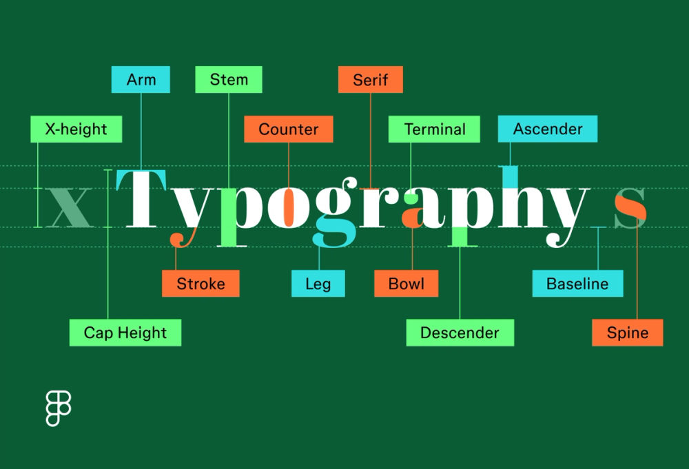
- Arm: a horizontal or angled stroke that doesn’t connect to a stem (e.g., the top of a “T”)
- Ascender: the part of a lowercase character that extends above (e.g., “h,” “b”)
- Baseline: the invisible line where characters sit, used to ensure alignment and consistency
- Bowl: a curved stroke that forms an enclosed shape(e.g., in “o” or “b”)
- Cap height: the height of uppercase letters, measured from the baseline
- Counter: the open or enclosed negative space within a letter (e.g., “o” or “d”)
- Descender: the part of a lowercase character that extends below the baseline (e.g., “g” or “p”)
- Leg: a short, descending stroke that extends from the bottom of a letterform, often at an angle (e.g., in “k,” “y,” or “Q”)
- Serif: a small decorative stroke at the end of a character’s main strokes
- Spine: the curved stroke found in letters like “s” and “j”
- Stem: the primary vertical stroke in a letterform
- Stroke: any individual line that makes up a character’s shape
- Terminal: the end of a character that doesn’t have a serif
- X-height: the height of lowercase letters, like “x,” which affects legibility at smaller sizes
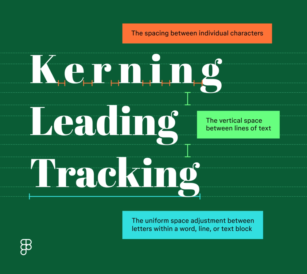
Measurement and spacing
In the anatomy of typography, the space around and in between is just as important as the details of the letterforms themselves. Fine-tuning spacing and measurement improves how a typeface reads and feels in your layout. Here’s what to notice:
- Kerning: the space between individual characters that can affect a typeface’s visual consistency and overall flow
- Leading (line height): the vertical space between lines of text—more leading can make dense content easier to read
- Tracking (letter spacing): the uniform adjustment of spacing across a range of letters, used to open up or tighten blocks of text for tone or visual effect

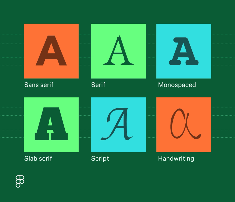
Type classifications
Type classifications group fonts based on shared structural traits, like the presence of serifs or uniform character width. These are the major classifications to know:
- Sans serif. These clean, modern fonts are without decorative elements for a minimalist look. Examples: Montserrat, Roboto, Lato.
- Serif. These fonts use small decorative elements at the end of character strokes. They’re often used to convey tradition, formality, or editorial tone. Examples: Noto Serif, Libre Baskerville, Crimson Text.
- Slab serif. A subset of serif fonts, slab serifs feature thick, block-like serifs with blunt or rounded edges. They bring a strong, structured feel. Examples: Slabo, Roboto Slab, Zilla Slab.
- Monospaced. These fonts have a uniform appearance, with every character occupying the same width and height. Examples: Courier New, Source Code Pro, IBM Plex Mono.
- Script. Designed to mimic handwriting or calligraphy, script fonts connect characters in flowing strokes. Use them sparingly for personality or emphasis. Examples: Oleo Script, Bad Script, Dancing Script.
- Handwriting. These fonts mimic casual, hand-drawn writing styles. Often informal, with irregular shapes and varied pressure. Examples: Caveat, Architects Daughter, Coming Soon.

Why is the anatomy of type important for designers?
Typography anatomy goes beyond crafting visually appealing typefaces. You can use the anatomy of type to improve a project’s readability, choose stronger font pairings, and improve communication with the reader. Here’s how anatomy knowledge shows up in practice:
- Clearer hierarchy. Use structural traits, such as weight and x-height, to guide users in navigating content.
- Greater accessibility. Choose typefaces that hold up across sizes, screen types, and contrast settings.
- Improved legibility. Select typefaces with open counters, balanced strokes, and readable forms.
- More expressive tone. Use subtle details, like terminals, spines, and serifs, to match your design’s voice.
- Smarter font pairing. Spot visual relationships across typefaces to create intentional contrast or cohesion.
Tips for designers when applying type anatomy knowledge
Knowing how type is built helps you use it more effectively. These tips show how to apply anatomy concepts in practical, design-focused ways:
- Adjust spacing based on character shapes. Kerning and tracking should account for stroke endings, diagonals, and negative space created by counters.
- Design for consistency across type styles. Understanding baseline alignment, cap height, and descender length helps you keep different fonts visually balanced
- Pair fonts by comparing anatomy. Match or contrast features like serif style, x-height, or terminal shape to create harmony or visual tension with purpose.
- Select typefaces with the right structural traits. A tall x-height and open counters improve legibility at small sizes—ideal for interfaces or body copy.
- Use stroke weight and contrast to guide emphasis. Bolder stems and higher contrast can draw attention but may reduce legibility if overused.
Apply your typography knowledge with Figma
Figma can help you create impactful typography that will make your designs stand out. Here’s how:
- Explore different fonts and typefaces and learn how they work best for your design project.
- Learn visual hierarchy and how it guides viewers through your designs, encouraging better communication.
- Discover how design thinking can help spark your creativity and develop new ideas.
Ready to use typography anatomy to enhance your designs?