Mobile website design: 10 inspiring examples + best practices


Share Mobile website design: 10 inspiring examples + best practices
Explore more from
Design basics
From wireframe to website, faster
Design, prototype, and refine every page.


Ever tapped a hamburger menu that doesn’t work or struggled with a button that’s too small? As a designer, you’ve probably felt that frustration and seen users deal with it during testing. With mobile now the main way people browse, mobile-friendly design isn’t optional—it’s the baseline.
Whether updating a site, launching a product, or refreshing your portfolio, strong mobile design is key to keeping users happy. So what makes a mobile experience great, and how do you add creative touches without missing the basics?
Read on to learn:
- Key features of mobile Web design
- Why mobile website design matters
- Mobile website design best practices and examples

Key features of mobile website design
Designing for mobile isn’t just about smaller screens, touch controls, or varying Internet speeds. It’s about understanding context. Mobile users are often on the move, multitasking, or seeking quick answers.
These users tend to skim rather than read deeply, so mobile design should prioritize clarity and ease of use from the start. That’s why effective mobile-friendly websites consistently include these key features:
- Vertical display. Content appears in a single column to fit small screens better.
- Large, well-labeled buttons. These should be easy to see and tap with fingers, helping users navigate smoothly on mobile devices. Use colors that stand out from your website’s color scheme to draw attention and improve usability.
- Clean design with enough space. This makes content simple to read and helps users avoid mistakes.
- Clear calls to action (CTAs) near the top. Place CTAs near the top to instantly communicate the following steps, minimizing the need for scrolling or searching.
- Simplified menus. Designers often hide them behind a hamburger icon to save space.
- Less text with readable font size. Keep content easy to scan by using only the most important information, and choose a font size that remains clear and legible on small screens.
These features help mobile users find what they need quickly and easily.
Why mobile Web design matters
Focusing on mobile-first design can elevate your entire digital experience. Here are a few key benefits of prioritizing mobile-first Web design:
- Mobile-first indexing. Google looks at your mobile site first when it ranks you in search results. If your mobile site works well, it’s easier for people to find you online.
- Better user experience and faster loading times. People want websites that load fast and are easy to use on their phones. A good mobile design makes your site quick and simple to navigate, so visitors stay longer.
- Increased brand awareness and sales. Web design statistics show that people trust your brand more when your site works well on phones and tablets. It’s also easier for them to buy something or sign up, which helps your business grow.
Mobile website design best practices
Ready to design a mobile site that works everywhere? These best practices can help you create smooth user experiences and make your designs shine on any device.
Use a responsive design
A responsive design helps your website work well on any screen size. It automatically adjusts the layout and page elements to fit phones, tablets, and desktops.
With Figma Sites, you get ready-made, fully responsive templates that make designing a breeze. You don’t have to worry about tweaking aspect ratios or building different layouts for each device. Your site will look awesome everywhere, right from the start.
Design a mobile-friendly website
Launch faster with pre-built, fully responsive templates and components that look great on every device.
Incorporate touch-friendly elements with clear CTAs
Make buttons, links, and forms easy to tap by using large touch targets of at least 44x44 pixels and enough spacing to prevent accidental taps. Clear calls to action help users understand what to do next without frustration.
Avoid using pop-ups
Pop-ups can frustrate users and interrupt their flow. They often block content and interrupt the site experience. Think about other ways to share meaningful content, like banners or in-line messages.
Choose fonts that are easy to read
Writing concise and scannable content is essential for smaller screens, as is choosing an appropriate font. Use fonts optimized for websites. Clean and simple options, like Roboto, Inter, or Montserrat, are easy on the eyes and help users find information faster.
Use a “back to top” button
Pages are often longer on mobile devices, which means more scrolling. A “back to top” button lets users quickly return to the top of the page, which makes browsing smoother and more convenient.
Link the logo back to the homepage
Users expect your logo to take them back to your homepage. This is a standard shortcut (especially when the navigation menu tucks away), and provides a familiar, reliable way for users to return to the main page. Breadcrumbs also help users navigate back and reduce bounce by showing their location within the site.
Simplify navigation
Mobile users have less time and smaller screens, so you make menus clean and clear. Create a scroll-friendly layout that helps users navigate your site quickly and confidently. Keep menus short, use a hamburger icon to save space, and avoid long forms or too many buttons. Simple navigation makes it easier for people to find what they need.
Optimize load times/image sizes
Fast loading speeds are crucial on mobile. Compress images, limit animations, and remove anything that slows your page down. Use optimized formats like JPEG for photos and PNG for graphics with transparency. A faster site keeps users engaged and delivers a smoother, more enjoyable user experience.
Prioritize accessible design
Design inclusively and accessibly, always. Use things like:
- Strong color contrast
- Readable fonts
- Labels that screen readers can process
- Large touch targets
- Keyboard-friendly navigation
- Alt text
Accessibility benefits all users and shows that you value inclusive experiences. Plugins like Able make it easier to identify and fix accessibility issues early in your design process.
10 best mobile website design examples
Great mobile design looks good, loads quickly, and performs well on small screens. Most importantly, users find it easy to navigate. The examples below show how different brands solve common mobile design challenges. Use them as inspiration as you plan your own mobile website design.
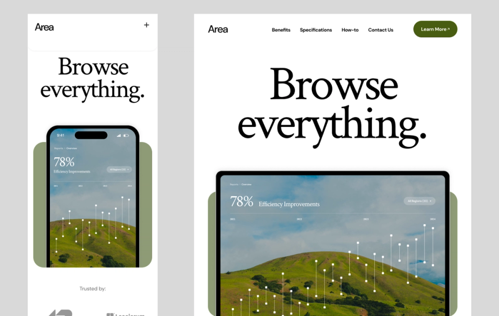
Example 1: Trustworthy app download

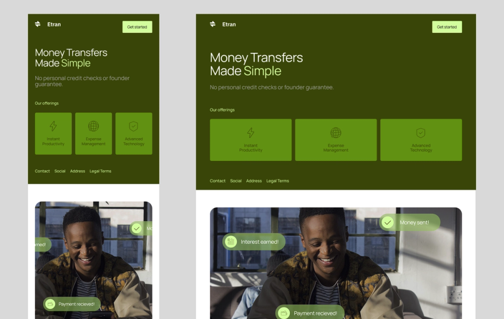
This mobile layout uses shades of green to create a calm, clean look. It features large buttons and text boxes that users can easily tap and read on a phone.
The design includes short, simple text and clear icons, helping users quickly locate information. Its high-contrast color palette also makes the site more accessible for all users.
Example 2: Retro-industrial music event


Designers often simplify mobile designs to make content easier to scan, but that doesn’t mean they have to be boring. To create a bold look, this design uses bright, contrasting colors and the unique, readable Martian Mono font. The layout remains user-friendly, with a large “Buy Tickets” button and a clear headliner schedule that users can easily explore.
Example 3: Sweet flower shop

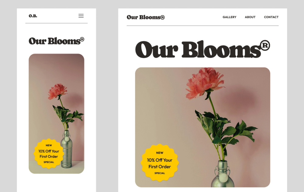
This delicate template uses a hamburger menu that opens into a complete list of options. Just remember to keep the menu text short and easy to understand. A hamburger icon helps keep the page clean so the rest of the site shines.
There’s also plenty of white space, which makes the buttons and product or service sections stand out in a way that’s easy to follow.
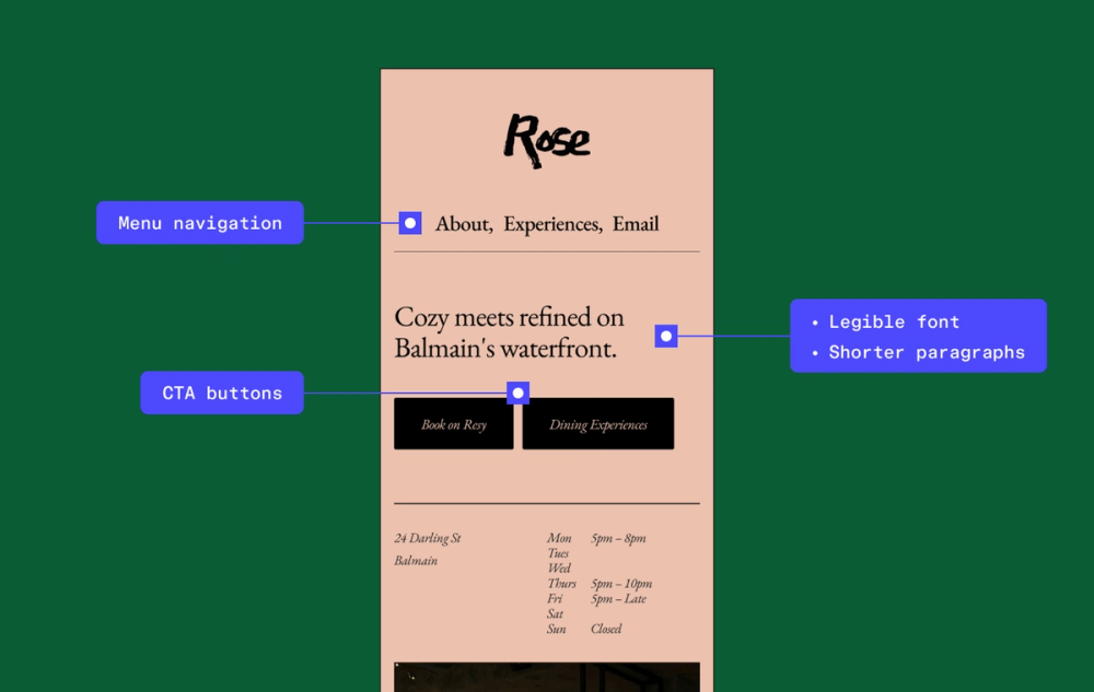
Example 4: Sincere, professional legal services

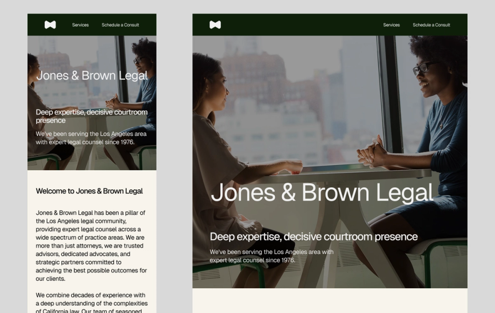
Sometimes, websites need more copy to give users all the information they need. Thanks to smart use of visual hierarchy, this design includes more text but still feels clean and easy to navigate. It features clear headers and scannable body copy, and breaks up content sections with different background colors.
These techniques guide the eye, making longer blocks of text feel manageable on a small screen. A fixed top menu bar also keeps key pages within easy reach, so users can jump around without getting lost.
Example 5: Performance-driven gym

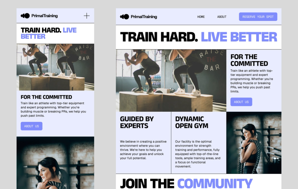
When you’re making a contact section for a mobile website, keep it simple. This example lays out the text on the left side, including contact information, store hours, and social media links.
Use a user-friendly font for contact details. If users can’t read it, they can’t reach or connect with you on social media.
Example 6: Friendly accounting services

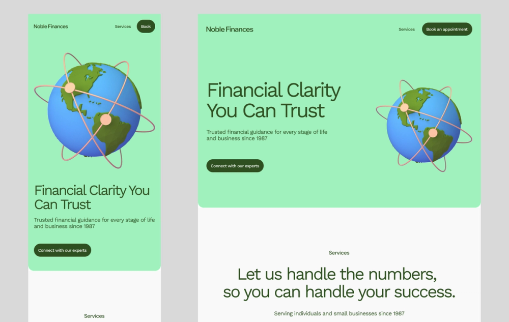
You can have fun with illustrations on a mobile site, but they shouldn’t get in the way on a smaller screen. This design uses cool, unique illustrations to break up the text on the page.
It also has CTA buttons with bold colors, so users can easily find the pages they want to visit. The navigation menu at the top helps users find exactly what they’re looking for without having to scroll around.
Example 7: Group event

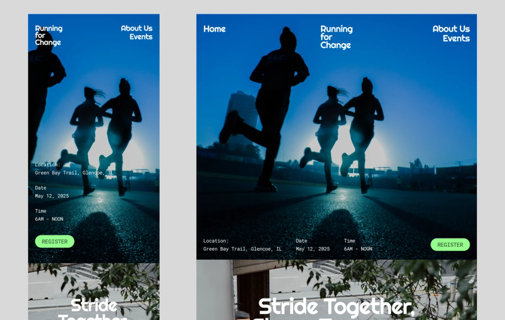
This template puts the most essential information and the main button at the top, letting users quickly access key content without scrolling. There’s also a simple menu at the top for easy navigation. Even though the design uses three different fonts, they’re all legible and match the overall look and style of the site.
Example 8: Moody dance studio

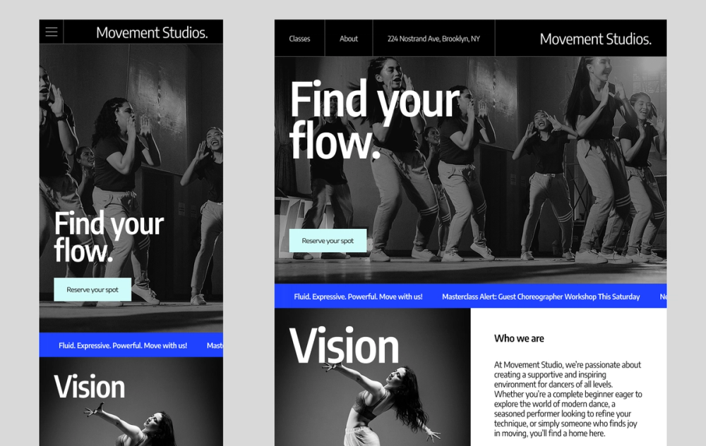
This mobile design stands out with its bold use of high-quality, full-bleed imagery that adapts beautifully to smaller screens. While it includes more text than other templates, generous white space keeps the layout clean and easy to scan.
The colorful rectangular buttons pop against the black-and-white visuals, drawing users to key information. To maintain fast load times on mobile, optimize large images using modern formats like WebP or AVIF, which reduce file size without compromising quality.
Example 9: Modern product launch

This website uses familiar HTML elements in clever, mobile-friendly ways. A sticky navigation menu appears at the top, making it easy for users to jump between pages without scrolling. The prominent “Learn More” CTA, likely a styled button or link, encourages deeper exploration.
A standout feature is the horizontally scrollable table, often built using <div>s with overflow settings rather than traditional table elements. This approach keeps content compact and interactive on smaller screens while improving load performance and responsiveness.
Example 10: Modern-retro beverage brand

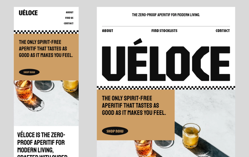
This template is a great example of how to keep a strong brand look while working well on phones. The design uses white space to keep things clean and easy to follow. It also shows off the products with beautiful images that work as buttons. The text is readable thanks to a bold color combination.
Mobile website design FAQ
How do I create a mobile-friendly website design?
Start with a responsive layout that adjusts to different screen sizes. Keep navigation simple and use large touch targets so it’s easy to tap. Make sure the most important content comes first, and test your design on real devices to see how it feels.
What are the main differences between mobile and desktop sites?
Mobile sites work best on small screens and use touch for navigation. Designers often use:
- Simpler layouts
- Larger text
- Elements that load fast
This makes them easy to read and tap on the go. Desktop sites have more space to show more content and features across a larger canvas.
Are there differences between mobile URLs and desktop URLs?
Most modern websites use the same URL for both mobile and desktop. Designers call this responsive design. Some older or separate mobile sites still use different URLs, though. For example, you might see m.example.com for mobile.
Today, using one URL is more common, where the layout changes based on screen size.
What is the best size for mobile website design?
There isn’t one “best” size for mobile design. Responsive sites are helpful in this area, where the layout adjusts to fit any screen size. This works for small phones and large desktops, and you can find standard screen size guides in the Figma resource library.
What tools help test mobile responsiveness?
Figma helps you build clickable prototypes. You can also test their look on different mobile screen sizes within Figma. For browser-based testing, try Google Chrome’s DevTools and BrowserStack.
These tools let you see your site on different devices and browsers to help catch problems early. This way, you can fix them quickly and give users a better experience.
How can I preview what my site looks like on mobile?
Want to see how your site looks on phones? Chrome DevTools has a handy “Device mode” that shows your site on different screen sizes and lets you test touch interactions. If you’re working in Figma Sites, you can preview your design inside phone frames. This helps you get a real feel for the mobile experience.
Create an intuitive mobile website design with Figma
Designing a mobile website can be simple with the right tools. If you want to improve your mobile website design and make sites easy to use, Figma can help. Here’s how:
- Jump into Figma’s collaborative online design platform to start building, then create interactive prototypes to test your mobile layouts.
- Kickstart your mobile website design with a variety of Figma templates.
- Browse the Figma Community to find fresh mobile design examples and templates shared by other designers.
Create mobile first website design
Ready to design with mobile in mind?