Types of color palettes: Definition, examples, + tips
Share Types of color palettes: Definition, examples, + tips
Explore more from
Design basics
Master color to elevate your designs
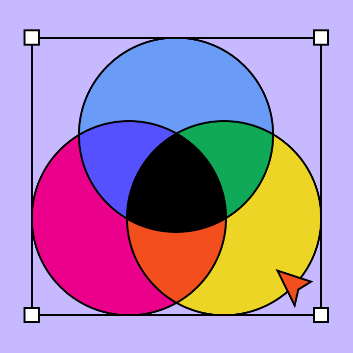
Experiment, refine, and apply color palettes in Figma.

You open your meditation app before bed. Deep blues wash across the screen, instantly calming. That’s the power of a thoughtful color palette.
Designers leverage color theory to create harmonious interfaces that reflect a brand’s identity, evoke emotions, and prompt users to take action.
Read on to learn:
- What a color palette is
- Six types of color palettes and examples
- How to choose a color scheme for your designs
What is a color palette?
A color palette is a combination of colors designers use to create visually captivating websites and apps. Color schemes often include one primary color, one secondary color, and one or two accent colors. In UI/UX design, colors are powerful tools to influence behaviors, evoke emotions, and increase brand awareness. When used correctly, color palettes enhance the user experience and facilitate navigation through your content.
For example, shades like red, yellow, and orange are known as appetizing and attention-grabbing colors. Popular food apps like DoorDash, Grubhub, Yelp, and OpenTable utilize these stimulating colors to evoke hunger and encourage users to order a meal or make a reservation.
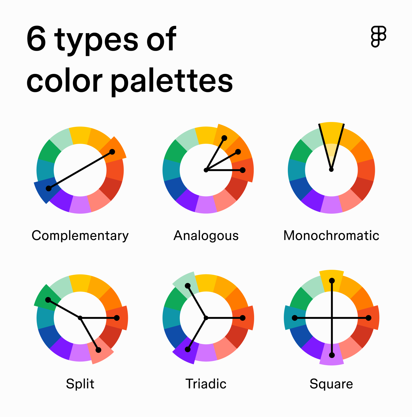
Six types of color palettes
There are six types of color palettes you can reference to create standout user interfaces, including:
- Complementary. Pick colors opposite each other on the wheel and you’ll get instant drama—bold, high-contrast pairings that demand attention. Classic complementary colors are red + green, or blue + orange.
- Analogous. Choose neighbors on the wheel, and you’ll land on palettes that feel natural and easy. These blends are common in nature (sunset oranges, pinks, and purples), which is why analogous shades are so calming to the eye.
- Monochromatic. Sometimes less is more. A monochromatic color scheme takes one base color and plays with its tints and shades. The result is clean, minimal, and almost impossible to clash.
- Split complementary. A split complementary color palette is like a remix of complementary. Start with a base color, then use the two shades on either side of its opposite. You’ll still get contrast, but it’s softer and easier to balance.
- Triadic. To get a triadic color palette, draw a triangle on the wheel and connect the points. Three hues in perfect tension: vibrant, energetic, and playful if you balance them right.
- Square. Four colors spaced evenly around the wheel = maximum variety. This tetradic palette gives you range and balance, but it’s easy to overwhelm if you don’t ground it with plenty of neutrals.

Color palette examples
To get a glimpse of color schemes in action, here are some examples of different color pairings and how to incorporate them into your designs.
Light blue

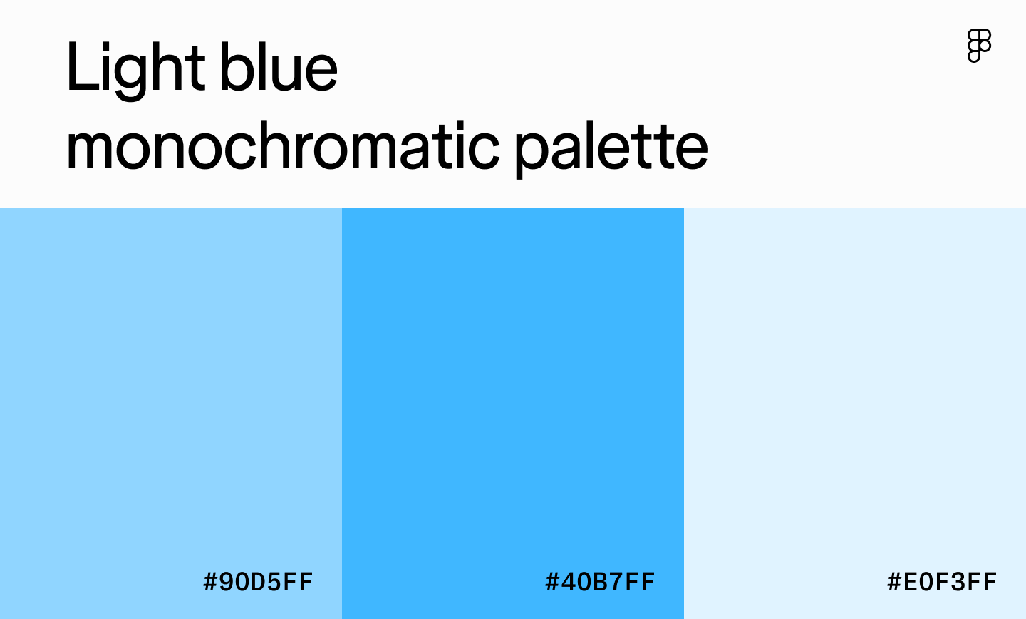
Type: Monochromatic
Best for: Productivity apps, banking apps, educational platforms, or healthcare dashboards
Light blue is all about trust and calm—perfect for industries where users want to feel secure. Use darker blues for text and navigation, with brighter shades as accents to add a little energy without losing clarity.
Cream

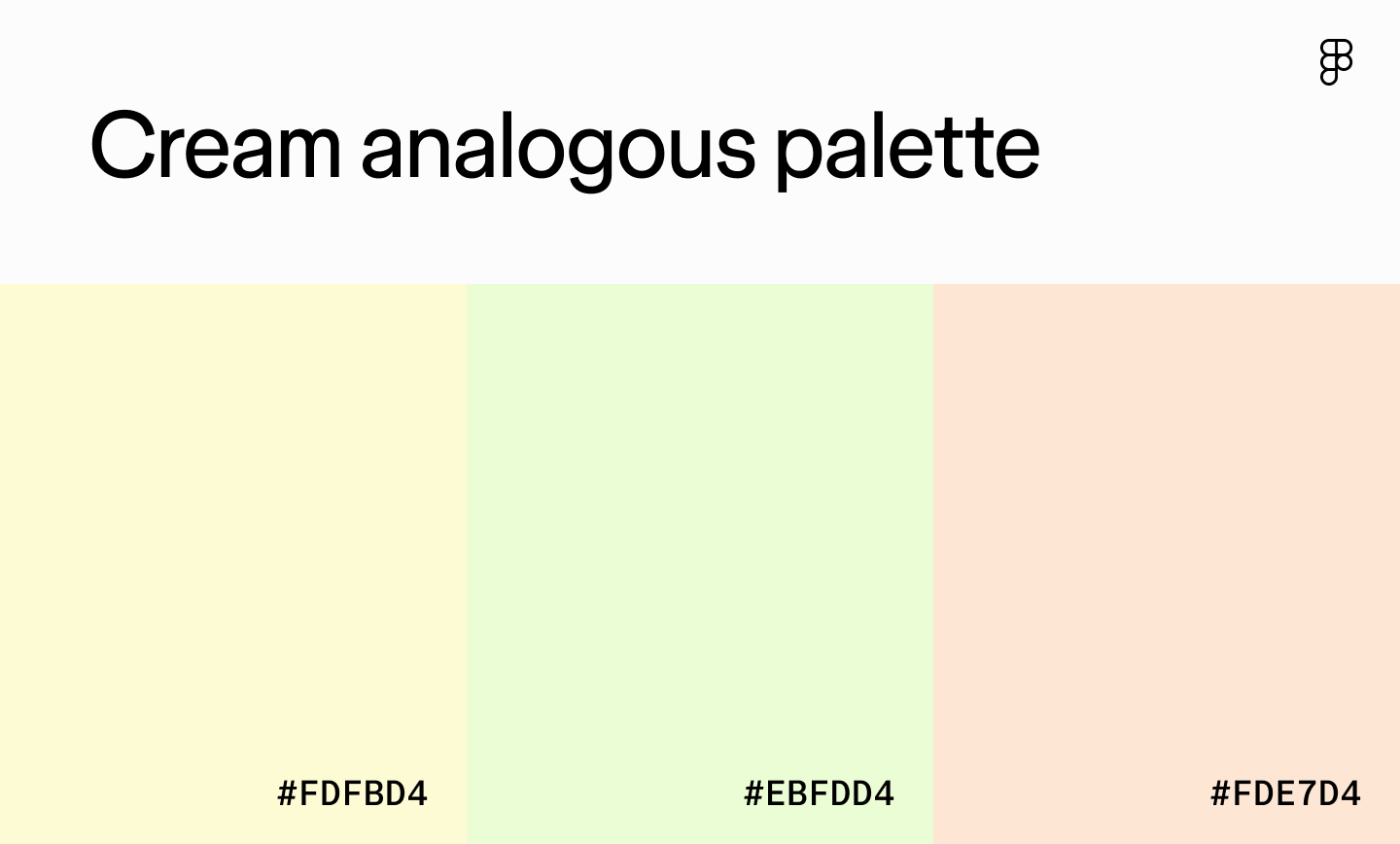
Type: Analogous
Best for: Wellness apps, booking sites for spas, or e-commerce sites selling natural products
Cream as a primary color creates a warm, inviting base. Pair it with light green and peach for a spa-like feel that’s easy on the eyes. If you need buttons or key actions to stand out, don’t be afraid to layer in a high-contrast accent.
Lilac

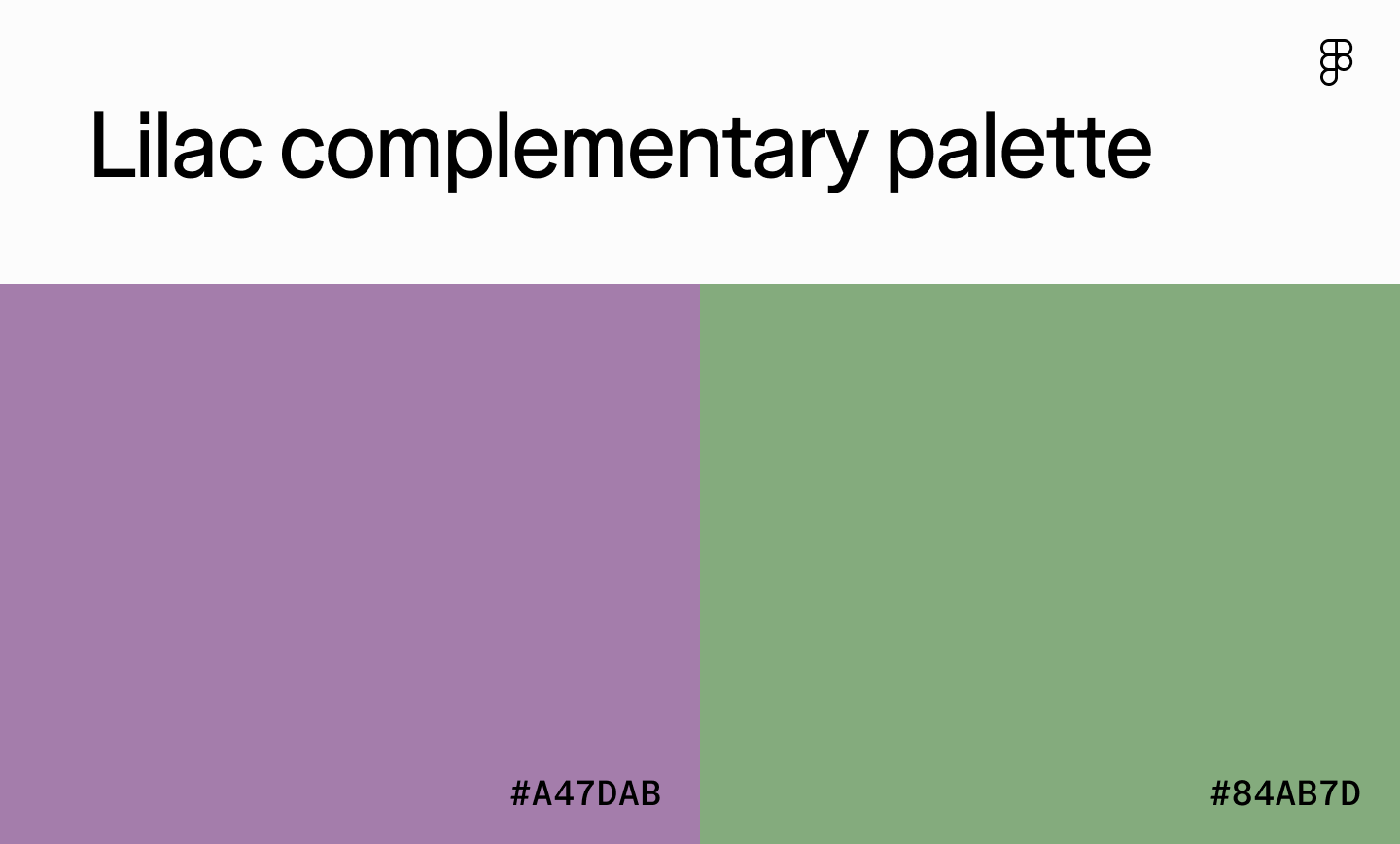
Type: Complementary
Best for: Meditation apps, wedding planning websites, or spring-inspired interfaces
Lilac paired with green can feel whimsical or refined depending on how you balance them. Lead with lilac for a calming, elegant vibe, and flip it to green as the anchor for something more natural and grounded.
Pastel orange

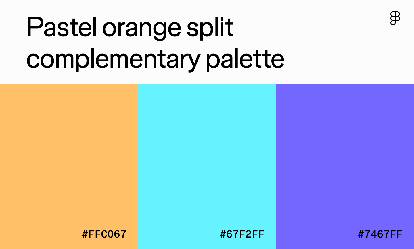
Type: Split complementary
Best for: Educational apps for children, creative platforms, or gaming apps
Pastel orange brings warmth and playfulness. Pair it with blues and violets (a split complementary combo) and you’ve got something energetic but not overwhelming. It works well for creative tools aimed at younger audiences—though it needs neutrals in the mix to keep things balanced.
Beige

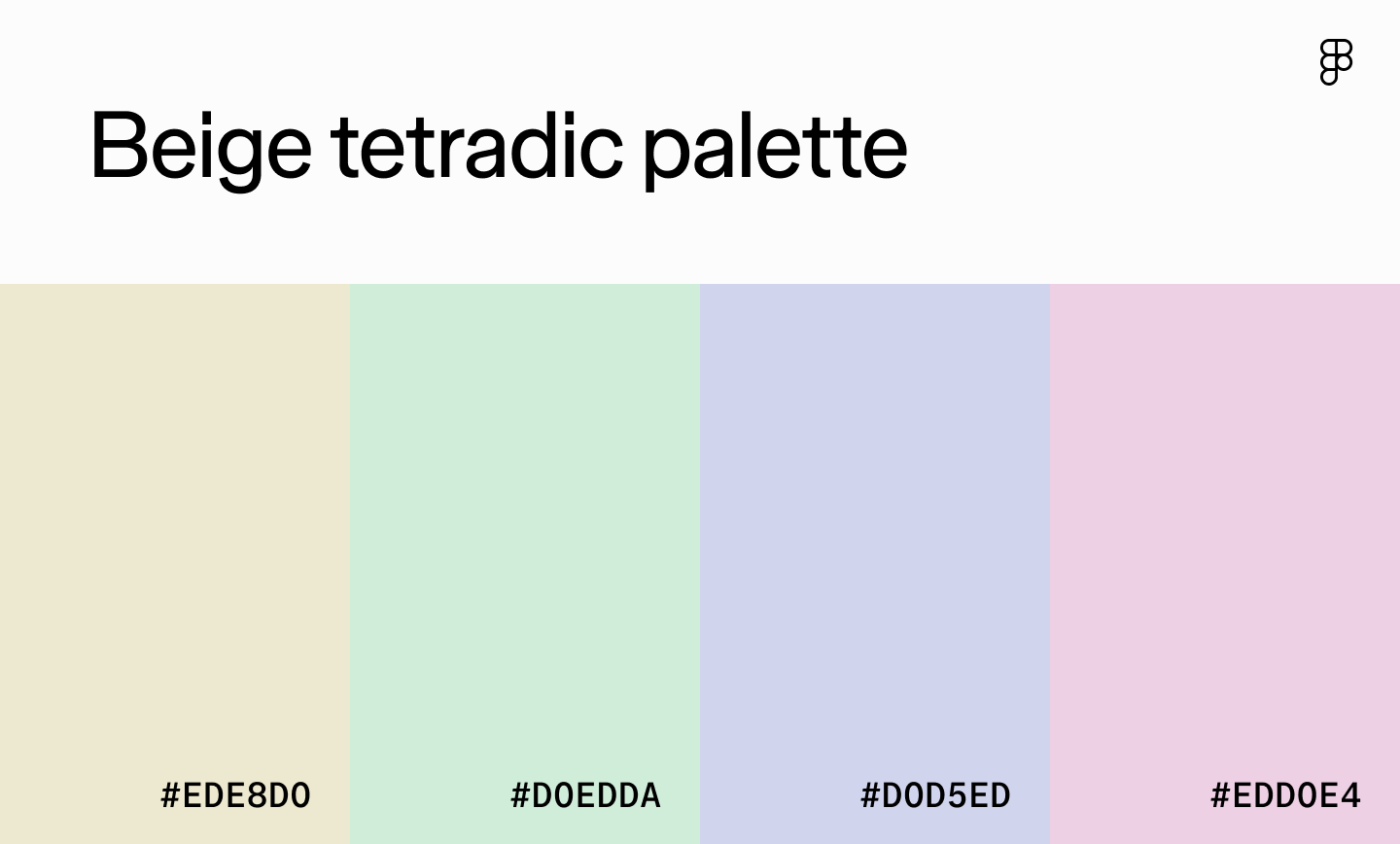
Type: Square
Best for: Mindfulness apps, spa or wellness websites, or floral businesses
Beige makes a calm, natural base for this tetradic color palette, especially when paired with three pastel shades. Since the contrast is low, lean on darker text or subtle patterns to keep elements readable and distinct.
Pink

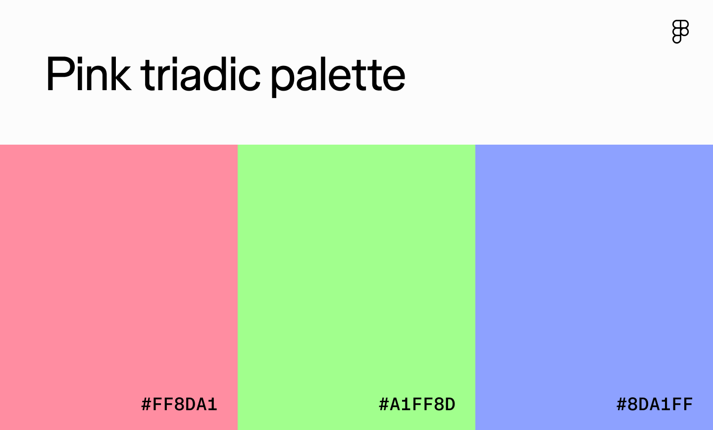
Type: Triadic
Best for: Creative platforms, children’s apps, or design tools
The combination of pink, bright green, and light purple brings a fun, energetic, youthful appeal to user interfaces. The high-contrast colors provide excitement that keeps users engaged while evoking feelings of creativity and imagination.
To avoid overwhelming users, make one color dominant and let the others play supporting roles.
Maroon

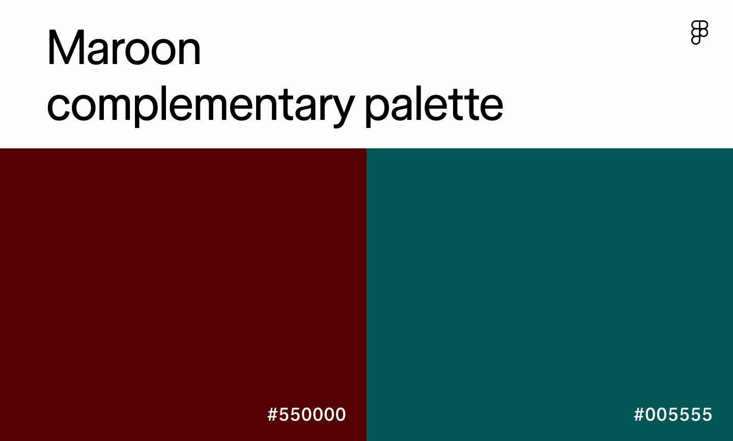
Type: Complementary
Best for: Academic institutions, high-end retail websites, or platforms offering exclusive memberships
Maroon is a sophisticated shade often used to create a luxurious or serious feel. Pair it with its opposite, deep turquoise, and you get sophistication with a hint of vibrancy. It evokes feelings of trust, luxury, and even power. Introduce lighter neutrals alongside it so the interface doesn’t feel too heavy.
Green sage

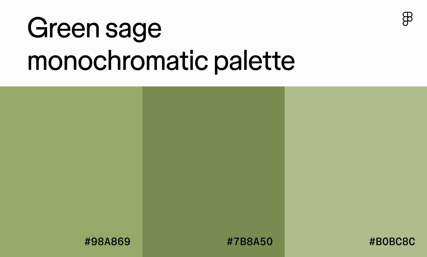
Type: Monochromatic
Best for: Online stores offering organic or healthy food, nature apps, or gardening platforms
Green sage palettes feel earthy and balanced—the kind of colors you see in outdoor gear brands or plant-care apps. These muted colors evoke feelings of relaxation and balance connected to nature. Layering a few shades of green adds quiet depth to UI elements, while a contrasting neutral color like brown or cream can help add visual interest and enhance readability.
Brown

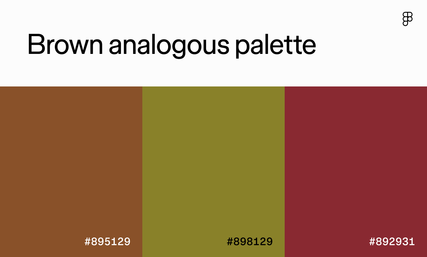
Type: Analogous
Best for: Fine dining apps, high-end furniture brands, or educational apps
Brown paired with olive green and maroon feels serious, traditional, even a little old-world. It works beautifully for brands that want to project heritage and stability but it can get heavy fast, so brighten it up with lighter shades.
Yellow

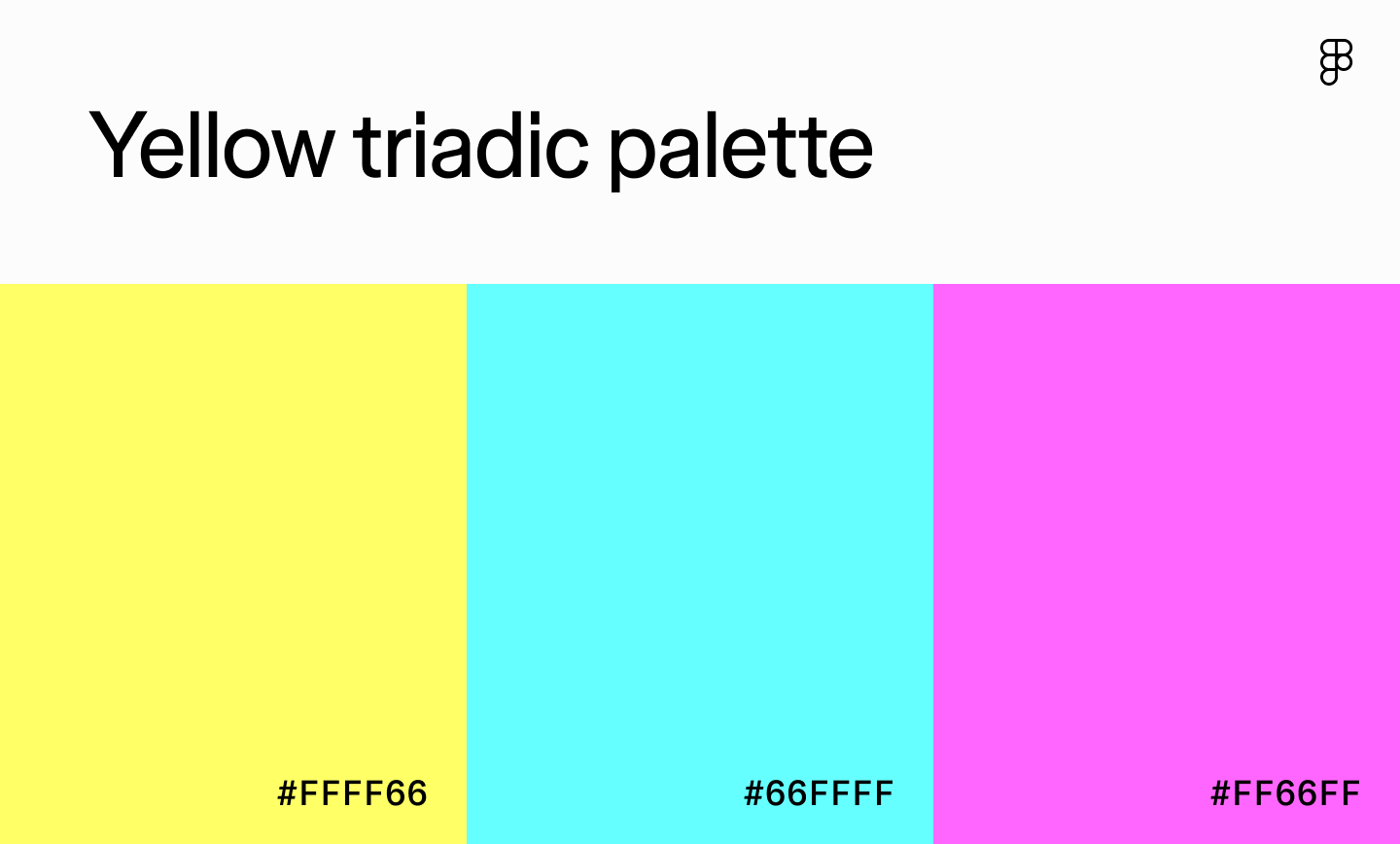
Type: Triadic
Best for: Gaming platforms, children’s apps, or creative websites targeting younger audiences
Yellow, light cyan, and light magenta create a triadic palette that is pure energy. It practically hums off the screen and is great for gaming or kids’ platforms. One trick is to pick one dominant shade and let the other two show up sparingly, or you’ll wear your users out.
Tan

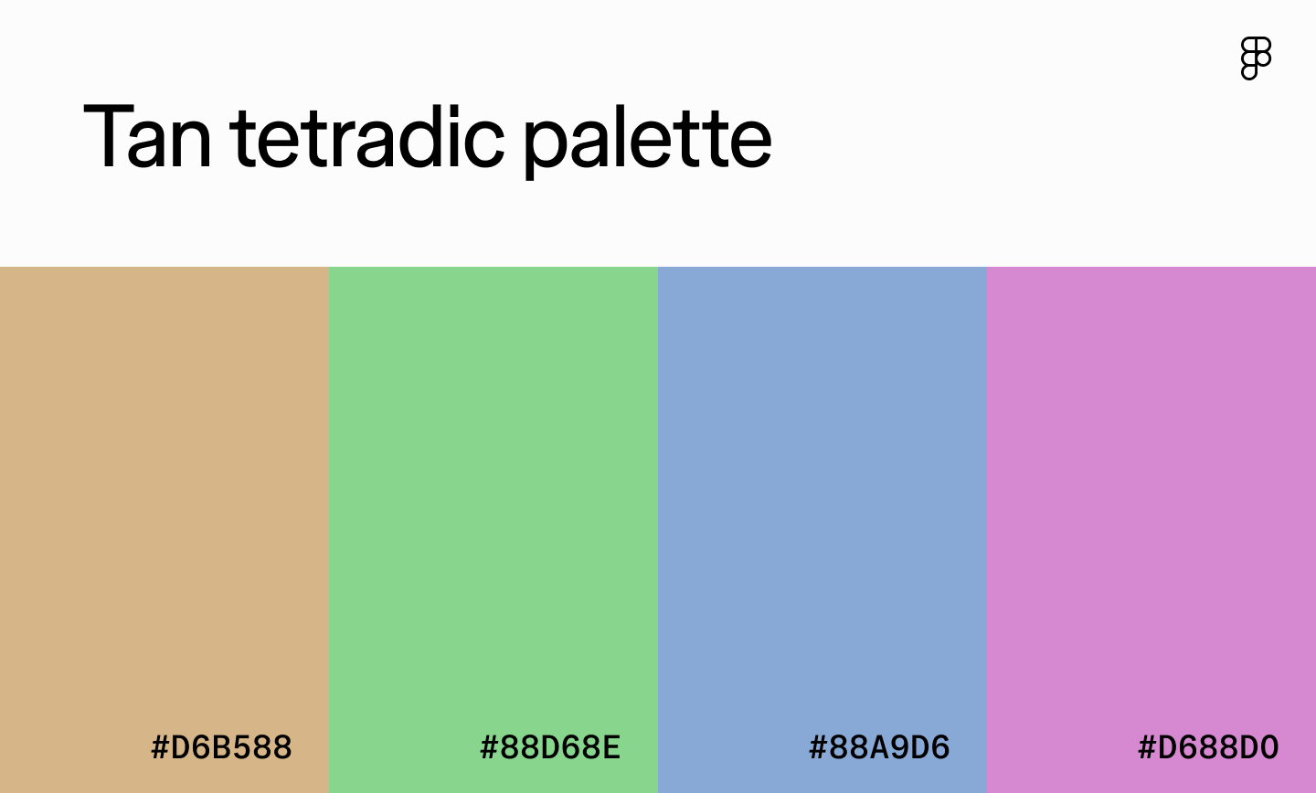
Type: Square
Best for: Event planning platforms, design tools, or children’s apps
In this color palette, tan makes a steady background, while green, blue, and purple bring the energy without feeling overpowering. This palette feels light and imaginative. To keep it from looking too washed out, add a pattern or texture so the design has some bite.
Mint blue

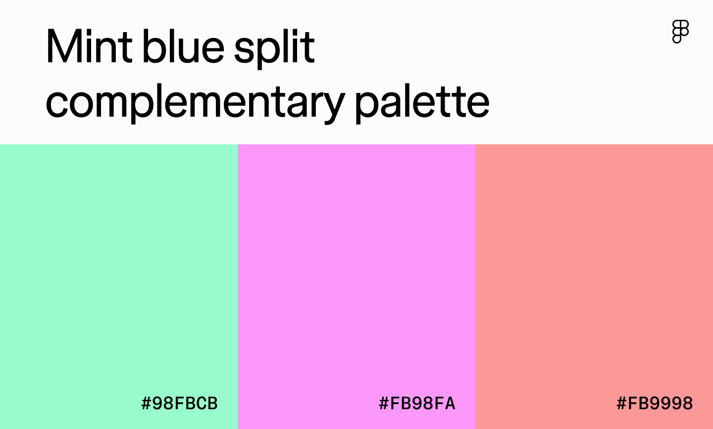
Type: Split complementary
Best for: Wedding or party planning apps and health and wellness platforms
With mint blue as the primary color, this split complementary palette adds a fresh, invigorating appeal to UI designs. The pink shades also promote a romantic and whimsical feel—great for wedding or party planning apps. To add visual interest and maintain balance, use white space and incorporate textures and patterns.
Ready to experiment with different color palettes?
Craft harmonious color combos and get a shareable link, or import them directly to your Figma workspace.
How to choose a color scheme for your design
Creating a color palette that resonates with users involves careful thought, research, and understanding how users interpret colors. Here’s how to choose a winning color combination for your next design.

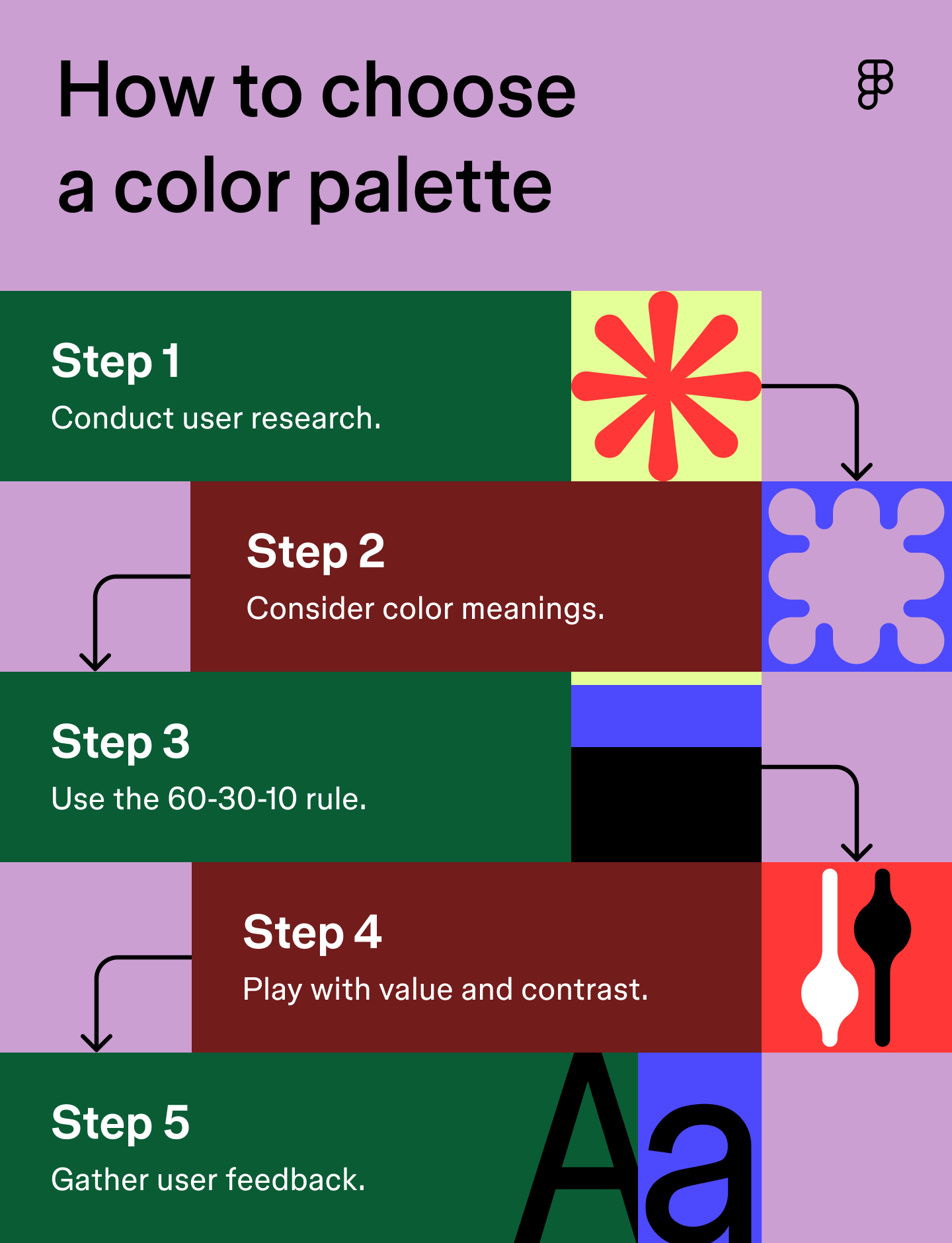
Step 1: Conduct research
Any great design project starts with thorough research. When choosing a color palette, start with your users: what do they care about, and what emotions should your product spark?
A meditation app leans into blues and greens for calm, while a toy site might use bright yellows and pinks to feel fun and playful. Create a few user personas so you can match colors to real people, not just a mood board.
Pro tip: Create user personas to understand your target audience’s emotions and preferences. This will help you establish your design goal and create a palette that resonates with the end user.
Step 2: Consider color meanings
Color psychology is powerful—and it’s cultural. Always double-check what your color choices will mean to your audience before locking them in.
Here are some examples of common colors, their meanings, and how to use them in UI design:
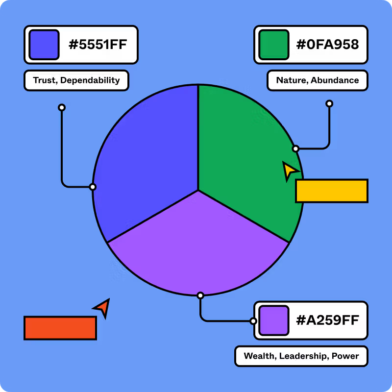
- Red is often associated with love, passion, danger, and anger. Red can trigger a wide range of emotional responses and create a sense of urgency within UI designs.
- Blue symbolizes peace, tranquility, and a sense of security. It can evoke feelings of trust, professionalism, and calmness.
- Green is known for its connection to nature. Green represents growth, vitality, and freshness, promoting feelings of relaxation and emotional well-being.
- Yellow is known for its cheerful disposition and helps create an inviting and energetic user interface.
- Pink can symbolize romance and playfulness, creating a youthful and inviting atmosphere.
- White is one of the most versatile neutral shades, symbolizing cleanliness and tranquility, bringing harmony to designs.
Pro tip: Always consider the cultural context of colors, especially when designing for a global audience. Color meanings and color symbolism can vary, so research color considerations to ensure the shades you use convey the appropriate message.
Step 3: Use the 60-30-10 rule
Designers borrow the 60-30-10 from interior design because it works: 60% dominant, 30% secondary, 10% accent. Here’s how to break it down:
- Dominant or primary color (60%): Your main shade should tie to brand identity (think dark purple in Slack or green for Spotify).
- Secondary colors (30%): This shade complements the primary color and provides a visually pleasing contrast.
- Accent color (10%): These colors add pops of interest and help UI elements stand out.
Take the sleep app Hatch, for example. It uses a dark blue background as its primary color to evoke feelings of relaxation. A slightly lighter shade of blue adds visual interest and makes buttons stand out. Finally, it uses gray, light blue, and soft orange as accent shades to highlight essential buttons and elements. This color palette complements the primary blue tones without disrupting the app’s peaceful ambiance.
Pro tip: Start with a grayscale version of your design before applying color. This allows you to focus on arranging elements in a clear and usable way, ensuring a strong visual hierarchy and making the design easy to navigate and understand, even without color.
Step 4: Play with value and contrast
Experimenting with value and contrast creates a balanced color palette that effectively guides users through your interface. Value refers to the lightness (high value) or darkness (low value) of a single color, which can change the entire feel of a design. Lighter shades with high value typically exude a soft and airy feel, while darker shades with low value are dramatic and bold.
Contrast refers to the difference in value (lightness and darkness) between two colors. For example, black text on a white background has a high contrast, while light gray on a white background has a low contrast. The Web Content Accessibility Guidelines (WCAG) recommend a minimum of a 4.5:1 contrast ratio for normal text and a 3:1 ratio for large text. A ratio of 4.5:1 means the lighter color is 4.5 times lighter than the darker color.
Contrast is the key to grabbing user attention, making elements stand out, and ensuring readability. High contrast between text and background is also crucial for accessibility, making your design clear and easy to understand by everyone, including those with visual impairments.
Pro tip: Sometimes colors can appear differently across devices, so test your design on multiple screens and under varying lighting to ensure a consistent experience.
Step 5: Gather feedback
Before you launch your design, gather feedback on your color palette to ensure it resonates with end users and aligns with your overall goal. This allows you to make any necessary adjustments to your color palette to create a pleasing user experience.
Pro tip: Conduct A/B testing to see how users respond to different color schemes. This helps you assess the proper contrast between elements for readability and accessibility. For example, you can test two variations of CTA buttons in different shades to see which one gets more clicks and prompts users to take action.
Color palettes in branding and UX
A good color palette is a strategic tool that reinforces a brand’s identity and guides the user experience. Colors can influence how users perceive a brand, evoke specific emotions, and create a sense of trust and professionalism.
In branding, a consistent color palette ensures instant recognition and helps differentiate a company from its competitors. For example, a specific shade of red can be a powerful and recognizable trademark for a brand like Coca-Cola.
In UX design, colors can establish visual hierarchy, draw attention to key elements like calls to action, and provide clear feedback to the user (like a red warning message versus a green success message). Ultimately, a cohesive color palette creates a memorable and intuitive experience that keeps users engaged.
Find the right color palette with Figma
Colors play a crucial role in UI and UX design, helping designers communicate messages effectively and influence user behavior. If you’re ready to create a memorable and engaging color palette for your next design project, Figma can help.
Here’s how:
- Create custom color palettes from any image with Figma’s color picker tool.
- Explore Figma’s color meaning library to learn about different colors and how to use them in UI design.
- Generate color palettes on the color wheel or the color palette generator, then import them directly into Figma to experiment with different color combinations in your designs.
- Explore the accessibility resources, tools, and plugins within the Figma Community to ensure your color palettes resonate with all users.
Ready to create an impactful color palette?
Figma’s design tools help you experiment, generate, and save your favorite color combos.


From the blog
The Figma design agent is here
Starting today, work with an agent that is built for Figma—directly on the canvas.

The TL;DR on MCP: Why context matters and how to put it to work
Figma’s MCP server brings your design decisions into the tools where code gets written—so what gets built actually matches what was designed. Here’s what that unlocks for everyone who builds products.
How to supercharge your design system with slots
Slots give you the ability to customize components without breaking the system. We’re sharing five field-tested tips from early users to help you unlock more freedom without giving up control.
The new business case for design systems
Design systems have evolved from static libraries to key drivers of business revenue, customer loyalty, and product strategy. Here’s what you need to know about how to track and communicate the value of your design system, based on new research from the Design Executive Council (DXC).

5 shifts redefining design systems in the AI era
As AI reshapes how we make products, design systems are evolving from libraries of reusable parts into living frameworks that scale taste and craft. We spoke with product leaders and practitioners about the shifts they’re seeing in how design systems are built, used, and maintained.

Schema 2025: Design systems for a new era
Design systems help teams push what’s possible while maintaining a high level of craft, polish, and performance. Here’s everything we announced at Schema by Figma to help teams design for the AI era.