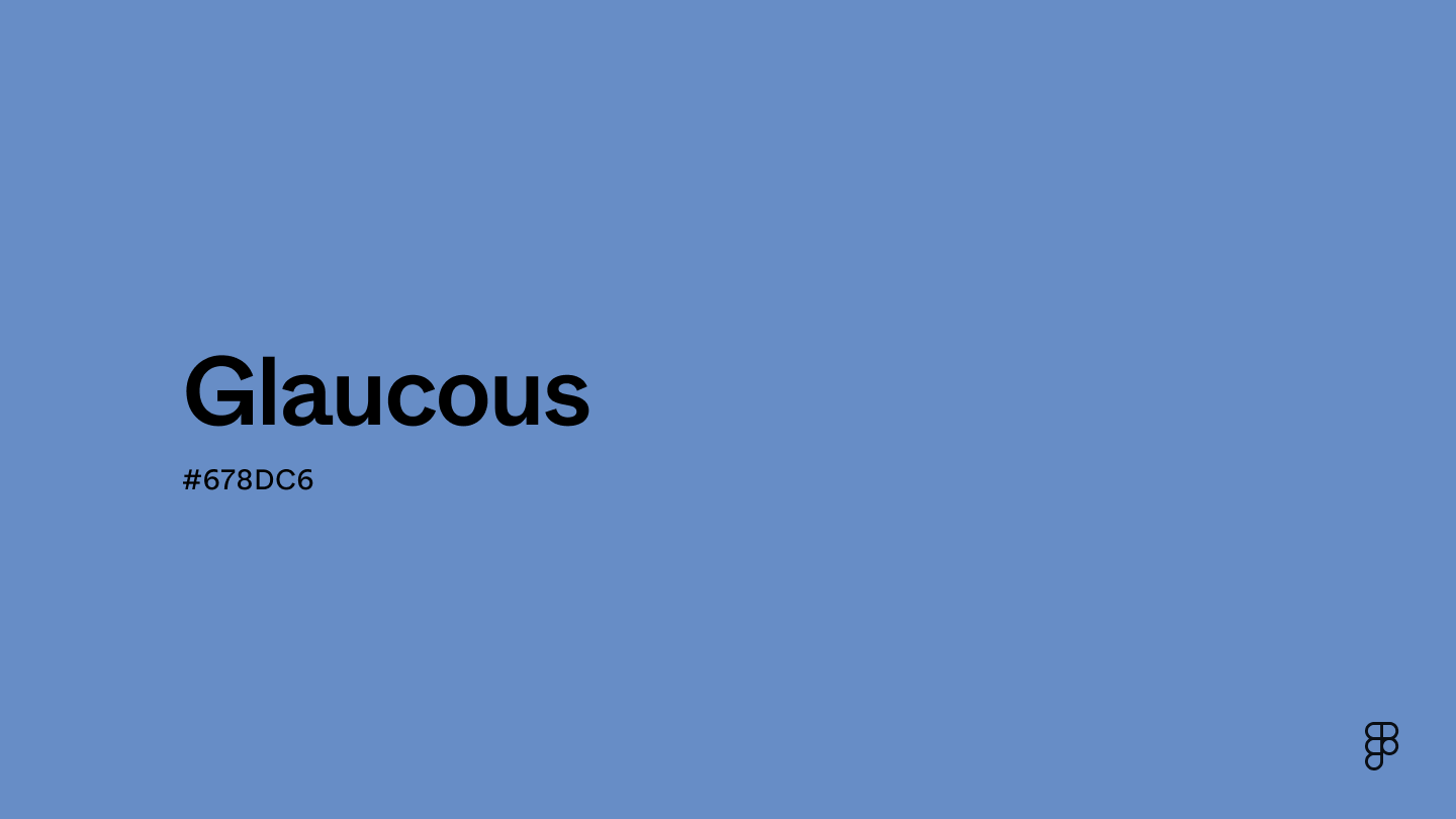
Glaucous is a cool-toned shade of blue that borders the blue-green and blue-violet regions of the color wheel. Its blue influence promotes peace and tranquility, while its muted appearance conveys sophistication and reliability.

Color variations
Shades
Tints
Tones
Hues
Color Harmonies
Complementary
Split
Monochromatic
Analogous
Triadic
Square
Custom Palettes
Triton
Beachwalk
Aurora
Glaucous is defined by the following color codes and values to ensure consistency across various digital platforms and devices.
- HEX code: #678DC6
- RGB value: 40.4% red, 55.3% green, and 77.6% blue
Accessibility considerations play a crucial role in UX and UI design color choices. Figma offers plugins in the Community to make sure your designs meet Web Content Accessibility Guidelines.
Here are some ways to use glaucous in your designs:
- Create a serene atmosphere. Glaucous’s muted, blue-green tone evokes a sense of tranquility and peace, making it ideal for wellness, meditation, or spa-related apps.
- Enhance readability. Use glaucous for headings or buttons to increase visibility and improve visual hierarchy.
- Convey trust and reliability. Glaucous is often associated with wisdom and stability, making it perfect for financial, legal, or educational platforms where trust is paramount.
Keep in mind that color and its meaning can change from culture to culture—and at any given time. If you are designing for a global audience, research color considerations for your specific regions.
For variations within the same cool spectrum as glaucous, consider:
- Blue-gray (#6A89A7) offers a softer, more muted tone.
- Cornflower blue (#6395EE) is a brighter, more vibrant blue with a hint of purple.
- Light blue (#90D5FF) is a lighter, airier shade, conveying a sense of freshness.
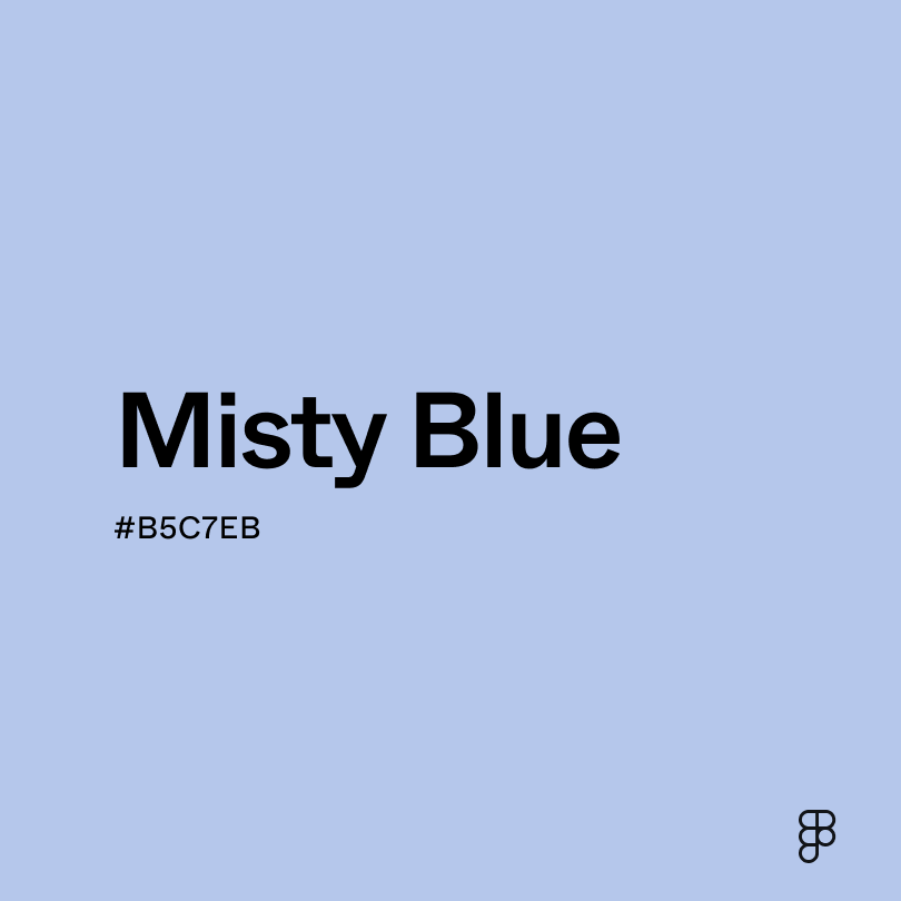
- Misty blue (#B5C7EB) offers a softer, more ethereal tone for a dreamy vibe.
To complement glaucous, consider pairing it with:
- Gray (#898989) creates a sophisticated look emphasizing glaucous’s depth and tranquility.
- Pastel orange (#FFC067) offers a vibrant, unexpected contrast that brings warmth and energy to the cooler tones of glaucous.
- Soft pink (#E89EB8) provides a gentle, romantic contrast to glaucous’s coolness, creating a dreamy palette.
- Gold (#EFBF04) brings a touch of luxury and warmth.
Other colors worth considering include turquoise or mint green for a playful look and jet black or navy blue for a dramatic contrast.
While glaucous is cool and calming, it may clash with:
- Neon green (#2CFF05) creates a jarring contrast with the cool, muted tones of glaucous.
- Purple (#9D00FF) lacks contrast when paired with glaucous, as both colors are on the cooler side of the color wheel.
- Rose (#FF1D8D) is too saturated against the softness of glaucous.
- Aqua (#00FFF0) is too bright and lacks the depth of glaucous, creating a flat and uninteresting appearance.
Glaucous symbolizes tranquility, wisdom, and stability. It draws inspiration from the sea and sky, evoking feelings of peace and serenity. This color also represents depth, intelligence, and a connection to the natural world.
In color psychology, glaucous is seen as calming and reassuring, fostering a sense of security and trust while encouraging clear thought and focus. It can also evoke feelings of freedom, promoting openness and optimism.
In UI design, glaucous creates a serene and professional atmosphere. It’s suitable for platforms prioritizing trust, reliability, and information, such as those in the wellness, finance, or technology spaces.
The term “glaucous” comes from the Greek word “glaukos,” meaning“gray-green” or “gleaming.” Historically, it was mainly used in botanical and ornithological contexts to describe the bluish-green or gray-white waxy coating found on certain plants and bird feathers. This natural occurrence of the color has influenced its use in art and design.
Contrast 3.39
- Large Text
#678DC6
- Normal Text
How you design, align, and build matters. Do it together with Figma.
| Category | ||
|---|---|---|
Fail | Fail | |
Pass | Fail | |
Pass | Fail |
Contrast 6.2
- Large Text
#678DC6
- Normal Text
How you design, align, and build matters. Do it together with Figma.
| Category | ||
|---|---|---|
Pass | Fail | |
Pass | Pass | |
Pass | Pass |
Color simulations
Protanopia
Deuteranopia
Tritanopia
Achromatopsia
The hexadecimal color #678DC6, known as glaucous, has RGB values of R:103, G:141, B:198 and CMYK values of C:0.48, M:0.29, Y:0, K:0.22.
| VALUE | CSS | |
|---|---|---|
| HEX | 678DC6 | #678DC6 |
| RGB DECIMAL | 103, 141, 198 | RGB(103,141,198) |
| RGB PERCENTAGE | 40.4, 55.3, 77.6 | RGB(40.4%,55.3%,77.6%) |
| CMYK | 48, 29, 0, 22 | |
| HSL | 216°, 45.5, 59 | HSL(216°,45.5%,59%) |
| HSV (OR HSB) | 216°, 48, 77.6 | |
| WEB SAFE | 6699CC | #6699CC |
| CIE-LAB | 58.046, 2.511, -33.627 | |
| XYZ | 25.309, 26.009, 57.11 | |
| xyY | 0.233, 0.24, 26.009 | |
| CIE-LCH | 58.046, 33.72, 274.27 | |
| CIE-LUV | 58.046, -19.099, -52.373 | |
| HUNTER-LAB | 50.999, -0.666, -30.694 | |
| BINARY | 01100111, 10001101, 11000110 | |
| iOS - SwiftUI | Color(red: 0.404, green: 0.553, blue: 0.776) | |
| iOS - UIKit | UIColor(red: 0.404, green: 0.553, blue: 0.776, alpha: 1) | |
| Android - Compose | Color(0xFF678DC6) |