33 modern fonts to elevate your designs


Share 33 modern fonts to elevate your designs
Explore more from
Design basics
Design and prototype with consistent type
Bring type to life in every interaction.

While many use “modern” and “contemporary” interchangeably, modern design refers to a movement in the late 19th and early to mid-20th centuries. If you’re aiming for this aesthetic for your next project, choose modern fonts featuring clean lines, contrasting strokes, and thin serifs for a sleek, updated feel.
Read on to learn:
- 33 modern fonts
- The primary types of modern fonts
- How to use each font
- Tips for using modern fonts
Modern Fonts That Make Your Designs Pop
Elevate your designs with modern fonts — Try Figma for free
Font 1: Instrument Sans

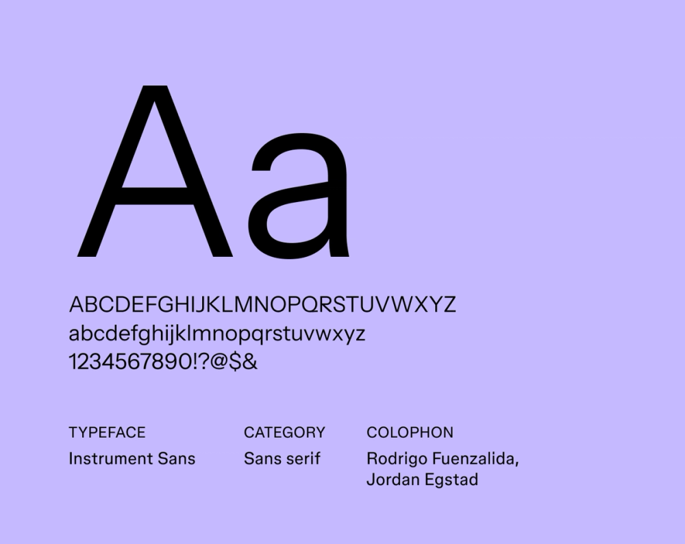
Instrument Sans offers a clean and modern design that prioritizes versatility. It features balanced proportions and a neutral style, making it suitable for professional use or creative branding. The font’s simplicity ensures clarity and readability, while its modern aesthetic adds a contemporary touch.
Best for: UI/UX design, user interfaces, branding, and general body text
Font 2: Work Sans

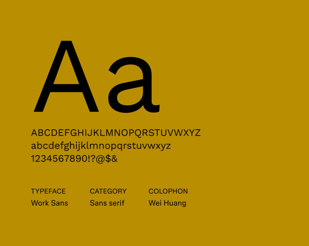
Work Sans is a geometric sans serif designed for on-screen readability. Its simple and modern design style makes it a great choice for headings and body text on websites and interfaces.
Best for: Web design, app interfaces, and minimalist designs
Font 3: Instrument Serif

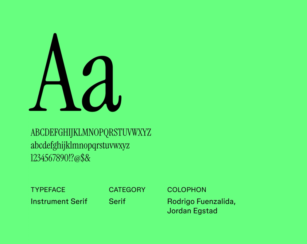
Instrument Serif is a typeface that blends classic serif elements with a modern aesthetic. It balances elegance and readability, making it a great choice for designs that require a sophisticated and professional appearance.
Best for: Editorial design, long-form content, and books
Font 4: Rethink Sans

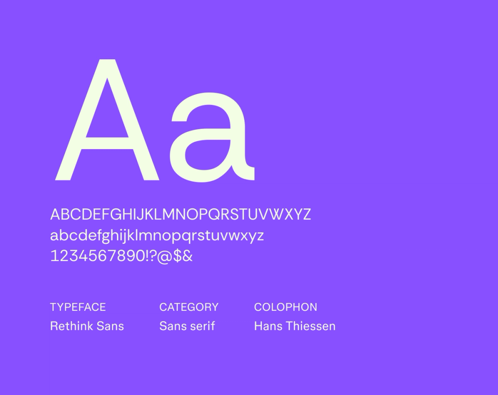
Rethink Sans is a geometric sans serif designed for a modern and approachable feel. Its simple, clean lines make it a strong choice for tech-related designs or contemporary branding.
Best for: User interfaces, websites, educational materials, and inclusive designs
Font 5: Quintessential

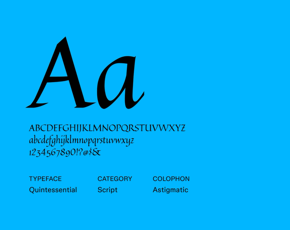
Quintessential is a playful script font with a vintage, hand-lettered feel. It adds a touch of elegance and personality to designs, making it a great option for modern wedding materials, artistic projects, and boutique brands wanting to convey a nostalgic vibe.
Best for: Invitations, branding, and logos
Font 6: Plus Jakarta Sans

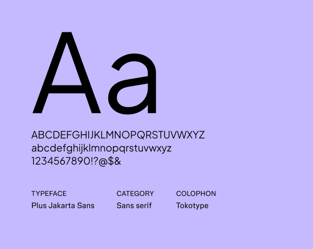
Plus Jakarta Sans is a modern geometric sans serif font that’s both friendly and professional. It’s highly versatile and legible, perfect for modern designs that prioritize readability.
Best for: UI/UX design, mobile apps, digital branding, and modern websites
Font 7: Inclusive Sans

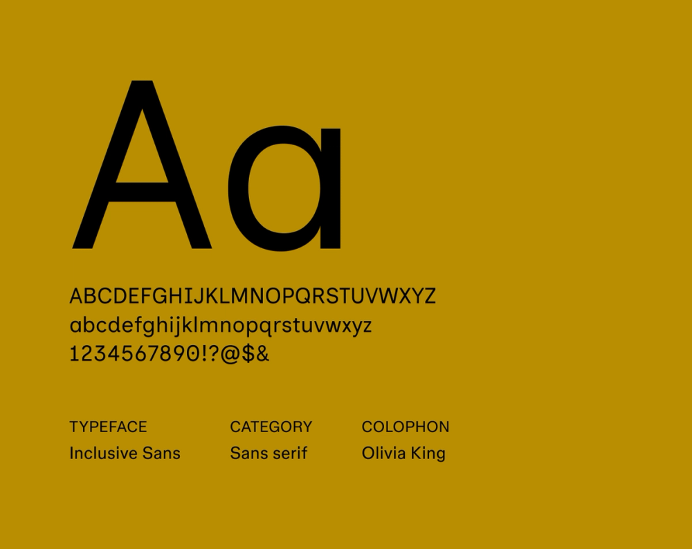
Inclusive Sans is an accessible font choice that prioritizes readability for all audiences. Its open letterforms and optimized spacing ensure an inclusive design across a wide range of devices and sizes.
Best for: Websites, apps, and projects prioritizing accessibility
Font 8: Playfair Display

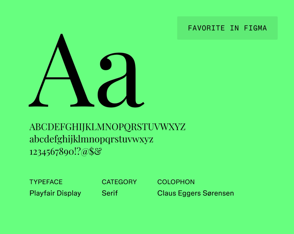
Playfair Display is a high-contrast serif font that works best in larger sizes. With its refined details and graceful curves, . it’s a go-to choice for sophisticated and elegant designs.
Best for: Headlines, titles, and editorial designs
Font 9: Montserrat

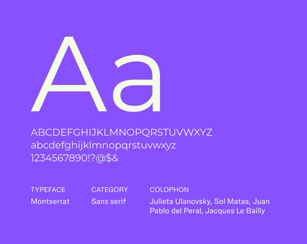
This geometric sans serif is inspired by urban typography, blending old roots with contemporary features. Montserrat’s clean and inviting style is highly versatile and often used in Web and print design.
Best for: Headlines, body text, UI/UX design, and branding
Font 10: Open Sans

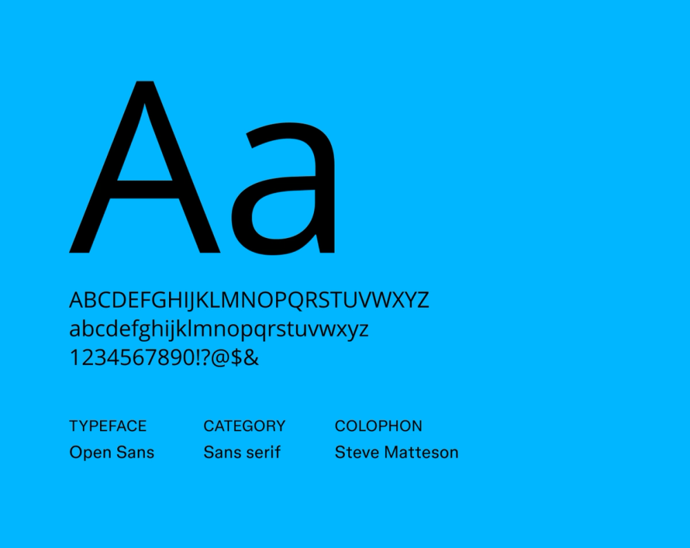
Open Sans is another font choice designed for on-screen readability, with a neutral, legible design that is optimized for both Web and print use. It supports various languages and weights, making it adaptable to many design contexts.
Best for: Web design, app interfaces, body text, and general use
Font 11: Lato

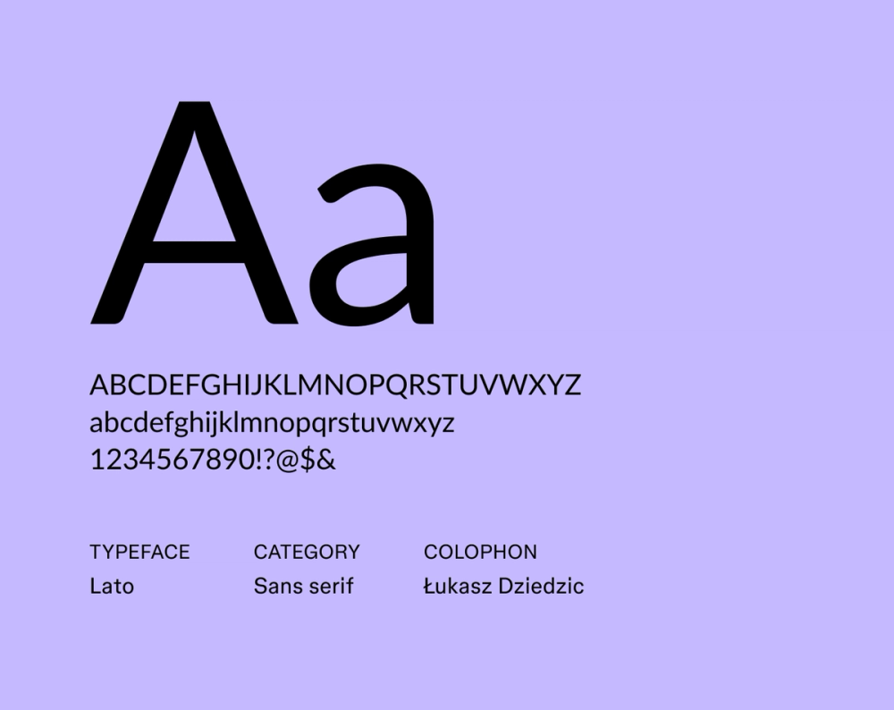
Lato’s warm and friendly feel is designed for maximum legibility across various sizes and applications. Because of its modern and approachable look, Lato is a popular choice for branding, Web design, and user interfaces.
Best for: Body text, websites, and apps
Font 12: Poppins

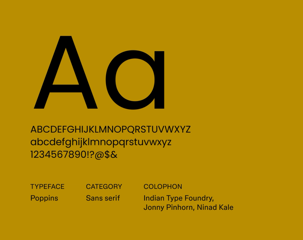
Poppins is a geometric sans serif font with a contemporary style. Its clean lines and uniform stroke width create a sense of balance and clarity, while the subtly rounded corners add a touch of warmth and approachability.
Best for: Logos, Web design, app interfaces, and modern branding
Font 13: Charis SIL

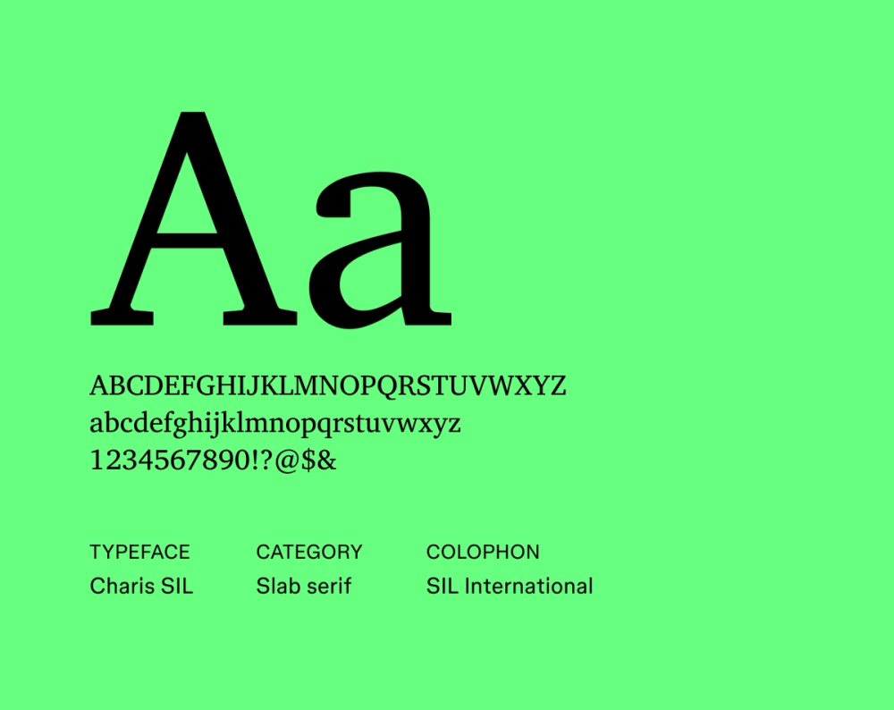
Charis SIL is a slab serif font that prioritizes readability, ensuring the text stands out even when printed or displayed in smaller sizes. It's ideal when you need a neutral yet functional font. Charis SIL is also optimized for print and digital displays, providing a variety of weights and styles.
Best for: Body text and extended passages
Font 14: Domine

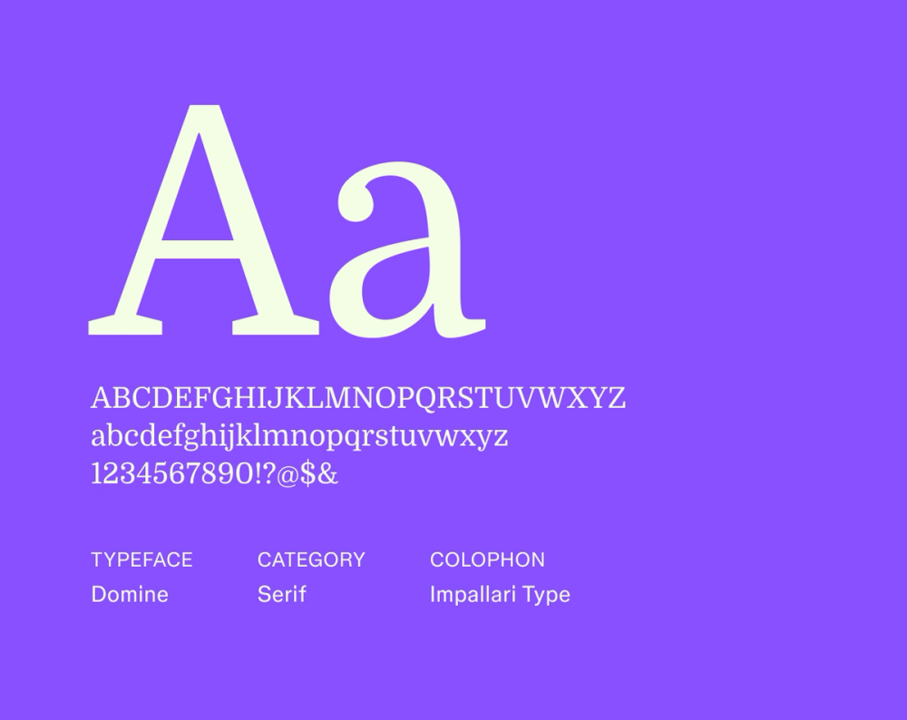
Domine is a highly readable serif font designed for digital screens. Its sturdy, clean lines and well-balanced proportions provide clarity and polish—ideal for websites, blogs, and documents. Domine is a versatile choice for contemporary applications that want a modern touch.
Best for: Body text, blogs, headlines, formal documents, and digital reading
Font 15: Bodoni Moda

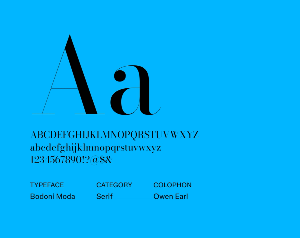
Bodoni Moda puts a modern spin on the classic serif font, Bodoni. It features high-contrast and stylish letterforms, which make it great for contemporary and sophisticated designs aiming for a refined look.
Best for: Luxury branding, editorial designs, and high-end magazines
Font 16: Forum

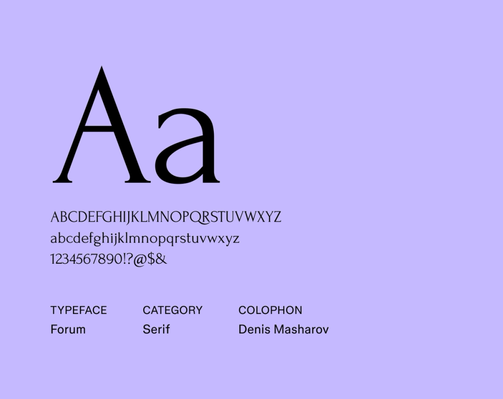
Forum brings modern clarity with its clean lines and balanced propositions. It is inspired by ancient Roman inscriptions and adds a classical yet temporary feel to designs. Forum is great for display purposes or branding with a timeless feel.
Best for: Formal invitations, classic branding, headlines, book covers, historical-themed designs
Font 17: Chonburi

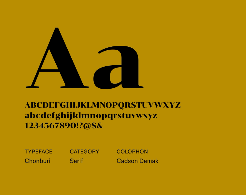
Chonburi, a display serif font, evokes a retro vibe with its Thai-inspired design. Its playful personality makes it a unique choice for modern brands seeking to express a vintage, vibrant, and bold brand identity.
Best for: Headlines, titles, posters, and retro branding
Font 18: Xanh Mono

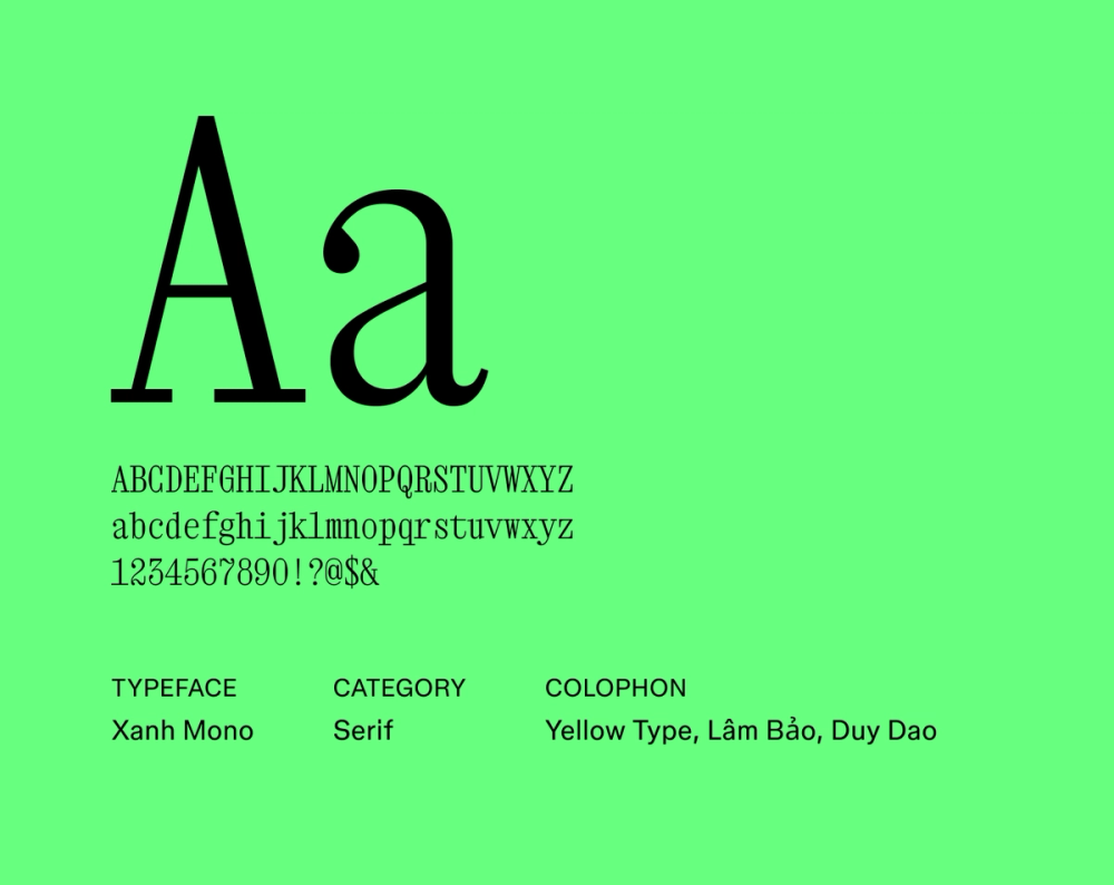
Xanh Mono is a contemporary monospace serif font with clean lines and balanced proportions. It’s designed for display and reading purposes, making it a versatile choice for a wide range of design projects.
Best for: Logos, headlines, technical documents, and creative branding
Font 19: Corben

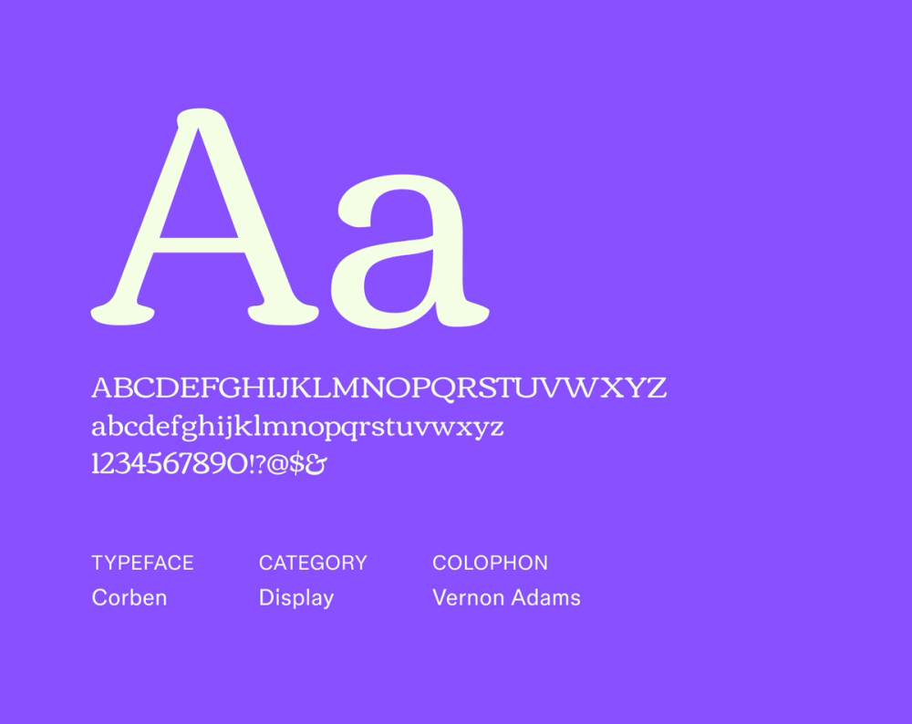
Corben is a display font with a playful design suitable for Web use. Its sophisticated yet approachable style (notice its slightly rounded edges) makes it a perfect choice for projects that are going for an informal but still professional look.
Best for: Websites, logos, headlines, online advertising, and creative branding
Font 20: Roboto Serif

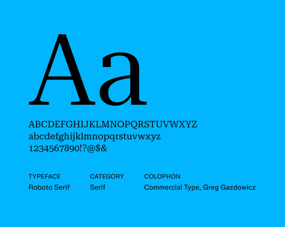
Roboto Serif is a modern, highly legible font designed for a comfortable on-screen reading experience. It features a sleek, clean design suitable for various screen sizes. Since it's a variable font, it gives designers greater control and flexibility over styling.
Best for: Responsive websites, app interfaces, and UX design
Font 21: Pridi

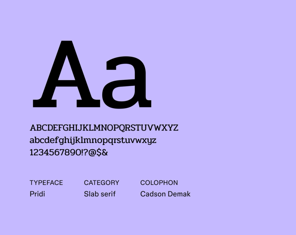
Pridi is a contemporary typeface that blends Thai design elements with modern typography. Its versatility makes it suitable for digital and print applications, offering a refined design look that balances traditional and contemporary minimalism.
Best for: Headlines, cultural publications, magazines, and modern branding
Font 22: Arapey

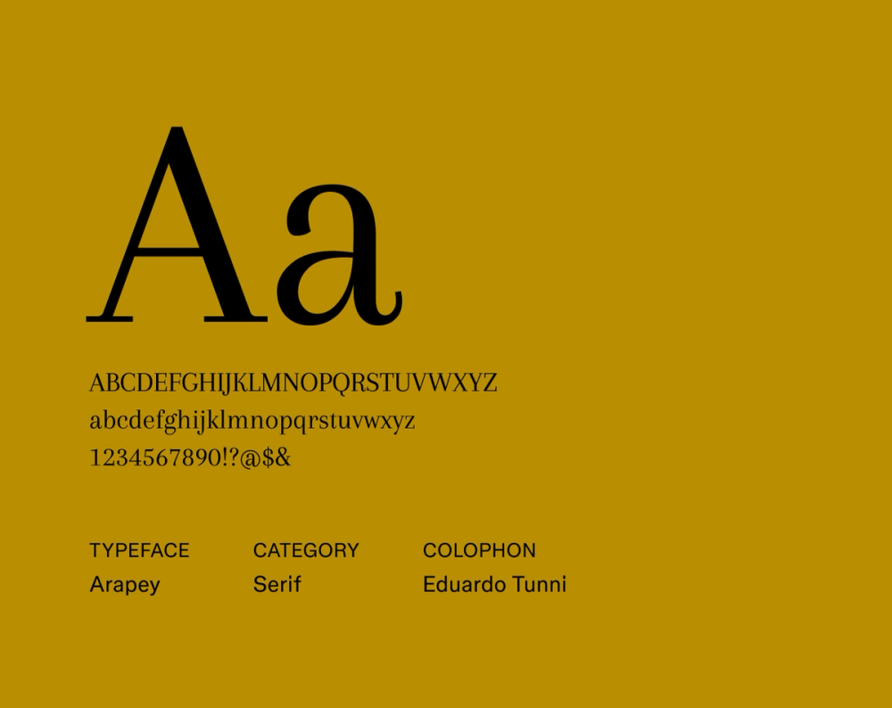
Arapey’s subtle contrast and graceful, flowing lines give it a refined, modern look. Its elegant and soft style makes it well-suited for sophisticated, timeless branding with a relaxed feel.
Best for: Body text, headlines, and distinguished branding
Font 23: Tienne

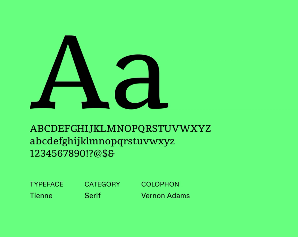
Tienne is a contemporary serif font designed for online use. Its classic style and sturdy proportions offer a modern interpretation of the traditional serif font, ensuring readability without sacrificing its unique character.
Best for: Websites, online branding, and blogs
Font 24: Manrope

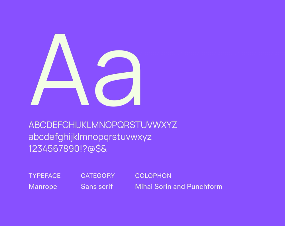
Manrope is a sans serif font with a clean, minimalist, geometric design. It offers versatility and readability in various sizes, making it a popular choice for digital interfaces and modern branding.
Best for: UI design, Web design, and modern branding
Font 25: Nunito Sans

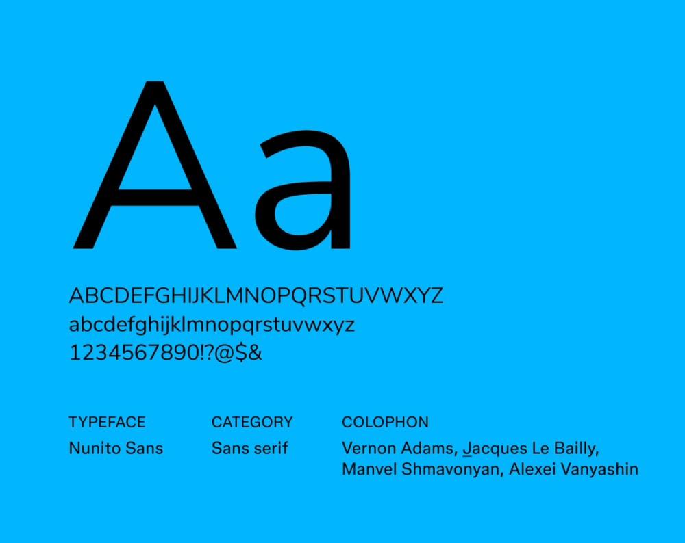
Nunito Sans is a sleek and modern sans serif typeface well-suited for various applications. Its friendly and approachable feel makes it great for creating a positive user experience in digital products, whether used for body text or headlines.
Best for: Headlines, body text, user interfaces, Web design, and mobile apps
Font 26: Inter

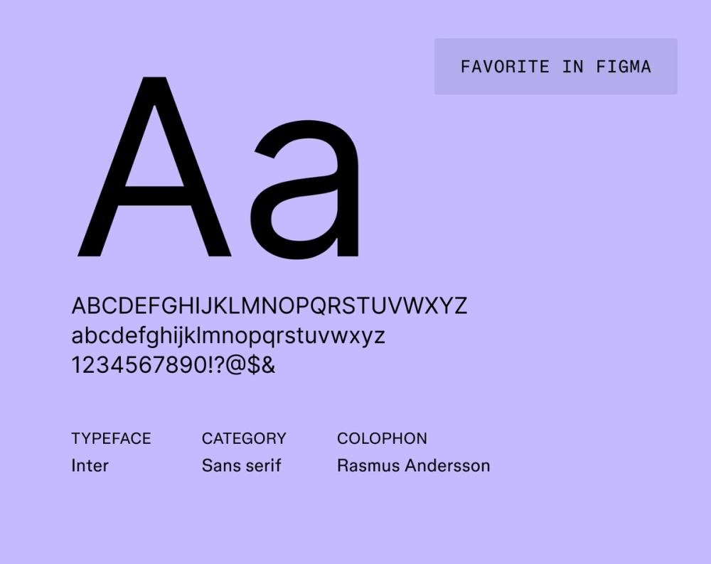
Inter is a contemporary sans serif typeface designed to enhance readability on digital screens. Its open letterforms and optimized legibility make it the ultimate font choice for tech-savvy projects and professional branding.
Best for: User interfaces, corporate or tech-focused branding, app design, and digital publications
Font 27: DM Sans

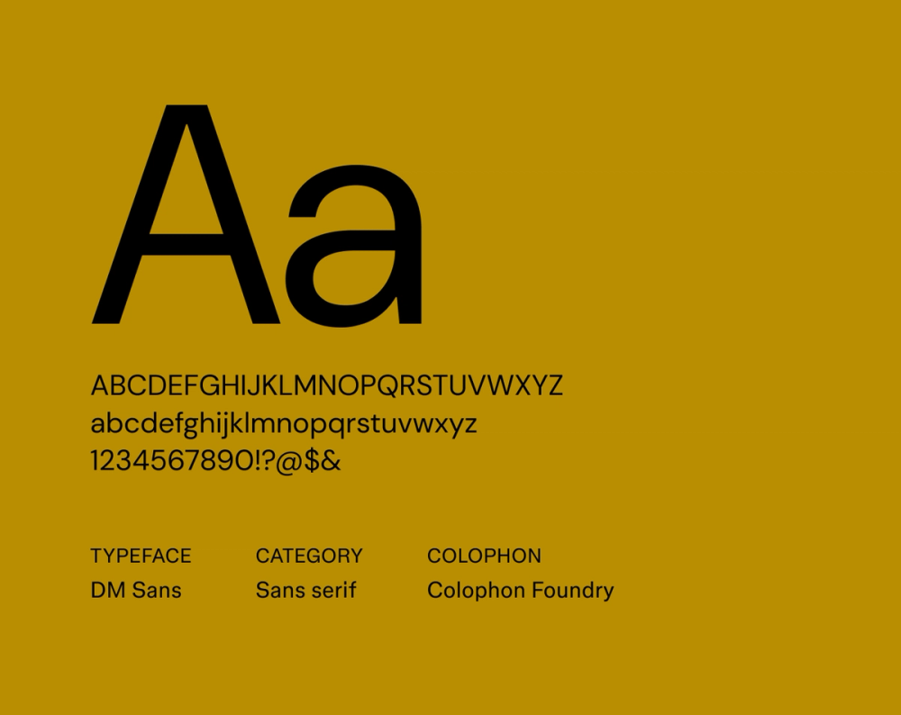
DM Sans is a geometric sans serif font with a low-contrast design that offers a clean and professional appearance. Its legibility at small sizes makes it ideal for modern brands that want a sleek and approachable brand image.
Best for: Websites, apps, and branded materials
Font 28: Red Hat Display

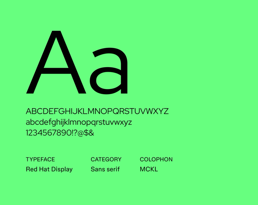
Red Hat Display is a sans serif font crafted for display purposes. Its strong, bold letterforms capture attention while maintaining visual appeal, making it a great choice for brands wanting to make an impact while maintaining a modern feel.
Best for: Headlines, titles, and strong branding
Font 29: Ubuntu

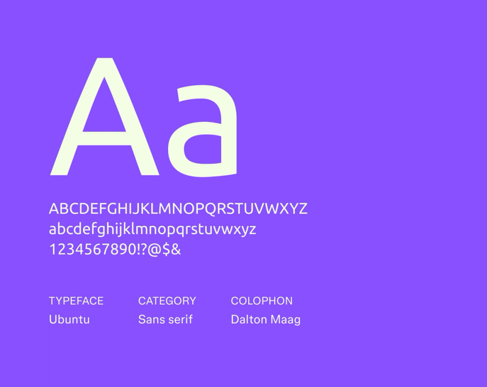
Ubuntu is a modern sans serif typeface that prioritizes clarity and approachability. Its humanist design ensures excellent readability while maintaining a contemporary feel. Ubuntu’s versatility and broad language support make it a popular choice for many projects.
Best for: User interface design, Web design, and global branding
Font 30: Kanit

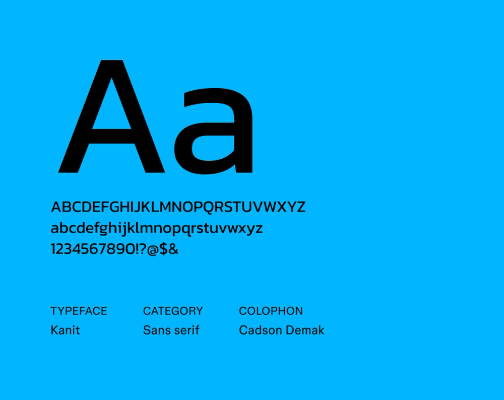
Kanit is a stylish sans serif font. Its clean lines and soft curves give off a futuristic yet friendly look, making it great for modern branding and digital applications.
Best for: Headlines, tech branding, and futuristic designs
Font 31: Anonymous Pro

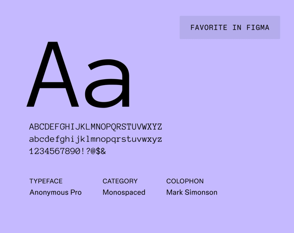
Anonymous Pro is a modern monospaced font designed for coding and tech applications. It features precise, readable letterforms with a contemporary design style that works for minimalist branding.
Best for: Coding interfaces, contemporary design projects, and websites
Font 32: IBM Plex Mono

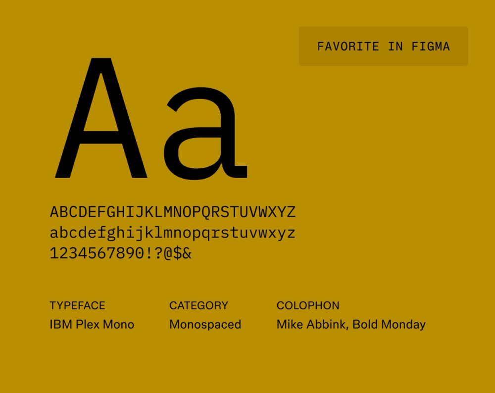
IBM Plex Mono is an open-source modern font part of the IBM Plex family of typefaces. IBM originally designed this font for legibility when coding, but its high readability makes it useful in design applications like UI design, websites, and apps. IBM Plex Mono includes global language support, making it ideal for projects in multiple languages.
Best for: UI design, websites, and apps
Font 33: Space Mono

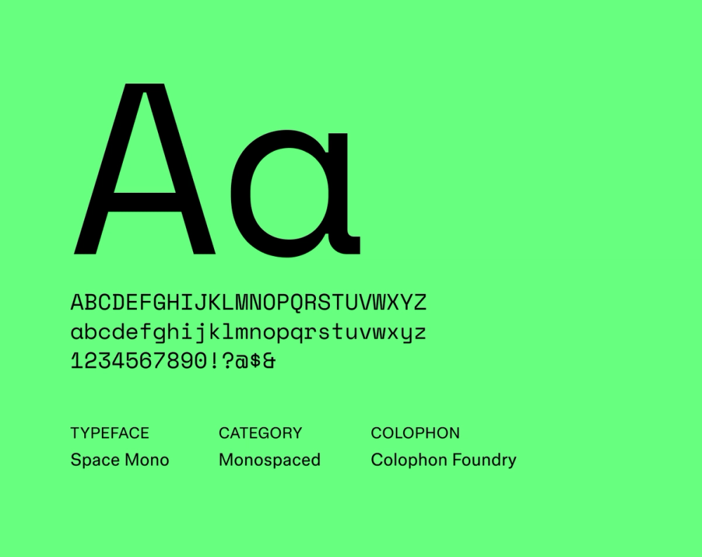
Space Mono is a modern monospaced font featuring retro-futuristic elements. It’s commonly associated with science fiction and technology. Its uniform appearance is ideal for displaying large blocks of type. The font offers a modern look with an edge of friendliness using geometric influences and rounded terminals. Space Mono is available in various weights and styles, including italics.
Best for: Blocks of type associated with technology and science fiction
Six pro tips for using modern fonts
Modern fonts can be a great way to establish a feeling of sophistication and contemporary style. Follow these tips to use them appropriately.
- Prioritize legibility. Modern fonts generally use serifs, ideal for headers; however, sans serif fonts are typically a better choice for body copy due to their legibility. Consider adjusting the leading and kerning for improved readability.
- Create a clear visual hierarchy. Arranging elements in a certain way helps guide the viewer’s eye. Use a font with varied weights and sizes to establish visual order.
- Maintain harmony. Your primary font should be appealing and harmonious with your design. Test different font pairings to see what works best for your needs.
- Consider the user. When selecting a font, your user should be the key focus. Make sure that the font you choose conveys your intended message while keeping your target audience in mind.
- Embrace white space. Don't fear the white space (the negative space around typography). Give your font room to breathe while drawing attention to key elements.
- Consider context. Since fonts are used in magazines, brochures, web pages, or other mediums, consider how your font functions within the larger context of a design.
Bring modern fonts to life with Figma
Modern fonts can convey contemporary sophistication, but choosing the best font based on your needs is up to you. Ready to start designing your project? Figma can help. Here’s how:
- Discover different font types and how the right typeface can shape the impact of your project.
- Learn about handwriting fonts and how they can add personality to your design.
- Explore monospace fonts that can invoke a retro technology vibe.
Upgrade Your Fonts, Upgrade Your Design
Ready to start designing?