Rose gold is a luxurious and romantic color that blends the warmth of gold with a delicate touch of pink. Its unique shade results from combining gold (a metal) with copper to achieve its signature warm, pinkish glow. This blend creates a sophisticated look not found naturally in the light spectrum but engineered for its appealing, soft luminosity.

Color variations
Shades
Tints
Tones
Hues
Color Harmonies
Complementary
Split
Monochromatic
Analogous
Triadic
Square
Custom Palettes
Mulled Wine
Watercolor Wisp
Ballet Slippers
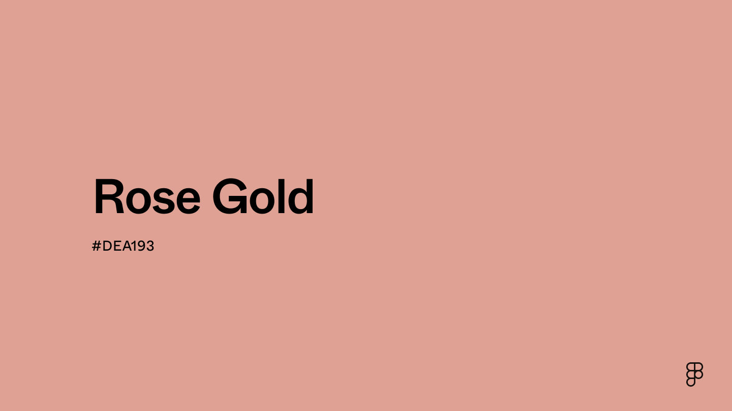
Rose gold is defined by the following color codes and values to ensure consistency across various digital platforms and devices.
- HEX code: #DEA193
- RGB value: 87.1% red, 63.1% green and 57.6% blue
Accessibility considerations play a crucial role in UX and UI design color choices. Figma offers plugins in the Community to make sure your designs meet Web Content Accessibility Guidelines.
Since rose gold is a metallic and not a pure hue, it doesn’t display uniformly across all devices. It's crucial to test how this color renders on different screens to ensure visual consistency and to adjust its saturation or brightness according to your design needs. If rose gold is part of your color strategy, here are a few suggestions on how to apply it:
- Use sparingly for accents. Rose gold can highlight important buttons, links, or call-to-action elements, drawing attention without overwhelming the overall design.
- Establish luxury. If you’re designing for brands associated with luxury, elegance, or high-end service, rose gold conveys premium quality and exclusivity.
- Add depth. Using rose gold in backgrounds or as part of a gradient can add depth and warmth to your designs. It pairs well with dark colors like navy or black and soft pastels, creating rich and appealing visual landscapes.
- Create harmony and balance. Pair rose gold with complementary colors like deep blues, creamy whites, and soft grays. Avoid using it with colors that might clash or reduce its impact.
Keep in mind that color and its meaning can change from culture to culture—and at any given time. If you are designing for a global audience, research color considerations for your specific regions.
For variations within the same warm and metallic spectrum as rose gold, consider:
- Copper (#B87333) is deeper and has more of an earthy tone, but it maintains a warm glow similar to rose gold.
- Blush (#DE5D83) offers a pinker approach while still resonating with the soft warmth of rose gold.
- Salmon (#FA8072) is lighter and leans more towards pink, presenting a delicate alternative that complements the blush tones in rose gold.
- Dusty rose (#DCA1A1) is muted and shares a subtle elegance with rose gold, making it a complementary choice for a soft palette.
To complement rose gold's warm and elegant tones, consider pairing it with:
- Charcoal gray (#4A4A4A) provides a sophisticated contrast that enhances rose gold’s rich hue.
- Cream (#FDFBD4) offers a gentle background that allows rose gold to stand out without overwhelming.
- Teal (#069494) introduces a vibrant yet soothing color that contrasts beautifully with rose gold.
- Navy blue (#000080) acts as a deep, rich backdrop that brings out the metallic shimmer of rose gold.
- Moss green (#8A9A5B) harmonizes with rose gold for a more natural, earthy look.
Other colors worth considering include deep violet for a regal feel, soft lilac for a gentle contrast, and classic black for a dramatic effect.
While rose gold is versatile, it may clash with:
- Lime green (#89F336) often creates a striking contrast that can be too harsh, overpowering the subtle warmth of rose gold.
- Bright orange (#FFA500) competes for attention and can diminish the sophisticated presence of rose gold.
- Hot pink (#FF69B4) might overwhelm the muted tones of rose gold, leading to an unbalanced color palette.
- Electric blue (#00F0FF) has a vibrancy that could overshadow the understated elegance of rose gold.
- Neon yellow (#FFFF00) introduces a brightness that clashes with rose gold's soft and refined nature.
Rose gold symbolizes elegance, sophistication, and warmth. It is strongly associated with romance, affection, and compassion, making it a popular choice for expressing tender emotions. Rose gold also conveys luxury and style but with a softer, more accessible undertone than traditional gold.
In color psychology, rose gold evokes calm and composure with warmth and optimism. The pink hue in rose gold promotes a sense of nurturing and love, while the metallic gold aspect adds an element of prestige and high value. This color can influence perceptions by making environments feel inviting, luxurious, intimate, and comforting.
In UI design, rose gold can create a luxurious and trendy appearance. It works well in branding elements and design accents to attract a fashion-conscious and design-savvy audience. Rose gold can suggest sophistication and premium quality—great for applications offering a high-end user experience. It's particularly effective in apps and websites focused on lifestyle, beauty, and luxury retail.
Rose gold first became popular in early 19th century Russia, where it was known as "Russian gold." The unique pink hue of rose gold is created by blending yellow gold with copper alloys. Adding more copper results in a deeper rose color.
The Art Deco movement in the 1920s revived its popularity. The movement's emphasis on bold geometry and luxurious materials matched well with rose gold's romantic and luxurious qualities.
Today, rose gold is commonly used in technology and fashion accessories, such as smartphones and watches. It appeals to a modern audience that appreciates both innovation and vintage elegance.
Contrast 2.18
- Large Text
#DEA193
- Normal Text
How you design, align, and build matters. Do it together with Figma.
| Category | ||
|---|---|---|
Fail | Fail | |
Fail | Fail | |
Fail | Fail |
Contrast 9.63
- Large Text
#DEA193
- Normal Text
How you design, align, and build matters. Do it together with Figma.
| Category | ||
|---|---|---|
Pass | Pass | |
Pass | Pass | |
Pass | Pass |
Color simulations
Protanopia
Deuteranopia
Tritanopia
Achromatopsia
The hexadecimal color #A2574F, known as cognac, has RGB values of R:162, G:87, B:79 and CMYK values of C:0, M:0.46, Y:0.51, K:0.36.
| VALUE | CSS | |
|---|---|---|
| HEX | A2574F | #A2574F |
| RGB DECIMAL | 162, 87, 79 | rgb(162,87,79) |
| RGB PERCENTAGE | 63.5, 34.1, 31 | rgb(63.5%,34.1%,31%) |
| CMYK | 0, 46, 51, 36 | |
| HSL | 5.8°, 34.4, 47.3 | hsl(5.8,34.4%,47.3%) |
| HSV (OR HSB) | 5.8°, 51.2, 63.5 | |
| WEB SAFE | 996666 | #996666 |
| CIE-LAB | 45.721, 29.961, 18.446 | |
| XYZ | 19.72, 15.064, 9.266 | |
| xyY | 0.448, 0.342, 15.064 | |
| CIE-LCH | 45.721, 35.184, 31.619 | |
| CIE-LUV | 45.721, 53.85, 16.292 | |
| HUNTER-LAB | 38.812, 22.773, 13.014 | |
| BINARY | 10100010, 01010111, 01001111 | |
| iOS - SwiftUI | Color(red: 162/255, green: 87/255, blue: 79/255) | |
| iOS - UIKit | UIColor(red: 162/255.0, green: 87/255.0, blue: 79/255.0, alpha: 1.0) | |
| Android - Compose | Color(0xFFA2574F) |