How to design an app in 5 steps


Share How to design an app in 5 steps
Explore more from
Design basics
Bring designs to life with prototypes
Share flows, gather feedback, and iterate fast with Figma.

Apps show up in almost everything we do on the daily—ordering dinner, managing schedules, connecting with friends, or planning a trip. A well-designed app solves a specific problem and makes it easier to get something done.
Building an app is about creating an experience people actually love to use, a process that is rapidly evolving. Ready to turn your idea into a real app? Let’s get started.
Read on to learn:
- How to design an app
- How to develop an app for iOS vs. Android
- Examples of app design


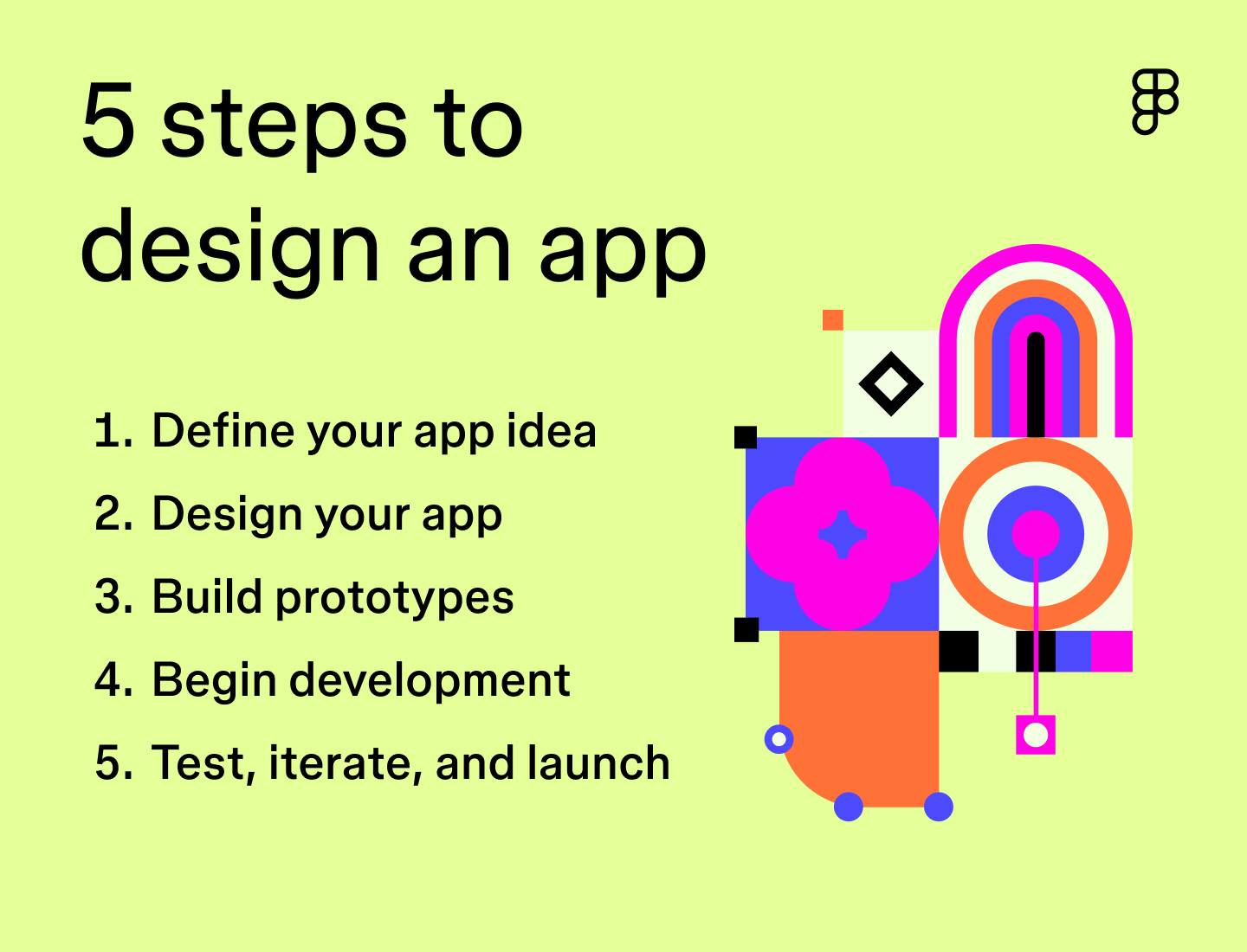
Step 1: Define your app idea
Every app starts with a clear idea. The more focused the concept, the easier it is to design, test, and build something that users actually want. To make sure you’re headed in the right direction, it’s important to validate your app idea and find a strong product-market fit.
Identify the problem or need
Start by mapping out what your app is trying to solve. Ask yourself questions like:
- What is the app’s primary purpose?
- Who is it for, and what are they trying to accomplish?
- What’s missing from existing solutions?
- How will this app improve that experience?
- How does this app align with the company’s larger mission and values?
Getting clear on the “why” behind your idea will shape every decision that follows, from which features to build to how the interface should feel.
Conduct market research
Take a deep dive into existing apps to spot trends and identify market gaps. Knowing what’s already out there will make it easier to brainstorm how to design an app with standout features and functions that set it apart.
Conducting a competitive analysis helps you understand the landscape and spot opportunities. You can also run a SWOT analysis to identify your app’s strengths, weaknesses, opportunities, and potential challenges to make sure your idea stands out.
Define your target audience
Good design starts with understanding your users. What are they trying to get done? What frustrates them? What would feel like a better experience?
Start with user interviews during the early development phase. Early feedback doesn’t need to be formal—just enough to spot patterns in how people approach the problem your app addresses.
Create user personas
User personas help turn raw research into something you can design around. They represent typical users with shared behaviors, needs, and preferences. Throughout the project, you can use them to check your design decisions and prioritize features that align with real user goals.
“If you don’t know who you’re building for, then the time you invest in building and creating something will be wasted.”
— —Ana Boyer, Designer Advocate at Figma
Step 2: Design your app
Once the concept is solid, the next step is turning it into a functional design that balances both user interface (UI) and user experience (UX) design.
UI design covers everything your user interacts with—interactive elements like buttons and menus, as well as icons, colors, and overall layout. UX design ensures the experience is smooth and intuitive by organizing content effectively and anticipating user needs.
“When something is more attractive, compelling, and clear, people tend to gravitate towards it.”
— —Katie Dill, Head of Design at Stripe
Outline core functions and features
Every feature should connect back to your app’s primary goal. If it doesn’t support a user task or improve the experience, it’s probably not needed—at least not in the first version.
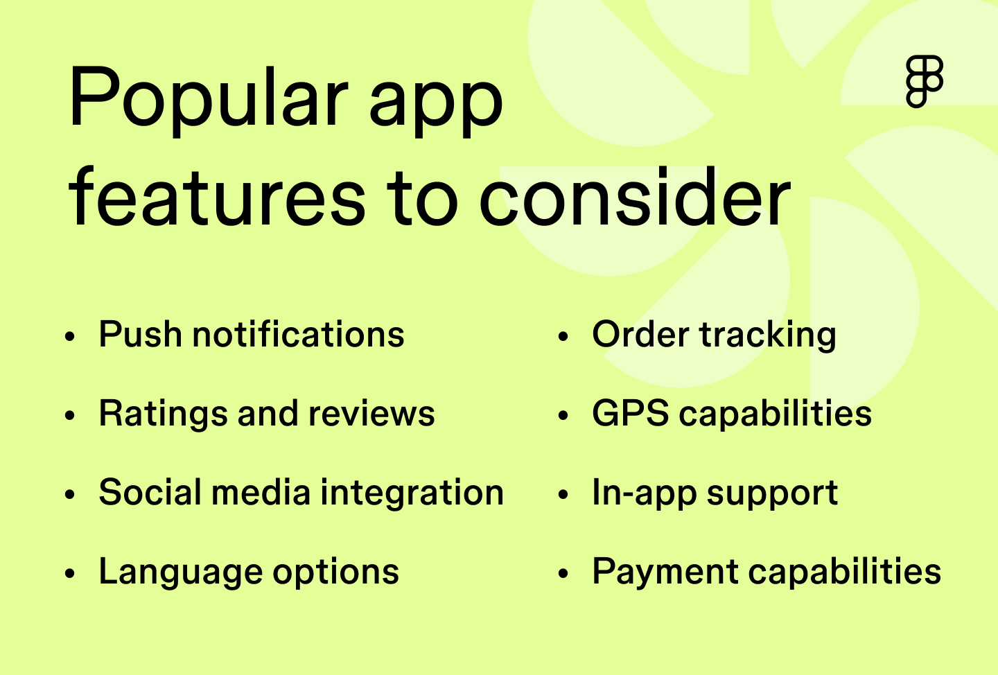
Here are a few common features that often show up in mobile apps:
- Push notifications
- Location and GPS services
- Payment and checkout flow
- Search and filtering
- Social media integrations
- Order tracking
- In-app support
- Language options
- Ratings and reviews
- Gamification elements
- Personalization based on user behavior
For example, Uber’s core function is connecting people needing a ride with drivers. Features like GPS tracking help users and drivers find each other, while real-time updates show estimated arrival and drop-off times. Push notifications keep riders informed without opening the app. The interface is minimal, with only the necessary steps visible at each point in the flow—pickup, drop-off, driver info, and payment. Ratings and reviews provide quick feedback and help maintain service quality.
To keep everyone aligned on your app’s purpose, core features, and key functionality, consider creating a product requirements document (PRD).

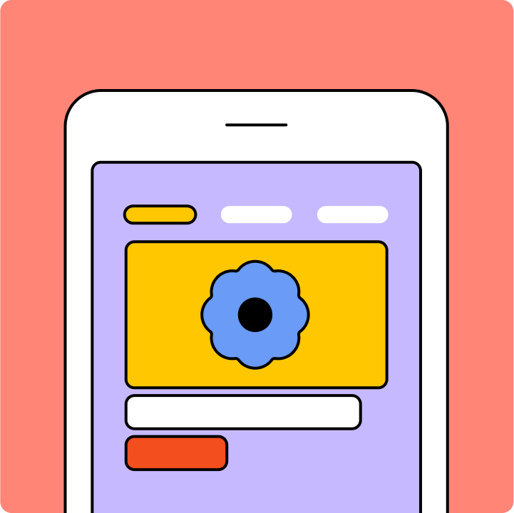
Create wireframes

Wireframes help define structure before visuals get involved. They focus on layout, content hierarchy, and interaction points—just enough to test whether the flow makes sense. Wireframes might also include simple outlines of interactive elements that will be included within the app, aligning teams on direction early on.
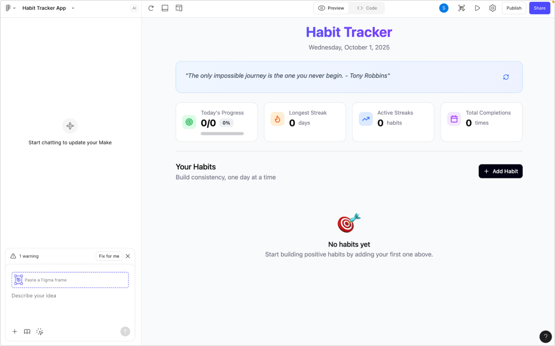
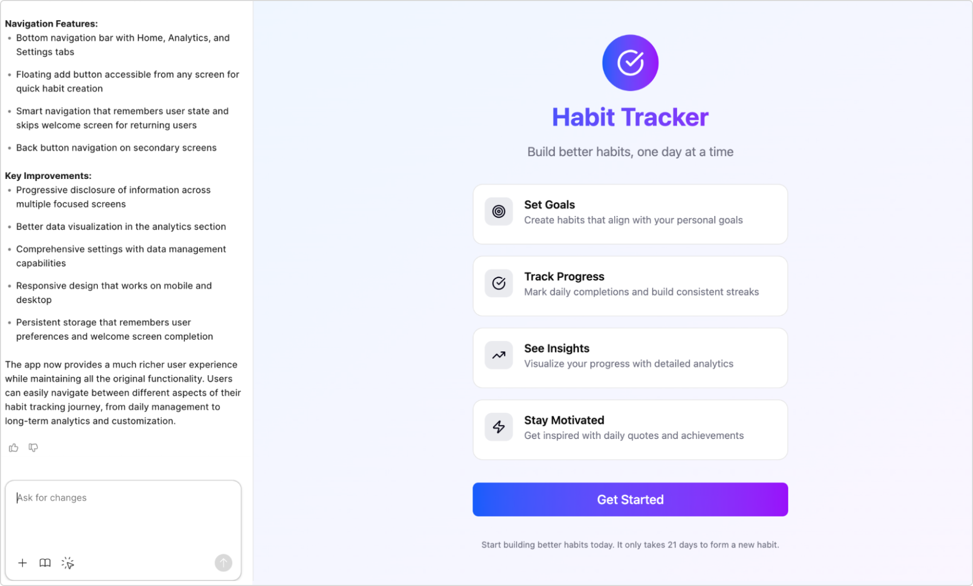
Figma Make can help jumpstart this process. Its AI functionality can rapidly turn simple text prompts into design concepts in seconds. It’s editable from the start, so you can adjust layout, content, and structure immediately.
Focus on the essentials, like each screen’s main goal, content organization, and usability. And remember, wireframes are flexible. They’re for alignment so teams can agree on what each screen needs to do before locking in visuals. You can always go back and change things as the design evolves.
Choose your color palette and typography
Once the structure is set, build out visual styles that support usability and reflect the app’s purpose. Typography should be readable across screen sizes. Use of your color palettes should guide interactions, creating a clear visual hierarchy for users.
For instance, the Calm app uses different shades of the color blue, which are associated with tranquility and relaxation—perfect for its goal of reducing stress and anxiety through guided meditations, sleep stories, and music.
DoorDash heavily uses the color red, known to stimulate appetite and encourage a sense of urgency. This design choice aligns with its mission to provide quick meal delivery.
Step 3: Build prototypes

Prototyping is essential for early-stage app development, helping you test how the app works before writing any code. Prototypes visualize key design elements and user interactions, allowing for quick testing, iteration, and problem-solving.
Think of a prototype as your app’s rough draft. At this stage, the goal is to map out core flows, interactions, and screen transitions—just enough to validate whether the design holds up when people actually use it. When building your prototypes, focus on the following:
Create user flows
User flows show how someone moves through your app, screen by screen and action by action. Think of them as pathways that guide users from one action to the next. A user might browse product details, add items to a cart, then complete checkout—all facilitated by a well-thought-out user flow.
Start by outlining key paths, then map screens to those flows. This helps you design interactions in order instead of designing screens in isolation.
Organize app content
A well-structured app makes it easier to navigate, especially when it includes many screens or features. Using basic information architecture (IA) is about organizing principles to decide where things go, what belongs together, and how users find what they need..
Take Netflix, for example—if you’re in the mood for a comedy, its clear categories and intuitive navigation make it easy to find a title that makes you laugh.
Keep these best practices and tips in mind when considering how to design an app and organize your content:
- Organization. Use card sorting to understand how your users expect content to be organized. This will help you structure and categorize your content to meet user expectations.
- Labeling. Use clear and intuitive labels so users can easily identify information and navigate the app.
- Navigation. Create intuitive menus and systems that help users effortlessly explore content.
- Search. Implement search functions, filters, and related suggestions to help users quickly find what they need.
Prioritize app features
When it comes to app features, sometimes less is more—especially when launching an app for the first time. Too many features can overwhelm users and complicate the interface.
The MoSCoW method is a great way to prioritize app features, breaking them into four buckets: must-have, should-have, could-have, and won’t-have. This approach helps you focus on the features that solve user problems and provide a clear path for users to complete key actions.
Ready to bring your app to life?
Design with Figma Make.
Design for interactivity
Building prototypes allows you to create interactive experiences. This lets you visualize how users will interact with your app, helping validate decisions before development.
Use hover effects, colors, animations, and micro-interactions to transform static designs into dynamic experiences. Simple touches—like an animated heart when liking a photo or a color change when hovering over a button—enhance usability by giving instant visual feedback, making the user experience more enjoyable and engaging.
Figma Make is a vibe coding tool that helps streamline this process by using AI to quickly convert your designs and text prompts into functional, interactive prototypes. This allows you to build and test complex animations and micro-interactions without manual coding.
Step 4: Begin development
Your app is taking shape. Design is mapped out, interactions are defined, and you’ve got working prototypes. Now, it’s time to bring it to life and develop a fully functioning app.
Choose your app type
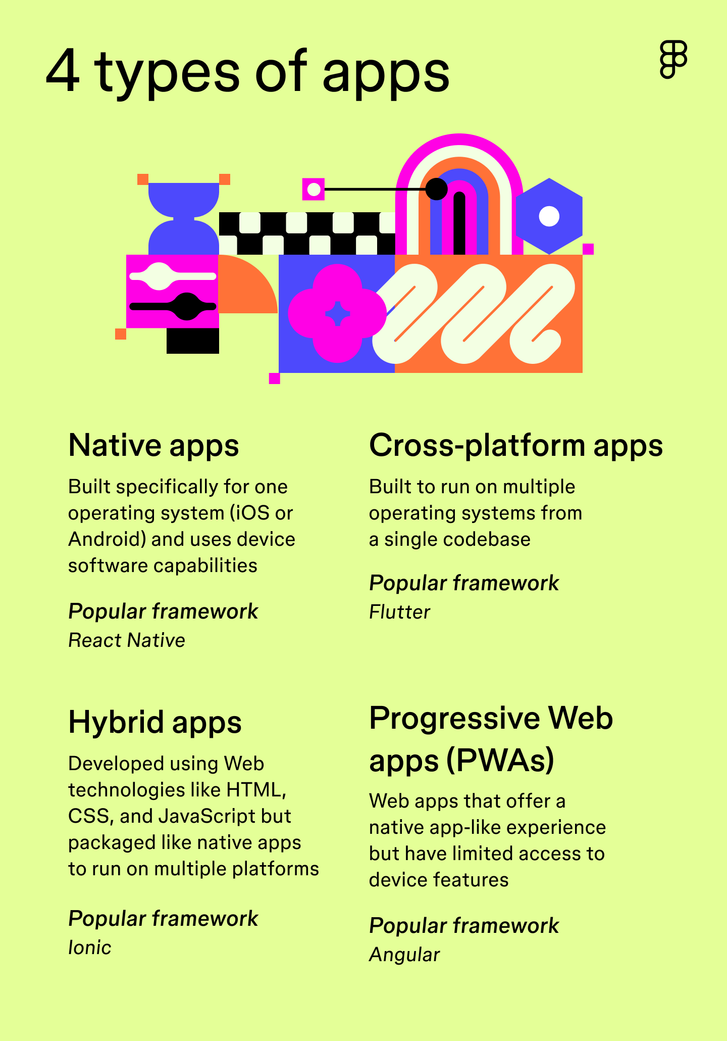
The type of app you choose determines the programming languages and frameworks needed during development. There are four common approaches:
- Native apps. These apps are designed for specific operating systems, like iOS or Android, allowing access to a device’s hardware and features. Native apps offer the best performance but are more expensive to develop since they require tailored development for each operating system.
- Cross-platform apps. These apps are built to work on multiple platforms from a single codebase, saving time and money.
- Hybrid apps. These are built using Web technologies but packaged as native apps. Hybrid apps are easier to maintain but offer fewer features compared to native apps.
- Progressive Web apps (PWAs). These websites behave like apps but run in a browser. They’re simple to deploy and accessible from any device, though they don’t always offer the full feature set of native apps.

Start coding
The coding phase is when design becomes reality—on both the frontend and backend. Here’s the difference:
- Frontend development. This involves building the visual elements that users see and interact with, such as layout, colors, and buttons. Depending on the operating system or type of app you’re developing, you might use programming languages like Kotlin or Swift and frameworks like React or Flutter.
- Backend development. This focuses on functionality and how your app works behind the scenes. You might use languages like Java or Python and databases like SQL.
The use of AI in coding is accelerating: 68% of developers are now using prompts to generate code, and 82% report being satisfied with the output.
Tools like Figma’s Dev Mode make it easy to generate and copy CSS, iOS, or Android code snippets directly from your designs. You can also use plugins to generate custom output based on your framework, cutting down on time spent in handoff.
Create an MVP
Focus on building the core experience first. A minimum viable product (MVP) is a simplified version of your app that includes only the most essential features—acting as your “test” version. Launching an MVP allows you to test your app’s core functionalities with real users before the final launch. Using intentional MVP testing methods at this stage helps you gather the data needed to refine your vision.
Gather early feedback
Test with real people as early as possible. Gathering feedback early in development helps catch issues before they become problems. It’s critical to have users and team members to test the core features as they would in the real world.
The team at Stripe uses friction logging, or what they refer to as “walking the store,” to identify pain points. This process lets different team members experience the product firsthand to reveal “friction” points—areas of confusion that can be addressed to enhance the user experience.
Step 5: Test, iterate, and launch
Final polish matters. Even small bugs or slow load times can affect user trust and adoption. Before you launch, make time for testing and iteration.
Run tests and implement feedback
Releasing an app without proper testing can lead to a confusing user experience. Here are the core testing types to run before launch:
- Usability testing helps you observe how users complete tasks within the app, revealing any challenges or areas for improvement.
- Accessibility testing ensures the app is accessible to users with disabilities and impairments, providing an inclusive experience.
- Performance testing assesses the app’s speed, loading time, and battery usage under different conditions to optimize efficiency.
- Compatibility testing ensures the app functions appropriately across various devices and operating system versions (iOS or Android).
- QA testing identifies bugs and errors within the software that could impact the app’s performance.
After collecting feedback, incorporate the changes, and then rerun the tests to ensure the effectiveness of your improvements.

Submit to app stores
Once your app is ready, it’s time to launch. Each platform, like Apple and Google Play, has its own rules for publishing, so make sure your app meets all submission requirements, including metadata, privacy policies, and screenshots.
Continuously improve
Remember, products are always a work in progress, so launching your app is just the beginning. Track usage, collect feedback, and keep iterating. Monitor what features get used (or ignored), where users drop off, and what gets flagged in reviews. Regular updates keep your app relevant—and show your users you’re listening.
“Our users prefer—and even expect—to have a product that’s always getting better.”
— —Yuhki Yamashita, Chief Product Officer at Figma
Need some coding support?
Code like a pro with Dev Mode.
iOS vs. Android development
When developing an app, deciding whether to focus on iOS, Android, or both can impact your design and development approach. Each operating system has unique challenges and advantages, so here’s a helpful breakdown to guide your decision-making.
Developing for iOS
iOS development is known for its simplicity, thanks to fewer device variations and a dedicated development environment. Here’s what to keep in mind:
- Programming language. iOS apps are typically built using Swift or Objective-C. Swift is Apple’s modern programming language, designed for safety, performance, and ease of use.
- Development environment. Xcode is the go-to platform for iOS app development, providing all the tools you need in one place.
- Device fragmentation. Apple’s limited number of device types (iPhone, iPad) and screen sizes make designing for iOS more straightforward.
- Target market. iOS tends to have a younger audience with a higher average income, often based in North America and Western Europe.
Developing for Android
Android development is more complex due to a wider variety of devices, but it offers a broader global reach. Here’s what to consider:
- Programming language. Android apps are typically built using Java or Kotlin, with Kotlin quickly becoming the preferred language for Android developers.
- Development environment. Android Studio is the official IDE, offering a wide array of tools to support development across multiple devices.
- Device fragmentation. Android’s vast range of devices, screen sizes, and hardware configurations makes it more complex to ensure a consistent user experience.
- Target market. Android dominates global markets, with a more diverse audience across demographics, offering broader expansion opportunities.
App design examples
Wondering how to design an app that provides a consistent experience across all devices? Check out these examples of apps that nail design and development.
Example 1: Spotify

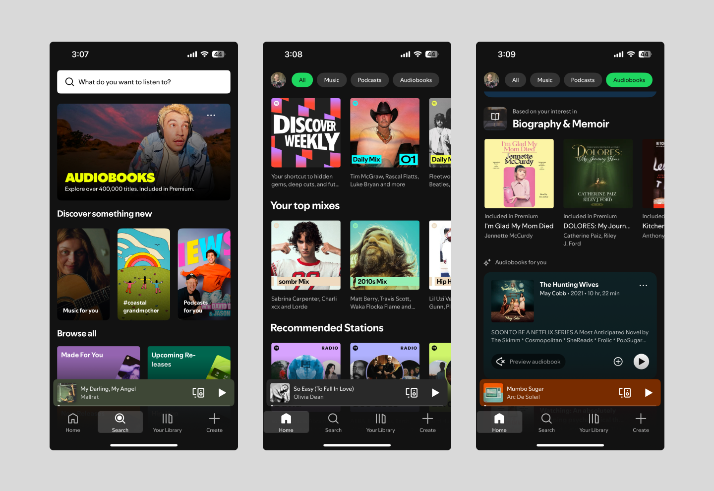
Spotify is a great example of a native app designed with the end user in mind. Its intuitive navigation allows users to easily explore music, podcasts, and audiobooks, while data-driven insights deliver personalized recommendations based on listening habits.
Spotify also integrates with social platforms so users can share their favorite songs, playlists, and other content with their followers, boosting engagement. Spotify’s offline listening feature lets users save content and enjoy it without Wi-Fi or cellular data.
Example 2: DoorDash

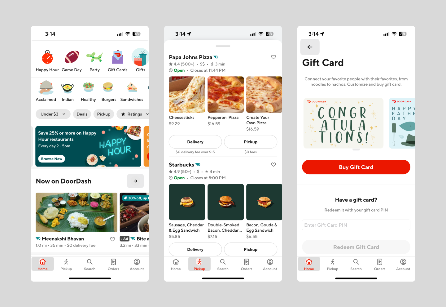
DoorDash offers a simple, user-friendly interface with real-time order updates and tracking. Clear icons categorize restaurants, food types, and grocery options, making it easy to browse and explore.
The app uses location services to provide accurate food delivery options and real-time order tracking. Push notifications send delivery updates, while ratings and reviews help users make informed choices.
Example 3: Instagram

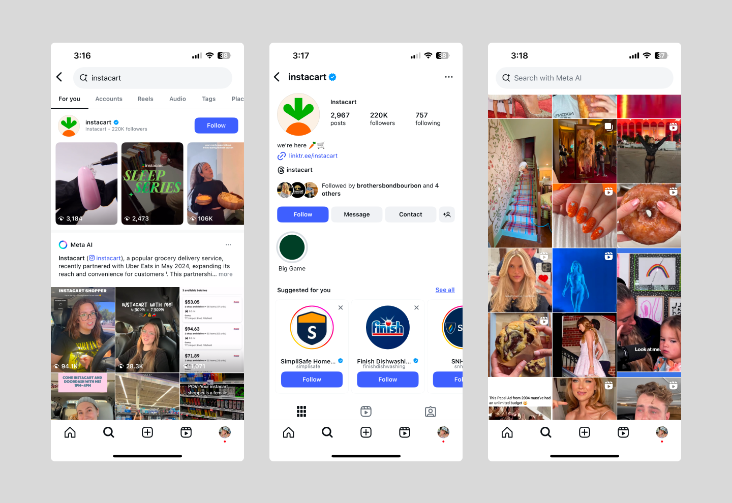
Instagram is a social media app known for its subtle but engaging interactions—like the animated heart when you double-tap a photo or emoji reactions to Stories. These micro-interactions create delightful experiences that keep users engaged.
As a native app, Instagram integrates with device features like the camera, photo gallery, and GPS. It curates personalized feeds based on user behavior and allows creators to monetize content, driving both user engagement and in-app purchases.
Simplify app creation with Figma
Designing an app that stands out starts with knowing your users and refining until it clicks. Figma makes the process simple, from early brainstorming to polished UI. With powerful tools at every step, you can turn ideas into a real product.
Ready to start designing your app? Here’s how Figma can help you get started:
- Use FigJam’s shared online whiteboard to brainstorm, sketch, and collaborate with your team in real time—perfect for gathering feedback and refining ideas on the spot.
- Browse through Figma’s library of mobile app design templates to jumpstart your design. These templates offer a solid foundation for creating an engaging mobile experience.
- Build interactive prototypes with Figma’s prototyping tool, then use Dev Mode to make the design-to-development handoff seamless.
Turn your ideas into reality
Figma makes designing simple.