31 best serif fonts to elevate your designs


Share 31 best serif fonts to elevate your designs
Explore more from
Design basics
Design and prototype with consistent type
Bring type to life in every interaction.

Some fonts feel classic. Others feel clean, modern, or formal. Serif fonts, with their small decorative strokes at the ends of letters, impart a range of personalities.
They’re often used to signal credibility, elegance, or tradition, but the right serif can also feel fresh and contemporary. Whether you’re designing a brand, kerning type for a social post, or building a UI, serif fonts can shape how your message is perceived.
Read on to learn:
- 31 of the best serif fonts
- Tips for using serif fonts
Font 1: Instrument Serif

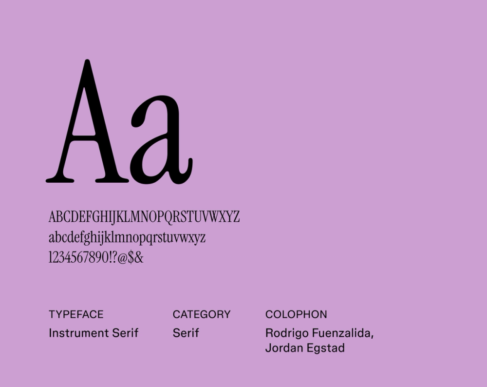
Instrument Serif blends a classic serif aesthetic with a crisp, modern feel. Its balanced letterforms and clean terminals ensure a harmonious appearance, making it suitable for both professional contexts and creative branding. The font’s refined simplicity allows for clear communication while injecting a fresh, contemporary vibe into your design.
Best for: UI/UX design, user interfaces, branding, and body text
Font 2: Playfair Display

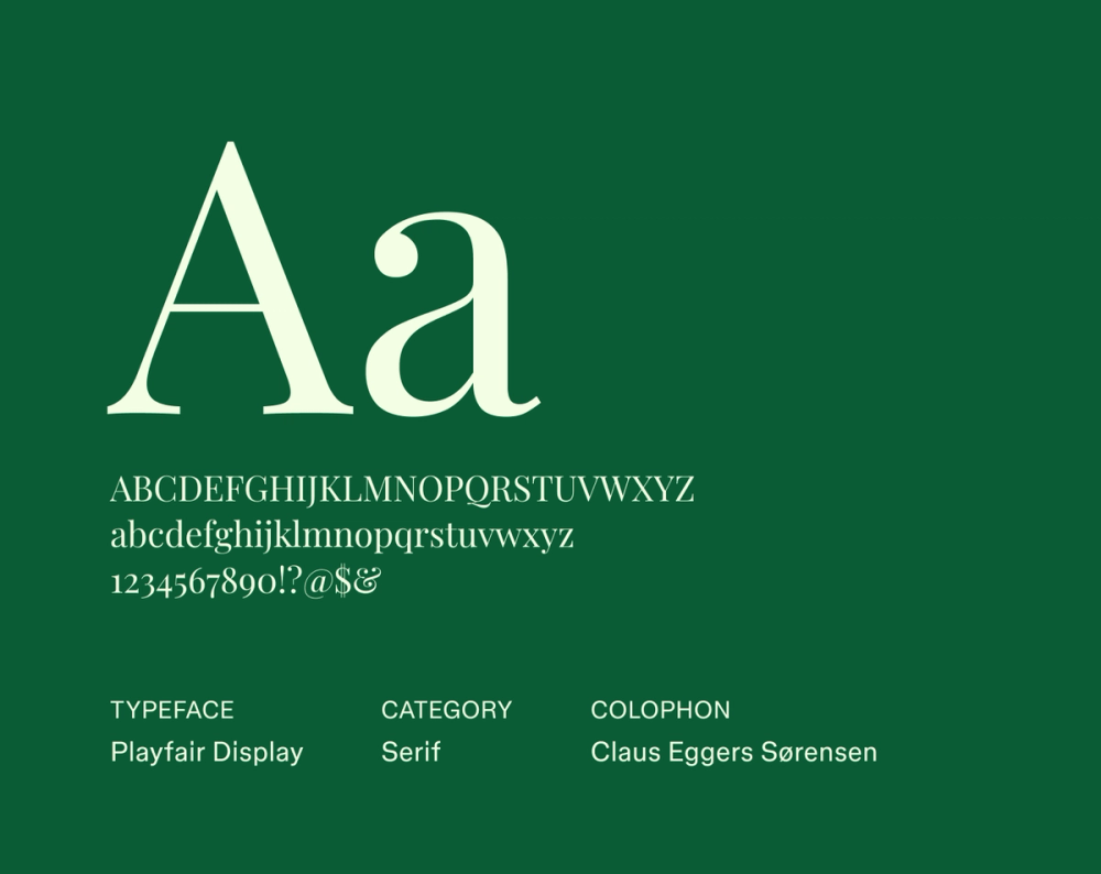
Playfair Display draws its inspiration from the graceful typography of the late 18th century. It’s characterized by a dramatic contrast between thick vertical strokes and delicate hairlines, giving it a sophisticated flair. While it shines in larger sizes for captivating headings and titles, its distinct personality also lends a touch of classic elegance to shorter blocks of text.
Best for: Headlines, titles, fashion magazines, and designs that need a bit of classical elegance
Font 3: Domine

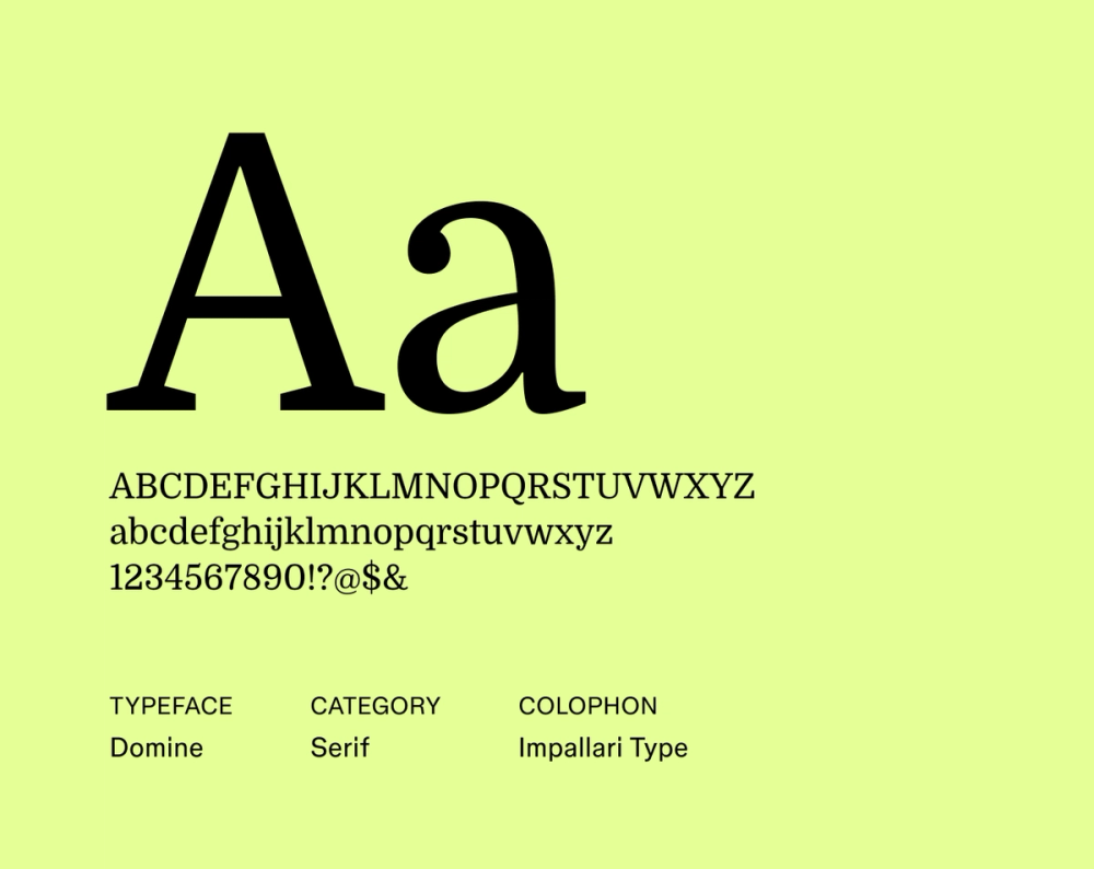
Domine stands out with its noticeable vertical stress and sturdy, practical serifs, giving it a solid, grounded feel. Despite its robust structure, Domine maintains comfortable legibility for longer sections, thanks to its open counters.
This font strikes a warm balance between authority and approachability, making it well-suited for designs that project trustworthiness and accessibility.
Best for: News websites, online publications, and professional websites that aim for readability with a touch of character
Font 4: Bodoni Moda

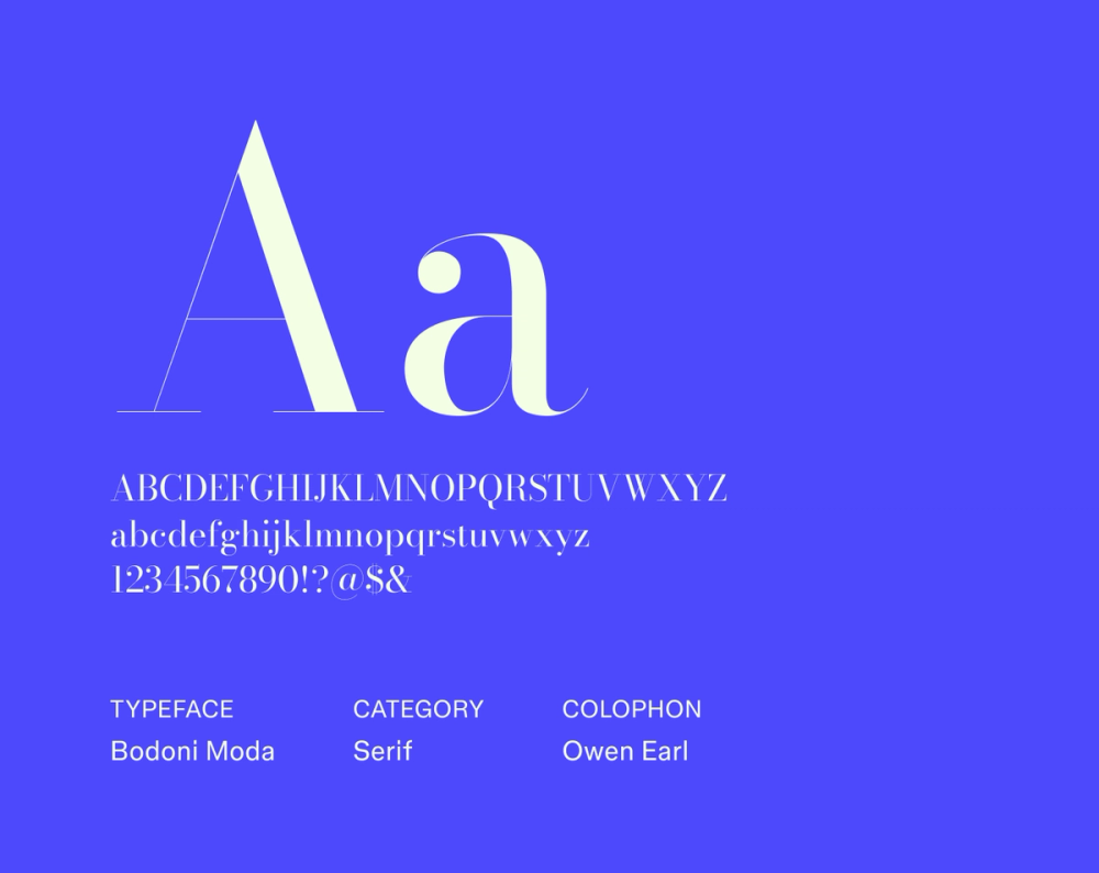
Bodoni Moda is a serif typeface that embodies high fashion and sophisticated design. It’s instantly recognizable by its extreme contrast and elegant, unbracketed hairlines, making it a showstopper in display settings like headlines and titles. While its dramatic style isn’t designed for extensive body text, it adds a touch of high-end glamour and artistic flair to projects demanding a strong aesthetic impact.
Best for: Fashion branding, editorial design, luxury goods websites, and impactful headlines
Font 5: Chonburi

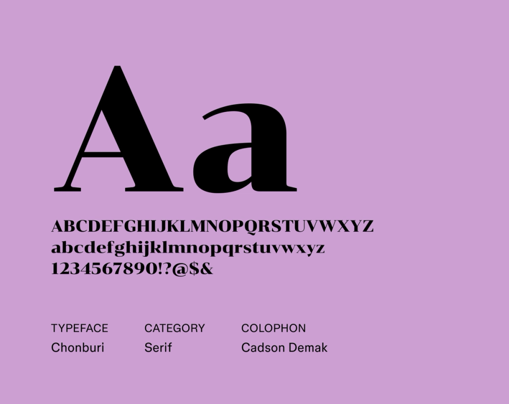
Chonburi is a playful font with a distinct retro flair, inspired by vintage hand-lettering. This serif typeface features thick, rounded forms and a charmingly irregular baseline, giving it a unique, whimsical character. It’s great for display uses like logos and posters, but its clear letterforms also make it surprisingly readable in shorter text blocks.
Best for: Headlines, logos, posters, and designs aiming for a fun, retro, or hand-crafted aesthetic
Font 6: Roboto Serif

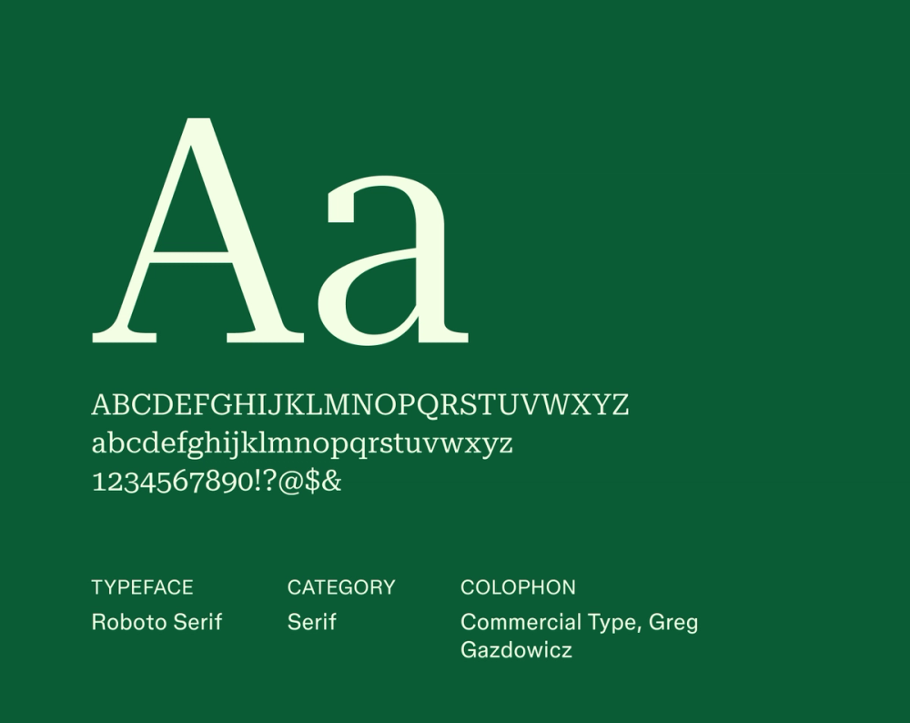
Roboto Serif offers an approachable reading experience. It retains the signature friendly, open curves and clean, structured shapes of the original sans serif Roboto, while adding well-defined serifs that aid in smooth flow. This modern font creates a comfortable experience for the reader, making it a versatile choice where on-screen legibility and a welcoming feel are key.
Best for: Body text on websites and apps and editorial content
Font 7: Tienne

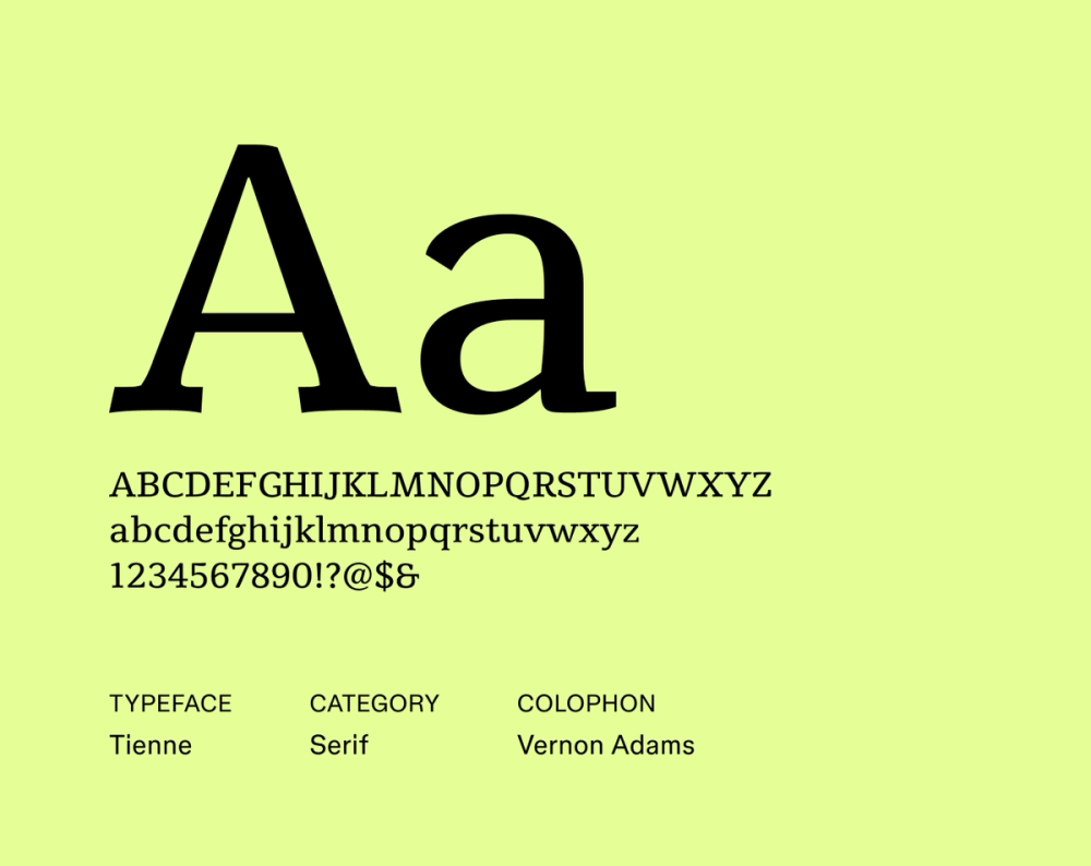
Tienne’s strong vertical strokes and well-defined lines provide a sense of stability and confident clarity. Even with its inherent weight, the open shapes of the letters and balanced spacing prevent it from feeling too heavy, making it a strong pick for both impactful headings and longer paragraphs.
Best for: Websites with substantial text content and editorial layouts
Font 8: EB Garamond

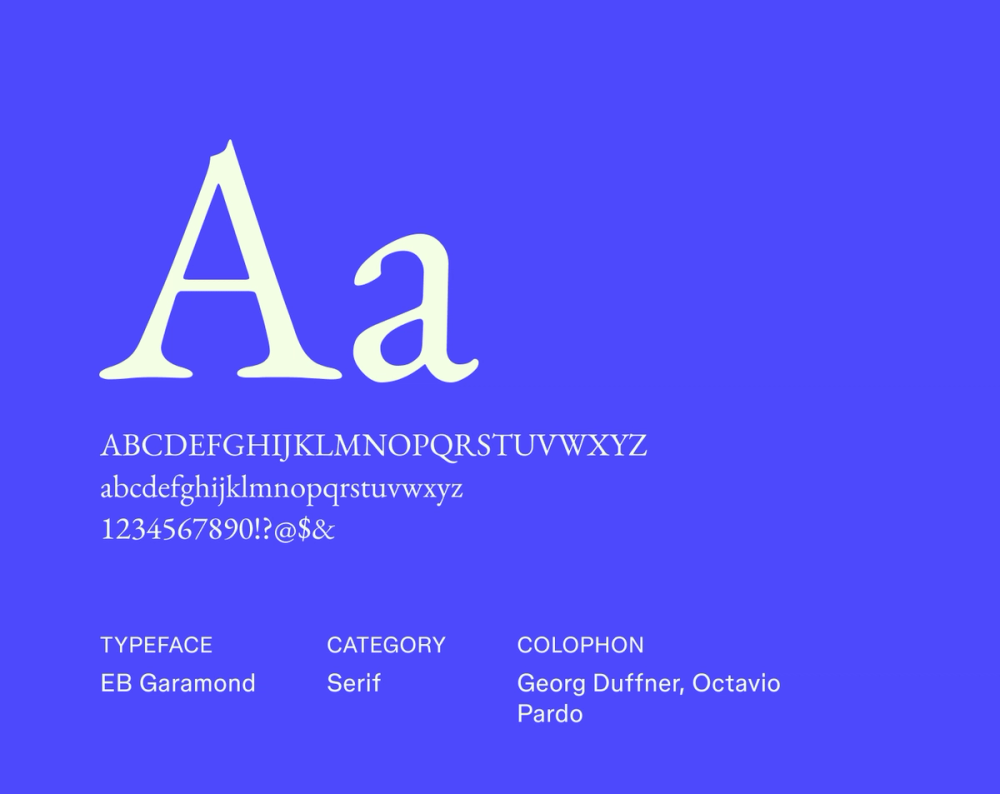
EB Garamond is a revival of Claude Garamond’s classic 16th-century typeface, bringing its timeless elegance into the modern digital age. This font excels in display settings, where its refined details and curves can truly be appreciated. It also offers excellent legibility in longer blocks of text, establishing itself as a top-tier serif font for a wide array of sophisticated projects.
Best for: Book design, literary publications, and websites with a focus on elegance
Font 9: Cormorant

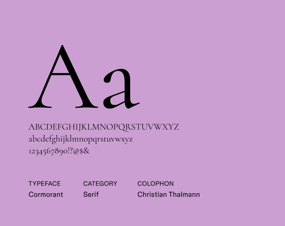
Cormorant is a striking display serif typeface, drawing inspiration from the elegance of classic Garamond designs. Its tall x-height and sharp, graceful lines give it a sophisticated and somewhat dramatic presence. This font shines in headlines and titles, where its fine serifs and high-contrast silhouette capture attention and give designs a refined and stylish aesthetic.
Best for: Headlines, titles, branding for luxury goods, and designs seeking a modern take on classic elegance
Font 10: Libre Caslon

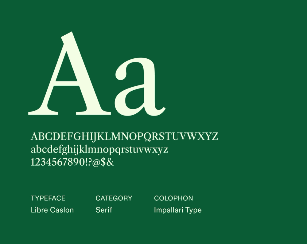
Libre Caslon is a free and open-source revival of the beloved classic Caslon typeface. It beautifully retains the original’s traditional charm through its slightly irregular yet graceful letterforms and balanced proportions. This font offers a warm, inviting, and historically rich feel, making it an excellent choice for accessible projects that value a timeless aesthetic.
Best for: Body text in books and on websites, educational materials, and designs seeking a friendly yet traditional serif style
Font 11: Tinos

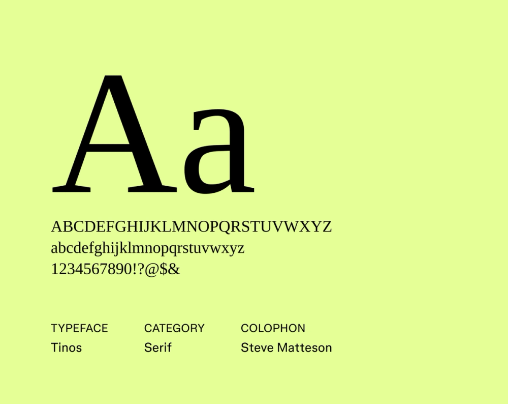
Tinos is a contemporary typeface with a strong, versatile character. Its upright structure and balanced letterforms contribute to exceptional readability across various screen sizes and in print. It’s a highly dependable font suitable for a wide range of applications.
Best for: Body text on websites and in documents, user interfaces, and projects requiring a clean and highly legible serif font
Font 12: Prata

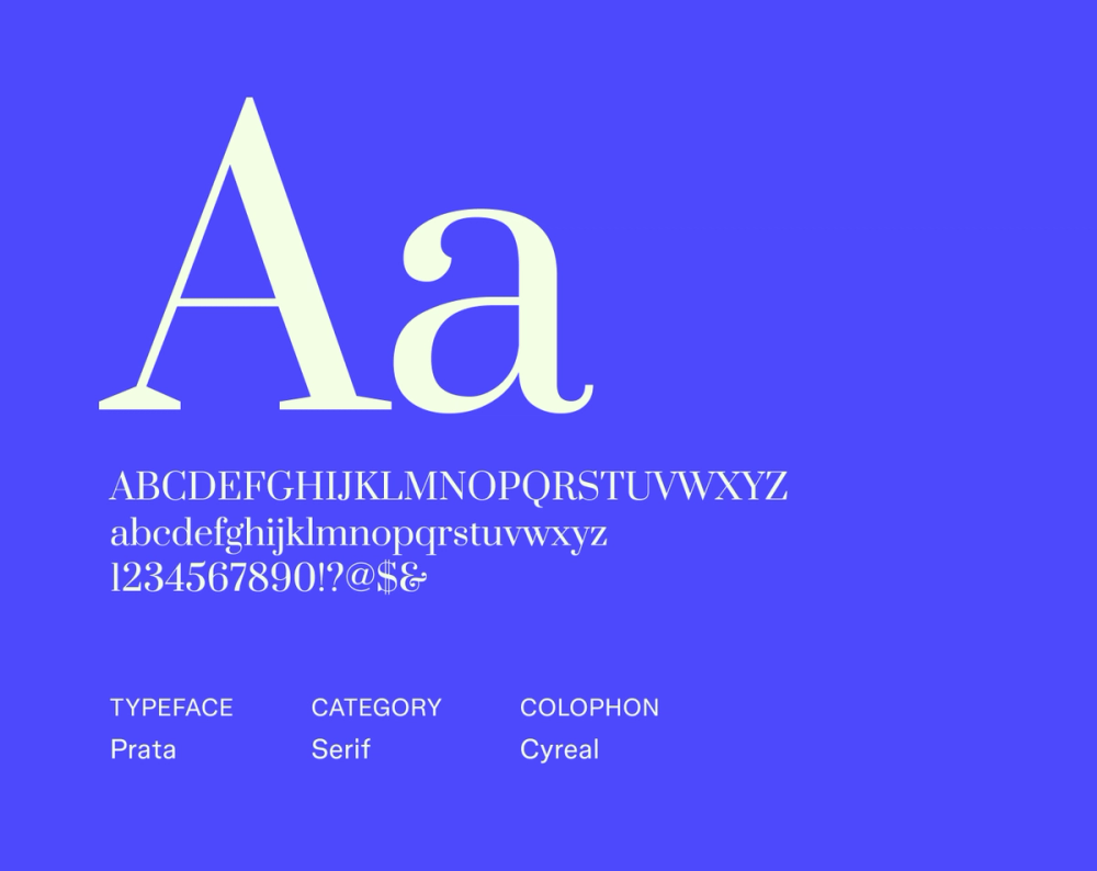
Prata is an elegant serif typeface defined by its flowing, high-contrast strokes and delicate, calligraphic serifs. This combination offers both sophisticated display appeal and easy readability in shorter text blocks. It’s perfect for adding refinement and artistic flair, creating a stylish and memorable design aesthetic.
Best for: Headlines, beauty or lifestyle product branding, invitations, and designs seeking an elegant and distinct serif font
Font 13: Merriweather

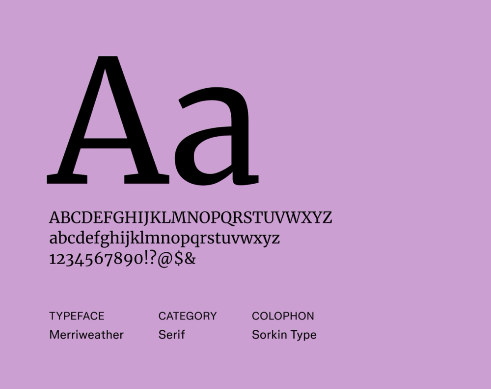
Merriweather is a serif typeface specifically designed for comfortable on-screen reading. Its condensed letterforms, robust serifs, and generous x-height work together to ensure excellent legibility, even at small sizes. The font’s distinct character also suits headlines and subheadings, making it a versatile choice for a wide array of digital content.
Best for: Body text on websites and blogs, online magazines, and projects prioritizing readability on screens
Font 14: Libre Baskerville

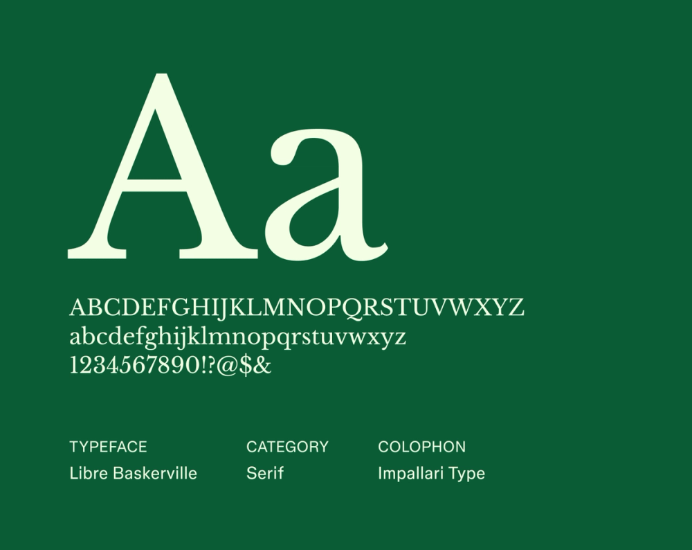
Libre Baskerville is a digital-first revival of the classic Baskerville typeface, optimized for screen readability. It features a slightly taller x-height and wider letterforms while maintaining the original’s inherent elegance. This sophisticated and trustworthy font works beautifully for both body and display text, bringing traditional refinement to fonts for websites.
Best for: Websites, e-books, and digital publications that aim for a classic and highly readable serif style
Font 15: Lora

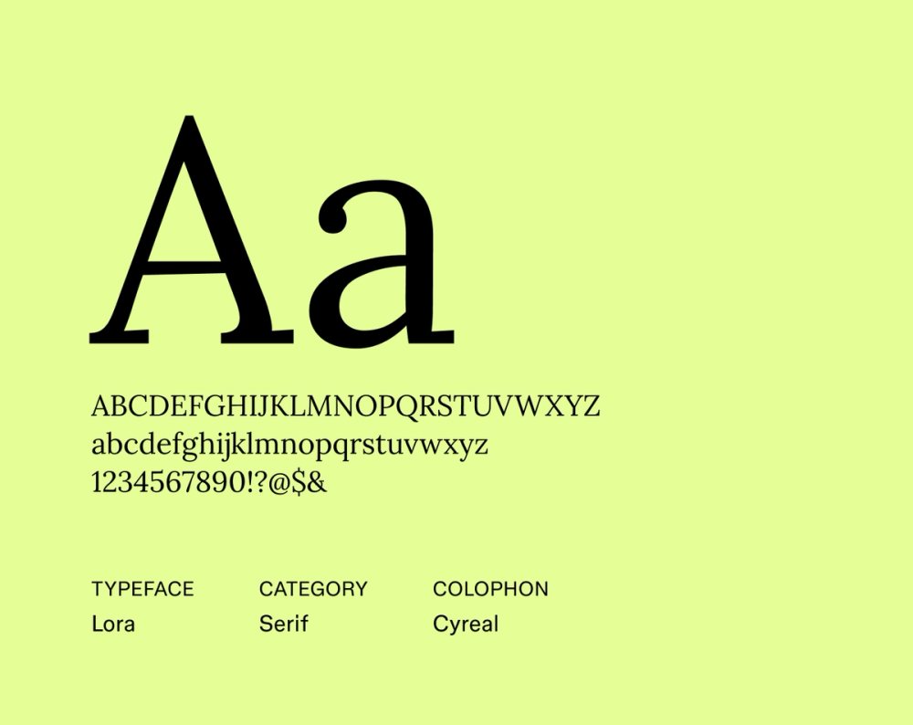
Lora is a serif typeface that blends modern aesthetics with a subtle calligraphic touch, offering a warm and inviting elegance. While it works well for headings, Lora remains comfortably readable in longer text, providing a sophisticated yet engaging reading experience that feels both current and timeless.
Best for: Blog headlines, literary websites, and fashion and lifestyle branding
Browse Figma’s font library to find serif fonts that add sophistication and readability to your work.
Font 16: PT Serif

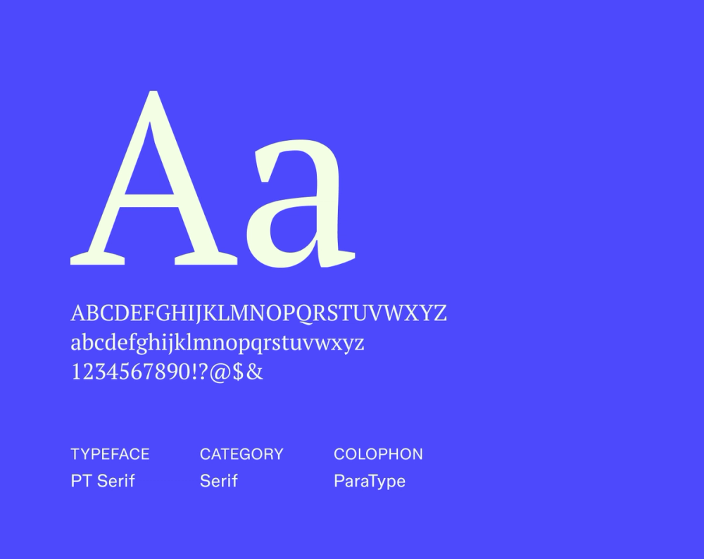
PT Serif is a versatile and highly readable serif typeface created for multilingual use across digital and print. Its clear, well-proportioned letterforms and functional, moderate serifs make it exceptionally suitable for long text passages. This font provides a comfortable and efficient reading experience, prioritizing clarity across different platforms and languages.
Best for: Websites with extensive text content, online publications, and projects requiring strong multilingual support and readability
Font 17: Didot

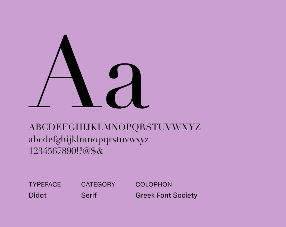
Didot is a neoclassical serif typeface defined by its strikingly high contrast between thick vertical and impossibly thin horizontal strokes, creating an elegant and sophisticated look favored by the fashion and luxury industries. While its delicate hairlines can be challenging for lengthy small text, Didot is an exceptional choice for stylish headlines and titles, adding high-end glamour to any design.
Best for: Fashion magazines, luxury branding, high-end editorial design, and impactful headlines
Font 18: Noto Serif

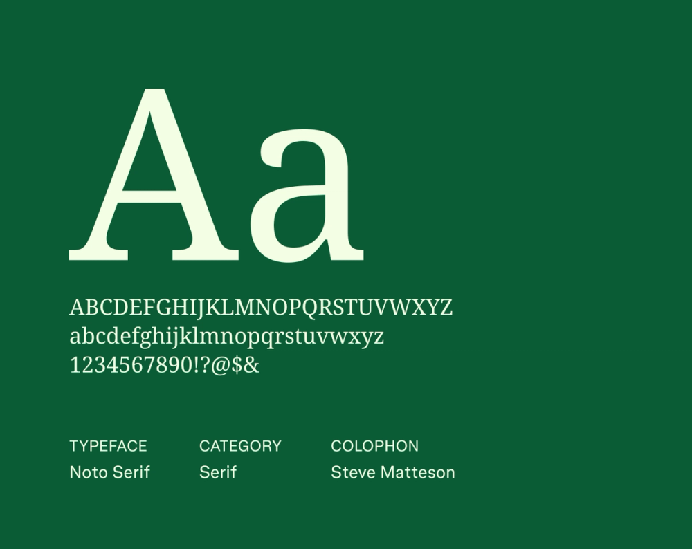
Noto Serif is a highly versatile and visually consistent serif typeface. It’s part of the extensive Noto project designed for global projects by supporting all scripts. Its clear, well-proportioned letterforms and balanced serifs ensure readability across languages and various contexts. Its neutral aesthetic makes it adaptable for diverse design applications where universal clarity is paramount.
Best for: Multilingual websites and documents and projects requiring consistent typography across various languages
Font 19: Young Serif


Young Serif’s clean, open letterforms and well-defined serifs contribute to excellent readability across various text sizes. Its understated elegance makes it suitable for display, and its clean structure allows for versatile font pairing in more complex designs. Young Serif also maintains a level of simplicity that ensures comfortable reading in longer passages, blending style with substance.
Best for: Websites, blog content, and branding materials that seek a clean and modern serif with clear readability
Font 20: Averia Serif Libre

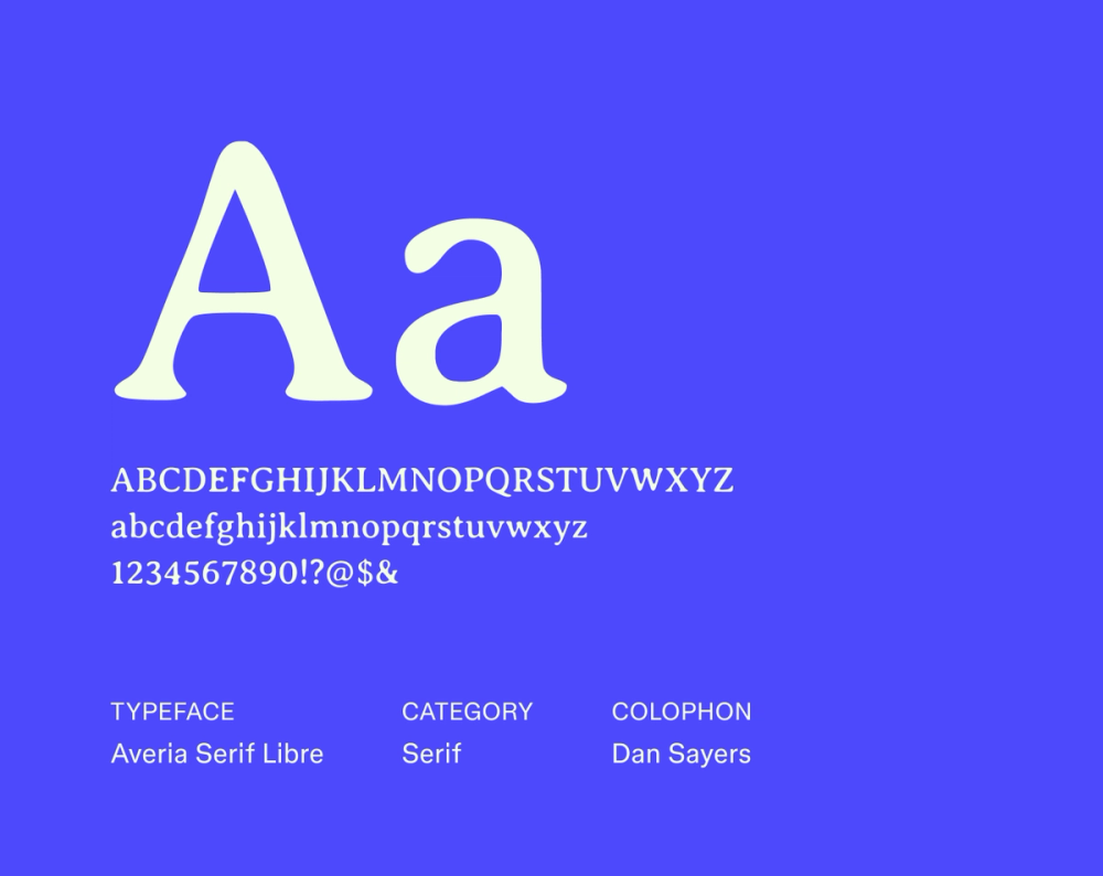
Averia Serif Libre is a distinct yet friendly serif font, characterized by its slightly rounded terminals and moderate contrast. It lends a warm, casual feel to less formal designs and shorter texts. However, its unique, almost hand-drawn characteristics mean it shines brightest when used for blog titles or branding with an intentionally approachable vibe, rather than extensive body copy.
Best for: Blog titles and branding with a friendly and approachable vibe
Font 21: Bree Serif

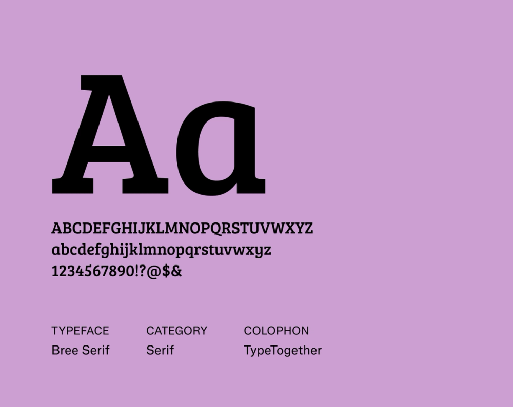
Bree Serif is a lively and modern serif typeface with a unique personality. Its rounded terminals and slightly slanted posture give it a friendly and approachable feel, setting it apart from traditional serifs. Bree Serif brings warmth and contemporary flair to any design, perfect for making a memorable and inviting impression.
Best for: Website headings and branding that want to feel approachable and modern
Font 22: Charis SIL

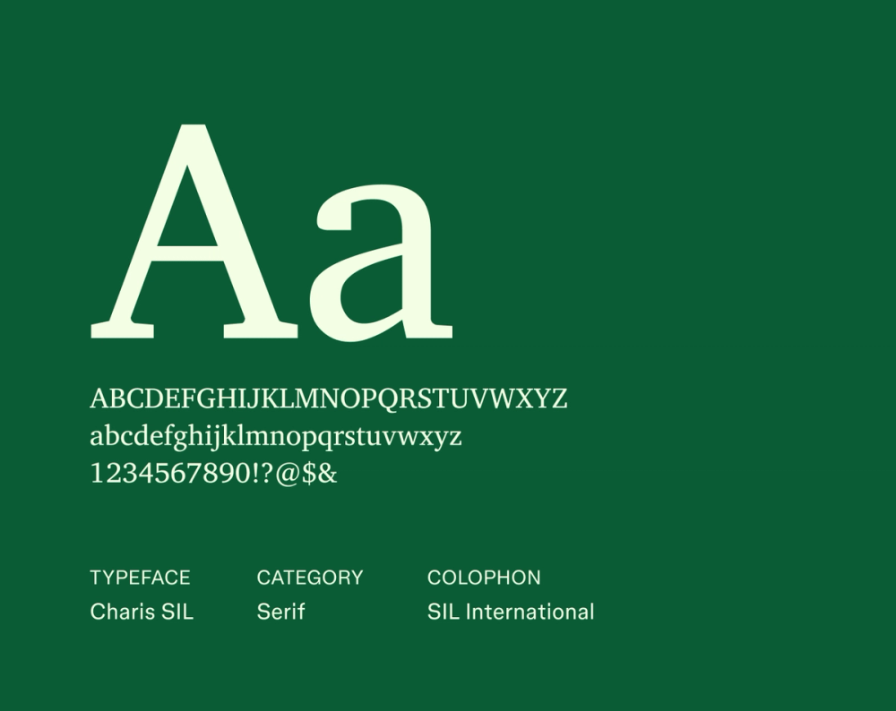
Charis SIL is primarily designed for exceptional clarity and legibility, especially in complex scripts and for extended reading. While its core focus is on functionality and broad language support, Charis SIL also possesses a clean and unassuming aesthetic that performs reliably in various contexts, ensuring content is always straightforward and easy to follow.
Best for: Linguistic materials and websites with diverse language content
Font 23: DM Serif

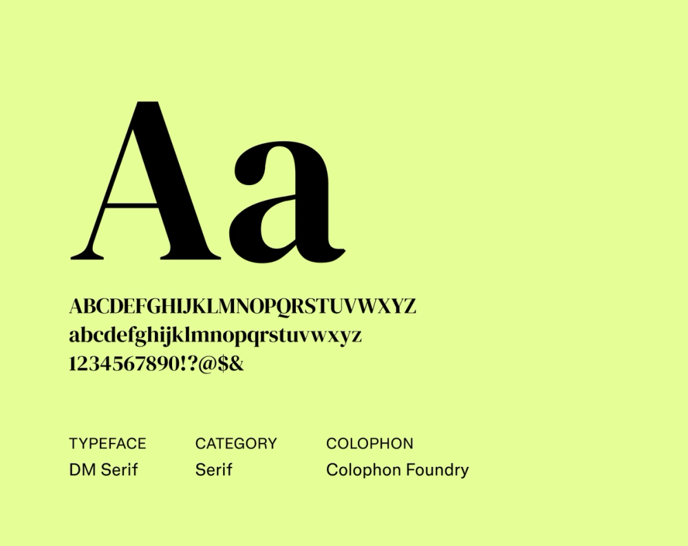
DM Serif is a modern serif typeface that balances elegance with comfortable readability. Its clean, open letterforms and subtle contrast contribute to a smooth reading experience in both print and digital environments. While its refined aesthetic works well for headings and subheadings, DM Serif’s inherent clarity also makes it a solid choice for longer blocks of text.
Best for: Websites, blogs, and editorial content that seeks a modern and readable serif font with a touch of elegance
Font 24: IBM Plex Serif

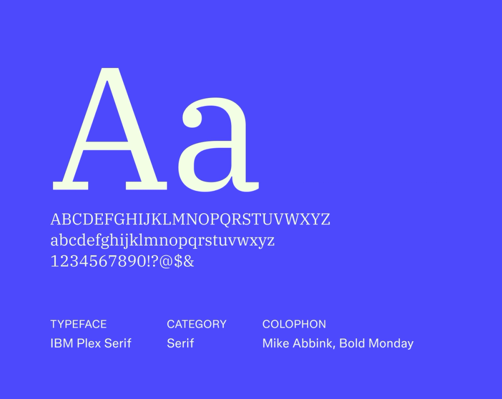
IBM Plex Serif is a humanist serif typeface designed with clarity and universality as core principles. It shares a consistent and approachable design language with other fonts in the larger IBM Plex family. While it maintains a modern and neutral aesthetic suitable for professional contexts, subtle humanist touches add warmth, making it a versatile choice for a wide range of applications requiring a clean, legible, and friendly presence.
Best for: Corporate communications, user interfaces, websites, and any project requiring a clean, legible font
Font 25: Inria Serif

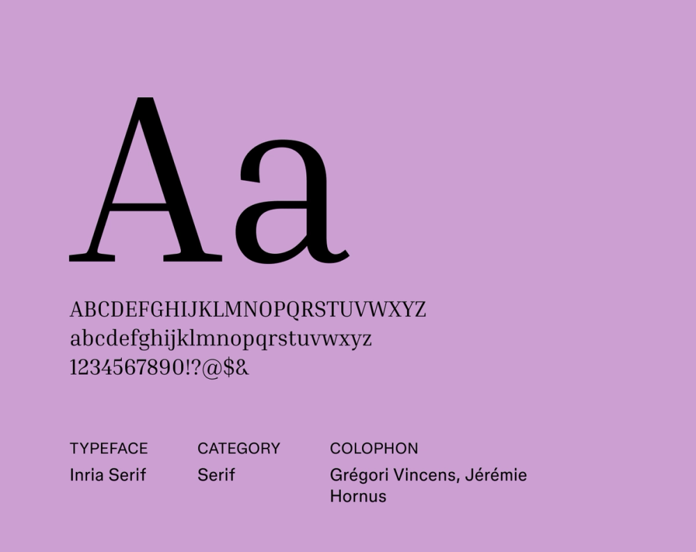
Inria Serif features slightly rounded terminals and open forms that contribute to a comfortable reading experience, especially in longer blocks of text. While its modern simplicity works well on screen, subtle calligraphic influences give it a touch of warmth and personality. Inria Serif aims to be both highly legible and inviting, making it a versatile choice for various design applications.
Best for: Blog content
Font 26: Hedvig Letters Serif

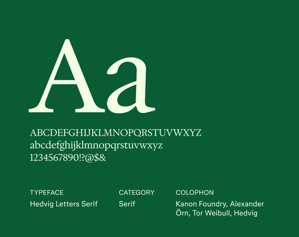
Hedvig Letters Serif blends classical proportions with a contemporary sharpness. Its refined aesthetic makes it stand out distinctly in headings and titles, though its careful design also ensures good readability in shorter blocks of text. The font brings a touch of unique character and sophisticated clarity to any design, perfect for making a memorable impression.
Best for: Branding for creative industries and editorial design
Font 27: Kyiv Type Serif

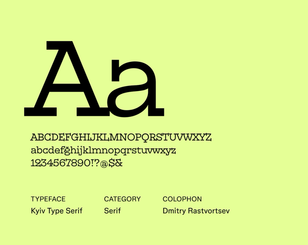
Kyiv Type Serif features sturdy letterforms and well-defined curves that contribute to excellent readability in both print and digital environments. While it has a strong and somewhat traditional structure, its open forms prevent it from feeling heavy, making it surprisingly suitable for extended blocks of text. Kyiv Type Serif provides a dependable and clear reading experience across a wide range of applications.
Best for: Websites with substantial text content
Font 28: Crimson Text

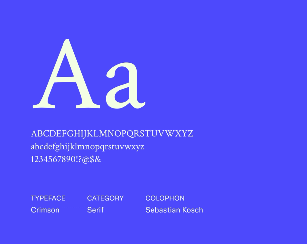
Crimson Text is a serif font with well-proportioned letterforms and clear serifs, offering a consistently comfortable reading experience for long blocks of text. Its traditional charm makes it well-suited for literary and formal uses, while its clean lines provide modern versatility. Crimson ultimately delivers a dependable and aesthetically pleasing result with a timeless quality.
Best for: Body text in books and articles
Font 29: Source Serif

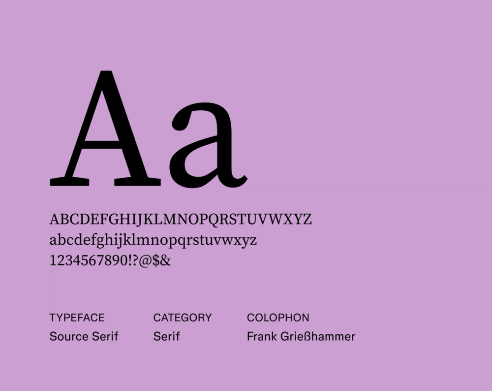
Source Serif is a versatile and highly readable serif typeface designed to complement Source Sans. Its clean, balanced letterforms offer excellent legibility across platforms, blending modern clarity with subtle humanist touches that add a touch of warmth. It stands as a reliable and harmoniously designed serif font option for diverse applications.
Best for: Websites, e-books, and applications that benefit from consistent typography
Font 30: Aleo

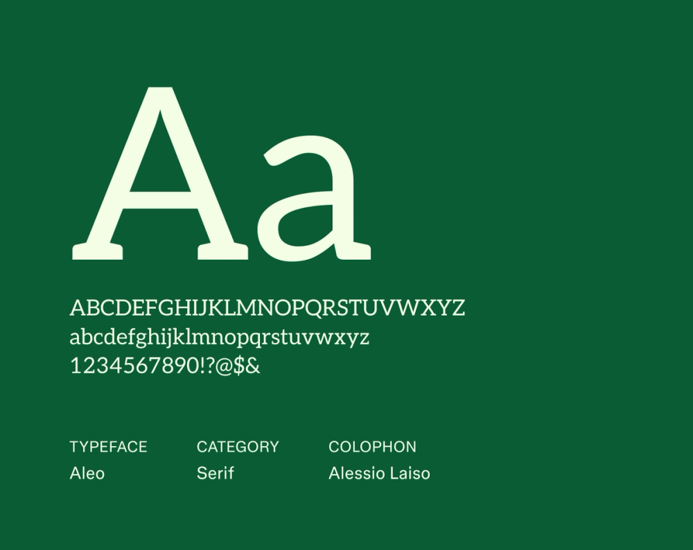
Aleo is a friendly, modern slab serif typeface characterized by its semi-rounded corners and bold horizontal serifs, which help with readability. Balancing robustness with a soft touch, the font is suitable for striking display use and shorter text blocks that need a distinct personality. It aims to be both engaging and easy to read.
Best for: Headlines, branding that wants to convey a friendly yet confident image, and shorter text passages
Font 31: Ramaraja

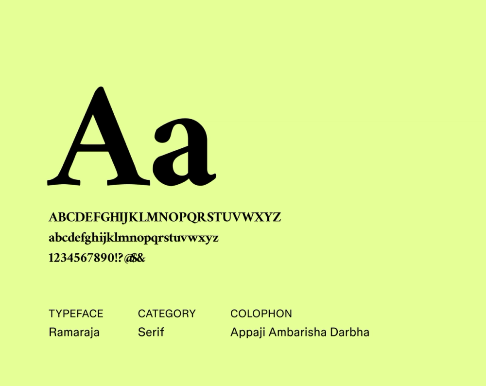
Ramaraja is a distinct serif typeface with a strong calligraphic influence, lending it a truly unique elegance. Its flowing strokes and decorative serifs create a captivating rhythm and visual interest. Ideal for headings and titles, its artistic design also ensures clarity in shorter text blocks, bringing a sophisticated and expressive flair to your projects.
Best for: Branding for artistic or cultural projects
Tips for using serif fonts
Here are a few things to keep in mind when working serif fonts into your design system or brand:
- Prioritize readability. Serif fonts are often easy to read, but not always. Choose weights, sizes, and line spacing that support clarity, especially for body text. Fonts with high contrast or thin details may look great in headlines but can be hard to read in longer passages.
- Use visual hierarchy to guide the eye. Serif fonts can do double duty—use bold or italic variations to create structure across headings, subheadings, and paragraphs. Hierarchy helps readers scan content and move through it easily.
- Pair thoughtfully. When combining serif fonts with other typefaces, look for contrast in shape, tone, or texture—but aim for balance. For example, pair a traditional serif headline with a clean, minimal sans body, or vice versa.
- Match tone to audience and medium. Some serif fonts carry more personality than others. Consider who you’re designing for and how the content will be used. A literary journal might lean into historical elegance, while a tech blog might benefit from a modern serif with clean geometry.
- Let your layout breathe. White space around serif text enhances readability and visual impact. Serif fonts especially benefit from room to show their details—tight letter spacing (or poor kerning) can make even elegant type feel cramped.
- Consider where it’s going. Not all serif fonts work well everywhere. Some are optimized for screen use, while others shine in print or high-resolution editorial work. Choose fonts that suit the format and hold up across devices and sizes.
Explore the best serif fonts with Figma
Selecting the best serif font can impact the tone and readability of your designs, lending a touch of tradition or modern sophistication. Experimenting with different serif styles and understanding their nuances allows you to craft compelling and effective typography.
Ready to choose fonts for your next project? Figma can help. Here’s how:
- Browse Figma’s font resources to discover more options.
- Explore the Figma Community to find more serif fonts and design examples recommended by other creatives.
- Use Figma’s design tool to create projects with even more control.
Bring your Fonts to life with Figma Design
Ready to start designing?