5 top web design grid layout examples


Share 5 top web design grid layout examples
Explore more from
Design basics
From wireframe to website, faster
Design, prototype, and refine every page.

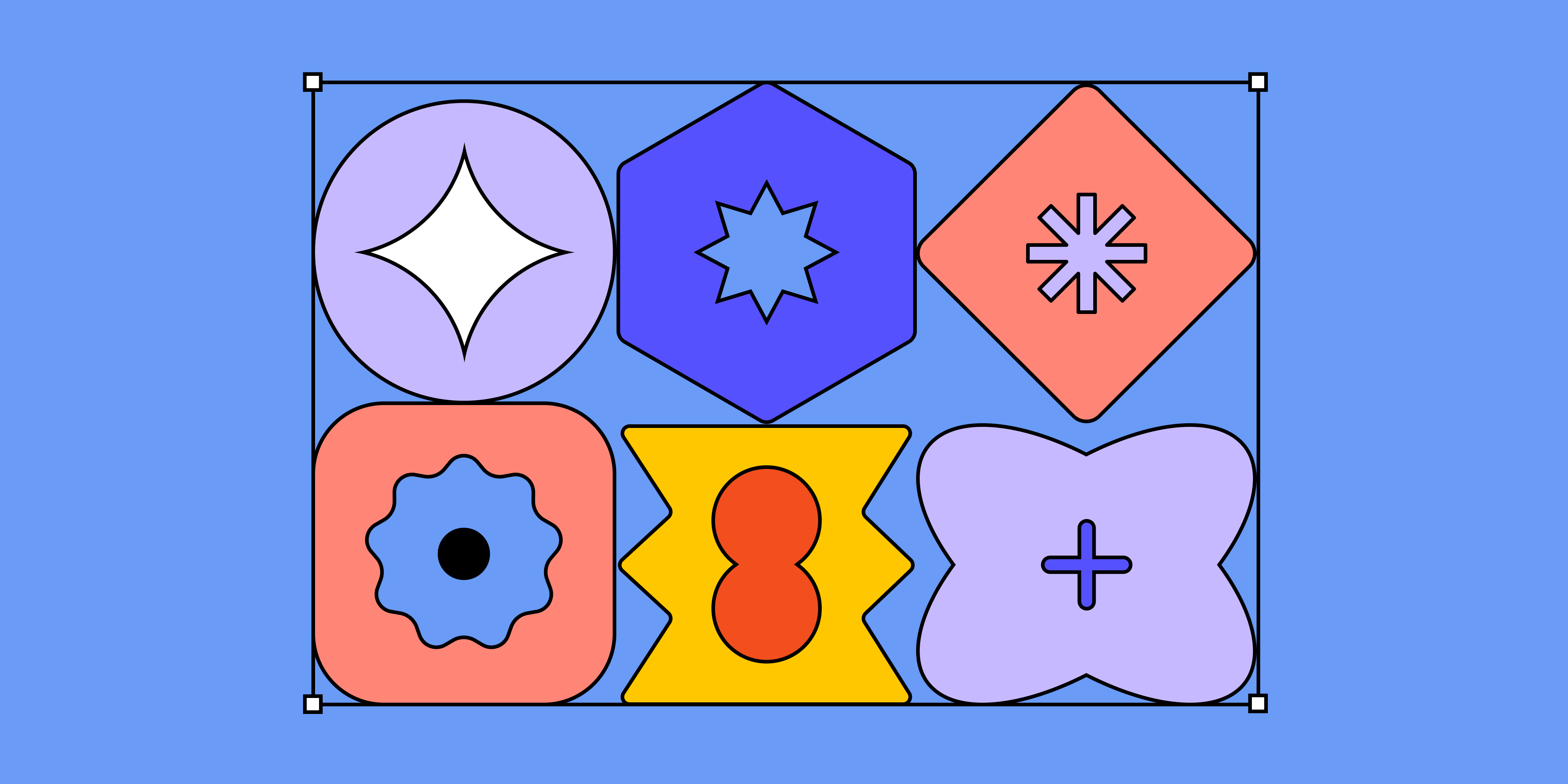
It happens to every designer: You're brought in to fix a disorganized website, but how to create order isn't obvious. How do you lay out web pages so they make sense to users? Where do key user interface (UI) features go, and how does the information flow across the site? A web design grid can help you design an elegant solution.
Read on to discover:
- What a web design grid is—and how a grid system can improve interface design and overall user experience (UX)
- Pro tips to create a web design grid that works for your design system
- Five proven web design grid layout examples to get started.
What is a web design grid?
Digital designers use grids to plot content and other UX design features on a website. Think of your grid system as a showcase made of boxes, neatly arranged in rows and columns. To organize your page layout, you can fit text, images, and UI design elements into this grid structure. This makes important elements easier to find and workflows easier to follow, from landing pages to web forms.
“A grid system helps the designer rationalize decisions, but you don’t need to get hung up on pixel perfection,” explains Tom Lowry, Director of Advocacy at Figma. For Tom's pro tips on using grids for design projects, check out his article “Everything you need to know about layout grids”—and for specific tips on using grids in web design, read on.
3 benefits of web design grids
When you apply a grid to your web design, you're faced with decisions about what goes where —and why. Grids help you put UX design principles into practice, and quickly see how moving a few UI elements can improve site functionality.
Grid website design has three key benefits:
- Consistency. Grid spacing and layouts set standard spacing, alignment, and size for your design elements. With a coherent structure and clear hierarchy in place, you can create a consistent site experience that works across different devices.
- Design efficiency. Consider your grid a handy point of reference for your team throughout the design process, from sketches and prototyping to web development. Establishing a framework upfront lightens the cognitive load of deciding where to place text, images, videos, and other site elements.
- User understanding. Users won’t stick around if they're confused or can’t find what they want. Organizing site features reduces user confusion and increases engagement.
Real-life grid design
In urban planning, a bird’s-eye view of a city layout reveals its grid. Streets divide buildings, parks, and parking lots. Similarly, web designers use sequential columns and rows to create a baseline grid. Content, features, and whitespace fill these boxes–much like buildings, parks, and parking lots in a city grid.
Grid website basics
Look closely at any website plotted on a grid, and you'll recognize these key elements at work:
- Margins separate content from the edge of the page.
- Flowlines break up page space into bands, guiding readers through sections. They help align typography, making text easier to scan.
- Rows are horizontal bands that divide page space, so content is easier to scroll.
- Columns are vertical blocks that help align visual elements for clarity. To see how you can make your design feel spare or crowded, try shifting your column width or increasing the number of columns on a page.
- Gutters are buffers between rows and columns. You can change the gutter width to help group related content, or set different elements apart.
- Modules are building blocks of content and visual elements, grouped together into rows and columns.
How to create a web design grid
First, decide which of the two main types of grids you want to use for your design. With hard grids, all page elements align strictly to baseline rows and columns. Soft grids hold content together more loosely, using consistent base unit spaces between elements.
“Hard grids can be technically challenging with the way elements work within a web browser, especially across different device sizes,” Tom explains. “The idea of hard grids came from print and newspaper or editorial design, so it’s a little antiquated. In reality, I think soft grids are more practical. Not every single little thing has to adhere to an underlying grid in digital spaces.”
Next, establish your spatial system, with pointers from Figma on creating grid layouts. To set the standard size and spacing for your UI elements, use these three design fundamentals:
- Base units are the smallest units of measurement in your design—every page element will be a multiple of this measurement. The standard base unit for HTML or CSS design is usually 0.5 or 1 REM (root ephemeral unit), equivalent to eight or 16 pixels (px). Since pixels are fixed values, it's better to use REM measurements to ensure your grid is scalable (see below) and meets accessibility standards.
- Sizing is the height and width of UI elements, measured in base unit increments.
- Padding is the space between UI elements, measured in base unit increments.
Pro tips for scale in responsive web design
Before you set sizes for your grid elements, consider users accessing your site on different devices. To create a responsive grid design, set the sizes of key page elements like margins and rows as percentages in REM, rather than fixed pixel values. This helps your design adapt to different screen sizes.
To make a responsive layout work, consider scale. “On a mobile device, you want small margins because you don’t want any content touching the edges of the screen," Tom explains. "On a desktop website, you want liquid or flexible margins so your text doesn’t span across a giant widescreen." Readability is another key consideration in responsive design. "You can use extra margin space for navigation or additional information—but let those extra elements collapse and hide on smaller screens if they compromise the reading experience. ”
5 popular web design grid layout examples
Now you're ready to design your grid website. To browse different types of grids, Tom recommends the book Grid Systems in Graphic Design by Josef Müller-Brockmann. "Even though it’s rooted in print design, it has lots of good examples and illustrations,” he says.
From browsing online, you'll also recognize these five popular web design grid layouts:
Example 1: Block grid
Also known as a single-column or manuscript grid, this simple block grid features a large, central rectangular column, filling most of the page space within the margins.
Block grids support a vertical reading experience, drawing the reader’s eyes downward. This is ideal for text-heavy content like blogs, newsletters, articles, or an About Us page. Google Docs and Microsoft Word both use block grids.
Block grids are plain, so design elements are vital to enhance the visual flow. Play around with these elements to break up monotony:
- White space
- Headers
- Hero images
- Shape dividers
- Bullet points
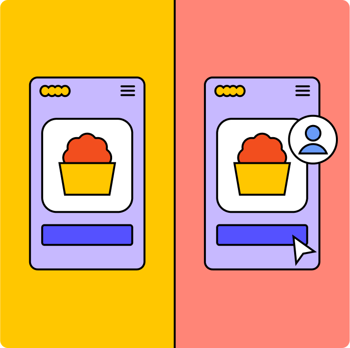
Example 2: Column grid
You'll recognize column grids from print and digital newspapers, which organize content into columns. Media sites range from two to 12-column grids, but three is considered the UX sweet spot.
With a column grid layout, text, visual elements, and videos fit within the column's vertical lines and flowlines. A classic web design use case for column grids is a pricing page, where site visitors can easily compare and contrast cost and feature differences to inform purchases.
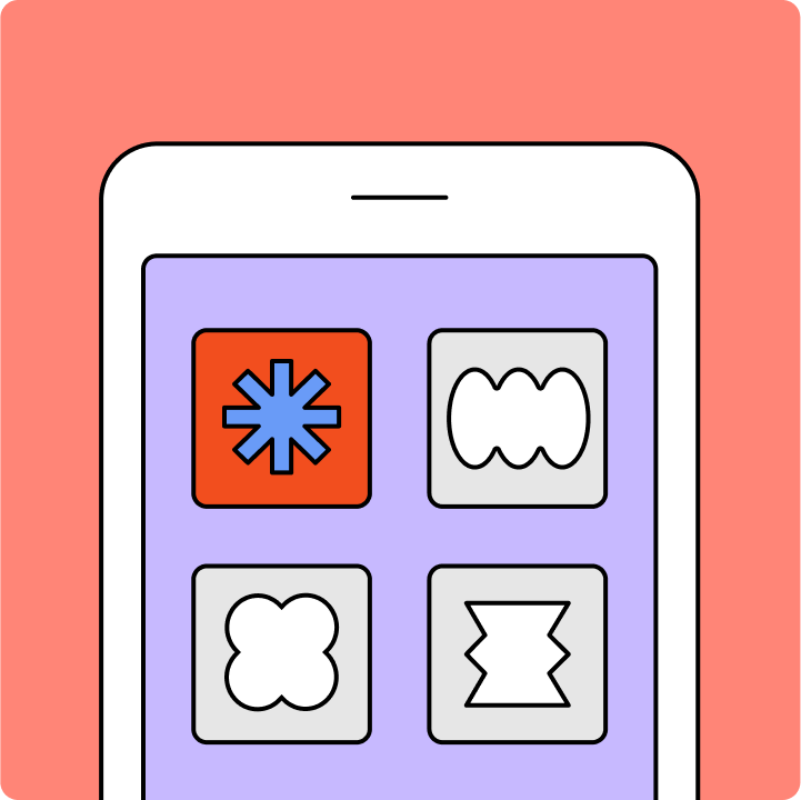
Example 3: Modular grid
Most websites and apps that display a gallery of images rely on modular grids to organize content into neat columns and rows. For example, a user’s profile on Instagram displays videos and photos in modules. Clothing websites often show products in modular fashion for easy comparison.
A modular grid provides three primary advantages:
- Ease of use. Users intuitively know how to navigate a modular site with grid layouts.
- Product display. Exhibiting dozens of products at once maximizes product views.
- Responsiveness. Modular grids help desktop and mobile sites load easily.
Example 4: Baseline grid
A baseline grid is like a piece of notebook paper—a dense grid with equally spaced horizontal lines. These lines dictate where text must fit, aligning text throughout the document for scanability. The once-standard 8px grid system uses a 4px baseline—but today, web designers measure text size in REM to ensure it meets scalability and size standards for accessibility.
Your baseline grid impacts key design decisions, including:
- Text size
- Line height pairings
- Margin spacing
- Padding spacing
Example 5: Hierarchical grid
Hierarchies allow you to organize modules and other page elements in order of importance, while offering a more flexible, responsive page design. Tesla’s Model S page shows how a hierarchical grid layout keeps responsive content modules organized.
Snap to the grid with Figma
A grid is a handy tool for any website designer, helping to outline the look and feel of the entire user experience. But they can also unlock creativity, Tom says. “Grid systems didn't always provide me with the flexibility I wanted—but when I discovered how layout grids work in Figma, it opened up design possibilities.”
For starters, Figma website wireframes let you apply a layout grid to any frame. Then you can use Figma's grid and spacing templates to define your page structure, hierarchy, and rhythm clearly—as you'll see in this popular web web design grid layout example from Figma's professional design community.
Ready to launch your next grid website design?
Build your web design layout with Figma
Keep reading

What is visual hierarchy
If everything looks the same, then you see nothing. Visual hierarchy can change that.
Learn more

UI vs UX
Read on to find out what it takes to design engaging UI, and create a memorable UX.
Learn more

What is product design?
Learn how product designers help define which goals matter, from both user and business perspectives
Learn more