12 design system examples to help you build your own

Share 12 design system examples to help you build your own
Explore more from
Design basics
Create, collaborate, and ship in Figma
All your design work, in one place.


Design systems bring consistency, scalability, and efficiency to product design. They act as a shared toolkit of components, guidelines, and resources that help teams deliver cohesive user experiences faster. Whether you’re starting from scratch or refining an existing system, studying successful examples can spark ideas, streamline decisions, and help you avoid common pitfalls.
This guide explores 12 standout design systems, ranging from enterprise solutions to startup-friendly templates. You’ll find actionable ideas, practical patterns, and resources you can adapt to your own projects.
Read on to learn:
- What a design system is
- Key benefits of using one
- Noteworthy design system examples
What is a design system?
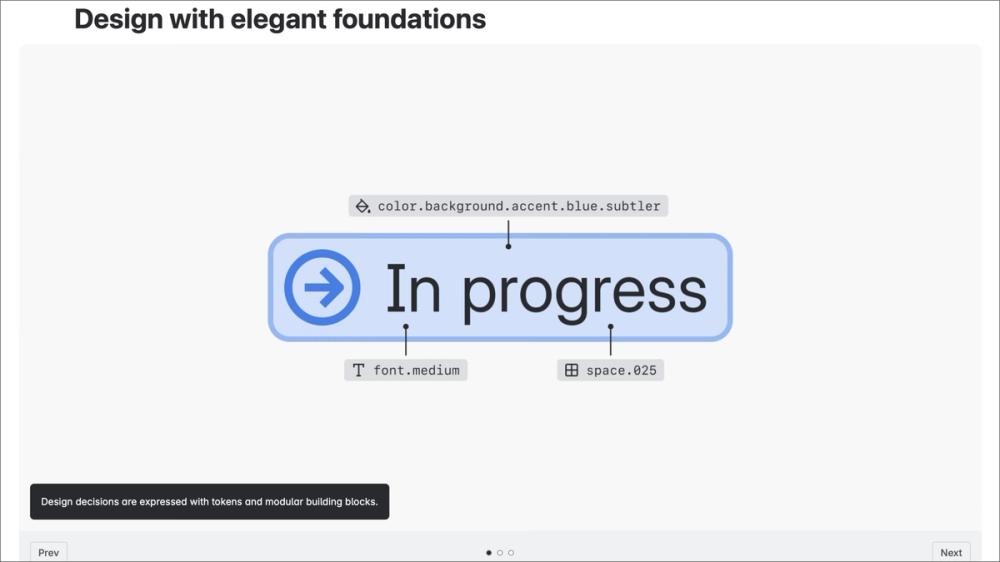
A design system is a comprehensive collection of reusable components, guidelines, and tools that help teams build consistent, high-quality products. Think of it as a central toolkit for your product’s design, bringing your design and development work into a shared source of truth.
Most design systems include key ingredients like:
- UI kits. Think reusable building blocks like buttons, forms, and icons.
- Design tokens. These define your brand’s specific values, such as colors, spacing, and typography.
- Patterns. These are solutions for how elements behave, like navigation bars or modal windows.
- Documentation. This explains how and when to use each element.
When paired with tools like Figma’s Dev Mode, a well-crafted design system, helps teams work faster, stay aligned, and deliver seamless user experiences across products and platforms.
Six benefits of a design system
A design system is more than a style guide. It’s a powerful tool that helps your team move faster, collaborate more effectively, and streamline design and development.
Here are some key benefits:
- Speeds up design and development. Reusing components instead of rebuilding every time makes it faster to launch features.
- Improves consistency. Visuals and interactions stay aligned across all pages and products.
- Fosters cross-team collaboration. Shared guidelines and resources help designers, developers, and product managers work from the same playbook.
- Supports accessibility. Incorporating best practices from the start ensures an inclusive, user-friendly experience for everyone.
- Simplifies onboarding. Providing new teammates with ready-to-use patterns and a clear understanding of your product’s design principles shortens their learning curve.
- Scales with your product and team. As your product grows and your team expands, your system keeps everything connected and cohesive, making it easier to manage and evolve.
Build faster with Dev Mode
Streamline your workflow and turn designs into code.
12 inspiring examples of design systems
The following examples show how top teams apply design systems in real-world products. From enterprise frameworks to community-built Figma kits, each demonstrates a unique approach to consistency, scalability, and user experience.
Example 1: TapTap Design System

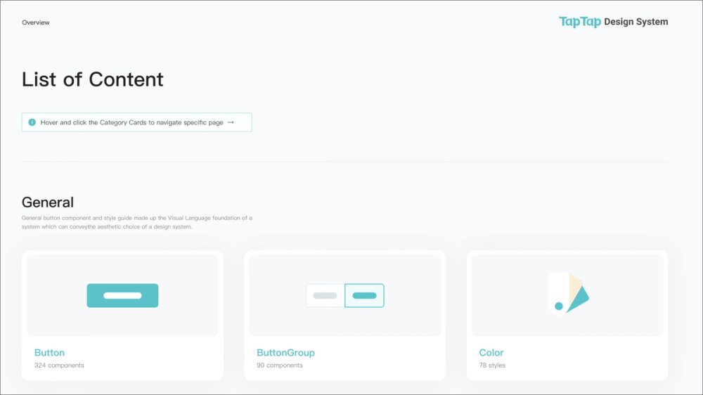
The TapTap Design System features crafted components, extensive variables (including for dark mode), and hundreds of pre-built page examples, making it incredibly versatile. It also supports the latest Figma features like Auto Layout 5.0 and component properties.
This system is ideal for individual designers or small to large design teams looking for a robust starting point that can handle nearly any project. Its neutral aesthetic makes it adaptable to various brand styles, saving hours on setup and ensuring high-quality, consistent designs from day one.
Example 2: Google’s Material Design 3

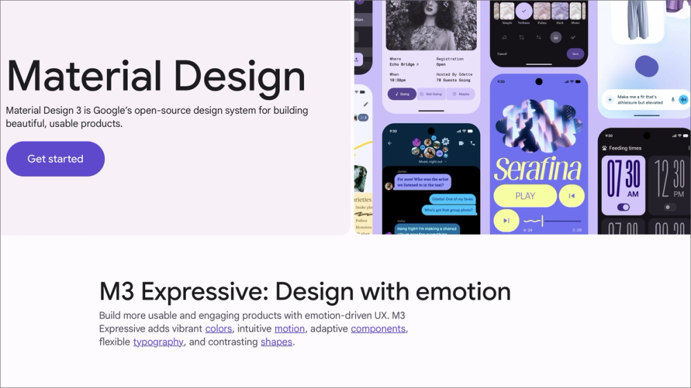
Material Design 3 (M3) is Google’s latest open-source design system, highlighting customization and expressiveness through Material You. It offers comprehensive guidelines for color, typography, shape, and motion, plus a vast library of interactive components. M3’s dynamic color adapts the visual theme to user preferences.
M3’s integration with development frameworks and extensive documentation make it a go-to for teams designing Android apps or modern, adaptable web experiences.
Example 3: Arco Design System

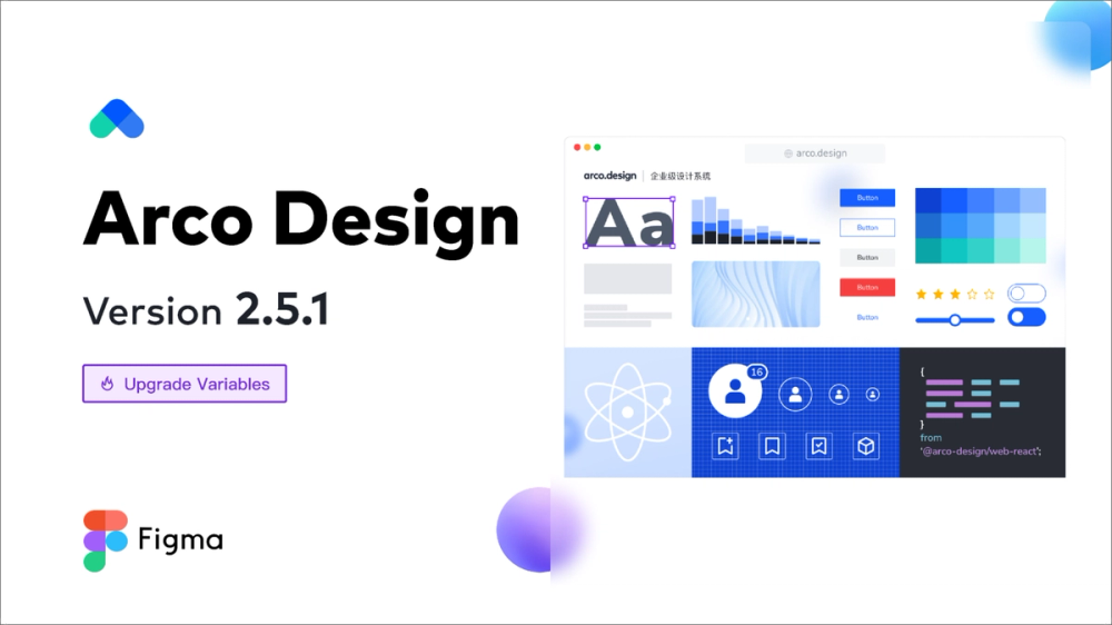
Arco Design System from ByteDance (TikTok’s parent company) offers a rich set of components, design tokens, and strong customization. Its unique Design Lab enables easy theme creation with intelligent code generation.
It’s perfect for teams building complex enterprise apps needing customizable themes and efficient design-to-development workflows. Arco’s smart tools and developer integration make it a great choice for large teams and sophisticated products.
Example 4: Shopify Polaris

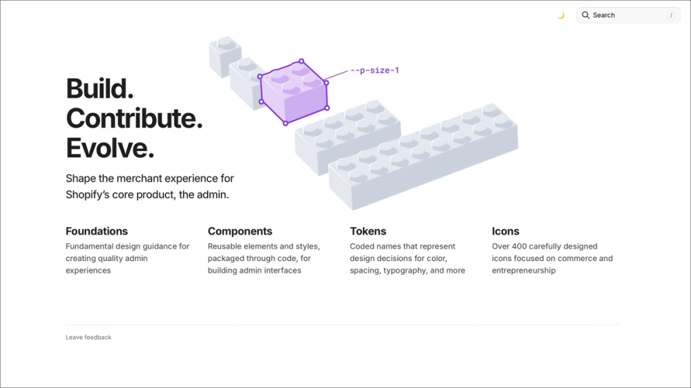
Shopify Polaris is the design system that powers experiences across the Shopify ecosystem, including the admin, POS, and mobile apps. It includes a comprehensive set of UI components, content guidelines, design principles, and accessibility standards—all focused on building consistent, accessible, and efficient e-commerce experiences.
Its documentation, React and CSS components, and resources for both design and content strategy make it essential for teams building apps or themes for Shopify merchants.
Example 5: Dialect Design System

Designed for speed and flexibility, the Dialect Design System offers a free component library on the Figma Community. While details on specific features, like tokens or extensive documentation, may vary in the community version, it typically provides a core set of UI design components ready for immediate use.
This system is an excellent starting point for beginners, students, or small teams looking to prototype or build a consistent UI without starting entirely from scratch. It provides a foundation of design system components that designers can customize to fit project needs.
Example 6: IBM Carbon Design System

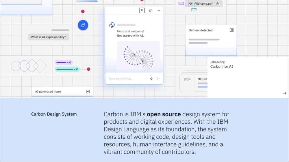
The IBM Carbon Design System is an open-source framework that supports IBM’s digital products. Known for its extensive component library, robust accessibility standards, and thorough documentation covering design, front-end code, and best practices, Carbon emphasizes flexibility and consistency across IBM’s diverse product ecosystem.
Its structure and best-practice guidance make it an effective choice for enterprise teams building large, accessible applications.
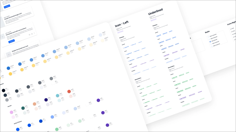
Example 7: Simple Design System

This design system template from the Figma Community provides a practical starting point for creating your own system. It includes foundational elements like color palettes, typography styles, spacing guidelines, and a core set of UI components, often set up with Auto Layout and variants.
This example is great for designers who want a clean, well-structured template to build upon, rather than starting from a blank canvas. It’s useful for those learning to implement design systems in Figma and helps establish organizational habits from the start.
Example 8: Apple’s Human Interface Guidelines

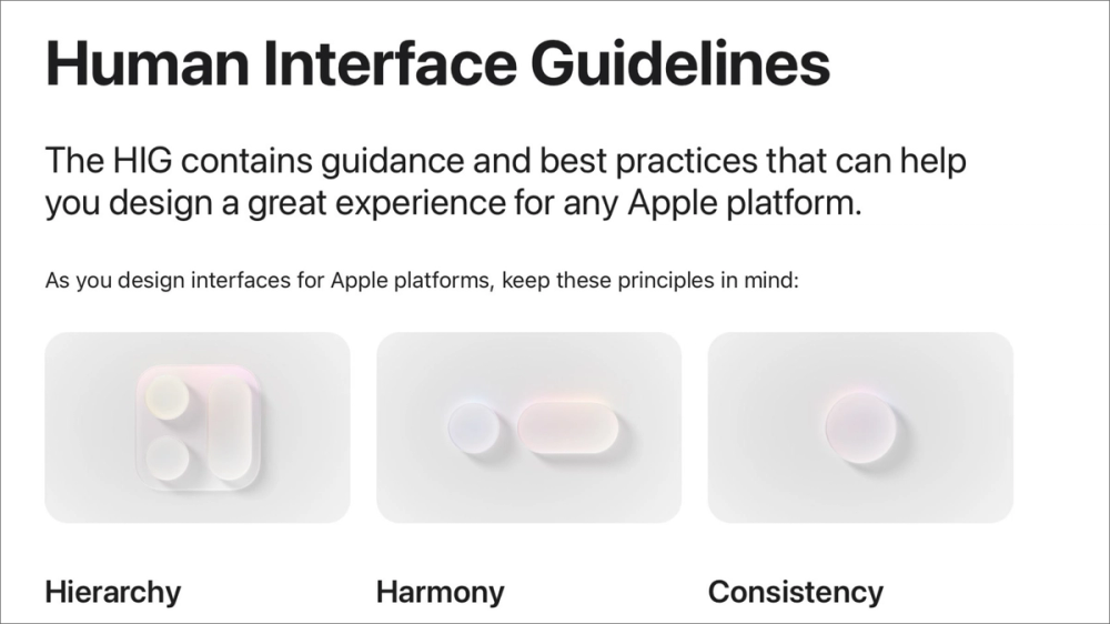
While not a code-based design system like others, Apple’s Human Interface Guidelines (HIG) serve as the definitive design system for all Apple platforms, including:
- iOS
- iPadOS
- macOS
- watchOS
- tvOS
It offers comprehensive principles, patterns, and UI elements to help create native, intuitive, and consistent experiences across the Apple ecosystem.
The HIG covers everything from high-level design philosophy to detailed component behavior and accessibility standards, making it the go-to for Apple app designers.
Example 9: Finesse UI


Finesse UI is a free Figma UI kit and design system (community version) that provides a clean, modern, and highly organized set of components. It typically includes buttons, input fields, navigation elements, and more, built with Figma features like Auto Layout and variants for easy customization.
Its structure and style make it versatile for freelancers, small teams, and anyone looking for an aesthetically polished starting point.
Example 10: Atlassian Design System

The Atlassian Design System powers products like Jira, Confluence, and Trello, emphasizing consistency, clarity, and efficiency across complex enterprise tools. It features a rich component library, comprehensive content guidelines, accessibility best practices, and design principles that prioritize team collaboration.
It’s ideal for teams managing complex, interconnected products that require a consistent experience across multiple applications.
Example 11: Wanted Design System

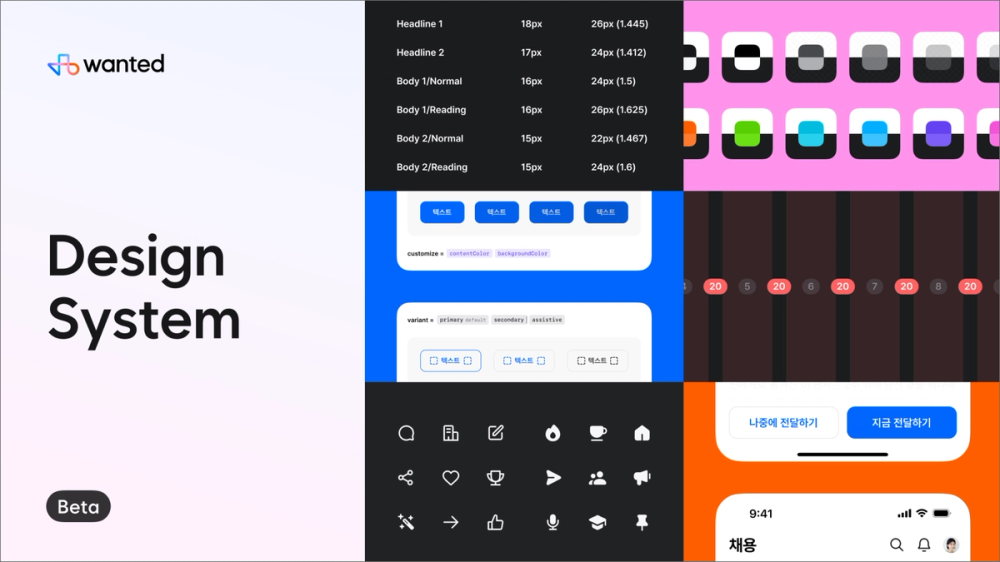
The Wanted Design System from the Figma Community offers a modern and well-structured approach to creating consistent UIs. It often includes a range of common components, typography scales, color palettes, and organized styles that are easy to adapt. It focuses on providing a clean, professional aesthetic for various digital products.
It’s a solid option for designers who want to quickly establish a clean visual language without building every element from scratch.
Example 12: Uber’s Base Design System

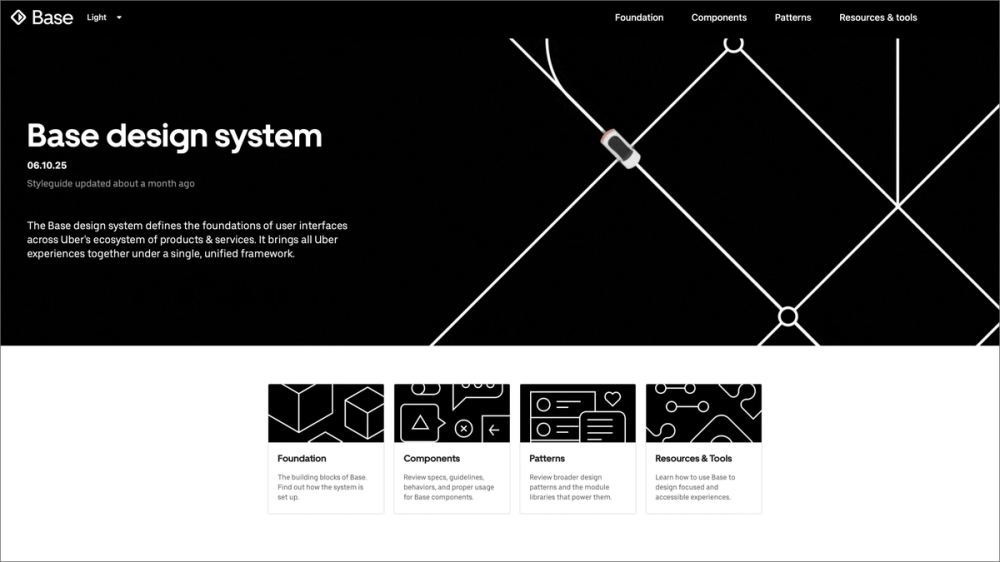
Uber’s Base Design System provides a unified framework to maintain consistency across its services, from ride-sharing to food delivery. It defines core elements including typography, color, iconography, and spacing, offering clear guidelines for application across platforms and products.
Base is a strong model for scaling design across a global, multi-product ecosystem. It’s especially valuable for teams that need a cohesive visual foundation, even when products have distinct user-facing identities.
Bring your design system to life with Figma
As these design system examples show, a well-implemented system is key to creating seamless user experiences and streamlining workflows. Figma offers powerful tools to support every stage of the process:
- Speed up design and ensure consistency across your system in Figma Buzz.
- Collaborate in Dev Mode to bridge the gap between design and development with code-ready specs.
- Get inspired in the Figma Community by browsing templates, UI kits, and system examples from top designers.
Create and manage design systems with Figma
Unify your team and build consistent, scalable designs effortlessly.
Keep reading

How to use an existing design system
Learn the basics of working with components and libraries with this design system.


Consistency in design
Learn how design consistency builds a cohesive brand and sets clear user expectations.

Graphic design principles
Learn the 13 core graphic design principles and how to apply them.
From the blog
The Figma design agent is here
Starting today, work with an agent that is built for Figma—directly on the canvas.

The TL;DR on MCP: Why context matters and how to put it to work
Figma’s MCP server brings your design decisions into the tools where code gets written—so what gets built actually matches what was designed. Here’s what that unlocks for everyone who builds products.
How to supercharge your design system with slots
Slots give you the ability to customize components without breaking the system. We’re sharing five field-tested tips from early users to help you unlock more freedom without giving up control.
The new business case for design systems
Design systems have evolved from static libraries to key drivers of business revenue, customer loyalty, and product strategy. Here’s what you need to know about how to track and communicate the value of your design system, based on new research from the Design Executive Council (DXC).


5 shifts redefining design systems in the AI era
As AI reshapes how we make products, design systems are evolving from libraries of reusable parts into living frameworks that scale taste and craft. We spoke with product leaders and practitioners about the shifts they’re seeing in how design systems are built, used, and maintained.

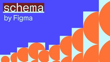
Schema 2025: Design systems for a new era
Design systems help teams push what’s possible while maintaining a high level of craft, polish, and performance. Here’s everything we announced at Schema by Figma to help teams design for the AI era.