What is Kerning & Why it Matters in Font Design

Share What is Kerning & Why it Matters in Font Design
Explore more from
Design basics
Design and prototype with consistent type
Bring type to life in every interaction.

Poorly spaced letters derail great design. When text feels off—whether letters crowd together or drift apart—the culprit is often kerning. Even beautiful fonts need precise spacing to maintain their impact.
The difference between amateur and professional typography often comes down to letter spacing. Learning to kern effectively helps you create clean, readable designs that hold viewers' attention.
Read on to find out:
- What kerning is
- The difference between kerning, tracking, and leading
- Types of kerning and when to use them
- Good kerning and bad kerning examples
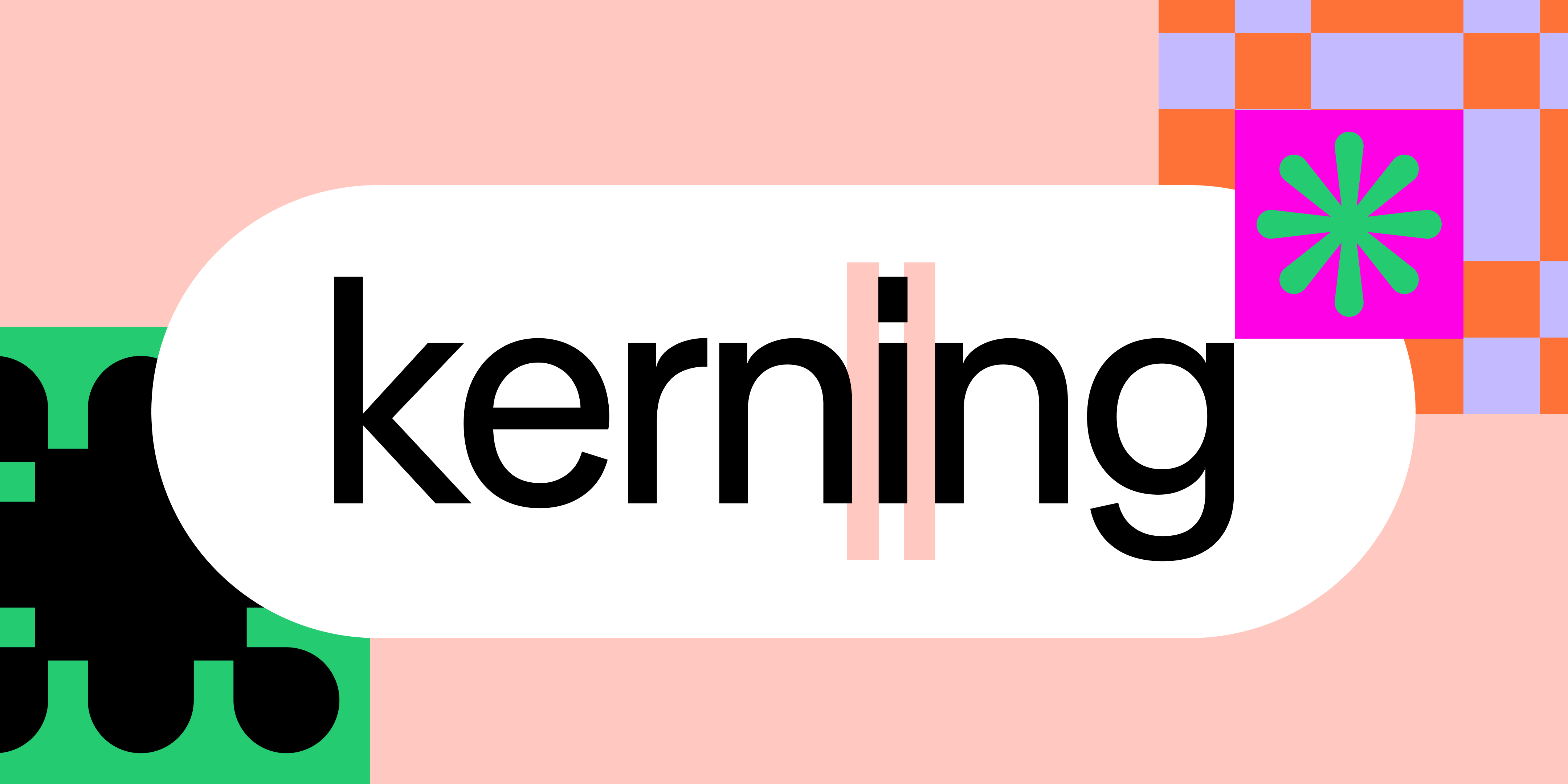
What is kerning?
Kerning is a design principle that refers to the process of adjusting the spacing between individual letter pairs. Each letter's relationship with its neighbors shapes the overall visual harmony, creating balanced, readable text.
Whether you’re crafting a website, designing a logo, or creating printed materials, kerning can transform your project’s appearance. It's fundamental to professional typography.
Kerning originated in the era of metal typesetting, where typesetters modified metal letter blocks to improve spacing between challenging letter pairs like A and V. They physically adjusted these blocks to create more balanced letter combinations.
Today, kerning remains critical in print and digital design. Precise letter spacing maintains professionalism and readability across all applications—from business cards to billboards.

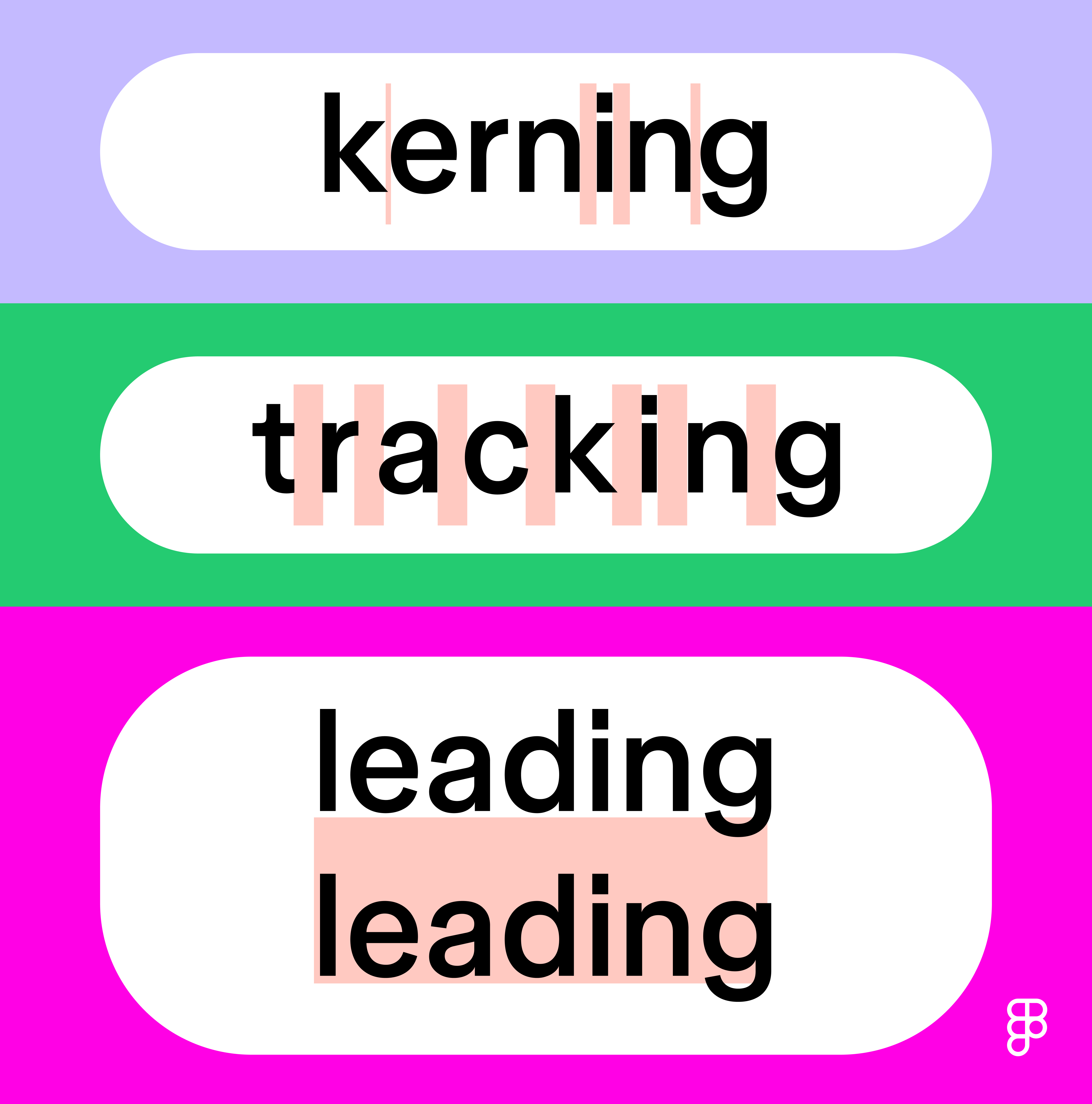
The difference between leading, kerning, and tracking
Three key letter spacing elements shape typography: kerning, tracking, and leading. Each serves a distinct purpose:
Tracking
Tracking adjusts spacing uniformly across a range of characters (such as an entire word, sentence, or paragraph). Unlike kerning’s precise letter-pair adjustments, tracking modifies overall text density. Increasing tracking creates open, airy text while decreasing it creates a more compact look.
Leading
Leading refers to the vertical spacing between lines of text. The term comes from hand typesetting in traditional printing, when strips of lead were used to separate lines.
Proper leading ensures readability and a balanced appearance, especially in longer paragraphs. Too much leading makes text feel disconnected, while too little makes it cramped.
Types of kerning
You can apply kerning in various ways. Let’s explore a few different types of kerning.
- Default spacing. Default spacing keeps letters at their standard distances. While functional, this mechanical approach often lacks visual harmony.
- Automatic kerning. Many computer programs can apply automatic kerning. Although this is a convenient feature, it may not always achieve ideal results, especially with unique fonts and specific design needs. There are two types of automatic kerning:
- Metric kerning uses spacing values that are predetermined by the font designer.
- Optical kerning is when the software adjusts spacing based on the shapes of letters rather than predefined metrics. This is particularly useful when dealing with irregular fonts or when you want to combine different typefaces.
- Manual kerning. For ultimate precision, designers often adjust kerning manually. This involves evaluating each letter pair and manually tweaking the spacing between them to achieve the desired look.
When to use kerning
Kerning isn’t always necessary, but there are specific scenarios where it’s crucial. Here are some of the most common use cases:
- Logos and branding. Meticulous letter spacing on logos give brands that polished, professional look. Each character contributes to brand identity, making proper kerning crucial for lasting impact.
- Headlines. Larger text draws more attention, making uneven spacing especially noticeable in headlines.
- Poster design. For posters and fliers, careful kerning ensures your message remains legible whether viewed up close or at a distance.
- Small font sizes. Whenever small text is used, like for captions or footnotes, precise spacing is critical to maintain readability.
- Mobile and web design. On smaller screens, kerning is essential to ensure text doesn't appear cramped or illegible.
Problematic letter pairs
Certain letter combinations naturally create awkward spacing. . Slanted letters like A, K, V, W, and Y need special attention when paired. Capital letters followed by lowercase ones also deserve careful adjustments—look out for combinations like "AV," "WA," "VA," "LY," and "To."
Pro tip:
To replicate kerning in Figma Design, place your cursor between two letters and adjust the spacing. Use the |A| field to adjust letter spacing for your selection, or use keyboard shortcuts:
- Mac users: Hold down ⌥ Option and < to increase or > to decrease.
- Windows users: Hold down Alt and < to increase or > to decrease.
Kerning tips
Good kerning comes with practice and attention to detail. Here's how to develop your eye for letter spacing::
- Font size affects spacing needs. Smaller font sizes need more space between letters to maintain legibility, while larger text lets you fine-tune relationships between specific characters.
- Context shapes your kerning approach. A logo appearing on both business cards and billboards needs spacing that works at every scale. Consider where and how your design will appear.
- Accessibility matters in digital design. Kerning impacts UX/UI, readability, and designing for accessibility in apps or websites. Always ensure your kerning choices don’t compromise readability for users with visual impairments or screen readers.
- Change your perspective. Feeling stuck? Zoom out, rotate, and flip/mirror your words to get a fresh perspective. Viewing your design from different angles or at a smaller size can help you identify spacing issues you might otherwise miss.
- Digital tools can help perfect your spacing. Many design programs include gridlines and kerning tools to make the process easier. Check out Figma’s letter spacing options.
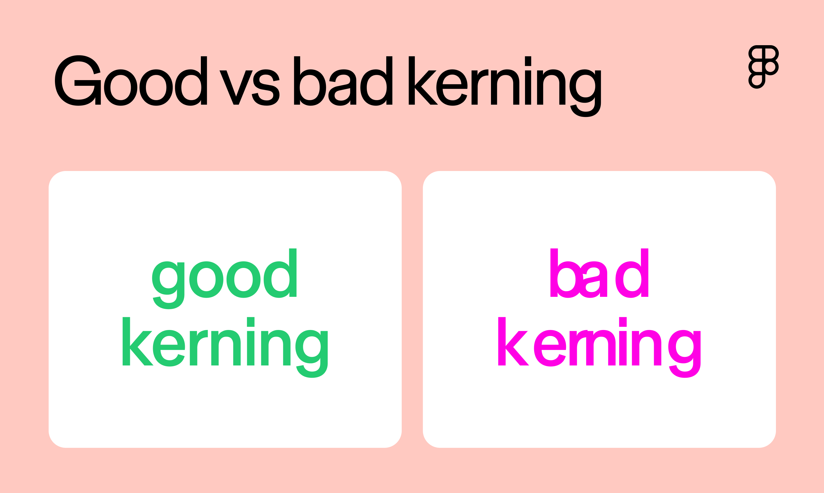
Examples of kerning done right
The difference between good and poor kerning often determines whether a design succeeds or stumbles. Well-executed spacing enhances the design, while awkward letter spacing can distract viewers and diminish impact. Here are some classic examples of kerning in action:

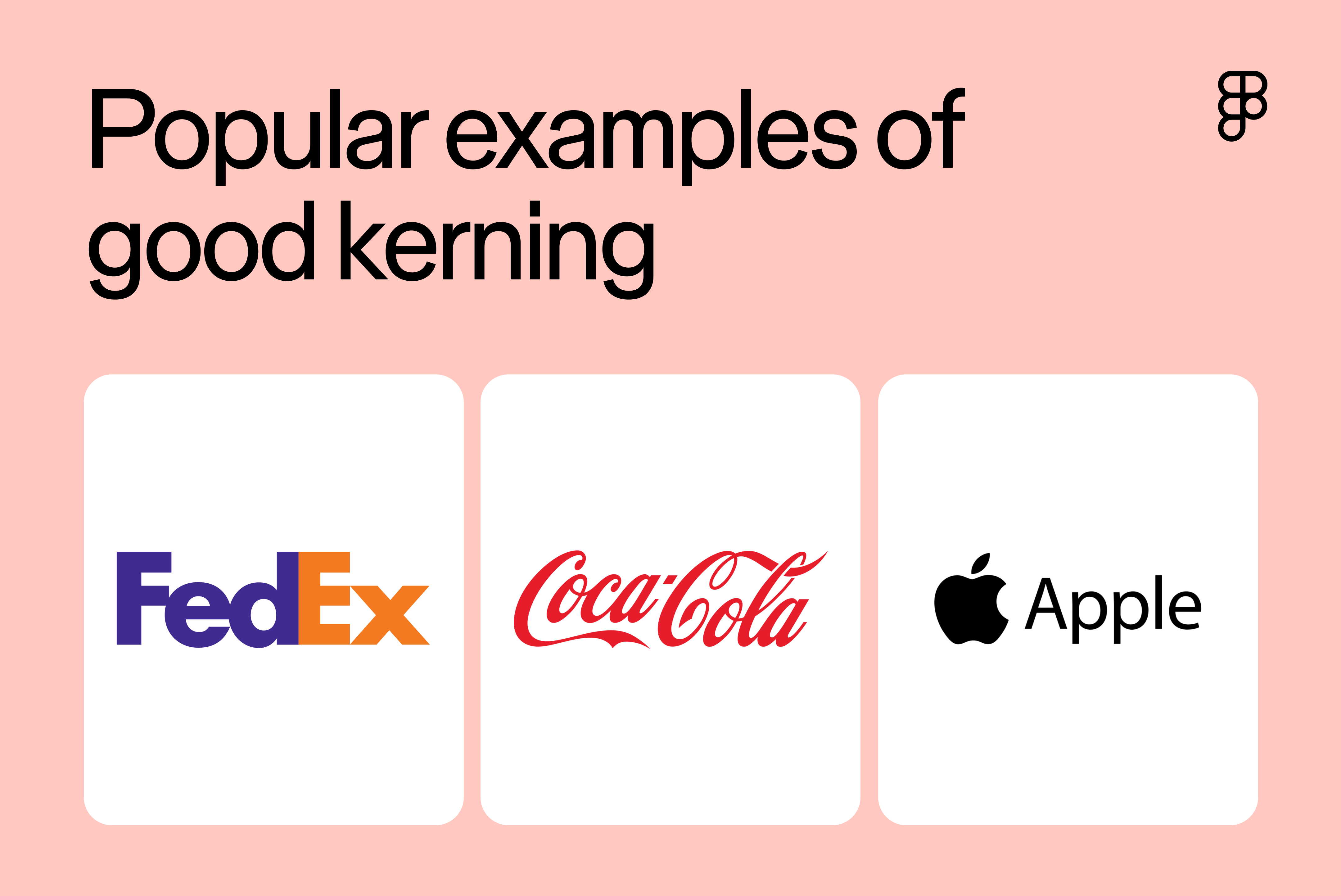
- FedEx. The FedEx logo uses tight kerning to create a modern look. The tight kerning makes the text readable and creates that famous hidden arrow between the E and X.
- Google. Google's logo, last updated in 2015, features custom modifications to a sans-serif typeface called Product Sans. The precise spacing contributes to the logo’s simple, modern aesthetic while maintaining the brand’s friendly and approachable feel.
- Apple. Apple maintains its minimalist aesthetic through clean, precise spacing. The kerning reflects the brand's commitment to simplicity and attention to detail.
For more examples of kerning in action, check out these good and bad versions of hypothetical designs:

Bring balance to your text designs with kerning
Kerning might seem like a small detail, but it's often the difference between amateur and professional typography. Here are a few ways Figma can help you master this essential skill with tools and resources to elevate your designs.
- Explore typography systems in Figma to understand the roles they play in your project.
- Browse various fonts and typography templates from the Figma Community to tweak kerning and find the perfect fit for your design.
- Try out different type arrangements, present examples, and collect feedback from your collaborators with FigJam’s online whiteboard.
Ready to start kerning?
Keep reading


From the blog
The Figma design agent is here
Starting today, work with an agent that is built for Figma—directly on the canvas.

The TL;DR on MCP: Why context matters and how to put it to work
Figma’s MCP server brings your design decisions into the tools where code gets written—so what gets built actually matches what was designed. Here’s what that unlocks for everyone who builds products.
How to supercharge your design system with slots
Slots give you the ability to customize components without breaking the system. We’re sharing five field-tested tips from early users to help you unlock more freedom without giving up control.
The new business case for design systems
Design systems have evolved from static libraries to key drivers of business revenue, customer loyalty, and product strategy. Here’s what you need to know about how to track and communicate the value of your design system, based on new research from the Design Executive Council (DXC).

5 shifts redefining design systems in the AI era
As AI reshapes how we make products, design systems are evolving from libraries of reusable parts into living frameworks that scale taste and craft. We spoke with product leaders and practitioners about the shifts they’re seeing in how design systems are built, used, and maintained.

Schema 2025: Design systems for a new era
Design systems help teams push what’s possible while maintaining a high level of craft, polish, and performance. Here’s everything we announced at Schema by Figma to help teams design for the AI era.