25 best fonts for resumes that get you noticed


Share 25 best fonts for resumes that get you noticed
Explore more from
Design basics
Design and prototype with consistent type
Bring type to life in every interaction.


Choosing the right for your resume can make all the difference in catching a recruiter’s eye. It affects readability and helps set the tone for your professional brand.
A clean, modern font works well in creative roles. In more traditional industries, like law, finance, or medicine, a classic serif font might feel more polished and appropriate. Since your resume is often a company’s first impression of you, your font choice should reflect your industry and your personal style.
Read on to find out:
- 25 of the best fonts for resumes
- Tips for choosing a resume font
Font 1: Open Sans

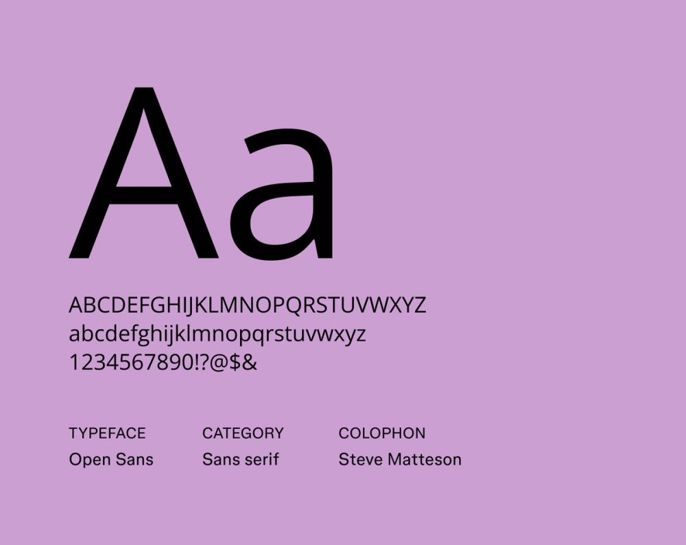
Font type: Sans serif
Open Sans offers a friendly yet no-nonsense design with its open letterforms and neutral, upright posture. Its balanced x-height and generous counter spaces make your resume easy to read, making it a reliable choice for clear, straightforward communication without feeling too stiff.
Best for: General use across industries, especially marketing, tech, and customer service roles
Font 2: Roboto

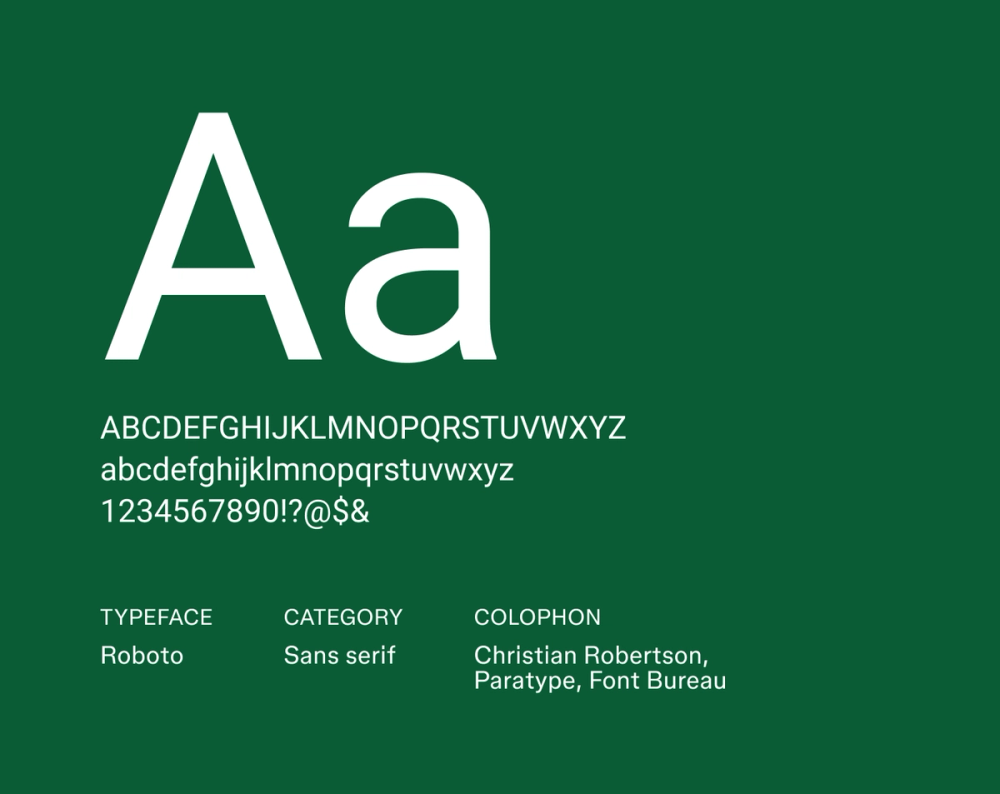
Font type: Sans serif
Initially designed for Android, Roboto balances mechanical precision, with warm, humanist curves. It feels modern and approachable, making it a fantastic pick for resumes where you need both polished professionalism and easy readability to shine.
Best for: Tech and digital-focused roles, including software engineering and product design
Font 3: Lato

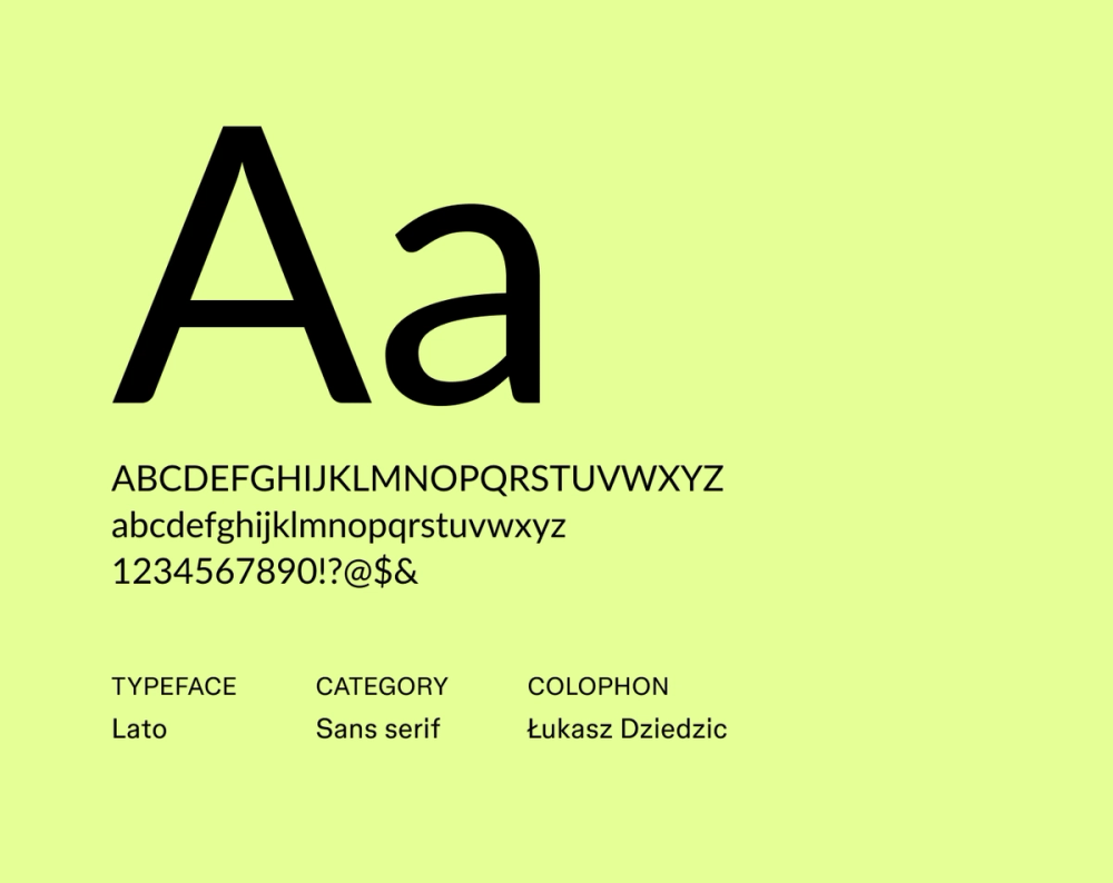
Font type: Sans serif
Lato, meaning “summer” in Polish, truly lives up to its name with a friendly yet robust presence. Its semi-rounded details give it a warm, inviting personality, while its strong underlying structure keeps it super crisp and easy to read, even in smaller sizes.
Best for: Creative professionals, marketing, and communications resumes
Font 4: Source Sans Pro

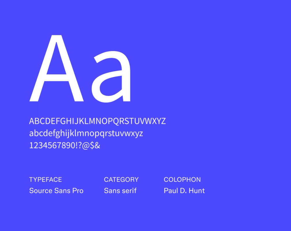
Font type: Sans serif
Designed by Adobe, Source Sans Pro offers a clean, technical vibe far from distracting. Its consistent stroke widths and well-defined letterforms make it versatile for both print and digital. This typeface quietly conveys professionalism and a clear information flow without any fuss.
Best for: Designers, writers, and roles where subtlety and polish matter
Font 5: Inter

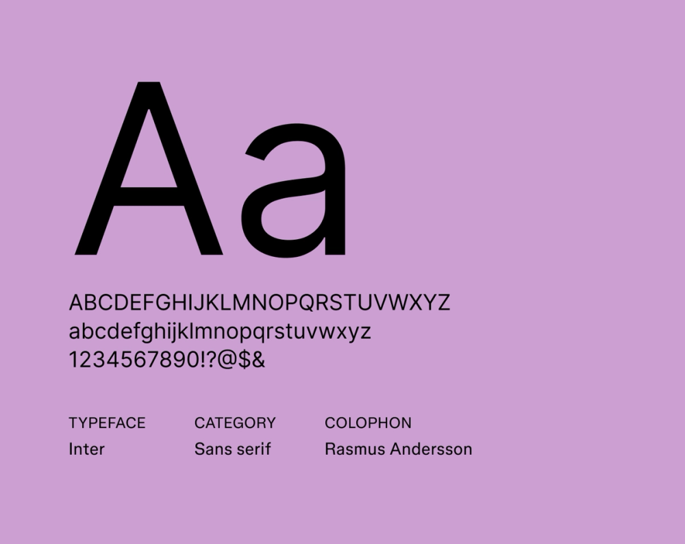
Font type: Sans serif
Made for digital screens, Inter prioritizes legibility at every size. Its large x-height and optimized letter spacing keep your resume readable whether viewed on mobile or printed out.
Best for: Tech, UX/UI, and remote work resumes where clarity is key
Font 6: Karla

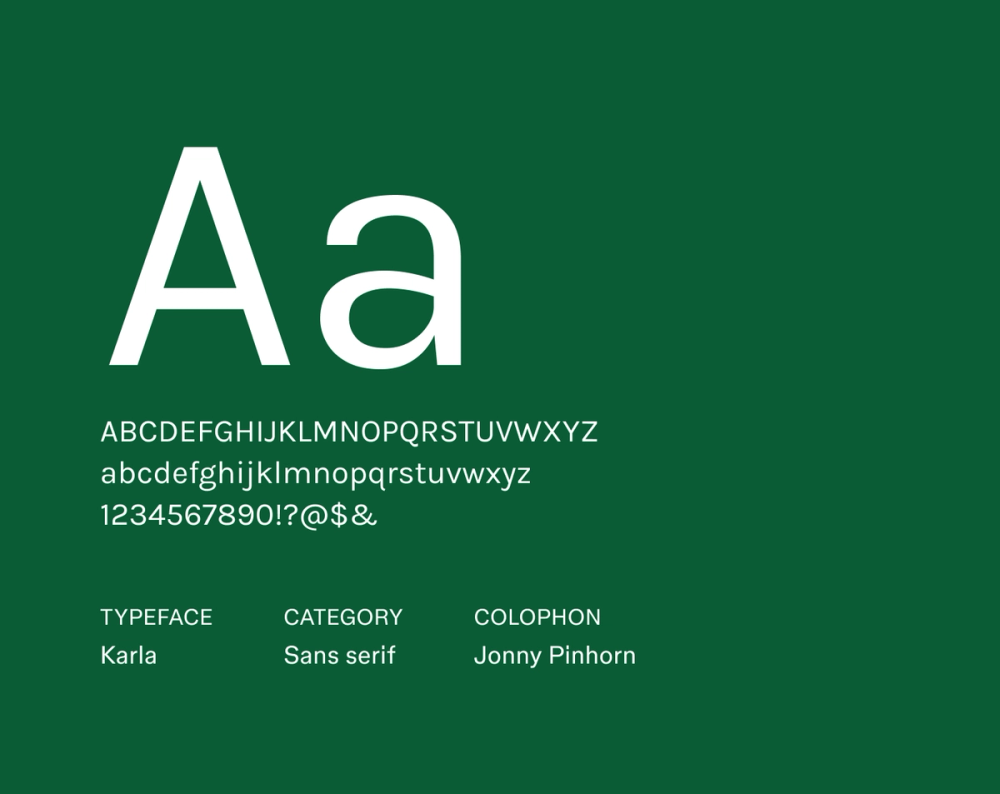
Font type: Sans serif
Karla brings a distinct yet professional flair to your resume. Its letterforms feature a unique blend of geometric structure and friendly appeal, making it ideal for industries that value personality without sacrificing polish.
Best for: Creative industries, startups, and human-centered roles
Font 7: Work Sans

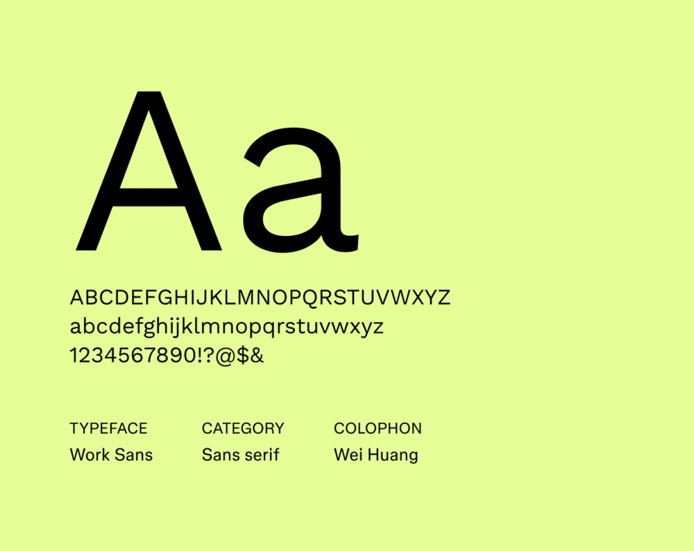
Font type: Sans serif
Work Sans is optimized for on-screen readability, making it a strong contender for any digital resume. It maintains a clean, modern appearance with just enough character in its letterforms to be memorable, ensuring your content looks great and is easy to follow on any screen.
Best for: Remote jobs, tech roles, and modern startups
Font 8: Fira Sans

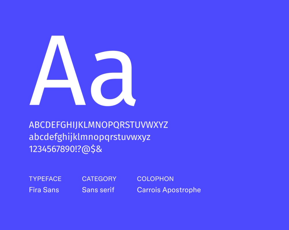
Font type: Sans serif
Originally developed for Mozilla’s Firefox OS, Fira Sans combines geometric precision with a humanist touch. Its contemporary look and clean lines translate to both PDF and Web-based resumes, ensuring a consistent and professional impression no matter where it’s viewed.
Best for: Developers, data analysts, and tech-forward roles
Font 9: Nunito Sans

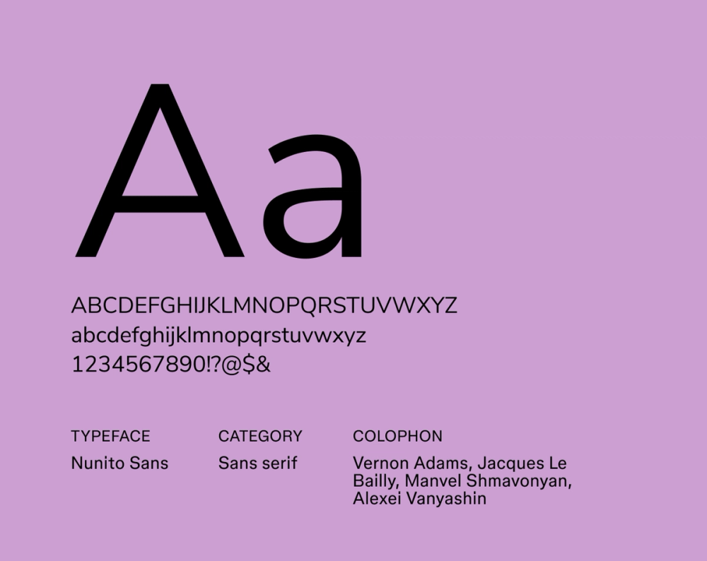
Font type: Sans serif
Nunito Sans blends rounded edges with a modern aesthetic, giving it a soft yet structured look. It’s highly legible and naturally gives off a friendly, approachable tone, making your resume feel approachable and easy to read.
Best for: Education, nonprofit, and customer service roles
Font 10: IBM Plex Sans

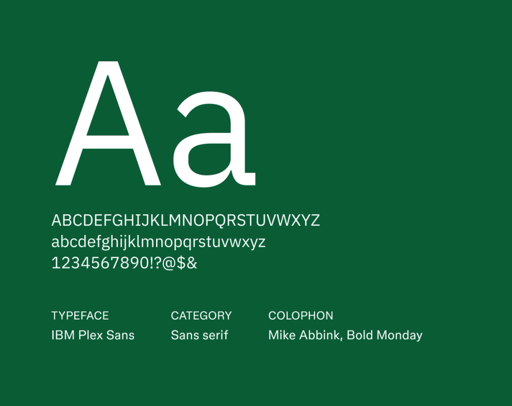
Font type: Sans serif
IBM Plex Sans was designed to embody IBM’s brand: rational yet expressive. Its open, clear letterforms and precise proportions convey intelligence and innovation. It’s a solid choice for projecting competence and forward-thinking.
Best for: Engineering, business analysis, and technical fields
Font 11: Libre Franklin

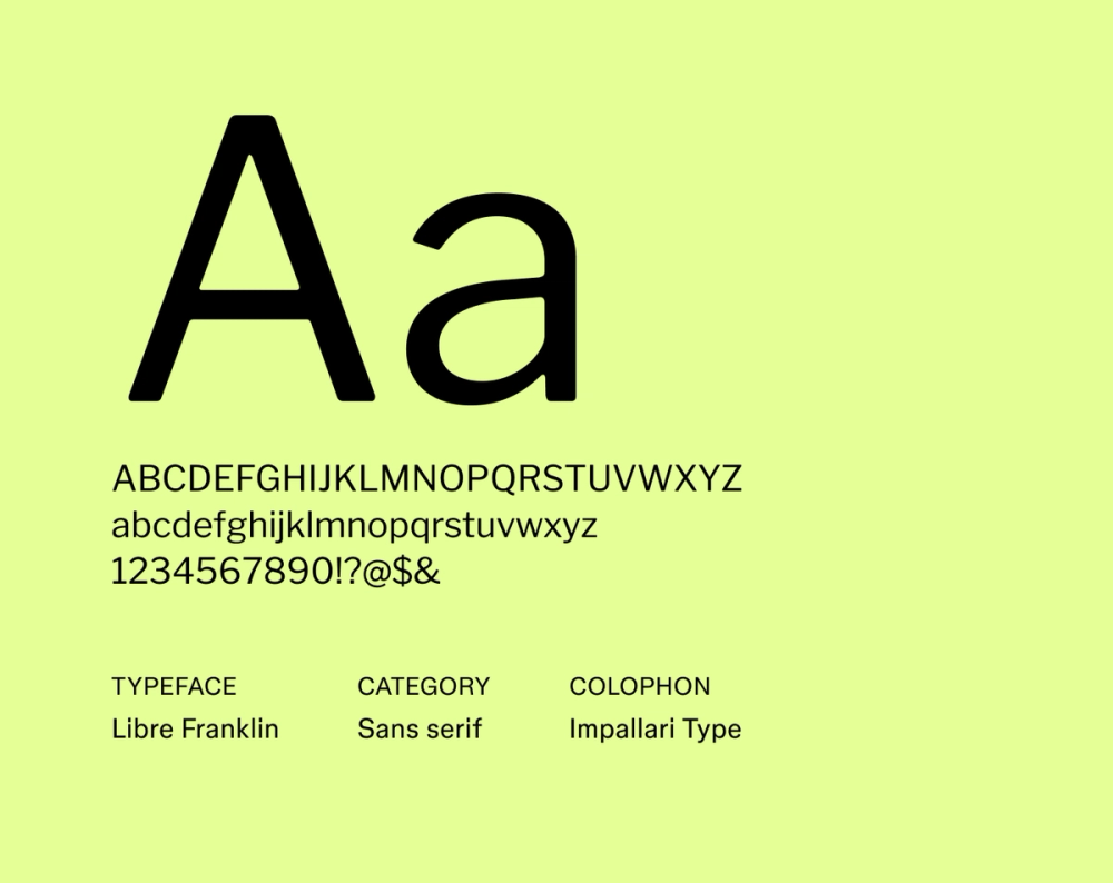
Font type: Sans serif
Libre Franklin is a modern take on the classic Franklin Gothic, bringing its inherent strength and clarity to your resume. It makes headings and body text pop with a strong, confident presence that’s also remarkably easy to read.
Best for: Business, marketing, and executive roles
Font 12: Montserrat

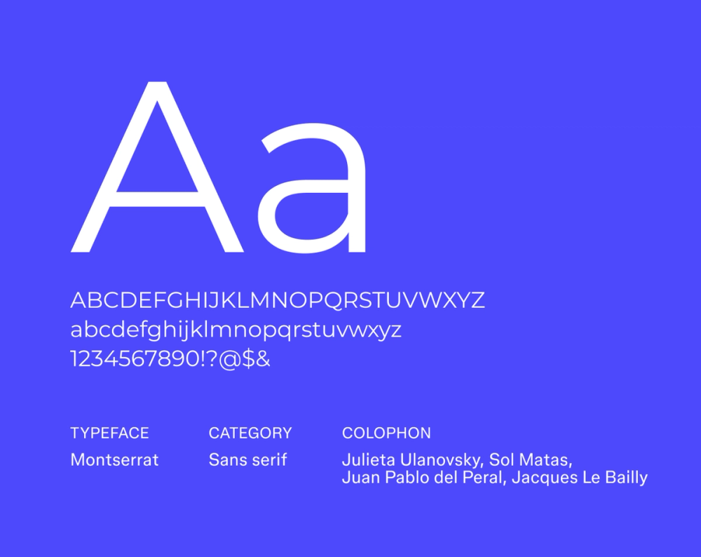
Font type: Sans serif
Inspired by the vibrant signage of Buenos Aires, Montserrat is bold, modern, and full of personality. Its strong, geometric lines and distinctive character shapes make it an excellent fit for resumes that want a bit of design flair and modern edge without losing professionalism.
Best for: Creative directors, designers, and branding professionals
Font 13: DM Sans

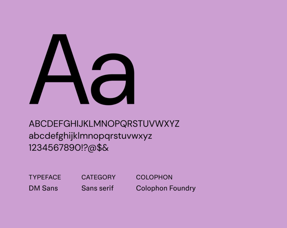
Font type: Sans serif
DM Sans is a low-contrast, geometric font that’s easy on the eyes, especially for digital viewing. Its clean design and generous spacing ensure clarity, making your resume effortlessly scannable and readable even at smaller sizes.
Best for: Digital marketers, product managers, and developers
Font 14: Alegreya Sans

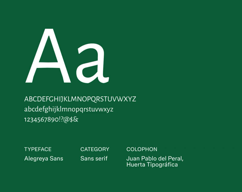
Font type: Sans serif
Alegreya Sans brings a natural reading rhythm to your resume. Originally designed for comfortable long-form text, it offers a subtle literary quality while remaining fresh and clean, inviting the reader to glide through your content smoothly.
Best for: Editors, writers, and education professionals
Font 15: Noto Sans

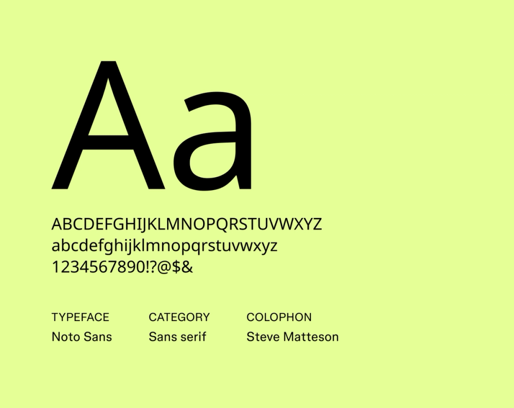
Font type: Sans serif
Noto Sans is part of Google’s massive Noto project, designed to support virtually all written languages. Its clean, neutral, and robust design makes it perfect for resumes that might be read in various formats or global contexts, ensuring clarity and compatibility across languages and platforms.
Best for: International roles, global companies, and multilingual resumes
Font 16: Raleway

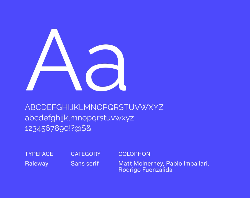
Font type: Sans serif
Raleway is a sleek, geometric font that’s best used for headings or accents. It features distinct stylistic alternates that can add unique character, bringing a modern minimalism to your resume that’s eye-catching without feeling overdone.
Best for: Designers, architects, and roles where visual appeal matters
Find your perfect font
Explore Figma's Font Library to discover a wide range of typefaces and pairings that bring your designs to life.
Font 17: Merriweather

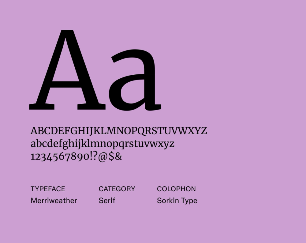
Font type: Serif
Merriweather is a classic serif font designed for excellent readability, even on screens. Its large x-height and robust serifs ensure clarity in digital environments, while its timeless form gives your resume a formal, timeless feel.
Best for: Academia, law, and traditional industries
Font 18: PT Serif

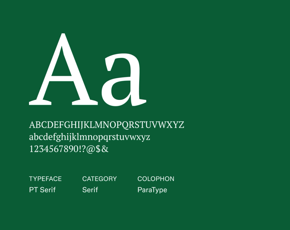
Font type: Serif
PT Serif offers a refined, professional look with exceptional legibility across different applications. Its clear, traditional letterforms and balanced proportions make it an ideal choice for resumes that benefit from a more formal, authoritative, and elegant presentation.
Best for: Legal, finance, and public sector resumes
Font 19: Lora

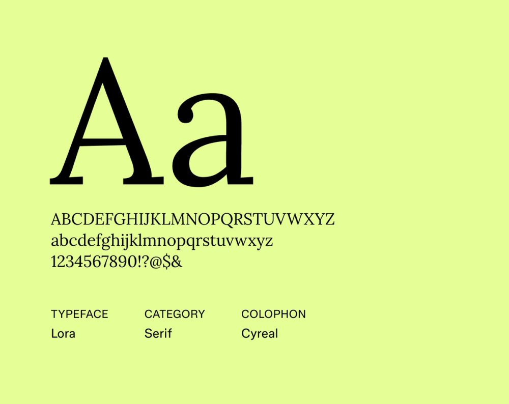
Font type: Serif
Lora beautifully combines a classic serif style with subtle modern curves. It brings a literary flair without feeling old-fashioned, giving your resume a polished, thoughtful tone.
Best for: Publishing, education, and humanities-related roles
Font 20: Crimson Text

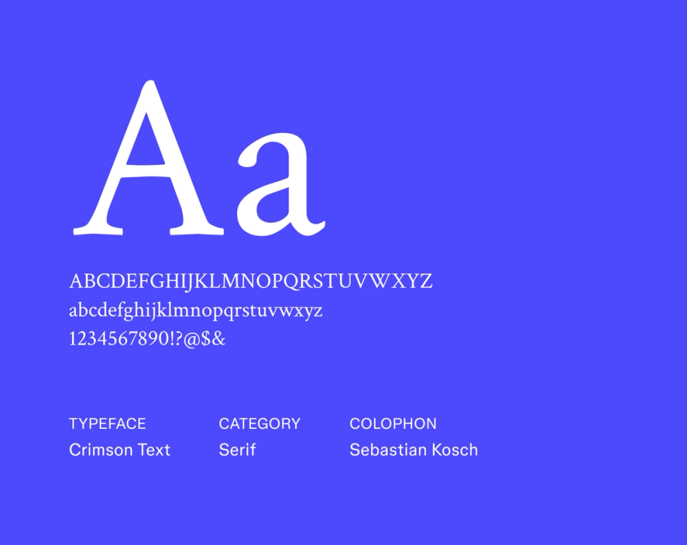
Font type: Serif
Crimson Text draws strong inspiration from old-style typefaces but is optimized for modern use. Its delicate serifs and elegant proportions lend your resume a scholarly and timeless professionalism, evoking authority and a refined tone.
Best for: Academia, research, and editorial careers
Font 21: EB Garamond

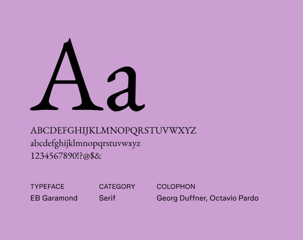
Font type: Serif
EB Garamond revives a beloved 16th-century typeface with grace and readability. Its refined details, moderate stroke contrast, and classic proportions make it a great choice if you’re looking for a traditional resume style with historical depth and quiet sophistication.
Best for: Academic, literary, and heritage-focused roles
Font 22: Cormorant Garamond

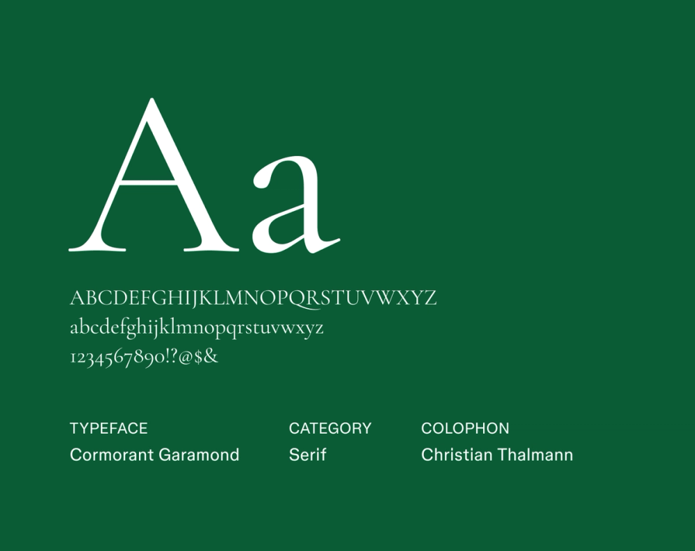
Font type: Serif
Cormorant Garamond elegantly reinterprets the classic Garamond, adding a contemporary lightness and distinctive flair. Its high stroke contrast and delicate, expressive curves make your resume stand out with modern elegance and expressive detail.
Best for: Art history, editorial, and academic roles
Font 23: Domine

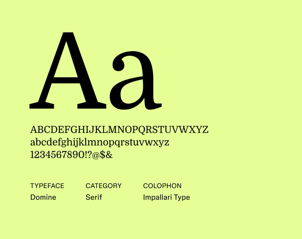
Font type: Serif
Domine is a strong serif typeface specifically designed for excellent readability on screens. It offers a traditional, grounded look with robust serifs and clear letterforms, offering both authority and approachability—great for roles where confidence and clarity go hand in hand.
Best for: Journalism, education, and public sector roles
Font 24: Baskerville

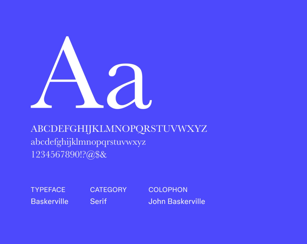
Font type: Serif
Baskerville is a timeless classic, celebrated for its refined details and superb readability. Its sharp serifs and high stroke contrast convey a strong sense of authority and established credibility, making it a strong choice for more traditional industries.
Best for: Law, finance, and high-level executive roles
Font 25: Arvo

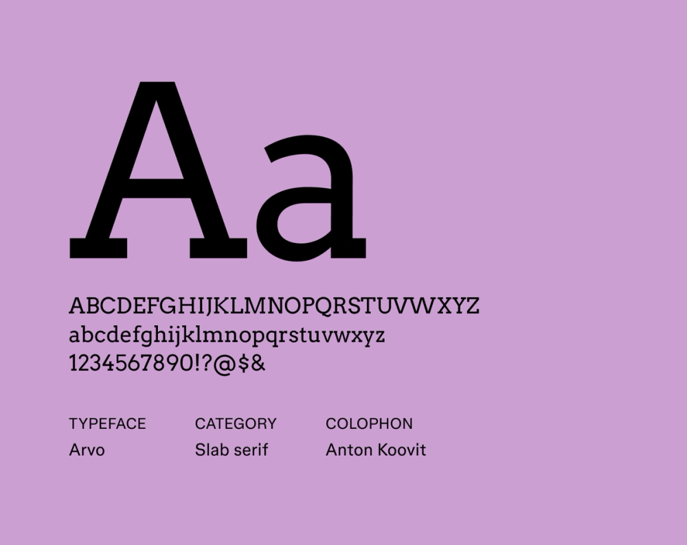
Font type: Slab serif
Arvo’s distinctive, bold, and geometric presence sets it apart while maintaining professionalism. Its unapologetically strong slab serifs and monolinear stroke construction create a bold, structured layout—perfect for resumes with clear sections and visual hierarchy.
Best for: Engineering, data, and structured professional resumes
Create your ideal resume.
Explore free resume templates and make them your own with Figma Buzz.
Tips for choosing a resume font
What is the best font for a resume? While there’s no one definitive answer, you want your resume font style to be:
- Easy to read. Choose fonts with clear letterforms at any size. Make sure characters are easily distinguishable, whether viewed in print or on screens.
- Professional in appearance. Avoid overly stylized or novelty fonts that might come off as unprofessional. Stick with clean, polished options that reflect your industry.
- Modern but neutral. A clean, modern typeface helps your message take center stage without visual distractions.
- Well-spaced. Look for fonts with consistent kerning (letter spacing), balanced line height, and a readable x-height (the height of lowercase letters).
- Widely available. Choose Web-safe fonts like Google fonts to ensure your resume displays correctly across various devices and operating systems.
- Simple in design. Minimalist fonts with simple shapes, balanced strokes, and low contrast between thick and thin lines tend to be more readable and versatile.
- Complete character support. Look for fonts that include a full set of characters, including punctuation, numbers, symbols, and special accents you might need.
- Multiple weights and styles. A font family with regular, bold, and italic options helps create a clear hierarchy in your layout without switching fonts.
- ATS-friendly. Applicant tracking systems (ATS) may struggle with fonts that include unusual ligatures, embedded symbols, or graphical quirks. Stick with straightforward typefaces that won’t cause parsing issues.
Your experience should speak for itself, and your font choice can support that message. Experimenting with different resume design ideas can help you see how fonts, spacing, and hierarchy work together to make your key skills and achievements stand out.
Best font for resume FAQ
Below are answers to commonly asked questions about choosing the best font for your resume.
What is the best font size for resume text?
For most resumes, a font size between 10 and 12 points works well for body text since it’s easy to read without taking up too much space. Your name and section headings can be larger, typically between 14 and 18 points, to help them stand out.
Just be careful not to go too small or too big. Text under 10 points can be difficult to read, while anything over 12 points for body text might look bulky or unpolished. Feel free to adjust slightly based on the font you choose and how much content you’re working with.
What’s the worst resume font?
The worst resume fonts are hard to read or look unprofessional. Script, decorative, or novelty fonts can distract recruiters and make your resume harder to scan. Avoid fonts like Comic Sans, Papyrus, or any overly stylized typefaces that don’t match your industry’s tone.
Are serif fonts or sans serif fonts good for resumes?
Both serif and sans serif fonts work well for resumes. Serif fonts are often seen as traditional and formal, while sans serif fonts offer a clean, modern look. The best serif fonts, in particular, tend to shine in fields like law and academia, while sans serif options are popular in tech and creative industries.
Do fonts matter if I upload my resume as a PDF?
Yes, fonts matter even if you upload your resume as a PDF. PDFs help preserve the look of your resume across devices. However, rare or custom fonts might not display correctly on all systems.
To ensure your resume looks polished and professional everywhere, stick with common, widely supported fonts.
Which font is most ATS-friendly?
The most ATS-friendly fonts are simple, clean, and highly legible. Standard sans serif and classic serif fonts perform best with applicant tracking systems.
Aim for typefaces that avoid unusual characters, excessive styling, or special ligatures, as these can sometimes lead to parsing challenges within ATS software.
Design your standout resume with Figma
Now that you know what to look for in a resume font, it’s time to put it all together. Figma makes it easy to create a polished, professional resume that looks sharp on screen and in print.
With a wide range of typography options and customizable templates, you can experiment with fonts like Open Sans or Merriweather to find the perfect style that reflects your brand, and even explore subtle font pairings for added flair.
- Browse a variety of fonts and typography templates to find the best fit for your resume.
- Explore resume examples and templates from the Figma Community.
- Browse Figma’s font library to find your favorite styles and perfect pairings.
- Design your resume from scratch using Figma’s design tool.
From font to finish.
Design a standout resume that pairs great fonts with eye-catching design with Figma Buzz.
Keep reading

Design a CV or resume
In designing your resume, you will put into practice all of the principles learned in this course.


Portfolio website examples
Explore inspiring portfolio examples, creation tips, and how Figma can help—all in one guide.


How to create a one-page website
Learn how to plan, wireframe, design, and build stunning one-page websites.