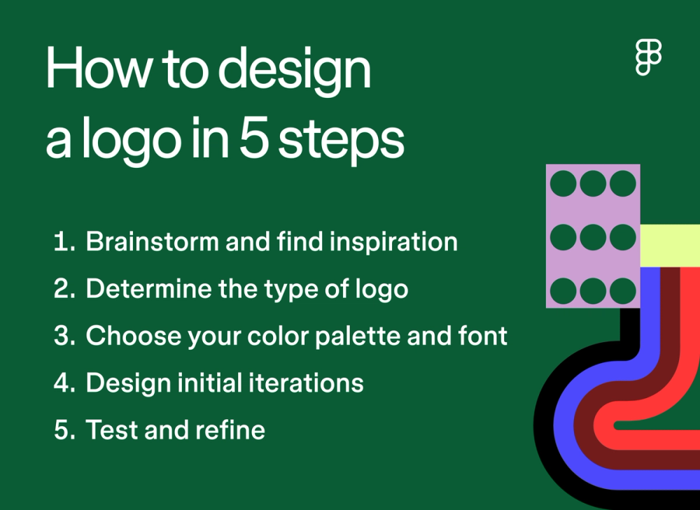
How to design a logo in five steps


Share How to design a logo in five steps
Explore more from
Design basics
Build a brand that speaks clearly
Unify logos, colors, and messaging in Figma.

A memorable logo can make all the difference in today’s visually driven world. Every element—from the color palette to typography and illustrations—shapes how people perceive and remember your brand.
The most enduring logos capture something essential about a brand. Think of Paul Rand’s work for NeXT Computer or the instant recognition of the Coca-Cola script. These designs work because they distill complex brand identities into clear, memorable marks.
Ready to discover how to design a logo that will leave a lasting impression?
Read on to learn:
- The five steps to designing a logo
- What makes a good logo design
- Pro tips for designing memorable logos

Step 1: Brainstorm and find inspiration
Designing a logo starts with a deep understanding of your brand identity and brainstorming ideas that align with that identity. Here’s how to tackle the early stages of logo design.
Understand your brand identity
Your logo translates your brand’s entire identity into a single mark. The FedEx logo doesn’t just catch an eye — it reinforces the company’s promise of swift delivery.
To start, ask yourself the following questions:
- Who is my target audience and what are their demographics and shared interests?
- What is my brand’s core mission and message?
- What fundamental values guide my business decisions?
- What adjectives describe my company?
- What symbols, icons, colors, or typography resonate with my brand’s personality?
In his article with Graphis Magazine, Graphic designer Paul Rand says it best: “Graphic designers are really silent salesmen.” Your logo, your silent salesperson, should speak volumes about your brand.
Once you have a deep understanding of your brand identity, it will be easier to brainstorm design ideas that match.
Brainstorm ideas
The best ideas emerge from brainstorming sessions—taking even the wildest ideas and transforming them into creative concepts. BBring your team together to:
- Create a mood board to help visualize your logo’s desired look and feel. Think of it as a visual roadmap to guide your logo design process. Study competitors to spot opportunities to stand out.
- Use mind mapping to explore connections between concepts.
Pro tip: FigJam’s mind map template includes drawing tools to help you sketch initial concepts and ideas.
Step 2: Determine the type of logo
The next step in the logo design process is to match your brand identity to the right logo style. Each type serves different goals and creates distinct impressions.
Explore types of logos

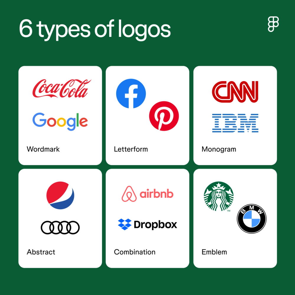
There are many different types of logos, including:
- Wordmark: Also known as logotypes, wordmark logos only include your company name, with a strong emphasis on typography to convey your unique brand message. These are best for brands with short, unique names, like Coca-Cola.
- Letterform: A letterform logo design features a single letter and is best for well-known companies that want to create a strong and recognizable brand identity, like Facebook and Pinterest.
- Monogram: Similar to letterform logos, monogram logos are great for established brands that want a simple yet effective logo design. They use the initials of a brand’s name, like CNN, H&M, and IBM.
- Abstract: Abstract logos are best for brands looking for a modern and unique design style. These logos use abstract shapes and symbols, similar to Pepsi and Audi’s.
- Combination: Combination logos integrate text and symbols, perfect for brands looking to leverage the power of both. Companies like Doritos, Airbnb, and Dropbox are great examples of logos combining text and imagery.
- Emblem: Emblems are contained within a specific shape, like Starbucks or BMW, and are typically used for brands that want to evoke a traditional design style.
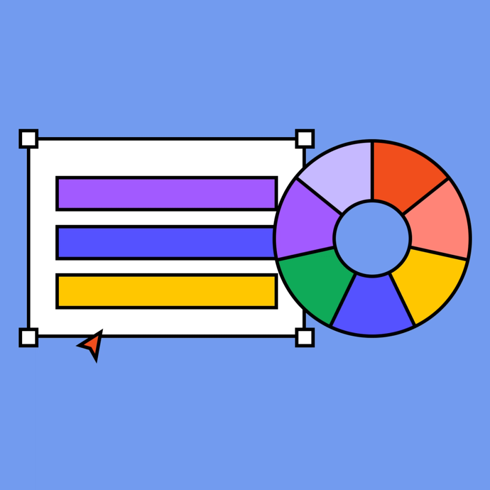
Step 3: Choose your color palette and font
Color combinations and typography do more than add style. They shape how people feel about your brand. Be sure to pick elements that reflect your brand personality and evoke the emotions you intend.
Consider color theory and color psychology
Two principles should guide your color choices: color theory and color psychology.
Color theory refers to how colors work together to create visually pleasing designs. It considers physical properties like contrast to ensure readability and grab attention or color schemes like complementary and analogous to create a harmonious logo design.
Color psychology refers to how colors make people feel. For example, UPS uses the color brown as a primary brand shade in its logo, evoking a sense of reliability and security—exactly what customers want from a shipping company.
Get creative with typography
Your font choice matters most when designing a wordmark, letterform, or monogram logo. The font should be both readable and reflective of your brand’s personality. Consider the following font types to determine the font family you align with most:
- Display fonts are common for logos because of their decorative and unique appearance.
- Serif fonts feature a decorative tail at the end of each stroke, offering a timeless and professional look.
- Sans serif fonts are modern and minimal, ideal for brands looking for a readable and simple typeface.
- Monospace fonts are blocky with proportional spacing, often evoking a retro or vintage vibe.
- Slab serif fonts are often considered powerful and authoritative due to their thick strokes, ideal for brands looking to grab attention.
- Script fonts mimic handwriting and offer an elegant and creative touch in logo designs.
Step 4: Design initial iterations
After finalizing your colors and fonts, it’s time to begin your logo concepts to live through shapes and structure.
Outline shapes
Shapes can carry their own emotional weight in logo design. Shapes to consider include:
- Basic shapes are traditional geometric shapes like circles, rectangles, squares, and triangles. Circles, for example, suggest unity or community. Squares and rectangles convey reliability and security.
- Organic shapes include flowing lines and curves, often representing movement, direction, and fluidity.
- Abstract shapes are more unconventional and unique. They typically combine other geometric shapes and lines into more complex forms, with the brand adding its unique style to capture its essence.
As with other design elements, shapes and lines should reflect your brand personality. A tech company like Dropbox uses geometric shapes in its logo to align with its commitment to reliability and professionalism. Nike’sabstract “swoosh” suggests motion and energy, accurately capturing the brand’s values.
Create mockups
Now you’re ready to turn your concepts and sketches into logo mockups. When creating mockups, consider these principles.
- White space. Proper use of white space — the empty space between elements — prevents designs from feeling cluttered and creates balance and harmony.
- Visual hierarchy. Carefully consider the placement of elements and color contrast to make the most important elements stand out.
- Alignment. Create order by fixing elements to a common baseline. You can achieve this in Figma by adding a grid for consistent alignment or using the auto layout setting to align text with other logo elements.
Step 5: Test and refine
It’s time to gather feedback and put your logo designs in front of the people who matter most — your stakeholders and target audience.
Conduct testing and gather feedback
Feedback from your team and audience is vital in ensuring you’re making the right improvements. First, gather team feedback by conducting a peer review to uncover the strengths and improvements you can make to your design. Sometimes, having an outside opinion from your team helps uncover possible tweaks you may not have identified on your own.
A/B testing is also helpful in getting feedback. You can run a target audience survey with a small pool of customers to determine which design most resonates with your audience.
Finalize your logo
Take all the input you received and apply it to create your final logo design. From there, you’ll prepare your logo for various applications and export the best file formats for digital or print use.
Keep these tips in mind when finalizing your logo:
- Logo variations. Create a family of logos for different uses. For example, Dropbox's full logo includes both the company name and box icon on its website, but just the box icon for smaller spaces like profile pictures on its social channels.
- File formats. Consider how your logo will be used to determine the best file format. For example, .JPG and .PNG are commonly used for print, while .SVG is better suited for websites and online media because of its scalability and clarity.
What makes a good logo?

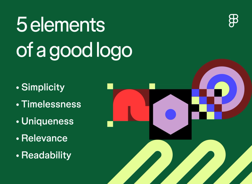
The most effective logos nail these fundamental principles:
- Simplicity. Express your message through clean, essential elements. Nike's swoosh says "motion" without a single extra line.
- Timelessness. Focus on enduring brand values rather than current trends. The Apple logo has worked for decades because it taps into fundamental ideas about knowledge and innovation.
- Uniqueness. Stand apart with original design choices. FedEx's hidden arrow creates a moment of discovery other shipping companies can't copy.
- Relevance. Match your audience and industry. A children's reading app needs different energy than a financial app.
- Readability. Keep text crisp and clear at any size. If people can't read it, they won't remember it.
Pro tips for designing a memorable logo

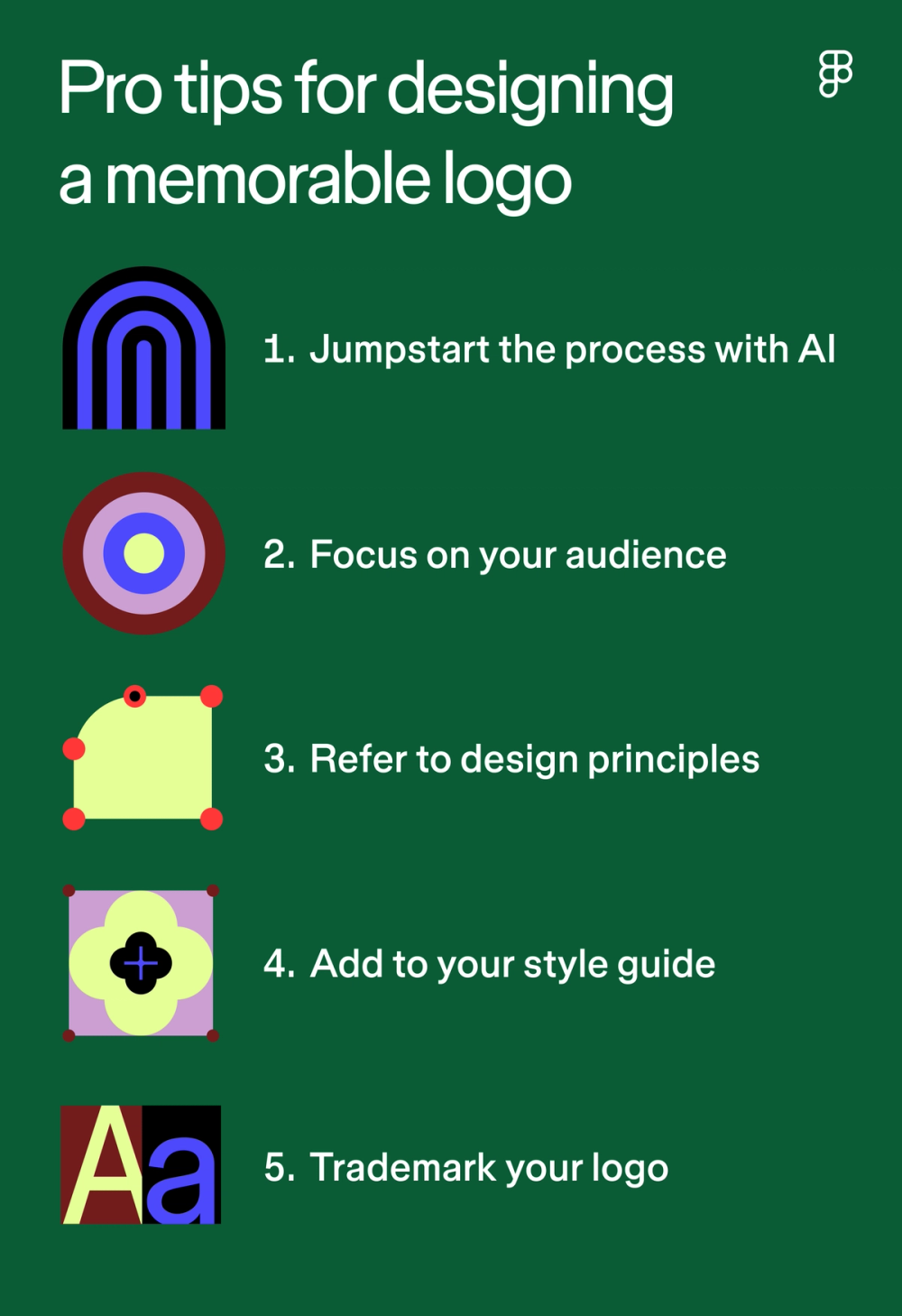
Crafting the perfect logo takes time. Here’s what to keep in mind to make the process as smooth as possible:
- Jumpstart the process with AI. Jump from concept to mockup faster with Figma’s AI features. Sortbrainstorming ideas in FigJam, then generate initial concepts in seconds to iterate on.
- Focus on your audience. Build your logo around your audience’s values and interests.
- Refer to design principles. Let fundamental graphic design principles guide you. Strong alignment, thoughtful contrast, and proper proportion create logos that work.
- Document everything. A brand style guide is your source of truth for your brand story, target audience, voice, writing guidelines, and, of course, visual elements. Include clear rules for usage to ensure consistency across different channels.
- Protect your work. Check for trademark conflicts, then register your logo with the United States Patent and Trademark Office (USPTO) through the Trademark Electronic Application System (TEAS).
Start designing your logo with Figma
Now that you know the basics of how to design a logo, it’s time to start creating one that truly represents your brand. Here’s how to transform your logo concepts into reality with Figma's design tools:
- Use FigJam templates to brainstorm initial ideas and the online whiteboard to collaborate with team members and create initial sketches.
- Browse over 1,000 color palettes in Figma’s color palette library, then reference the color meaning library to learn more about your color choices.
- Open Figma’s design tool, bring your logo design to life, and use the collaboration features to gather real-time feedback on designs.
Sign up for Figma today
With Figma, you can create low or high fidelity designs for free. Sign up today.