What are split complementary colors?


Share What are split complementary colors?
Explore more from
Design basics
Master color to elevate your designs
Experiment, refine, and apply color palettes in Figma.


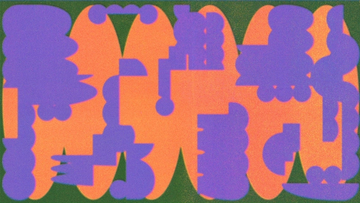
Vibrant designs are eye-catching, but they can get overwhelming—high-contrast color schemes like red and green have all the subtlety of traffic lights. To avoid loud color clashes, designers tone down their designs with split complementary colors. Split-complementary color schemes introduce intriguing contrasts that make a lasting impact.
Read on to learn more about:
- What split-complementary color schemes are, and how to create one in 3 steps
- Benefits of split complementary colors
- 3 prime examples of split-complementary color schemes
- How to apply split complementary colors like a pro with Figma
What are split-complementary color schemes?
Choose any color on the color wheel, and the color across from it on the wheel is its complementary color. See the colors on either side of that complementary color? Those are split complementary colors. Add your base or main color and split complementary colors together, and you've got a split-complementary color scheme.
How to make 12 different color schemes
All you need is a basic color wheel to start color mixing like a pro. Combine primary colors, secondary colors, and tertiary colors to make 12 essential split-complementary schemes:
- Red + yellow-green + blue-green
- Orange + blue-green + blue-purple
- Red-purple + yellow + green
- Red-orange + green + blue
- Yellow-green + purple + red
- Yellow-orange + blue + purple
- Yellow + red-purple + blue-violet
- Green + red-purple + red-orange
- Blue + red-orange + yellow-orange
- Blue-green + red + orange
- Blue-purple + orange + yellow
- Purple + yellow-green + yellow-orange
3 steps to build your split-complementary color scheme
Building split-complementary color schemes is a gradual, additive process that's easy to learn. Beginners can create color schemes like pros in three steps:
- Choose your base wisely. Brand designers often start by choosing a base color to express the brand personality. Explore color meanings to find the best fit for your brand, whether that's a creative, vibrant violet or a relaxing light blue.
- Add accents. You can use a color palette generator to explore split complements as accent colors. Find your base color, then add split-complementary color accents to achieve a balanced brand color palette.
- Edit. How do you keep split complementary colors from clashing? Apply color theory, and keep tweaking tint, shade, and saturation levels to hit the right note for your brand. Brighter colors strike an energetic, upbeat tone. Softer colors can set a more soothing, serene mood.
Why use split complementary colors?
Split-complementary color schemes give designers creative options with three key benefits:
- Greater range. More color combinations give you more ways to attract and engage viewers.
- Good contrast. Three colors offer more contrast for distinctive, accessible designs.
- Less visual tension. Split complements provide a slightly softer contrast to the base color than complementary colors do.
2 prime examples of split-complementary color schemes
Designers use split complementary colors to achieve color harmony and make an impact. To see how they work in practice, check out the two examples below.
- Travel site Trivago uses a split-complementary color scheme for a logo that sends a subtle yet clear message: try and go.
- Claude Monet set the scene for a grand day out with sun-washed red-orange, blue, and green hues in his painting “Regatta at Argenteuil.”
4 pro tips for split-complementary color schemes
To use split complementary colors effectively, consider these four pointers:
- Follow the 60-30-10 rule. Use 60% base color, plus 30% and 10% of each supporting color to achieve a cohesive design. To balance brighter shades, try neutrals—white, black, gray, or beige.
- Control color temperature. Use a mixture of warm and cool colors to set the mood and influence user emotions.
- Make your design accessible. Choose a split-complementary color palette that makes your visual design easy to read and understand.
- Test and refine your colors with stakeholder input and user feedback.
Alternatives to split-complementary color schemes
Even toned-down split complementary colors create contrast. Consider your color options with these alternative approaches:
- Want color without the contrast? Try an analogous color scheme, using three colors that sit side by side each other on the color wheel (such as violet, red-violet, and red).
- For a more cohesive color scheme, explore monochromatic colors—variations of a single color.
- For a balanced color palette with plenty of visual pop, consider a triadic color scheme. Just choose three colors evenly spaced around the color wheel.
- Go for maximum contrast and drama with a tetradic color scheme, combining two sets of complementary colors.
Build your split-complementary color palette with Figma
Enhance your designs with split-complementary color palettes using Figma’s professional design resources. You can jump right in and start generating split-complementary color combos with Figma’s color picker. Need inspiration? Browse color palettes shared by Figma’s design community.
Once you've explored your options, test and tweak your design using Figma’s pro design tool.
For helpful tips and tutorials, check out Figma’s design basics library to learn more about color theory, color symbolism, RGB, and more.
Ready to make a splash with split complementary colors?
Keep reading


What is UI design
What is UI design today, and what role does it play in the design thinking process?
Learn more


What is visual hierarchy
If everything looks the same, then you see nothing. Visual hierarchy can change that.
Learn more


UI vs UX
Read on to find out what it takes to design engaging UI, and create a memorable UX.
Learn more
From the blog
The Figma design agent is here
Starting today, work with an agent that is built for Figma—directly on the canvas.

The TL;DR on MCP: Why context matters and how to put it to work
Figma’s MCP server brings your design decisions into the tools where code gets written—so what gets built actually matches what was designed. Here’s what that unlocks for everyone who builds products.
How to supercharge your design system with slots
Slots give you the ability to customize components without breaking the system. We’re sharing five field-tested tips from early users to help you unlock more freedom without giving up control.
The new business case for design systems
Design systems have evolved from static libraries to key drivers of business revenue, customer loyalty, and product strategy. Here’s what you need to know about how to track and communicate the value of your design system, based on new research from the Design Executive Council (DXC).


5 shifts redefining design systems in the AI era
As AI reshapes how we make products, design systems are evolving from libraries of reusable parts into living frameworks that scale taste and craft. We spoke with product leaders and practitioners about the shifts they’re seeing in how design systems are built, used, and maintained.


Schema 2025: Design systems for a new era
Design systems help teams push what’s possible while maintaining a high level of craft, polish, and performance. Here’s everything we announced at Schema by Figma to help teams design for the AI era.