Color symbolism explained


Share Color symbolism explained
Explore more from
Design basics
Master color to elevate your designs
Experiment, refine, and apply color palettes in Figma.

A strong color palette can help teams deliver impactful brand messages that connect deeply with customers. But choosing the right tints and hues for your designs isn’t as simple as picking your favorite colors. To engage target audiences, top brands use color symbolism—insights about what colors represent and mean to users.
Read on to learn more about:
- What color symbolism is and why it’s important
- The meaning behind warm, cool, and neutral colors
- How to apply color symbolism to your color palette with Figma
What is color symbolism?
Color symbolism is the way that artists and designers use colors to communicate ideas and stir emotions. Designers use color strategically to sell products, capture attention, and upend social conventions. In the early 20th century, leading American fashion designers determined that boys should dress in the color pink. But in the 1940s, designers started dressing women in "shocking" pink – and recently, bold pink has made a roaring comeback with the feminist Barbie blockbuster phenomenon.
The meaning of colors
Color symbolism considers how different cultures and context (such as location, era, and values) affect the meaning of colors. Highly coveted indigo from West Africa has been a symbol of wealth and power for centuries—an association still expressed in dark blue English suits and high-end Japanese selvedge denim alike.
Colors can make a powerful impact on diverse groups of people—but the same color can convey different meanings to different people, depending on cultural background and personal experiences. The color red evokes feelings of love and passion almost universally. But in Chinese culture, red also stands for good luck and prosperity, sparking feelings of hope and joy.
Specific colors can also come with positive or negative connotations. The color white typically represents purity and innocence in the West, and it's the standard choice for a wedding dress. But white would be inappropriate for a happy occasion in Asian countries such as Japan, Korea, China, and India, where it's often associated with grief and death.
Why color symbolism is important
Thoughtful use of color can influence customers’ thoughts and feelings, shaping experiences in positive ways. Designers that use color symbolism effectively can:
- Strengthen brand identity. For example, a youthful, energetic brand may use vibrant, warm colors like red or orange for a signature color palette.
- Arouse strong feelings about a product, helping to attract and engage users.
- Enhance key messages, supporting brand storytelling that captivates customers.
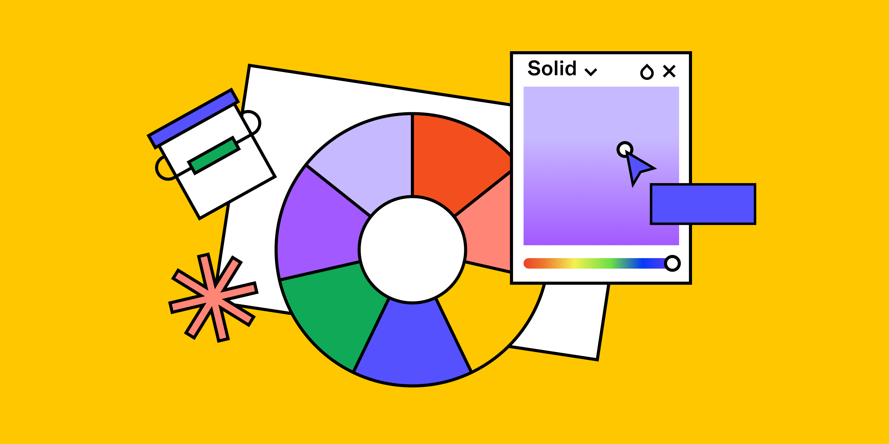
How to use a color wheel
Experienced brand designers don't just choose colors instinctively—they apply color symbolism and color theory to build color palettes. Designers plot color selections on a color wheel, which organizes different colors into three groups: primary colors (red, blue, and yellow), secondary colors (purple, green, and orange), and tertiary colors (such as red-orange and blue-green). Complementary colors on opposite sides of the color wheel add dramatic contrast to logos, apps, or websites. Focusing on either cool or warm shades on the same side of the color wheel can produce more subtle color schemes.
Color symbolism of warm, cool, and neutral hues
Color temperature—how warm or cool a color is—plays a key role in color symbolism. Designers can influence the meaning of colors based on their temperature.
Warm colors
Warm colors include red, orange, and yellow along with their variations (think glowing sunsets and blazing fires). These colors can generate energy and excitement, capturing your users’ attention.
- Red symbolizes vitality, power, and passion for top brands such as Virgin, Target, and Coca-Cola. The color red can also communicate danger or urgency (e.g., red flags, stop signs, and traffic lights) and call out key design elements, such as calls to action (CTAs). Pro tip: Use red sparingly—too much red can overwhelm users.
- Orange can infuse warmth and vibrancy into web or graphic designs. HubSpot and Boost Mobile use the color orange to help convey playfulness, enthusiasm, and creativity. Pro tip: Exercise restraint when using orange to maintain your brand’s credibility and authority.
- Yellow expresses cheerfulness and optimism. Commonly used in children’s toys (think of rubber duckies), the color yellow can produce a fun, happy mood. Pro tip: Yellow font can introduce readability and accessibility issues, so use it against a dark background, as an accent, or as a solid background color with dark text.
Cool colors
Cool colors include blue, green, and purple hues—colors that reflect water, sky, and nature. These calming colors can convey relaxation or reassuring professionalism.
- Blue symbolizes trust and dependability. The color blue is popular with banks and technology brands (think of IBM's signature blue) to convey a poised, reliable image. Pro tip: Use a blue that’s not too cool to avoid setting an impersonal or unwelcoming tone.
- Green represents nature and abundance. Seventh Generation and Beyond Meat lean into the color green for eco-savvy, wholesome brand positioning, while Starbucks uses green to symbolize growth and vigor. Pro-tip: Green can also express greed, envy or jealousy, so take care when choosing how much and what shade of green to use.
- Purple signifies wealth, leadership, and power, from Caesar's purple toga in ancient Rome to the LA Lakers' uniforms. Pro tip: Use a light touch. Too much purple can strike a pompous or elitist tone.
Neutral colors
Neutral colors—white, black, and brown shades—don’t show up on the color wheel. These subtle hues complement other colors, but can also stand alone.
- White often symbolizes cleanliness, purity, and simplicity in Western cultures and contexts—think of Apple's iconic branding. But white takes on different meanings in Japan and India, where it's the color of mourning. Pro tip: Create a clean, minimal design using white space to set off other colors and design elements.
- Black represents sophistication, strength, and mystery. Luxury brands and minimalist designs (such as Mastercard Black and Chanel) use black to convey elegance and prestige. Pro tip: Lots of black can make your design feel heavy or bleak. Apply with care.
- Brown stands for earthiness and reliability. When used in branding and packaging, the color brown can tap into feelings of comfort and trust. Pro tip: Pair brown with complementary colors to keep your designs from appearing dull or overly rustic.
3 steps to apply color psychology to your palette
Expert designers consider color psychology when making color choices that support their brand in three key steps:
- Research cultural associations for your target audience to select a color palette that attracts rather than repels.
- Explore color combinations for accessibility and appeal, until you find a palette that delights users.
- Test colors in different contexts. Colors can look different in various lighting conditions and digital environments.
Apply color symbolism to your color palette with Figma
Kickstart the creation of your color palette with Figma’s professional design resources. Design goals still in flux? Invite key stakeholders to a brainstorm session using FigJam’s online collaborative whiteboard. Then use Figma’s research templates to better understand your customers’ thoughts, feelings, and color preferences. Design a color combination that works for users, then gather feedback from key stakeholders and your target audience to make sure it resonates.
Looking for visual inspiration to get started? Browse the robust library of pro-level color palettes shared by the Figma community. Over 18,500 designers have used Figma community member Jordan’s ultimate color palette system.
Ready to make an impact with color?
Keep reading

What is UI design
What is UI design today, and what role does it play in the design thinking process?
Learn more

What is visual hierarchy
If everything looks the same, then you see nothing. Visual hierarchy can change that.
Learn more

UI vs UX
Read on to find out what it takes to design engaging UI, and create a memorable UX.
Learn more
From the blog
The Figma design agent is here
Starting today, work with an agent that is built for Figma—directly on the canvas.

The TL;DR on MCP: Why context matters and how to put it to work
Figma’s MCP server brings your design decisions into the tools where code gets written—so what gets built actually matches what was designed. Here’s what that unlocks for everyone who builds products.
How to supercharge your design system with slots
Slots give you the ability to customize components without breaking the system. We’re sharing five field-tested tips from early users to help you unlock more freedom without giving up control.
The new business case for design systems
Design systems have evolved from static libraries to key drivers of business revenue, customer loyalty, and product strategy. Here’s what you need to know about how to track and communicate the value of your design system, based on new research from the Design Executive Council (DXC).


5 shifts redefining design systems in the AI era
As AI reshapes how we make products, design systems are evolving from libraries of reusable parts into living frameworks that scale taste and craft. We spoke with product leaders and practitioners about the shifts they’re seeing in how design systems are built, used, and maintained.

Schema 2025: Design systems for a new era
Design systems help teams push what’s possible while maintaining a high level of craft, polish, and performance. Here’s everything we announced at Schema by Figma to help teams design for the AI era.