13 core graphic design principles + how to apply them

Share 13 core graphic design principles + how to apply them
Explore more from
Design basics
Create, collaborate, and ship in Figma
All your design work, in one place.

Graphic design is all around us—from the sleek logos on your favorite products to the eye-catching ads as you scroll through social media. These designs can influence our choices, habits, and emotions through the strategic use of color or careful placement of elements.
By understanding the core graphic design principles, you can create visuals that not only look good but effectively deliver your message. Ready to understand the building blocks of graphic design to create impactful designs?
Read on to learn:
- 13 graphic design principles
- How to apply them to your designs

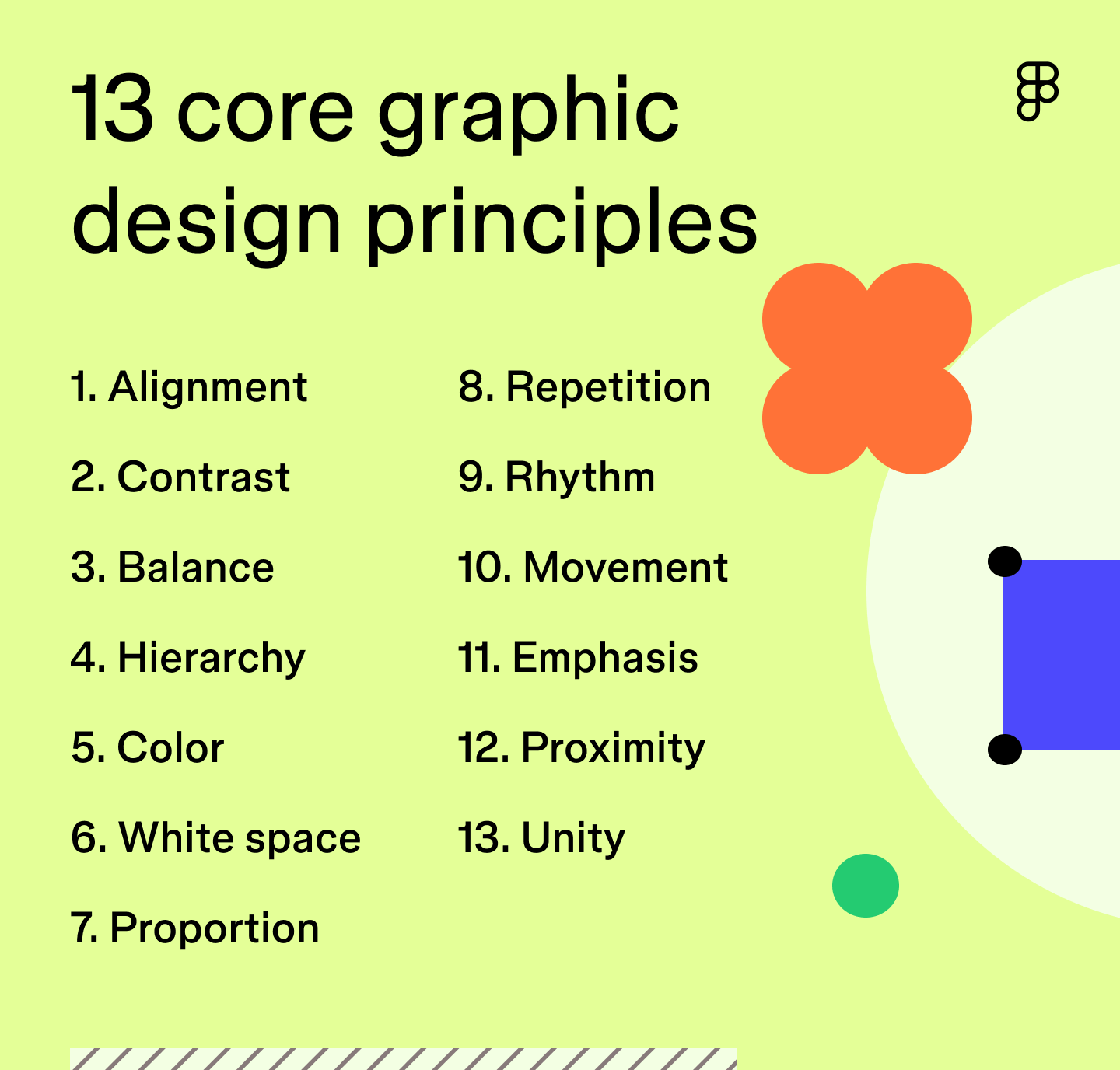
Principle 1: Alignment
The alignment graphic design principle is the arrangement of text and elements to create order and visual connection. You accomplish this by aligning elements to a common edge, center, or baseline.
This enhances readability and guides viewers’ eyes through content in a digestible way. For example, text is often aligned left since most languages read from left to right.
How to apply: Use a layout grid to organize text and graphic design elements to create a visually structured design. In Figma, you can add layout grids to any frame or component for more precise and consistent alignment. You can also use Figma’s auto layout settings to align text layers or icons with text to ensure visual balance.
Principle 2: Contrast
Contrast creates a noticeable difference between elements to add visual interest and emphasize important information within designs. This graphic design principle is crucial since the human eye naturally gravitates toward elements with higher contrast.
While contrasting colors are a common way to emphasize contrast, you can also apply it by using different sizes, textures, shapes, weights, and alignment of elements in designs—for example, the color red against a white background or a large, bold font for a call to action.
How to apply: Focus on the most important details in your design and use a higher contrast to make them stand out. Avoid applying too much contrast, though, as this can lead to a visually jarring and confusing design.
Principle 3: Balance

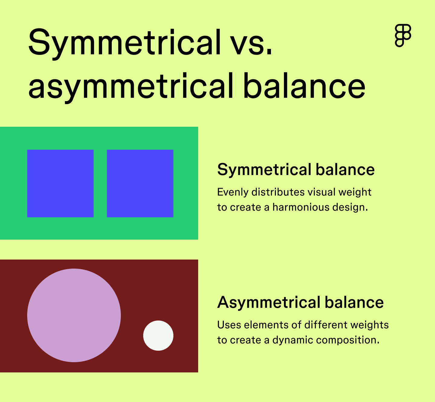
Balance focuses on distributing the visual weight of design elements to create a cohesive design. It helps establish unity between elements to effectively communicate your message. You can typically achieve this through symmetrical or asymmetrical balance.
- Symmetrical balance focuses on the even distribution of visual weight to create harmony within a design. Elements on each side of the design have an even weight.
- Asymmetrical balance uses asymmetry to create a dynamic and visually exciting design composition. Elements on one side of the design are balanced by elements of a different weight on the other side.
How to apply: Use grid lines as a guide to help position elements symmetrically or asymmetrically, and strategically use white space to prevent your design from looking cluttered.
Principle 4: Hierarchy
You can achieve visual hierarchy by strategically arranging and emphasizing elements in order of importance. This helps viewers understand your content and quickly directs them to the most important information.
For example, a social media ad for a new restaurant may feature a photo of a popular dish as its focal point with a bold, attention-grabbing headline prominently placed at the top to announce its grand opening. This clearly establishes the main goal of attracting customers to the grand opening event. Less critical information like the address and contact information might be placed at the bottom of the graphic in a smaller font size.
How to apply: Convey your message by placing the most important information at the top, then use colors, bold fonts, and other design elements to emphasize crucial details.
Principle 5: Color
Color can evoke emotions, communicate messages, and shape the perception of your brand. In graphic design, colors aren’t chosen at random. You can use color theory and color psychology to choose a color palette that will leave a lasting impression. While these two concepts may seem similar, there’s an important distinction:
- Color theory refers to how colors work together to create harmony based on their placement on the color wheel. For instance, shades of blue and orange are complementary colors because they are opposite each other on the color wheel.
- Color psychology is the study of how colors influence human behavior and emotions. For example, the color yellow can elevate your mood, while the color blue can evoke a sense of calmness.
It’s also important to consider accessibility when creating a color palette to ensure colors are easily distinguishable, especially for those with color vision deficiencies.
How to apply: Use your knowledge of color theory and color psychology to create a color palette that evokes the right emotions and aligns with your brand identity. Figma’s color palette generator can help you create a custom color scheme. Select your desired color palette, then bring it right into your Figma Design.
Principle 6: White space
Imagine a design where text and icons had little to no space in between. It would feel overwhelming and be hard to visually digest. White space, or negative space, is the empty area between and around text and design elements.
When done right, white space gives your design breathing room, helping create balance, improve readability, and prevent designs from feeling cluttered. By creating visual separation between design elements, you can emphasize important details and guide a user’s eye more effectively.
How to apply: Consider the purpose of your design to determine the appropriate amount of white space. For example, a minimal design style might include more white space, while an information-packed design might have less. Use Figma’s auto layout features to specify how far apart you’d like objects to be or set uniform padding to ensure consistency.
Principle 7: Proportion

Proportion in the principles of graphic design refers to the size and weight of design elements in relation to one another. Maintaining proportion creates a visually pleasing balance between objects and is a great way to establish visual hierarchy, as large objects are naturally seen as more important.
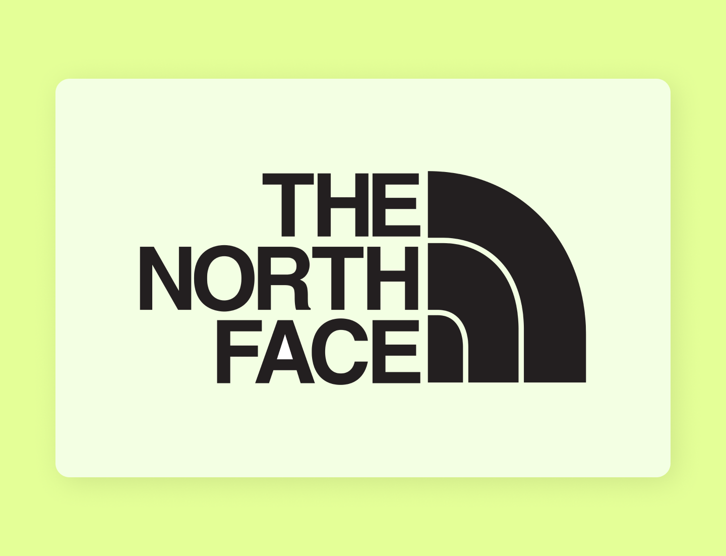
The North Face logo is a great example of using proportion to create a harmonious design. It uses a bold but readable font that complements the half-dome icon without overpowering it.
There may be instances where you’re creating a humorous design that requires more exaggerated proportions to emphasize your unique design style. Play around with proportions to see what feels right for your content type.
How to apply: Use your grid system as a baseline to ensure consistent proportions between elements. Consider each element’s visual weight and balance heavier-weighted objects with lighter ones to create harmonious proportions.
Principle 8: Repetition
Repetition is when identical or similar elements are reused throughout designs. You can achieve repetition by repeating colors, textures, shapes, patterns, or fonts. This creates a sense of cohesion and balance and establishes a visual rhythm to guide viewers’ eyes seamlessly through the design.
Repetition can also help establish your brand identity to create memorable and impactful designs. For example, a cohesive color palette and font types strengthen brand recognition.
How to apply: Create a design system to ensure consistency for repetitive elements across projects. Design systems in Figma make it easy to establish a consistent brand identity and achieve unity across designs.
Principle 9: Rhythm


Rhythm creates a sense of movement, flow, and visual interest within designs. It’s similar to repetition but focuses on the placement and spacing between the repeated elements.
There are four types of rhythm you can apply to graphic designs:
- Regular rhythm uses the same clear pattern and spacing between repeated elements.
- Random rhythm follows no distinct pattern, and elements are placed at random.
- Flowing rhythm creates movement and fluidity by repeating elements in a curved pattern using lines and organic shapes.
- Progressive rhythm subtly changes each repeated element to show a gradual progression.
How to apply: Choose the rhythm type that aligns with your design style to create your desired effect. Use a grid system for a regular, structured approach with consistent spacing. Or play around with direction and fluid objects like shapes and lines to achieve more flow and dynamism.
Principle 10: Movement
Movement is the way a user’s eye is guided through a design. This creates a visual journey leading them from one element to another. Placing elements along the natural eye path ensures important elements are seen and understood.
How to apply: Follow common eye-tracking patterns, like the Z-pattern, F-pattern, or layer cake pattern, to guide the placement of design elements. Strategically place your most important information in areas viewers are naturally drawn to.
Principle 11: Emphasis
Emphasis is all about highlighting the main focal point of your design. It draws the viewer’s attention and ensures they grasp your message quickly. Essentially, emphasis draws attention to the most important part of your design.
How to apply: Use other graphic design best practices and techniques, like color, contrast, white space, or proportion, to make your most important visual elements stand out.
Principle 12: Proximity
Proximity refers to how objects and design elements are placed together to show their relationship. When designing a website, navigation buttons like “Home” or “Contact Us” are placed close together, showing their relationship and making it easier for users to find what they need.
The closer elements are, the easier it is for viewers to understand their connection while placing elements farther apart signals no connection. This provides structure to design and organizes information so your message is communicated effectively.
How to apply: Group related elements together to show their connection, and use white space to separate unrelated groups. When compiling your design, use Figma’s grouping tool to group related objects in a single layer, making them easier to move and position. Smart selections also allow you to adjust each element's spacing, position, and size within a group at once.
Principle 13: Unity
Unity ties all graphic design rules together to ensure your design feels harmonious and cohesive. When designs have unity, all elements flow seamlessly to form a unified composition.
How to apply: Focus on consistent design elements, like colors, fonts, and shapes, to create rhythm and harmony. Apply the proximity principle to ensure your message is easy to digest, and use your grid system to maintain consistent spacing and alignment to create a sense of order.
Kick off your graphic designs with Figma
By understanding and applying these graphic design principles, you can create visually pleasing and memorable designs. Ready to create graphic designs that effectively communicate your message and inspire action? Figma can help. Here’s how:
- Create a design system to ensure your team uses consistent design styles, colors, and elements across projects.
- Explore the Figma Community for graphic packs, font pairings, and inspiration to guide your designs.
- Take your ideas and bring them to life with Figma’s collaborative design tool.
Keep reading

What is graphic design?
Learn how to tell a story with graphic design.
Learn more

5 essential UI design principles
UI design principles can make your product or site more engaging, useful, accessible, and trustworthy.
Learn more

What is UX design?
Learn key principles, skills, and how to use Figma for UX design.
Learn more