28 professional fonts and how to choose one


Share 28 professional fonts and how to choose one
Explore more from
Design basics
Design and prototype with consistent type
Bring type to life in every interaction.

Professional fonts are like a visual handshake—the first impression your brand makes with the world. They signal competence, clarity, and trust. Whether it’s a pitch deck or corporate branding, UI, or marketing materials, the right font can subtly shape how people perceive what your brand is about and what it stands for.
This guide covers 28 of the best professional fonts and how to pick the best one for your project.
Read on to learn:
- Key characteristics of professional fonts
- Examples of popular professional fonts and their use cases
- How to choose the right font for your needs
Font 1: Public Sans

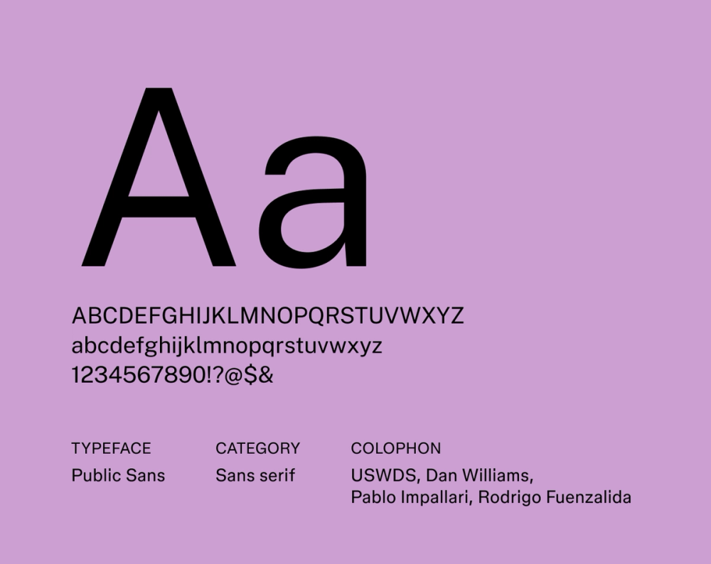
Public Sans is a strong, neutral typeface in design with clarity and accessibility in mind. It’s a go-to choice for projects that need a clean, straightforward look. Its open letterforms and generous spacing contribute to excellent readability across digital interfaces and print materials.
This professional font is especially effective when you want to prioritize reliability and professionalism without being overly formal.
Best for: Government websites, user interfaces, documentation, and any project prioritizing clear communication and accessibility
Font 2: Inclusive Sans

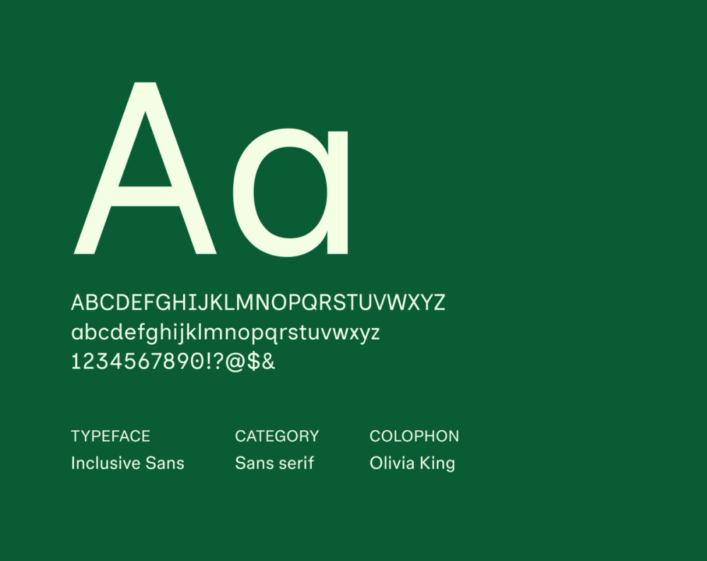
As its name suggests, Inclusive Sans was designed for inclusivity and accessibility. It features open counters and clear distinctions between letterforms, offering a friendly and approachable feel. Inclusive Sans focuses on readability and considers all users, including those with visual impairments and cognitive differences.
Best for: Accessibility-focused websites, educational materials, user interfaces, and projects prioritizing readability and inclusivity
Font 3: Rethink Sans

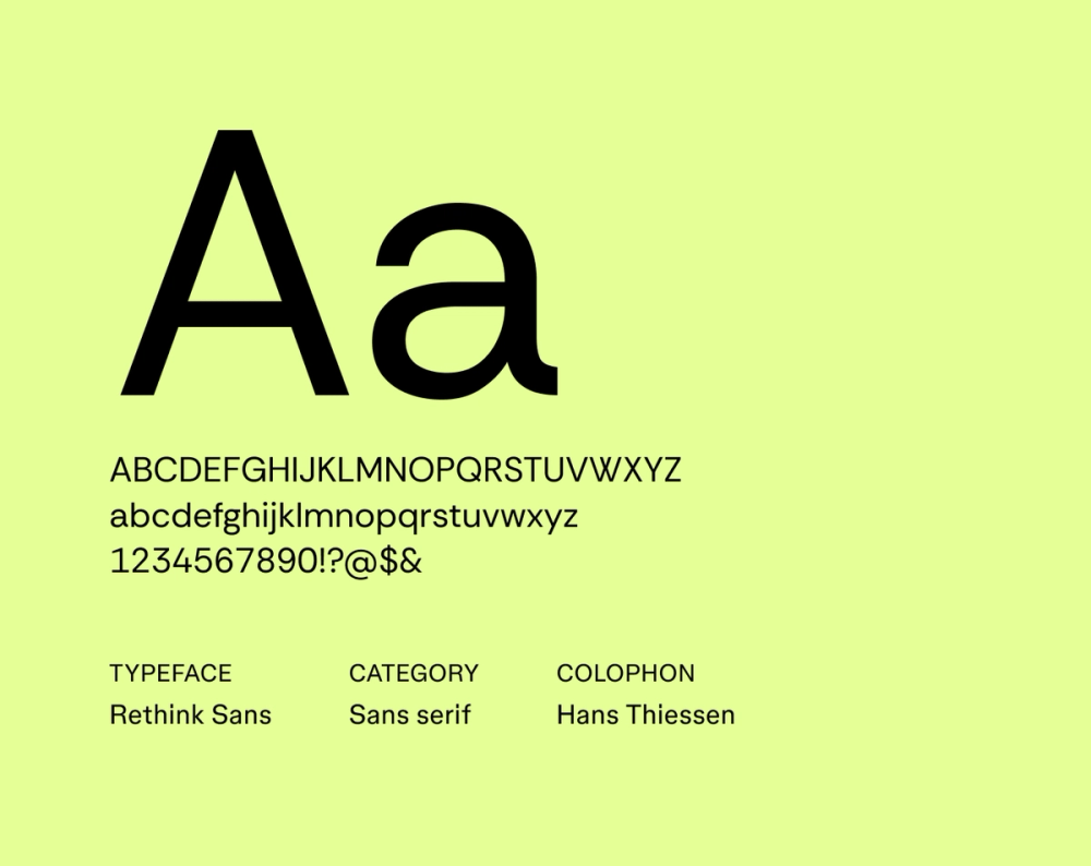
Rethink Sans is a professional sans serif font that’s both modern and functional. It features a neutral, adaptable design to ensure consistency and readability across different applications. Rethink Sans is a reliable choice for brands that want a contemporary identity while maintaining trustworthiness.
Best for: Modern websites, corporate branding, and professional user interfaces
Font 4: Plus Jakarta Sans

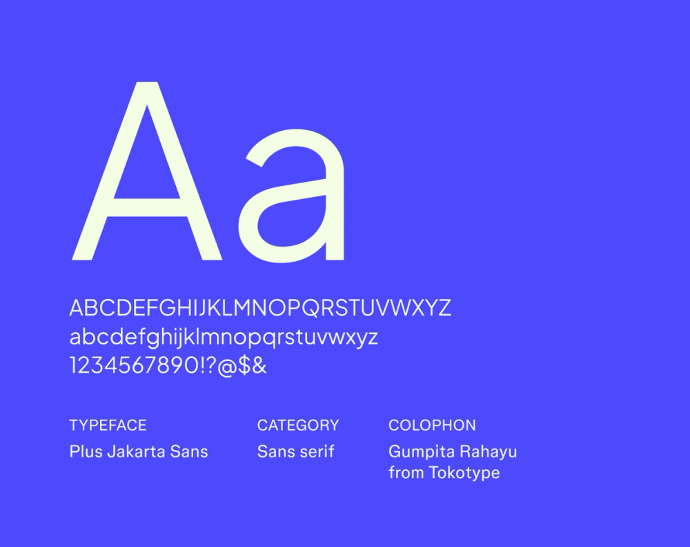
Plus Jakarta Sans has a professionally refined geometric design with a friendly and inviting feel. Its balanced proportions and slightly rounded corners contribute to its modern and trustworthy appearance. Plus Jakarta Sans is suitable for professional projects prioritizing approachability with a contemporary style.
Best for: Modern corporate branding, professional UI design, and app interfaces
Font 5: Source Serif 4

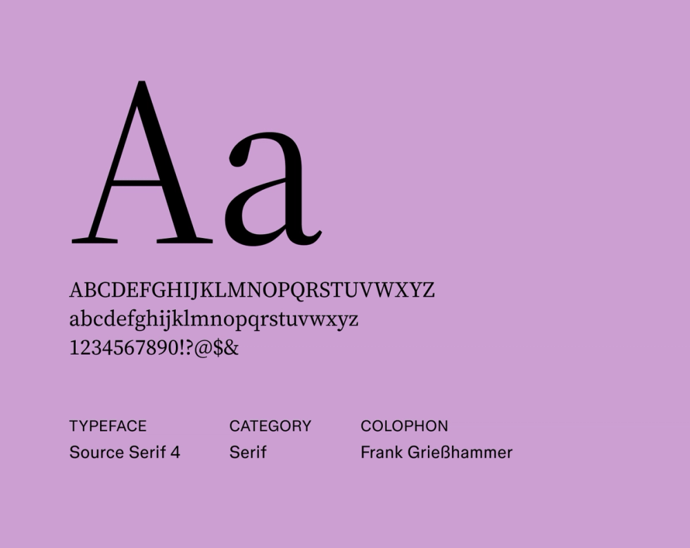
Source Serif 4 was designed for digital readability. Its balanced letterforms offer a sense of authority, while its optical sizes make it highly versatile across applications and text sizes. Source Serif 4 is ideal for companies and projects that want to balance professionalism and clarity.
Best for: Professional long-form digital content, academic publications, e-books, and corporate websites
Font 6: Work Sans

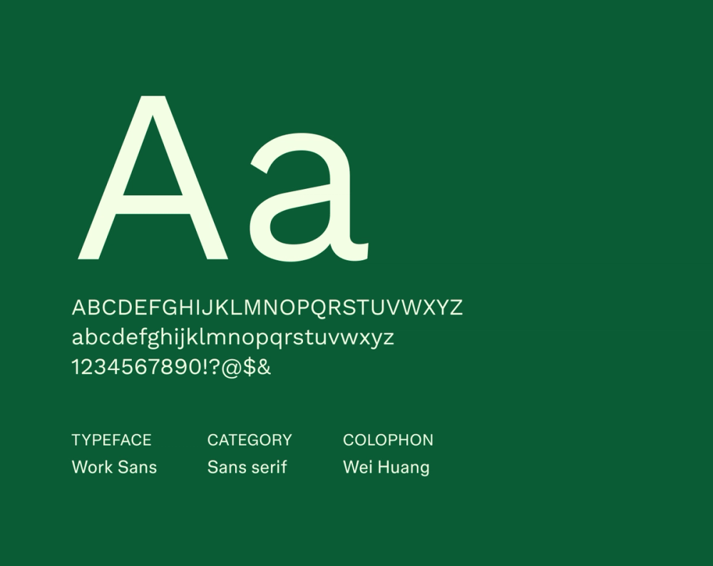
Work Sans is a sans serif font optimized for on-screen readability. Its geometric design, clean lines, and various weight ranges ensure consistent and legible text across digital applications and projects. Work Sans projects efficiency and modernity, which is great for professional interfaces and digital design.
Best for: Professional user interfaces, digital dashboards, and Web design
Font 7: Schibsted Grotesk

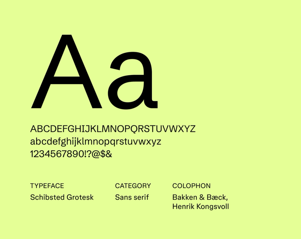
Schibsted Grotesk is a professionally designed sans serif font that’s functional and legible. Its clear, neutral design ensures consistent performance across various media, whether on-screen or in print. Schibsted Grotesk is ideal for professional communication and branding, as it conveys reliability and efficiency.
Best for: Corporate communications, presentations, reports, emails, and projects that need a professional and reliable sans serif typeface
Font 8: Instrument Serif

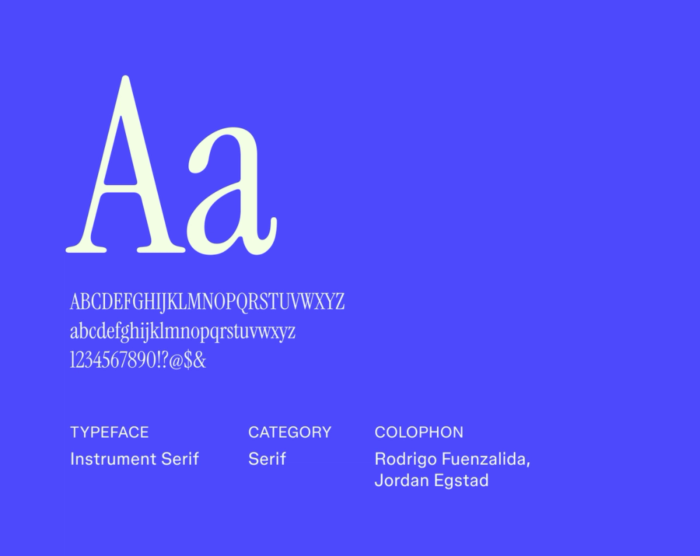
Instrument Serif is a bold and impactful serif typeface designed to command attention and create a lasting impression. Its strong, geometric forms and condensed letterforms make it effective for headlines, posters, and branding.
Instrument Serif’s design suits projects that aim to stand out and convey ambition and innovation. The font’s versatility lends itself to digital and print applications, ensuring a consistent and memorable typographic experience.
Best for: Headlines, posters, branding, advertising, and projects that require a bold and impactful serif typeface
Font 9: Libre Baskerville

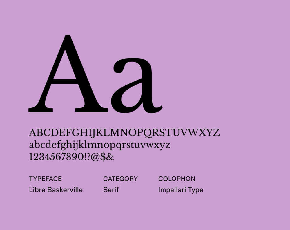
Libre Baskerville is a serif typeface that evokes classic elegance and traditional craftsmanship. Its high readability and refined letterforms make it a popular choice for projects that need sophistication and formality.
Libre Baskerville’s balanced proportions and distinct serifs contribute to a comfortable reading experience, even in longer texts. Designers often use this font to lend a sense of authority and timelessness to their work, making it suitable for digital and print applications.
Best for: Long-form articles, editorial design, e-books, websites for academic institutions, and projects that aim to convey tradition and credibility
Font 10: Source Sans Pro

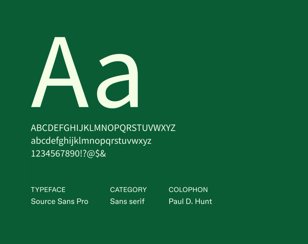
Source Sans Pro is a versatile and highly readable sans serif typeface. It’s designed for user interfaces, making it an excellent choice for digital design projects.
Its clean, geometric forms and well-defined letter shapes ensure clarity at various sizes—a crucial factor for Web and app design. Source Sans Pro balances functionality and aesthetic appeal, offering a neutral yet approachable look.
Best for: User interfaces, Web design, mobile apps, documentation, and any project that needs a clean, modern, and highly readable typeface
Font 11: Bebas Neue

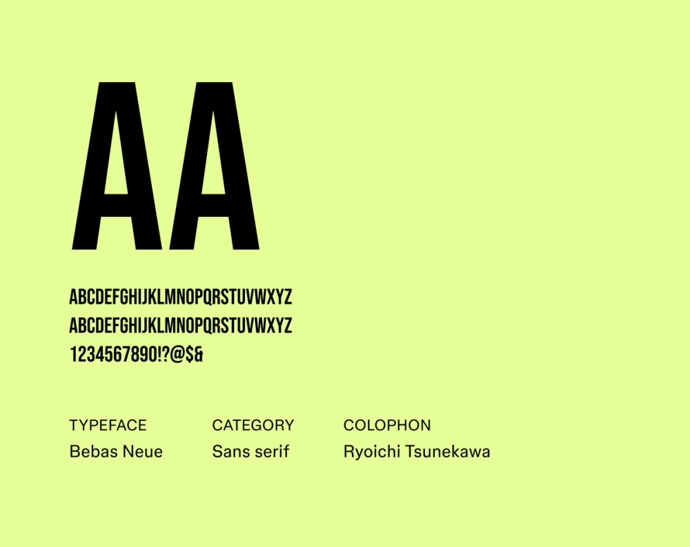
With its clean, tall, condensed letterforms, Bebas Neue brings a bold, modern feel to headlines and display text. Its condensed nature allows for efficient use of space, making it easier to fit a lot of text into a limited area.
Best for: Headlines, posters, branding, website banners, and projects that need a bold, modern, and space-efficient typeface
Font 12: Albert Sans

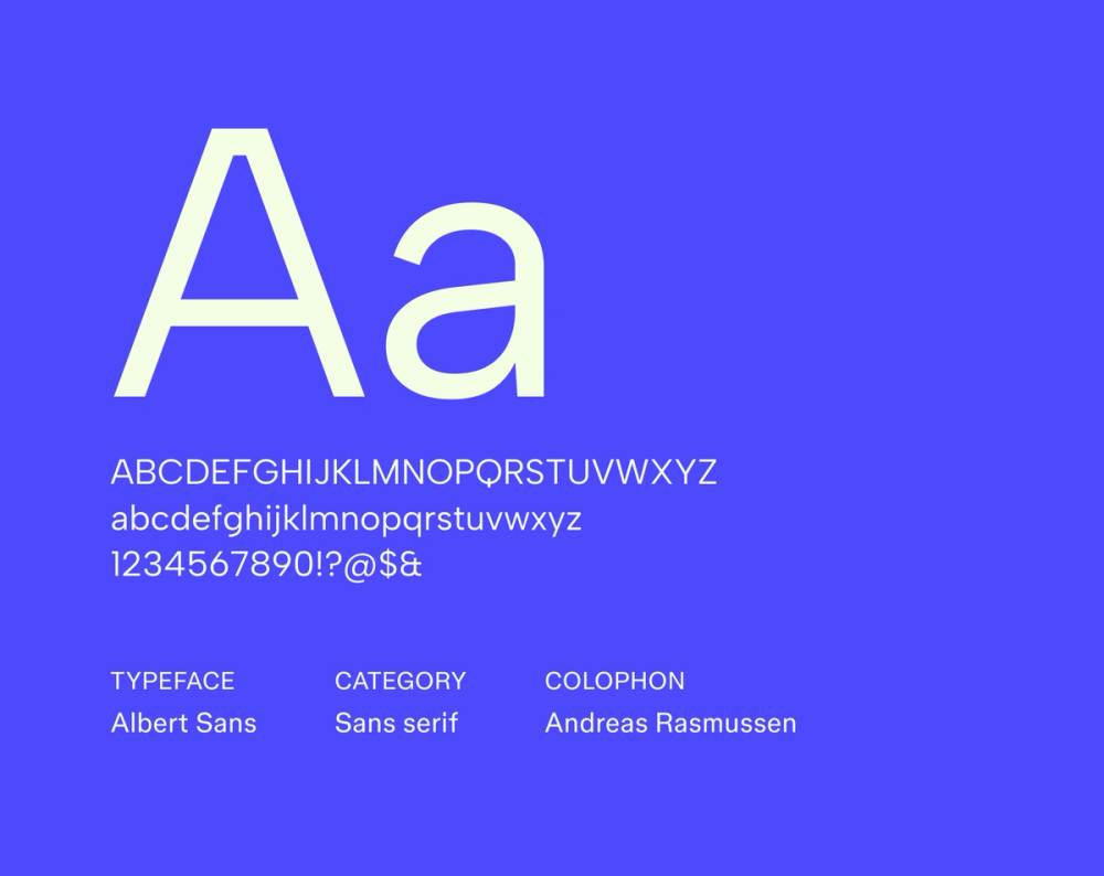
Albert Sans is a sans serif font with a clean and approachable aesthetic. Its well-balanced letterforms and subtle geometric qualities make it highly readable in display and body text.
Albert Sans offers clarity and simplicity, and its neutral, approachable appearance allows it to fit in designs seamlessly. Designers often favor Albert Sans for its ability to convey professionalism and modernity without being overly stylized.
Best for: User interfaces, branding, marketing materials, Web design, and projects that need a clean, modern, and highly readable typeface
Font 13: Aleo

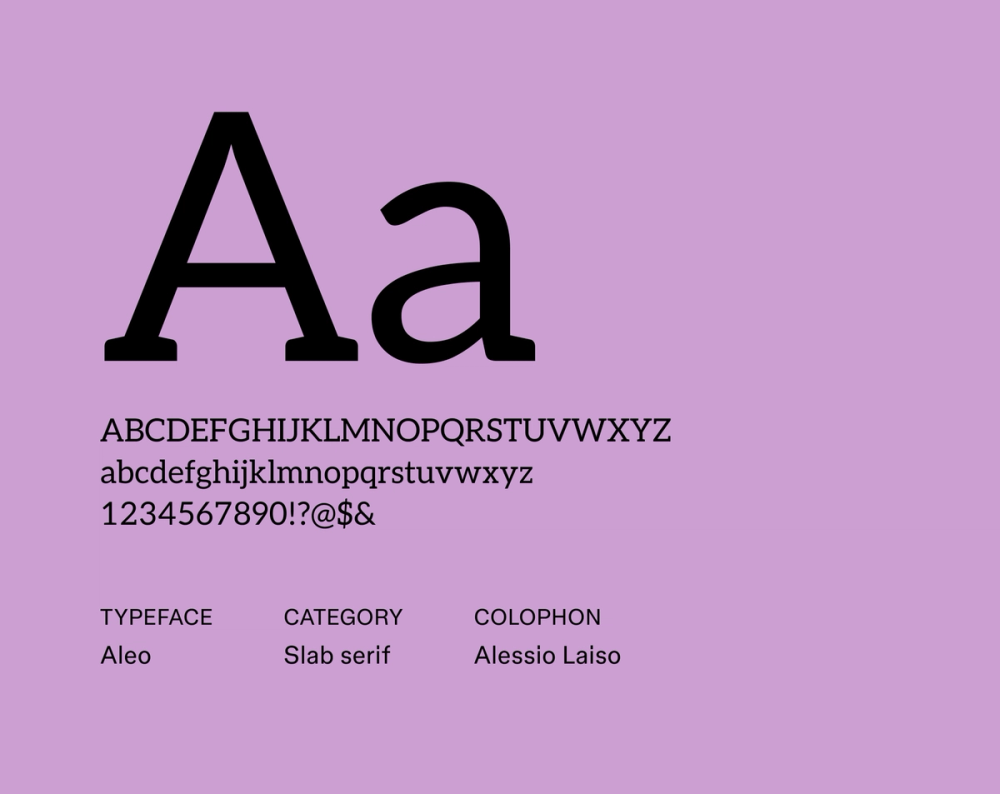
Aleo is a contemporary slab serif font that combines readability with personality. Its semi-rounded details and strong structure make it versatile for display and body text.
Aleo balances friendliness and authority. Its distinct slab serifs provide a strong visual presence, while its overall design maintains a clean and modern aesthetic. Designers often choose Aleo for projects that need a unique yet professional typeface that offers approachability and reliability.
Best for: Headlines, branding, editorial design, Web interfaces, and projects that need a distinctive slab serif typeface with excellent readability
Font 14: Lora

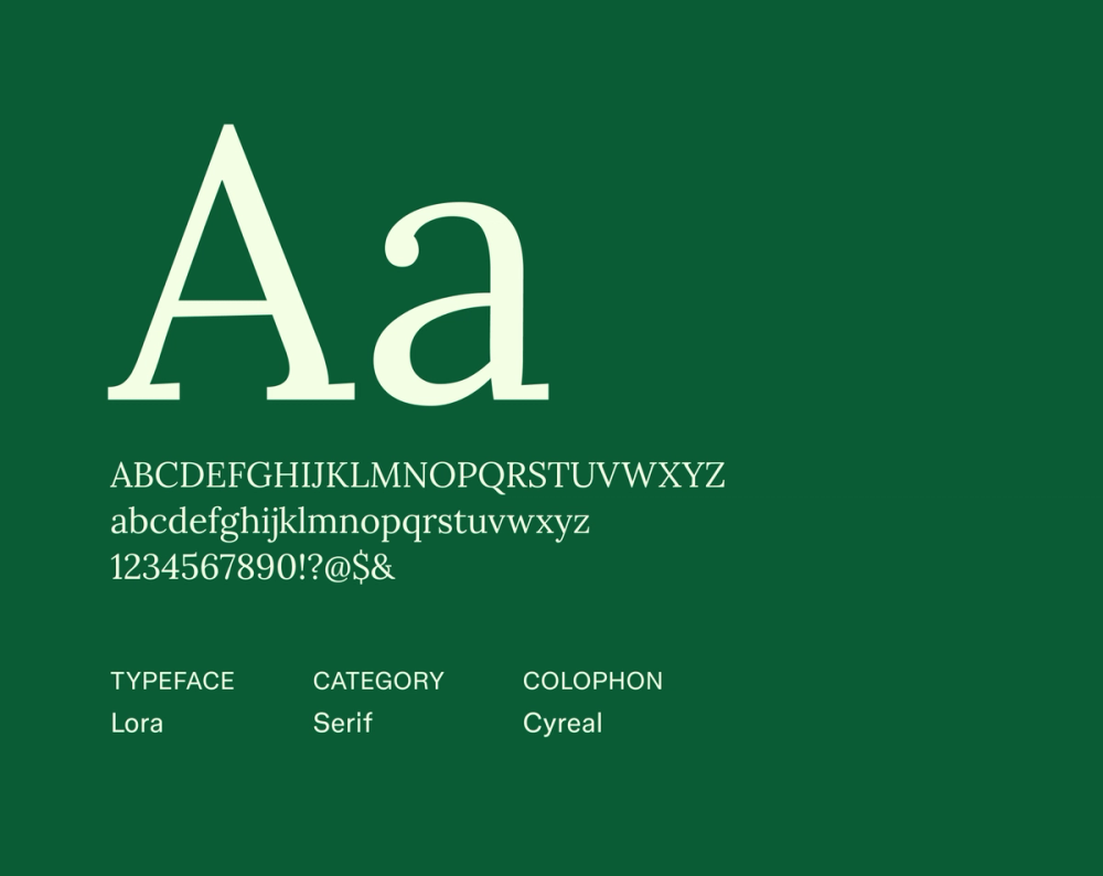
Lora is a serif typeface with roots in calligraphy, making it great for text-heavy projects. Its brushed curves and moderate contrast give it a contemporary feel while maintaining readability. Lora is effective for body text because its refined letterforms create a comfortable reading experience.
Designers use Lora for projects that require elegance and practicality. It offers a sophisticated yet approachable look. Its versatility makes it suitable for digital and print applications, especially when conveying a sense of storytelling or narrative.
Best for: Blog posts, online magazines, e-books, literary websites, and projects emphasizing readability and a refined aesthetic
Font 15: Archivo Black

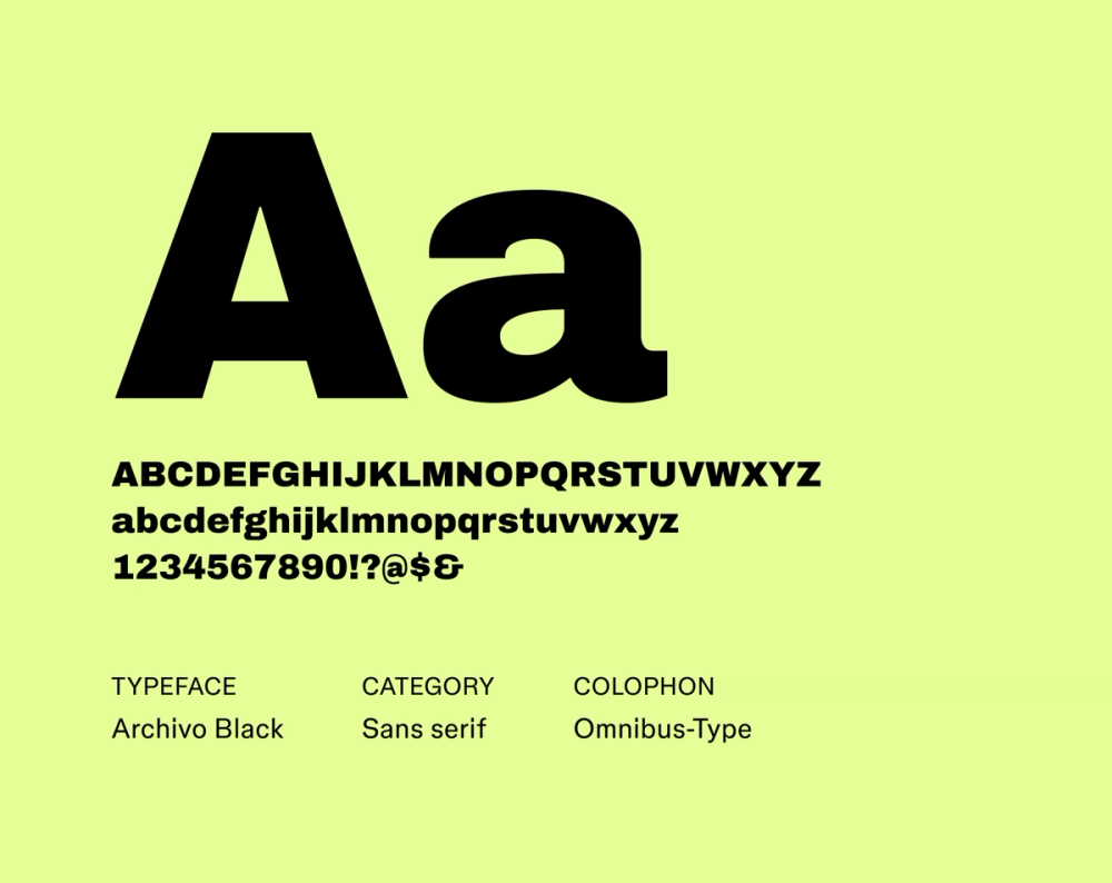
Archivo Black is a bold and impactful sans serif typeface designed for display. Its strong geometric forms and heavy weight command attention, making it ideal for headlines, posters, and branding. Archivo Black’s robust character and clean lines lend a modern and industrial feel to any project.
Its condensed nature efficiently uses space, making it effective for strong visual statements in limited areas. Designers often choose Archivo Black to convey power, confidence, and modernity.
Best for: Headlines, posters, branding, advertising, and projects that need a bold, impactful, and space-efficient display typeface
Font 16: EB Garamond

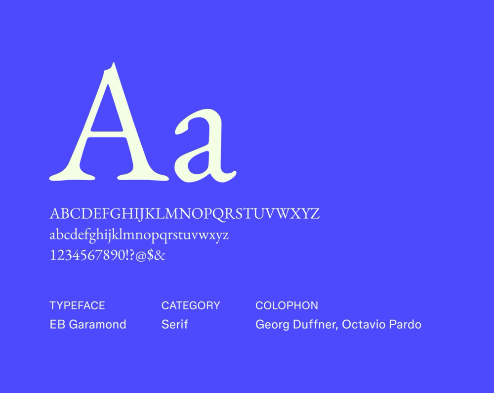
EB Garamond is a classic, elegant serif typeface that exudes sophistication and readability. Its balanced proportions and moderate contrast make it a versatile choice for body text and display purposes.
Designers often choose this professional font for projects that require a sense of tradition and authority while maintaining a clean and modern feel. Its versatility makes it suitable for a wide range of applications, from books and magazines to websites and branding materials.
Best for: Books, magazines, websites, branding, editorial design, and projects that require a sophisticated and highly readable serif typeface
Font 17: Ramaraja

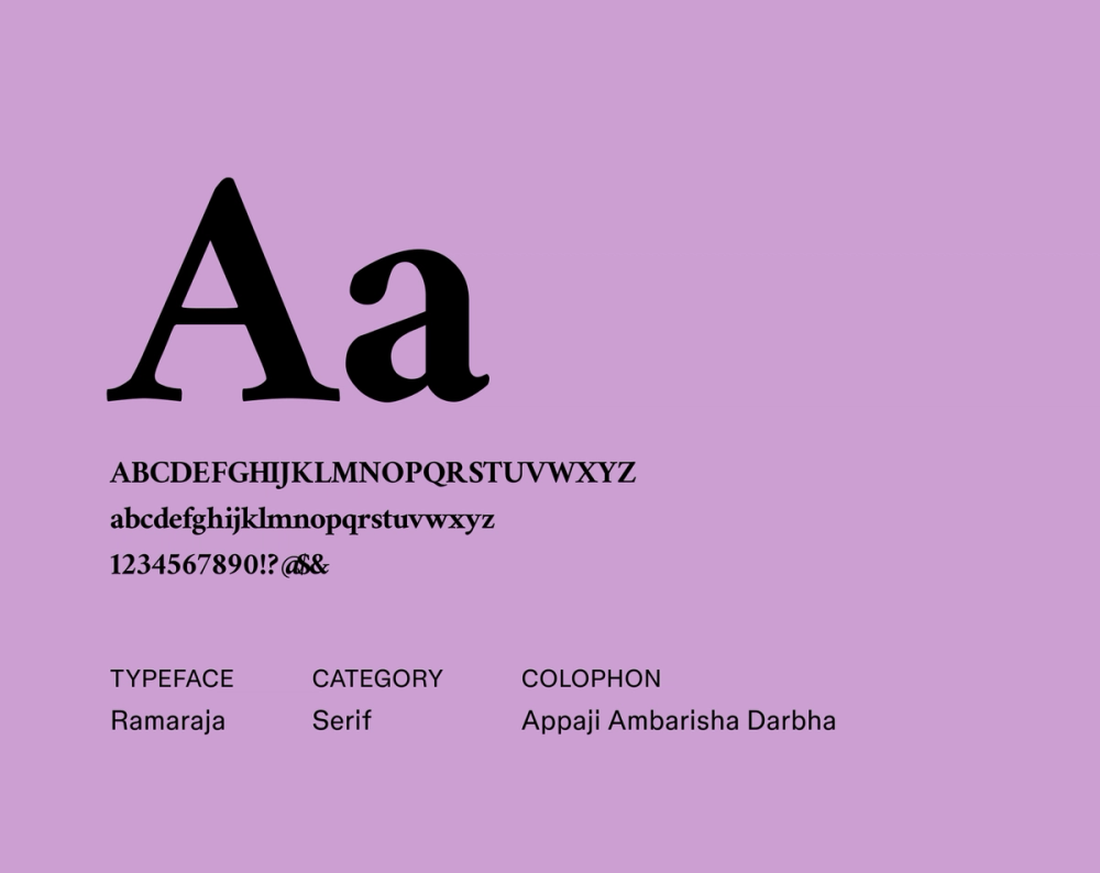
Ramaraja is a high-contrast serif typeface with expressive, vintage-inspired character. It's ideal for making a statement, especially in headlines or branding that needs personality with timeless elegance.
It’s suitable for projects that aim to stand out and convey a sense of timeless elegance.
Best for: Headlines, branding, packaging design, editorial design, and projects that require a distinctive and characterful serif typeface
Font 18: Crimson Text

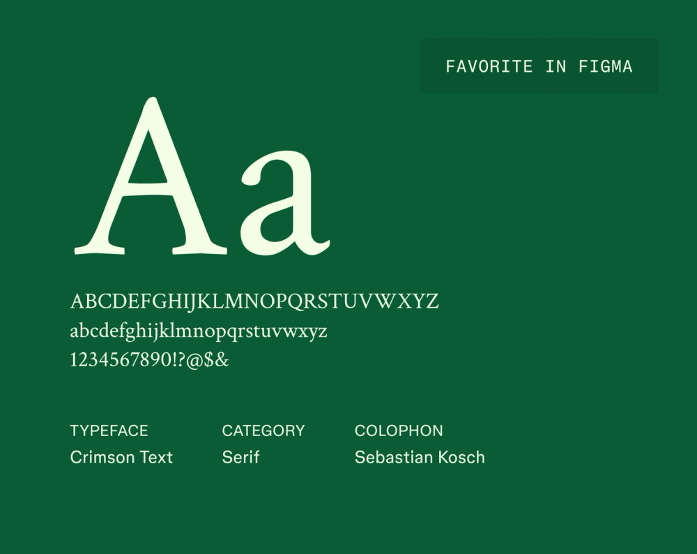
Crimson Text draws from classic old-style serif typefaces, offering warmth and readability. Its balanced proportions and delicate serifs make it a great choice for long-form content that needs a balance of tradition and modernity. Designers often favor Crimson Text because it conveys authority and sophistication, making it a valuable asset for editorial and literary designs.
Best for: Books, articles, academic papers, literary websites, and projects that need a highly readable and elegant serif typeface
Font 19: Domine

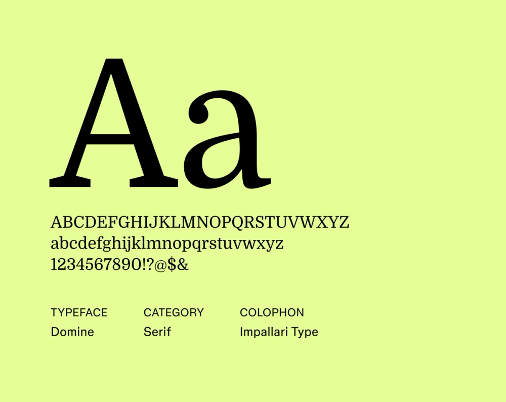
Domine stands out with strong, structured letterforms that bring authority to headlines and branding.
It pairs traditional serif features with a clean, contemporary feel, making it a reliable option for projects that need clarity and strength.
Best for: Headlines, branding, editorial design, websites for institutions, and projects that need a strong and authoritative serif typeface
Font 20: Bodoni Moda

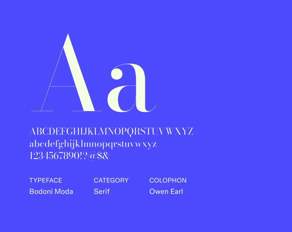
Bodoni Moda is a classic font known for its extreme contrast between thick and thin strokes and unbracketed serifs. Its elegant and sophisticated design makes it a popular choice for high-end branding, fashion magazines, and projects that aim to feel refined and high-end.
Bodoni Moda’s dramatic appearance and sharp details create a strong visual impact, making it particularly effective for headlines and display text. Designers often use Bodoni Moda to convey timeless elegance, high-quality craftsmanship, and prestige in their designs.
Best for: Fashion magazines, luxury branding, high-end advertising, editorial design, and projects that need a sophisticated and dramatic display typeface
Font 21: Lato

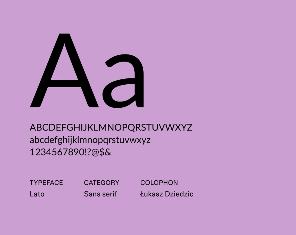
Lato is a warm and inviting sans serif typeface that balances professionalism and approachability. Its semi-rounded details and clean lines create a friendly and approachable tone, making it suitable for various applications.
Lato’s versatility allows it to function effectively in headlines and body text, offering a consistent and harmonious typographic experience. Designers often choose Lato for its ability to convey transparency and trust, making it popular for corporate branding, websites, and user interfaces.
Best for: Corporate branding, websites, user interfaces, marketing materials, and projects that need a friendly, approachable, and versatile sans serif typeface
Font 22: Hind

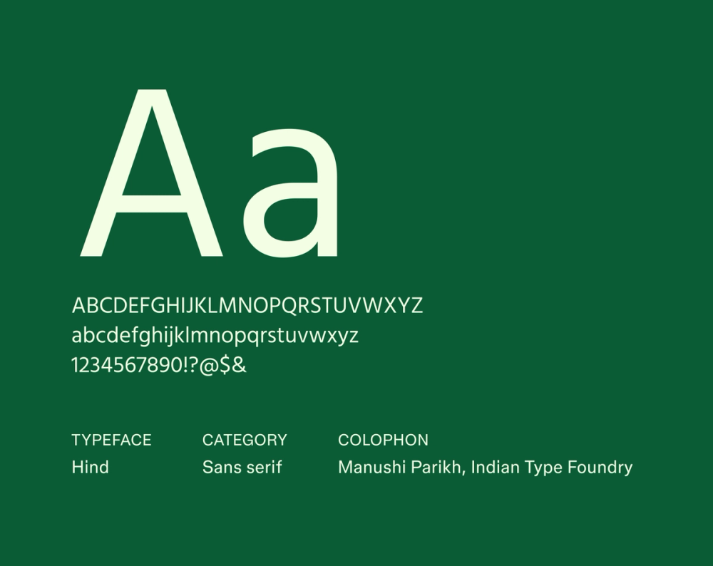
Hind offers geometric shapes and open letterforms that make it highly legible on any screen size. Its modern tone features letterforms that make it suitable for various applications, including user interfaces, web design, branding, and print materials. Its modern tone strikes a balance between neutrality and personality.
Best for: User interfaces, Web design, mobile apps, branding, and projects that need a legible, versatile, and modern sans serif typeface
Font 23: Noto Sans

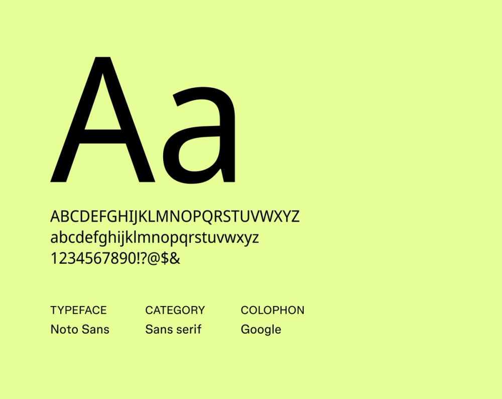
Noto Sans is a global typeface family designed with universal communication and inclusivity in mind. It supports various languages and scripts, making it an ideal choice for projects with international audiences.
Designers often choose Noto Sans to create a consistent typographic experience, regardless of the language or script used. Its commitment to inclusivity makes it a valuable tool for promoting accessibility and effective communication on a global scale.
Best for: Websites, applications, and documents with multilingual content, internationalization projects, and projects prioritizing inclusivity and accessibility
Font 24: Raleway

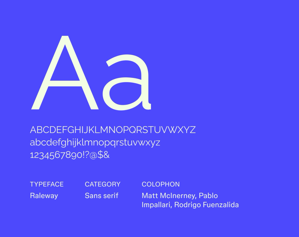
Raleway pairs elegance with refined geometry. Its thin weight and graceful curves make it ideal for polished branding and editorial work.
Its versatility allows it to function well in digital and print applications, offering a consistent and stylish typographic experience.
Best for: Branding, websites, headlines, editorial design, and projects that need an elegant and sophisticated sans serif typeface
Font 25: Tenor Sans

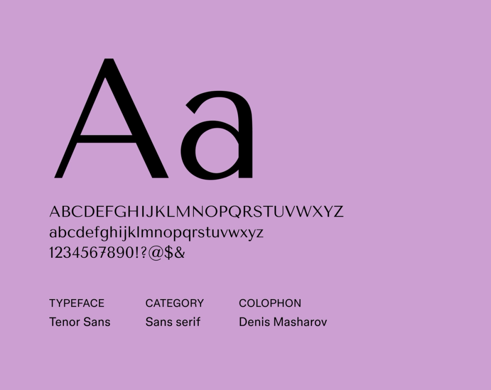
Tenor Sans is a modern font that exudes clarity with sophistication. Its clean lines, open letterforms, and well-defined shapes allow for exceptional readability across various applications. Tenor Sans balances neutrality and personality, making it suitable for body text and display.
Designers often choose Tenor Sans for its ability to convey professionalism and trustworthiness while maintaining a friendly and approachable feel. Its versatility makes it a reliable choice for projects that need a clean and modern font.
Best for: Branding, websites, user interfaces, marketing materials, and projects that need a versatile and highly readable sans serif typeface
Font 26: Roboto

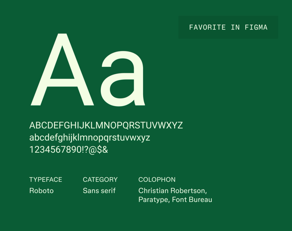
Roboto is one of the best professional fonts known for its clean aesthetic and excellent readability. Its open letterforms provide a friendly and approachable feel. Roboto’s versatility makes it suitable for various applications, from corporate documents and presentations to Web design and user interfaces.
Designers often choose Roboto for its professional yet inviting appearance, making it a safe and reliable choice for projects requiring clarity and familiarity.
Best for: Corporate communications, presentations, reports, emails, and projects that require a professional and highly readable sans serif typeface
Font 27: Urbanist

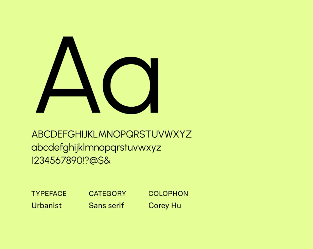
Urbanist was built for the screen. Its clean lines, open letterforms, and geometric construction help it scale clearly across all devices.
Urbanist is perfect for conveying modernity and sophistication while maintaining a neutral and approachable feel. Its versatility allows it to adapt seamlessly to various design contexts, ensuring a consistent and user-friendly experience.
Best for: User interfaces, Web design, mobile apps, data visualizations, and projects that need a highly legible and modern sans serif typeface
Font 28: GFS Didot

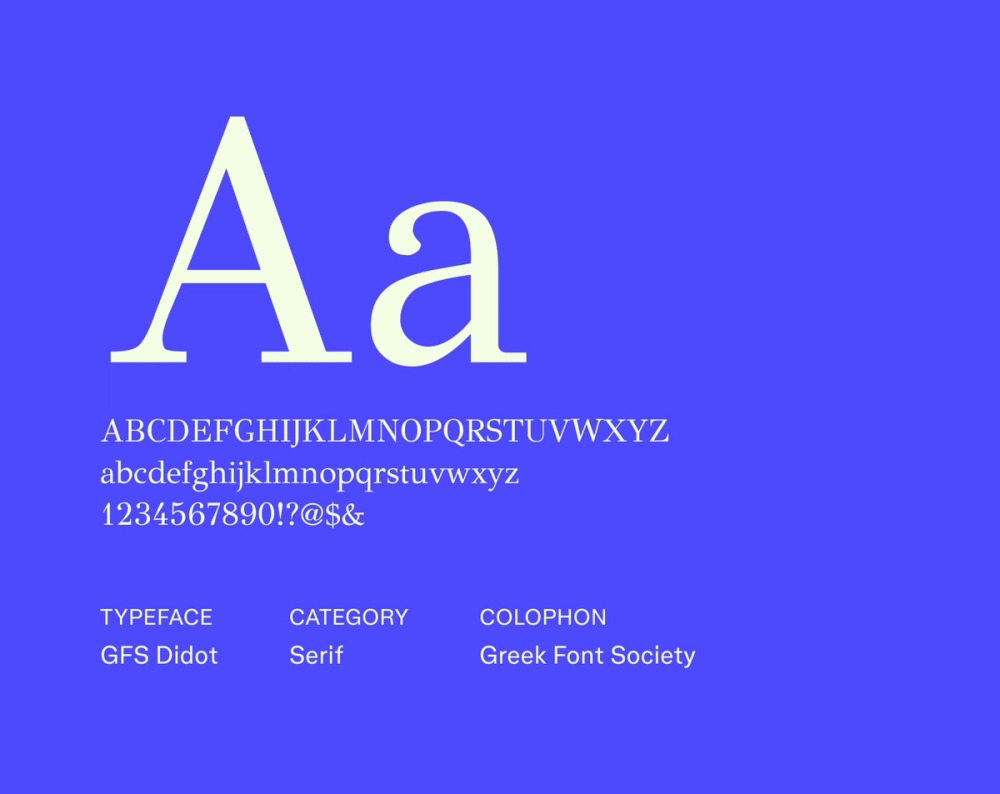
GFS Didot blends refined contrast with a timeless serif structure. Inspired by classical type design, it adds an air of luxury and elegance—perfect for high-end editorial work and branding.
Designers use GFS Didot to convey high-quality craftsmanship, and prestige. Its enduring appeal makes it a valuable asset for projects that aim to evoke luxury and refinement.
Best for: Fashion magazines, luxury branding, high-end advertising, editorial design, and projects that need a sophisticated and elegant display typeface
How to choose the right font for your business
Selecting the perfect font for your business is crucial to establishing a strong brand identity and ensuring effective communication. Here’s how:
- Define your brand identity. Your font choice should reflect your brand’s personality and values. Is it modern or classic? Playful or serious? Choose a font that reflects those qualities.
- Think about emotional impact. Fonts convey feeling. Serif fonts often convey tradition and trustworthiness. Sans serif fonts can feel more modern and approachable. Look for a style that supports the message you want to send.
- Test your font across platforms. Make sure your font holds up across Web, mobile, and print. Legibility and consistency matter—especially in responsive designs.
- Pairing wisely. If you’re using more than one font, go for font pairings that complement each other. Clear hierarchy and contrast make content easier to read and navigate.
- Check the licensing. To avoid legal issues, confirm that you have the necessary licenses for commercial use of your chosen font.
Leverage the power of fonts with Figma
Choosing the right professional fonts is essential for creating a strong brand identity and ensuring effective communication. By understanding the key characteristics of professional fonts and exploring various examples, you can make informed decisions that elevate your designs and reinforce your brand’s message. Ready to create designs that are both visually appealing and highly effective? Figma can help. Here’s how:
- Discover a vast collection of fonts and design resources in the Figma Community.
- Find the perfect fonts for your next project with Figma's Font Library.
- Collaborate with your team using FigJam’s shared online whiteboard.
- Use Figma templates to experiment with different font combinations.