Guide to designing a hamburger menu + examples


Share Guide to designing a hamburger menu + examples
Explore more from
Design basics
From wireframe to website, faster
Design, prototype, and refine every page.

Tap the corner of any mobile app, and you'll likely find a hidden menu waiting. That ubiquitous three-line icon—known as the hamburger menu—represents a critical tradeoff in interface and Web design. While it keeps interfaces clean, it also conceals key navigation paths. Understanding when and how to implement this pattern can dramatically impact your users' experience.
Read on to learn:
- What a hamburger menu is
- Pros and cons of hamburger menus
- Tips for hamburger menu design
- Hamburger menu examples
What is a hamburger menu?
The hamburger menu transforms complex navigation into a single, recognizable icon: three horizontal lines that represent a collapsible menu. Typically positioned in the top corners of interfaces, it reveals full navigation options with a single tap or click.
The hamburger menu was first introduced as part of the UI for the Xerox Star personal computer in 1981. Designer Norm Cox created the icon as an intuitive representation of a collapsed menu list—a concept that would become central to modern UI design, gaining popularity after mobile devices became more widely used.
When should you use a hamburger menu?
The effectiveness of hamburger menus varies significantly based on context, user needs, and design goals. They work best when:
- Your interface prioritizes mobile-first design with limited screen space
- Your design style is clean and minimalist
- Secondary navigation items can be tucked away to highlight key content
- Your users are familiar with this mobile navigation technique
The Figma Community offers a wide range of UI icons, including hamburger menus, making it easy to find and import the icons directly into your Figma design projects.
When to avoid a hamburger menu
Some interfaces benefit from more visible navigation patterns. Skip the hamburger menu when:
- Your website has a complex navigation structure.
- Crucial information and primary feature pages need to be prominently displayed.
- Your website already uses a heavy amount of interaction features.
- Quick access to features or pages is important.
Pros and cons of hamburger menus

Before deciding if a hamburger menu is right for your website, consider its impact on the user experience.
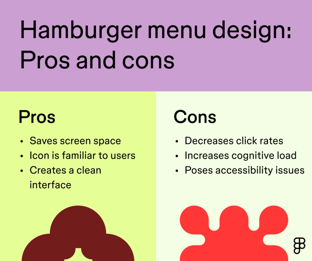
Hamburger menu pros
Using a hamburger menu can be valuable for a variety of reasons, as it:
- Saves space. Hamburger menus condense navigation into a single icon, freeing up valuable screen space on smaller devices and mobile apps.
- Creates a cleaner interface. A hamburger menu removes visual clutter from the main view.
- Is familiar to users. Most mobile users understand and expect the hamburger menu, ultimately leading to a more intuitive and efficient interaction.
Hamburger menu cons
While hamburger menus can streamline your interface, they also come with some drawbacks and tradeoffs, including:
- Decreased click rates. Some users have a more challenging time finding hidden menu items, which could lead to lower click-through rates and missed opportunities for engagement and conversion.
- Increased cognitive load. Hamburger menus add an extra step for users to find what they need.
- Accessibility issues. Hidden menus often create potential accessibility barriers, especially for those who rely on screen readers.
Seven tips for hamburger menu design

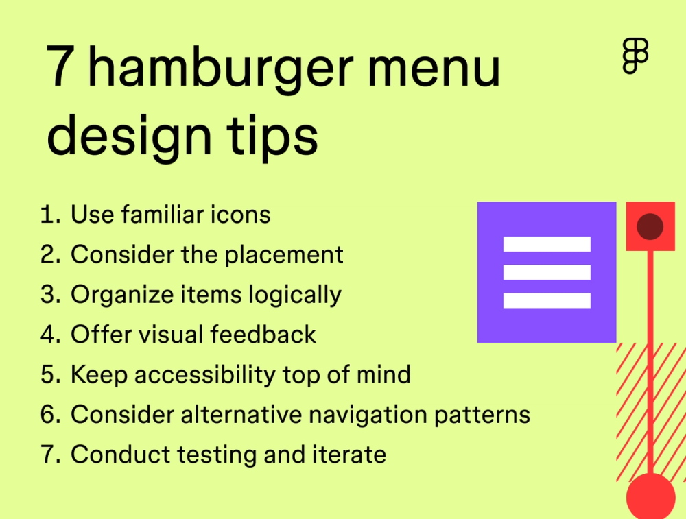
Though they’re not for everyone, hamburger menus have become a staple in mobile app design. Make your hamburger menu more effective and user-friendly with these tips:
Tip 1: Use familiar icons
The three-line hamburger icon is instantly recognizable. Stick to this standard pattern and use clear visual indicators like arrows for submenus. Users navigate more confidently when interfaces use familiar signs and symbols.
Tip 2: Consider placement
Most users look for the hamburger menu in the top corners of their screen. Choose either top left or right, and stay consistent across your design system to help users navigate efficiently.
Tip 3: Organize items logically
When designing your hamburger menu, think like your target user. What’s the first thing they want to do? Place the high-priority actions at the top of the menu and group related items together. A clear hierarchy helps users find what they need quickly.
Tip 4: Offer visual feedback
Help users understand their interactions by implementing subtle animations or color changes when they select menu items. Small visual cues make navigation feel more responsive and intentional.
Tip 5: Keep accessibility top of mind
Designing with accessibility in mind is crucial to ensure your app or website is inclusive. Make your hamburger menu work for everyone. Confirm it’s keyboard-navigable and compatible with screen readers. Add proper Accessible Rich Internet Applications (ARIA) labels so users with assistive technology can navigate your menu easily.
Tip 6: Consider alternative navigation patterns
A hamburger menu may not always be the best choice. If that’s the case, consider other navigation patterns like:
- Tabbed menus are ideal for websites with a few main categories. They display tabs horizontally at the top of the screen and open the corresponding page when clicked.
- Side navigation works for websites with many subcategories. It displays a vertical list of menu options on the side of the page.
- Slide-out navigation saves space on mobile devices and small screens. It’s hidden until triggered by a button click or user gesture, sliding in from the side of the screen to reveal menu options.
- Vertical dropdown menus offer a compact way of organizing complex navigation structures. They reveal submenus when a button or link is clicked, which is useful.
Ultimately, you want to design a navigation menu that aligns with your users’ actions and preferences.
Tip 7: Test and iterate
As with any UI design feature, it’s always smart to conduct testing to identify areas for improvement. Watch how people actually use your menu design. Run usability tests to spot problems early, and use A/B to compare different approaches Use the feedback gathered to iterate on your design and refine your menu until it works smoothly for your audience.
Hamburger menu examples
Get a sense of intuitive and clean menu designs with these standout hamburger menu examples.
Example 1: Amazon

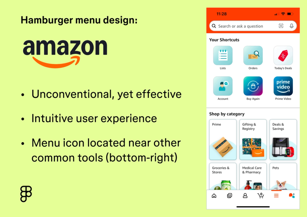
While unconventional, the Amazon app’s bottom right hamburger menu works because it’s positioned near the other frequently used toolbar icons. Users are already accustomed to navigating the app via the bottom toolbar, making it an intuitive user experience.
Example 2: Southwest Airlines

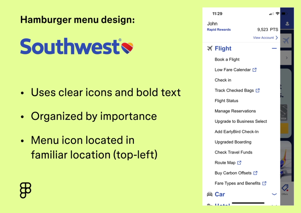
Southwest Airlines places its hamburger menu in the top-left corner of the app screen, a location that makes it easy for new users to find. Once expanded, menu options display with clear icons and bold text. An arrow icon indicates submenus and organizes them in order of importance, easily guiding users to their desired page. For example, the flight option is strategically placed at the top of the menu, as it’s the most common page destination.
Example 3: Dropbox

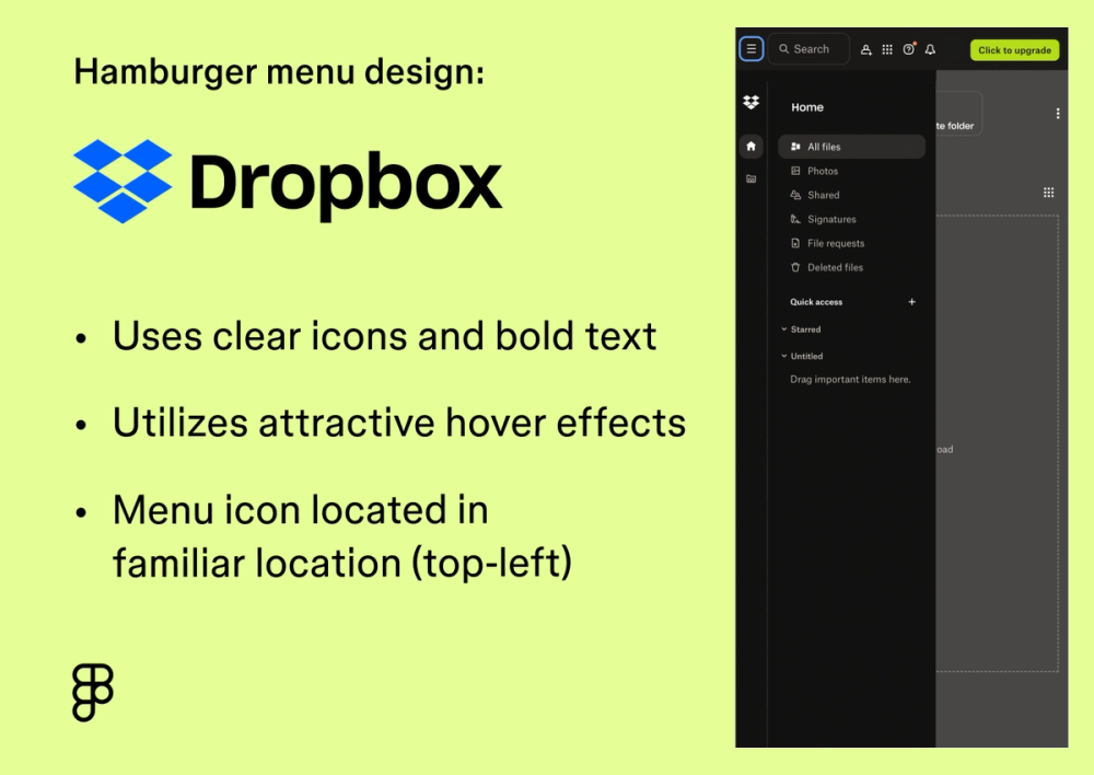
Dropbox offers easy access to your files behind the familiar hamburger icon in the upper left corner for users using a smaller screen or app. Once opened, Dropbox uses a subtle gray hover effect to highlight various options to navigate to shared deleted, or recently opened files, offering clear visual feedback to users.
Design clear navigation menus with Figma
Hamburger menus need to balance functionality, accessibility, and user expectations Figma gives you the tools to design, test, and refine these crucial navigational elements. Here’s how:
- Explore the Figma Community to download premade hamburger menu icons or browse navigation design templates to make designing your menu a breeze.
- Use Figma’s prototyping tool to build realistic designs with interactive hamburger menus and other interactions. View your responsive design on any screen for quick feedback and rapid iterations.
- Once you’ve nailed down your design, bring it into Dev Mode to start generating code and building your menu design all in one place.
Figma Callout
Ready to design a menu that clicks with your users?