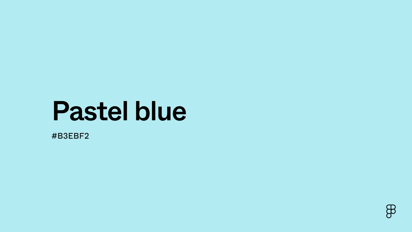
Pastel blue is a delicate, light shade of the primary color blue located in the cyan region of the color wheel. Due to its soft, cool hues, pastel blue can produce a calm and tranquil atmosphere, making it ideal for designs that want to evoke serenity and peace.

Color variations
Shades
Tints
Tones
Hues
Color harmonies
Complementary
Split
Monochromatic
Analogous
Triadic
Square
Custom palettes
Misty Lagoon
Coastal Dawn
Charming Seaside
Pastel blue is represented by specific color codes and values in the digital world to ensure consistency across platforms and devices.
- HEX code: #B3EBF2
- RGB value: 70.2% red, 92.2% green, and 94.9% blue
Accessibility considerations play a crucial role in UX and UI design color choices. Figma offers plugins in the Community to make sure your designs meet Web Content Accessibility Guidelines.
Here are some ways to use pastel blue in your designs:
- Implement a pleasant backdrop. To leverage light blue's association with calm and tranquility, use it in large proportions, like for a website background or navigation bar.
- Create subtle borders. Use pastel blue to organize UI elements or draw a definition around buttons and images to create a sense of visual structure.
- Highlight input fields. Draw attention to important areas like text boxes and checkboxes by highlighting them with pastel colors like light blue.
Keep in mind that color and its meaning can change from culture to culture—and at any given time. If you are designing for a global audience, research color considerations for your specific regions.
For variations within the same subdued, gentle spectrum as pastel blue, consider:
- Sky blue (#87CEEB) is a slightly brighter and more saturated shade of blue than pastel blue.
- Mint blue (#98FBCB) is a pale, relaxed shade that delivers tranquility and an understated feeling of freshness.
- Baby blue (#8FD9FB) is another shade of blue that is comparable to pastel blue, offering a similar pastel color with cool undertones.
- Glacier blue (#84A8C4) offers a cooler color thanks to its touch of gray.
To complement pastel blue, consider pairing it with:
- White (#FFFFFF) is the perfect complement to pastel blue’s soft, minimal look.
- Dusty rose (#DCA1A1) can add a touch of subdued warmth to a pastel blue color palette.
- Ivory (#FFFFE3) is another neutral color option that pairs well with pastel blue in refined designs.
- Soft gold (#F2CB91) is an excellent option to inject a bit of elegance into your design palette.
- Light taupe (#B38B6D) complements pastel blue, providing another warm, light color with hints of brown.
Other colors that work well with pastel blue include soft lilac and powder pink, adding a bit of romance to your palette. Soft charcoal and warm gray are options for a more reserved, neutral vibe.
While pastel blue is light and adaptable, it may clash with:
- Electric yellow (#FFFF33) is too intense to pair with pastel blue and can easily overpower the color’s softness.
- Neon green (#2CFF05) is a highly intense color that clashes with pastel blue, pulling attention away from the delicate palette.
- Hot pink (#FF69B4) is too vibrant to pair with a soft color like pastel blue.
- Royal blue (#305CDE) has a bold appearance that lacks cohesion with pastel blue.
- Deep red (#850101) is too rich to be paired with pastel blue, quickly overshadowing it.
Pastel blue’s light and subdued appearance symbolizes serenity and tranquility. Individuals tend to associate pastel blue with innocence and purity. Many cultures also view pastel blue as a symbol of spirituality.
In color psychology, pastel blue is associated with calmness and peace. Pastel blue can have a relaxing effect on the viewer, reducing stress and promoting feelings of mental clarity. These feelings make pastel blue ideal in interior design settings like hospitals and doctors’ offices.
Pastel blue is used in modern design to symbolize serenity and repose. Due to its muted hue, pastel blue is often used in interior decorating, graphic design, fashion, and corporate branding to convey feelings of peacefulness.
Pastel blue dates back to Italy, where the term "pastel" originated from "Castello," describing the texture of pigment mixtures like chalk. Over time, the term evolved to encompass muted hues, with pastel blue gaining popularity during the Rococo and Neoclassical periods for its delicate touch in art. Today, pastel blue continues to influence design, offering a serene and calming presence.
Contrast checker
Contrast 1.31
- Large Text
#B3EBF2
- Normal Text
How you design, align, and build matters. Do it together with Figma.
| Category | ||
|---|---|---|
Fail | Fail | |
Fail | Fail | |
Fail | Fail |
Contrast 16.08
- Large Text
#B3EBF2
- Normal Text
How you design, align, and build matters. Do it together with Figma.
| Category | ||
|---|---|---|
Pass | Pass | |
Pass | Pass | |
Pass | Pass |
Color simulations
Protanopia
Deuteranopia
Tritanopia
Achromatopsia
The hexadecimal color #B3EBF2, known as pastel blue, has RGB values of R:179 G:235, B:242 and CMYK values of C:26, M:3, Y:0, K:5.
| VALUE | CSS | |
|---|---|---|
| HEX | B3EBF2 | #B3EBF2 |
| RGB DECIMAL | 179, 235, 242 | RGB(179,235,242) |
| RGB PERCENTAGE | 70.2, 92.2, 94.9 | RGB(70.2%,92.2%,94.9%) |
| CMYK | 26, 3, 0, 5 | |
| HSL | 186.7°, 70.8, 82.5 | HSL(186.7,70.8%,82.5%) |
| HSV (OR HSB) | 186.7°, 26, 94.9 | |
| WEB SAFE | CCFFFF | #CCFFFF |
| CIE-LAB | 89.584, -16.126, -9.18 | |
| XYZ | 64.322, 75.409, 95.166 | |
| xyY | 0.274, 0.321, 75.409 | |
| CIE-LCH | 89.584, 18.555, 209.652 | |
| CIE-LUV | 89.584, -28.077, -11.72 | |
| HUNTER-LAB | 86.838, -19.751, -4.189 | |
| BINARY | 10110011, 11101011, 11110010 | |
| iOS - SwiftUI | Color(red: 179/255, green: 235/255, blue: 242/255) | |
| iOS - UIKit | UIColor(red: 179/255, green: 235/255, blue: 242/255, alpha: 1.0) | |
| Android - Compose | Color(0xFFB3EBF2) |