What is skeuomorphism?


Share What is skeuomorphism?
Explore more from
Design basics
Create, collaborate, and ship in Figma
All your design work, in one place.
Digital devices and apps can help us communicate, learn, shop, and take care of our health. But getting the hang of new tech isn’t always easy. That’s where skeuomorphism can help. This design style uses real-world elements (think Apple’s trash can for deleted files) to make the user experience more intuitive. But how do you know when to use it, and how?
Read on to learn more about:
- What skeuomorphism is—plus key benefits and pitfalls
- Best practices in skeuomorphic design, from Apple to Material Design and beyond
- How to apply skeuomorphic and flat design with Figma
What is skeuomorphism?
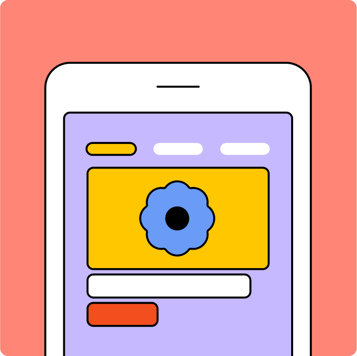
Skeuomorphism is a design style with visual cues (or affordances) that imitate the texture, shape, or function of physical objects. Think of a smartphone keyboard with letters designed to look like analog typewriter keys. Real-world visual cues can make UI elements feel familiar, even intuitive.
Why use skeuomorphism in user interface design?
Key benefits of the skeuomorphic design approach include:
- Relatable digital interfaces. Analog design elements can make users feel at home in the digital world.
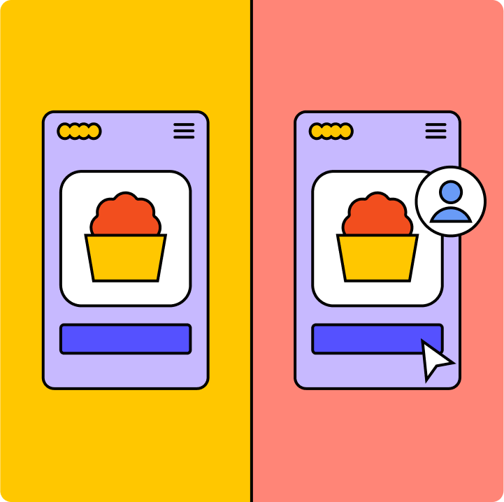
- Improved usability. Familiar visual cues help users navigate a complex graphical user interface, so they can finish tasks faster.
- Enhanced visual appeal. Realistic graphic design elements can elevate a digital design’s look and feel.
3 skeuomorphic design watchouts
Savvy designers need to know how dodge three common skeuomorphic design pitfalls:
- Dated design. Some analog design elements don't age well—just think of Microsoft Office’s floppy disk icon.
- Confusion. Include too many skeuomorphs, and your visual design can look cluttered and overwhelming.
- Performance issues. Highly detailed skeuomorphic design elements can slow load times.
Skeuomorphic design trends—from Apple to Google and beyond
Skeuomorphic design is not a fad. Steve Jobs launched the style in 1984 with the Apple Macintosh computer, featuring iconic graphics that looked like real-world objects: a trash can, calculator, bookshelf, and folders. Microsoft quickly followed suit, introducing skeuomorphs in its operating system. But with Apple's groundbreaking skeuomorphic designs for the iPhone, the style set trends worldwide.
Microsoft and Apple shift to flat design
Fast forward to 2012, when Microsoft released Windows 8. Gone were skeuomorphic design’s drop shadows, gradients, textures, and ornamentation. Windows 8 took a minimalist, "flat" design approach that received mixed reviews. Some users complained that Microsoft oversimplified its design, making it hard to understand and use. But when Apple shifted to flat design for the UI and UX design of Apple’s iOS 7, the usability was noticeably improved.
Google strikes a balance with Material Design
Google added its own spin to interaction design: combine simple, flat design with engaging skeuomorphic elements like shadows, layers, and animation. Google called this distinct design language Material Design, and launched it with open-source code in 2014. This adaptable, accessible design system has been widely adopted across apps and the web.
Skeuomorphism makes a (small) comeback
Neumorphism (aka new skeuomorphism or soft UI) emerged in 2019 to soften the hard, robotic edges of flat design. Neumorphism brings minimalism to life with subtle shadows and low contrasting colors.
Examples of skeuomorphism at work
Skeuomorphic design isn't just for tech. The auto industry used this design approach to help customers make the leap from horse-drawn carriages to cars. Automakers put the motor up front, where a horse would normally stand, and called the engine's force "horsepower."
To make dairy alternatives like oat milk or cashew butter more approachable, the plant-based dairy industry also relies on skeuomorphic design principles. These alternatives imitate dairy’s creamy texture and pale colors to boost their appeal.
3 skeuomorphic design best practices
Skeuomorphic design elements can reduce the time it takes to learn and understand new technologies. Use the following best practices when applying skeuomorphism to your designs:
- Design for your users. Keep your users top of mind when you’re designing. Will your users know how to interact with each UI element? Do your users need a visual cue to help engage them?
- Keep it simple. Don’t clutter your design with unnecessary details. This makes it harder for users to find what they’re looking for.
- Strike a balance. Start with a mostly flat design approach, but add a touch of skeuomorphism to boost usability.
Play with skeuomorphic design elements in Figma
To get inspired, check out the skeuomorphic and neumorphic design examples from Figma's design community. Or just start your own design using Figma’s online design tool. Create interactive prototypes with Figma’s prototyping tool, and you're ready to test and launch.
Need help along the way? Figma’s resource library is packed with design tips and tricks.
Ready to dive into design?
Keep reading

What is UI design
What is UI design today, and what role does it play in the design thinking process?
Learn more

What is visual hierarchy
If everything looks the same, then you see nothing. Visual hierarchy can change that.
Learn more

UI vs UX
Read on to find out what it takes to design engaging UI, and create a memorable UX.
Learn more