39 impressive font pairings to elevate your designs


Share 39 impressive font pairings to elevate your designs
Explore more from
Design basics
Design and prototype with consistent type
Bring type to life in every interaction.

Typography shapes how users experience your designs, influencing emotions, guiding navigation, and leaving a lasting impression. Thoughtful font pairing creates visual structure, enhances readability, and strengthens your design's impact. But with so many fonts available, finding the right combination of fonts for your website can be challenging.
The right font pairing helps you create clear visual hierarchies and memorable designs, whether working on marketing materials, social media posts, or entire brand systems.
Read on to learn:
- 39 font pairings to elevate your designs
- Five pro tips for pairing fonts that look good together
Pairing 1: Abril Fatface + Lato

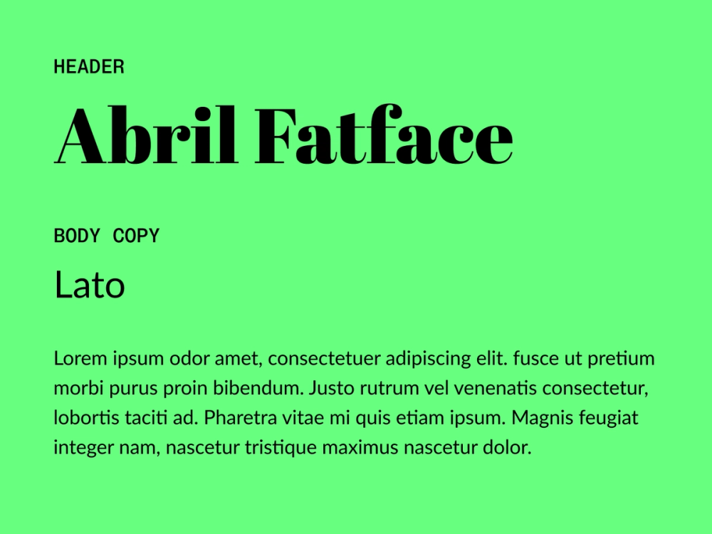
Abril Fatface’s bold, elegant serifs make an impact when paired with Lato’s clean sans serif design. Use Abril Fatface for attention-grabbing headlines and Lato for clear, readable body text.
Best for: luxury brands that want to evoke a sense of sophistication or editorial layouts where a balance between impactful topography and legibility is important
Colophon:
- Abril Fatface: TypeTogether
- Lato: Łukasz Dziedzic
Pairing 2: Fugaz One + Work Sans

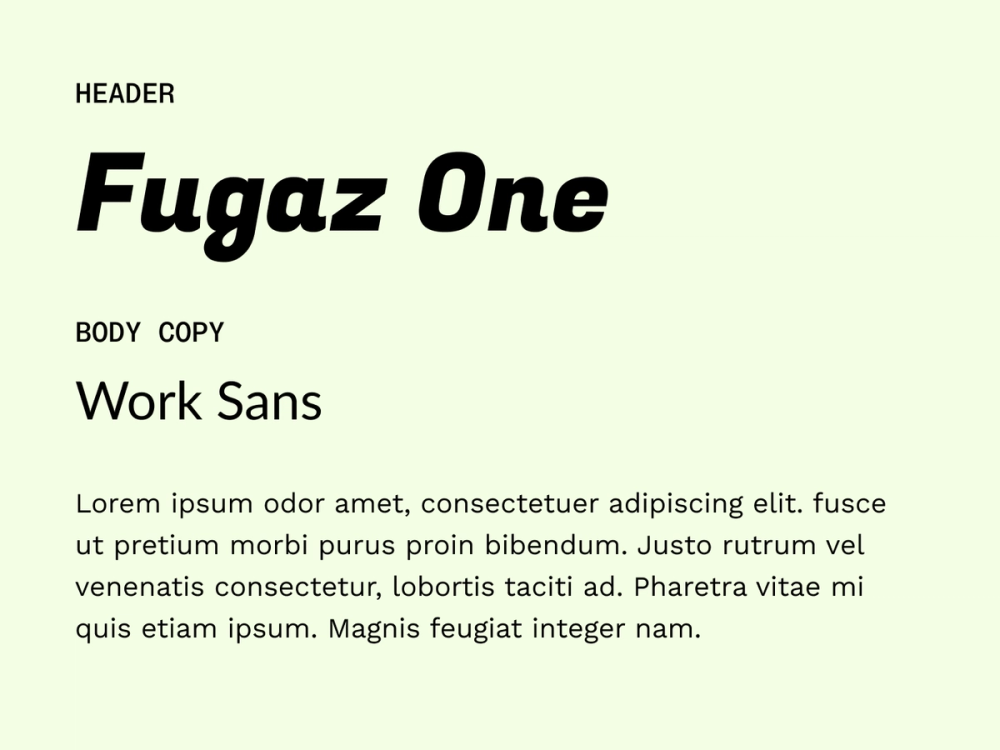
Fugaz One’s geometric italic style brings energy to headlines while Work Sans keeps body text clean and easy to read.
Best for: creative websites, tech companies, and marketing materials where you want to convey approachability without sacrificing professionalism
Colophon:
- Fugaz One: LatinoType
- Work Sans: Wei Huang
Pairing 3: Space Mono + Plus Jakarta Sans

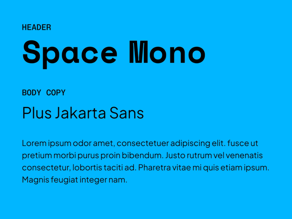
Space Mono’s retro-tech feel pairs well with Plus Jakarta Sans’ friendly and professional vibe. Together, they balance innovation with readability for modern brands.
Best for: brands in the tech space, coding environments, text-heavy content, or design portfolios that want to emphasize innovation and readability
Colophon:
- Space Mono: Colophon Foundry
- Plus Jakarta Sans: Tokotype
Pairing 4: Grand Hotel + Lato

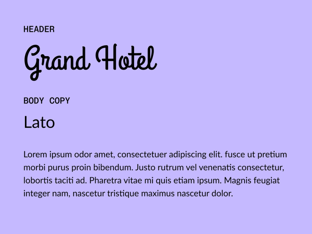
Grand Hotel is a script font that brings elegant handwritten flair to headlines and logos, while Lato’s clean lines ground the design with structured simplicity.
Best for: wedding invitations or websites, boutique branding, and lifestyle brands that want elegance and readability
Colophon:
- Grand Hotel: Astigmatic
- Lato: Łukasz Dziedzic
Pairing 5: Raleway + Merriweather

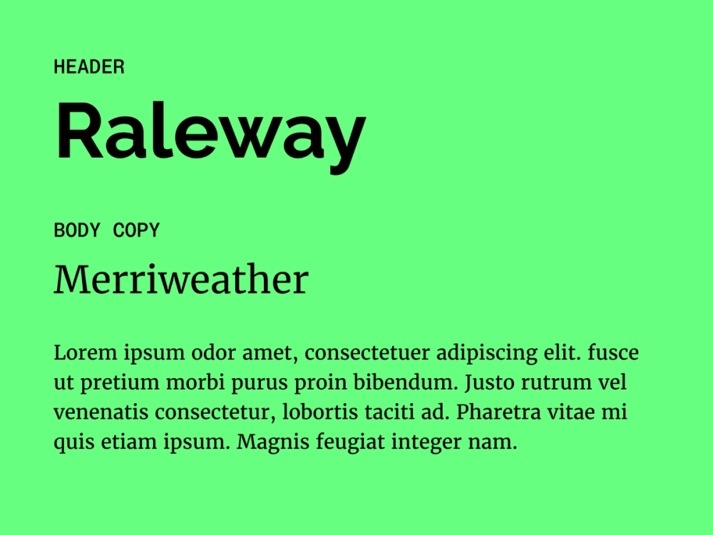
Raleway’s sleek strokes and neo-grotesque-inspired style make headlines stand out, while Merriweather’s classic appearance and condensed letterforms ensure comfortable on-screen reading.
Best for: educational websites, literary journals, or corporate communications where professionalism meets contemporary design
Colophon:
- Raleway: Matt McInerney, Pablo Impallari, Rodrigo Fuenzalida
- Merriweather: Sorkin Type
Pairing 6: Chonburi + Domine

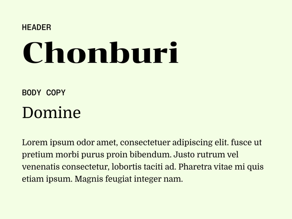
Chonburi’s playful, retro flair pairs naturally with Domine’s approachable style. Chonburi’s thick lines ensure strong on-screen legibility for headlines and subheadings, while Domine’s open spacing and friendly shapes make it ideal for long-form reading.
Best for: news sites, publications, or professional websites that want to establish authority while maintaining readability
Colophon:
- Chonburi: Cadson Demak
- Domine: Impallari Type
Pairing 7: Inter + Krub

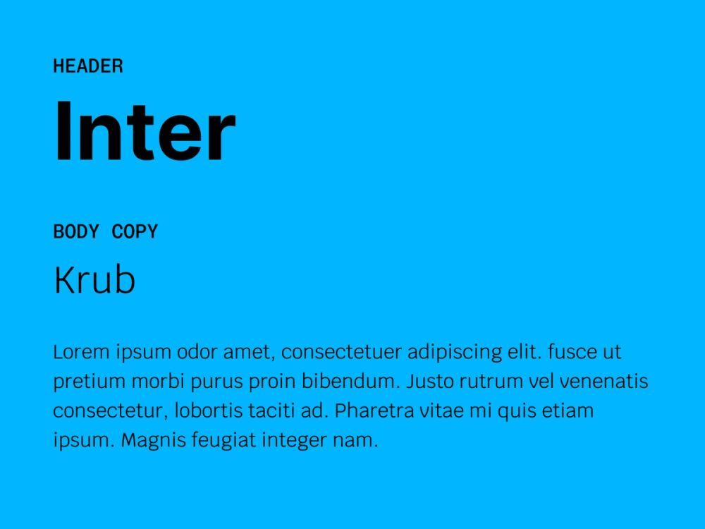
In this modern font pairing, Inter’s clean, contemporary lines contrast nicely with Krub’s distinctive looped letterforms, creating visual interest. Designed for screens, Inter stands out on monitors and mobile devices, while Krub’s balance and clarity make it a good choice for body text.
Best for: tech websites, digital magazines, and marketing materials that aim to blend approachability with a slightly innovative appeal
Colophon:
- Inter: Rasmus Andersson
- Krub: Cadson Demak
Pairing 8: Oswald + Source Serif 4

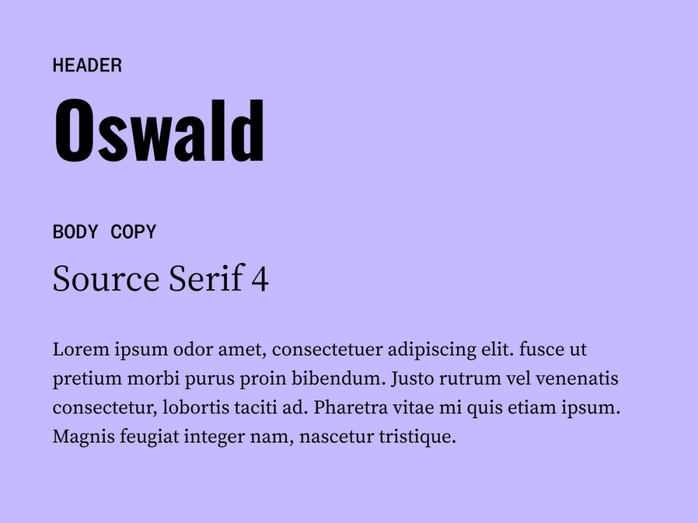
Oswald’s bold and condensed style grabs attention in headers and navigation elements, while Source Serif 4’s refined appearance ensures readability and strengthens visual hierarchy across longer content.
Best for: brands and websites aiming to convey professionalism and trust and responsive websites, where designers must balance a strong visual impact with readability
Colophon:
- Oswald: Vernon Adams, Kalapi Gajjar, Cyreal
- Source Serif 4: Frank Grießhammer
Pairing 9: Arima Madurai + Mulish

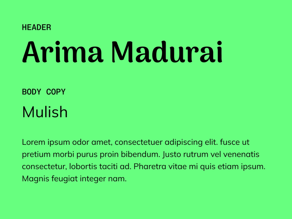
Arima Madurai’s flowing curves add warmth and creativity to headlines, while Mulish’s minimalist style keeps body text polished and easy to read.
Best for: children’s websites, creative portfolios, and lifestyle brands that want to convey creativity while maintaining a professional appearance
Colophon:
- Arima Madurai: Natanael Gama, Joana Correia, Rosalie Wagner
- Mulish: Vernon Adams, Cyreal, Jacques Le Bailly
Pairing 10: Nunito + Lora

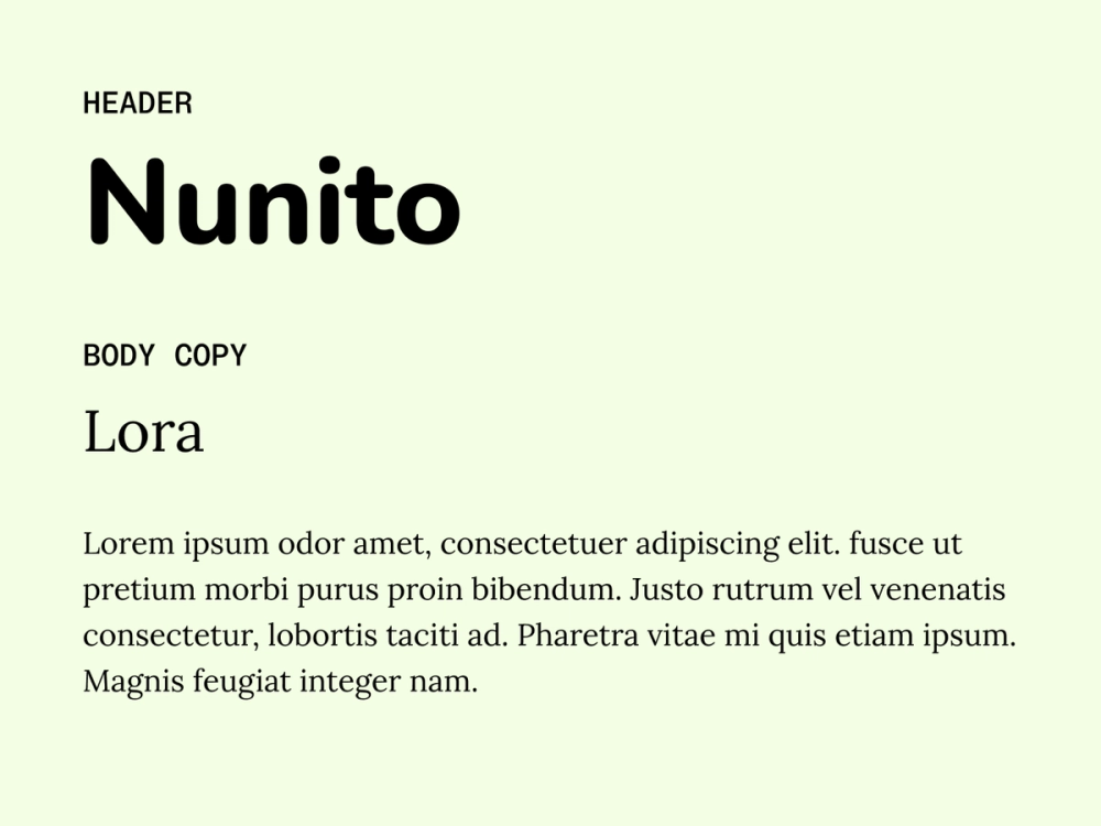
Nunito’s rounded, friendly forms create an inviting tone for headlines, while Lora’s elegant serif styling brings structure and sophistication to body text. Together, they offer a perfect blend of warmth and readability.
Best for: brands and websites that aim to convey approachability, like educational platforms or healthcare websites
Colophon:
- Nunito: Vernon Adams, Cyreal, Jacques Le Bailly
- Lora: Cyreal
Pairing 11: Ultra + Slabo

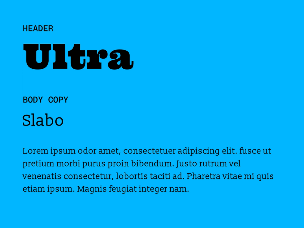
Ultra’s bold slab serif design brings power and personality to headlines, while Slabo’s clean, screen-optimized serif style provides comfortable easy-to-read body text. Together, they deliver a strong visual impact without losing readability.
Best for: editorial designs, music websites, and other creative projects where visual impact is essential
Colophon:
- Ultra: Astigmatic
- Slabo: John Hudson
Pairing 12: Arvo + Lato

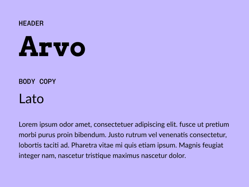
Arvo’s sturdy, geometric slab serifs anchor headlines with authority, while Lato’s clean, humanist influence keeps body text light and readable. This pairing projects both confidence and approachability.
Best for: technical documentation, corporate websites, and modern marketing materials where you want to convey both strength and accessibility
Colophon:
- Arvo: Anton Koovit
- Lato: Łukasz Dziedzic
Pairing 13: Unica One + Crimson Text

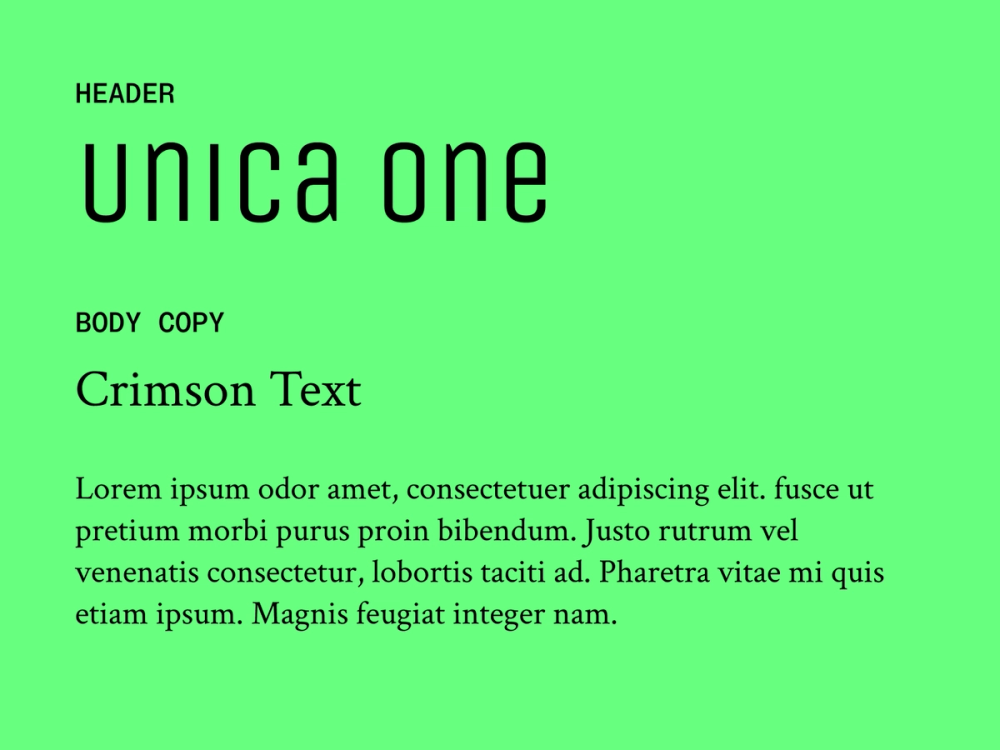
Unica One’s bold, condensed sans serif lines give a crisp, modern edge, while Crimson Text’s classic serif style offers excellent readability for body text. Together, they balance modern structure with timeless appeal.
Best for: luxury brands and high-end magazines or blogs aiming to merge contemporary design with timeless sophistication
Colophon:
- Unica One: Eduardo Tunni
- Crimson Text: Sebastian Kosch
Pairing 14: Cinzel + Fauna One

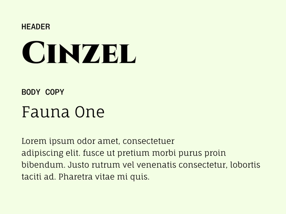
Cinzel, an elegant, Roman-inspired typeface, pairs well with Fauna One’s soft and slightly condensed serifs. Cinzel’s decorative capital letters add grandeur to headlines, while Fauna One’s softer, natural letterforms keep long body text readable and inviting. This pairing feels refined yet accessible.
Best for: projects focused on history, heritage, art, or culture aiming for a refined yet approachable aesthetic
Colophon:
- Cinzel: Natanael Gama
- Fauna One: Eduardo Tunni
Pairing 15: Yeseva One + Josefin Sans

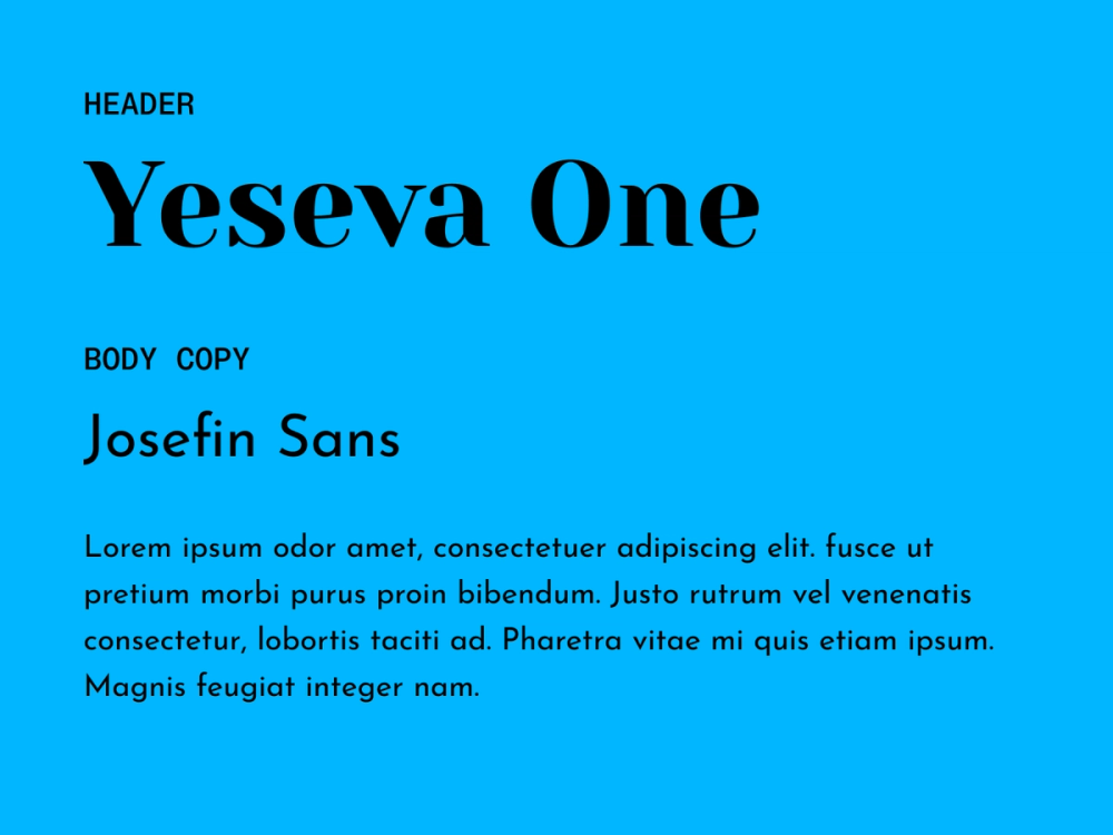
Yeseva One is a display serif font that brings a bold, feminine energy to headlines. Josefin Sans offers clean, geometric balance for body copy. This pairing blends elegance and modernity with a touch of personality.
Best for: fashion, lifestyle, or creative brands looking to merge sophistication and freshness
Colophon:
- Yeseva One: Jovanny Lemonad
- Josefin Sans: Santiago Orozco
Pairing 16: Sacramento + Alice

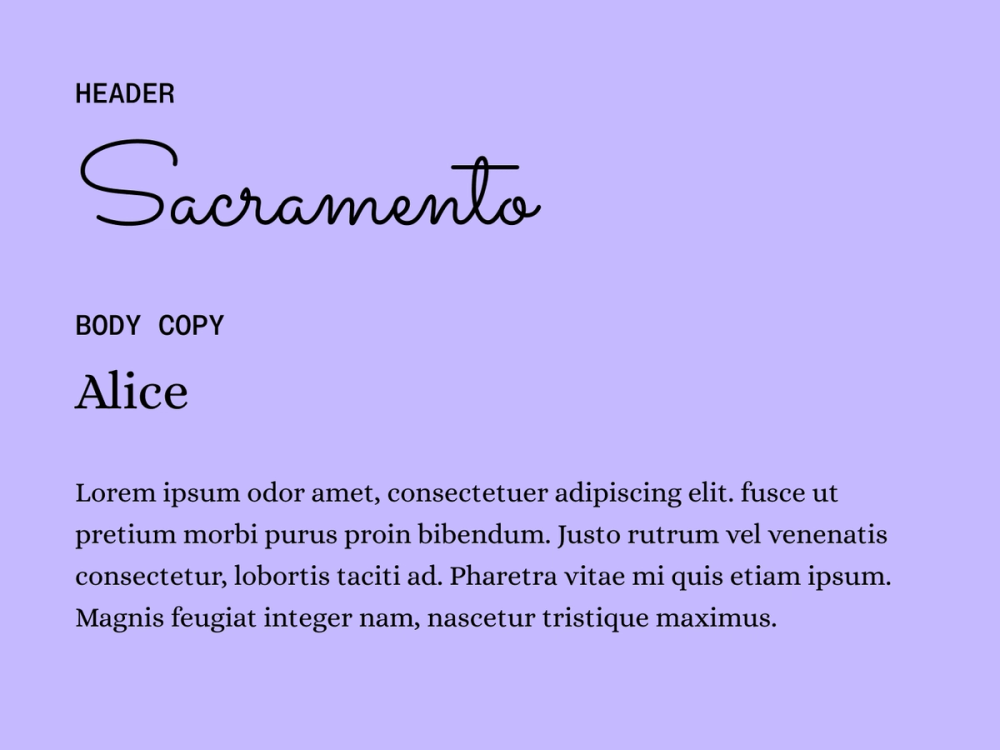
Sacramento is a monoline script with elegant, flowing curves that bring vintage charm to headlines. The serif font Alice complements it with a subtle serif structure that adds readability and a touch of whimsy to body text.
Best for: wedding websites, personal blogs, or projects with a nostalgic or romantic theme
Colophon:
- Sacramento: Astigmatic
- Alice: Ksenya Erulevich, Cyreal
Pairing 17: Roboto + Lora

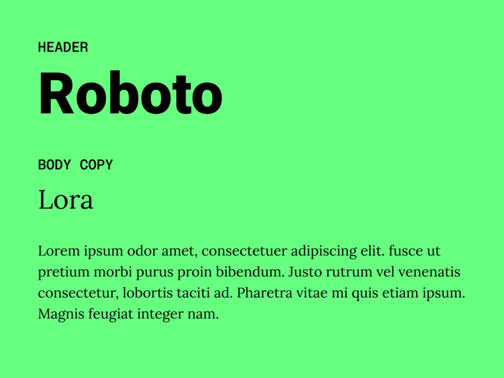
Roboto’s modern sans serif font design gives headlines a bold, contemporary look while remaining approachable and friendly. Lora balances it out with classic serif elegance, offering warmth, sophistication, and smooth readability in longer body text. These fonts create a seamless contrast between modern minimalism and timeless elegance.
Best for: professional websites, blogs, and editorial layouts
Colophon:
- Roboto: Christian Robertson, Paratype, Font Bureau
- Lora: Cyreal
Pairing 18: Montserrat + Karla

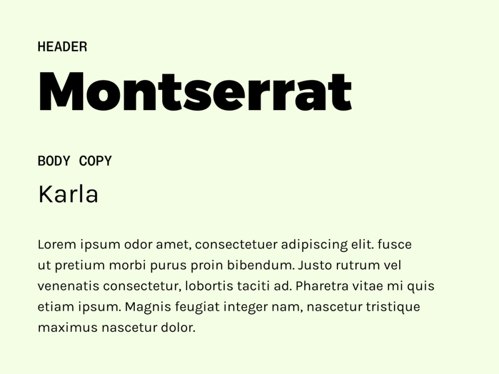
Montserrat's geometric style delivers a bold, polished feel to headlines, while Karla's humanist design ensures a clear, comfortable user experience. The result is a sleek, contemporary pairing with broad usability.
Best for: corporate websites, tech-centric designs, and projects aiming for a polished yet approachable look
Colophon:
- Montserrat: Julieta Ulanovsky, Sol Matas, Juan Pablo del Peral, Jacques Le Bailly
- Karla: Jonny Pinhorn
Pairing 19: Fjalla One + Cantarell

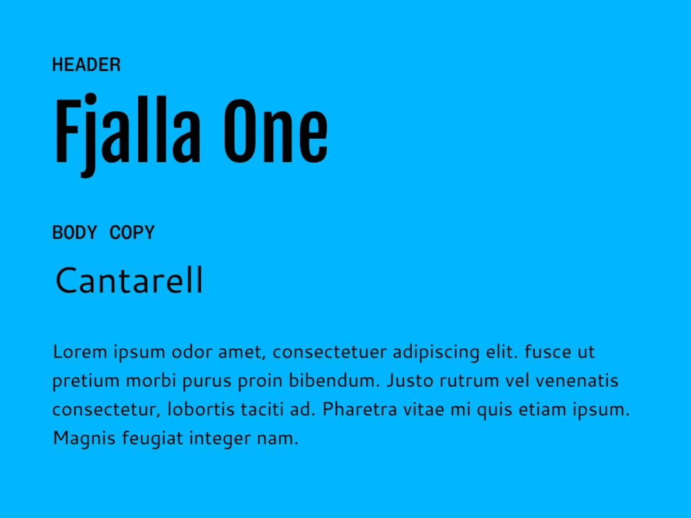
Fjalla One stands out with its tall, bold structure — great for making headlines feel strong and confident. Cantarell is a humanist sans serif typeface that balances that energy with open forms and a friendly tone, making it especially effective in body text on smaller screens. This combination strikes the perfect balance between boldness and simplicity.
Best for: websites, blogs, or marketing materials that want to blend clarity with a modern aesthetic
Colophon:
- Fjalla One: Sorkin Type, Irina Smirnova
- Cantarell: Dave Crossland
Pairing 20: Source Sans Pro + Alegreya

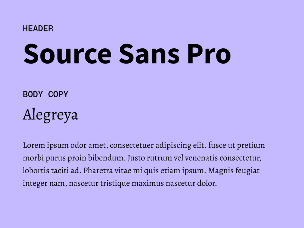
Use Source Sans Pro to create a clean, professional tone in headlines. In contrast, Alegreya brings warmth and rhythm to longer text with its calligraphic serif style. Together, these two fonts are both understated and effective.
Best for: digital publications, literary websites, and educational platforms where readability and professionalism are essential
Colophon:
- Source Sans Pro: Paul D. Hunt
- Alegreya: Juan Pablo del Peral, Huerta Tipográfica
Pairing 21: Stint Ultra Expanded + Pontano Sans

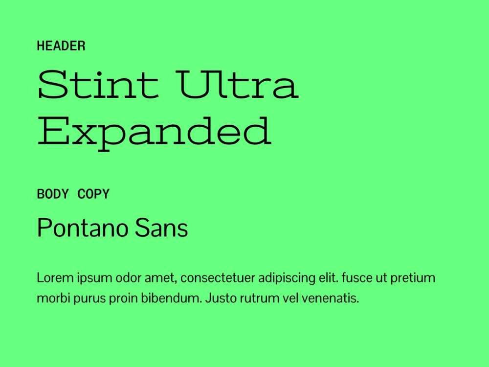
Stint Ultra Expanded is a wide, condensed sans serif type that's highly readable for titles and headings. Pontano San’s clean, geometric design provides a sleek and modern feel for body text, ensuring a seamless contrast with Stint Ultra Expanded's bold style.
Best for: designs that want to make a strong visual impact while maintaining clarity and sophistication
Colophon:
- Stint Ultra Expanded: Astigmatic
- Pontano Sans: Vernon Adams
Pairing 22: Ubuntu + Rokkitt

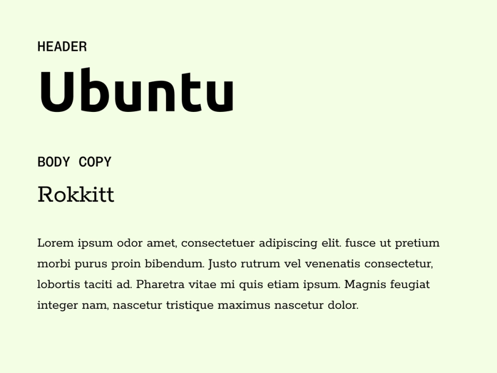
Ubuntu’s friendly curves and modern energy pair beautifully with Rokkitt’s sturdy slab serif structure. The contrast between humanist and geometic styles adds personality without sacrificing professionalism.
Best for: technology websites, digital platforms, and modern businesses that want to maintain professionalism with a touch of personality
Colophon:
- Ubuntu: Dalton Maag
- Rokkitt: Vernon Adams
Pairing 23: Nunito + PT Sans

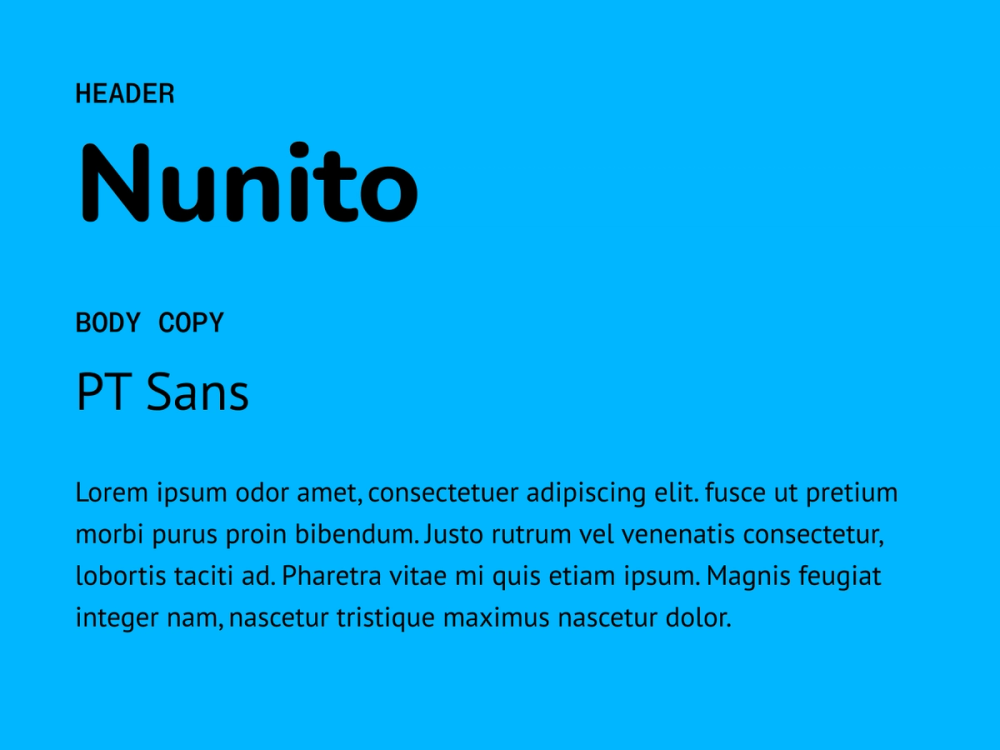
Nunito’s soft, rounded shapes bring a friendly and warm vibe to headlines, while PT Sans anchors the design with its structured, neutral style for body text. This pairing feels both accessible and polished across the different screen sizes.
Best for: websites, blogs, or any design project aiming to achieve a professional yet friendly tone with optimal legibility
Colophon:
- Nunito: Vernon Adams, Cyreal, Jacques Le Bailly
- PT Sans: ParaType
Pairing 24: DotGothic16 + Space Mono

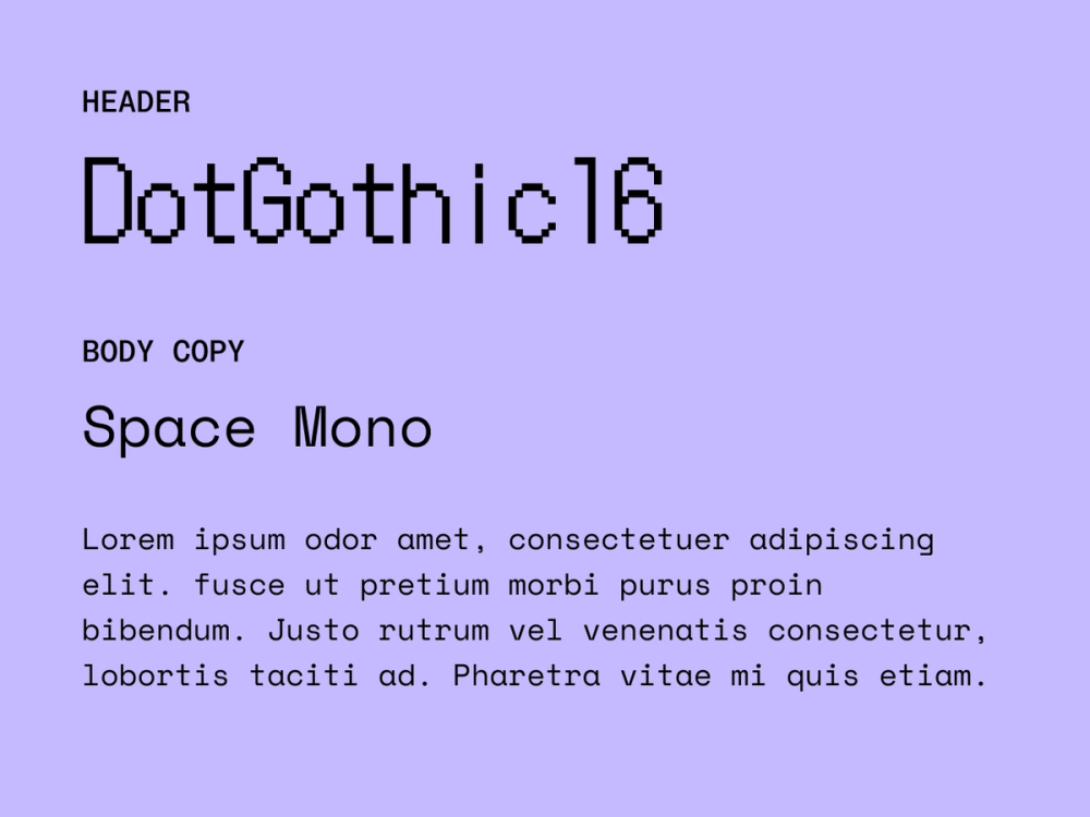
DotGothic16 injects retro pixel-art flair into headlines. Inspired by space exploration and 1960s technology, Space Mono’s monospaced structure provides the clean, technical foundation perfect for readable body text.
Best for: tech or programming-related content and websites, balancing readability with a hint of personality in headlines
Colophon:
- DotGothic16: Fontworks Inc.
- Space Mono: Colophon Foundry
Pairing 25: Playfair Display + Lato

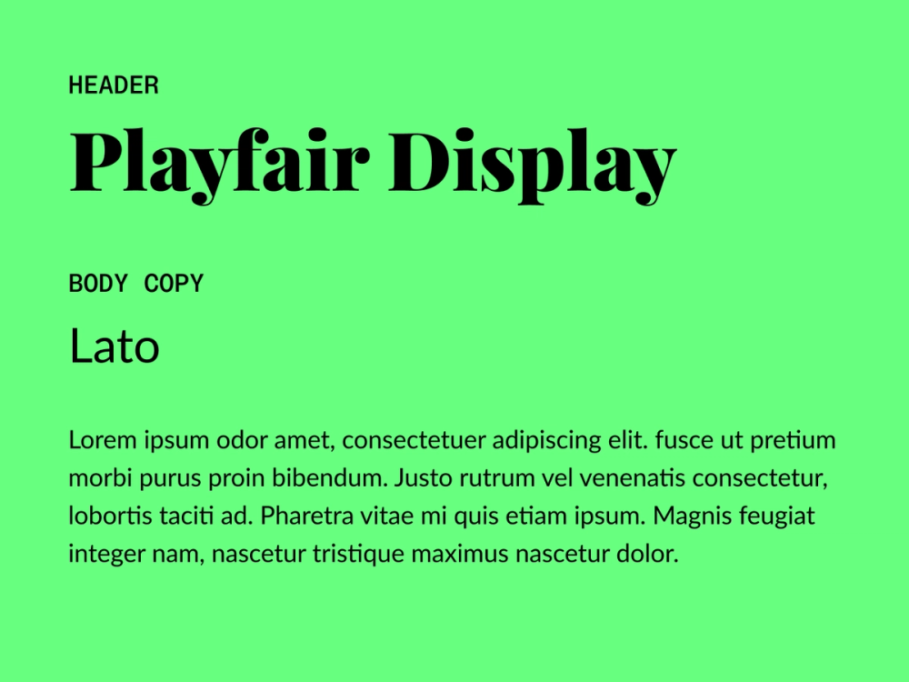
Playfair Display features elegant, high-contrast serifs that create striking and sophisticated headlines and titles. Lato’s neutral and highly readable sans serif design gives body text a friendly tone.
Best for: editorial designs, luxury brands, or other projects that require a refined yet easy-to-read design style
Colophon:
- Playfair Display: Claus Eggers Sørensen
- Lato: Łukasz Dziedzic
Pairing 26: Quicksand Bold + Quicksand Regular

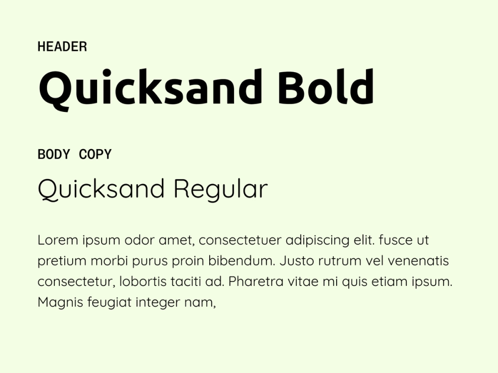
Using different weights within the Quicksand family creates a clean and cohesive design. Quicksand Bold brings energy to headlines with a modern, rounded appearance, while Quicksand Regular ensures body text stays friendly and easy to read.
Best for: playful, youthful designs, offering consistency without sacrificing visual interest
Colophon:
- Quicksand Bold: Andrew Paglinawan
- Quicksand Regular: Andrew Paglinawan
Pairing 27: Syne + Inter

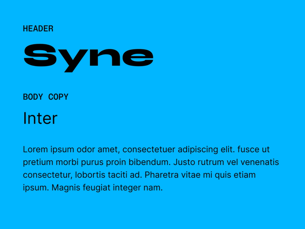
Syne’s bold, expanding forms add character with a unique visual effect to headlines. It pairs seamlessly with Inter’s streamlined design, which makes body text crisp and highly legible. This pairing feels fresh and user-friendly.
Best for: websites or projects in the tech and design fields that prioritize clarity and innovation
Colophon:
- Syne: Bonjour Monde, Lucas Descroix, George Triantafyllakos
- Inter: Rasmus Andersson
Pairing 28: Yellowtail + Rethink Sans

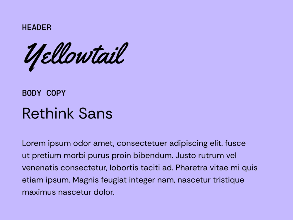
Yellowtail’s retro, brush-script charm grabs attention in headlines with its unique character. Rethink Sans, a clean and contemporary sans serif font, keeps body text grounded and easy to read. The contrast adds just the right amount of playfulness
Best for: restaurants, event promo, creative or fashion-forward brands that embrace a retro aesthetic while prioritizing readability
Colophon:
- Yellowtail: Astigmatic
- Rethink Sans: Hans Thiessen
Pairing 29: Rufina + Average Sans

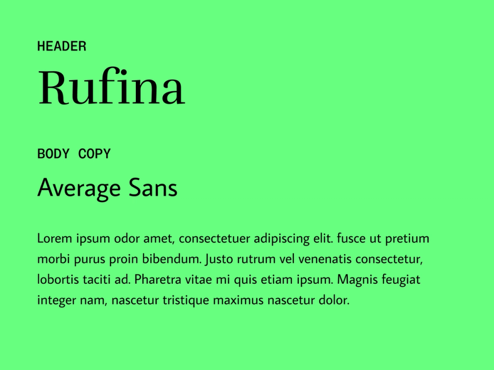
Rufina’s classic serif style adds elegance and simplicity to headlines. Average Sans balances things out with its neutral, straightforward approach to body text, keeping designs equal parts fresh and timeless.
Best for: editorial or professional designs that aim for a refined yet fresh look, ensuring easy readability
Colophon:
- Rufina: Martin Sommaruga
- Average Sans: Eduardo Tunni
Pairing 30: Poiret One + Montserrat

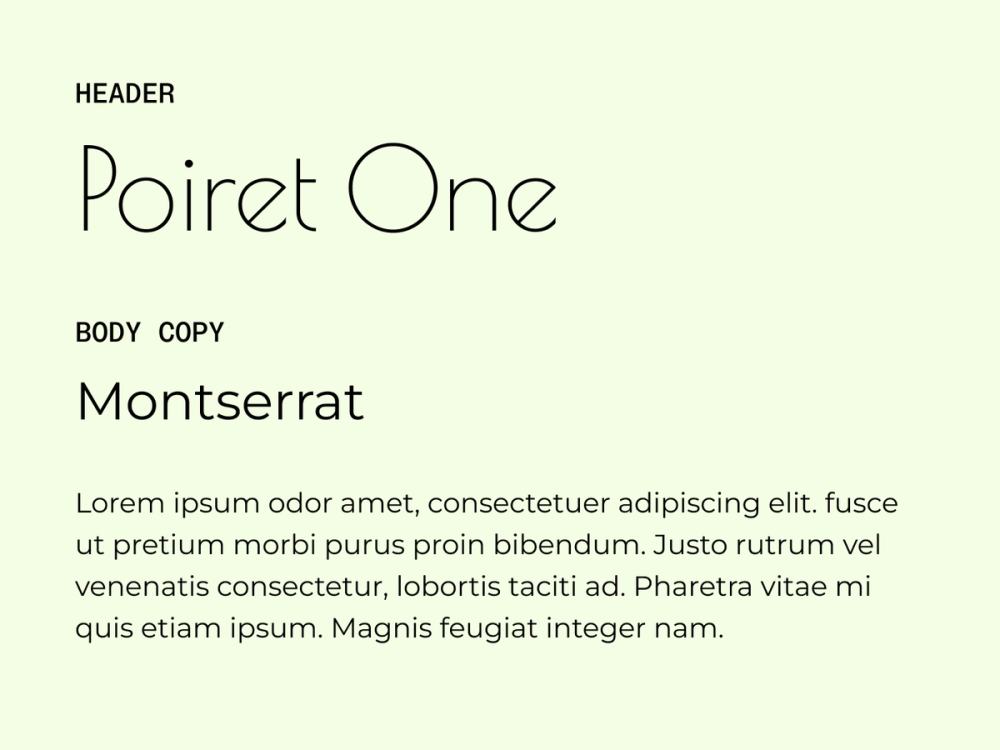
Poiret One’s Art Deco-inspired geometry delivers striking, stylish headers and titles, while Montserrat’s clean, urban sans serif structure ensures body text feels modern and readable.
Best for: projects that aim to convey a sense of style and luxury, creating a bold visual impact
Colophon:
- Poiret One: Denis Masharov
- Montserrat: Julieta Ulanovsky, Sol Matas, Juan Pablo del Peral, Jacques Le Bailly
Pairing 31: Sintony + Poppins

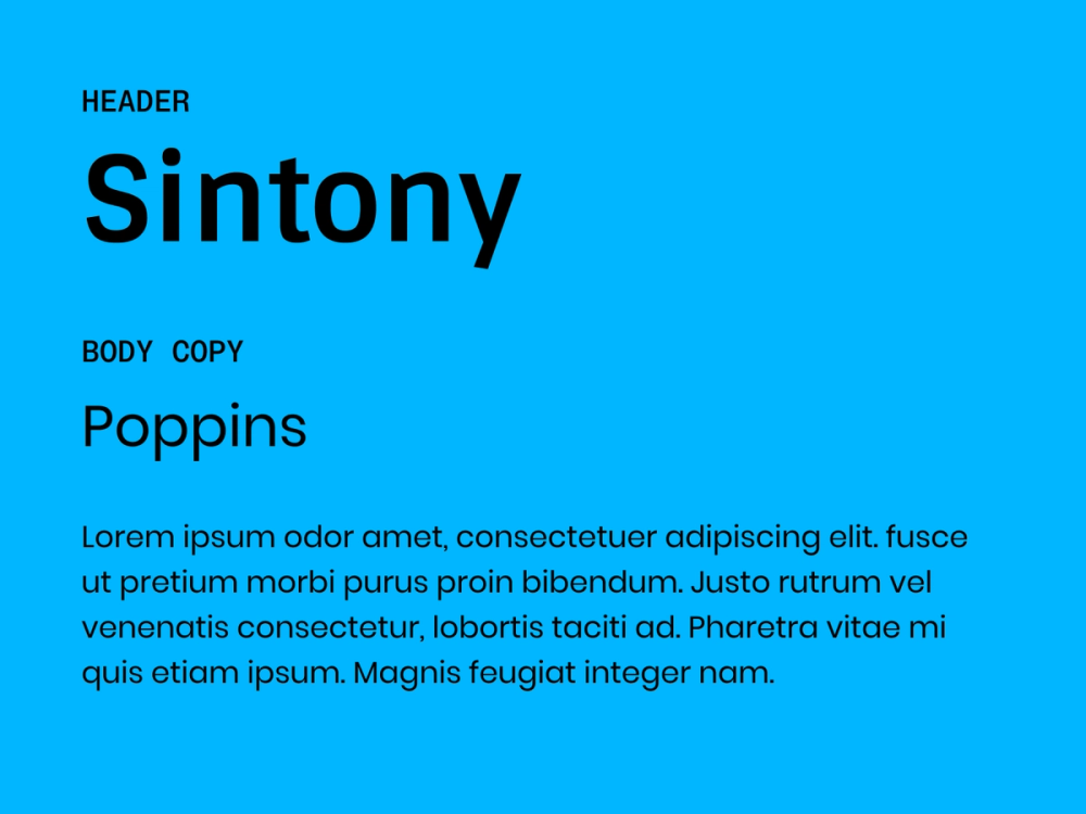
Sintony’s slightly square structure adds a touch of sophistication to headers. With its clean and geometric sans serif shape, Poppins keeps body text approachable and easy to read, creating a friendly yet professional tone.
Best for: tech, creative, or educational projects, providing a friendly yet professional feel
Colophon:
- Sintony: Eduardo Rodriguez Tunni
- Poppins: Indian Type Foundry, Jonny Pinhorn, Ninad Kale
Pairing 32: Philosopher + Mulish

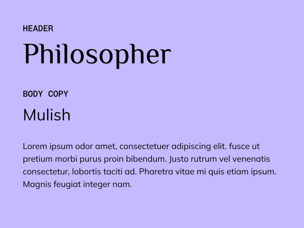
Philosopher adds an elegant touch to headers with its modern serif styling. While it works well for headlines, its versatility and legibility also make it suitable for body text and logo designs. Mulish’s minimalist sans serif design ensures smooth, readable body text. Together, they balance timeless appeal with functionality.
Best for: literary content or educational websites that want to create a timeless yet approachable appearance
Colophon:
- Philosopher: Jovanny Lemonad
- Mulish: Vernon Adams, Cyreal, Jacques Le Bailly
Pairing 33: Cardo + Hind

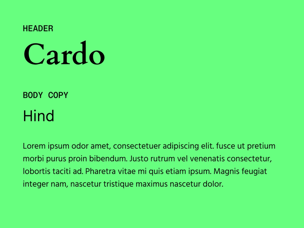
Cardo is a large Unicode font with a classical style specifically designed for scholars and linguists. With its classic, scholarly feel, it works well for headlines and pairs nicely with Hind, a clean sans serif font that keeps body text easy to read. This pairing is a great mix of tradition and function.
Best for: historical, educational, or literary projects that blend modern elements with traditional formats
Colophon:
- Cardo: David Perry
- Hind: Indian Type Foundry
Pairing 34: Bubblegum Sans + Open Sans

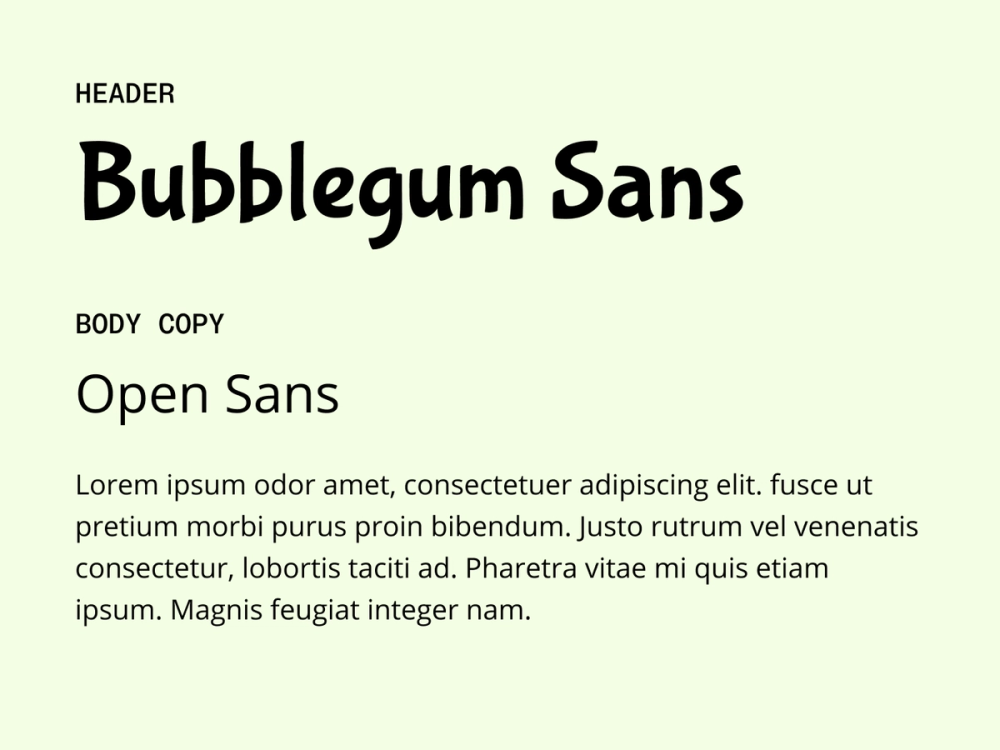
Bubblegum Sans brings a playful energy to headlines with its rounded, friendly shapes, making it perfect for headlines. Opens Sans keeps body text grounded with its clean, neutral style.
Best for: creative platforms or children’s websites wanting a light-hearted and casual appearance
Colophon:
- Bubblegum Sans: Sudtipos
- Open Sans: Steve Matteson
Pairing 35: Archivo Narrow + Tenor Sans

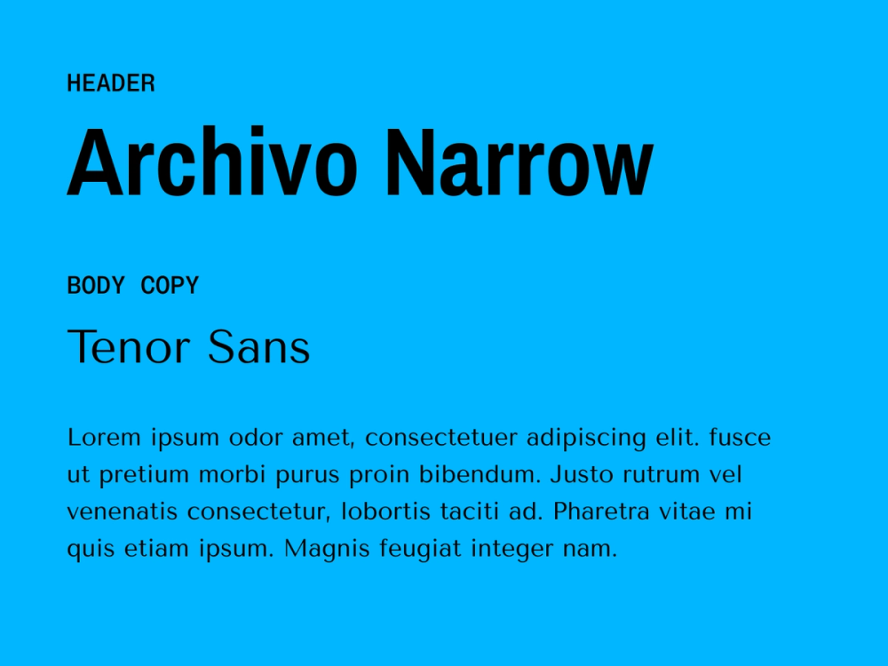
Archivo Narrow’s condensed, bold style is great for tight headline spaces, while Tenor Sans adds clarity and elegance to body text.
Best for: corporate websites, editorial layouts, or advertising designs where space may be tight
Colophon:
- Archivo Narrow: Omnibus-Type
- Tenor Sans: Denis Masharov
Pairing 36: Rethink Sans + Spectral

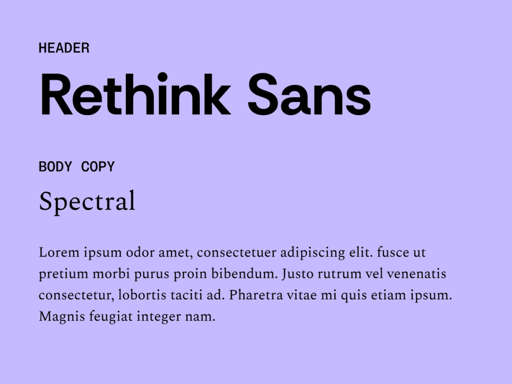
Rethink Sans offers a crisp, modern aesthetic for headlines, while Spectral adds warmth and readability to body text with its refined serif style. This pairing offers a harmonious blend of clarity, elegance, and visual appeal.
Best for: professional websites, corporate documents, and editorial content that values both readability and a contemporary aesthetic
Colophon:
- Rethink Sans: Hans Thiessen
- Spectral: Production Type
Pairing 37: Crimson Serif + DM Sans

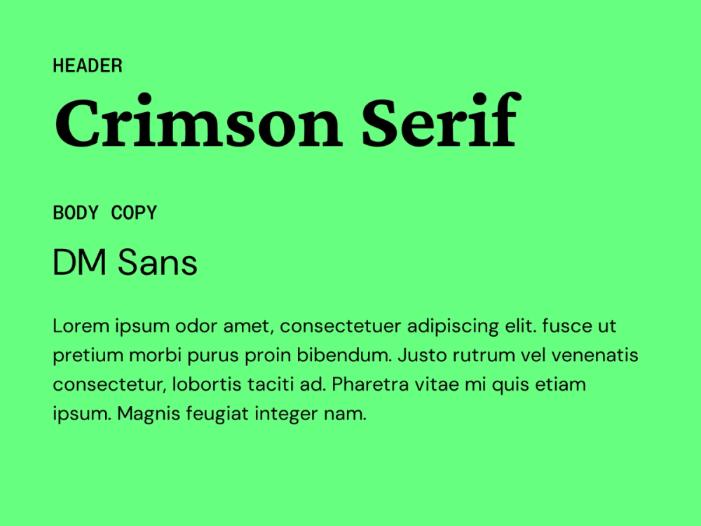
Crimson Serif brings a touch of tradition and authority to headings, while DM Sans’ minimalist geometric style keeps the body text clean and modern. Combining them strikes a balance between classic and modern — ideal for designs that want to convey both established and forward-thinking.
Best for: websites or publications that want to convey a sense of history and credibility while maintaining a modern design sensibility
Colophon:
- Crimson Serif: Sebastian Kosch
- DM Sans: Colophon Foundry
Pairing 38: Young Serif + Instrument Sans

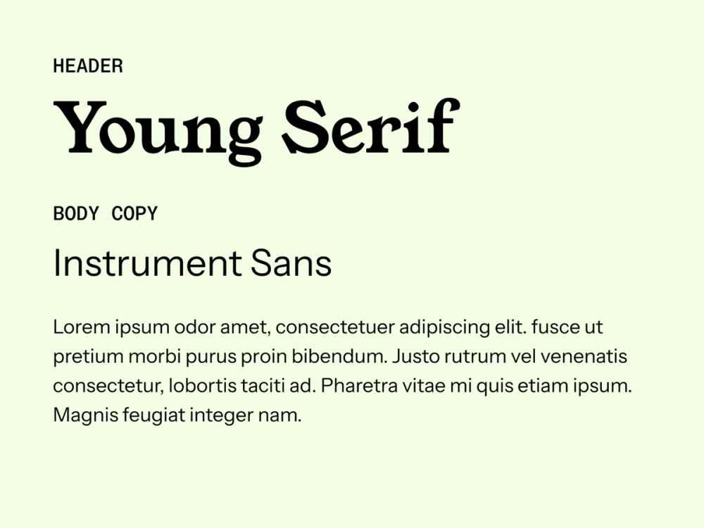
Young Serif is a display typeface that adds character and flair to headings. Instrument Sans provides keeps things clear and grounded in the body text. Use this pairing to bring personality to your titles without sacrificing clarity in the main text.
Best for: art and design websites, creative portfolios, and projects that need a balance of artistic expression and readability
Colophon:
- Young Serif: Bastien Sozeau
- Instrument Sans: Rodrigo Fuenzalida, Jordan Egstad
Pairing 39: Instrument Sans + Geist

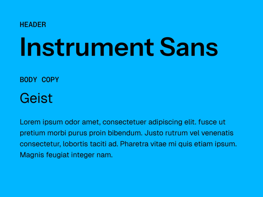
Instrument Sans and Geist are both clean, modern sans serifs. Pairing them creates cohesion with just enough contrast to guide the eye. The subtle differences in their letterforms can establish a visual hierarchy without disrupting the clean and minimalist feel.
Best for: digital interfaces, tech websites, and any project that prioritizes a clean, modern, and highly functional typographic style
Colophon:
- Instrument Sans: Rodrigo Fuenzalida, Jordan Egstad
- Geist: Andrés Briganti, Mateo Zaragoza, Guillermo Rauch, Evil Rabbit, José Rago, Facundo Santana
Five pro tips for pairing fonts
Transform your approach to typography by keeping these pro tips to font pairing in mind:
- Create meaningful contrast. Pair fonts with different weights and x-heights to establish a clear visual hierarchy and guide readers through content.
- Master spacing fundamentals. Pay close attention to kerning (letter spacing) and leading (line height) to maintain readability and visual balance.
- Leverage font families. Many fonts come with multiple weights (light, regular, bold) and styles (italic, condensed). Use them to create variation while keeping your design cohesive.
- Prioritize readability. Choose fonts with clean, clear letterforms and appropriate x-heights, especially for smaller sizes and digital screens. Even decorative headlines should maintain legibility.
- Test across contexts. Preview your font combinations on different screens, resolutions, and backgrounds to ensure consistent clarity and visual impact.
Start designing with Figma
Choosing fonts is all about balancing style and readability. Good font pairings can enhance your message and bring personality to any design, whether you're aiming for a modern look or a timeless feel.
If you’re ready to use impactful typography to make your designs stand out, Figma can help. Here’s how:
- Explore Figma’s font library to learn more about font types and how to pair them.
- Browse the Figma Community to find font pairings and design examples recommended by fellow creatives.
- Start creating with Figma’s design tool and access OpenType and variable fonts that give you better stylistic control.
Font Pairings That Just Work
Explore expert font combinations and apply them in Figma — It’s free to try