How to create a one-page website in four steps


Share How to create a one-page website in four steps
Explore more from
Design basics
From wireframe to website, faster
Design, prototype, and refine every page.


Facing a tight deadline for developing a website? Or need a quick way to show off an awesome product, service, or event? A one-page website can be a lifesaver in these scenarios.
One-page websites put all the important information on one scrollable page, making navigation easy for users and production even simpler for designers and developers.
When you’re short on time or developer resources, here’s everything you need to know about one-page websites and how to build them.
Read on to learn:
- Use cases for a one-page website
- Advantages of a one-page website
- The steps for making a one-page website
- Tips for creating a one-page website
What is a one-page website?
A one-page website presents all content on a single, scrollable page. Rather than navigating through separate pages, visitors find everything—from company information to contact details—organized in sequential sections.
You’ll often see one-page websites for use cases like:
- Launching a new product or service
- Promoting a specific campaign or event
- Creating a simple online presence for a small business
- Building a personal portfolio or resume
Multi-page websites spread content across separate pages, each accessed through menus and navigation links.
Here's how the two approaches compare:
| Best for | Pros | Cons | |
|---|---|---|---|
| One-page website | Small businesses, single product/service launches, even promotions, portfolios | Easier and faster to build and maintain, great for simple messages and focused content, provides a smooth, guided user experience | Can be overwhelming with too much content, limited SEO opportunities for multiple keywords, can be slower to load if not optimized, not ideal for complex navigation |
| Multi-page website | Larger businesses with lots of products/services, websites with extensive information, E-commerce stores | Can handle a lot of content, allows for complex navigation and site structure, better for SEO when targeting many keywords | More complex and time-consuming to build and maintain, can be more expensive to develop and host, requires careful planning of site structure and navigation, can lead to a fragmented user experience if not designed properly |
Benefits of one-page websites
One-page websites prioritize simplicity and efficiency, offering several key advantages:
- Content focus. If you have a concise message or only need to present a small amount of information, a one-page design keeps it clean and focused.
- Cross-device compatibility. Because all your content is on a single page, ensuring your website looks great and functions flawlessly on all devices is generally easier. This responsive design is crucial for effectively reaching a wider audience.
- Resource efficiency. One-page websites are often less expensive to develop and host because they typically use a static vs. dynamic website structure, which serves pre-built files rather than pulling from a complex database.
- Quick deployment. The simplified structure and development process means you can launch your site much faster than a traditional multi-page website.
- User experience. A one-page website allows you to guide users through a clear and intuitive journey. This makes directing them toward specific calls to action easier and creates a narrative flow that unfolds as the user scrolls down the page.
Four steps to create a one-page website
Creating a one-page website is straightforward, especially when broken down into these manageable steps.
Step 1: Plan your site
Even though they have a simpler structure, one-page websites still require careful planning to be effective. Here are the key elements to consider:
- Define your goals. Focus on primary objectives—lead generation, product promotion, or brand awareness.
- Identify your audience. Understanding your target users shapes content and design decisions. Create user personas to pinpoint demographics, interests, needs, and online behavior.
- Structure your content. Organize content into logical sections that guide the user down the page.
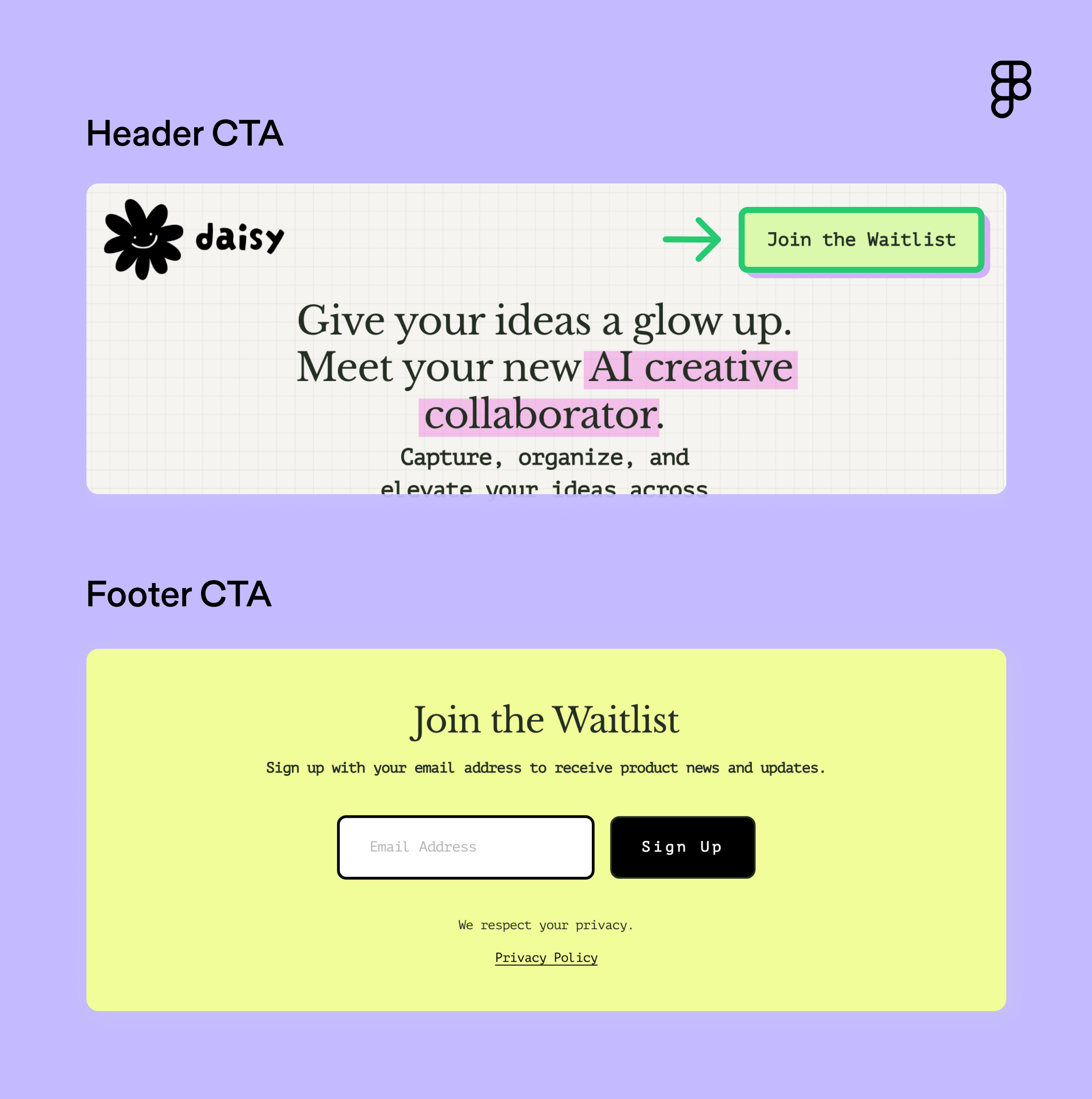
- Create strong calls to action (CTAs). Make every CTA count. Daisy AI does this well by including CTAs that stand out visually in the header and footer. The language is actionable and directs the user toward one clear action.

Step 2: Create a wireframe
A wireframe is a basic visual representation of your website’s layout, showing the placement of key elements without focusing on visual design details like colors, fonts, or images.
This helps visualize the flow of information with key elements like:
- Header. Create a strong visual hierarchy and clear navigation.
- Hero section. Craft a compelling headline and subheading.
- Content sections. Organize your content into easy-to-read sections.
- CTA. Encourage visitors to take action (e.g., sign up, contact, purchase).
- Footer. Include contact information, social media links, and copyright information.
Kick off the process by quick sketching with Figma’s wireframe kits. Once you’re ready to create more detailed mockups, use the wireframe tool to collaborate with your team.
Step 3: Design your layout
Now it’s time to bring your one-page website to life visually. Find design inspiration in the Figma Community. Search for “one-page templates” to browse designs you can customize and adapt to your needs.
Keep these design principles in mind:
- Embrace simplicity. A clean, minimalist design is often best for one-page websites. Avoid clutter with clear layouts, white space, and a limited color palette.
- Optimize for mobile-first design. Make sure your website looks great on all devices with responsive design techniques. This ensures your layout adapts seamlessly to different screen sizes.
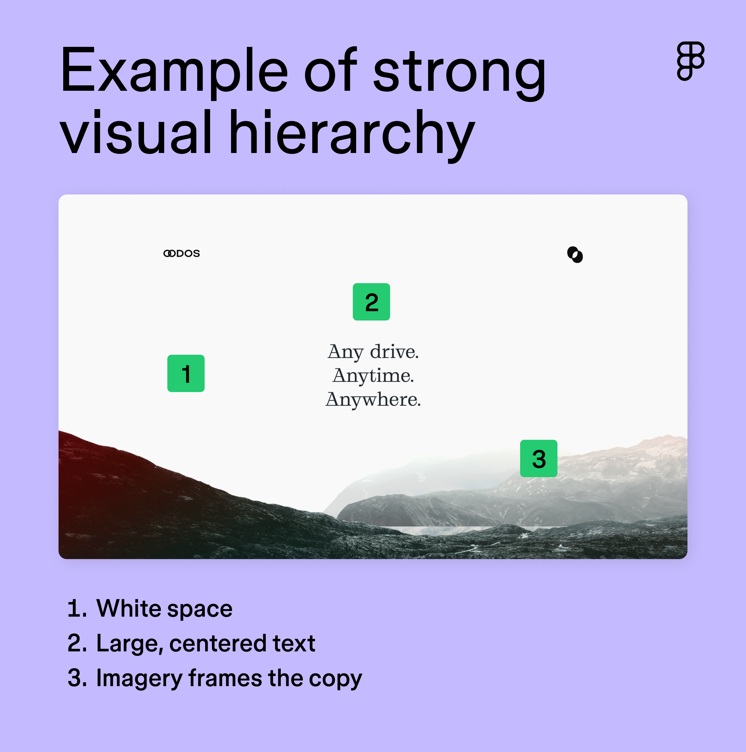
- Prioritize visual hierarchy. Use font size, color contrast, and spacing to strategically guide the user’s eye. OODOS’ site highlights its headline with white space, large, centered text, and imagery that frames the copy.

Step 4: Build your site
This stage focuses on combining all the details and ensuring everything works seamlessly. Tap into Dev Mode to connect design and coding. It streamlines the handoff process between designers and developers by allowing annotations and specifications for details like animations, responsiveness, and measurements.
Nail down the rest of these details before crossing the finish line:
- Write compelling copy. Use clear and concise language. Remember, less is often more on a one-page website.
- Add high-quality images. Use visually appealing images to break up text and enhance the overall design. High-resolution images are crucial (compressed to reduce file size without sacrificing quality, of course).
- Implement on-page SEO best practices. Naturally incorporate target keywords into your headings, body text, title tag, and meta description. These should be phrases your target audience is likely to search for.
- Test on different devices. Make sure your website looks and functions correctly on various devices and browsers.
- Check for broken links and errors. Fix any issues before launching. A broken link or typo can negatively affect your website’s credibility.
- Publish your website. Make your website live and share it with the world.
Tips for designing a strong one-page website
Creating a compelling one-page website requires careful consideration of design principles and user experience. Here are some key tips to build a website that not only looks great but also achieves its intended purpose:
- Leverage white space. Create visual hierarchy and improve readability with strategic spacing. It gives the eye a break and prevents the design from feeling cluttered.
- Consider color psychology. Colors evoke different emotions and associations. For example, the color red evokes excitement, making it a common choice for food or entertainment brands.
- Prioritize loading times. Optimize your images and code then test with Google's PageSpeed Insights and see what needs improvement.
- Maintain brand voice. Keep tone and style consistent to reinforce brand identity.
- Consider sticky navigation. Keep your navigation menu visible as users scroll down the page. Anyone.Events’ site features a sticky navigation bar that offers jump links to sections throughout the page. This keeps time to value low and provides an easy user experience.
- Gather feedback. Ask friends, family, and colleagues to test your website and provide feedback.
- Use analytics tools. Once your site is live, track performance and collect data to gain insights into user behavior, such as which sections are most popular, how long users stay on your page, and where they click.
Design a beautiful one-page website with Figma
No matter how many pages it has, building a great website takes planning, smart design, and teamwork. Figma simplifies this process for designers, developers, and business owners alike. Here’s how:
- Discover pre-built Web design templates to get a head start on your wireframes.
- Use Figma’s Web design tool to visualize how your site will function, map out the flow between sections, and create responsive designs that adapt seamlessly to different devices.
- Hand off your designs with Dev Mode, which allows developers to inspect designs, grab code snippets, and integrate your work into their existing setup easily.
Try Figma Sites
Ready to design your one-page website?
Keep reading


Website layout ideas
Learn 12 website layout ideas to engage your audience and how Figma can help in this guide.


Static vs dynamic websites
Discover the advantages, drawbacks, and differences of static vs. dynamic websites.

Web design and development
Learn the key differences between Web design and development and their roles in creating stunning and functional websites.