Mint green is a light, cool-toned green that embodies freshness and tranquility. This crisp color sits between green and blue on the color wheel, reminiscent of fresh mint leaves. It’s a green diluted with white and a hint of blue often used for springtime design elements.

Color variations
Shades
Tints
Tones
Hues
Color harmonies
Complementary
Split
Monochromatic
Analogous
Triadic
Square
Custom palettes
Herbal Harmony
Lotus Garden
Spearmint
Mint green is represented by the following color codes and values to ensure consistency across various digital platforms and devices.
- HEX code: #ADEBB3
- RGB value: 67.8% red, 92.2% green, and 70.2% blue
Accessibility considerations play a crucial role in UX and UI design color choices. Figma offers plugins in the Community to make sure your designs meet Web Content Accessibility Guidelines.
Here are some ways to use mint green in your designs:
- Draw attention. A splash of mint green’s lightness can make buttons and CTAs stand out without being aggressive.
- Create a clean background. Mint green works exceptionally well as a background color in UI design due to its lightness that isn’t too harsh on the eyes.
- Evoke calmness. Mint green hues evoke calmness and tranquility, making it perfect for health, wellness, and productivity interfaces.
Keep in mind that color and its meaning can change from culture to culture—and at any given time. If you are designing for a global audience, research color considerations for your specific regions.
For variations within the same calmness as mint green, consider:
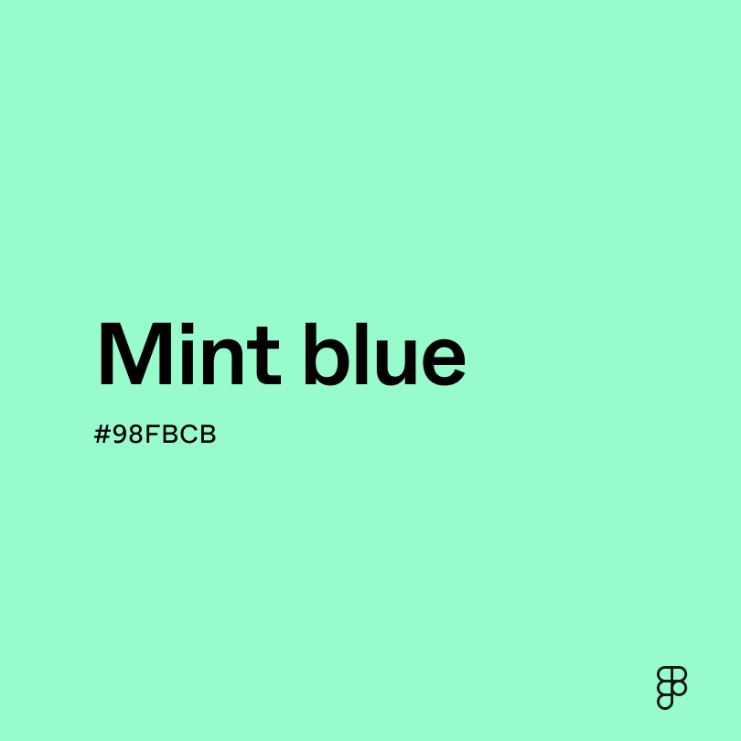
- Mint blue (#98FBCB) is a tad more blue than mint green.
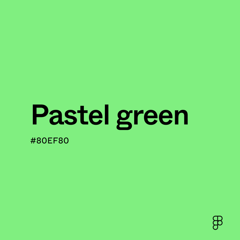
- Pastel green (#80EF80) brings a similar lightness as mint green but is more toned down.
- Celadon (#A8DCAB) is a muted shade of green with hints of blue and gray.
- Green sage (#98A869) evokes the same feelings of nature and tranquility as mint green but is a bit more dusty.
To complement mint green’s coolness, consider pairing it with:
- White (#FFFFFF) aids in mint green’s clean and airy aesthetic.
- Forest green (#2E6F40) is a darker hue that evokes the same sense of nature as mint green.
- Peach (#FFD3AC) creates a youthfulness that brings out mint green’s brightness.
- Lavender (#D3D3FF) complements mint green’s sense of calmness and peace.
Other colors worth considering include charcoal gray to balance mint green’s airy aesthetic, navy blue for a nautical or coastal look, and coral to inject a dose of youthful energy.
While mint green is a refreshing hue, it may clash with:
- Mint blue (#98FBCB) could make a design appear flat when paired with a similar low-contrast hue like mint green.
- Brown (#895129) creates too much contrast with mint green and can disrupt the visual harmony.
- Neon green (#2CFF05) can create visual chaos rather than cohesion when this fluorescent hue pairs with the calmness of mint green.
- Yellow (#FFFF00) is overly saturated and can clash with mint green’s tranquil energy.
- Orange (#FFA500) competes for attention because it doesn’t harmonize with mint green’s coolness.
Mint green evokes the crispness of fresh mint leaves and is often associated with springtime, new beginnings, and serenity. This color connects to nature and is commonly used to signify freshness and vitality.
In color psychology, mint green promotes feelings of renewal, tranquility, growth, and inspiration. It is perceived as a soothing color across many cultures, often related to freshness and prosperity. Its calming effect makes it suitable for environments that aim to reduce stress and encourage creativity.
For UI/UX design, mint green offers a calming user experience. It embodies a fresh and contemporary aesthetic that is inviting and gentle. Mint green is an excellent background color that coincides with lighter neutral colors and even some contrasting hues for balance.
Mint green was officially recognized in the early 20th century, though the color likely existed in pigments and fabrics long before it was named. Its popularity surged during the Art Deco era, which was known for its embrace of geometric shapes and new materials. During this period, mint green symbolized modernity and sophistication.
Over time, mint green's connotations evolved to represent youthful energy, eco-friendliness, and a connection to nature. Today, it is frequently used in product design, ceramics, glassware, clothing, and accessories to evoke a natural and cheerful ambiance.
Contrast Checker
Contrast 1.37
- Large Text
#ADEBB3
- Normal Text
How you design, align, and build matters. Do it together with Figma.
| Category | ||
|---|---|---|
Fail | Fail | |
Fail | Fail | |
Fail | Fail |
Contrast 15.31
- Large Text
#ADEBB3
- Normal Text
How you design, align, and build matters. Do it together with Figma.
| Category | ||
|---|---|---|
Pass | Pass | |
Pass | Pass | |
Pass | Pass |
Color simulations
Protanopia
Deuteranopia
Tritanopia
Achromatopsia
The hexadecimal color #ADEBB3, known as mint green, has RGB values of R:173 G:235, B:179 and CMYK values of C:26, M:0, Y:24, K:8.
| VALUE | CSS | |
|---|---|---|
| HEX | #ADEBB3 | #ADEBB3 |
| RGB DECIMAL | 173, 235, 179 | RGB(173, 235, 179) |
| RGB PERCENTAGE | 67.8, 92.2, 70.2 | RGB(67.8%,92.2%,70.2%) |
| CMYK | 26, 0, 24, 8 | |
| HSL | 125.8°, 60.8, 80 | HSL(125.8°, 60.8%, 80%) |
| HSV (OR HSB) | 125.8°, 26.4, 92.2 | |
| WEB SAFE | #99FFCC | #99FFCC |
| CIE-LAB | 87.753, -30.364, 21.012 | |
| XYZ | 55.076, 71.554, 53.555 | |
| xyY | 0.306, 0.397, 71.554 | |
| CIE-LCH | 87.753, 36.925, 145.317 | |
| CIE-LUV | 87.753, -30.727, 35.644 | |
| HUNTER-LAB | 84.589, -31.81, 21.675 | |
| BINARY | 10101101, 11101011, 10110011 | |
| iOS - SwiftUI | Color(red: 0.678, green: 0.922, blue: 0.702) | |
| iOS - UIKit | UIColor(red: 0.678, green: 0.922, blue: 0.702, alpha: 1) | |
| Android - Compose | Color(0xFFADEBB3) |