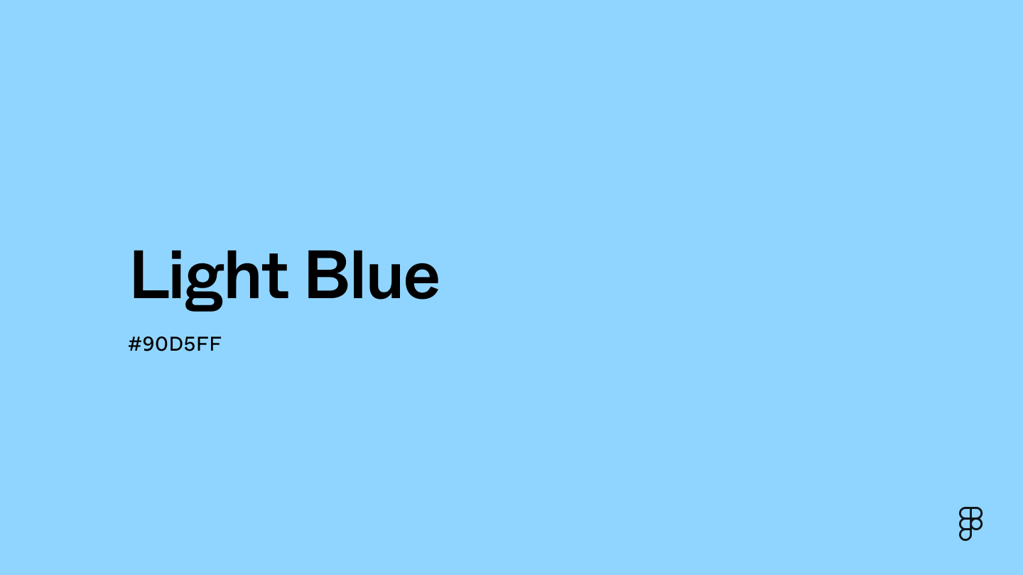
Light blue is a serene, delicate shade with a calming and airy feel. It sits between blue and green on the color wheel—a cooler hue known for its soothing qualities. Light blue ranges from soft sky tones to more vivid aquamarine hues.

Color variations
Shades
Tints
Tones
Hues
Color harmonies
Complementary
Split
Monochromatic
Analogous
Triadic
Square
Custom palettes
Calm blue
Coastal Sunrise
Mermaid’s Tail
Light blue is defined by the following color codes and values to ensure consistency across various digital platforms and devices.
- HEX code: #90D5FF
- RGB value: 56.5% red, 83.5% green and 100% blue
Accessibility considerations play a crucial role in UX and UI design color choices. Figma offers plugins in the Community to make sure your designs meet Web Content Accessibility Guidelines.
Light blue offers a versatile color for UI design, promoting feelings of calmness, trust, and freshness. Here are some effective ways to integrate it into your interfaces:
- Promote calmness. Use light blue for backgrounds or base elements to create a peaceful and serene user experience. This can be particularly effective for meditation apps, sleep trackers, or spa websites.
- Encourage trust. Light blue's psychological association with reliability makes it a great choice for health, finance, or security apps where building trust is essential.
- Enhance readability. Light blue can improve text readability and highlight key information when paired with contrasting colors. Consider a light blue background with dark grey text for optimal contrast.
- Experiment with tone. Light blue encompasses a range of shades and tints. Paler variations like baby blue can create an ethereal feel, while slightly darker tones like sky blue add depth. Explore this range to find the perfect tone for your design's mood.
Keep in mind that color and its meaning can change from culture to culture—and at any given time. If you are designing for a global audience, research color considerations for your specific regions.
For variations within the same serene and refreshing spectrum as light blue, consider:
- Sky blue (#87CEEB) captures the essence of a clear, unclouded sky, slightly more subdued but equally as tranquil as light blue.
- Powder blue (#B0E0E6) offers a softer, more muted version with a touch of green, embodying the gentle calm of light blue.
- Baby blue (#8FD9FB) appears slightly lighter, evoking a sense of youthful innocence and serenity similar to light blue.
- Cyan (#00FFFF), while more vibrant, shares light blue's airy and open vibe, embodying the crisp clarity of tropical waters.
To complement light blue's tranquil tones, consider pairing it with:
- Soft coral (#F88379) provides a warm, inviting contrast that beautifully highlights the coolness of light blue.
- Cool gray (#CBCBCB) introduces a subtle, modern backdrop that allows light blue to stand out without overwhelming.
- Cream (#FDFBD4), a warm, soft hue, complements light blue's brightness, creating a delicate and inviting atmosphere.
- Peach (#FFD3AC) offers a gentle, warm embrace that seamlessly blends with the serene quality of light blue.
- Celadon (#A8DCAB) adds a refreshing, harmonious touch, echoing the calm and rejuvenating feel of a serene escape.
Other colors worth considering include navy blue for a classic, nautical vibe, lavender for a soft, whimsical palette, and white for a crisp, clean look that amplifies the airy feel of light blue.
While light blue is versatile, it may clash with:
- Bright red (#FF0000) can be too overpowering against the soft backdrop of light blue, creating a stark and potentially jarring contrast.
- Neon orange (#FFA500) presents an overly vibrant energy that might disrupt the peaceful and serene vibe of light blue.
- Dark brown (#654321), while a natural earth tone, may dull the freshness of light blue, resulting in a less harmonious and appealing contrast.
- Lime green (#89F336), with its high intensity, can detract from the serene and refined quality of light blue, leading to a visually unsettling palette.
- Hot pink (#FF69B4), although lively, may clash with light blue by competing for visual dominance rather than complementing its tranquility.
Light blue, evoking the serene sky and tranquil sea, embodies tranquility, peace, and calmness. Its soothing presence universally instills a sense of serenity and mental clarity. Culturally, light blue symbolizes freshness and innovation.
Psychologically, light blue represents trustworthiness and reliability, promoting relaxation and clear thought—almost like a visual breath of fresh air. Its calming influence proves especially valuable in environments that reduce stress and enhance focus.
In UI/UX design, light blue's calming and trustworthy qualities make it a popular choice for creating open and reassuring user interfaces. Its ties to innovation and freshness invigorate design elements, making it a go-to color for brands that aim to convey creativity and forward-thinking.
Though blue has been connected to the heavens and royalty for millennia, the concept of a distinct "light blue" shade is a more recent development.
The 18th-century Rococo era saw a surge in popularity for light and airy aesthetics, solidifying the appreciation for light blue tones. However, it wasn't until 1915 that the term "light blue" was first documented in English.
Before the 1940s, blue was sometimes linked to femininity, while pink leaned towards masculinity. This trend eventually reversed, with light blue becoming a common choice for baby boys' clothing and decor.
Today, light blue transcends its early gender-specific associations. It's embraced in national flags, corporate branding, and various design applications.
Contrast checker
Contrast 1.6
- Large Text
#90D5FF
- Normal Text
How you design, align, and build matters. Do it together with Figma.
| Category | ||
|---|---|---|
Fail | Fail | |
Fail | Fail | |
Fail | Fail |
Contrast 13.15
- Large Text
#90D5FF
- Normal Text
How you design, align, and build matters. Do it together with Figma.
| Category | ||
|---|---|---|
Pass | Pass | |
Pass | Pass | |
Pass | Pass |
Color simulations
Protanopia
Deuteranopia
Tritanopia
Achromatopsia
The hexadecimal color #90D5FF, known as light blue, has RGB values of R:144, G:213, B:255 and CMYK values of C:0.44, M:0.16, Y:0, K:0.
| VALUE | CSS | |
|---|---|---|
| HEX | 90D5FF | #90D5FF |
| RGB DECIMAL | 144, 213, 255 | rgb(144,213,255) |
| RGB PERCENTAGE | 56.5, 83.5, 100 | rgb(56.5%,83.5%,100%) |
| CMYK | 44, 16, 0, 0 | |
| HSL | 202.7°, 100, 78.2 | hsl(202.7,100%,78.2%) |
| HSV (OR HSB) | 202.7°, 43.5, 100 | |
| WEB SAFE | 99CCFF | #99CCFF |
| CIE-LAB | 82.236, -11.006, -27.285 | |
| XYZ | 53.342, 60.735, 103.515 | |
| xyY | 0.245, 0.279, 60.735 | |
| CIE-LCH | 82.236, 29.421, 248.032 | |
| CIE-LUV | 82.236, -32.588, -42.323 | |
| HUNTER-LAB | 77.933, -14.207, -24.199 | |
| BINARY | 10010000, 11010101, 11111111 | |
| iOS - SwiftUI | Color(red: 144/255, green: 213/255, blue: 255/255) | |
| iOS - UIKit | UIColor(red: 144/255.0, green: 213/255.0, blue: 255/255.0, alpha: 1.0) | |
| Android - Compose | Color(0xFF90D5FF) |