Orange is the vibrant secondary color between red and yellow on the color wheel. When used in the proper settings, it evokes feelings of playfulness and excitement. You can create lighter, joyful hues of orange by adding more yellow or a darker, intense orange by adding more red.

Color variations
Shades
Tints
Tones
Hues
Color harmonies
Complementary
Split
Monochromatic
Analogous
Triadic
Square
Custom palettes
Citrus Infusion
Celestial Citrine
Phoenix Rising
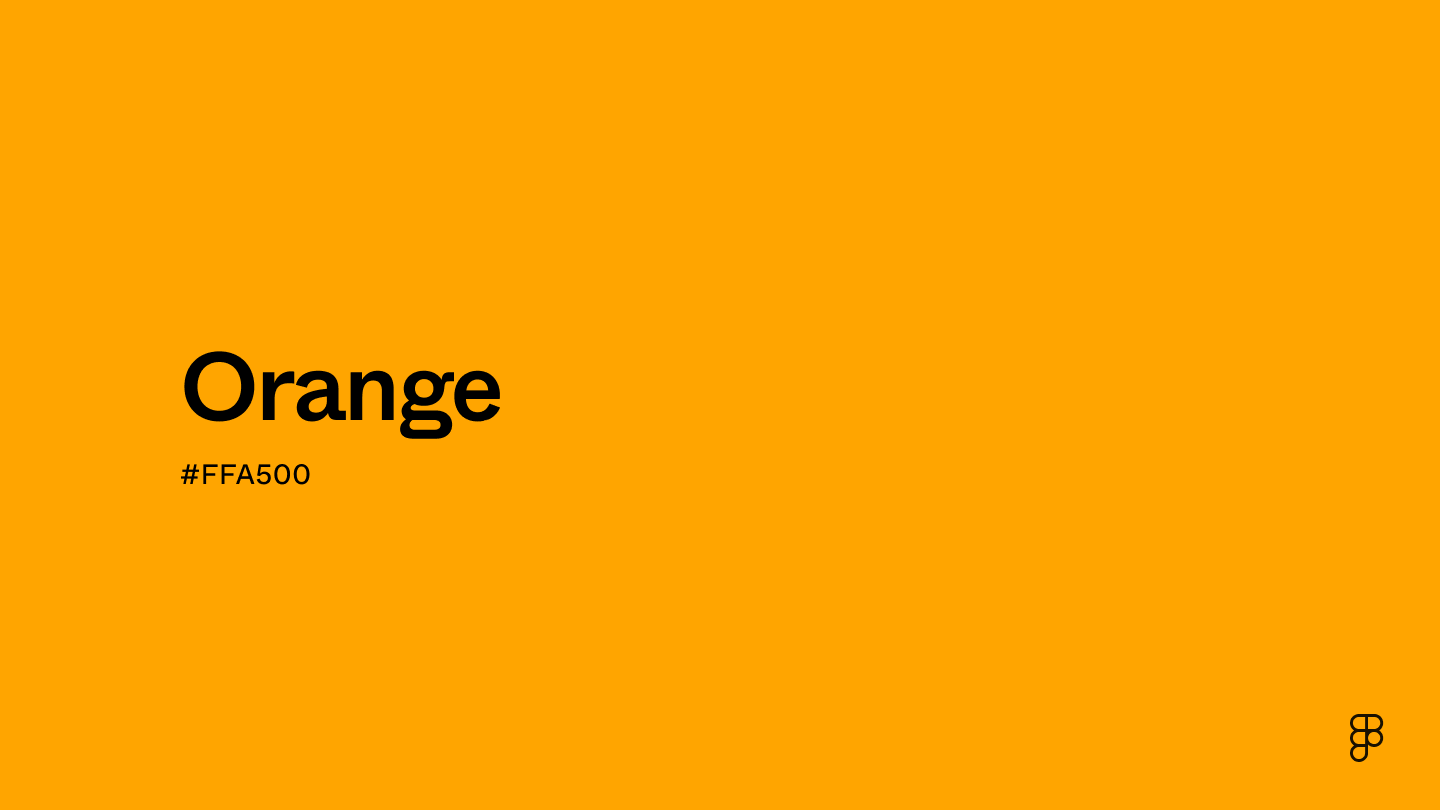
To achieve consistency across multiple platforms and devices, use the specific color codes related to orange.
- HEX code: #FFA500
- RGB value: 100% red, 64.7% green, and 0% blue
Accessibility considerations play a crucial role in UX and UI design color choices. Figma offers plugins in the Community to make sure your designs meet Web Content Accessibility Guidelines.
Here are some ways to use orange in your designs:
- Indicate important or clickable areas. Use orange for elements that need to feel dynamic and engaging, like hover effects or other interactive elements.
- Highlight calls to action. Pair orange with a neutral background to make text or buttons pop.
- Guide viewers with accents. Use orange for accents in icons or illustrations to add a pop of color and guide the viewer’s eye.
- Indicate progress with visual cues. Orange can be used to indicate positive progress or the completion of tasks, forms, or processes within the UI.
Keep in mind that color and its meaning can change from culture to culture—and at any given time. If you are designing for a global audience, research color considerations for your specific regions.
For variations within the same energetic spectrum as orange, consider:
- Red (#FF2C2C) is a bold, stimulating color that matches the energetic warmth of orange.
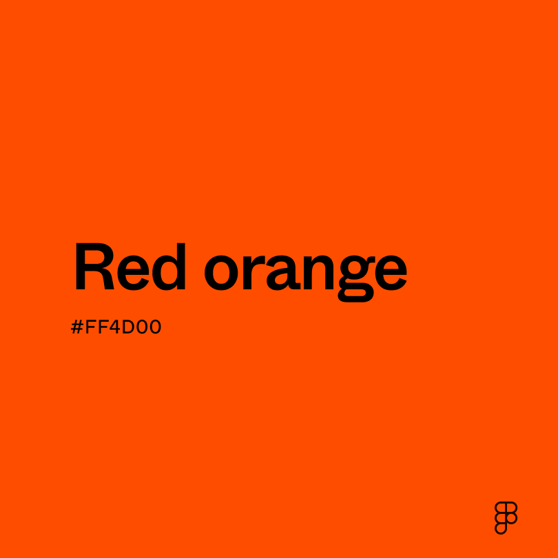
- Red-orange (#FF4B33) is orange-infused with the fiery intensity of red, making it bolder and more dramatic.
- Yellow-orange (#FFB800) capitalizes on the cheerful essence of orange with a lighter touch.
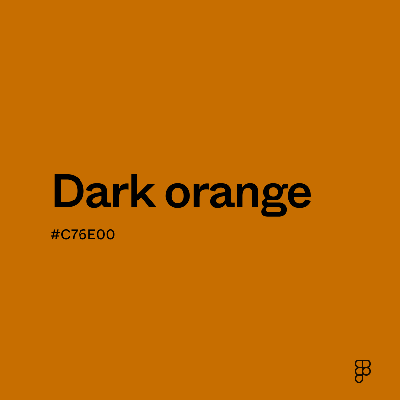
- Dark orange (#C76E00) shares orange’s warmth but with a deeper intensity.
Orange pairs beautifully with color palettes that enhance or tone down its vibrancy, like deep blues or neutral creams. To complement orange, consider pairing it with:
- Navy blue (#000080) is a complementary color that contrasts well with orange.
- Charcoal (#4A4A4A) is versatile and mature, which pairs nicely with orange’s vibrant and joyful energy.
- Cream (#FDFBD4) creates a natural warmth when paired with orange.
- Black (#000000) offers a bold and dramatic statement for any design.
Brighter accents like teal or purple also make bold color palettes with orange. While they make more of a statement, these colors add a pop of energy and lean into the playfulness of orange.
While orange is bright and bold, it may clash with:
- Neon green (#2CFF05) can create an extreme visual contrast when paired with orange.
- Brown (#895129) paired with orange can make a design look flat because there’s not enough contrast to make either color pop.
- Fuchsia (#FE3894) with orange can create an intense look where the orange seems at odds with the vibrant fuchsia.
- Emerald green (#00674F) and orange create a strong contrast that can be jarring. It’s like presenting two opposing energies at once.
Orange's vibrant energy captures the spirit of enthusiasm and symbolizes friendship, happiness, and even prosperity. Across diverse cultures, orange holds varied meanings. In Greek mythology, gods dressed in orange often represented immortality, while in Eastern religions such as Hinduism and Buddhism, orange is revered as a sacred color.
Color psychologists often associate orange with emotions and attitudes that inspire action or optimism. This includes encouraging creativity, self-expression, and a sense of playfulness.
In UI design, orange is frequently used to prompt action through CTA buttons, convey warnings or alerts, and emphasize critical information. Its vibrant energy lends a friendly and creative impression, making it a popular choice for brands with similar identities, like Dunkin’ Donuts or Reese’s.
The word “orange” derives from the Old Persian word “nārang,” which refers to the bitter orange fruit. The English word “orange” also appeared in the 12th century and was likely derived from the French word “orenge.”
This intense color was a favorite among artists like Vincent van Gogh. You can find representations of orange across a variety of his paintings.
Orange had another breakout moment during the 20th century when it was primarily used for theatrical stage decorations and costume embellishments. Once the dye became more commercially available, it was associated with affordability and joyfulness.
Contrast checker
Contrast 1.97
- Large Text
#FFA500
- Normal Text
How you design, align, and build matters. Do it together with Figma.
| Category | ||
|---|---|---|
Fail | Fail | |
Fail | Fail | |
Fail | Fail |
Contrast 10.63
- Large Text
#FFA500
- Normal Text
How you design, align, and build matters. Do it together with Figma.
| Category | ||
|---|---|---|
Pass | Pass | |
Pass | Pass | |
Pass | Pass |
Color simulations
Protanopia
Deuteranopia
Tritanopia
Achromatopsia
The hexadecimal color #FFA500, known as orange, has RGB values of R:255 G:165 , B:0 and CMYK values of C:0, M:35, Y:100, K:0.
| VALUE | CSS | |
|---|---|---|
| HEX | ffA500 | #ffA500 |
| RGB DECIMAL | 225, 165, 0 | RGB(255,165,0) |
| RGB PERCENTAGE | 100, 64.7, 0 | RGB(100%,64.7%,0%) |
| CMYK | 0, 35, 100, 0 | |
| HSL | 38.8°, 100, 50 | HSL(38.8,100%,50%) |
| HSV (OR HSB) | 38.8°, 100, 100 | 38.8°, 100, 100 |
| WEB SAFE | FF9900 | #FF9900 |
| CIE-LAB | 74.935, 23.929, 78.949 | |
| XYZ | 54.697, 48.174, 6.418 | |
| xyY | 0.5, 0.441, 48.174 | |
| CIE-LCH | 74.935, 82.495, 73.138 | |
| CIE-LUV | 74.935, 74.837, 73.998 | |
| HUNTER-LAB | 69.408, 19.203, 43.103 | |
| BINARY | 11111111, 10100101, 00000000 | |
| iOS - SwiftUI | Color(red: 1, green: 0.647, blue: 0) | |
| iOS - UIKit | UIColor(red: 1, green: 0.647, blue: 0, alpha: 1) | |
| Android - Compose | Color(0xFFFFA500) |