Schema 2025: Design systems for a new era


Design systems help teams push what’s possible while maintaining a high level of craft, polish, and performance. Here’s everything we announced at Schema by Figma to help teams design for the AI era.
Share Schema 2025: Design systems for a new era
Quality and taste matter more than ever now that the boundaries between product, design, and engineering are blurring For years, the boundaries between product development roles have become less defined. Our latest report quantifies this shift and explores what it means for you and your team.

Are roles and responsibilities a thing of the past?
Today, we’re sharing design systems updates to help you navigate these shifts across design and development. We’re focusing on balancing power and flexibility, bridging the gap between design and code, and broadening the reach and impact of your design system to let more people contribute to the design process. We want teams to take ideas further while extending and evolving taste and design intent wherever they are working. We’re rolling out some of these features in the coming weeks, and will continue to develop others based on your feedback.
Nimble by design
Design systems are built to make things simpler. But as they span new products, brands, and platforms, simplicity can give way to complexity for design systems managers and product builders alike. Today, we’re announcing updates that make it easier for teams to scale their design systems across new paradigms.
Extended collections
Variables have become the standard We’re launching Dev Mode, variables, advanced prototyping, and a series of quality of life updates to help you go from design to build.Config 2023: Reimagining where teams design and build together
Enter: Extended collections, a new way to manage multi-brand design systems. Now, design systems authors can release a simple whitelabeled version of their design system that designers across the company can extend with their own themes, publish, and reuse. This extension is intrinsically tied to the parent design system, meaning it will inherit changes like new variables or color updates. This allows the extended collection to stay in sync with the core system while still maintaining the colors and values it has explicitly overridden.
Learn more about Extended collections, which will be available in November.
Slots
Since components were originally released in Figma, they’ve had restrictions on how they could be used. For example, if you had a dropdown list component, you couldn’t add new list items to an instance; you’d either have to author it with hidden list items (which designers could unhide to use), or designers would have to detach the component (breaking its connection with the design system and making handoff more difficult). With slots, you will be able to add your own layers within instances and easily specify which instances a slot accepts, allowing for both increased usability and compliance with your design system.
Learn more about slots and apply for early access here.
Check designs
If you’ve ever handed off a design for development, you’ve probably received follow-up questions about which exact token you’re using. Now it’s easier than ever to match your raw values with their corresponding variables with our new Check designs linter. Simply mark something ready for dev, or trigger “Check designs” via a quick action, and we’ll automatically surface elements like variables to align to your design system. Our custom model will suggest the right variable to use in that context, and let you check the work before applying it. Once you’re done, you can hand off those designs to a dev with confidence.
Learn more about Check designs. Organization or Enterprise full seat plans can apply for early access here.
Improvements to design system performance
Our design systems rewrite has delivered big performance gains: Actions like updating variables or switching modes are now 30–60% faster, and heavy state swaps have gone from 3500ms to 350ms, and from 2500ms to 450 ms, depending on complexity of variable interactions and components.
We know that performance gains can have an outsized impact on workflow efficiency. That’s why we set out to improve performance by creating a single, unified foundation for all of Figma’s design systems features. We’ve completed a massive rewrite of our design systems architecture, refactoring and creating new systems and underlying data models that power core features like components and variables.
With this new foundation, you’ll see faster instance updates (especially for components with thousands of instances) and a more responsive editing experience across even the most complex files. These systems also provide the foundation for many of the new features we’re announcing today.
These performance improvements are now live.
Codebase context
Whether through loosely inferred connections—like shared naming conventions on components, styles, and variables—or more tightly-bound context with Code Connect and variables code syntax, we’ve been working hard to bring context from your codebase into your design system. As more teams rely on AI tools to write workable code, this link between design systems and code is more important than ever.
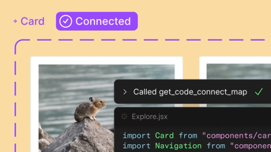
Code Connect UI
Code Connect Today, we’re announcing beta for Code Connect, a feature built to improve design system adoption by making code more accessible and useful for developers.

The right code for your design system
Learn more about the Code Connect UI, which is now rolling out to Organization and Enterprise customers.
Figma MCP server
The Figma MCP server Today we’re announcing the beta release of the Figma MCP server, which brings Figma directly into the developer workflow to help LLMs achieve design-informed code generation.Introducing our MCP server: Bringing Figma into your workflow
Learn more about the Figma MCP server, which is now available, and visit the MCP Client Catalog to get started with a supported MCP client.
Built for the whole team
As AI tools make it easier for even more people to participate in the design process, many teams are worried that quality is at stake. Our view is that design is everyone’s business. Craft doesn’t have to suffer when more people design; especially if designers are defining the quality bar. We’re making it easier for builders in every role to take part in design, without losing sight of craft and taste.
Design systems in Make
We launched Figma Make Today we’re introducing Figma Make, a new prompt-to-app capability to help you quickly explore, iterate, and refine—whether it's generating high-fidelity prototypes or getting into the details in design and code.
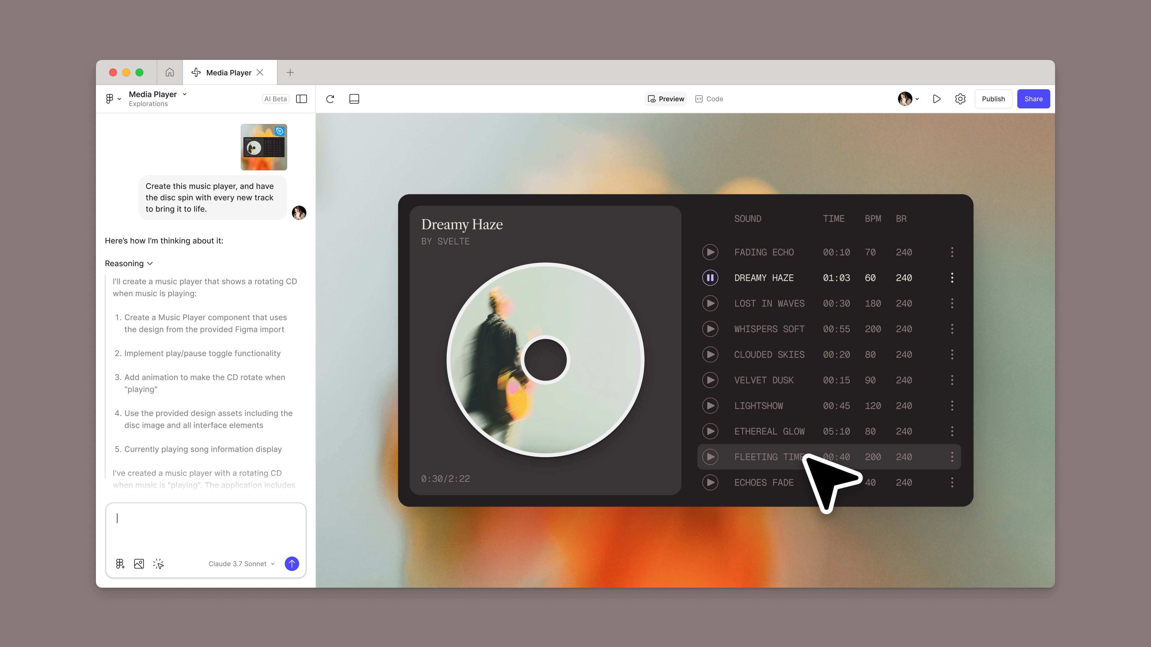
Introducing Figma Make: A new way to test, edit, and prompt designs
At the same time, we know that pulling context from your design system and production code is essential to getting better results. People spend months crafting thousands of components, styles, and variables with every single detail being refined down to the pixel—we want that level of fidelity and craft to be reflected in your Make generations. We also want you to be able to bring in your design systems no matter where they live—whether they're in Figma libraries or in code. We’re approaching this in two ways:
Make kits
The first is to allow you to directly import libraries from Figma, through a new feature we’re calling Make kits. With Make kits, you will be able to generate React code components and CSS files for your styles and variables, then package those outputs for use in Figma Make.
Learn more about Make kits and apply for early access here.
Npm package imports
For teams who already have a design system in their codebase, we will allow you to import your React components—whether self-built or open-source components—via public and private node package manager (npm) imports.
Learn more about npm packages.
Evolving design systems—together
All of these updates are focused on helping you build and maintain design systems that flex and grow with your team. And to truly enable this kind of scale, we’re always looking to the community for their feedback on how we can help those who manage, maintain, and consume design systems. Here are some of the most-requested features that we’re excited to roll out over the coming weeks.
Importing and exporting variables
Native import and export has long been a top-requested feature in our forums. We’ve held off on adding this feature—opting instead to release an open source import/export plugin—until The Design Tokens W3C Community Group (DTCG), a community focused on creating design tokens standards, finished their 1.0 release. This was to ensure a better authoring experience across our tooling ecosystem. The community group spec is now officially at 1.0, along with native import and export support in Figma.
Variables import and export will be available in November.
Simplifying authoring experience for collections
To give you context on your design system architecture while you author new variables, we’re making a change that will show you all of your subscribed collections—directly in the authoring modal. You’ll also be able to create variables inline to help you more easily author collections that are organized in groups. Finally, to make more space for these updates, the authoring modal will open full screen by default.
Variables authoring improvements will be available in November.
More variable modes
For large teams, four modes just isn’t enough for your growing design systems. Today, we have increased the number of modes to 10 for those on the Professional plan and 20 for those on Figma Organization.
Learn more about the variable mode limit increase, which is now available.
Design systems allow teams to harness the power of AI tooling while keeping craft high. We want to make it easy for design systems authors and consumers to use their systems as catalysts for creativity as they navigate this shifting landscape. As always, we’re driven by your feedback and can’t wait to see what you build as these updates roll out over the coming months.
Paige Costello is the VP of Product at Figma leading the Editor group, responsible for Figma Design. Before Figma, she led Core Product and was the Head of AI at Asana, a work management platform built to maximize team impact and create clarity at scale. She has also held leadership roles at Intercom and Intuit. Paige is passionate about building products customers love and growing the people who bring them to life.