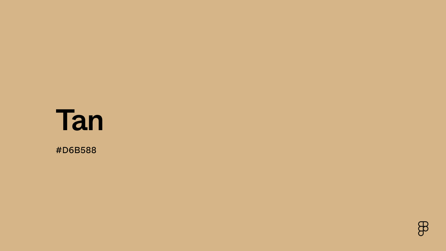
Tan is a warm, neutral, and versatile color that perfectly balances the earthiness of brown with the lightness of white. It is positioned within the brown spectrum on the color wheel, offering stability and reliability. Tan can create an atmosphere of understated elegance and warmth.

Color variations
Shades
Tints
Tones
Hues
Color Harmonies
Complementary
Split
Monochromatic
Analogous
Triadic
Square
Custom Palettes
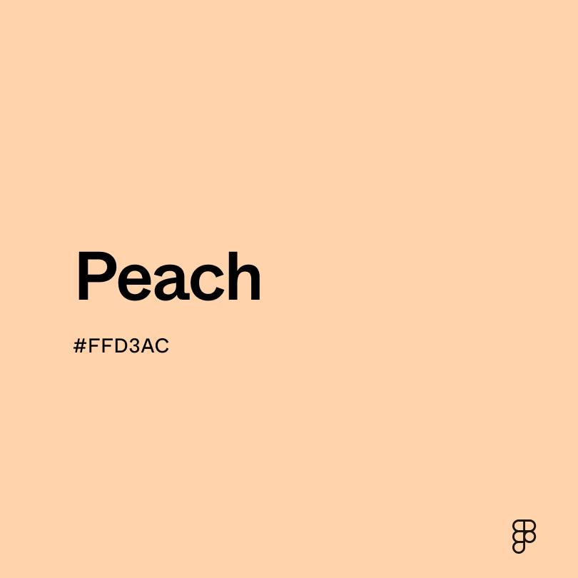
Cappuccino
Shoreline
Tawny
Tan is defined by the following color codes and values to ensure consistency across various digital platforms and devices.
- HEX code: #D6B588
- RGB value: 83.9% red, 71% green and 53.3% blue
Accessibility considerations play a crucial role in UX and UI design color choices. Figma offers plugins in the Community to make sure your designs meet Web Content Accessibility Guidelines.
Here are some ways to leverage tan’s natural and neutral qualities to create interfaces that are both visually appealing and user-friendly:
- Create a calming base. Use a light tan as a background color for websites or apps to create a sense of relaxation. Or apply it in headers and footers to convey a sense of reliability and stability.
- Highlight information. Tan can be used for subtle buttons or text to create a visually distinct element without being overly loud.
- Evoke a natural vibe. Pair tan with green accents or nature-inspired imagery to create a calming and organic aesthetic.
- Consider warmth. Lighter tans tend to feel more airy and open. Darker tans can create a warmer and more grounded atmosphere. Choose the shade that best suits the overall mood you want to convey.
- Strike a balance. While tan is a versatile neutral, too much can make an interface feel bland. Pair it with accents of cooler tones or contrasting colors for visual interest.
- Keep context in mind. Consider the overall brand identity and target audience when choosing a shade of tan. For example, a luxury brand might use a richer, darker tan, while a minimalist brand might opt for a lighter, airier shade.
Keep in mind that color and its meaning can change from culture to culture—and at any given time. If you are designing for a global audience, research color considerations for your specific regions.
For variations within the same earthy and warm spectrum as tan, consider:
- Khaki (#F0E68C) is lighter with a yellowish hue, offering a similar muted earthiness that evokes a sense of natural simplicity and versatility.
- Camel (#C19A6B), though slightly darker, shares tan's warmth with a richer, more pronounced golden undertone, embodying sophistication and timeless style.
- Beige (#EDE8D0) is softer and more neutral, providing a lighter backdrop that retains the warm, understated elegance of tan.
- Sand (#CBBD93) closely mirrors tan's connection to the natural world, with a slightly grayer undertone, suggesting serene beaches and desert landscapes.
To complement tan's understated warmth, consider pairing it with:
- Forest green (#228B22) adds depth and a touch of nature, echoing the hues of the forest against tan's earthy base for a grounded, organic palette.
- Navy blue (#000080) offers a classic, refined contrast, its deep richness enhancing tan's light warmth for a sophisticated, balanced look.
- Burgundy (#660033) introduces warmth and depth, creating a rich, inviting palette combining earthiness and depth.
- Soft peach (#FFE5B4) is gently vibrant, adding a subtle, cheerful brightness that highlights tan's softer side for a cozy, inviting atmosphere.
- Slate gray (#6D8196) provides a cool, modern contrast, its muted tones balancing tan's warmth for a chic, contemporary aesthetic.
Other colors worth considering include creamy white for a clean, crisp contrast, soft lavender for a gentle, romantic touch, and copper for a hint of rustic metallic warmth that complements tan's earthiness.
While tan is generally versatile, it may clash with:
- Electric blue (#00F0FF), whose intensity can overshadow tan's subtle warmth, creating a stark, less harmonious contrast.
- Neon pink (#FF1493), with its vibrant, saturated hue, might be too striking against tan's muted warmth, leading to visual tension.
- Lime green (#89F336) can be overly vivid next to tan, potentially resulting in a jarring, unbalanced palette.
- Dark purple (#4B0082), though deep and rich, may overwhelm tan's light, neutral tones, overshadowing its natural elegance.
- Intense orange (#FFA500), while warm, can compete with tan for attention, potentially creating an overly bold, less refined palette.
Tan symbolizes stability, reliability, and a connection to the earth, making it resonate with themes of nature and wholesomeness. This color often represents durability and a timeless style, as seen in brands like Timberland, which uses tan to symbolize rugged outdoor adventure and trendy urban fashion.In color psychology, tan is seen as a grounding color that promotes calm and resilience. Its natural and subdued hue can help reduce stress and create a relaxed atmosphere.
In UI design, tan is an excellent choice for creating a calming and inviting atmosphere. It works well as a neutral background that doesn't overpower other design elements, providing a subtle warmth that enhances the user experience. Tan can also serve as an accent color, adding a touch of sophistication and natural elegance to a design.
The term “tan” emerged in the 16th century, likely derived from the word tannum, referring to the tannic acid used in the leather-tanning process. This process dates back to ancient civilizations and involves treating animal skins to produce durable, flexible leather. The result of this process gives the skin the natural, warm brown shades we associate with tan.
Throughout history, tan has been a color of utility and functionality, frequently used in military uniforms and gear because of its camouflage qualities in desert and savannah environments. By the early 20th century, tan gained popularity in fashion, particularly for men's suits and jackets. It offered a more casual and versatile alternative to traditional black or navy. Interestingly, the trend of suntanning also emerged around this time, further solidifying the link between the color and a sun-kissed appearance.
Contrast 1.94
- Large Text
#D6B588
- Normal Text
How you design, align, and build matters. Do it together with Figma.
| Category | ||
|---|---|---|
Fail | Fail | |
Fail | Fail | |
Fail | Fail |
Contrast 10.82
- Large Text
#D6B588
- Normal Text
How you design, align, and build matters. Do it together with Figma.
| Category | ||
|---|---|---|
Pass | Pass | |
Pass | Pass | |
Pass | Pass |
Color simulations
Protanopia
Deuteranopia
Tritanopia
Achromatopsia
The hexadecimal color #D6B588, known as tan, has RGB values of R:214, G:181, B:136 and CMYK values of C:0, M:0.15, Y:0.36, K:0.16.
| VALUE | CSS | |
|---|---|---|
| HEX | D6B588 | #D6B588 |
| RGB DECIMAL | 214, 181, 136 | rgb(214,181,136) |
| RGB PERCENTAGE | 83.9, 71, 53.3 | rgb(83.9%,71%,53.3%) |
| CMYK | 0, 15, 36, 16 | |
| HSL | 34.6°, 48.8, 68.6 | hsl(34.6,48.8%,68.6%) |
| HSV (OR HSB) | 34.6°, 36.4, 83.9 | |
| WEB SAFE | CCCC99 | #CCCC99 |
| CIE-LAB | 75.528, 5.58, 27.365 | |
| XYZ | 48.699, 49.123, 30.208 | |
| xyY | 0.38, 0.384, 49.123 | |
| CIE-LCH | 75.528, 27.928, 78.475 | |
| CIE-LUV | 75.528, 24.044, 35.598 | |
| HUNTER-LAB | 70.088, 1.374, 23.508 | |
| BINARY | 11010110, 10110101, 10001000 | |
| iOS - SwiftUI | Color(red: 214/255, green: 181/255, blue: 136/255) | |
| iOS - UIKit | UIColor(red: 214/255.0, green: 181/255.0, blue: 136/255.0, alpha: 1.0) | |
| Android - Compose | Color(0xFFD6B588) |