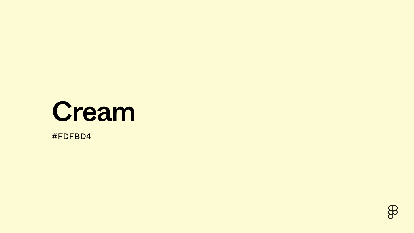
Cream is a versatile, neutral shade of light yellow that can balance a variety of palettes with ease. This soft, pastel color resides near the edge of the color wheel between yellow and orange, giving this tertiary shade a gentle warmth that pairs especially well with other pastels to evoke elegance and class.

Color variations
Shades
Tints
Tones
Hues
Color harmonies
Complementary
Split
Monochromatic
Analogous
Triadic
Square
Custom palettes
Old Photograph
Lavender Fields
Desert Oasis
Cream is represented by specific color codes and values in the digital world to ensure consistency across platforms and devices.
- HEX code: #FDFBD4
- RGB value: 99.2% red, 98.4% green, and 83.1% blue
Accessibility considerations play a crucial role in UX and UI design color choices. Figma offers plugins in the Community to make sure your designs meet Web Content Accessibility Guidelines.
Here are some ways to use cream in your designs:
- Enhance readability and reduce eyestrain. Cream is gentler on the eyes than pure white, so using it as a background color with high-contrast text in black or navy blue can make it easier for users to read and engage with your design.
- Evoke warmth and comfort. Cream's soft, warm tone creates a welcoming atmosphere in web design and user interfaces. It pairs well with similar warm colors, fostering a friendly and inviting environment for users.
- Convey professionalism. Cream is ideal for interfaces that require a professional, cohesive look, such as business applications, e-commerce sites, and digital portfolios.
- Establish visual hierarchy. Draw attention to your most important elements with high-contrast color combinations featuring cream. Contrasting a cream background with a button in a bold color can help users navigate your website or platform.
Keep in mind that color and its meaning can change from culture to culture—and at any given time. If you are designing for a global audience, research color considerations for your specific regions.
For variations within the same off-white spectrum as cream, consider:
- Ivory (#FFFFE3) is a touch lighter and brighter, radiating classic elegance.
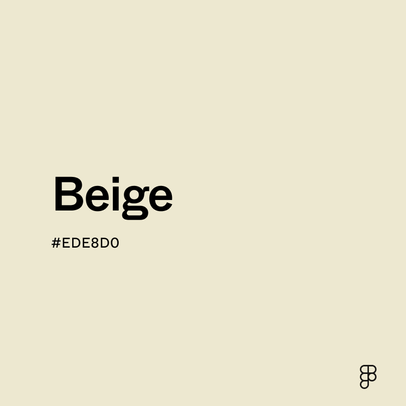
- Beige (#EDE8D0) sits closer to a light brown with a rustic, earthy feel.
- Seashell (#FFF1E7) resembles a faint blush with soft pink undertones.
- Champagne (#F7E6CA) offers more warmth with an inviting, sophisticated charm.
To complement cream, consider pairing it with:
- Periwinkle (#CCCCFF) creates a dreamy palette with soft bluish-purple undertones.
- Pastel blue (#B3EBF2) is a breath of fresh air, offering a playful, cool contrast.
- Lavender (#D3D3FF) pairs with cream in a romantic, elegant combination.
- Mint green (#ADEBB3) contrasts neutral cream with a refreshing, tranquil tone.
Cream also pairs well with pastels in a fresh springtime palette or with vibrant yellows and oranges to create an energized look.
While cream is a neutral color, it may clash with:
- Royal blue (#305CDE) creates a jarring contrast with cream’s gentle warmth.
- Rose red (#FA003F) may disrupt cream’s neutrality with its high saturation and intensity.
- Yellow-green (#CCFF00) creates a sickly palette that drains cream of its warmth.
- Aquamarine (#66F1C2) may overpower cream and create a busy design with an impersonal feel.
Cream evokes feelings of sophistication and serenity, combining the cleanliness of white with the warmth of yellow. This color often symbolizes purity and professionalism, and its gentle warmth brings a sense of elegance and familiarity. In various cultural contexts, cream represents calmness and understated luxury.
In color psychology, cream is seen as soothing and comforting. It is less stark than white, making it easier on the eyes and more conducive to relaxation. Cream's association with warmth and softness often makes it a preferred choice in environments that want to foster a welcoming and calm atmosphere.
In UI design, cream is highly effective as a neutral background color that enhances readability and visual comfort, avoiding the harshness of pure white. It works well in minimalist and vibrant design schemes since its soft backdrop complements bolder colors without competing for attention.
The first recorded use of "cream" as a color name dates back to 1590, inspired by the pale shade of dairy cream. During the Renaissance, this color was favored by artists as a base for depicting skin tones. Historically, cream has represented modesty and sophistication, frequently used for textiles and clothing across different cultures. Even today, its longstanding association with understated luxury has made it a classic choice in modern designs.
Contrast checker
Contrast 1.05
- Large Text
#FDFBD4
- Normal Text
How you design, align, and build matters. Do it together with Figma.
| Category | ||
|---|---|---|
Fail | Fail | |
Fail | Fail | |
Fail | Fail |
Contrast 19.93
- Large Text
#FDFBD4
- Normal Text
How you design, align, and build matters. Do it together with Figma.
| Category | ||
|---|---|---|
Pass | Pass | |
Pass | Pass | |
Pass | Pass |
Color simulations
Protanopia
Deuteranopia
Tritanopia
Achromatopsia
The hexadecimal color #FDFBD4, known as cream, has RGB values of R:253 G:251, B:212 and CMYK values of C:0, M:1, Y:16, K:1.
| VALUE | CSS | |
|---|---|---|
| HEX | FDFBD4 | #FDFBD4 |
| RGB DECIMAL | 253, 251, 212 | RGB(253,251,212) |
| RGB PERCENTAGE | 99.2, 98.4, 83.1 | RGB(99.2%,98.4%,83.1%) |
| CMYK | 0, 1, 16, 1 | |
| HSL | 57.1°, 91.1, 91.2 | HSL(57.1,91.1%,91.2%) |
| HSV (OR HSB) | 57.1°, 16.2, 99.2 | |
| WEB SAFE | FFFFCC | #FFFFCC |
| CIE-LAB | 97.886, -5.626, 18.965 | |
| XYZ | 86.887, 94.631, 75.972 | |
| xyY | 0.337, 0.368, 94.631 | |
| CIE-LCH | 97.886, 19.782, 106.522 | |
| CIE-LUV | 97.886, 3.258, 28.952 | |
| HUNTER-LAB | 97.278, -10.805, 21.791 | |
| BINARY | 11111101, 11111011, 11010100 | |
| iOS - SwiftUI | Color(red: 2.53, green: 2.51, blue: 2.12) | |
| iOS - UIKit | UIColor(red: 0.992, green: 0.984, blue: 0.831, alpha: 1) | |
| Android - Compose | Color(0xFFFDFBD4) |