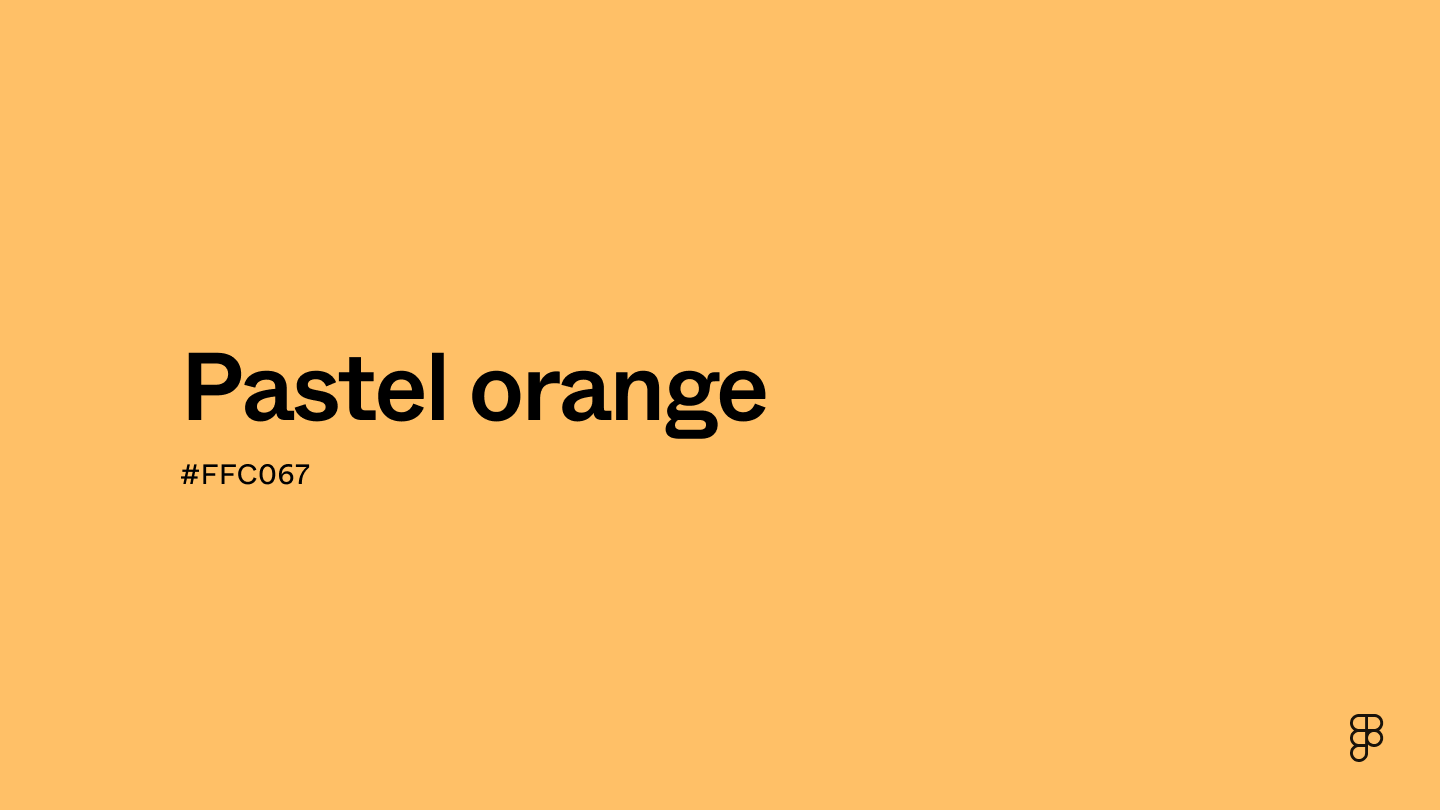
Pastel orange is a lighter, paler hue of pure orange. It conveys the same warmth and energy as orange but in a less intense way. Pastel orange has low saturation, which means pure orange pigment is mixed with white or gray to create a softer, less vibrant color. This light-toned orange shade evokes the peace of a soft sunset on a summer night.

Color variations
Shades
Tints
Tones
Hues
Color harmonies
Complementary
Split
Monochromatic
Analogous
Triadic
Square
Custom palettes
Sandstone Creek
California Beaches
Saffron Sunset
Pastel orange is defined by the following color codes and values to ensure consistency across various digital platforms and devices.
- HEX code: #FFC067
- RGB value: 100% red, 75.3% green, and 40.4% blue
Accessibility considerations play a crucial role in UX and UI design color choices. Figma offers plugins in the Community to make sure your designs meet Web Content Accessibility Guidelines.
Here are some ways to use pastel orange in your designs:
- Evoke feelings of relaxation. The softness of pastel orange evokes warmth and serenity, making it perfect for wellness, travel, or social apps or websites.
- Draw attention to elements. Pastel orange isn’t bold, but you can still use it to draw attention to specific elements in your UI design, including buttons or CTAs.
- Create contrast. Since pastel orange is light, it pairs well with darker colors like dark gray or black to create contrast between the text and the background.
Keep in mind that color and its meaning can change from culture to culture—and at any given time. If you are designing for a global audience, research color considerations for your specific regions.
For variations within the same light spectrum as pastel orange, consider:
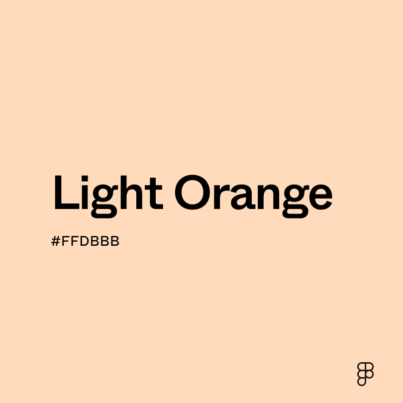
- Light orange (#FFDBBB) is a neighbor to pastel orange on the color wheel, which creates a light, cheerful hue.
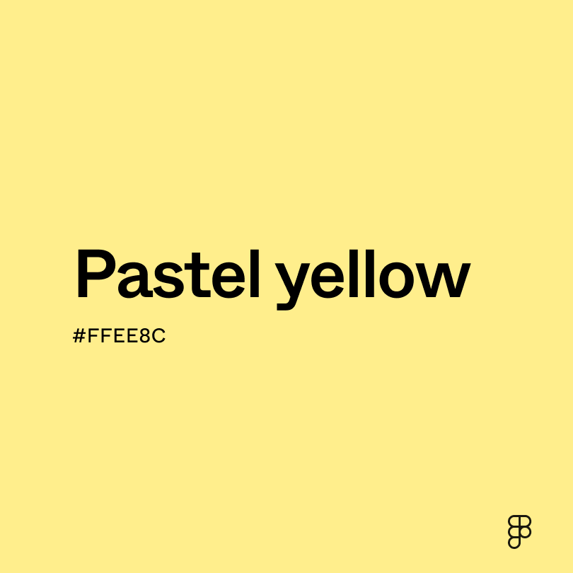
- Pastel yellow (#FFEE8C) shares the same pale, muted tones as pastel orange, but the yellow version.
- Peach (#FFD3AC) has a similar harmonious appearance to pastel orange but with a mix of yellow.
- Coral (#FF8559) is a saturated pink-orange shade that radiates the playfulness of pastel orange.
To complement pastel orange’s charm, consider pairing it with:
- Cream (#FDFBD4) provides a clean and calm base, allowing pastel orange to shine.
- Mint green (#ADEBB3) creates a tranquil and serene atmosphere to match pastel orange’s relaxation qualities.
- Coral (#FF8559) complements the warmth and cheerfulness of pastel orange to create playful yet inviting designs.
- Teal (#069494) helps create a modern or energetic feel with its boldness––just be sure to use it sparingly to avoid overpowering the lightness of pastel orange.
Other colors worth considering include cool gray for a soft, balanced look, pastel yellow to enhance the cheerfulness, and pastel blue to match the tranquility of pastel orange’s lightness.
While pastel orange is cheerful, it may clash with:
- Scarlet (#ED2100) can create a jarring contrast next to pastel orange’s softness.
- Navy blue (#000080) is a deep shade that creates a harsh contrast against the warmth of pastel orange.
- White (#FFFFFF) creates a stark contrast that may overwhelm pastel orange’s lightness.
- Brown (#895129) creates a muddy, disjointed appearance when paired with pastel orange.
Pastel orange symbolizes gentleness, warmth, and creativity. The soft nature of pastel orange is associated with new beginnings and a sense of security.
In color psychology, pastel orange’s calm and nurturing qualities evoke feelings of relaxation, optimism, and gentle stimulation, similar to a summer sunset.
For UI/UX design, pastel orange offers approachability. When used to highlight elements or build a user-friendly interface, pastel orange adds a touch of calmness.
Pastel orange doesn’t have a lengthy documented history compared to other colors like mauve or crimson. Pastel colors are muted versions of existing colors and weren’t prevalent until the 18th or 19th centuries.
Interestingly, the word "orange" actually comes from the fruit itself, not the other way around. It wasn't until the late 16th century that "orange" began to be used as a color term. Before that, people used descriptive phrases like "yellow-red" to refer to this specific shade.
Today, pastel orange is used when designing products to evoke peace, calm, and a soothing atmosphere.
Contrast checker
Contrast 1.62
- Large Text
#FFC067
- Normal Text
How you design, align, and build matters. Do it together with Figma.
| Category | ||
|---|---|---|
Fail | Fail | |
Fail | Fail | |
Fail | Fail |
Contrast 12.99
- Large Text
#FFC067
- Normal Text
How you design, align, and build matters. Do it together with Figma.
| Category | ||
|---|---|---|
Pass | Pass | |
Pass | Pass | |
Pass | Pass |
Color simulations
Protanopia
Deuteranopia
Tritanopia
Achromatopsia
The hexadecimal color #FFC067, known as pastel orange, has RGB values of R:255 G:192, B:103 and CMYK values of C:0, M:0.25, Y:0.6, K:0.
| VALUE | CSS | |
|---|---|---|
| HEX | #FFC067 | #FFC067 |
| RGB DECIMAL | 255, 192, 103 | RGB(255,192,103) |
| RGB PERCENTAGE | 100, 75.3, 40.4 | RGB(100%,75.3%,40.4%) |
| CMYK | 0, 25, 60, 0 | |
| HSL | 35.1°, 100, 70.2 | HSL(35.1,100%,70.2%) |
| HSV (OR HSB) | 35.1°, 59.6, 100 | |
| WEB SAFE | #FFCC66 | #FFCC66 |
| CIE-LAB | 81.807, 13.304, 52.882 | |
| XYZ | 62.539, 59.942, 21.107 | |
| xyY | 0.436, 0.417, 59.942 | |
| CIE-LCH | 81.807, 54.53, 75.879 | |
| CIE-LUV | 81.807, 49.151, 61.67 | |
| HUNTER-LAB | 77.422, 8.697, 38.031 | |
| BINARY | 11111111, 11000000, 01100111 | |
| iOS - SwiftUI | Color(red: 1, green: 0.753, blue: 0.404) | |
| iOS - UIKit | UIColor(red: 1, green: 0.753, blue: 0.404, alpha: 1) | |
| Android - Compose | Color(0xFFffc067) |