Design system 102: How to build a design system


It’s time to build your design system! We’ll walk you through the basics of creating a system tailored to your unique goals and challenges, whether building from scratch or starting with existing pieces.
Share Design system 102: How to build a design system
Artwork by Cynthia Alfonso
A well-crafted design system is a powerful tool for teams looking to create cohesive, scalable, and efficient processes. By establishing a shared language and a library of reusable components, a design system ensures consistency across your products, speeds up your workflow, and frees up your team to focus on solving user problems.
In this guide, we’ll break down the process of building a design system into clear, actionable steps. From defining your principles and laying the groundwork to creating and organizing your design assets, we’ll cover best practices and real-world examples to help you create a system that empowers your team and elevates your product.


This is the second part of our series on getting started with design systems. Check out our first part: Design systems 101: What is a design system?
Step 1: Lay the groundwork
Before diving into creating components and patterns, it’s important to understand why you’re building a design system and what problems you hope to solve. Maybe you’ve noticed inconsistency across platforms, time-consuming manual updates, or collaboration challenges between design and development teams.
Take a moment to clearly define your goals by answering these key questions:
- Why do you want a design system?
- What specific problems will it solve?
- How will you know if it’s successfully solving those problems?

Our design systems talk from Config 2024 highlights many points in this article, from defining standards, finding champions, working with developers early and often, and more.
Remember, design systems aren’t one-size-fits-all. They exist on a spectrum, from simple component collections for small teams to comprehensive systems for enterprise organizations. The key is to create a system that makes sense for your specific situation and can evolve as your needs change.
Take stock of what you have
Once you’ve aligned on your goals, take a closer look at your existing product landscape. Gather examples of your UI across different platforms and devices, including interactive states and alternate versions. Screenshots are your best friend here! Capture examples of your product across different platforms and devices, and don’t forget to include any interactive states or alternate versions. Chances are, you’ll start to notice patterns and consistencies that can serve as the starting point for your design system.
Don’t forget to inventory your codebase as well. Engineers may have already created reusable components that aren't documented in your design files. Look for patterns in your production code—repeated UI elements, standardized CSS variables, or shared components that developers have built. This technical audit helps bridge the gap between design and development by ensuring your design system builds upon existing engineering work rather than creating parallel systems.
Organize and evaluate
With your inventory in hand, organize your examples into categories and evaluate the big picture. What does your current design language look like? Are there inconsistencies or redundancies that could be streamlined?
Keep an eye out for areas where your product feels disjointed or where designers and developers are solving the same problems in different ways. These are often signals that your user experience could be improved through a more cohesive design system.
Find your champions
Building a design system is a team effort. Seek out people who are passionate about design consistency across your organization—not just from the design team, but also developers, product managers, and other stakeholders. Getting diverse perspectives will help ensure your design system meets the needs of your entire product team, not just one discipline.
Developers are particularly valuable allies, as they’ll be implementing the components in code and can provide insights on technical feasibility and maintenance considerations from the start. And remember, many successful design systems start with a team of one!
Choose your approach
There are two main ways to approach building your design system: starting from scratch with a custom solution, or adopting an existing framework and adapting it to your needs.
Building from scratch allows you to tailor the system to your unique requirements, but requires more time and resources upfront. Using an existing framework can help you get up and running faster, but may require more customization to fit your specific use case.
There’s no right or wrong answer—it depends on your team’s capabilities, bandwidth, and long-term goals. Don’t be afraid to start small and evolve over time.
Align with company goals
Make sure your design system initiative aligns with your overall company objectives. Consider factors like timing, resources, and leadership buy-in. Your earlier audit will come in handy here; use your findings to help build the case for how a design system will support key business goals.
Design systems require ongoing investment, so it’s important to secure stakeholder support early on. Tying your system to tangible business benefits, like faster time-to-market or improved developer productivity, can go a long way in getting the resources and buy-in you need.

Thinking about making the switch? Designer Advocate Clara Ujiie’s “An insider’s guide to a seamless Figma migration” has resources, tips, and tools for transitioning to Figma.
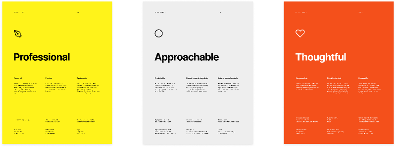
Define your guiding principles
With the groundwork in place, define a set of guiding principles that will serve as a north star for your system. Your principles should establish the purpose and values driving your system, and ensure that every decision ladders up to your organization’s broader goals. Aim for a small set of memorable, actionable statements that can be easily referenced and applied.
In an ideal world, you’d define your principles right at the start. But in practice, they often emerge later in the process, or evolve as your system matures. That’s okay! The important thing is that once you have them, you make sure everyone is aware of and aligned with them. They’ll make future decisions much clearer.
This series builds on our Introduction to design systems course, which follows the Habitz team as they establish their core principles and translate them into concrete design guidelines.
Here are a few tips for crafting effective design principles:
- Start with the “why.” What core belief or value is driving this principle?
- Be specific. Provide concrete examples and guidelines for how to apply the principle in practice.
- Keep it actionable. Principles should translate into tangible practices for both designers and developers.
Let’s say accessibility is a core priority for your team. A principle around designing for inclusivity might include guidelines like accounting for different vision and hearing abilities, testing contrast and legibility, or following the latest accessibility standards. The more specific and actionable, the better.

Discover your principles with your team using this FigJam template.
Leverage the wealth of knowledge within your organization as the foundation for your design principles. Take a look at existing resources like brand standards, voice and tone guides, or engineering best practices. Work with cross-functional partners to ensure your principles reflect both design and development values, creating a shared foundation that everyone can rally behind.

Step 2: Define your foundations
The foundations of your design system are the essential visual and functional elements that form its base. They include elements like accessibility, color, typography, iconography, illustration, and dimensions. These elements work together to create a strong, consistent design language that’s easy for people to use and understand.

Learn how Stash builds financial products that customers can trust by using Figma components and Ditto to ship out copy updates—speeding up their work by 20% and saving over 12,000 hours.
Make your design accessible to everyone
Accessibility means making sure everyone can use and understand your product, regardless of their abilities. This is everyone’s responsibility, and it should be a core part of your design system principles.
When creating your design system, consider elements like font sizes, color contrast, and how components are labeled and organized. It’s important to communicate both how and why your design system assets are intended to be used when creating accessible experiences. By prioritizing accessibility from the beginning and providing clear guidelines for both designers and developers, you lay the foundation for a more inclusive product.

Try Stark’s Contrast & Accessibility plugin to help you streamline your accessibility workflow. To ensure your colors are accessible, explore plugins in the Figma Community and follow Web Content Accessibility Guidelines.
Choose colors that work well together
Color is a powerful tool in design. When selecting colors for your design system, aim for a balanced palette that works across different modes (like dark mode) and platforms.

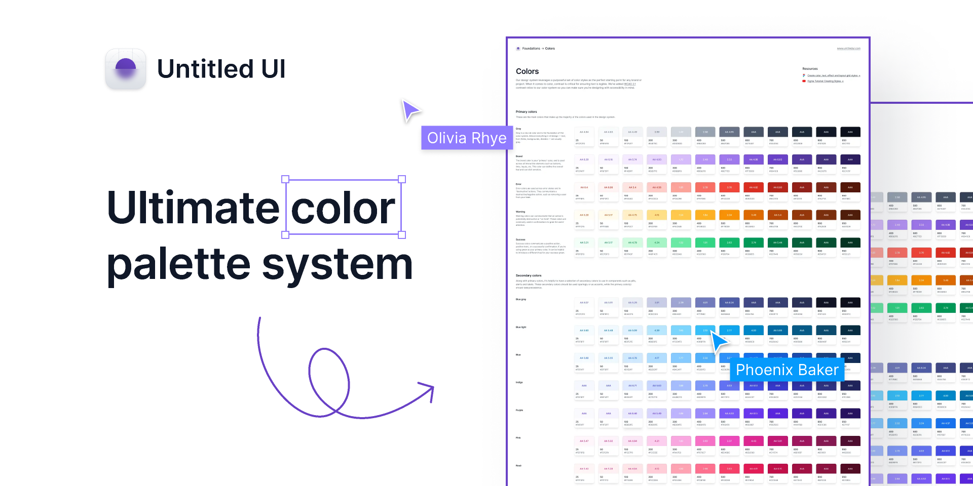
Check out this Ultimate color palette system from Untitled UI, a purposeful set of neatly-organized color styles—the perfect starting point for any brand or project.
To simplify your color palette, look at your team’s existing designs and consolidate similar shades. A good rule of thumb is to start with 60% neutral colors, 30% primary colors, and 10% secondary or accent colors. This balance provides enough flexibility while maintaining visual coherence.
Pick typography that’s easy to read and fits your brand
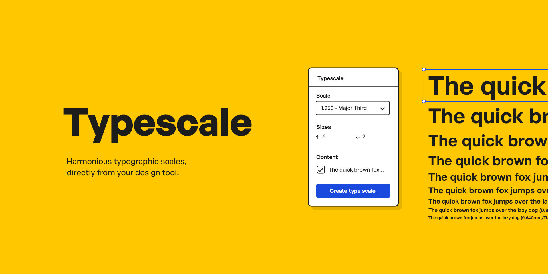
Typography is another key element of your design foundation. Choose fonts that are easy to read, match your brand personality, and work well together. Pay attention to details like letter spacing, weight, and line height to create a pleasant reading experience.
Establish a consistent set of font sizes and line heights when defining your type scale, commonly set around a base size of 16 pixels. You may also want to organize your type scale by its intended application in mind, such as ‘display’ or ‘title,’ or opt for a more primitive naming such as ‘heading-100.’

Use elevation to create visual hierarchy
Elevation refers to the use of shadows, layers, and transparency to create depth and order in your design. For example, cards can appear slightly raised off the page, or a dialog box might become a focal point by seeming to float above everything else through the use of shadows.
Elevation can help you structure your design, guiding users to understand which elements are primary and which are secondary, in an intuitive way.
Create consistent and meaningful icons
Explore this complete guide to iconography by illustrator and icon designer Bonnie Kate Wolf on DesignSystems.com.
Icons are small visual symbols that communicate ideas and actions quickly. A well-designed icon system strengthens your brand identity and improves usability. Make sure your icons are clear, consistent, and maintain their meaning even when styled differently.
Use an icon grid to ensure consistent sizing and alignment, and provide descriptive names and search terms to make them easy to find and use for both designers and developers.


See how the Microsoft team uses their Fluent icon system across their products. The Fluent icons include rounded corners, simplified shapes, and come in regular and filled.
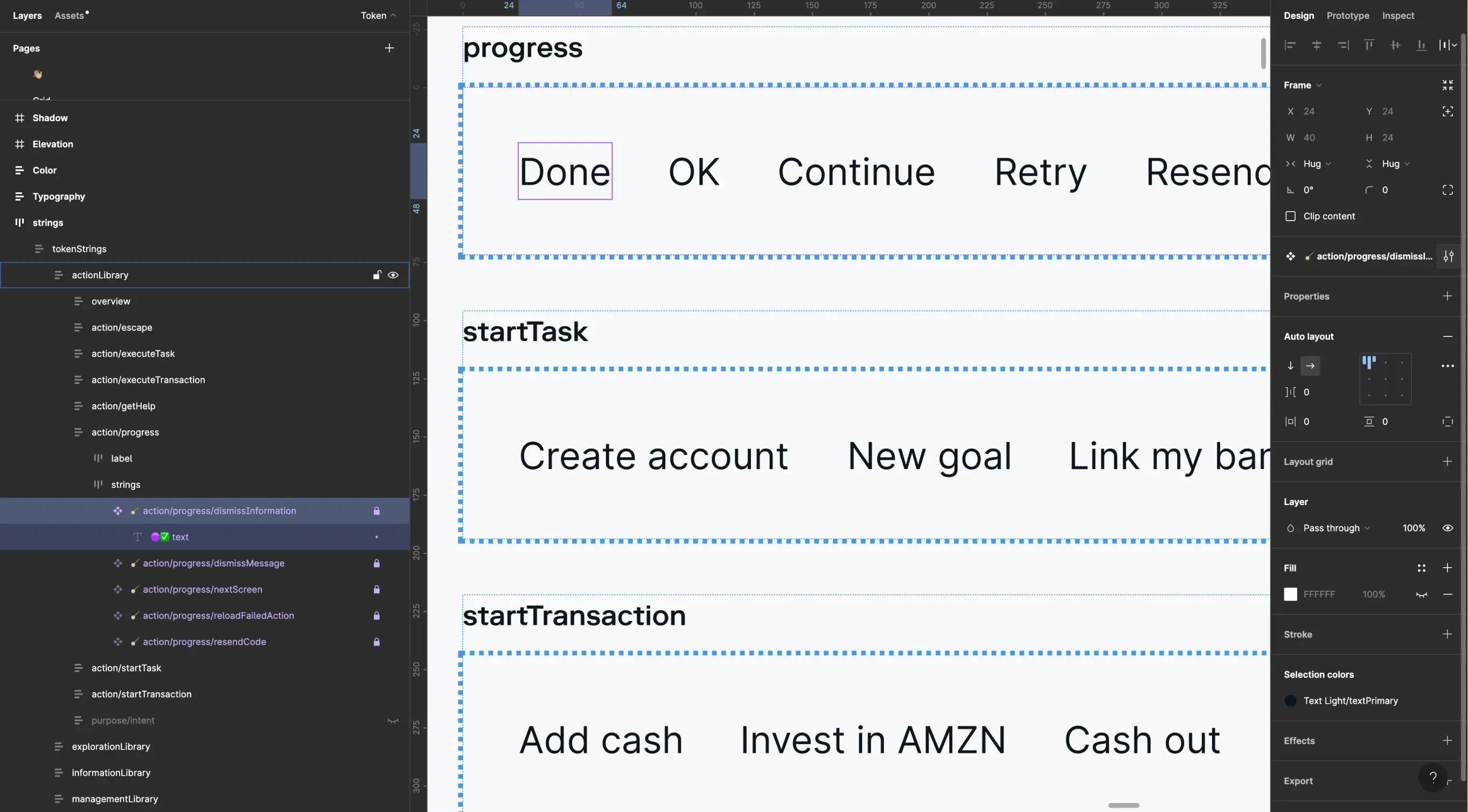
Apply tokens using variables and styles

Watch our lesson on applying tokens, variables, and styles, part of our introduction to design systems course.
Variables vs. styles
Variables in Figma store single values such as colors, whereas styles hold more complex information, such as gradients, and are better for detailed, multi-layered designs. Learn more.
In Figma, you can use variables and styles to create a consistent and scalable design system. They are most commonly categorized into two primary types:
- Primitives: These are your design system’s basic building blocks, like colors, spacing, and sizing. They form the foundations of your design but aren’t used directly in components or layouts.
- Semantic: These provide a meaningful context for how a variable or style should be used. For example, you may have a color variable called“color-background-warning” to convey a sense of urgency or potential danger.

Watch Figma tutorial: Intro to variables to better understand how variables work, and how to use them to represent design tokens and account for different modes and themes.
Creating a shared language between design and code is essential for tokens to be effective. When designers and developers use the same naming conventions and token structure, it becomes much easier to maintain consistency across both design files and code implementation. This alignment ensures that design decisions flow seamlessly into development.
When naming your variables and styles, use clear and consistent conventions. Design system contributor Nathan Curtis suggests combining a base (like color or size) with modifiers (like variant or state) to create names that are easy to understand and use.
This naming consistency extends to code as well. Understanding basic syntax patterns used by developers can help designers create more implementation-friendly variable names. For example, using kebab-case (with hyphens) for CSS variables or camelCase for JavaScript variables can make the translation from design to code much smoother.
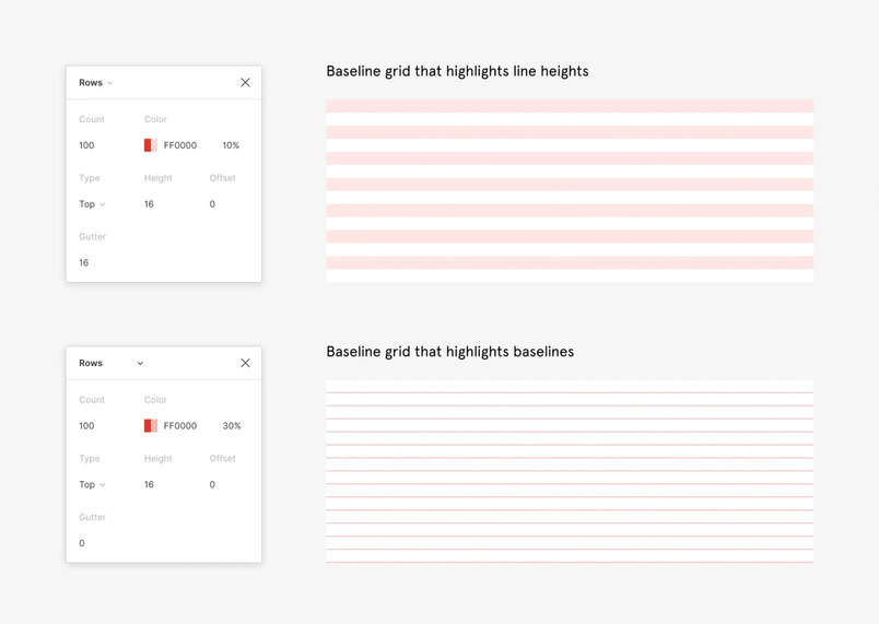
Use layout grids and spacing to create visual harmony
Layout grids, spacing, and sizing (referred to collectively as “spatial systems”) are like the invisible glue that holds your design together. They create a sense of structure, consistency, and visual harmony that makes your product feel polished and professional.
- Layouts: Define how your design adapts to different screen sizes and devices, ensuring a consistent experience across all platforms.
- Grids: Use column grids, baseline grids, and modular grids to align elements consistently and create a clear visual hierarchy.
- Spacing: Define consistent spacing units to control the distances between elements and create a balanced, readable layout.
When thinking about spatial systems, consider how your layout decisions will translate to code implementation. Discussing with developers how grid systems are implemented in your frontend framework—whether it’s CSS Grid, Flexbox, or a UI framework—can help ensure your design decisions are technically feasible and efficiently implemented.
Why is eight a recurring number in design systems? It’s simple—the majority of device breakpoints are divisible by eight, making it an ideal base unit for grids, spacing, and typography.
Learn more about spacing, grids, and layouts from Elliot Dahl, Head of Product Design at Hightouch, on DesignSystems.com.
Many types of grids can be used to create the backbone of your layout:
- Column grids divide the screen into vertical sections, making it easy to align elements and maintain a consistent look across different devices.
- Baseline grids control the vertical spacing between elements, typically aligning with the baseline of your text.
- Modular grids combine both column and row divisions to create a flexible structure for more complex layouts.

Responsive design is an approach to building for screens that takes into consideration a diversity of devices, optimizing for an optimal viewing experience across each.
By providing pre-built layout components and templates, your design system can help teams create responsive and adaptive designs more efficiently. These components can be built with a set of predefined breakpoints that determine how the layout changes at different screen sizes, ensuring visual consistency while making implementation straightforward for developers.
Counterpoint: Do you even need a grid? Design Systems Architect Donnie D’Amato makes the case for thinking outside the grid.
However, just having a system in place doesn’t guarantee that everyone will use it perfectly. It’s like having a recipe book—it’s super helpful, but it’s up to the chef to follow the instructions and create a delicious meal. That’s why it’s so important for designers to understand and embrace the spatial system. When designers understand why consistent spacing and layout matter, they’re more likely to create designs that look and feel great for users.

Step 3: Build your design system in Figma
Building a design system in Figma is all about creating a consistent, efficient, and scalable way of working across your entire project. Here's a step-by-step guide to help you get started:
Take a closer look at your existing designs
Remember that initial audit you did? It’s time to revisit that alongside your code audit. Start by mapping your design elements to existing code components wherever possible. This alignment ensures you’re building on the foundation your developers have already established rather than creating parallel systems.

In this Figma tip, Designer Advocate Lauren Andres goes over what component properties are and how to create them.
Component properties are the changeable aspects of a component. You can define which parts of a component others can change by tying them to specific design properties.
Define your variables and styles based on what’s already implemented in production to minimize inconsistencies between design intent and technical reality. Then, define your components—the pre-made building blocks that you can reuse throughout your designs, from simple buttons to complex modals.
Choose clear and consistent names
When naming your components and variables, choose names that reflect their function, rather than how they look or how they’re coded. Use semantic naming that reflects the meaning and purpose of the element. For example, “color-warning” for an alert message or “surface-primary” for the main background color.
This approach to naming creates a shared language that bridges design and development Component properties differ across design files and coding frameworks. How can we translate and align them to help designers and developers work better together?The shared language of props
When it comes to naming cases, talk with your development team to learn about any existing conventions in your organization that you could align with. Hyphens (like “primary-button”) and camel case (like “primaryButton”) tend to be the most commonly used approaches.
Organize your Figma library
Hear how Onfido, a technology company that helps businesses with verification, organizes their design system teams, projects, and files.
One of the great things about Figma is that you can share libraries across different files and projects. This means that everyone on your team can access the same set of styles and components, no matter what they’re working on.
When setting up your library, think about what structure will work best for your team. You might want to keep everything in a single file, or split things up into multiple files for different parts of your project. Consider how both your design team and your development team will be using the library.
To streamline the handoff process, consider using Code Connect to directly link your design components to code implementation. This powerful tool surfaces design systems code from your codebase within Figma, making it easier for both designers and developers to maintain consistency between design and implementation without leaving the Figma environment.

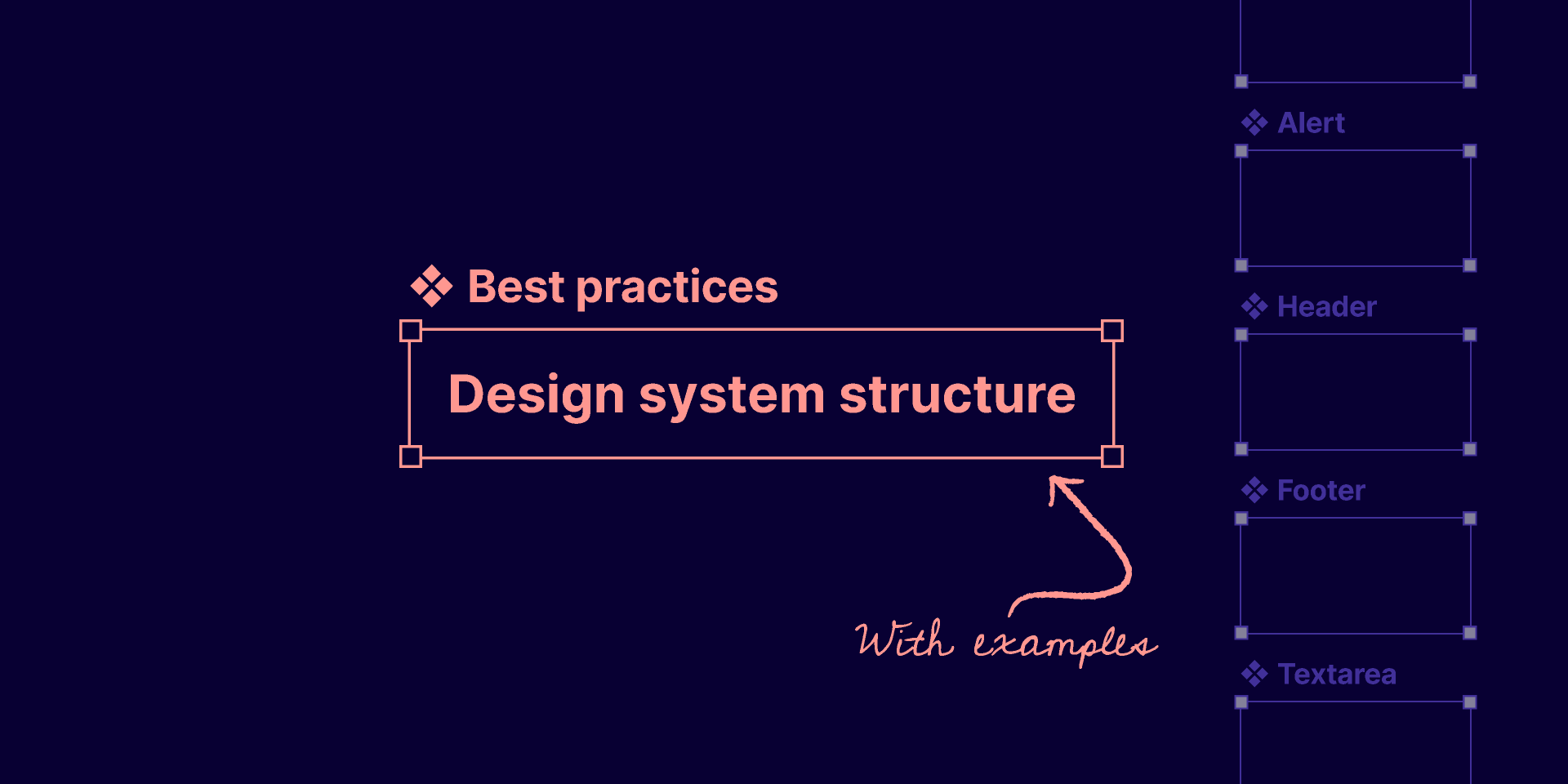
Looking for guidance on structuring your design system? Check out this Community file from Figma Designer Advocate Luis Ouriach for recommendations on how to build out your design system for teams, projects, and files.
Remember, building a design system in Figma is an ongoing process that will grow and evolve along with your team. Start by laying a strong foundation, and encourage everyone—designers and developers alike—to contribute and help improve your design system over time.
If you want to learn more about the nitty-gritty of building a design system in Figma, check out our step-by-step walkthrough and the video below.
✉️ Sign up for our editorial newsletter for more design systems tips and ideas!
And if you have any other questions or topics you’d like to learn about, give us a shout on Twitter at @figma. We’re always happy to help! Learn more about how Figma helps teams drive consistency, scale designs, and maintain parity with development using our design systems features and request a demo.