11 resume design ideas + tips to get noticed
Share 11 resume design ideas + tips to get noticed
Explore more from
Design basics
Bring your print ideas to life in Figma Buzz
Create, share, and iterate together seamlessly.


Condensing years’ worth of experience onto a single-page resume isn’t easy. How do you make sure your skills and achievements catch a recruiter’s eye without overwhelming the layout?
These resume design ideas can help. With the right layout, spacing, and typography, you can make your skills and experience impossible to miss.
Read on to learn:
- Tips to make your resume ATS-friendly so your experience is captured correctly
- Best practices to create a layout that’s readable, organized, and visually appealing
Idea 1: Prioritize scannability with white space

White space is essential. Generous margins, consistent line spacing, and padding between sections make your resume easier to read and easier for applicant tracking systems (ATS) to scan.
This typographic statement resume template from Figma pairs bold headings with open spacing to make your layout easy to scan.
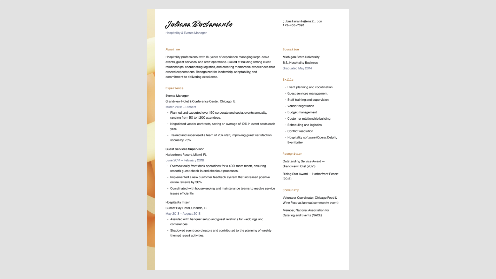
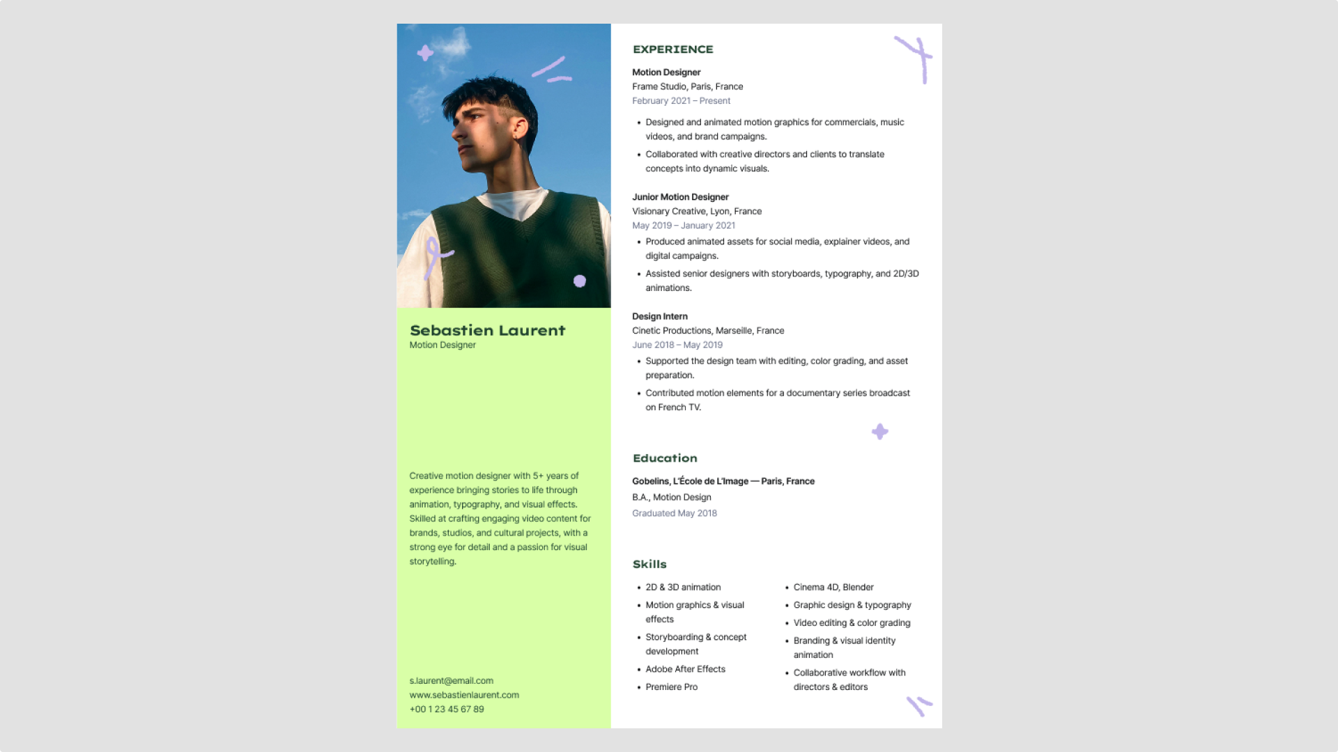
Idea 2: Use two-column designs wisely

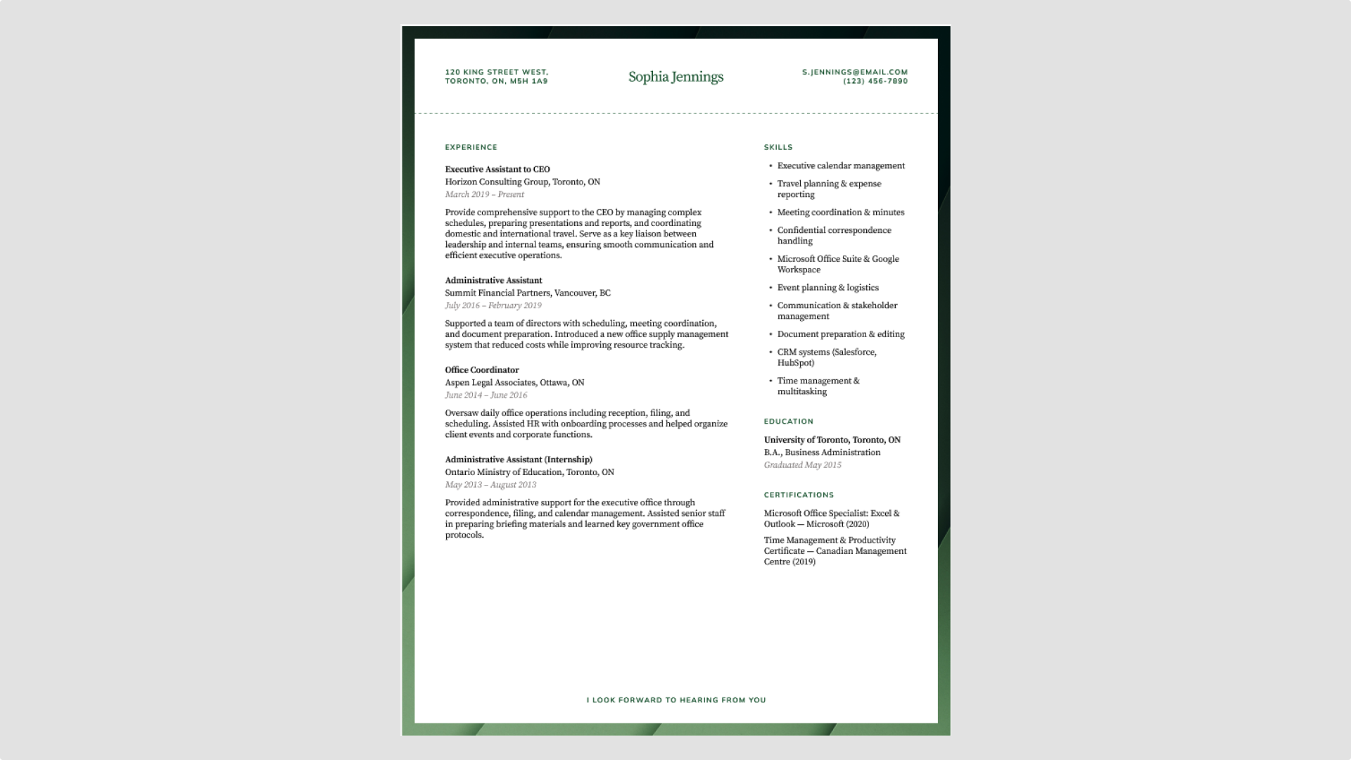
A two-column layout makes your resume easier to navigate. The narrow column works well for quick reference details such as skills, contact information, or languages, while the wider column gives your experience and education the space they need for clear descriptions and dates. This balance keeps the page structured without feeling crowded.
It also aligns with how many ATS tools process resumes—top to bottom, left to right—helping your key content get picked up correctly.
Use Figma’s modern professional resume template to try this layout.
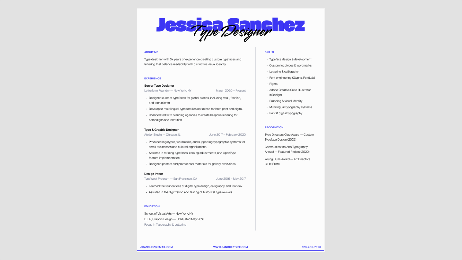
Idea 3: Use typography to denote hierarchy

Typography shapes how recruiters read your resume. Use size, weight, and spacing to make its structure clear at a glance.
- Level 1 (H1). Your name should be the largest element on the page.
- Level 2 (H2). Section headings (Experience, Education) stand out but remain secondary.
- Level 3 (H3). Job titles and company names should be bolded or slightly larger than body text.
When choosing a typeface, consider the best fonts for resumes, like Inter, Roboto, or Poppins. These classic sans serifs are ATS-friendly and easy to read.
Figma’s minimal monochrome professional resume is a simple resume template with a black-and-white layout and Inter font. It also uses bolding and subtle color accents to differentiate headings, job titles, and body text clearly.
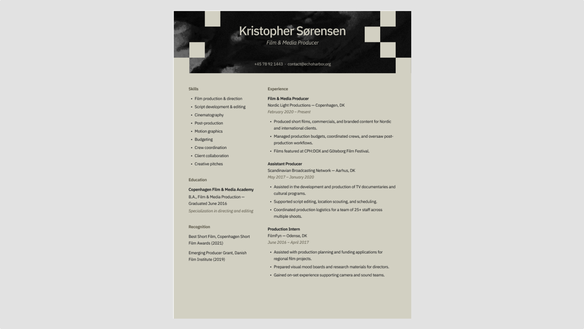
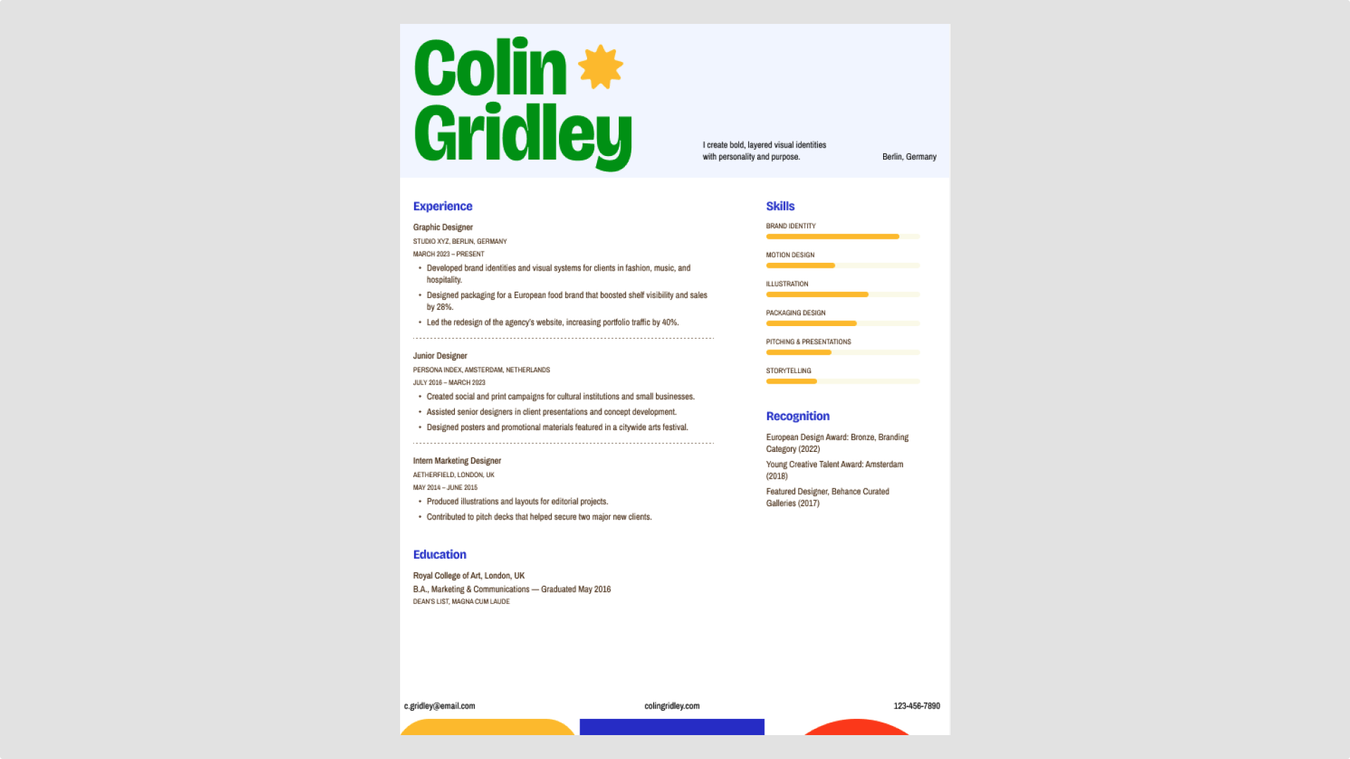
Idea 4: Use color as an accent (not a distraction)

Color can guide the reader’s eye and add personality to your resume, but it should never overpower your content. Choose one primary accent color—such as deep charcoal, professional navy, or a muted jewel tone—for elements like separators or thin lines. Avoid bright or overwhelming colors that can distract from your experience and skills.
For designer resumes, a few accents—like a line, heading, or symbol—can express style without overpowering your content.
Figma’s modern geometric blocks resume template shows how to do this effectively. Its restrained accent colors enhance the layout and structure, making it a strong example of a clean resume template design you can customize for your own background.
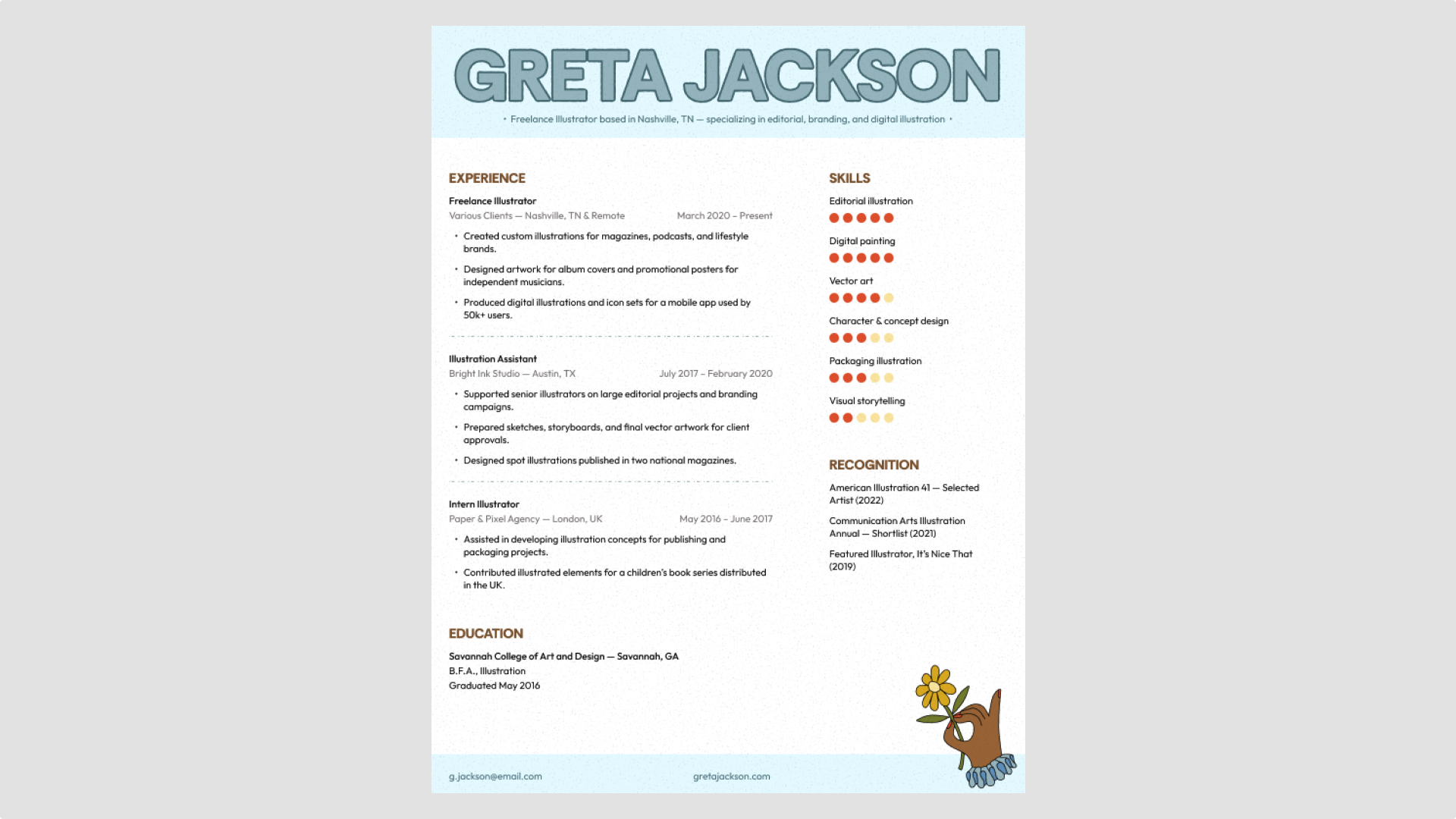
Idea 5: Avoid using icons

Icons and visual gimmicks (like skill bars or rating scales) often break ATS parsing and confuse readers. Instead, stick to clear, text-based formatting.
Figma’s cinematic portfolio resume template uses regular bullet points throughout, keeping the layout text-focused while still looking professional.
Explore standout resume fonts
Find fresh typefaces that add clarity and character to your resume with Figma’s font library.
Idea 6: Keep it to one or two pages

Early and mid-career professionals should aim for one page. Focus on the experience, skills, and accomplishments that matter most. If you need a second, repeat your name and contact info at the top.
Figma’s framed accent modern resume template is a great example of a one-page resume design. It organizes key details clearly, keeping the layout polished.
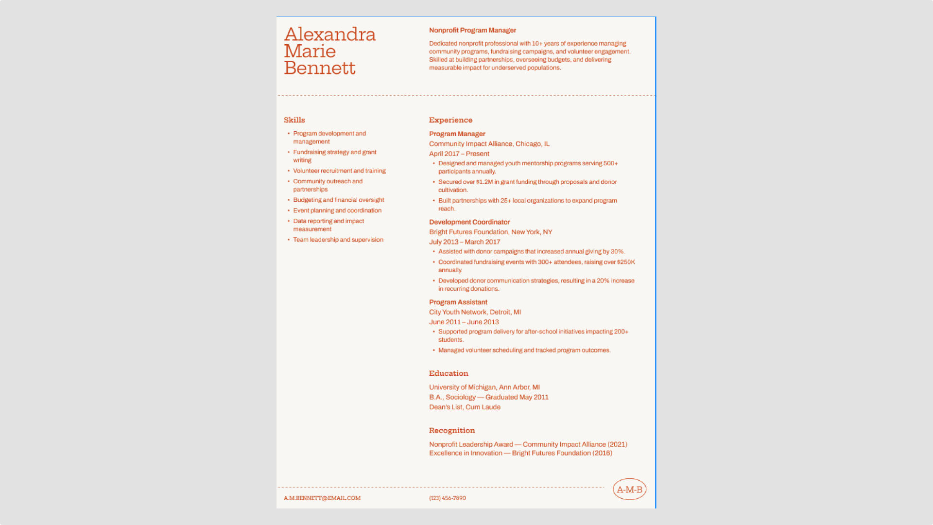
Idea 7: Be strategic with your top third

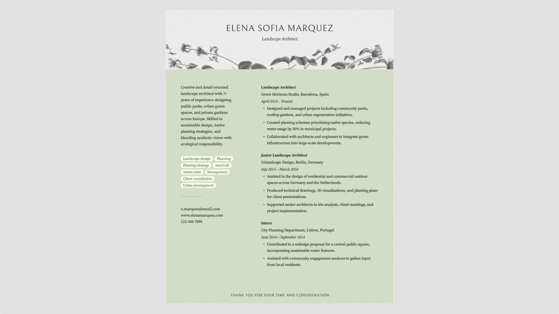
The top third of your resume is prime real estate. Use it to set the tone.
If you’re changing careers or have a unique value proposition, include a concise summary or profile at the top. If you have deep, relevant experience, start with your professional background.
Figma’s elegant nature-inspired resume template demonstrates this well. It includes a brief summary in the top left column below your name and contact info, immediately giving recruiters a clear view of key details.
Idea 8: Master alignment and formatting

Sloppy spacing can undercut even the best experience. Dates, job titles, and bullets should line up cleanly on a consistent grid.
Figma’s playful creative resume template shows how alignment keeps a design readable and organized. Even with its fun layout, every element lines up perfectly, making it a strong creative resume design example.
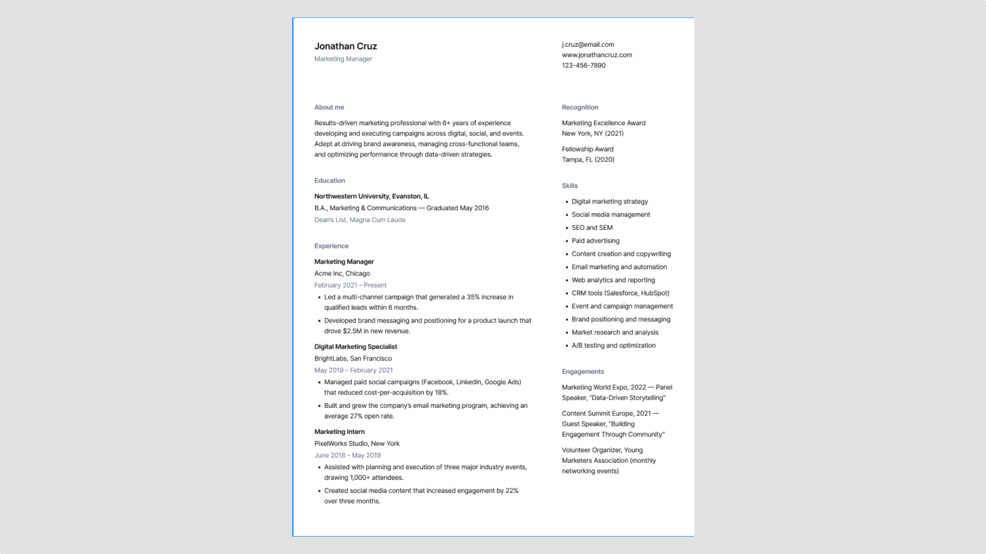
Idea 9: Leave a digital trail

Most resumes are viewed online, so make sure yours is clickable. Link your email, LinkedIn profile, portfolio or website, and any relevant project examples.
Figma’s resume templates, like this structured modern resume, make adding clickable links simple. Using Figma Design, simply select the text or object you want to link, click the link icon in the toolbar, and enter the URL.
Idea 10: Make customizing easy

Think of each section of your resume as a movable piece. Job entries, skills, and education blocks should be easy to shift or edit when you’re applying for different roles. In Figma, using frames and auto layout makes this quick and repeatable—no need to reformat everything from scratch.
In Figma’s bold, colorful graphic resume template, each section is a self-contained block you can move or edit, letting you tailor your resume quickly for any opportunity.
Idea 11: Design for accessibility

Good design is usable design. Choose high-contrast colors (like black on white), legible fonts, and layouts that support screen readers.
Use Figma’s built-in contrast checkers to make sure your colors meet accessibility standards. Small adjustments, like increasing text weight or spacing, can make a big difference for readability.
Figma’s creative expressive resume template is an excellent example of how accessibility and personality can work together. It uses a bold neon green highlight alongside a simple black-and-white layout. The bright accent draws attention without harming readability, as the main text maintains clean, high-contrast formatting.
Resume design best practices

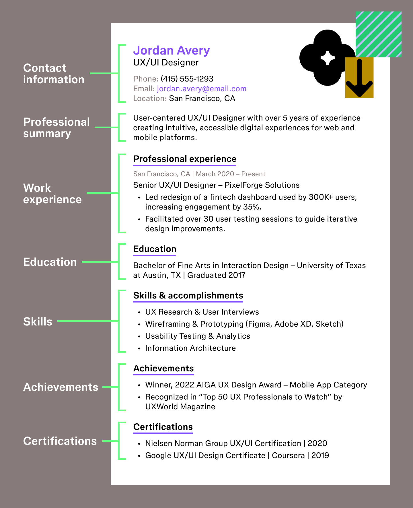
Here are a few guidelines to keep in mind as you think about how to design a resume that’s readable and easy for recruiters and ATS to review. You can pair these tips with the creative resume design examples above for extra guidance.
- Prioritize readability. Keep line length short and use bullet points so each idea is easy to skim.
- Avoid dark backgrounds. Most recruiters still print or scan resumes in black and white, so light backgrounds work best.
- Keep graphics minimal. Heavy visuals, tables, or photos can confuse ATS tools and distract from your content.
- Format for ATS. Save your resume as a PDF and make sure all text is selectable so automated systems can read it.
- Maintain consistent spacing. Even spacing between sections helps the page feel organized and easy to follow.
- Limit fonts. Stick to one or two clean fonts to keep your layout cohesive.
- Use comfortable margins. A little breathing room around the edges keeps the page from feeling crowded.
- Name your file clearly. A descriptive, easy-to-identify file name helps recruiters locate and reference your resume.
Land that interview with Figma resume designs
Thoughtful resume design ideas can make your experience easier to scan, support ATS parsing, and help your strongest skills rise to the top. From spacing to visual hierarchy to alignment, each choice you make shapes how a recruiter understands your story. Figma gives you flexible tools and ready-to-use templates to create a resume that feels both intentional and uniquely yours.
Here’s how Figma can help:
- Explore all of Figma’s resume templates to jumpstart your layout or spark new ideas.
- Use FigJam to brainstorm your achievements, outline sections, or map your career story before writing.
- Organize assets, colors, and type choices with shared styles for consistent formatting.
Ready to share your work with confidence?
Figma Buzz gives you a simple way to publish and showcase your creative projects in a dedicated space built for sharing.

25 best fonts for resumes that get you noticed
Choosing the best fonts for resume readability is key. Explore 25 top fonts available in Figma to make your application stand out from the crowd.


10 personal website examples + templates
See 10 personal website examples and templates for portfolios, resumes, and more, plus tips for how to design your own site with Figma.