How to draw a data flow diagram in 5 simple steps


Share How to draw a data flow diagram in 5 simple steps
Explore more from
Team productivity

When you talk about data with your team, things can get complicated quickly. You need to illustrate systems involving multiple inputs, subprocesses, and data flows. While flowcharts and other diagrams will get you started, project managers can also use a chart tailor-made to explain systems and processes: data flow diagrams.
Data flow diagrams, sometimes called data flowcharts, map the flow of the input data through a system or process until it becomes an output. Whether you’re a project manager mapping internal systems, a student in a systems design course, or a developer planning out a new feature, data flow diagrams can help you illustrate processes clearly.
Read on to learn:
- What a data flow diagram is
- How to make one in five steps
- Data flow diagram symbols
- Tips and best practices for data flow diagramming
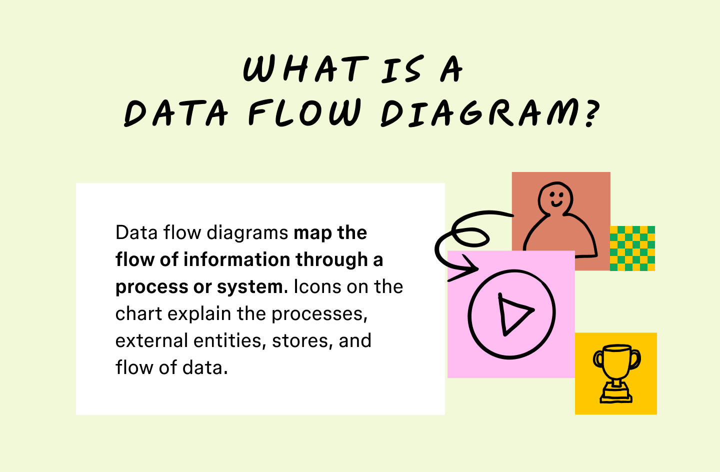
What is a data flow diagram?
A data flow diagram (DFD) is a chart that maps the flow of information through a system or process. Similar to a flowchart, DFDs also use symbols, arrows, and text to guide readers.
Charting the flow of this information helps design and explain complex systems. For existing processes, DFDs improve workflows and highlight issues in advance by giving a bird’s-eye view of your operations. Here’s a good example of what a DFD template looks like.
As processes and systems become increasingly complex, visuals can help describe them effectively. Similar to how flowcharts use symbols, DFDs use icons to trace the flow of information through data stores, inputs, and outputs. Unlike similar flowcharts, data flow diagrams don’t loop around or break into branches. Instead, DFDs chart the consistent flow every time a process starts.

Why should you use data flow diagrams?
Data flow diagrams visualize processes and break them down into basic elements. With the help of these visualizations, teams can then modify or better describe these systems to stakeholders. Project managers use data flow diagrams to:
- Illustrate processes. DFDs illustrate complex systems in clear terms. This helps managers share their progress and empowers stakeholders to give feedback.
- Enable collaboration. Using a diagram helps teams stay up to speed and quickly suggest changes.
- Increase efficiency. In fast-paced development, diagrams save crucial time, increasing productivity and efficiency.
- Reduce errors. Data flow diagrams can reveal bottlenecks, workflow issues, and system bugs.
- Make refinements. Illustrating a system helps you spot inefficiencies so you can rearrange processes or drop steps to boost efficiency.
- Model new systems. Before implementing a new process, you can model and test it. Diagrams provide a framework for brainstorming new processes and testing use cases.

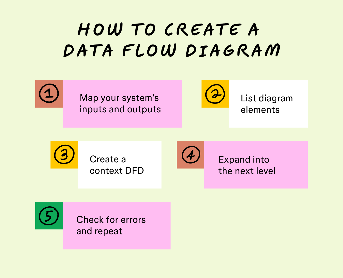
Step 1: Map your system’s inputs and outputs
After selecting your system or process, list the inputs and outputs related to its functions. Almost all processes begin when an external entity sends an input, and nearly all systems resolve after outputting data into another system, database, or process. These inputs and outputs explain what your system needs to accomplish.

Step 2: List diagram elements
Group the activities and entities on your data flow diagram, including external entities, data stores, and data flows. Some elements may fit into more than one category. For example, subsystems that use computer data can function as data stores or processes. In this case, note which systems work for multiple purposes.

Step 3: Create a context DFD
Regardless of the level you want to end on, start by charting a level 0 diagram. These context diagrams map all the basic flows and connections within your system. Draw a line between external entities and the processes or data flows their inputs go through to become outputs.

Step 4: Expand into the next level
If more detail is needed, expand your diagram to higher levels to map subprocesses and subsystems. Connect the extra diagrams to combine related processes and show your whole system. Only move up one level at a time and draw from processes mentioned in the previous level.
Step 5: Check for errors and repeat
Review your data flow diagram to ensure data flows clearly and check for any errors and potential refinements. Keep an eye out for any inputs missing a corresponding output or a shortage of data stores.
Stop here if your team understands the diagram and everything looks error-free. If more detail is needed, dive deeper with another diagram level, then review again. Catching oversights early on helps prevent bigger problems later. Maintaining consistency at every level ensures that everyone, from stakeholders to third parties, stays aligned.

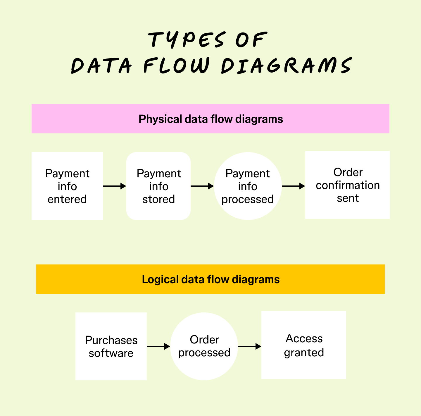
The two types of data flow diagrams
Data flow diagrams come in two categories: physical diagrams and logical diagrams. Let’s take a look at how they differ.
Physical data flow diagrams
Physical data flow diagrams reveal how you’ll implement a system and how it will work. These charts show how hardware, programs, and teams combine to make a system or process function. So, physical diagrams give the most practical overview of a system.
Logical data flow diagrams
Logical data flow diagrams explain what happens during a process, not how it happens. Logical diagrams focus on business activities and tasks over technical details, making them easier to understand. By focusing on a system in broader terms, logical diagrams highlight the kinds of data processed, where it comes from, and what a system does with it.
Physical and logical diagrams can describe the same systems and their data flow. Using them together gives the most in-depth overview of your processes and helps you understand a system in detail.

Data flow diagram notation types
DFDs use symbols that facilitate the explanation of how processes and systems operate. These data flow diagram symbols vary by notation style. The four notation styles include Yourdon/DeMarco, SSADM, Unified, and Gane-Sarson. Understanding their differences can help you choose the right one for your team or project.
Each notation style builds upon a base set of symbol types: external entities, processes, data stores, and data flows. But the specific shapes, details, and recommended use scenarios vary. Some notations prioritize simplicity, making them ideal for conceptual or early-stage diagrams. Others offer a greater level of specificity, which can be helpful for technical specifications or more detailed implementation planning.
| Notation type | Best for… | Key distinctions | External entity symbol | Process symbol | Data store symbol | Data flow symbol |
|---|---|---|---|---|---|---|
| Yourdon/DeMarco | Conceptual, logical overviews, and educational usage | Simple, minimal shapes for easy understanding | Rectangle | Circle | Open-ended rectangle (two parallel lines) | Arrow → |
| Gane-Sarson | System design documentation and technical teams | Distinct shapes make diagrams easy to scan in detail | Rectangle | Rounded rectangle | Open-ended rectangle with double lines | Arrow → |
| SSADM | Structured software/system analysis (especially U.K. projects) | Developed by and for the U.K. government | Oval | Rectangle with three horizontal divisions | Open rectangle with label inside | Arrow → |
| Unified | Merged projects and teams that need a hybrid notation | Blends symbols from other standards; often adapted for custom needs | Stick figure | Either circle (classic DFD style) or rectangle/rounded rectangle with <<process>> stereotype (UML-influenced) | Open-ended rectangle | Arrow → |
Yourdon/DeMarco notation
Developed by Edward Yourdon and Tom DeMarco in the late 1970s, this notation style quickly gained popularity in information system modeling. It emphasizes simplicity and clarity with symbols that are easy to draw and understand.
The Yourdon/DeMarco notation style became an essential tool for structured analysis in software engineering, enabling teams to visualize, analyze, and document how data moved through information and business systems.
SSADM notation
The Structured Systems Analysis and Design Method (SSADM) was developed by the U.K. government in the 1980s for software development projects. It focuses on thorough documentation, modular design, and traceability throughout the system development lifecycle.
While it’s mainly used for U.K. government IT projects, SSADM has become closely connected to public sector analysis and legacy enterprise systems. It’s less common in modern agile methodologies.
Gane-Sarson notation
The Gane-Sarson notation was introduced by Chris Gane and Trish Sarson in 1977 as part of their structured systems analysis approach. One notable feature of this style is the division of process symbols, which can contain process numbers, titles, and sometimes location indicators.
This notation was widely adopted in the U.S., especially in financial industries. It remains popular in technical documentation, prioritizing process clarity and hierarchical decomposition.
Unified notation
Unified notation is a more recent hybrid approach to DFDs. It draws on conventions from Unified Modeling Language (UML) and adapts DFD symbols for modern software engineering ecosystems. The goals of this notation type are flexibility, usability in diverse development environments, and easier alignment with digital diagramming tools.
Unified notation is especially useful for teams familiar with UML, working in cross-functional collaborative environments, or requiring a standardized visual style that works across multiple modeling methodologies.
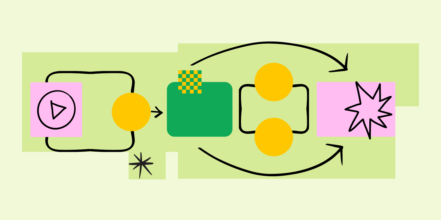
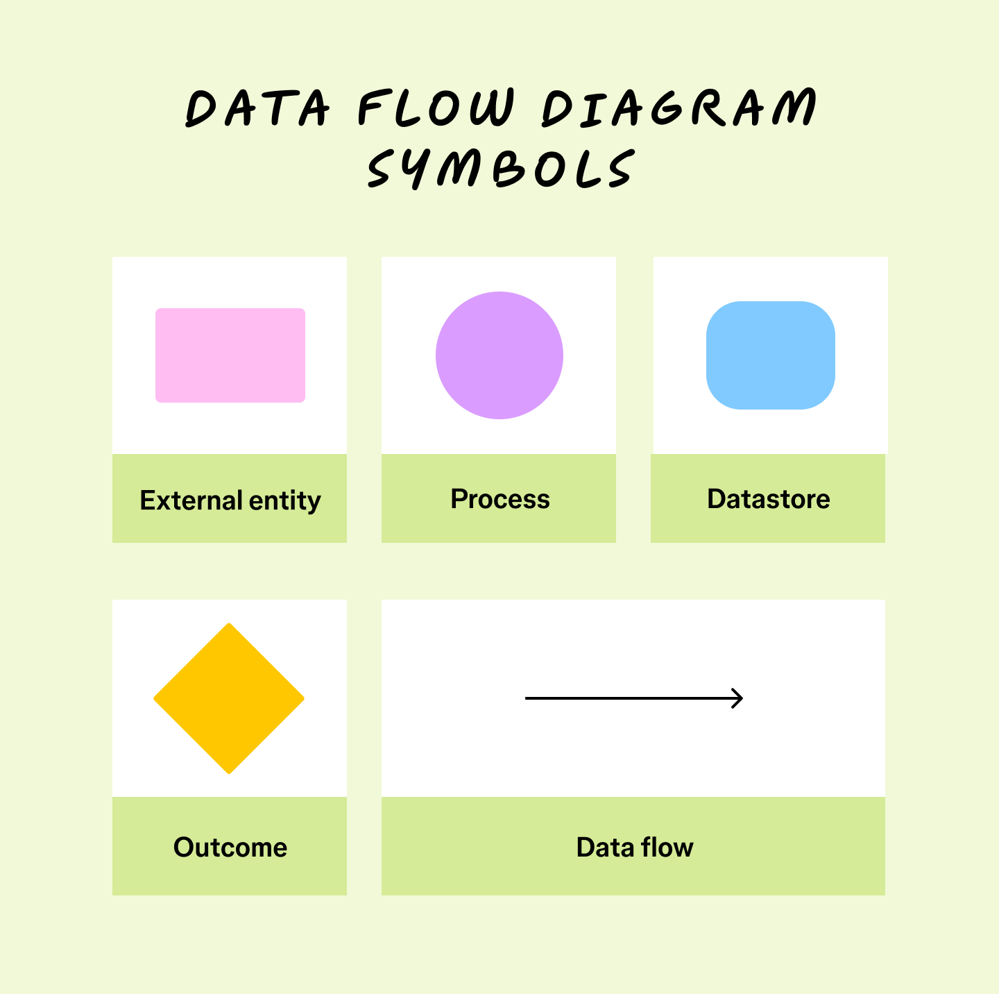
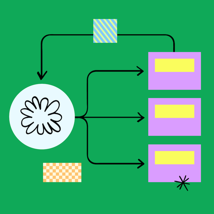
The four components of a data flow diagram
Regardless of the notation style, all data flow diagrams use similar symbols that represent these four core elements:
Component 1: External entity
Also known as “terminators,” external entities typically use a rectangle or square symbol to indicate an outside system or actor that initiates a data flow process. External entities send data to your system or receive data from your processes. People, organizations, and IT systems can act as external entities. When using the SSADM, external entities are represented using an oval symbol, while the Unified style uses a stick figure.
Component 2: Process
A process is represented using a circle or square. It refers to activities that change data or use it to create an output. Processes can manipulate data by sorting it, directing its flow, or using it for calculations.
Component 3: Data store
Also known as “warehouses,” data stores are typically represented using rectangular boxes. Storage sites hold data for later use in data flows. Data inputs place information into storage, while outputs draw it out for a process.
Component 4: Data flow
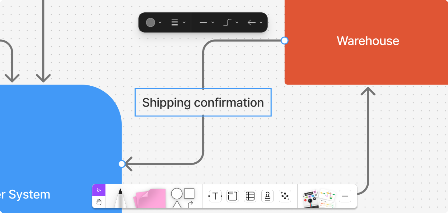
The path data takes through a system or process makes up the data flow, represented by an arrow. Data flow shows how and when your information architecture interacts with entities, processes, and data stores. Following the data flow also explains how a system works.

Data flow diagram examples and levels
Teams categorize data flow diagrams into levels. The higher the level, the more complex your diagram. At the lowest level, data flow diagrams give a big-picture overview. Higher-level diagrams show a level of detail that may require experience with the system to understand.
Here’s an overview of each level:
Level 0 data flow diagram example
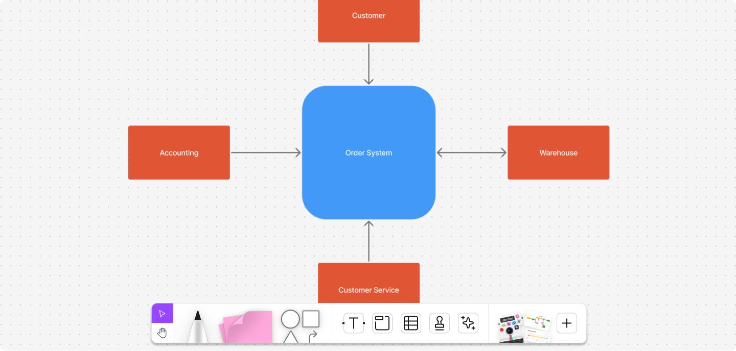
Level 0 data flow diagrams, also called context diagrams, give a broad overview of the system or process you want to map out. They focus on high-level processes and how external entities affect data flow.

Level 1 data flow diagram example
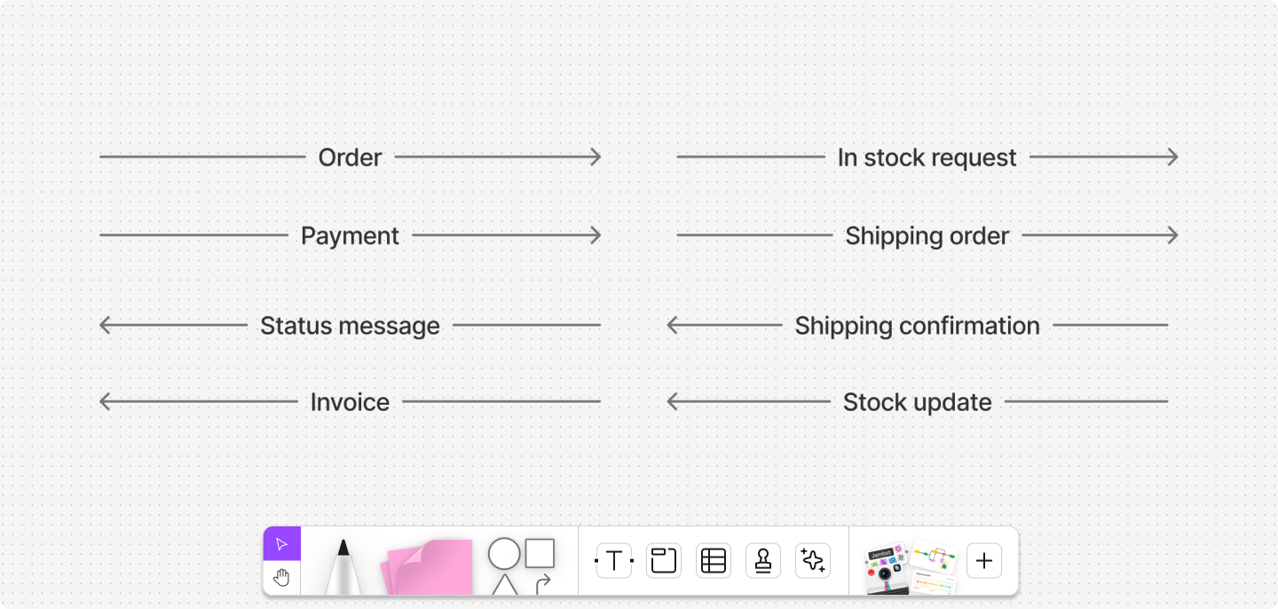
Level 1 data flow diagrams provide a more detailed breakdown, including subprocesses. They typically include more data flows and data stores. Level 1 diagrams include all your databases, external entities, and several process nodes. Each level 1 diagram explains a subprocess in a context diagram. So, use your level 1 diagram to explain what happens to data in these subsystems.

Level 2 data flow diagram example
Level 2 diagrams expand on the subprocesses in level 1 charts, explaining how all but the most complex systems work. For more granular steps and processes, use extra text to explain.

Level 2 data flow diagrams give even more detail by breaking level 1 diagrams into further subprocesses. They also tend to factor in less common processes, inputs, and outputs.
Level 3 and higher data flow diagrams comprehensively chart how a system works. Only the most complex systems benefit from a level 3 chart. In most cases, this level of detail adds more confusion than clarity. A level 3 diagram’s amount of detail suits internal communication and comparisons between similar systems.
Ready to start designing your own data flow diagram?
Use FigJam’s prebuilt data flow diagram template to quickly visualize, refine, and share your process.
Tips for creating data flow diagrams
Diagrams can get intricate quickly. To ensure your data flow diagrams communicate clearly and effectively, keep the following tips in mind:
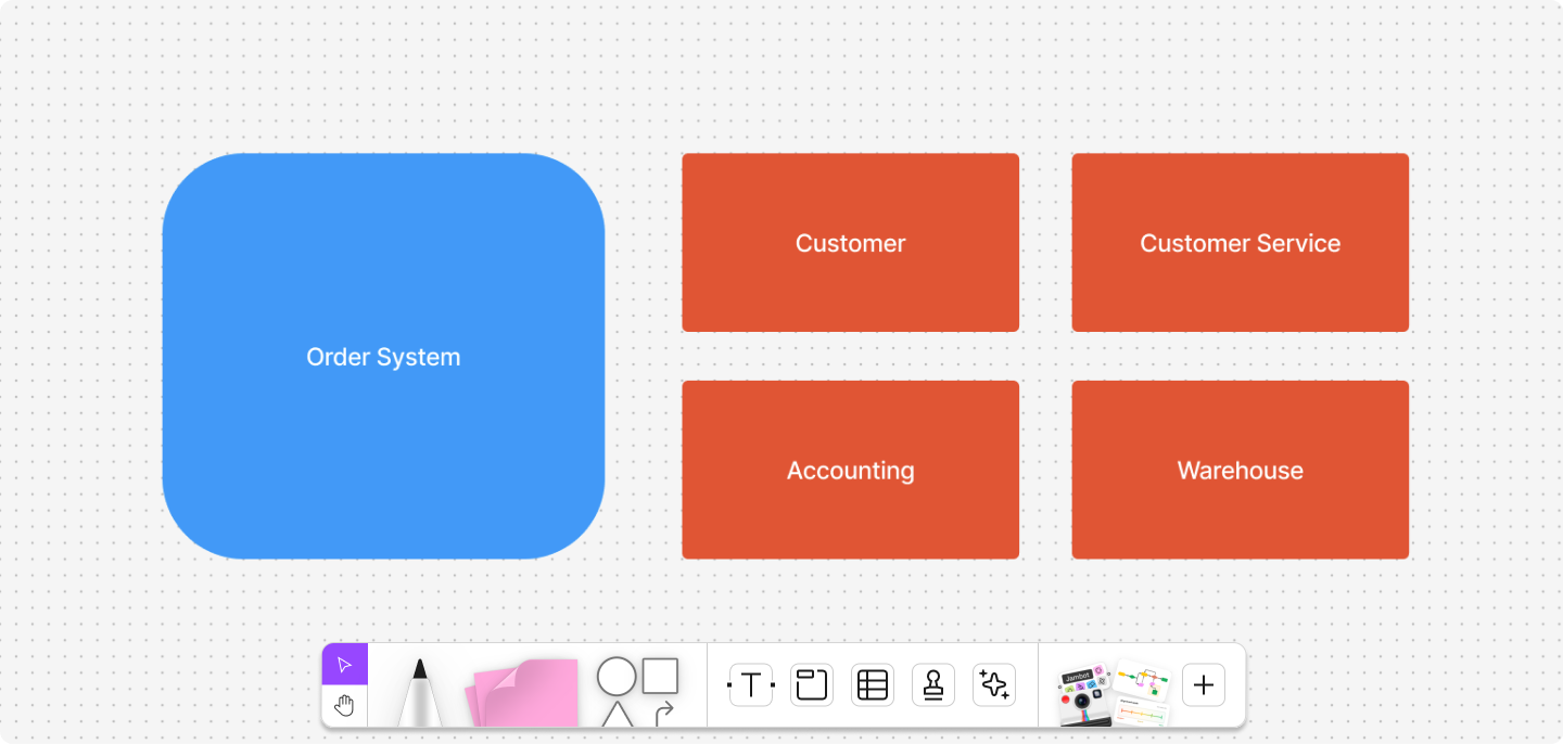
- Name the Level 0 process after the system. On the context diagram, the single process should use the information system or project title from the project charter.
- Keep Level 0 on one page. Decompose before you draw. If it doesn’t fit, you’re not at Level 0.
- Title each level distinctly. Use clear labels like “Order System—Level 0” and “Order System—Level 1 (Process 2).”
- Avoid crossing lines. Reroute connectors or duplicate symbols to prevent spaghetti diagrams.
- Mark duplicates clearly. If you repeat an external entity or data store, tag it appropriately and note that it’s a duplicate.
- Number processes consistently. Use hierarchical numbering (1, 2, 3 → 2.1, 2.2…) so readers can follow decompositions.
- Match other models. Keep names of data, processes, and stores consistent with ERDs, requirements, and specs.
- Watch for miracles. In a data flow diagram, “miracles” refer to outcomes without inputs. Double-check your diagram to ensure every output can be traced back to a specific input source and is accurately representative of the system's flow of information.
- Avoid black holes. Black holes occur when part of your diagram shows a process with incoming information, but no resulting action or input. Every process with inputs must have an output—nothing should just consume data.
- Check for gray holes. Outputs must be plausible given the inputs. Regularly assess your diagram and give it a quick review to confirm each output realistically ties to the inputs provided.
Data flow diagram FAQ
What is a data flow diagram used for?
A data flow diagram (DFD) shows how information moves through a system, process, or workflow. It helps technical teams and business stakeholders share a common view of how data is collected, transformed, stored, and output. Teams often use DFDs to analyze, document, or optimize systems, making it easier to spot inefficiencies or missing steps.
What are the four main symbols in a data flow diagram?
Symbols vary slightly depending on notation, but most DFDs include:
- External entities: sources or recipients of data outside of the system
- Processes: actions that transform data
- Data stores: repositories where data is held
- Data flows: arrows showing how data moves between elements
How is a DFD different from a flowchart?
A data flow diagram provides a high-level view of how data is processed and transformed within a system, highlighting data sources, processing steps, storage, and outputs. In contrast, a flowchart maps the detailed sequence of operations or decision logic, often including control flow and procedural steps.
What tools can I use to make a DFD?
Figma is a popular data flow diagram maker tool. With ready-made templates, drag-and-drop symbols, and a collaborative canvas, it makes diagramming quick and team-friendly. Everyone can work in real time and share feedback as you design.
Build, refine, and share data flow diagrams with FigJam
DFDs clearly outline the transmission and storage of information during a process. If you want to start on your next data flow diagram or share your work, FigJam can help.
FigJam is a shared online whiteboard that gives you and your team a space to design new data flows and exchange feedback. Here’s how you can get started:
- Use other diagramming templates to help visualize complex processes and timelines, like a Gantt chart.
- Hold brainstorming sessions to refine processes and use FigJam’s library of brainstorming templates to collaborate with your team.
- Then, note your findings, reflect on challenges, and celebrate your team’s success using the project retrospective template.
Ready to start diagramming?
Take your collaboration to the next level with FigJam.
Keep reading

What is a sequence diagram?
Learn what a sequence diagram is, common symbols and components, and how to make your own, plus examples using FigJam templates.

What is a context diagram? And how to create one (+ examples)
Learn how to create context diagrams, their purpose, key elements, common use cases, and why they’re an effective communication tool.