46 infographic examples for data-driven storytelling


Share 46 infographic examples for data-driven storytelling
Explore more from
Team productivity


The right visuals make information unforgettable. When presentations include visual aids, they're 43% more persuasive and memorable than those without. Infographics harness this power, transforming complex data and processes into a clear, visually engaging, and easy-to-digest format.
But what exactly makes an infographic effective, and when should you use one?
Read on to learn:
- What an infographic is and when to use one
- Infographic examples
- The three main types of infographics
- Elements of a good infographic
What is an infographic?
An infographic is a visual representation of information, data, or a process. It combines design elements with clear storytelling to make complex information immediately accessible.
Instead of dense paragraphs or raw data, infographics use visual elements—charts, icons, maps, and structured layouts—to guide viewers through information naturally and memorably.
When to use infographics
Infographics are particularly useful for conveying a large amount of information quickly or highlighting data-driven insights. They are widely used in marketing, education, journalism, and business to communicate complex information effectively. Use an infographic to:
- Simplify complex statistics
- Support data storytelling with visuals
- Boost SEO with useful linkable assets
- Visually explain a process or workflow
- Summarize key takeaways from a report or article
- Compare and contrast options in a clear, structured way
- Engage audiences on social media with shareable content
Read on for examples of infographics and see how they have a unique ability to combine clear design with strategic hierarchy to reach a variety of audiences.
Example 1: CDN map infographic

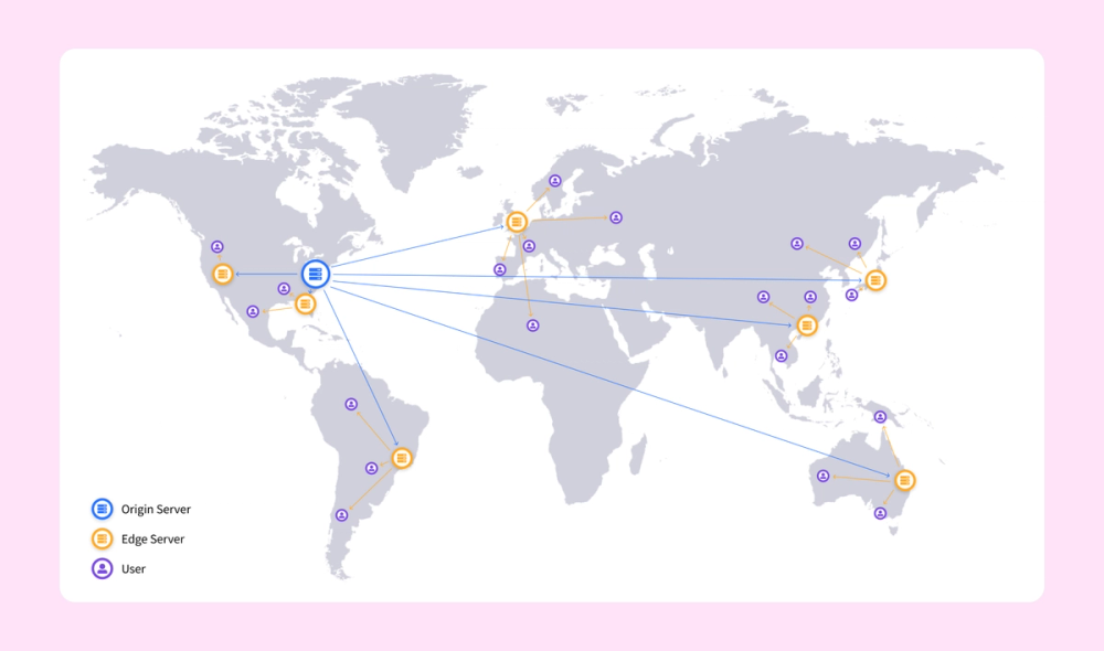
This infographic uses a simple map to illustrate how a content delivery network (CDN) works. It shows one original server and splinters off into locations used to serve data around the world. The only text is the icon legend in the lower left. The infographic maintains a clean and simple style by not labeling the countries on the map.
Example 2. Project roadmap infographic

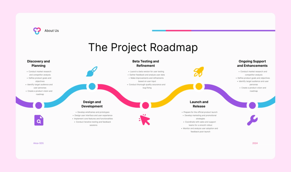
This colorful yet simple infographic features a project roadmap. From planning to post-launch support, each step has a relevant icon and four bullet points below it.
Example 3. Plastic waste statistical infographic

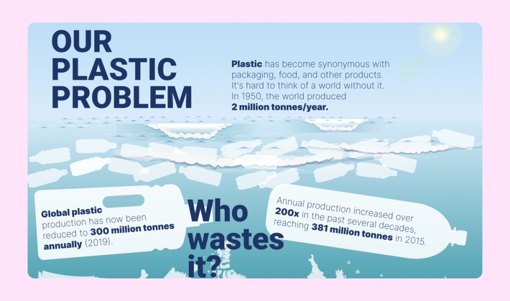
This infographic about plastic waste features layers of creative illustrations that tell a story. A gradient helps represent the ocean's depths, while large silhouettes of countries and marine animals create a backdrop for featured text and statistics.
Example 4. Budapest tourism infographic

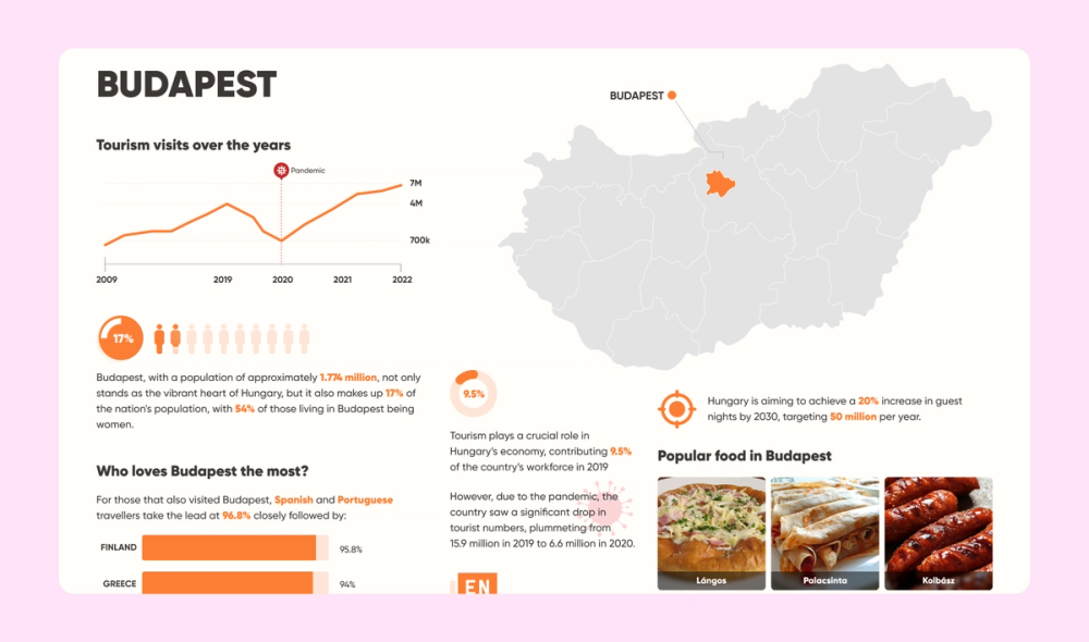
A clean layout presents the data in this Budapest tourism infographic in a clear and legible way. The simple orange color scheme matches the photos of local cuisine, while a map, line graph, donut chart, and bar chart add more visual interest. Don’t be afraid to use multiple data visualization techniques inside one infographic!
Example 5. Football team skills infographic

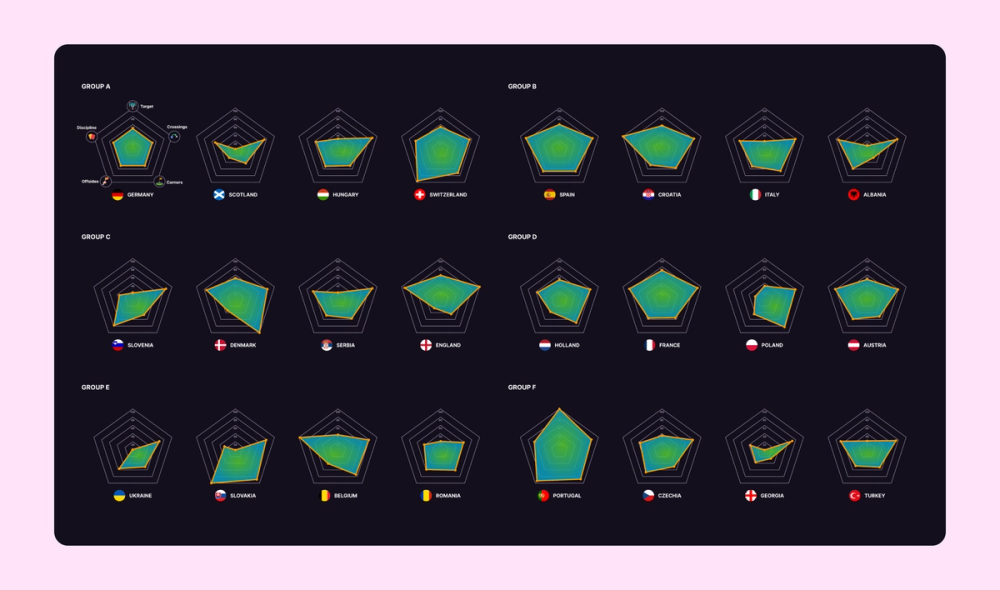
In this infographic, multiple radar charts show the strengths of football teams from different countries. The first of the 24 charts explains which skill corresponds with which point on the chart. This approach lets viewers determine the most well-rounded teams at a glance.
Example 6. “My life in Berkeley" infographic

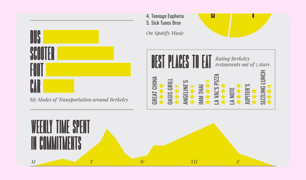
Bauhaus and Constructivist influences elevate this personal infographic about life in Berkeley. The dynamic layout combines perpendicular text, diverse data visualization methods, and strong typography to create visual rhythm and storytelling flow.
Example 7. Resume infographic

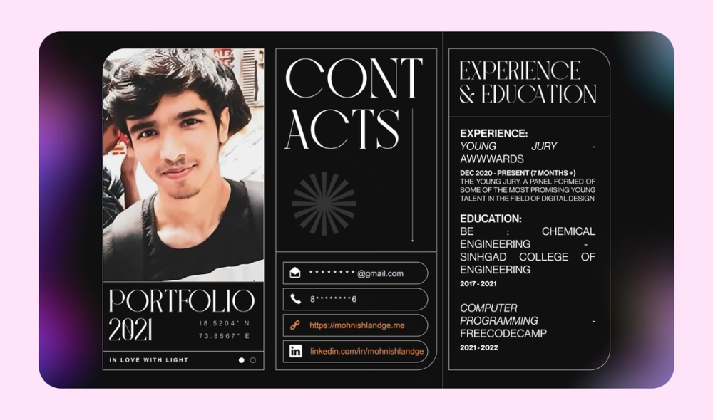
Contrast is key in this memorable resume infographic. The mix of sharp and rounded edges, different fonts, and gently blurred colorful gradients on a black background add a ton of visual interest and personal flair.
Example 8. Workout form infographic


This Vietnamese infographic shows the proper form for three different at-home exercises and common mistakes. The high-quality graphic illustrations communicate the proper form to the viewer, with text further explaining the technique.
Example 9. Pet ownership statistical infographic


This infographic about pet ownership has a pleasant, bright color scheme. Adorable photos and icons enhance the design, but the bold percentages and financial statistics are the real focus.
Example 10. User journey infographic

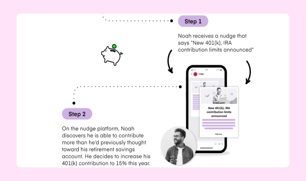
This infographic kicks off with a user persona and then guides through various steps in a hypothetical user journey. A cohesive and unique purple and neon green color scheme lends character to this infographic, while the screencaps add clarity.
Example 11. OS flowchart infographic

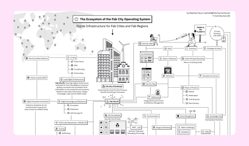
This super-detailed black and white infographic aims to map the ecosystem of the Fab City operating system. This model for sustainable cities focuses on locally produced goods and globally shared knowledge to minimize dependency on complex global supply chains. Crisp illustrations throughout the flowchart help with storytelling. Overall, the visual aesthetic is evocative of the Macintosh “System 1,” which suits the theme perfectly.
Example 12. Ad quality infographic

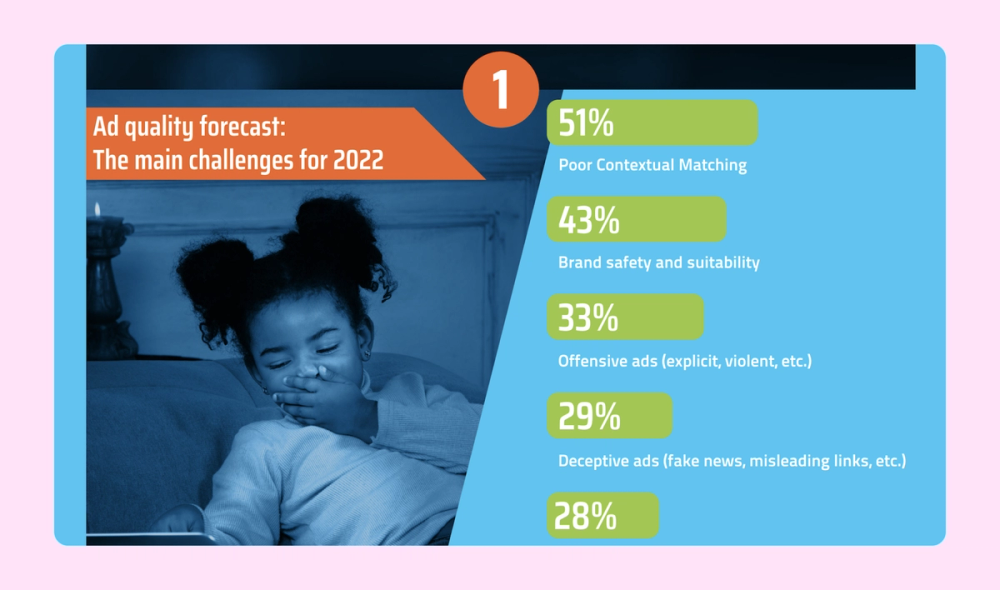
This infographic uses bar charts, pie charts, and other data visualization techniques to discuss ad quality and audiences. In addition to illustrations and a bold color scheme, the piece features background photos seamlessly integrated with a blue overlay filter.
Example 13. Conversational AI infographic

This list infographic about conversational AI examples has a futuristic feel thanks to a cohesive, cool-toned color scheme, bold icons, and sans serif font choices. Different formats help break up multiple text-heavy lists to create a better visual flow.
Example 14. Broadcasting flowchart infographic

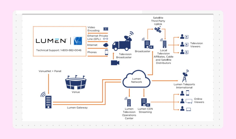
This simple flowchart uses a complementary color scheme of navy blue and orange. The solid icons represent a video's different phases as it is broadcast to viewers via various platforms, channels, and methods.
Example 15. Teacher tips list infographic

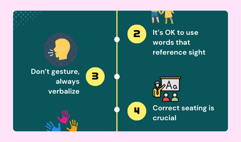
This infographic presents a simple list of 10 tips for teachers working with visually impaired students. A corresponding icon represents each tip, while halftones add texture to the background.
Example 16. Goals and objectives infographic


This creative timeline was created to help the designer set some personal and professional goals. It uses a limited color palette and a friendly illustration style to illustrate the objectives.
Example 17. Wellness infographic

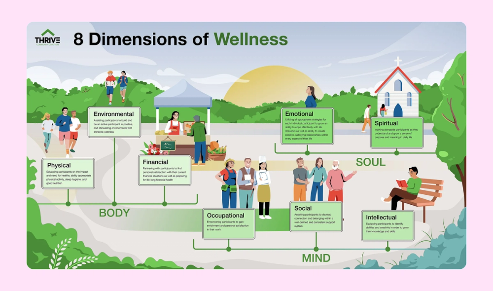
A unified illustration ties together eight dimensions of wellness, while strategically placed text boxes provide context. The integrated design emphasizes connections between personal well-being and community support.
Example 18. Tea infographic

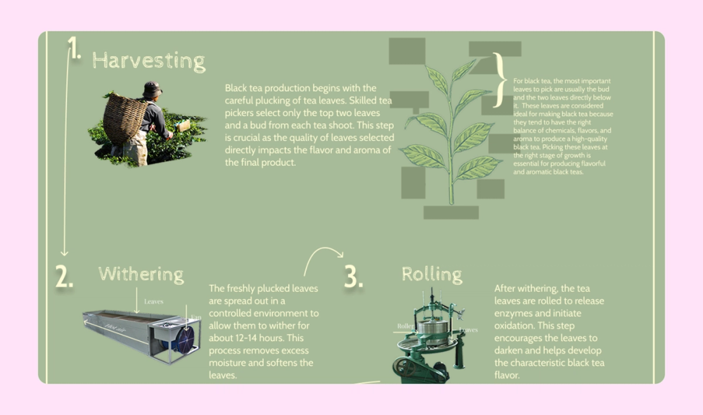
This simple infographic depicts the six steps black tea goes through before reaching a consumer, from harvesting to grading. Arrows guide the reader through the process while images support the text.
Example 19. Year-in-review infographic

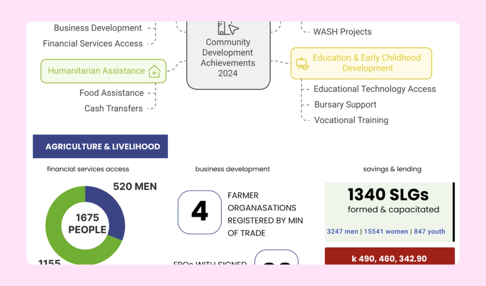
This sprawling infographic represents a year in review for Find Your Feet, an organization that helps rural families in Asia and Africa. The stats-heavy content is broken up with photos, icons, and different color boxes to maintain visual interest.
Example 20. Illustrator resume infographic

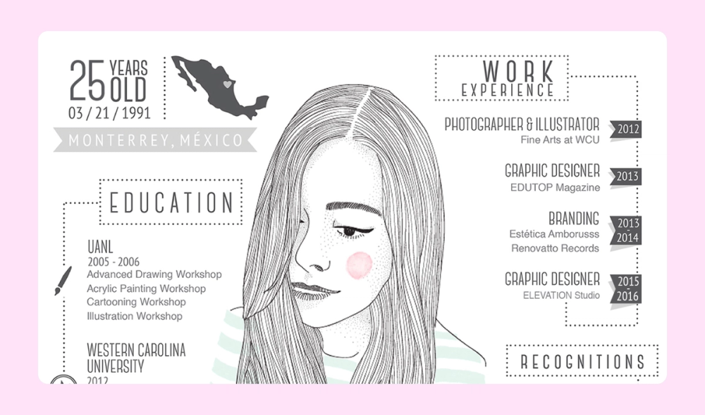
This resume infographic example takes a different approach, showcasing the creator’s illustration skills with a self-portrait. A creative arrangement of other elements—including a map, timeline, horizontal dot chart, and sliders—communicates important info to the reader.
Example 21. Flowchart infographic

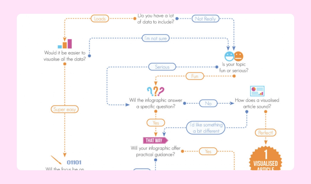
This useful flowchart infographic guides you through a series of questions to help you decide what kind of infographic to use to convey different kinds of information. The infographic uses complementary colors (blue and orange), small icons, and ample negative space to avoid distracting readers as they follow the arrows and move through the flow of questions.
Example 22. Credit card how-to infographic

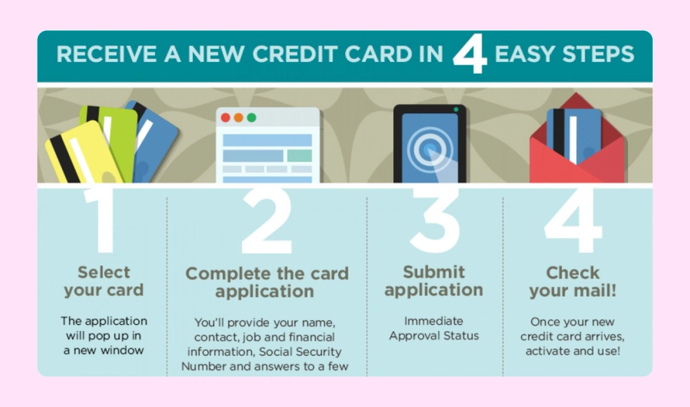
This how-to infographic explains how to sign up for a new credit card in four simple steps. Large numbers guide readers through the graphic, while clean illustrations enhance the information without distracting from it.
Example 23. London vs. Paris comparison infographic

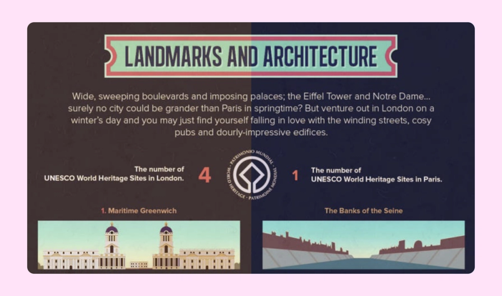
A comparison infographic is perfect for sharing visuals, quotes, and facts about London and Paris. The graphic design also incorporates iconic architecture from both cities: Big Ben and the Eiffel Tower.
Design eye-catching infographics with ease
Use Figma’s intuitive tools to turn data into engaging visual stories.
Example 24. Volunteer flowchart infographic

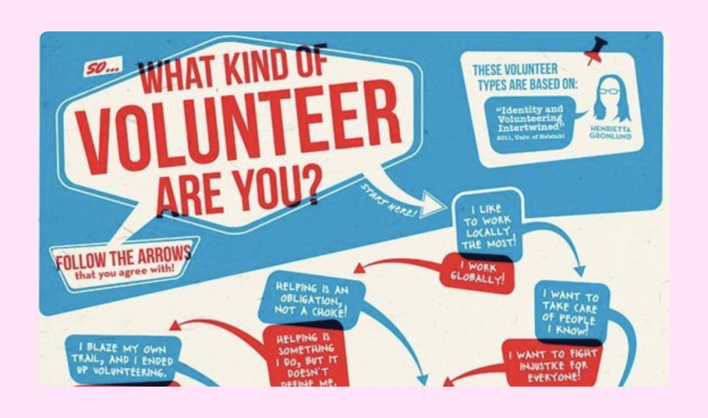
Asymmetrical design elements like curved arrows and offset text boxes bring energy and personality to this volunteer flowchart. The patriotic color combination of red, white, and blue reinforces themes of community service and civic engagement.
Example 25. Vegetarianism infographic

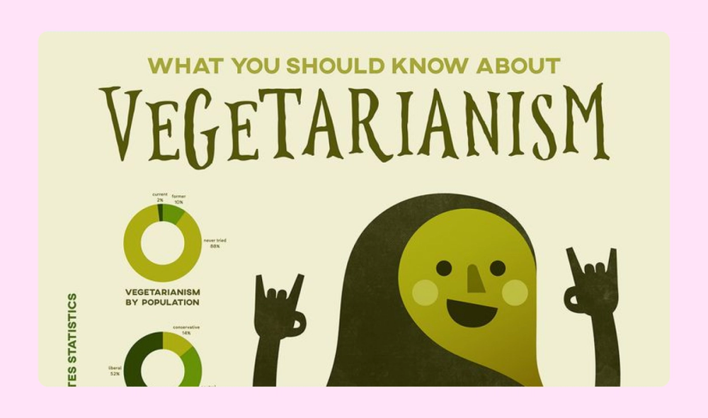
This adorable infographic uses donut charts and bar charts to share interesting statistics about vegetarianism. The monochromatic color scheme is also a great fit for the charming illustrations and topic.
Example 26. Carbon footprint infographic

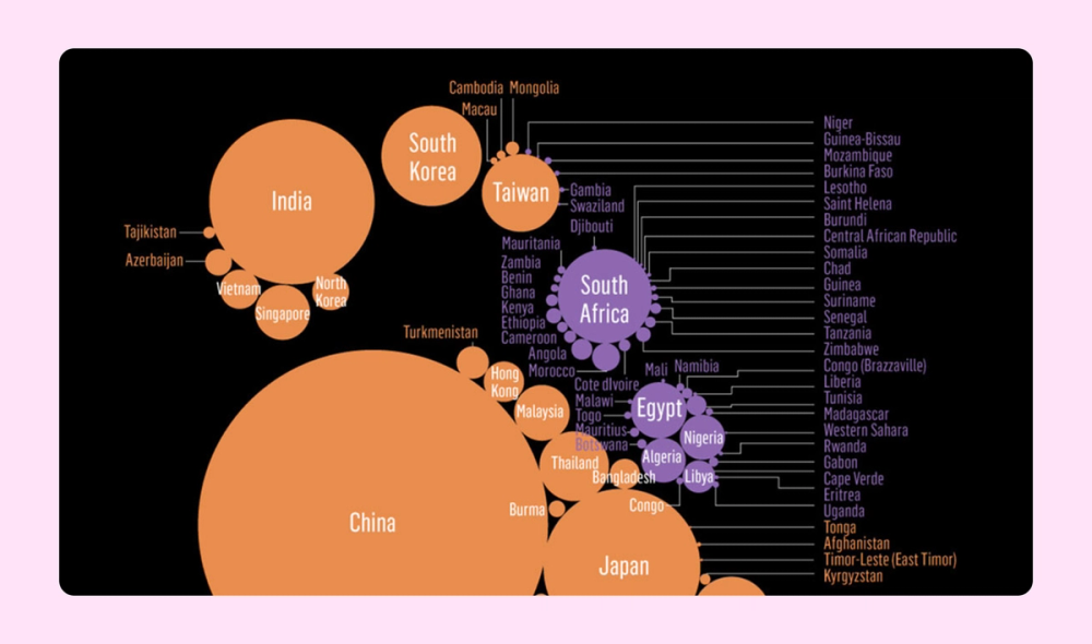
This clever infographic arranges color-coded countries in the shape of a foot to represent carbon footprints. The larger the circle, the higher the country's emissions. This helps viewers compare and understand the information at a glance.
Example 27. Thanksgiving infographic

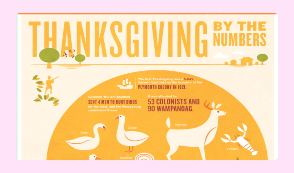
This “Thanksgiving by the Numbers” infographic uses a Venn diagram to compare the first Thanksgiving to America’s current celebrations. Additional statistics and fun facts are listed below. Bold illustrations evoke mid-century modern advertisements, while the orange autumnal color scheme fits right in.
Example 28. Family tree infographic

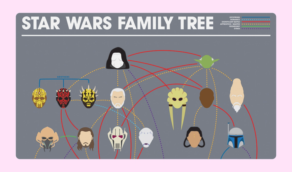
Sometimes, a picture says a thousand words. This Star Wars family tree uses simple, recognizable headshots to represent the characters. Different colors and styles of lines connect them, and a legend at the upper right explains the meaning of each type of line.
Example 29. Houseplant flowchart infographic

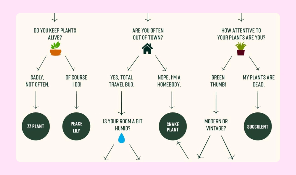
A beautiful illustration adds flair to this otherwise simple and straightforward flowchart infographic, which helps readers choose the perfect houseplant for their lifestyle and environment. Each question and answer are evenly spaced, and the plant choices are highlighted in dark green circles.
Example 30. Silicon Valley vs. Seattle infographic


Whimsical illustrations add interest to this cheeky comparison infographic about typical Silicon Valley vs. Seattle techies. There’s a thoughtful arrangement of details around the central characters and a complementary blue and orange color scheme.
Example 31. Space dogs infographic

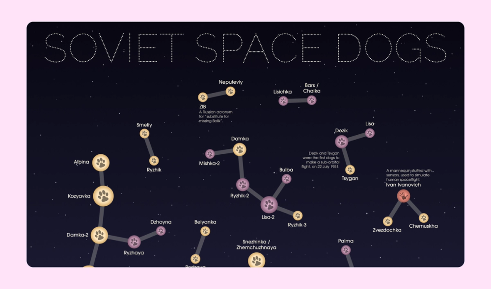
The layout for this infographic about dogs sent on outer space missions creatively mimics constellations in the night sky. Info about how to read the unique design legend is located in the bottom right corner.
Example 32. Tourism statistical infographic

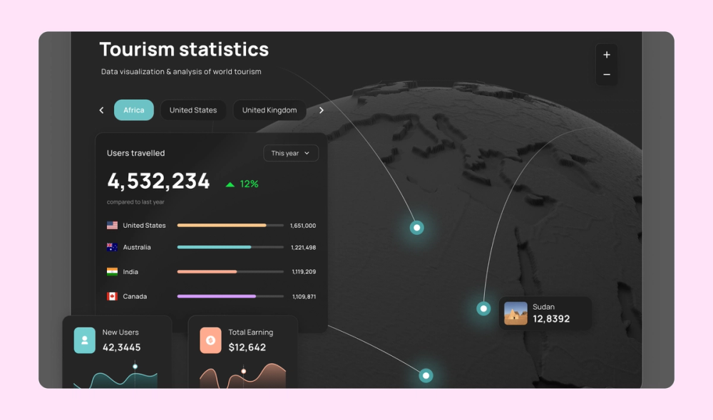
This statistical infographic incorporates maps, bar charts, and line graphs to visually represent tourism data. The clever combination results in a sleek and easy-to-read overview.
Example 33. Marketing funnel infographic

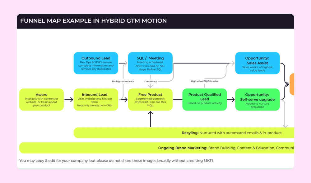
A no-nonsense flowchart format is the perfect way to represent this marketing funnel as a horizontal infographic. Color-coded boxes connect each step to a different department within the company—marketing, sales, customer success, and so on.
Example 34. Sales infographic

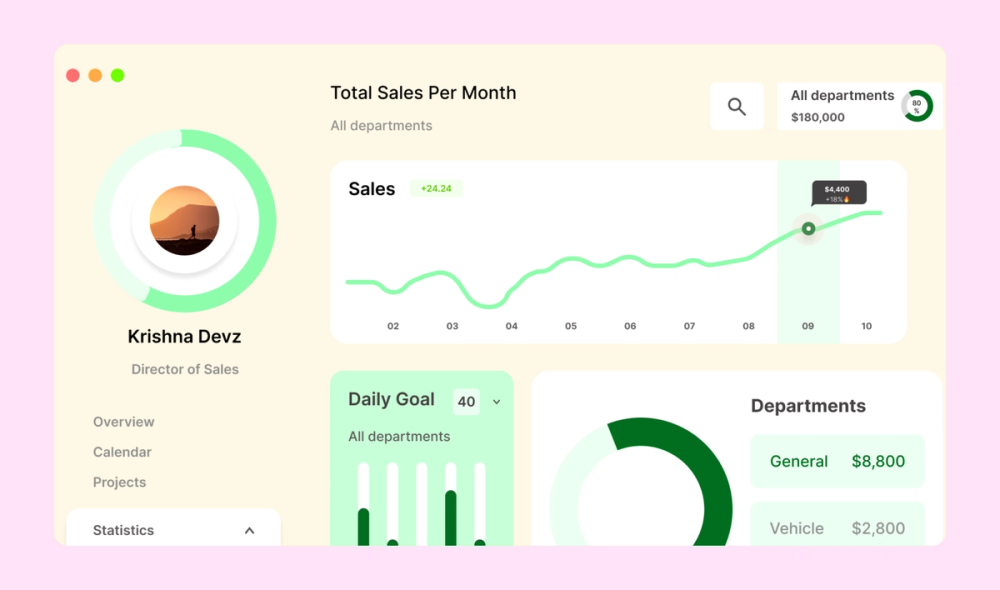
This infographic for a business presentation features a donut chart, bar chart, and line graph to distinguish and represent sales data at a glance. The color scheme sticks to shades of green, commonly used to represent profit.
Example 35. Horror video game infographic

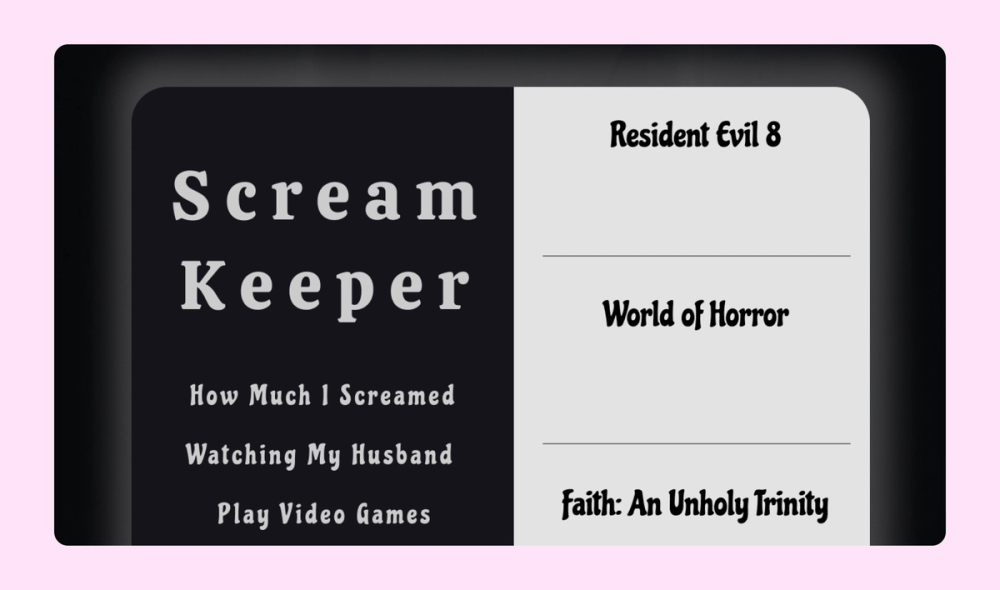
This minimalistic infographic uses Edvard Munch’s iconic painting The Scream and a stark black-and-white color scheme to track viewer reactions to horror video games.
Example 36. Google Cloud flowchart infographic

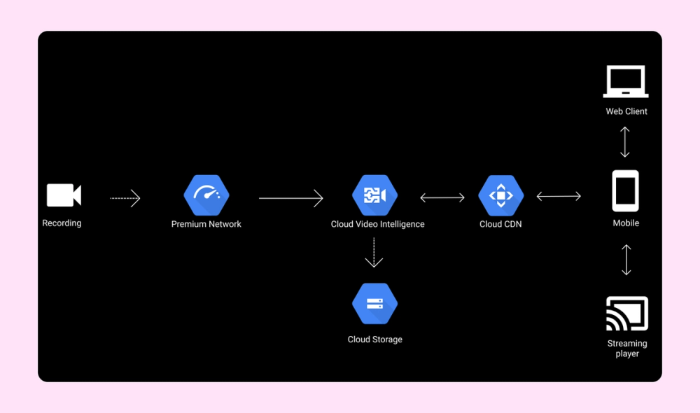
A simple, clean design and straightforward flowchart format help viewers understand how Google Cloud storage works. Bold high-contrast icons and a limited color palette work together to ensure legibility.
Example 37. LinkedIn Germany infographic

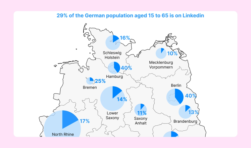
This infographic uses pie charts overlaid on a map to represent the registered LinkedIn users residing in the 16 federal states of Germany. Its simple approach and monochromatic blue color scheme make the data easy to interpret.
Example 38. Python infographic

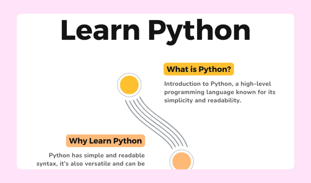
This infographic introduces viewers to the Python programming language. As you scroll down the winding road, you learn more fun facts and potential applications for the skill.
Example 39. Time management infographic

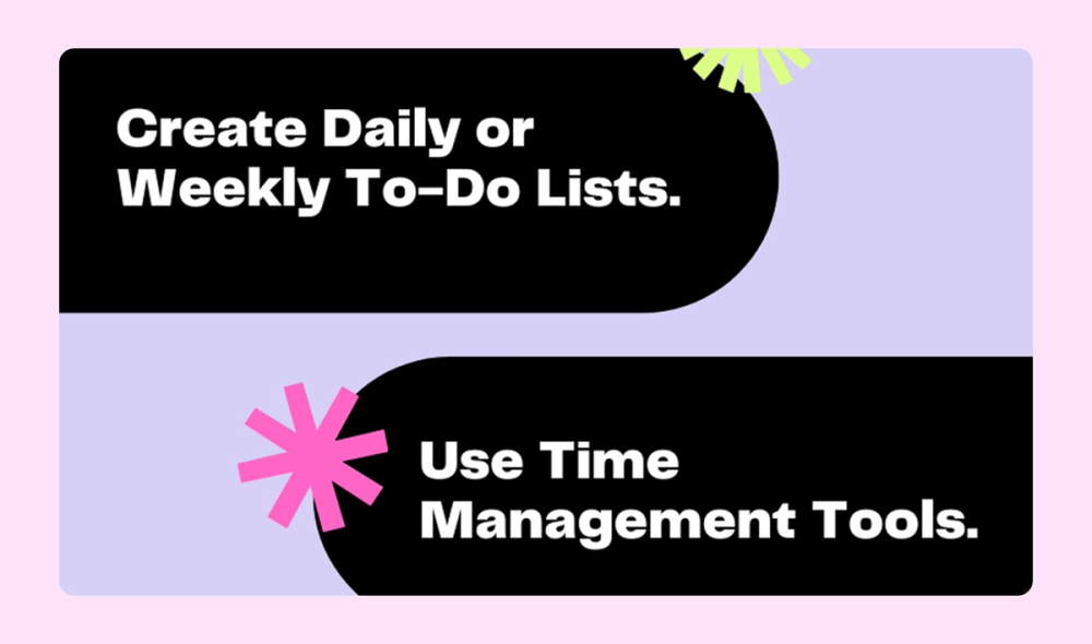
This super simple list infographic shares time management tips for college students. The high-contrast (light text on a black background and black text on a pastel purple background) design adds to the readability, while the pops of color add personality.
Example 40. AI infographic


This list infographic presents a quick rundown of AI topics. A cool color scheme gets a boost from gradient and glow effects, while the sans serif fonts add to the modern feel.
Example 41. Taylorism scientific management infographic

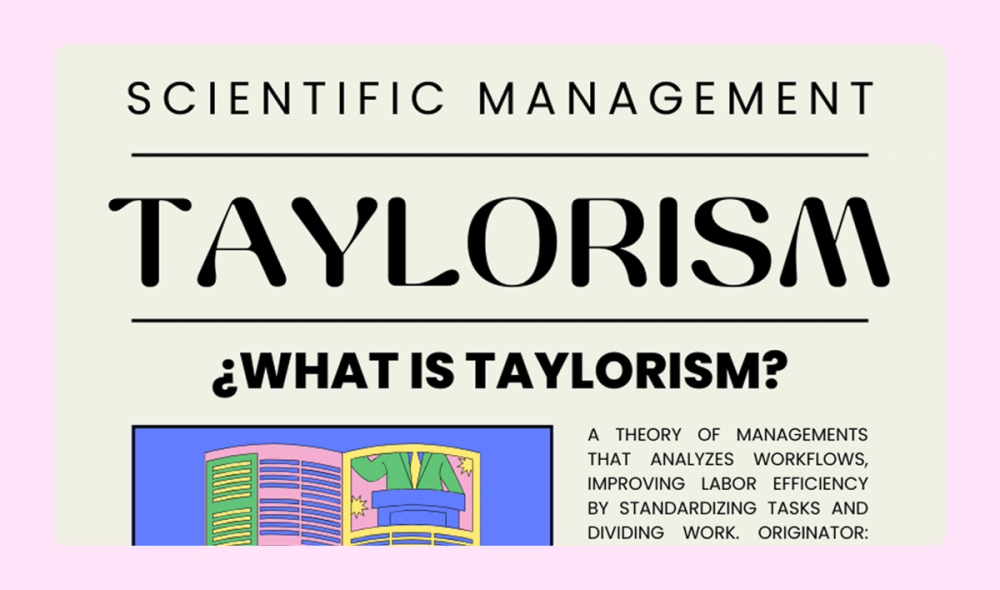
This infographic explains the “Taylorism” management theory in detail, including its definition, key principles, important dates, and pros and cons. The colorful illustrations add to the piece without overwhelming it.
Example 42. Bullying prevention infographic

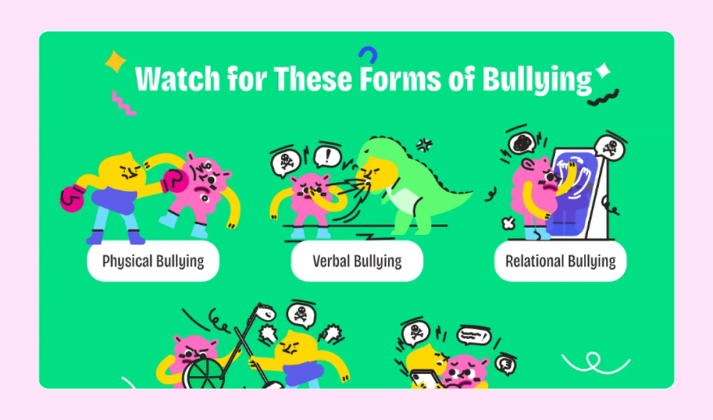
Child-friendly illustrations and bright colors make this sensitive topic accessible to young audiences. Bar charts present statistics clearly, while visual examples help identify bullying behaviors and prevention strategies.
Example 43. Neurodiversity infographic

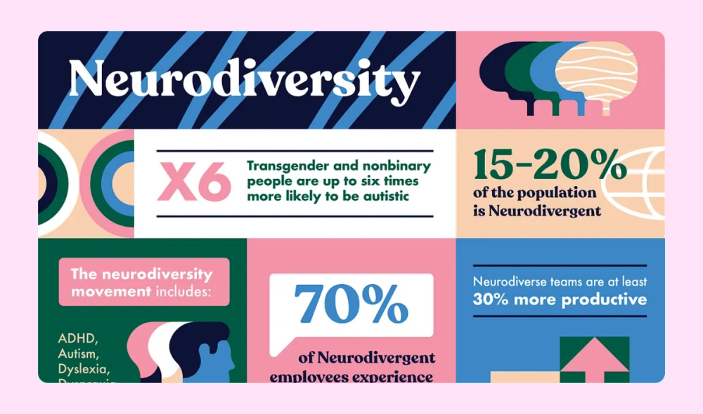
An eye-catching color scheme and big, bold numbers add visual interest to this infographic about neurodiversity. The square format also makes it easily shareable for social media platforms.
Example 44. Indonesian cuisine infographic

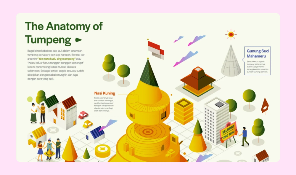
This Indonesian infographic breaks down the ingredients in a popular dish called “tumpeng.” The bright colors and adorable illustration style make it a real feast for the eyes.
Example 45. “Beginner’s guide to crypto” infographic

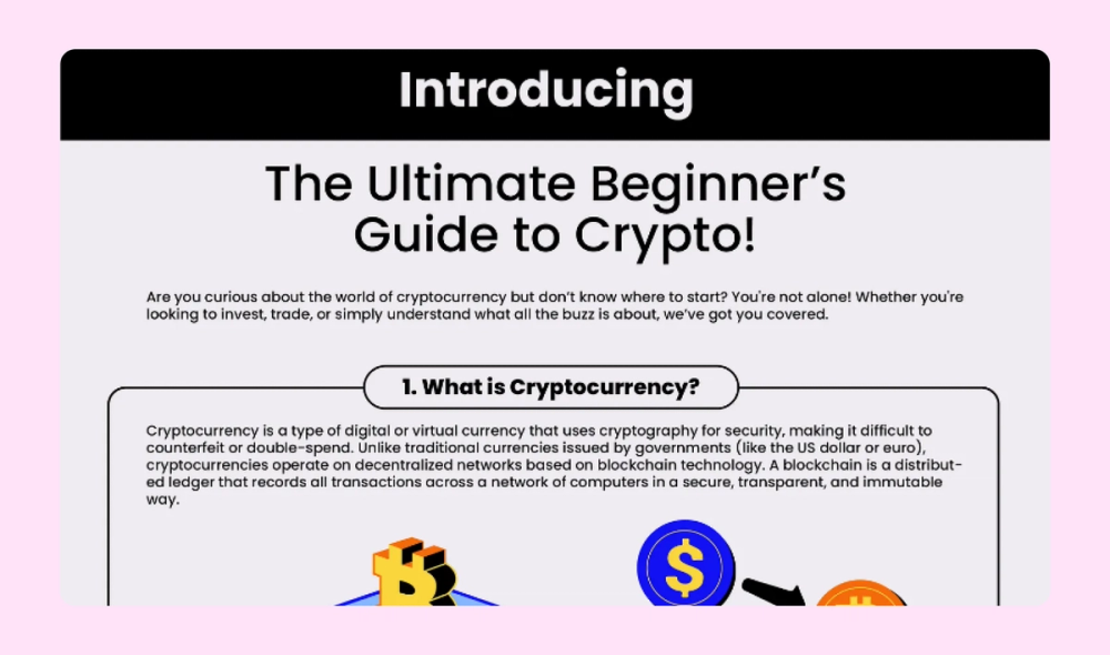
This infographic features a bright, bold four-color palette that grabs the viewer’s attention. Throughout all seven points, the text and images explain how cryptocurrency like Bitcoin works.
Example 46. Wildlife infographic

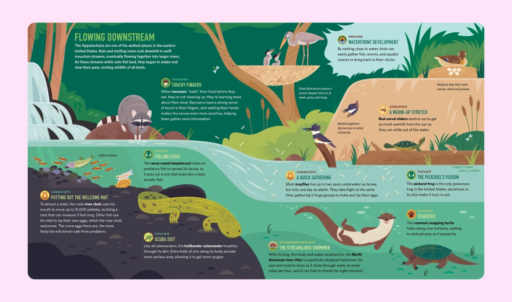
Illustrations and subtle textures bring river wildlife to life in this print-ready infographic. The magazine-style layout pairs educational facts with sophisticated visuals, creating an engaging reference guide.
Three types of infographics
Different visualization challenges require different approaches. Master these three fundamental types of infographics to transform any kind of information into clear, visual stories:
Statistical infographics
A statistical infographic deals with data and numbers. Instead of overwhelming readers with raw statistics, it uses data visualization techniques to summarize reports, studies, survey results, and more. This may include pie charts and graphs to compare quantities or line charts to illustrate trends over time.
These infographics are often used in marketing reports, case studies, white papers, and research summaries to make numerical data easier to understand at a glance.
Informational infographics
Informational infographics present text-based information. They are well-suited to explain concepts and summarize key takeaways from denser publications. Common formats include:
- List. List infographics present a series of key points, steps, or takeaways in a structured, easy-to-read layout. They are commonly used for tips, best practices, and checklists.
- Timeline. Timelines visualize chronological events, milestones, or historical developments. Use them to illustrate company history, industry evolution, or project roadmaps.
- Hierarchical. These infographics display information in order of importance, often in a pyramid or flowchart structure. Popular examples include Maslow’s hierarchy of needs and the food pyramid.
- Comparison. Use a comparison infographic to highlight differences and similarities between two or more things, such as products, services, or ideas. Side-by-side layouts with lists of pros and cons are commonly used in these infographics.
- Map/geography. Maps can visualize location-based data, trends, or statistics. These are particularly useful for population insights, regional comparisons, or global trends.
Some infographics may even feature a creative combination of more than one of these categories.
Process infographics
A process infographic represents a sequence of actions. This sequence could be represented by a flowchart, cyclic diagram, or other depiction of how-to steps. Illustrations in a process infographic may be more detailed to give viewers clear instructions.
Process infographics are handy for how-to guides, educational or instructional content, or business processes. They may also depict customer journeys or product lifecycles.
Four elements of a good infographic
To create an effective infographic, keep these four key elements in mind:
- Important information and concise content. Make sure you are communicating helpful information to the reader. Too much filler will overcomplicate your infographic.
- Storytelling. Use a clearly defined subject and story to convey the data and information you want readers to learn about. Your infographic should stand entirely on its own, outside the context of a blog post or other presentation.
- Design and style. The best infographics are informative as well as aesthetically pleasing. Carefully consider color palettes and ensure all images and text are relevant and sensibly connected.
- Size and shape. Create a clean layout with legible fonts. Make sure the infographic is eye-catching but not overcrowded. Consider where you’ll post it and if different formatting is necessary for other platforms. For more information, check out the social media size guide.
Step up your data visualization with FigJam
Feeling inspired by these infographic examples? Explore how FigJam’s tools and features can help you bring your visions to life:
- Invite feedback on your designs with FigJam’s collaborative online whiteboard.
- Leverage the power of AI with Jambot to summarize your data and come up with ideas for visuals.
- Use FigJam’s infographic template as a starting point to make your own timeline, flowchart, how-to, or statistical infographic.
- Browse the Figma Community for more examples and ideas to jumpstart your next project.
Ready to take your visual storytelling to the next level?
Bring ideas to life with collaborative tools in FigJam.