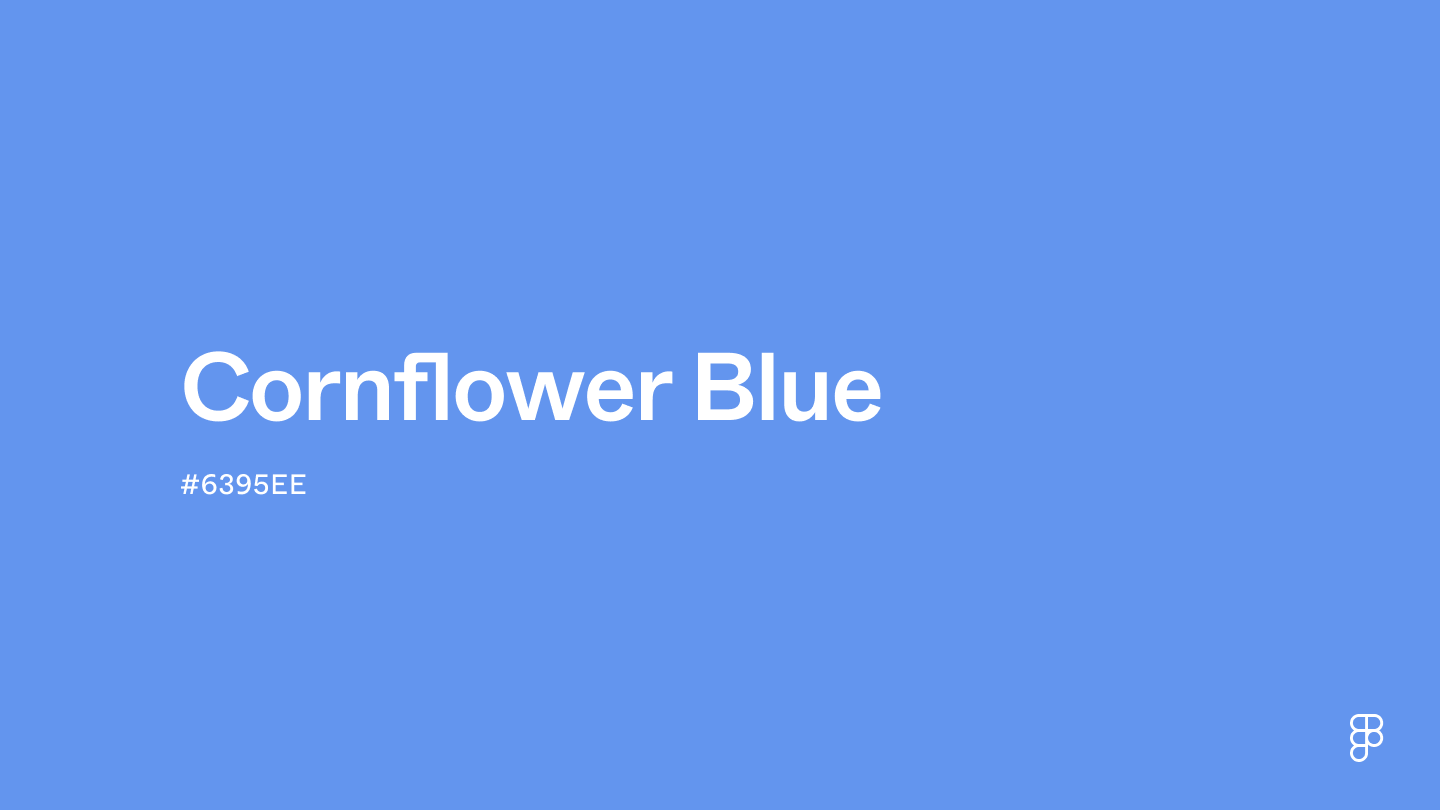
Cornflower blue is a vibrant yet soothing color that draws its name from the cornflower. It sits between blue and violet, embodying a cool hue with a serene yet lively essence. This particular shade is bright and more vivid than typical variations like periwinkle and lavender blue, making it a standout in designs that require a refreshing but calming influence.

Color variations
Shades
Tints
Tones
Hues
Color harmonies
Complementary
Split
Monochromatic
Analogous
Triadic
Square
Custom palettes
Meadow blue
Sunset Skies
Soft Spring
Cornflower blue is defined by the following color codes and values to ensure consistency across various digital platforms and devices.
- HEX code: #6395EE
- RGB value: 38.8% red, 58.4% green and 93.3% blue
Accessibility considerations play a crucial role in UX and UI design color choices. Figma offers plugins in the Community to make sure your designs meet Web Content Accessibility Guidelines.
Cornflower blue's calming nature makes it a versatile color for UI designers. Consider these possibilities:
- Create a soothing atmosphere. Use cornflower blue for a background or theme color to establish a calm and welcoming environment. Its soothing hue is ideal for healthcare, wellness, or meditation apps.
- Enhance usability. Use cornflower blue for buttons, links, or CTAs to guide users without being visually overwhelming.
- Build trust. Incorporate cornflower blue into an app or website branding elements to evoke feelings of trust, loyalty, and dependability—especially suitable for financial, educational, or service-based platforms.
- Accentuate with complementary colors. To add energy to your design while maintaining balance, use cornflower blue with complementary or analogous colors like soft yellows or vibrant oranges.
Keep in mind that color and its meaning can change from culture to culture—and at any given time. If you are designing for a global audience, research color considerations for your specific regions.
For variations within the same serene and vibrant spectrum as cornflower blue, consider:
- Periwinkle (#CCCCFF) shares cornflower blue's soft and dreamy vibe with a touch more purple, offering a slightly more whimsical feel.
- Sky blue (#87CEEB) captures the lightness and openness of the sky, closely resembling cornflower blue's airy and uplifting quality.
- Dodger blue (#1E90FF) is a bit more saturated, offering a vivid and energetic alternative that retains the essence of cornflower blue's charm.
- Steel blue (#4682B4) presents a more subdued and mature version, with a hint of gray adding depth while staying in harmony with cornflower blue's tranquility.
To complement cornflower blue's vibrant tones, consider pairing it with:
- Soft peach (#FFE5B4) provides a warm, inviting contrast that beautifully highlights the coolness of cornflower blue.
- Lavender (#E6E6FA) introduces a subtle, romantic hue that seamlessly blends with the serene quality of cornflower blue.
- Slate gray (#6D8196) offers a neutral, modern backdrop that allows cornflower blue to stand out without overwhelming.
- Mint green (#ADEBB3) adds a refreshing, harmonious touch, echoing the calm and rejuvenating feel of a garden in spring.
- Cream (#FDFBD4), a warm, soft hue, complements cornflower blue's brightness, creating a delicate and inviting atmosphere.
Other colors worth considering include dark chocolate brown for a rich, grounding contrast, silver for a sleek, modern twist, and coral for a vibrant, playful palette.
While cornflower blue is versatile, it may clash with:
- Bright orange (#FFA500) can be too harsh against the soothing backdrop of cornflower blue, creating a stark and potentially jarring contrast.
- Neon green (#2CFF05)) presents an overly vibrant energy that might disrupt cornflower blue's peaceful and serene vibe.
- Deep red (#8B0000), while a classic contrast, its intensity can overshadow the gentle charm of cornflower blue, making the combination feel aggressive.
- Hot pink (#FF69B4), while lively, may clash with cornflower blue by competing for visual dominance rather than complementing its tranquility.
- Chartreuse (#CCFF00), with its high intensity, can detract from cornflower blue's serene and refined quality, leading to a visually unsettling palette.
Cornflower blue represents tranquility, trust, and loyalty, creating a serene and peaceful ambiance. Its link to the cornflower emphasizes natural beauty and grace, encouraging environmental awareness and conservation. This color also symbolizes hope and resilience, showcasing the strength and perseverance inherent in nature.
Psychologically, cornflower blue evokes feelings of calmness and reassurance, fostering a sense of security and stability. It creates an environment that fosters clear thinking and effective communication, making individuals feel supported and at ease.
In UI/UX design, cornflower blue creates calming interfaces. It’s ideal as a background color for apps or websites focused on wellness, meditation, or environmental causes, encouraging users to connect with broader sustainability themes and the natural world.
Cornflower blue takes its name from the vibrant bloom of the cornflower plant, but its artistic claim to fame comes from Dutch painter Johannes Vermeer. He used expensive ultramarine pigments to capture its depth in masterpieces like "Girl With a Pearl Earring."
Throughout history, cornflower blue's meaning has shifted – from medieval devotion to a symbol of French remembrance in WWI. It remains a popular choice in fashion, design, and branding.
Contrast checker
Contrast 2.97
- Large Text
#6395EE
- Normal Text
How you design, align, and build matters. Do it together with Figma.
| Category | ||
|---|---|---|
Fail | Fail | |
Fail | Fail | |
Fail | Fail |
Contrast 7.06
- Large Text
#6395EE
- Normal Text
How you design, align, and build matters. Do it together with Figma.
| Category | ||
|---|---|---|
Pass | Pass | |
Pass | Pass | |
Pass | Pass |
Color simulations
Protanopia
Deuteranopia
Tritanopia
Achromatopsia
The hexadecimal color #6395EE, known as cornflower blue, has RGB values of R:99, G:149, B:238 and CMYK values of C:0.58, M:0.37, Y:0, K:0.07.
| VALUE | CSS | |
|---|---|---|
| HEX | 6395EE | #6395EE |
| RGB DECIMAL | 99, 149, 238 | rgb(99,149,238) |
| RGB PERCENTAGE | 38.8, 58.4, 93.3 | rgb(38.8%,58.4%,93.3%) |
| CMYK | 58, 37, 0, 7 | |
| HSL | 218.4°, 80.3, 66.1 | hsl(218.4,80.3%,66.1%) |
| HSV (OR HSB) | 218.4°, 58.4, 93.3 | |
| WEB SAFE | 6699FF | #6699FF |
| CIE-LAB | 61.928, 9.464, -49.857 | |
| XYZ | 31.322, 30.319, 85.086 | |
| xyY | 0.213, 0.207, 30.319 | |
| CIE-LCH | 61.928, 50.748, 280.748 | |
| CIE-LUV | 61.928, -23.219, -80.725 | |
| HUNTER-LAB | 55.063, 5.18, -53.075 | |
| BINARY | 01100011, 10010101, 11101110 | |
| iOS - SwiftUI | Color(red: 99/255, green: 149/255, blue: 238/255) | |
| iOS - UIKit | UIColor(red: 99/255.0, green: 149/255.0, blue: 238/255.0, alpha: 1.0) | |
| Android - Compose | Color(0xFF6395EE) |