In design, #252525 provides a strong, near-black visual impact without losing the detail and texture that can sometimes disappear with true black. This shade is excellent for creating contrast and depth in digital design while maintaining clarity and visibility of details.

Color variations
Shades
Tints
Tones
Hues
Color Harmonies
Complementary
Split
Monochromatic
Analogous
Triadic
Square
Custom Palettes
Ink Wash
Charcoal Rose
Midnight Shadow
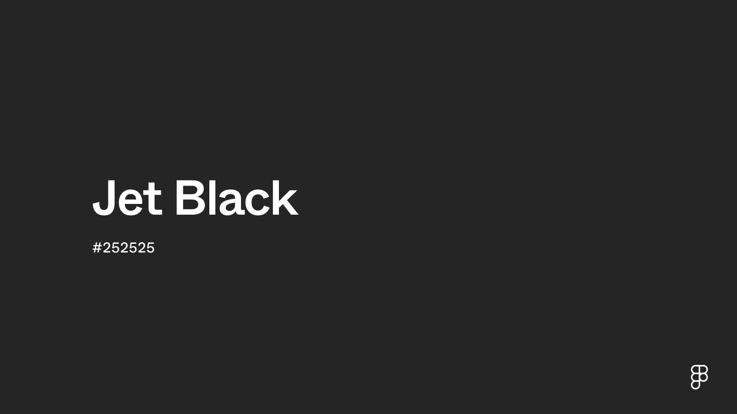
Jet black is defined by the following color codes and values to ensure consistency across various digital platforms and devices.
- HEX code: #252525
- RGB value: 14.5% red, 14.5% green and 14.5% blue
Accessibility considerations play a crucial role in UX and UI design color choices. Figma offers plugins in the Community to make sure your designs meet Web Content Accessibility Guidelines.
Here are a few ways to consider using jet black in your designs:
- Balance with light elements. Pair #252525 with lighter shades such as whites or pastels to balance its intensity. This combo prevents designs from feeling too heavy, ensuring an inviting user interface.
- Lean into luxury. Implement #252525 to project luxury, sophistication, and a high-tech feel. It pairs well with metallic accents and vibrant colors to enhance the overall aesthetic.
- Enhance communication. Use #252525 for headings and important text elements to draw attention and convey information efficiently. Its deep tone enhances visibility and impact.
- Create layering and texture. For shadows, overlays, and gradients, #252525 is an excellent shade to create visual interest and dimension in a subtle way.
Keep in mind that color and its meaning can change from culture to culture—and at any given time. If you are designing for a global audience, research color considerations for your specific regions.
For variations within the same deep and intense spectrum as jet black, consider:
- Charcoal (#4A4A4A) is a slightly lighter shade of black that still retains a deep, somber feel, making it a close relative.
- Onyx (#353839) offers a subtle metallic undertone that brings a different kind of depth similar to jet black.
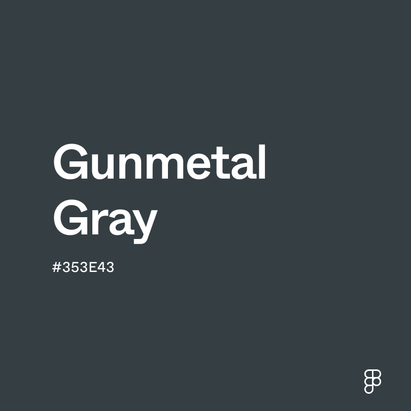
- Gunmetal (#353E43) has a bluish-gray tint, providing a softer alternative while maintaining the darkness.
- Ebony (#5D6658) introduces a hint of green, adding a touch of nature to the dark palette.
To complement jet black's profound and bold tones, consider pairing it with:
- White (#FFFFFF) creates a stark contrast, bringing out the intensity of jet black.
- Silver (#C4C4C4) offers a metallic sheen that brightens the deep black without overpowering it.
- Crimson red (#BF2323) adds a vibrant pop of color that stands out against the darkness of jet black.
- Teal (#069494) combines well by providing a cool, soothing element to the starkness of jet black.
- Dusty rose (#DCA1A1) softens the harsh contrast with its subdued warmth and subtle pink hue.
Other colors worth considering include pale gold to add elegance, sky blue for a serene look, and lavender for a touch of delicacy.
While jet black is versatile, it may clash with:
- Bright yellow (#FFFF00) can appear overly stark and may create an eye-straining contrast with jet black.
- Neon green (#2CFF05) often looks jarring against the seriousness of jet black, making the combination visually unsettling.
- Orange (#FFA500) tends to compete for attention when paired with jet black, which can overwhelm the senses.
- Light gray (#D3D3D3) might appear washed out against jet black, losing its subtlety.
- Pastel colors in general may become subdued or muddy when placed next to the dominance of jet black.
Jet black stands for elegance, mystery, and strength. It brings sophistication and formality, often showing seriousness and depth. Different cultures see jet black as a protector, taking in negativity. This makes it a strong symbol in fashion and decorations.
In color psychology, jet black looks authoritative and strong, showing decisiveness and resilience. It provides stability and control. However, using too much can make things feel heavy and oppressive.
Jet black works well as a background color in sleek, modern designs. It offers dramatic contrast, making other colors, especially bright or light ones, pop. This makes jet black popular for luxury brands, high-end electronics, and websites for art and photography. Using jet black carefully can also lessen eye strain in dim light.
The term “jet black” comes from the jet gemstone. Jet is a kind of lignite, an early form of coal, known for its deep, glossy black color. Unlike some gemstones, jet doesn't shine like metal, but it can be polished to look very shiny.
People have used jet in jewelry and decorations for hundreds of years. In Victorian England, jet became very popular for making jewelry for times of mourning. Its deep black color was perfect for expressing sadness and remembrance. Over time, the phrase "jet black" started to mean any very deep and dark black color, inspired by the look of the jet gemstone.
Contrast 15.33
- Large Text
#252525
- Normal Text
How you design, align, and build matters. Do it together with Figma.
| Category | ||
|---|---|---|
Pass | Pass | |
Pass | Pass | |
Pass | Pass |
Contrast 1.37
- Large Text
#252525
- Normal Text
How you design, align, and build matters. Do it together with Figma.
| Category | ||
|---|---|---|
Fail | Fail | |
Fail | Fail | |
Fail | Fail |
Color simulations
Protanopia
Deuteranopia
Tritanopia
Achromatopsia
The hexadecimal color #252525, known as jet black, has RGB values of R:37, G:37, B:37 and CMYK values of C:0, M:0, Y:0, K:0.85.
| VALUE | CSS | |
|---|---|---|
| HEX | 252525 | #252525 |
| RGB DECIMAL | 37, 37, 37 | rgb(37,37,37) |
| RGB PERCENTAGE | 14.5, 14.5, 14.5 | rgb(14.5%,14.5%,14.5%) |
| CMYK | 0, 0, 0, 85 | |
| HSL | 0°, 0, 14.5 | hsl(0,0%,14.5%) |
| HSV (OR HSB) | 0°, 0, 14.5 | |
| WEB SAFE | 333333 | #333333 |
| CIE-LAB | 14.68, -0, -0.002 | |
| XYZ | 1.758, 1.85, 2.015 | |
| xyY | 0.313, 0.329, 1.85 | |
| CIE-LCH | 14.68, 0.002, 266.929 | |
| CIE-LUV | 14.68, -0.001, -0.002 | |
| HUNTER-LAB | 13.602, -0.727, 0.739 | |
| BINARY | 00100101, 00100101, 00100101 | |
| iOS - SwiftUI | Color(red: 37/255, green: 37/255, blue: 37/255) | |
| iOS - UIKit | UIColor(red: 37/255.0, green: 37/255.0, blue: 37/255.0, alpha: 1.0) | |
| Android - Compose | Color(0xFF252525) |