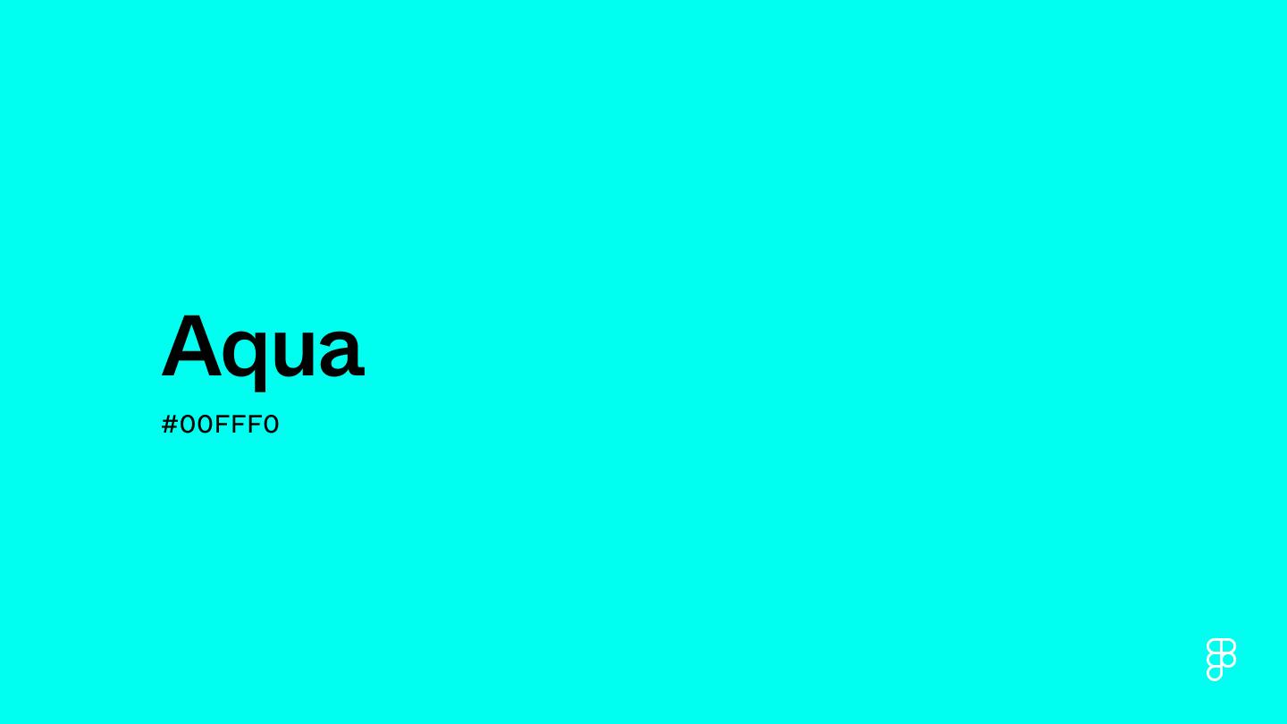
Aqua is a bright, lively color positioned between green and blue on the color wheel. This shade shares the qualities of sparkling tropical waters and evokes feelings of clarity, refreshment, and invigoration.

Color variations
Shades
Tints
Tones
Hues
Color Harmonies
Complementary
Split
Monochromatic
Analogous
Triadic
Square
Custom Palettes
Sea Shimmer
Shallow Reef
Azure Ocean
Aqua is defined by the following color codes and values to ensure consistency across various digital platforms and devices.
- HEX code: #00FFF0
- RGB value: 0% red, 100% green, and 94.1% blue
Accessibility considerations play a crucial role in UX and UI design color choices. Figma offers plugins in the Community to make sure your designs meet Web Content Accessibility Guidelines.
Here are some ways to use aqua in your designs:
- Use contrast to enhance readability. Pair aqua with neutral colors like white and cream to make elements like navigation menus more readable.
- Evoke a beachy vibe. Few colors suggest white sands and clear water quite like aqua does. Apply it in backgrounds and headers within an interface to create an atmosphere of leisure and recreation.
- Add eye-catching accents. Aqua’s vibrance makes buttons, icons, and CTAs stand out, encouraging user interaction.
Keep in mind that color and its meaning can change from culture to culture—and at any given time. If you are designing for a global audience, research color considerations for your specific regions.
For variations within the same blue-green spectrum as aqua, consider:
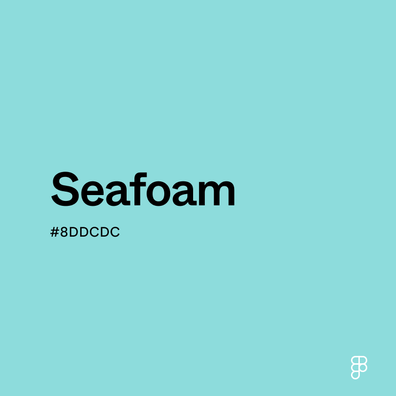
- Seafoam (#8DDCDC) is a mellow counterpart to aqua’s beachy vibe.
- Aquamarine (#66F1C2) brings more green into the mix, offering a warmer, more subdued feel.
- Electric blue (#00F0FF) is a cooler color but just as bright and peppy.
- Turquoise (#40E0D0) conveys a slightly more relaxed atmosphere with its deeper hue.
To complement aqua, consider pairing it with:
- Cream (#FDFBD4) provides a clean, neutral contrast to aqua’s vividness.
- Pink (#FF8DA1) complements aqua’s tropical mood with a sense of fun and youthfulness.
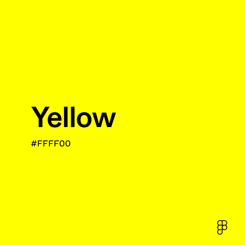
- Yellow (#FFFF00) contrasts the coolness of aqua with a warmth that suggests pineapple, sand, and sunshine.
- Peach (#FFD3AC) is a soft but playful color that balances aqua’s brightness.
Other colors worth considering are black and dark blue for dramatic contrast, white for a stark backdrop, or baby blue for a relaxed shade that blends well with aqua’s boldness.
While aqua is dynamic and vivid, it may clash with:
- Lime green (#89F336) can have a jarring effect when placed next to aqua.
- Brown (#895129) has an earthy richness that clashes with aqua’s oceanic atmosphere.
- Sage (#BBB791) is a subdued, leafy color that may create a jarring contrast with aqua’s sharp, blue-green hues.
- Indigo (#560591) has a depth and darkness that can overshadow aqua’s clarity and zest.
Aqua symbolizes rejuvenation, clarity, and tranquility. As its name suggests, aqua conjures images of clear tropical waters that refresh, soothe, and invigorate. Its bright, blue-green hues also suggest liveliness and energy.
In color psychology, aqua has a deeply purifying influence rooted in its connection to sunlit seas and sandy beaches. Its cool, striking tones can also evoke feelings of refreshment and zest.
In UI design, aqua can create a leisurely atmosphere associated with travel and tropical getaways. Its vibrancy makes it a strong choice for accents and highlighting points of interest. However, due to its intensity, it should be used sparingly to avoid overpowering other colors.
Aqua’s long association with water goes back to ancient Egypt, where it was considered sacred due to its connection with the sea and Hapi, the god of the Nile River. The Egyptians created aqua using a natural pigment to paint decorations at sacred sites like tombs and temples.
In the 20th century, design movements like Art Deco and mid-century modern embraced aqua for its vibrancy, working it into everything from fashion and home decor to advertising. The color’s popularity declined in the 1970s but resurged alongside neon shades in the 1980s.
Aqua takes its name from the Latin word for “water,” and its connection to water remains strong—it’s still used in design to add a splash of color and tropical flair.
Contrast 1.27
- Large Text
#00FFF0
- Normal Text
How you design, align, and build matters. Do it together with Figma.
| Category | ||
|---|---|---|
Fail | Fail | |
Fail | Fail | |
Fail | Fail |
Contrast 16.56
- Large Text
#00FFF0
- Normal Text
How you design, align, and build matters. Do it together with Figma.
| Category | ||
|---|---|---|
Pass | Pass | |
Pass | Pass | |
Pass | Pass |
Color simulations
Protanopia
Deuteranopia
Tritanopia
Achromatopsia
The hexadecimal color #00FFF0, known as aqua, has RGB values of R:0, G:255, B:240 and CMYK values of C:1, M:0, Y:0.06, K:0.
| VALUE | CSS | |
|---|---|---|
| HEX | 00FFF0 | #00FFF0 |
| RGB DECIMAL | 0, 255, 240 | RGB(0,255,240) |
| RGB PERCENTAGE | 0, 100, 94.1 | RGB(0%,100%,94.1%) |
| CMYK | 100, 0, 6, 0 | |
| HSL | 176.5°, 100, 50 | HSL(176.5°,100%, 0%) |
| HSV (OR HSB) | 176.5°, 100, 100 | |
| WEB SAFE | 00FFFF | #00FFFF |
| CIE-LAB | 90.691, -52.297, -6.984 | |
| XYZ | 51.483, 77.806, 94.738 | |
| xyY | 0.23, 0.347, 77.806 | |
| CIE-LCH | 90.691, 52.761, 187.607 | |
| CIE-LUV | 90.691, -71.69, -2.79 | |
| HUNTER-LAB | 88.208, -50.181, -1.934 | |
| BINARY | 00000000, 11111111, 11110000 | |
| iOS - SwiftUI | Color(red: 0, green: 1, blue: 0.941) | |
| iOS - UIKit | UIColor(red: 0, green: 1, blue: 0.941, alpha: 1) | |
| Android - Compose | Color(0xFF00FFF0) |