7 LinkedIn banner ideas + templates for eye-catching designs


Share 7 LinkedIn banner ideas + templates for eye-catching designs
Explore more from
Social media guide
Make Social Media Work Smarter, Not Harder
Transform posts into lasting growth with Figma Buzz.

LinkedIn is where professionals connect, share their expertise, and grow their careers. With millions of users on the platform, a strong visual presence guided by proven design principles is more important than ever.
That’s where your LinkedIn banner comes in. Your banner (formerly a LinkedIn background photo) is the large horizontal image at the top of your profile. A well-designed banner helps you stand out, make a great first impression, and visually communicate who you are.
Read on to learn:
- Seven LinkedIn banner ideas
- Best practices for creating LinkedIn banners
Example 1: Calming color palette


This banner template creates a calm, approachable presence. A soft color palette (light blues, gentle greens, or light grays) conveys clarity, trust, and professionalism.
It’s a natural fit for finance, education, or healthcare industries. These colors also reduce visual clutter, helping your profile feel open and easy to engage with.
Make it yours: Try swapping in your brand colors or personal favorites. A single accent shade can keep things polished while drawing attention to your name and headline.
Example 2: Abstract design layout


This layout uses color gradients and fluid lines for a creative edge. This banner template is ideal for designers, marketers, or tech pros. The open-ended style invites curiosity and encourages viewers to interpret your banner in their own way.
Make it yours: Choose abstract elements that express your personality. Structure them for logic, make them bold for energy, or let them flow for adaptability. Match the colors to your brand to keep things cohesive.
Example 3: Behind-the-scenes photo collage

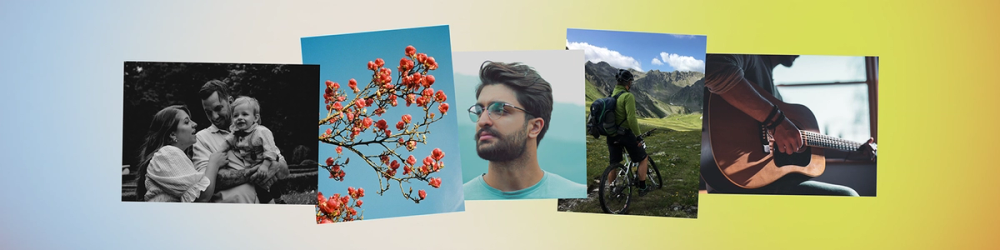
This LinkedIn banner is all about showing the many sides of your work. By blending snapshots of your tools, workspace, or finished projects, the collage format gives people a peek behind the scenes. The soft, gradient background colors help unify the images while keeping the look clean and professional.
Make it yours: Use a consistent filter to tie the images together. Think of a theme—like “behind the scenes” or “my work in action”—to help shape your banner's story.
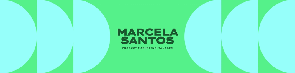
Example 4: Minimalist grid layout

This banner layout brings in a sense of structure. Clean lines and balanced spacing boost visual appeal, helping your profile feel organized and professional without being busy. It works exceptionally well for people who want their content and headline to do the talking.
Make it yours: Tweak the spacing, swap in your brand palette, or go for soft neutrals. This banner’s simplicity lets your profile photo and headline take the lead.
Discover more LinkedIn banner templates from Figma Buzz.
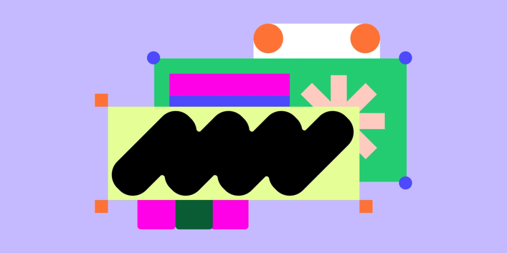
Example 5: Bold geometric shapes

This banner makes a bold first impression. Half circles, straight lines, and fun colors create energy and dimension. It’s a great match for creative roles, tech, or architecture.
The strong shapes add visual rhythm and make your banner more dynamic. The font choice of Lexend Zetta also adds a modern, sleek touch that complements the geometric design and reinforces a forward-thinking vibe.
Make it yours: Choose shapes that reflect your style, like angular for structure or round for approachability. Then, experiment with layering, transparency, and color combinations to add depth. Keep it balanced so it grabs attention without becoming too busy.
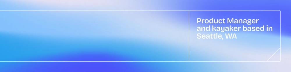
Example 6: Banner with a clear CTA

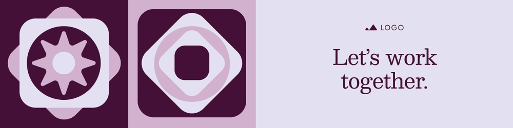
This LinkedIn banner encourages visitors to take the next step. Complementary purply tones create a cohesive, inviting color palette, while geometric shapes and illustrations along the side add visual interest without overwhelming the message.
A clear, concise call to action (CTA) guides people to your website, portfolio, downloadable resource, or direct connection. It’s a smart way to turn profile views into meaningful engagement.
Make it yours: Customize your CTA text to fit your goals, whether “Visit my site” or “Download the free guide.” Use brand colors and bold typography to make the CTA stand out without overpowering the rest of your banner.
Example 7: Quote-focused banner


Highlighting a memorable quote from your social media can amplify your brand. The centered quote draws immediate attention, making the message the focal point of the post.
A subtle background gradient adds depth and keeps the design visually engaging without distracting from the text. Whether it’s a powerful insight, a thoughtful message, or a signature phrase, this format gives your expertise a voice beyond your headline.
Make it yours: Choose a social media quote that resonates with your audience and supports your professional image. Ensure the text is easy to read and the design complements the quote, balancing visual interest with clarity.
Best practices for creating LinkedIn banners

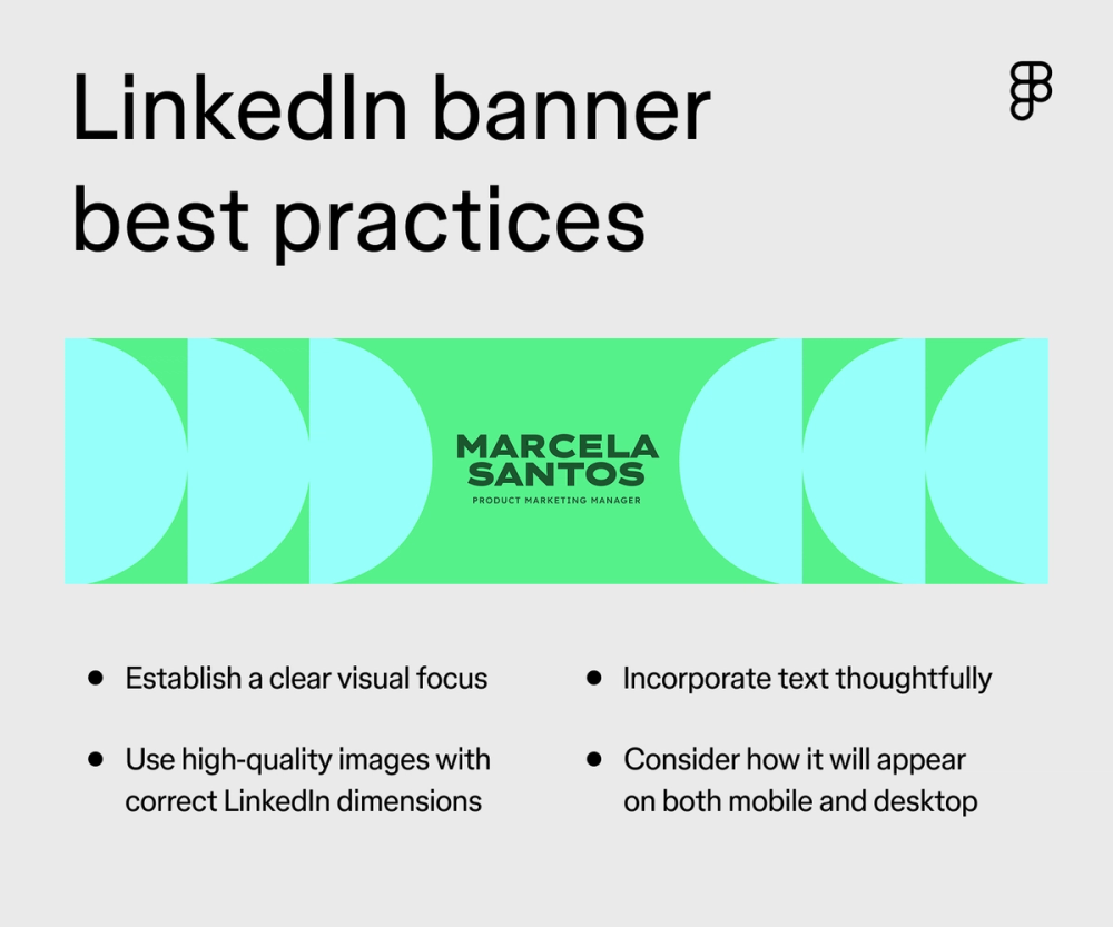
Your LinkedIn banner photo is prime real estate to make a strong first impression. To make the most of it, keep these best practices in mind:
- Feature visuals prominently. Make sure the most important aspects of your banner are immediately noticeable. Whether it’s a brand logo or a nod to your industry, it should immediately grab attention.
- Establish a clear visual focus. Guide the viewer’s eye across your banner. While there isn’t always a direct call to action in the same way as an ad, think about what you want people to notice most. Then make that a visually dominant element. Supporting details should be present but less prominent.
- Incorporate text thoughtfully. If you include text (like a tagline or a subtle call to connect), choose a legible font and keep it brief. Remember, your banner serves as a backdrop, so avoid overwhelming it with too much text.
- Use high-quality images and proper LinkedIn dimensions. Crisp, clear visuals are essential for a professional look. Make sure your image isn’t stretched or blurry. Triple-check that it adheres to the recommended LinkedIn background photo size for optimal display on all devices.
- Consider mobile and desktop views. Preview how your banner looks on both desktop and mobile. Key elements should be visible and not awkwardly cropped on smaller screens. Center important visuals so they’re visible on any screen.
Customize your LinkedIn banners with Figma
Exploring different LinkedIn banner ideas is a great place to start if you’re looking for ways to make your LinkedIn profile pop. Your LinkedIn banner is a key piece of your professional presence, offering a chance to communicate your brand and make a lasting connection visually. You can craft a profile that truly stands out by exploring different LinkedIn background photo ideas.
Ready to customize LinkedIn banners? Figma can help. Here’s how:
- Explore the Figma Community for a variety of banner templates to get you started.
- Explore more LinkedIn templates in the Figma Community to enhance your professional presence.
Consider using a shared online whiteboard like FigJam to brainstorm banner concepts and gather feedback.
Design your LinkedIn Banner with Figma Buzz
Join today for free or explore our library of free templates in Figma Community.
Keep reading

LinkedIn banner and post image size guide
Check out these LinkedIn best practices to help you make your best impression.

How to design a logo
Elevate your brand with a memorable logo — Learn how to design one and how Figma can help.

39 font pairing ideas
Explore font pairings to inspire your next design.